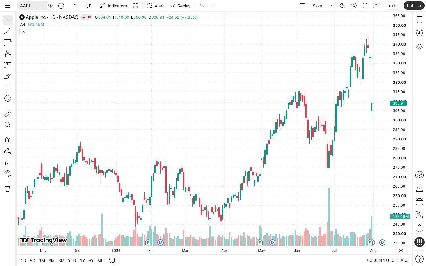
Every piece of chrome — a dozen drawing tools, six timeframes, watchlists, alerts — is compressed into four thin icon rails hugging the four edges of the screen, so the chart itself touches every edge of the viewport with nothing else competing for pixels.
Pushing every control to a thin icon-only rail on all four edges, leaving the content area completely edge-to-edge with zero border or padding. Worth lifting for any data-dense tool (chart, editor, canvas) where the content itself is the product and chrome is a tax on it — icon-only, no text labels, is what makes four rails still feel light instead of cluttered.
No traditional top-level nav visible — this is a tool, not a marketing surface. Instead, four separate icon rails split the controls by function: a top action bar (symbol, timeframe, drawing mode, alerts, save/publish), a left rail (drawing tools), a right rail (watchlists, alerts, objects), and a bottom rail (timeframe quick-picks). Nothing is labelled with text in the side rails — icons alone carry the entire tier.
Layout
Chrome fixed to all four edges at a consistent ~40-50px thickness; the chart itself is 100% fluid and fills every remaining pixel with zero padding, zero border, and zero card treatment around the plot.
Density
Extremely dense chrome (small ~20-24px icon targets packed edge to edge) wrapped around a deliberately uncluttered data surface — density is spent entirely on controls so the chart itself can stay legible at a glance.
Color
Grayscale everywhere except financial semantics: green for up-candles and positive change, red for down-candles and negative change, and one solid teal tag for the live price. Every icon, and every button except the black 'Publish' CTA, stays neutral.
Type
Numbers-first. Bold OHLC and volume figures sit directly on the chart as an overlay; the right axis uses bold tabular figures interrupted by one solid-colour current-price tag. Icon rails carry no text at all — hierarchy is entirely colour (red/green) and boldness, never size.
Pattern
Chrome pushed to the four edges as thin icon-only rails, leaving the content area completely edge-to-edge. The lesson generalizes to any data-dense tool: text labels are what make toolbars feel heavy, so once every control is icon-only, you can afford four rails and still read the whole screen as 'mostly chart.'
States
The live price renders as a solid filled tag directly on the axis at its exact y-position, distinct from the OHLC overlay's plain coloured text — two different visual treatments for 'this is the current value' versus 'this is descriptive data', so the eye finds 'now' instantly even inside a dense axis full of numbers.
Don't
Don't add a border, card, or internal padding around the chart plot to 'frame' it. The instant the plot is boxed off from its axes and rails, it stops reading as edge-to-edge and becomes just another bordered dashboard widget.
Make it your own
Turn this reference into a useful brief for your project. Copy it into the AI tool you already use.
Add constraintsPreview & edit promptAssembled in your browser. No API key or AI request needed. Changing the fields refreshes the preview.