← Back to library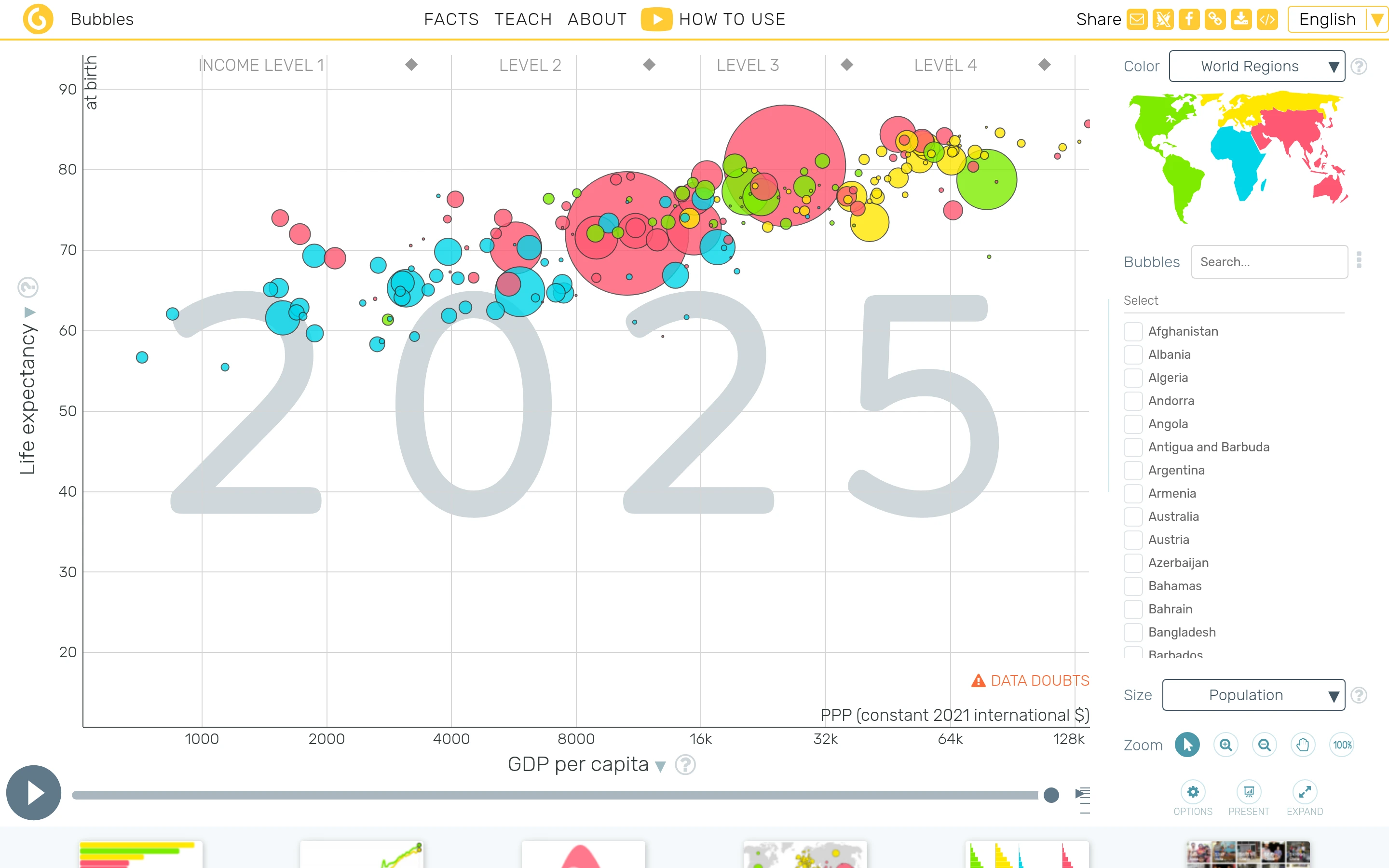
Viewport capture · opening screen Assembled in your browser. No API key or AI request needed. Changing the fields refreshes the preview.
Gapminder — Data explorer
Analytics & DataSee it livegapminder.org
A bubble chart fills most of the screen, with country filters beside it and a large year label behind the data.
Why this pattern works
Keep time, country selection, and visual encoding controls adjacent to one dominant chart.
Design notes
- Surface
- Gapminder — Data explorer
- Navigation
- Top links and a bottom visualization strip frame the explorer.
- Layout
- The chart, filter column, and time scrubber form three distinct working areas.
- Density
- Data-dense plot with a compact country list and axis selectors.
- Color
- White chart canvas with vivid categorical bubble colors.
- Type
- Small sans-serif labels keep tools and content visually separate.
- Pattern
- Keep time, country selection, and visual encoding controls adjacent to one dominant chart.
- States
- This capture records the visible state only. Loading, error, and later workflow states were not verified.
- Don't
- Adapt the interface pattern with original content, branding, and data; do not infer behavior from a still image.
Make it your own
Turn this reference into a useful brief for your project. Copy it into the AI tool you already use.