← Back to library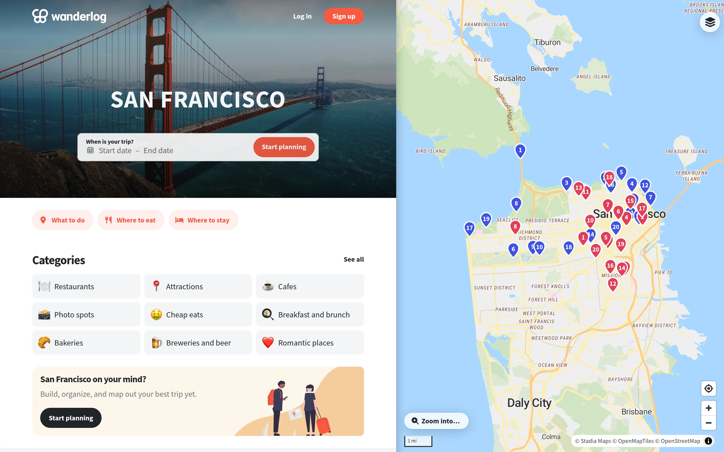
Viewport capture · opening screen Assembled in your browser. No API key or AI request needed. Changing the fields refreshes the preview.
Wanderlog — Travel planning map
Maps & TravelSee it livewanderlog.com
A destination guide and planning controls occupy the left half while a map plots places on the right.
Why this pattern works
Link travel categories to a persistent map so users retain geographic context while exploring.
Design notes
- Surface
- Wanderlog — Travel planning map
- Navigation
- Category shortcuts and trip dates sit within the destination panel.
- Layout
- A split view keeps destination content and geographic markers visible together.
- Density
- Moderate density in the guide, open space in the map.
- Color
- White cards, coral planning actions, and a pale map with colorful markers.
- Type
- Small sans-serif labels keep tools and content visually separate.
- Pattern
- Link travel categories to a persistent map so users retain geographic context while exploring.
- States
- This capture records the visible state only. Loading, error, and later workflow states were not verified.
- Don't
- Adapt the interface pattern with original content, branding, and data; do not infer behavior from a still image.
Make it your own
Turn this reference into a useful brief for your project. Copy it into the AI tool you already use.