← Back to library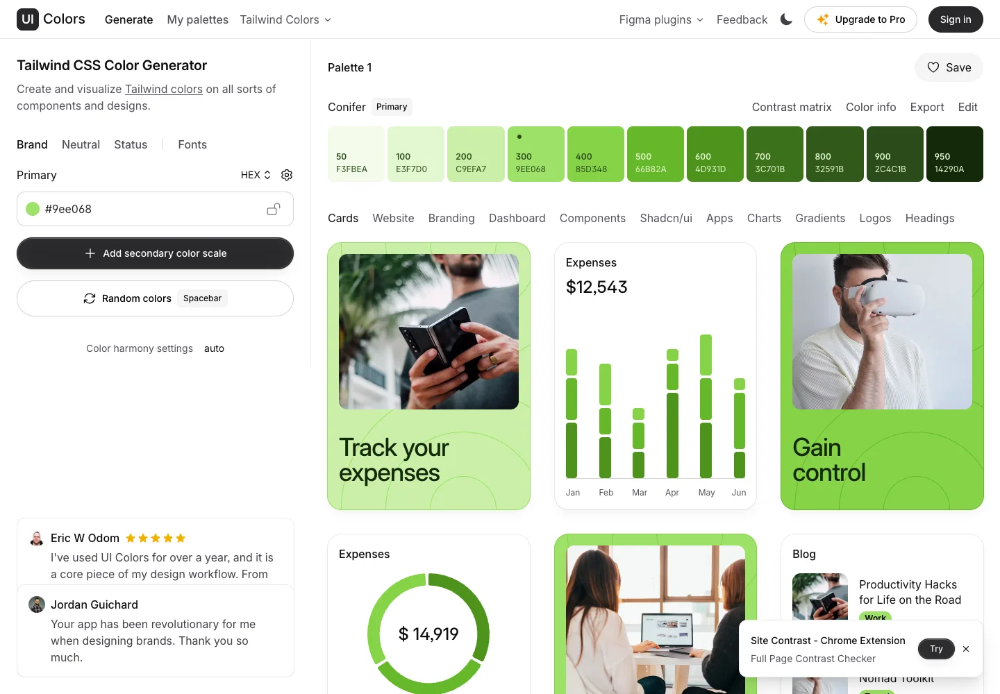
Page excerpt · scroll inside to explore Assembled in your browser. No API key or AI request needed. Changing the fields refreshes the preview.
UI Colors — Palette builder
Creative ToolsSee it liveuicolors.app
A color-scale tool arranges related shades in a structured preview.
Why this pattern works
Keep scale generation and contrast context visible while editing a base color.
Design notes
- Surface
- Palette builder
- Navigation
- Preview categories appear above the example area; export and save remain nearby.
- Layout
- A base-color panel sits beside a shade scale and contextual component previews.
- Density
- Use consistent spacing within repeated information so headings, values, and secondary details remain easy to compare.
- Color
- A pale workspace and green example scale contrast with the sample content.
- Type
- Use a clear type hierarchy for the page title, primary content, and supporting labels.
- Pattern
- Keep scale generation and contrast context visible while editing a base color.
- States
- Generated example palette and component previews; no project is saved.
- Don't
- Do not copy brand assets or sample records. Preserve keyboard access and design empty, loading, and error states for the actual task.
Make it your own
Turn this reference into a useful brief for your project. Copy it into the AI tool you already use.