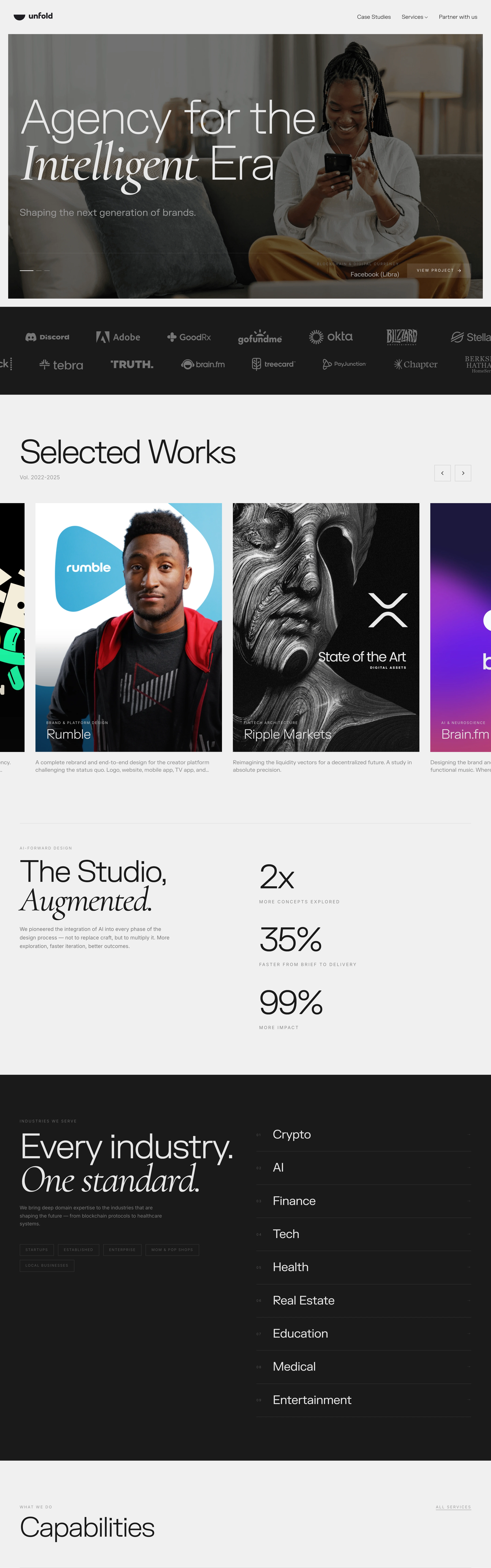
Sophisticated, confident, gallery-like. A design agency presenting itself as a curated studio, not a vendor.
Colors
Off-white/light-gray sections (#F1F0ED) alternating with near-black bands (#0B0B0B), white text on black (#FFFFFF), soft warm-neutral photography, no accent color beyond grayscale.
Type
A tall, slightly condensed grotesque (like a Neue Haas or ABC Diatype) for body/nav and labels, paired with an elegant italic serif (like a Times or GT Sectra italic) used only on emphasis words within headlines for editorial contrast.
Layout
Full-bleed photo hero with headline overlaid bottom-left; logo marquee strip beneath; horizontally-scrollable case-study card grid; alternating full-width black sections with big stat callouts or numbered lists (industries, capabilities) separated by thin hairline dividers.
Motion
Slow horizontal scroll/carousel on the case-study grid, gentle fade-ins on section entry; restrained, no bounce or parallax gimmicks.
Texture
Duotone/desaturated photography, thin 1px hairline dividers between list rows, generous negative space, no drop shadows or gradients.
Imagery
Generate: a warm, softly-lit lifestyle photo of a person in a home setting for the hero (muted, editorial, not corporate-stock feeling), plus dark moody case-study cover art (portrait bust in charcoal linework, abstract crypto/finance graphic). Tool: Pexels for the lifestyle hero photo; kie-ai Flux or GPT-Image for the dark case-study cover art.
Don't
No bright colors or gradients, no rounded bubbly UI elements, no dense grid of small cards — everything breathes with wide margins and large type.
Make it your own
Turn this reference into a useful brief for your project. Copy it into the AI tool you already use.
Add constraintsPreview & edit promptAssembled in your browser. No API key or AI request needed. Changing the fields refreshes the preview.