Unsplash — Photo grid
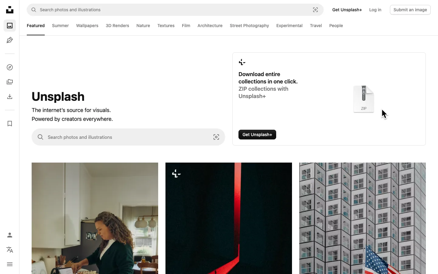
The interface is entirely monochrome — rail, search fields, tabs, buttons — so every fragment of color on the page comes from the photography instead of competing with it. A bordered promo card sits directly above completely borderless photo tiles, and the border is the only thing telling you which one is UI.
Why this pattern works
Steal the contrast: one bordered white card (the upsell) butted right against edge-to-edge, borderless photo tiles. The border does the job of marking 'this is chrome' so nothing else on the grid needs a frame, caption or overlay to read as content. Also worth lifting: the double search bar — one docked in the top chrome, one repeated inline in the hero — so a search field is never more than a glance away regardless of scroll position.
Design notes
- Surface
- Homepage, Featured tab, logged out
- Navigation
- Two tiers plus a rail. A slim ~64px icon-only rail runs down the left edge outside the content column, with no text labels except two near the very bottom; above the grid, a horizontal category tab strip (Featured, Summer, Wallpapers, 3D Renders...) sits under the search-and-account row. The rail changes SECTION, the tab strip changes FILTER within a section.
- Layout
- Fixed left icon rail, fluid content column. The page scrolls under a static top search/account bar; the category tab strip scrolls away with the rest of the page rather than staying pinned.
- Density
- Sparse chrome, dense photography. Nav elements are small (14px) and few; the grid below carries all the visual weight — three large tiles per row with barely a gutter between them.
- Color
- Rail, search fields, buttons and tabs are black, white and grey with no exceptions. Every drop of color on the page comes from the photographs themselves, which is what makes the grid read as a color wall set inside a colorless frame.
- Type
- One sans. The `Unsplash` wordmark is the single large moment on the page at ~48px bold; the tagline beneath it steps down hard to ~18px regular grey. Nav and tab labels sit at 14px, with only the active tab marked by an underline.
- Pattern
- Borderless photo tiles set directly beneath a bordered promo card — the promo card is the only rectangle on the page with a visible edge, and that edge is what tells you it's interface rather than content.
- States
- Logged out: `Log in` and a filled `Submit an image` button sit top-right in place of an avatar; a paid-tier upsell card occupies the slot a signed-in user's saved-collections module might otherwise take.
- Don't
- Don't add borders, shadows or caption overlays to the grid tiles — the moment a frame appears around a photo it stops reading as content and starts competing with the promo card for attention.
Make it your own
Turn this reference into a useful brief for your project. Copy it into the AI tool you already use.