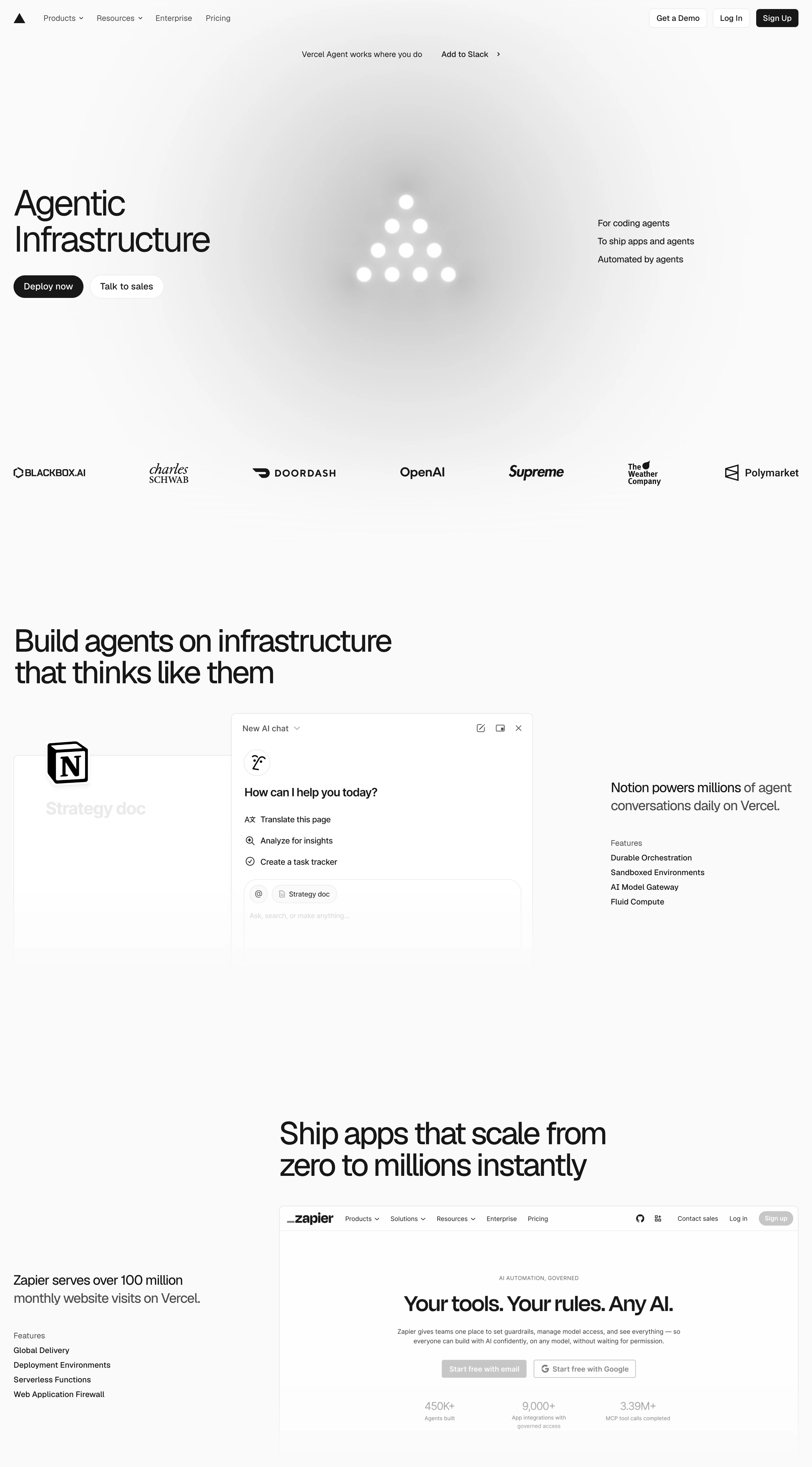
Engineering gravitas. Says almost nothing and implies everything — the confidence of a company that lets a triangle do the talking.
Colors
Pure white canvas, pure black type and mark, grey (#666666) annotations, hairline borders (#EAEAEA). No accent colour anywhere; customer logos and screenshots read monochrome too.
Type
One grotesk (Geist-like) doing everything: huge plain statements ('Agentic Infrastructure', 'Ship apps that scale…'), small margin annotations, tiny caps labels ('Features'). Weight and size are the only voice.
Layout
Asymmetric editorial spreads: headline left, sculptural mark center with small annotations hanging in the right margin; then alternating text-column + hairline-framed screenshot rows, feature lists tucked in the margins. Vast whitespace between acts.
Motion
Minimal and exact — a soft shadow drift on the mark, instant hovers, at most a quiet fade-up per section. Never decorative.
Texture
Flat white with one soft shadow under the hero mark; screenshots sit behind 1px hairlines; everything else is bare paper.
Imagery
Almost none: one sculptural black geometric mark with a soft drop shadow as the hero object, then real product screenshots framed in hairline borders. Tool: build the mark and UI frames in code/CSS; kie-ai Seedream only if a soft-shadowed 3D pass on the mark is needed. Zero photography, zero colour art, monochrome partner logos only.
Don't
No colour, no gradients, no illustration, no rounded playfulness, no dense marketing sections — a single accent hue would collapse the whole system.
Make it your own
Turn this reference into a useful brief for your project. Copy it into the AI tool you already use.
Add constraintsPreview & edit promptAssembled in your browser. No API key or AI request needed. Changing the fields refreshes the preview.