Vercel — Pricing
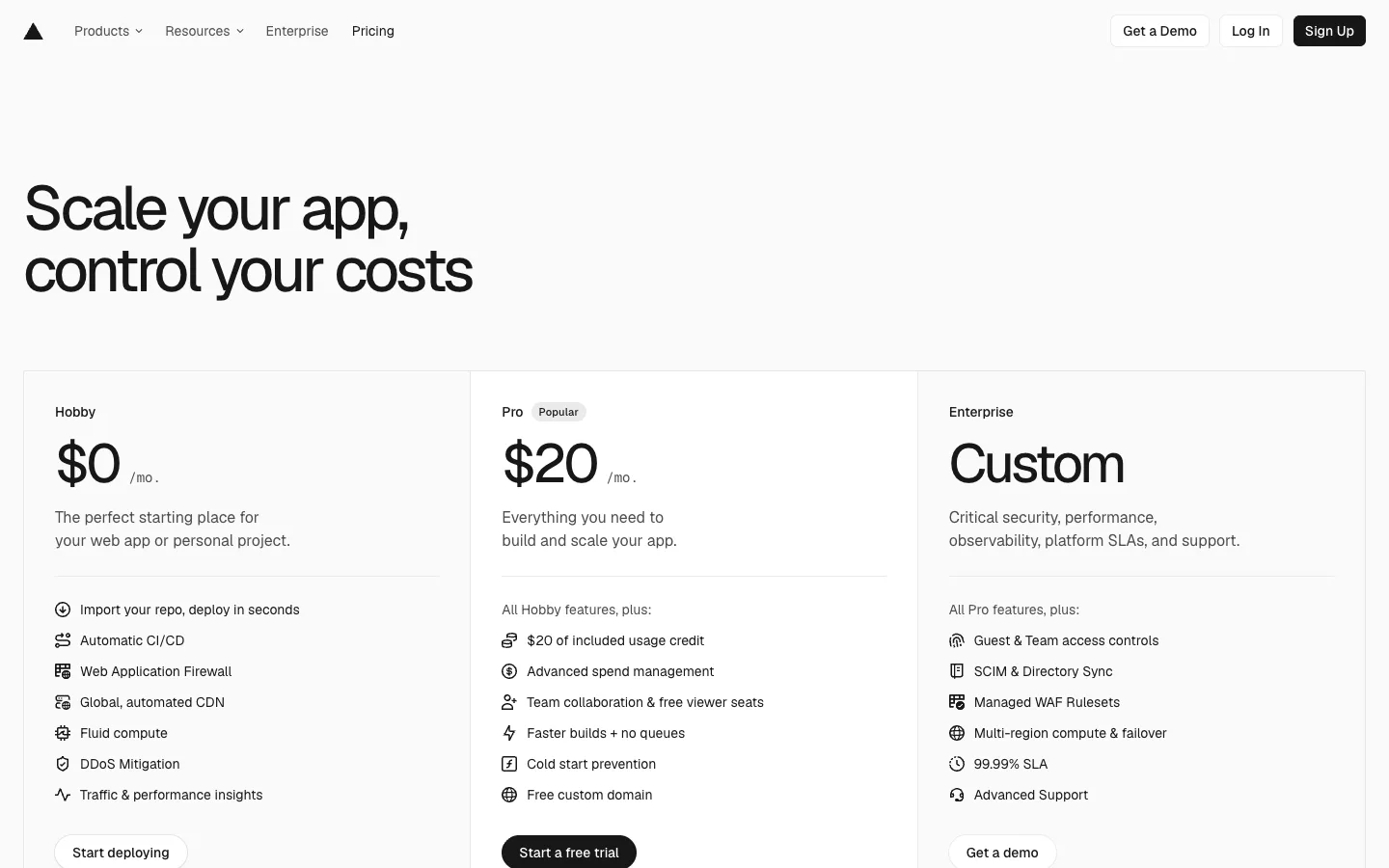
Monochrome pricing where emphasis is spent exactly once: a huge left-aligned grotesk headline, three hairline-divided tiers, and a single black CTA that marks the plan they want you to pick.
Why this pattern works
The one-black-button hierarchy. The whole page is black text on white with hairline borders — no accent colour exists — so the solid-black 'Start a free trial' pill on the Pro tier is the loudest thing on screen while Hobby and Enterprise get white bordered ghosts. Combined with the 'All Hobby features, plus:' inheritance line (each tier lists only its delta, never repeating the previous list), you get a pricing table that reads in seconds without a single badge colour, tint, or gradient. Also worth taking: pricing the tiers with typography alone — the $0/$20/Custom figures at display size ARE the design.
Design notes
- Surface
- Full pricing page: top nav, hero headline, three-column tier comparison band
- Navigation
- One slim white bar. Wordmark triangle far left, four text links (Products and Resources with chevrons, Enterprise, Pricing), then right-aligned auth cluster: two white bordered pills (Get a Demo, Log In) and one solid-black Sign Up pill. Pricing, the current page, is simply set heavier.
- Layout
- Hero then table. The headline sits hard left at the page margin with a huge right whitespace void. Below, a full-width band split into three equal columns by hairline vertical rules, each column padded identically: tier name, price, description, rule, feature list, CTA.
- Density
- Airy. Display-size prices, roomy ~32px feature-list line height, and roughly a third of the viewport spent on the hero whitespace. Nothing competes with the numbers.
- Color
- None, deliberately. White canvas, near-black text, grey secondary text, borders at ~8% black. The Popular badge is a grey outline chip, not a colour. The only fills on the page are the two black buttons (Sign Up in the nav, the Pro CTA) — emphasis by ink, not hue.
- Type
- A tight grotesk throughout. Headline at ~72px medium across two left-aligned lines; prices at ~64px; '/mo .' suffix dropped to ~13px grey beside them; tier names and features at ~14px. Enterprise swaps the number for the word 'Custom' at the same display size, keeping the row rhythm.
- Pattern
- Delta-only feature lists. Hobby lists its seven features with small line icons; Pro opens with 'All Hobby features, plus:' and Enterprise with 'All Pro features, plus:' — so each column is short, scannable, and implicitly ranked, and the reader never diff-checks two lists.
- States
- The Popular chip on Pro is the only state marker — a quiet grey rounded badge beside the tier name. No highlighted column, no scaled-up card, no tinted background; the black CTA alone carries recommendation.
- Don't
- Don't add an accent colour, a tinted 'recommended' column, or a second filled button. The system only works because black fill appears exactly once in the table; two black CTAs and the recommendation disappears.
Make it your own
Turn this reference into a useful brief for your project. Copy it into the AI tool you already use.