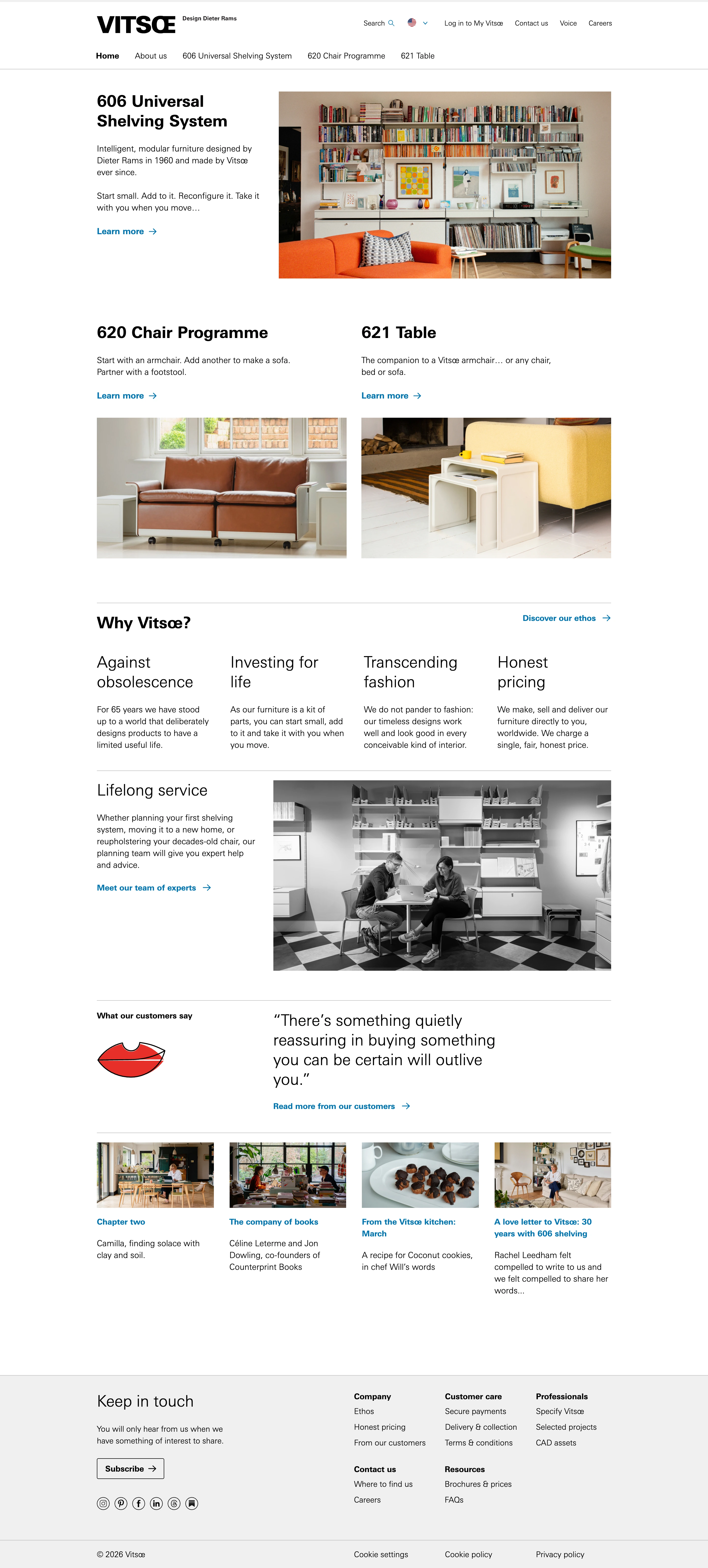
'Less, but better' as a website. Utterly calm, factual, self-assured; the design disappears behind the products it sells.
Colors
Pure white canvas, near-black grotesk text, one utilitarian hyperlink blue (~#0D71BB) as the ONLY accent, a light-grey footer slab. Colour photography is warm and natural; service photography is black-and-white.
Type
A single neo-grotesque in exactly two weights: bold for headings ('606 Universal Shelving System', 'Why Vitsœ?'), regular for short factual body. No italics, no display stunts — hierarchy comes from weight and whitespace alone.
Layout
Ruled sections: full-width hairlines divide text-left / photo-right rows, a four-column ethos grid ('Against obsolescence', 'Investing for life'…), and a 4-up editorial card row. Everything hangs off one strict, visible grid — the grid IS the design.
Motion
None to speak of. Static confidence; at most an instant underline on blue link hover.
Texture
Flat and matte throughout. No shadows, no borders beyond hairline rules, no rounded corners. Photography provides the only depth.
Imagery
Real interior photography only: modular furniture in lived-in rooms under natural light, plus black-and-white documentary shots of people at work. Tool: Pexels first for authentic interior/workshop photography; kie-ai Seedream only if a specific in-situ product shot can't be sourced. No renders, no studio gloss, no lifestyle staging.
Don't
No decoration, no icon sets, no gradients or shadows, no second typeface, no marketing exclamation — a single ornament would betray the whole ethos.
Make it your own
Turn this reference into a useful brief for your project. Copy it into the AI tool you already use.
Add constraintsPreview & edit promptAssembled in your browser. No API key or AI request needed. Changing the fields refreshes the preview.