WolframAlpha — Home
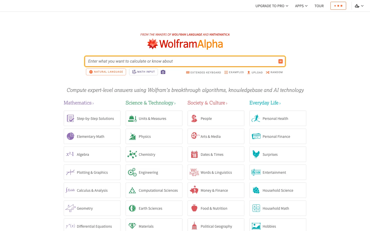
A computational answer engine that pairs one hero input with a colour-coded directory of everything it can do — four columns of icon cards, each column tinted its own hue.
Why this pattern works
The colour-coded capability directory. Under the single query input, the entire scope of the product is laid out as four columns — Mathematics, Science & Technology, Society & Culture, Everyday Life — where each column heading is set in its own hue (purple, green, red, teal-blue) and every icon inside that column's hairline-bordered cards is drawn in the same hue. The structure of the cards never varies (icon left, ~15px label, identical border and size), so colour alone carries the taxonomy and the eye can walk one branch of knowledge at a time. Steal this for any tool with a wide, hard-to-summarize capability surface: don't describe it in prose, index it — uniform cards, per-category hue, headings that are links ('Mathematics ›'). Also worth taking: the input-mode chips (NATURAL LANGUAGE / MATH INPUT) pinned directly beneath the query box, declaring the two ways to talk to it.
Design notes
- Surface
- Home page: slim utility nav, centred logo and query input with mode row, tagline, four-column category directory
- Navigation
- A thin white utility bar, right-aligned only: UPGRADE TO PRO ⌄, APPS ⌄, TOUR in small caps, an orange-bordered menu button, and a language toggle. No left-side nav at all — the brand lives in the hero, not the bar.
- Layout
- One centred column: a small red eyebrow line, the logo lockup, the full-width-feeling query input (~780px), a left-aligned mode/action row under it, an italic tagline, then the directory — four equal columns of stacked cards with coloured headings.
- Density
- Top half is spacious hero; bottom half is a compact index of 25+ capability cards at ~70px each. The page reads as: one input, then everything it can answer.
- Color
- White canvas, dark grey text. The brand orange-red owns the hero: 'Wolfram' in red, 'Alpha' in orange, a 2px orange border around the input, an orange submit glyph, an orange NATURAL LANGUAGE chip. The directory then switches to taxonomy colour: purple for Mathematics, green for Science & Technology, red for Society & Culture, teal-blue for Everyday Life — headings and card icons matching per column.
- Type
- A serif-inflected slab feel throughout, which makes it read scholarly rather than SaaS: logo ~40px, headline-free otherwise; the tagline is italic ~19px; category headings ~19px with a '›' affordance; card labels ~15px regular; the utility nav and action links are ~11px letterspaced caps.
- Pattern
- Uniform icon cards as an index: every card is the same white hairline-bordered rectangle with a multicolour-but-hue-anchored icon left of a plain label, stacked in tidy columns. Nothing is featured, nothing is bigger — the grid says 'we do all of this, equally well'.
- States
- The input is the resting focus: orange border at full strength before any interaction, italic placeholder ('Enter what you want to calculate or know about') phrased as an invitation. Mode chips show the active input style; EXTENDED KEYBOARD, EXAMPLES, UPLOAD, RANDOM sit as quiet icon+caps links on the row's right.
- Don't
- Don't mix hues within a column or vary the card size — the taxonomy reads through colour discipline and uniformity, and one oversized 'featured' card would break the index into marketing. Keep the orange strictly on the hero input; it never leaks into the directory.
Make it your own
Turn this reference into a useful brief for your project. Copy it into the AI tool you already use.