← Back to library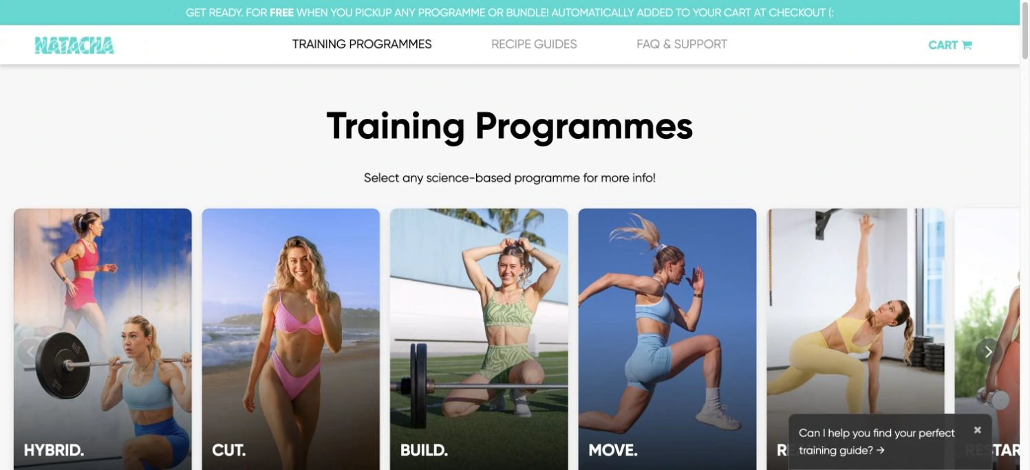
Viewport capture · opening screen Assembled in your browser. No API key or AI request needed. Changing the fields refreshes the preview.
Natacha Océane
Personal CreatorVisit sitenatachaoceane.com
A clean training-program catalog uses bold section typography and a horizontal row of large photographic program cards.
Why this pattern works
A fitness creator website; study its opening composition, identity, and paths into the creator’s work.
Design notes
- Mood
- Practical and visual.
- Colors
- White, black, turquoise, and fitness photography.
- Type
- The captured page uses Gilroy Bold. Keep a clear contrast between the main statement and the smaller navigation.
- Layout
- A clean training-program catalog uses bold section typography and a horizontal row of large photographic program cards.
- Motion
- Static viewport capture. Inspect the source website to assess animation, video, and reduced-motion behavior.
- Texture
- Let the original photographic or video imagery carry the visual detail.
- Imagery
- The screenshot documents the original live website. Use your own approved photography, illustration, and brand assets when adapting the composition.
- Don't
- Do not reproduce the creator’s identity, claims, copy, or artwork in a new brand.
Make it your own
Turn this reference into a useful brief for your project. Copy it into the AI tool you already use.