Gradient Mesh
CURATED COLLECTION · 50 REFERENCES
Research labs, voice products, writing tools, knowledge workspaces and infrastructure. Fifty reviewed public website designs.
Copy the reference notes below and paste them into Claude, ChatGPT, or your coding assistant. Add what you want to build.
Includes design notes, original sources, and preview links. An assistant that supports browsing can also read the public board link.
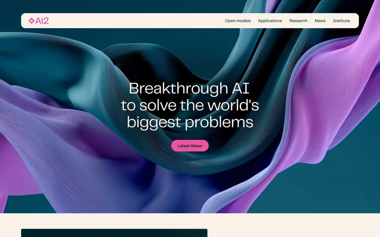
Sculptural blue and violet folds frame a centered research mission and a small pink action.
Useful for: Sculptural blue and violet folds frame a centered research mission and a small pink action.
# Design reference: Ai2
Source: https://allenai.org/
Swipefile reference: https://swipefile.design/ref/ai-ai2/
Captured: 2026-09-05. This is a dated reference, not a claim about the current live product.
Capture scope: one viewport. Do not infer unseen page sections or a complete user flow.

## Objective
Adapt the visual principles below to my project. Use my own content and identity. Do not reproduce logos, proprietary copy, or brand assets.

## Reference notes
- mood: Focused, spacious and product-led.
- colors: Deep teal, violet and pink
- typography: Clear display headline paired with smaller navigation and supporting text.
- layout: Full-bleed sculptural hero beneath a pill-shaped navigation bar.
- motion: Static capture of one viewport. Visit the source to study motion and interaction.
- texture: fluid folded forms
- dont: Adapt the structure to your own content and brand; use your own identity, copy and imagery.

Useful for: Sculptural blue and violet folds frame a centered research mission and a small pink action.

## Acceptance criteria
- Existing project conventions, design tokens, working functionality, and unrelated changes are preserved.
- Two or three reference principles clearly support the user's task; conflicts are resolved in favor of usability and the existing product.
- Reusable components and semantic HTML express the interface. Available licensed assets are used; important UI text is never rendered as a bitmap.
- Every visible control has a defined behavior. Loading, empty, error, success, disabled, and long-content states are specified where relevant. Demo data is clearly labeled.
- Navigation and content adapt at 375px, 768px, and 1440px without horizontal page overflow. Keyboard use, visible focus, labeled inputs, at least 44px touch targets, readable contrast, and reduced motion are supported.
- Verification distinguishes rendered behavior from proposals and identifies anything still requiring a backend or external service.

## Quality bar
Clear hierarchy, consistent spacing, restrained surfaces, and purposeful motion. Avoid decorative gradients, excessive cards, placeholder buttons, and invented metrics unless the project calls for them. Do not claim a feature is connected or tested without evidence.
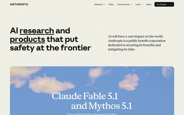
An off-white research homepage pairs a heavy, underlined statement with a short introduction and an editorial feature.
Useful for: An off-white research homepage pairs a heavy, underlined statement with a short introduction and an editorial feature.
# Design reference: Anthropic
Source: https://www.anthropic.com/
Swipefile reference: https://swipefile.design/ref/ai-anthropic/
Captured: 2026-09-05. This is a dated reference, not a claim about the current live product.
Capture scope: one viewport. Do not infer unseen page sections or a complete user flow.

## Objective
Adapt the visual principles below to my project. Use my own content and identity. Do not reproduce logos, proprietary copy, or brand assets.

## Reference notes
- mood: Focused, spacious and product-led.
- colors: Warm ivory and black
- typography: Clear display headline paired with smaller navigation and supporting text.
- layout: Asymmetric two-column introduction above a wide feature panel.
- motion: Static capture of one viewport. Visit the source to study motion and interaction.
- texture: flat paper-like backdrop
- dont: Adapt the structure to your own content and brand; use your own identity, copy and imagery.

Useful for: An off-white research homepage pairs a heavy, underlined statement with a short introduction and an editorial feature.

## Acceptance criteria
- Existing project conventions, design tokens, working functionality, and unrelated changes are preserved.
- Two or three reference principles clearly support the user's task; conflicts are resolved in favor of usability and the existing product.
- Reusable components and semantic HTML express the interface. Available licensed assets are used; important UI text is never rendered as a bitmap.
- Every visible control has a defined behavior. Loading, empty, error, success, disabled, and long-content states are specified where relevant. Demo data is clearly labeled.
- Navigation and content adapt at 375px, 768px, and 1440px without horizontal page overflow. Keyboard use, visible focus, labeled inputs, at least 44px touch targets, readable contrast, and reduced motion are supported.
- Verification distinguishes rendered behavior from proposals and identifies anything still requiring a backend or external service.

## Quality bar
Clear hierarchy, consistent spacing, restrained surfaces, and purposeful motion. Avoid decorative gradients, excessive cards, placeholder buttons, and invented metrics unless the project calls for them. Do not claim a feature is connected or tested without evidence.
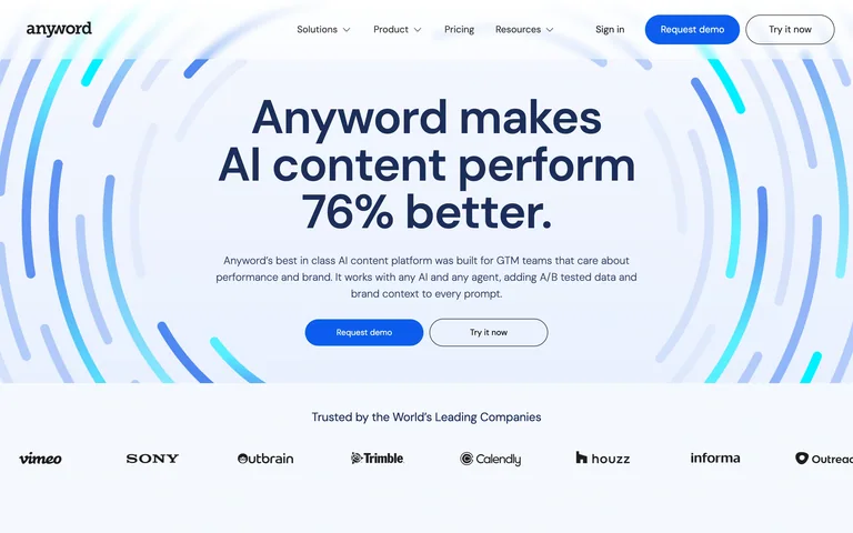
A centered content-platform pitch uses blue concentric strokes, paired actions and a customer-logo strip.
Useful for: A centered content-platform pitch uses blue concentric strokes, paired actions and a customer-logo strip.
# Design reference: Anyword
Source: https://www.anyword.com/
Swipefile reference: https://swipefile.design/ref/ai-anyword/
Captured: 2026-09-05. This is a dated reference, not a claim about the current live product.
Capture scope: one viewport. Do not infer unseen page sections or a complete user flow.

## Objective
Adapt the visual principles below to my project. Use my own content and identity. Do not reproduce logos, proprietary copy, or brand assets.

## Reference notes
- mood: Focused, spacious and product-led.
- colors: White, navy and electric blue
- typography: Clear display headline paired with smaller navigation and supporting text.
- layout: Centered hero and supporting logo row.
- motion: Static capture of one viewport. Visit the source to study motion and interaction.
- texture: circular line illustration
- dont: Adapt the structure to your own content and brand; use your own identity, copy and imagery.

Useful for: A centered content-platform pitch uses blue concentric strokes, paired actions and a customer-logo strip.

## Acceptance criteria
- Existing project conventions, design tokens, working functionality, and unrelated changes are preserved.
- Two or three reference principles clearly support the user's task; conflicts are resolved in favor of usability and the existing product.
- Reusable components and semantic HTML express the interface. Available licensed assets are used; important UI text is never rendered as a bitmap.
- Every visible control has a defined behavior. Loading, empty, error, success, disabled, and long-content states are specified where relevant. Demo data is clearly labeled.
- Navigation and content adapt at 375px, 768px, and 1440px without horizontal page overflow. Keyboard use, visible focus, labeled inputs, at least 44px touch targets, readable contrast, and reduced motion are supported.
- Verification distinguishes rendered behavior from proposals and identifies anything still requiring a backend or external service.

## Quality bar
Clear hierarchy, consistent spacing, restrained surfaces, and purposeful motion. Avoid decorative gradients, excessive cards, placeholder buttons, and invented metrics unless the project calls for them. Do not claim a feature is connected or tested without evidence.
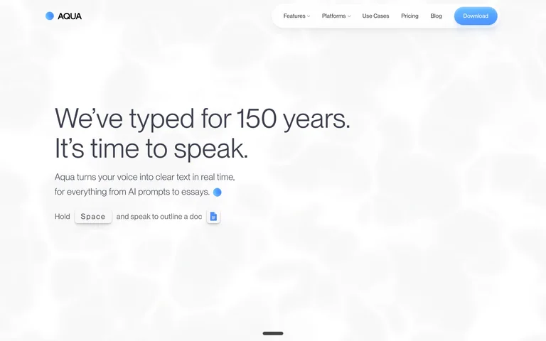
A restrained dictation homepage puts a left-aligned statement and keyboard hint on a soft, nearly white backdrop.
Useful for: A restrained dictation homepage puts a left-aligned statement and keyboard hint on a soft, nearly white backdrop.
# Design reference: Aqua Voice
Source: https://aquavoice.com/
Swipefile reference: https://swipefile.design/ref/ai-aqua-voice/
Captured: 2026-09-05. This is a dated reference, not a claim about the current live product.
Capture scope: one viewport. Do not infer unseen page sections or a complete user flow.

## Objective
Adapt the visual principles below to my project. Use my own content and identity. Do not reproduce logos, proprietary copy, or brand assets.

## Reference notes
- mood: Focused, spacious and product-led.
- colors: White, charcoal and sky blue
- typography: Clear display headline paired with smaller navigation and supporting text.
- layout: Sparse hero with text anchored on the left.
- motion: Static capture of one viewport. Visit the source to study motion and interaction.
- texture: soft cloud-like image
- dont: Adapt the structure to your own content and brand; use your own identity, copy and imagery.

Useful for: A restrained dictation homepage puts a left-aligned statement and keyboard hint on a soft, nearly white backdrop.

## Acceptance criteria
- Existing project conventions, design tokens, working functionality, and unrelated changes are preserved.
- Two or three reference principles clearly support the user's task; conflicts are resolved in favor of usability and the existing product.
- Reusable components and semantic HTML express the interface. Available licensed assets are used; important UI text is never rendered as a bitmap.
- Every visible control has a defined behavior. Loading, empty, error, success, disabled, and long-content states are specified where relevant. Demo data is clearly labeled.
- Navigation and content adapt at 375px, 768px, and 1440px without horizontal page overflow. Keyboard use, visible focus, labeled inputs, at least 44px touch targets, readable contrast, and reduced motion are supported.
- Verification distinguishes rendered behavior from proposals and identifies anything still requiring a backend or external service.

## Quality bar
Clear hierarchy, consistent spacing, restrained surfaces, and purposeful motion. Avoid decorative gradients, excessive cards, placeholder buttons, and invented metrics unless the project calls for them. Do not claim a feature is connected or tested without evidence.
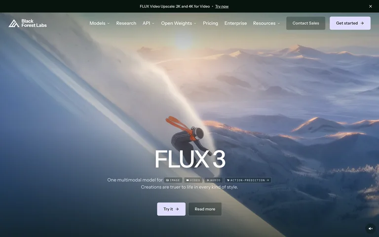
A cinematic landscape carries a large FLUX model title and a compact pair of product actions.
Useful for: A cinematic landscape carries a large FLUX model title and a compact pair of product actions.
# Design reference: Black Forest Labs
Source: https://bfl.ai/
Swipefile reference: https://swipefile.design/ref/ai-black-forest-labs/
Captured: 2026-09-05. This is a dated reference, not a claim about the current live product.
Capture scope: one viewport. Do not infer unseen page sections or a complete user flow.

## Objective
Adapt the visual principles below to my project. Use my own content and identity. Do not reproduce logos, proprietary copy, or brand assets.

## Reference notes
- mood: Focused, spacious and product-led.
- colors: Slate, lavender and white
- typography: Clear display headline paired with smaller navigation and supporting text.
- layout: Full-width imagery with a centered lower title and transparent header.
- motion: Static capture of one viewport. Visit the source to study motion and interaction.
- texture: photographic landscape
- dont: Adapt the structure to your own content and brand; use your own identity, copy and imagery.

Useful for: A cinematic landscape carries a large FLUX model title and a compact pair of product actions.

## Acceptance criteria
- Existing project conventions, design tokens, working functionality, and unrelated changes are preserved.
- Two or three reference principles clearly support the user's task; conflicts are resolved in favor of usability and the existing product.
- Reusable components and semantic HTML express the interface. Available licensed assets are used; important UI text is never rendered as a bitmap.
- Every visible control has a defined behavior. Loading, empty, error, success, disabled, and long-content states are specified where relevant. Demo data is clearly labeled.
- Navigation and content adapt at 375px, 768px, and 1440px without horizontal page overflow. Keyboard use, visible focus, labeled inputs, at least 44px touch targets, readable contrast, and reduced motion are supported.
- Verification distinguishes rendered behavior from proposals and identifies anything still requiring a backend or external service.

## Quality bar
Clear hierarchy, consistent spacing, restrained surfaces, and purposeful motion. Avoid decorative gradients, excessive cards, placeholder buttons, and invented metrics unless the project calls for them. Do not claim a feature is connected or tested without evidence.
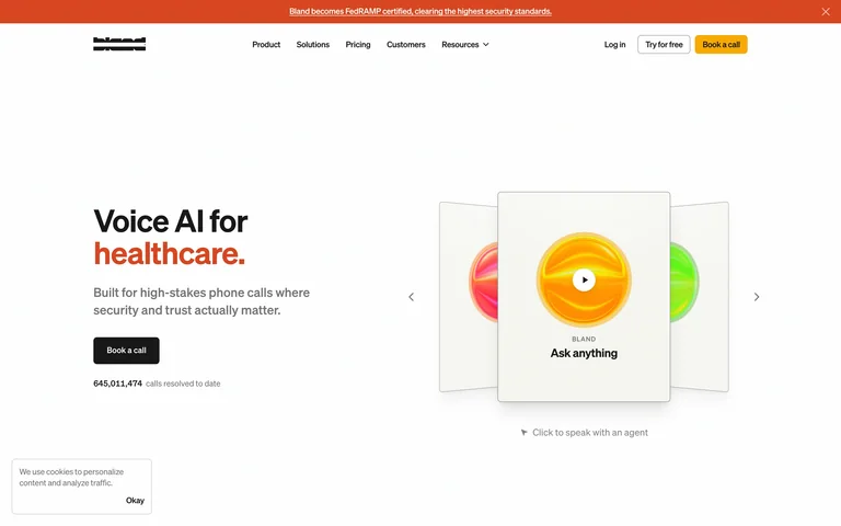
A compact voice-agent pitch faces a horizontal carousel of illustrated industry examples.
Useful for: A compact voice-agent pitch faces a horizontal carousel of illustrated industry examples.
# Design reference: Bland
Source: https://www.bland.ai/
Swipefile reference: https://swipefile.design/ref/ai-bland/
Captured: 2026-09-05. This is a dated reference, not a claim about the current live product.
Capture scope: one viewport. Do not infer unseen page sections or a complete user flow.

## Objective
Adapt the visual principles below to my project. Use my own content and identity. Do not reproduce logos, proprietary copy, or brand assets.

## Reference notes
- mood: Focused, spacious and product-led.
- colors: White, charcoal, orange and yellow
- typography: Clear display headline paired with smaller navigation and supporting text.
- layout: Split hero with a short headline on the left and cards on the right.
- motion: Static capture of one viewport. Visit the source to study motion and interaction.
- texture: simple illustrated cards
- dont: Adapt the structure to your own content and brand; use your own identity, copy and imagery.

Useful for: A compact voice-agent pitch faces a horizontal carousel of illustrated industry examples.

## Acceptance criteria
- Existing project conventions, design tokens, working functionality, and unrelated changes are preserved.
- Two or three reference principles clearly support the user's task; conflicts are resolved in favor of usability and the existing product.
- Reusable components and semantic HTML express the interface. Available licensed assets are used; important UI text is never rendered as a bitmap.
- Every visible control has a defined behavior. Loading, empty, error, success, disabled, and long-content states are specified where relevant. Demo data is clearly labeled.
- Navigation and content adapt at 375px, 768px, and 1440px without horizontal page overflow. Keyboard use, visible focus, labeled inputs, at least 44px touch targets, readable contrast, and reduced motion are supported.
- Verification distinguishes rendered behavior from proposals and identifies anything still requiring a backend or external service.

## Quality bar
Clear hierarchy, consistent spacing, restrained surfaces, and purposeful motion. Avoid decorative gradients, excessive cards, placeholder buttons, and invented metrics unless the project calls for them. Do not claim a feature is connected or tested without evidence.
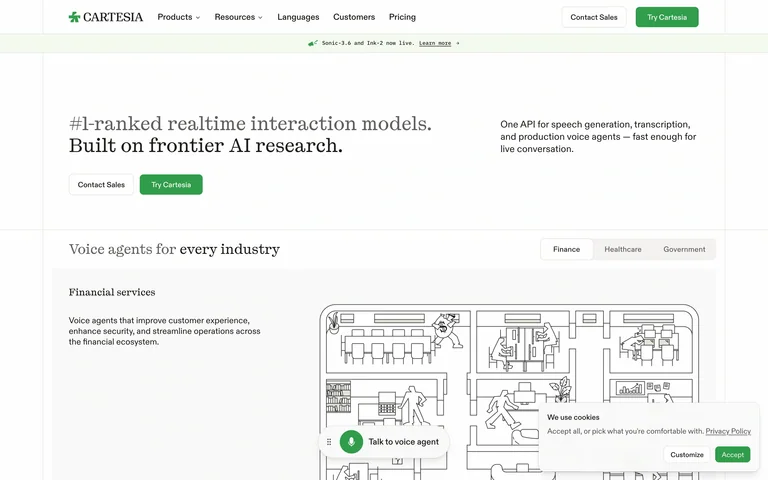
A serif model introduction leads into an industry selector and a line-drawn voice-agent workflow.
Useful for: A serif model introduction leads into an industry selector and a line-drawn voice-agent workflow.
# Design reference: Cartesia
Source: https://www.cartesia.ai/
Swipefile reference: https://swipefile.design/ref/ai-cartesia/
Captured: 2026-09-05. This is a dated reference, not a claim about the current live product.
Capture scope: one viewport. Do not infer unseen page sections or a complete user flow.

## Objective
Adapt the visual principles below to my project. Use my own content and identity. Do not reproduce logos, proprietary copy, or brand assets.

## Reference notes
- mood: Focused, spacious and product-led.
- colors: White, black and green
- typography: Clear display headline paired with smaller navigation and supporting text.
- layout: Two-column introduction above an industry tab and diagram panel.
- motion: Static capture of one viewport. Visit the source to study motion and interaction.
- texture: architectural line drawing
- dont: Adapt the structure to your own content and brand; use your own identity, copy and imagery.

Useful for: A serif model introduction leads into an industry selector and a line-drawn voice-agent workflow.

## Acceptance criteria
- Existing project conventions, design tokens, working functionality, and unrelated changes are preserved.
- Two or three reference principles clearly support the user's task; conflicts are resolved in favor of usability and the existing product.
- Reusable components and semantic HTML express the interface. Available licensed assets are used; important UI text is never rendered as a bitmap.
- Every visible control has a defined behavior. Loading, empty, error, success, disabled, and long-content states are specified where relevant. Demo data is clearly labeled.
- Navigation and content adapt at 375px, 768px, and 1440px without horizontal page overflow. Keyboard use, visible focus, labeled inputs, at least 44px touch targets, readable contrast, and reduced motion are supported.
- Verification distinguishes rendered behavior from proposals and identifies anything still requiring a backend or external service.

## Quality bar
Clear hierarchy, consistent spacing, restrained surfaces, and purposeful motion. Avoid decorative gradients, excessive cards, placeholder buttons, and invented metrics unless the project calls for them. Do not claim a feature is connected or tested without evidence.
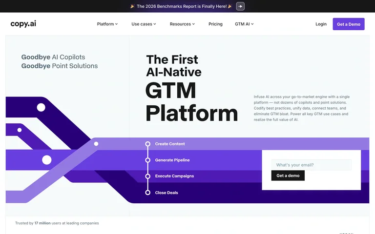
A bold stacked platform title sits beside a short statement above a wide purple process illustration.
Useful for: A bold stacked platform title sits beside a short statement above a wide purple process illustration.
# Design reference: Copy.ai
Source: https://www.copy.ai/
Swipefile reference: https://swipefile.design/ref/ai-copy-ai/
Captured: 2026-09-05. This is a dated reference, not a claim about the current live product.
Capture scope: one viewport. Do not infer unseen page sections or a complete user flow.

## Objective
Adapt the visual principles below to my project. Use my own content and identity. Do not reproduce logos, proprietary copy, or brand assets.

## Reference notes
- mood: Focused, spacious and product-led.
- colors: White, black and violet
- typography: Clear display headline paired with smaller navigation and supporting text.
- layout: Asymmetric hero with a full-width process band beneath.
- motion: Static capture of one viewport. Visit the source to study motion and interaction.
- texture: flat directional ribbons
- dont: Adapt the structure to your own content and brand; use your own identity, copy and imagery.

Useful for: A bold stacked platform title sits beside a short statement above a wide purple process illustration.

## Acceptance criteria
- Existing project conventions, design tokens, working functionality, and unrelated changes are preserved.
- Two or three reference principles clearly support the user's task; conflicts are resolved in favor of usability and the existing product.
- Reusable components and semantic HTML express the interface. Available licensed assets are used; important UI text is never rendered as a bitmap.
- Every visible control has a defined behavior. Loading, empty, error, success, disabled, and long-content states are specified where relevant. Demo data is clearly labeled.
- Navigation and content adapt at 375px, 768px, and 1440px without horizontal page overflow. Keyboard use, visible focus, labeled inputs, at least 44px touch targets, readable contrast, and reduced motion are supported.
- Verification distinguishes rendered behavior from proposals and identifies anything still requiring a backend or external service.

## Quality bar
Clear hierarchy, consistent spacing, restrained surfaces, and purposeful motion. Avoid decorative gradients, excessive cards, placeholder buttons, and invented metrics unless the project calls for them. Do not claim a feature is connected or tested without evidence.
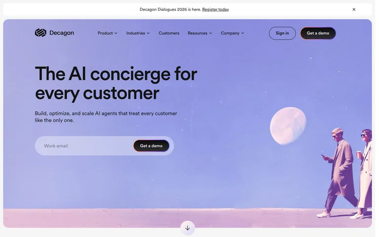
A pale violet scene gives a customer-service platform a spacious headline, small actions and sculptural character imagery.
Useful for: A pale violet scene gives a customer-service platform a spacious headline, small actions and sculptural character imagery.
# Design reference: Decagon
Source: https://decagon.ai/
Swipefile reference: https://swipefile.design/ref/ai-decagon/
Captured: 2026-09-05. This is a dated reference, not a claim about the current live product.
Capture scope: one viewport. Do not infer unseen page sections or a complete user flow.

## Objective
Adapt the visual principles below to my project. Use my own content and identity. Do not reproduce logos, proprietary copy, or brand assets.

## Reference notes
- mood: Focused, spacious and product-led.
- colors: Lavender, pink and black
- typography: Clear display headline paired with smaller navigation and supporting text.
- layout: Rounded full-width hero with text left and figures right.
- motion: Static capture of one viewport. Visit the source to study motion and interaction.
- texture: soft 3D scene
- dont: Adapt the structure to your own content and brand; use your own identity, copy and imagery.

Useful for: A pale violet scene gives a customer-service platform a spacious headline, small actions and sculptural character imagery.

## Acceptance criteria
- Existing project conventions, design tokens, working functionality, and unrelated changes are preserved.
- Two or three reference principles clearly support the user's task; conflicts are resolved in favor of usability and the existing product.
- Reusable components and semantic HTML express the interface. Available licensed assets are used; important UI text is never rendered as a bitmap.
- Every visible control has a defined behavior. Loading, empty, error, success, disabled, and long-content states are specified where relevant. Demo data is clearly labeled.
- Navigation and content adapt at 375px, 768px, and 1440px without horizontal page overflow. Keyboard use, visible focus, labeled inputs, at least 44px touch targets, readable contrast, and reduced motion are supported.
- Verification distinguishes rendered behavior from proposals and identifies anything still requiring a backend or external service.

## Quality bar
Clear hierarchy, consistent spacing, restrained surfaces, and purposeful motion. Avoid decorative gradients, excessive cards, placeholder buttons, and invented metrics unless the project calls for them. Do not claim a feature is connected or tested without evidence.
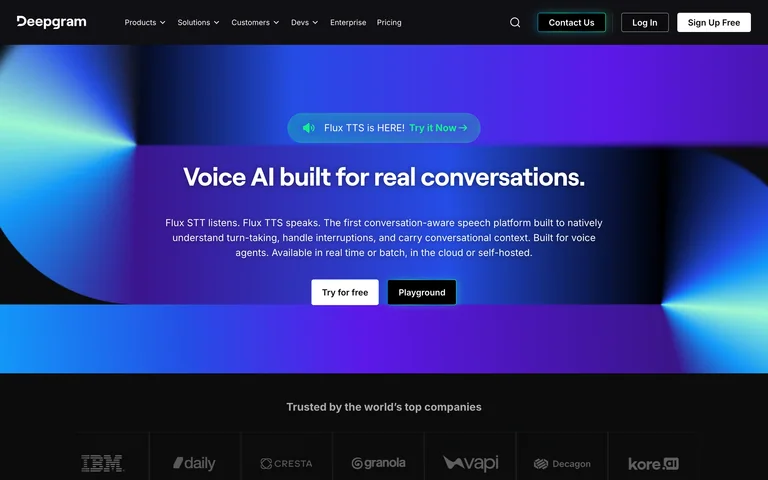
A dark voice infrastructure homepage centers its message inside a saturated blue and green geometric band.
Useful for: A dark voice infrastructure homepage centers its message inside a saturated blue and green geometric band.
# Design reference: Deepgram
Source: https://deepgram.com/
Swipefile reference: https://swipefile.design/ref/ai-deepgram/
Captured: 2026-09-05. This is a dated reference, not a claim about the current live product.
Capture scope: one viewport. Do not infer unseen page sections or a complete user flow.

## Objective
Adapt the visual principles below to my project. Use my own content and identity. Do not reproduce logos, proprietary copy, or brand assets.

## Reference notes
- mood: Focused, spacious and product-led.
- colors: Black, blue, violet and mint
- typography: Clear display headline paired with smaller navigation and supporting text.
- layout: Centered hero with paired actions and a logo strip below.
- motion: Static capture of one viewport. Visit the source to study motion and interaction.
- texture: luminous geometric shapes
- dont: Adapt the structure to your own content and brand; use your own identity, copy and imagery.

Useful for: A dark voice infrastructure homepage centers its message inside a saturated blue and green geometric band.

## Acceptance criteria
- Existing project conventions, design tokens, working functionality, and unrelated changes are preserved.
- Two or three reference principles clearly support the user's task; conflicts are resolved in favor of usability and the existing product.
- Reusable components and semantic HTML express the interface. Available licensed assets are used; important UI text is never rendered as a bitmap.
- Every visible control has a defined behavior. Loading, empty, error, success, disabled, and long-content states are specified where relevant. Demo data is clearly labeled.
- Navigation and content adapt at 375px, 768px, and 1440px without horizontal page overflow. Keyboard use, visible focus, labeled inputs, at least 44px touch targets, readable contrast, and reduced motion are supported.
- Verification distinguishes rendered behavior from proposals and identifies anything still requiring a backend or external service.

## Quality bar
Clear hierarchy, consistent spacing, restrained surfaces, and purposeful motion. Avoid decorative gradients, excessive cards, placeholder buttons, and invented metrics unless the project calls for them. Do not claim a feature is connected or tested without evidence.
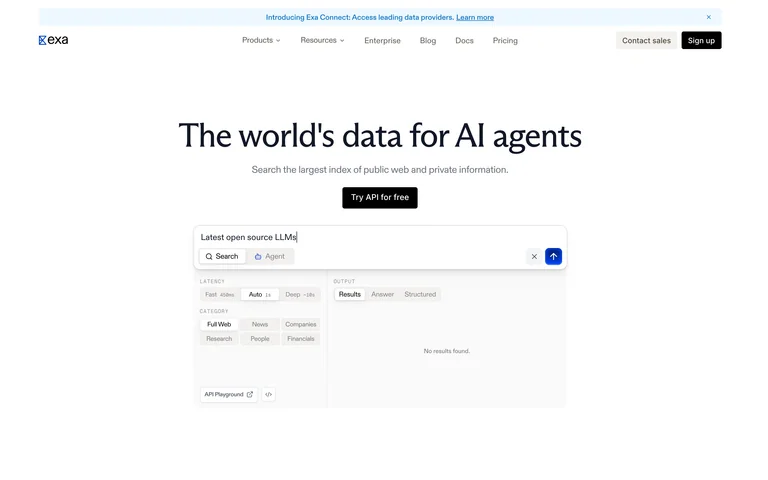
A minimal search API homepage introduces the product with a centered headline and a compact interface preview.
Useful for: A minimal search API homepage introduces the product with a centered headline and a compact interface preview.
# Design reference: Exa
Source: https://exa.ai/
Swipefile reference: https://swipefile.design/ref/ai-exa/
Captured: 2026-09-05. This is a dated reference, not a claim about the current live product.
Capture scope: one viewport. Do not infer unseen page sections or a complete user flow.

## Objective
Adapt the visual principles below to my project. Use my own content and identity. Do not reproduce logos, proprietary copy, or brand assets.

## Reference notes
- mood: Focused, spacious and product-led.
- colors: White, black and pale blue
- typography: Clear display headline paired with smaller navigation and supporting text.
- layout: Broad whitespace around centered copy and a small search demonstration.
- motion: Static capture of one viewport. Visit the source to study motion and interaction.
- texture: fine interface rules
- dont: Adapt the structure to your own content and brand; use your own identity, copy and imagery.

Useful for: A minimal search API homepage introduces the product with a centered headline and a compact interface preview.

## Acceptance criteria
- Existing project conventions, design tokens, working functionality, and unrelated changes are preserved.
- Two or three reference principles clearly support the user's task; conflicts are resolved in favor of usability and the existing product.
- Reusable components and semantic HTML express the interface. Available licensed assets are used; important UI text is never rendered as a bitmap.
- Every visible control has a defined behavior. Loading, empty, error, success, disabled, and long-content states are specified where relevant. Demo data is clearly labeled.
- Navigation and content adapt at 375px, 768px, and 1440px without horizontal page overflow. Keyboard use, visible focus, labeled inputs, at least 44px touch targets, readable contrast, and reduced motion are supported.
- Verification distinguishes rendered behavior from proposals and identifies anything still requiring a backend or external service.

## Quality bar
Clear hierarchy, consistent spacing, restrained surfaces, and purposeful motion. Avoid decorative gradients, excessive cards, placeholder buttons, and invented metrics unless the project calls for them. Do not claim a feature is connected or tested without evidence.
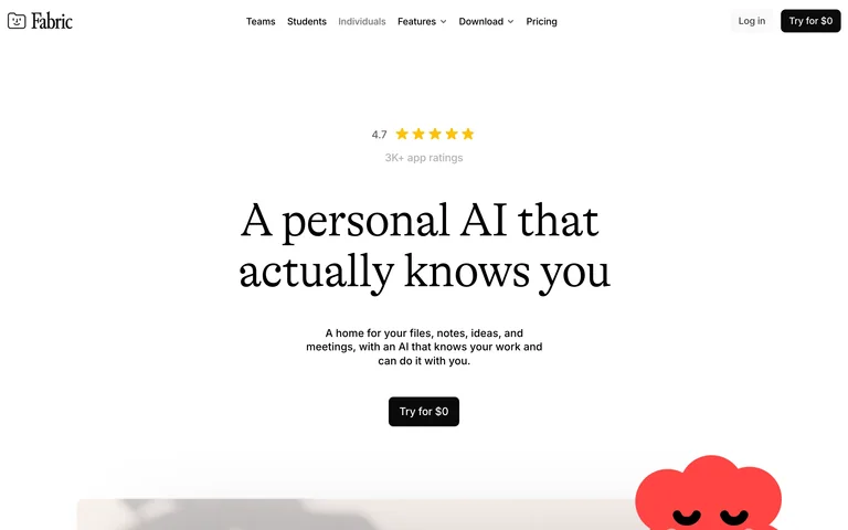
A serif personal-AI statement sits below a small rating marker on a spacious white canvas.
Useful for: A serif personal-AI statement sits below a small rating marker on a spacious white canvas.
# Design reference: Fabric
Source: https://fabric.so/
Swipefile reference: https://swipefile.design/ref/ai-fabric/
Captured: 2026-09-05. This is a dated reference, not a claim about the current live product.
Capture scope: one viewport. Do not infer unseen page sections or a complete user flow.

## Objective
Adapt the visual principles below to my project. Use my own content and identity. Do not reproduce logos, proprietary copy, or brand assets.

## Reference notes
- mood: Focused, spacious and product-led.
- colors: White, black and coral
- typography: Clear display headline paired with smaller navigation and supporting text.
- layout: Centered editorial headline, short explanation and single dark action.
- motion: Static capture of one viewport. Visit the source to study motion and interaction.
- texture: playful red character accent
- dont: Adapt the structure to your own content and brand; use your own identity, copy and imagery.

Useful for: A serif personal-AI statement sits below a small rating marker on a spacious white canvas.

## Acceptance criteria
- Existing project conventions, design tokens, working functionality, and unrelated changes are preserved.
- Two or three reference principles clearly support the user's task; conflicts are resolved in favor of usability and the existing product.
- Reusable components and semantic HTML express the interface. Available licensed assets are used; important UI text is never rendered as a bitmap.
- Every visible control has a defined behavior. Loading, empty, error, success, disabled, and long-content states are specified where relevant. Demo data is clearly labeled.
- Navigation and content adapt at 375px, 768px, and 1440px without horizontal page overflow. Keyboard use, visible focus, labeled inputs, at least 44px touch targets, readable contrast, and reduced motion are supported.
- Verification distinguishes rendered behavior from proposals and identifies anything still requiring a backend or external service.

## Quality bar
Clear hierarchy, consistent spacing, restrained surfaces, and purposeful motion. Avoid decorative gradients, excessive cards, placeholder buttons, and invented metrics unless the project calls for them. Do not claim a feature is connected or tested without evidence.
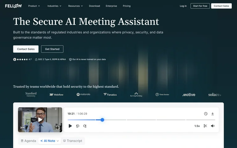
An enterprise meeting assistant pairs a large serif title with proof logos and a cropped recording interface.
Useful for: An enterprise meeting assistant pairs a large serif title with proof logos and a cropped recording interface.
# Design reference: Fellow
Source: https://fellow.ai/
Swipefile reference: https://swipefile.design/ref/ai-fellow/
Captured: 2026-09-05. This is a dated reference, not a claim about the current live product.
Capture scope: one viewport. Do not infer unseen page sections or a complete user flow.

## Objective
Adapt the visual principles below to my project. Use my own content and identity. Do not reproduce logos, proprietary copy, or brand assets.

## Reference notes
- mood: Focused, spacious and product-led.
- colors: Deep teal, cream and pale blue
- typography: Clear display headline paired with smaller navigation and supporting text.
- layout: Left-led hero with a wide product preview at the fold.
- motion: Static capture of one viewport. Visit the source to study motion and interaction.
- texture: subtle vertical light columns
- dont: Adapt the structure to your own content and brand; use your own identity, copy and imagery.

Useful for: An enterprise meeting assistant pairs a large serif title with proof logos and a cropped recording interface.

## Acceptance criteria
- Existing project conventions, design tokens, working functionality, and unrelated changes are preserved.
- Two or three reference principles clearly support the user's task; conflicts are resolved in favor of usability and the existing product.
- Reusable components and semantic HTML express the interface. Available licensed assets are used; important UI text is never rendered as a bitmap.
- Every visible control has a defined behavior. Loading, empty, error, success, disabled, and long-content states are specified where relevant. Demo data is clearly labeled.
- Navigation and content adapt at 375px, 768px, and 1440px without horizontal page overflow. Keyboard use, visible focus, labeled inputs, at least 44px touch targets, readable contrast, and reduced motion are supported.
- Verification distinguishes rendered behavior from proposals and identifies anything still requiring a backend or external service.

## Quality bar
Clear hierarchy, consistent spacing, restrained surfaces, and purposeful motion. Avoid decorative gradients, excessive cards, placeholder buttons, and invented metrics unless the project calls for them. Do not claim a feature is connected or tested without evidence.
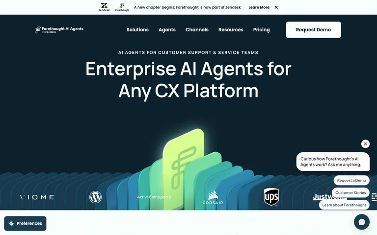
A dark customer-service homepage presents its enterprise headline above a layered illustrated integration scene.
Useful for: A dark customer-service homepage presents its enterprise headline above a layered illustrated integration scene.
# Design reference: Forethought
Source: https://forethought.ai/
Swipefile reference: https://swipefile.design/ref/ai-forethought/
Captured: 2026-09-05. This is a dated reference, not a claim about the current live product.
Capture scope: one viewport. Do not infer unseen page sections or a complete user flow.

## Objective
Adapt the visual principles below to my project. Use my own content and identity. Do not reproduce logos, proprietary copy, or brand assets.

## Reference notes
- mood: Focused, spacious and product-led.
- colors: Deep navy, mint and cyan
- typography: Clear display headline paired with smaller navigation and supporting text.
- layout: Centered headline over a wide isometric product illustration.
- motion: Static capture of one viewport. Visit the source to study motion and interaction.
- texture: layered isometric panels
- dont: Adapt the structure to your own content and brand; use your own identity, copy and imagery.

Useful for: A dark customer-service homepage presents its enterprise headline above a layered illustrated integration scene.

## Acceptance criteria
- Existing project conventions, design tokens, working functionality, and unrelated changes are preserved.
- Two or three reference principles clearly support the user's task; conflicts are resolved in favor of usability and the existing product.
- Reusable components and semantic HTML express the interface. Available licensed assets are used; important UI text is never rendered as a bitmap.
- Every visible control has a defined behavior. Loading, empty, error, success, disabled, and long-content states are specified where relevant. Demo data is clearly labeled.
- Navigation and content adapt at 375px, 768px, and 1440px without horizontal page overflow. Keyboard use, visible focus, labeled inputs, at least 44px touch targets, readable contrast, and reduced motion are supported.
- Verification distinguishes rendered behavior from proposals and identifies anything still requiring a backend or external service.

## Quality bar
Clear hierarchy, consistent spacing, restrained surfaces, and purposeful motion. Avoid decorative gradients, excessive cards, placeholder buttons, and invented metrics unless the project calls for them. Do not claim a feature is connected or tested without evidence.
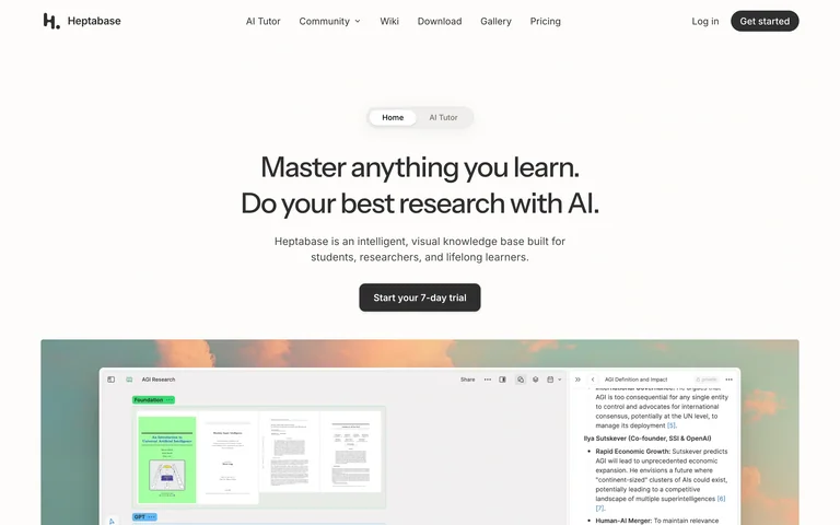
A compact switch between the core product and its AI tutor sits above a centered research promise and workspace preview.
Useful for: A compact switch between the core product and its AI tutor sits above a centered research promise and workspace preview.
# Design reference: Heptabase
Source: https://heptabase.com/
Swipefile reference: https://swipefile.design/ref/ai-heptabase/
Captured: 2026-09-05. This is a dated reference, not a claim about the current live product.
Capture scope: one viewport. Do not infer unseen page sections or a complete user flow.

## Objective
Adapt the visual principles below to my project. Use my own content and identity. Do not reproduce logos, proprietary copy, or brand assets.

## Reference notes
- mood: Focused, spacious and product-led.
- colors: Warm white, charcoal and green
- typography: Clear display headline paired with smaller navigation and supporting text.
- layout: Centered headline and action above a wide knowledge-workspace image.
- motion: Static capture of one viewport. Visit the source to study motion and interaction.
- texture: product screenshot on a muted backdrop
- dont: Adapt the structure to your own content and brand; use your own identity, copy and imagery.

Useful for: A compact switch between the core product and its AI tutor sits above a centered research promise and workspace preview.

## Acceptance criteria
- Existing project conventions, design tokens, working functionality, and unrelated changes are preserved.
- Two or three reference principles clearly support the user's task; conflicts are resolved in favor of usability and the existing product.
- Reusable components and semantic HTML express the interface. Available licensed assets are used; important UI text is never rendered as a bitmap.
- Every visible control has a defined behavior. Loading, empty, error, success, disabled, and long-content states are specified where relevant. Demo data is clearly labeled.
- Navigation and content adapt at 375px, 768px, and 1440px without horizontal page overflow. Keyboard use, visible focus, labeled inputs, at least 44px touch targets, readable contrast, and reduced motion are supported.
- Verification distinguishes rendered behavior from proposals and identifies anything still requiring a backend or external service.

## Quality bar
Clear hierarchy, consistent spacing, restrained surfaces, and purposeful motion. Avoid decorative gradients, excessive cards, placeholder buttons, and invented metrics unless the project calls for them. Do not claim a feature is connected or tested without evidence.
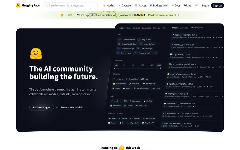
A dark community hero embeds a model-and-code preview within a white, search-led developer navigation shell.
Useful for: A dark community hero embeds a model-and-code preview within a white, search-led developer navigation shell.
# Design reference: Hugging Face
Source: https://huggingface.co/
Swipefile reference: https://swipefile.design/ref/ai-huggingface-company/
Captured: 2026-09-05. This is a dated reference, not a claim about the current live product.
Capture scope: one viewport. Do not infer unseen page sections or a complete user flow.

## Objective
Adapt the visual principles below to my project. Use my own content and identity. Do not reproduce logos, proprietary copy, or brand assets.

## Reference notes
- mood: Focused, spacious and product-led.
- colors: White, near-black and yellow
- typography: Clear display headline paired with smaller navigation and supporting text.
- layout: Dense global navigation above a split dark feature panel.
- motion: Static capture of one viewport. Visit the source to study motion and interaction.
- texture: code and interface panels
- dont: Adapt the structure to your own content and brand; use your own identity, copy and imagery.

Useful for: A dark community hero embeds a model-and-code preview within a white, search-led developer navigation shell.

## Acceptance criteria
- Existing project conventions, design tokens, working functionality, and unrelated changes are preserved.
- Two or three reference principles clearly support the user's task; conflicts are resolved in favor of usability and the existing product.
- Reusable components and semantic HTML express the interface. Available licensed assets are used; important UI text is never rendered as a bitmap.
- Every visible control has a defined behavior. Loading, empty, error, success, disabled, and long-content states are specified where relevant. Demo data is clearly labeled.
- Navigation and content adapt at 375px, 768px, and 1440px without horizontal page overflow. Keyboard use, visible focus, labeled inputs, at least 44px touch targets, readable contrast, and reduced motion are supported.
- Verification distinguishes rendered behavior from proposals and identifies anything still requiring a backend or external service.

## Quality bar
Clear hierarchy, consistent spacing, restrained surfaces, and purposeful motion. Avoid decorative gradients, excessive cards, placeholder buttons, and invented metrics unless the project calls for them. Do not claim a feature is connected or tested without evidence.
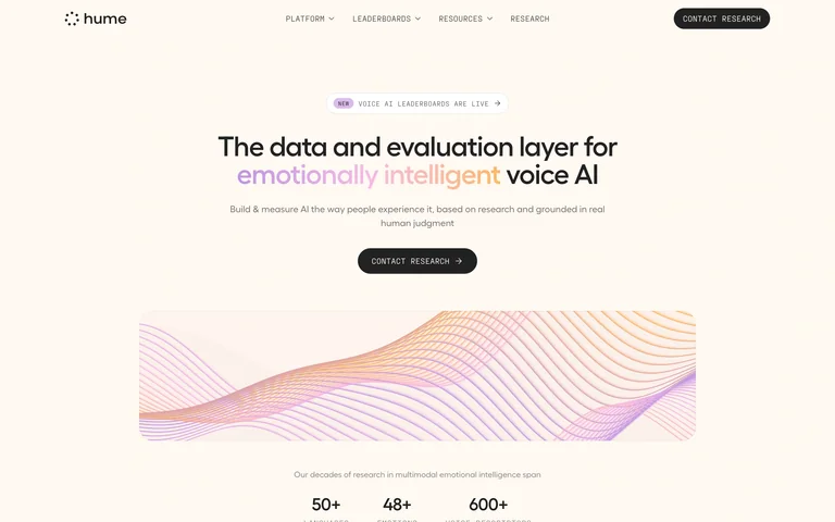
A restrained voice research homepage combines a centered headline with a flowing pastel mesh illustration.
Useful for: A restrained voice research homepage combines a centered headline with a flowing pastel mesh illustration.
# Design reference: Hume AI
Source: https://www.hume.ai/
Swipefile reference: https://swipefile.design/ref/ai-hume/
Captured: 2026-09-05. This is a dated reference, not a claim about the current live product.
Capture scope: one viewport. Do not infer unseen page sections or a complete user flow.

## Objective
Adapt the visual principles below to my project. Use my own content and identity. Do not reproduce logos, proprietary copy, or brand assets.

## Reference notes
- mood: Focused, spacious and product-led.
- colors: Cream, black, peach and lilac
- typography: Clear display headline paired with smaller navigation and supporting text.
- layout: Centered text and small action above a wide undulating mesh.
- motion: Static capture of one viewport. Visit the source to study motion and interaction.
- texture: fine wave-like mesh
- dont: Adapt the structure to your own content and brand; use your own identity, copy and imagery.

Useful for: A restrained voice research homepage combines a centered headline with a flowing pastel mesh illustration.

## Acceptance criteria
- Existing project conventions, design tokens, working functionality, and unrelated changes are preserved.
- Two or three reference principles clearly support the user's task; conflicts are resolved in favor of usability and the existing product.
- Reusable components and semantic HTML express the interface. Available licensed assets are used; important UI text is never rendered as a bitmap.
- Every visible control has a defined behavior. Loading, empty, error, success, disabled, and long-content states are specified where relevant. Demo data is clearly labeled.
- Navigation and content adapt at 375px, 768px, and 1440px without horizontal page overflow. Keyboard use, visible focus, labeled inputs, at least 44px touch targets, readable contrast, and reduced motion are supported.
- Verification distinguishes rendered behavior from proposals and identifies anything still requiring a backend or external service.

## Quality bar
Clear hierarchy, consistent spacing, restrained surfaces, and purposeful motion. Avoid decorative gradients, excessive cards, placeholder buttons, and invented metrics unless the project calls for them. Do not claim a feature is connected or tested without evidence.
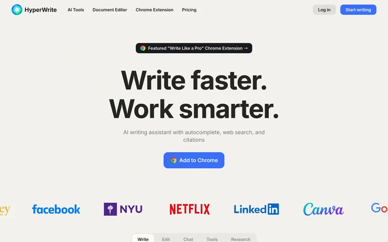
A large two-line writing headline, concise explanation and blue action lead into a colorful logo strip.
Useful for: A large two-line writing headline, concise explanation and blue action lead into a colorful logo strip.
# Design reference: HyperWrite
Source: https://www.hyperwriteai.com/
Swipefile reference: https://swipefile.design/ref/ai-hyperwrite/
Captured: 2026-09-05. This is a dated reference, not a claim about the current live product.
Capture scope: one viewport. Do not infer unseen page sections or a complete user flow.

## Objective
Adapt the visual principles below to my project. Use my own content and identity. Do not reproduce logos, proprietary copy, or brand assets.

## Reference notes
- mood: Focused, spacious and product-led.
- colors: Warm gray, charcoal and blue
- typography: Clear display headline paired with smaller navigation and supporting text.
- layout: Centered typography-first hero with social proof at the fold.
- motion: Static capture of one viewport. Visit the source to study motion and interaction.
- texture: flat neutral background
- dont: Adapt the structure to your own content and brand; use your own identity, copy and imagery.

Useful for: A large two-line writing headline, concise explanation and blue action lead into a colorful logo strip.

## Acceptance criteria
- Existing project conventions, design tokens, working functionality, and unrelated changes are preserved.
- Two or three reference principles clearly support the user's task; conflicts are resolved in favor of usability and the existing product.
- Reusable components and semantic HTML express the interface. Available licensed assets are used; important UI text is never rendered as a bitmap.
- Every visible control has a defined behavior. Loading, empty, error, success, disabled, and long-content states are specified where relevant. Demo data is clearly labeled.
- Navigation and content adapt at 375px, 768px, and 1440px without horizontal page overflow. Keyboard use, visible focus, labeled inputs, at least 44px touch targets, readable contrast, and reduced motion are supported.
- Verification distinguishes rendered behavior from proposals and identifies anything still requiring a backend or external service.

## Quality bar
Clear hierarchy, consistent spacing, restrained surfaces, and purposeful motion. Avoid decorative gradients, excessive cards, placeholder buttons, and invented metrics unless the project calls for them. Do not claim a feature is connected or tested without evidence.
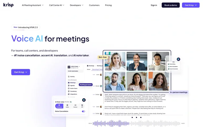
A short voice-AI statement and purple action sit beside a collage of meeting and transcript interfaces.
Useful for: A short voice-AI statement and purple action sit beside a collage of meeting and transcript interfaces.
# Design reference: Krisp
Source: https://krisp.ai/
Swipefile reference: https://swipefile.design/ref/ai-krisp/
Captured: 2026-09-05. This is a dated reference, not a claim about the current live product.
Capture scope: one viewport. Do not infer unseen page sections or a complete user flow.

## Objective
Adapt the visual principles below to my project. Use my own content and identity. Do not reproduce logos, proprietary copy, or brand assets.

## Reference notes
- mood: Focused, spacious and product-led.
- colors: White, violet and charcoal
- typography: Clear display headline paired with smaller navigation and supporting text.
- layout: Left-aligned copy opposite layered product screenshots.
- motion: Static capture of one viewport. Visit the source to study motion and interaction.
- texture: overlapping meeting-interface cards
- dont: Adapt the structure to your own content and brand; use your own identity, copy and imagery.

Useful for: A short voice-AI statement and purple action sit beside a collage of meeting and transcript interfaces.

## Acceptance criteria
- Existing project conventions, design tokens, working functionality, and unrelated changes are preserved.
- Two or three reference principles clearly support the user's task; conflicts are resolved in favor of usability and the existing product.
- Reusable components and semantic HTML express the interface. Available licensed assets are used; important UI text is never rendered as a bitmap.
- Every visible control has a defined behavior. Loading, empty, error, success, disabled, and long-content states are specified where relevant. Demo data is clearly labeled.
- Navigation and content adapt at 375px, 768px, and 1440px without horizontal page overflow. Keyboard use, visible focus, labeled inputs, at least 44px touch targets, readable contrast, and reduced motion are supported.
- Verification distinguishes rendered behavior from proposals and identifies anything still requiring a backend or external service.

## Quality bar
Clear hierarchy, consistent spacing, restrained surfaces, and purposeful motion. Avoid decorative gradients, excessive cards, placeholder buttons, and invented metrics unless the project calls for them. Do not claim a feature is connected or tested without evidence.
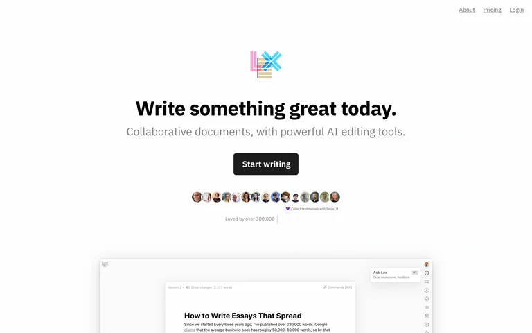
A tiny colorful wordmark introduces a centered writing promise, author avatars and a cropped document editor.
Useful for: A tiny colorful wordmark introduces a centered writing promise, author avatars and a cropped document editor.
# Design reference: Lex
Source: https://lex.page/
Swipefile reference: https://swipefile.design/ref/ai-lex/
Captured: 2026-09-05. This is a dated reference, not a claim about the current live product.
Capture scope: one viewport. Do not infer unseen page sections or a complete user flow.

## Objective
Adapt the visual principles below to my project. Use my own content and identity. Do not reproduce logos, proprietary copy, or brand assets.

## Reference notes
- mood: Clear and product-focused.
- colors: White, black and rainbow accents
- typography: Prominent display heading with smaller supporting copy and navigation.
- layout: Centered copy, single dark action, avatar strip and editor preview.
- motion: Static capture of one viewport. Visit the source to study motion and interaction.
- texture: Restrained interface surfaces; imagery and color carry the visual emphasis.
- dont: Adapt the structure to your own content and brand; use your own identity, copy and imagery.

Useful for: A tiny colorful wordmark introduces a centered writing promise, author avatars and a cropped document editor.

## Acceptance criteria
- Existing project conventions, design tokens, working functionality, and unrelated changes are preserved.
- Two or three reference principles clearly support the user's task; conflicts are resolved in favor of usability and the existing product.
- Reusable components and semantic HTML express the interface. Available licensed assets are used; important UI text is never rendered as a bitmap.
- Every visible control has a defined behavior. Loading, empty, error, success, disabled, and long-content states are specified where relevant. Demo data is clearly labeled.
- Navigation and content adapt at 375px, 768px, and 1440px without horizontal page overflow. Keyboard use, visible focus, labeled inputs, at least 44px touch targets, readable contrast, and reduced motion are supported.
- Verification distinguishes rendered behavior from proposals and identifies anything still requiring a backend or external service.

## Quality bar
Clear hierarchy, consistent spacing, restrained surfaces, and purposeful motion. Avoid decorative gradients, excessive cards, placeholder buttons, and invented metrics unless the project calls for them. Do not claim a feature is connected or tested without evidence.
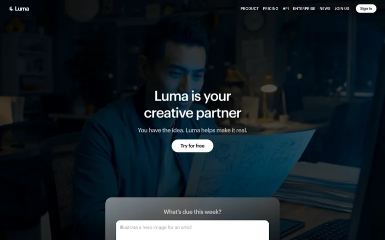
A dark cinematic scene places a concise creative-partner statement above a partially visible prompt composer.
Useful for: A dark cinematic scene places a concise creative-partner statement above a partially visible prompt composer.
# Design reference: Luma
Source: https://lumalabs.ai/
Swipefile reference: https://swipefile.design/ref/ai-luma-labs/
Captured: 2026-09-05. This is a dated reference, not a claim about the current live product.
Capture scope: one viewport. Do not infer unseen page sections or a complete user flow.

## Objective
Adapt the visual principles below to my project. Use my own content and identity. Do not reproduce logos, proprietary copy, or brand assets.

## Reference notes
- mood: Clear and product-focused.
- colors: Dark navy and white
- typography: Prominent display heading with smaller supporting copy and navigation.
- layout: Full-bleed scene with centered text and a composer peeking from the fold.
- motion: Static capture of one viewport. Visit the source to study motion and interaction.
- texture: Restrained interface surfaces; imagery and color carry the visual emphasis.
- dont: Adapt the structure to your own content and brand; use your own identity, copy and imagery.

Useful for: A dark cinematic scene places a concise creative-partner statement above a partially visible prompt composer.

## Acceptance criteria
- Existing project conventions, design tokens, working functionality, and unrelated changes are preserved.
- Two or three reference principles clearly support the user's task; conflicts are resolved in favor of usability and the existing product.
- Reusable components and semantic HTML express the interface. Available licensed assets are used; important UI text is never rendered as a bitmap.
- Every visible control has a defined behavior. Loading, empty, error, success, disabled, and long-content states are specified where relevant. Demo data is clearly labeled.
- Navigation and content adapt at 375px, 768px, and 1440px without horizontal page overflow. Keyboard use, visible focus, labeled inputs, at least 44px touch targets, readable contrast, and reduced motion are supported.
- Verification distinguishes rendered behavior from proposals and identifies anything still requiring a backend or external service.

## Quality bar
Clear hierarchy, consistent spacing, restrained surfaces, and purposeful motion. Avoid decorative gradients, excessive cards, placeholder buttons, and invented metrics unless the project calls for them. Do not claim a feature is connected or tested without evidence.
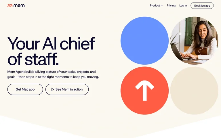
An oversized personal-assistant headline sits opposite four circular tiles mixing color, portrait photography and an arrow.
Useful for: An oversized personal-assistant headline sits opposite four circular tiles mixing color, portrait photography and an arrow.
# Design reference: Mem
Source: https://get.mem.ai/
Swipefile reference: https://swipefile.design/ref/ai-mem/
Captured: 2026-09-05. This is a dated reference, not a claim about the current live product.
Capture scope: one viewport. Do not infer unseen page sections or a complete user flow.

## Objective
Adapt the visual principles below to my project. Use my own content and identity. Do not reproduce logos, proprietary copy, or brand assets.

## Reference notes
- mood: Clear and product-focused.
- colors: Cream, navy, coral and blue
- typography: Prominent display heading with smaller supporting copy and navigation.
- layout: Two-column hero with oversized circular imagery.
- motion: Static capture of one viewport. Visit the source to study motion and interaction.
- texture: Restrained interface surfaces; imagery and color carry the visual emphasis.
- dont: Adapt the structure to your own content and brand; use your own identity, copy and imagery.

Useful for: An oversized personal-assistant headline sits opposite four circular tiles mixing color, portrait photography and an arrow.

## Acceptance criteria
- Existing project conventions, design tokens, working functionality, and unrelated changes are preserved.
- Two or three reference principles clearly support the user's task; conflicts are resolved in favor of usability and the existing product.
- Reusable components and semantic HTML express the interface. Available licensed assets are used; important UI text is never rendered as a bitmap.
- Every visible control has a defined behavior. Loading, empty, error, success, disabled, and long-content states are specified where relevant. Demo data is clearly labeled.
- Navigation and content adapt at 375px, 768px, and 1440px without horizontal page overflow. Keyboard use, visible focus, labeled inputs, at least 44px touch targets, readable contrast, and reduced motion are supported.
- Verification distinguishes rendered behavior from proposals and identifies anything still requiring a backend or external service.

## Quality bar
Clear hierarchy, consistent spacing, restrained surfaces, and purposeful motion. Avoid decorative gradients, excessive cards, placeholder buttons, and invented metrics unless the project calls for them. Do not claim a feature is connected or tested without evidence.
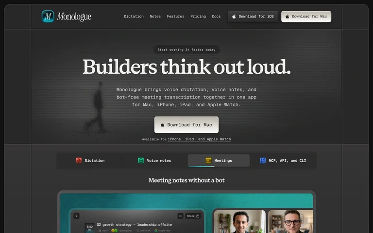
A dark framed homepage pairs a serif dictation headline with capability tabs and a meeting preview.
Useful for: A dark framed homepage pairs a serif dictation headline with capability tabs and a meeting preview.
# Design reference: Monologue
Source: https://www.monologue.to/
Swipefile reference: https://swipefile.design/ref/ai-monologue/
Captured: 2026-09-05. This is a dated reference, not a claim about the current live product.
Capture scope: one viewport. Do not infer unseen page sections or a complete user flow.

## Objective
Adapt the visual principles below to my project. Use my own content and identity. Do not reproduce logos, proprietary copy, or brand assets.

## Reference notes
- mood: Clear and product-focused.
- colors: Charcoal, cream and teal
- typography: Prominent display heading with smaller supporting copy and navigation.
- layout: Centered copy above tabs and a product preview.
- motion: Static capture of one viewport. Visit the source to study motion and interaction.
- texture: Restrained interface surfaces; imagery and color carry the visual emphasis.
- dont: Adapt the structure to your own content and brand; use your own identity, copy and imagery.

Useful for: A dark framed homepage pairs a serif dictation headline with capability tabs and a meeting preview.

## Acceptance criteria
- Existing project conventions, design tokens, working functionality, and unrelated changes are preserved.
- Two or three reference principles clearly support the user's task; conflicts are resolved in favor of usability and the existing product.
- Reusable components and semantic HTML express the interface. Available licensed assets are used; important UI text is never rendered as a bitmap.
- Every visible control has a defined behavior. Loading, empty, error, success, disabled, and long-content states are specified where relevant. Demo data is clearly labeled.
- Navigation and content adapt at 375px, 768px, and 1440px without horizontal page overflow. Keyboard use, visible focus, labeled inputs, at least 44px touch targets, readable contrast, and reduced motion are supported.
- Verification distinguishes rendered behavior from proposals and identifies anything still requiring a backend or external service.

## Quality bar
Clear hierarchy, consistent spacing, restrained surfaces, and purposeful motion. Avoid decorative gradients, excessive cards, placeholder buttons, and invented metrics unless the project calls for them. Do not claim a feature is connected or tested without evidence.
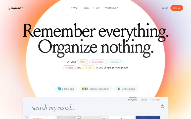
A large serif memory-and-organization statement fills a white circle surrounded by a warm gradient glow.
Useful for: A large serif memory-and-organization statement fills a white circle surrounded by a warm gradient glow.
# Design reference: mymind
Source: https://mymind.com/
Swipefile reference: https://swipefile.design/ref/ai-my-mind/
Captured: 2026-09-05. This is a dated reference, not a claim about the current live product.
Capture scope: one viewport. Do not infer unseen page sections or a complete user flow.

## Objective
Adapt the visual principles below to my project. Use my own content and identity. Do not reproduce logos, proprietary copy, or brand assets.

## Reference notes
- mood: Clear and product-focused.
- colors: White, black, peach and violet
- typography: Prominent display heading with smaller supporting copy and navigation.
- layout: Centered editorial hero with content-type chips and a search preview.
- motion: Static capture of one viewport. Visit the source to study motion and interaction.
- texture: Restrained interface surfaces; imagery and color carry the visual emphasis.
- dont: Adapt the structure to your own content and brand; use your own identity, copy and imagery.

Useful for: A large serif memory-and-organization statement fills a white circle surrounded by a warm gradient glow.

## Acceptance criteria
- Existing project conventions, design tokens, working functionality, and unrelated changes are preserved.
- Two or three reference principles clearly support the user's task; conflicts are resolved in favor of usability and the existing product.
- Reusable components and semantic HTML express the interface. Available licensed assets are used; important UI text is never rendered as a bitmap.
- Every visible control has a defined behavior. Loading, empty, error, success, disabled, and long-content states are specified where relevant. Demo data is clearly labeled.
- Navigation and content adapt at 375px, 768px, and 1440px without horizontal page overflow. Keyboard use, visible focus, labeled inputs, at least 44px touch targets, readable contrast, and reduced motion are supported.
- Verification distinguishes rendered behavior from proposals and identifies anything still requiring a backend or external service.

## Quality bar
Clear hierarchy, consistent spacing, restrained surfaces, and purposeful motion. Avoid decorative gradients, excessive cards, placeholder buttons, and invented metrics unless the project calls for them. Do not claim a feature is connected or tested without evidence.
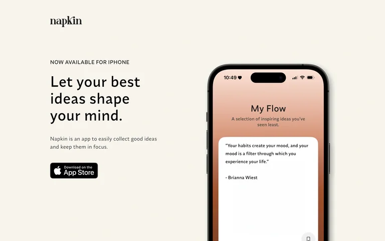
An idea-collection homepage pairs a short statement with a tall phone mockup and an App Store action.
Useful for: An idea-collection homepage pairs a short statement with a tall phone mockup and an App Store action.
# Design reference: Napkin
Source: https://napkin.one/
Swipefile reference: https://swipefile.design/ref/ai-napkin-notes/
Captured: 2026-09-05. This is a dated reference, not a claim about the current live product.
Capture scope: one viewport. Do not infer unseen page sections or a complete user flow.

## Objective
Adapt the visual principles below to my project. Use my own content and identity. Do not reproduce logos, proprietary copy, or brand assets.

## Reference notes
- mood: Clear and product-focused.
- colors: Warm cream, black and peach
- typography: Prominent display heading with smaller supporting copy and navigation.
- layout: Split hero with a large phone interface.
- motion: Static capture of one viewport. Visit the source to study motion and interaction.
- texture: Restrained interface surfaces; imagery and color carry the visual emphasis.
- dont: Adapt the structure to your own content and brand; use your own identity, copy and imagery.

Useful for: An idea-collection homepage pairs a short statement with a tall phone mockup and an App Store action.

## Acceptance criteria
- Existing project conventions, design tokens, working functionality, and unrelated changes are preserved.
- Two or three reference principles clearly support the user's task; conflicts are resolved in favor of usability and the existing product.
- Reusable components and semantic HTML express the interface. Available licensed assets are used; important UI text is never rendered as a bitmap.
- Every visible control has a defined behavior. Loading, empty, error, success, disabled, and long-content states are specified where relevant. Demo data is clearly labeled.
- Navigation and content adapt at 375px, 768px, and 1440px without horizontal page overflow. Keyboard use, visible focus, labeled inputs, at least 44px touch targets, readable contrast, and reduced motion are supported.
- Verification distinguishes rendered behavior from proposals and identifies anything still requiring a backend or external service.

## Quality bar
Clear hierarchy, consistent spacing, restrained surfaces, and purposeful motion. Avoid decorative gradients, excessive cards, placeholder buttons, and invented metrics unless the project calls for them. Do not claim a feature is connected or tested without evidence.
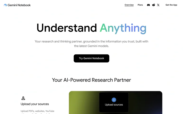
A centered research-partner introduction uses a gradient word and a simple action before explaining source uploads.
Useful for: A centered research-partner introduction uses a gradient word and a simple action before explaining source uploads.
# Design reference: Gemini Notebook
Source: https://notebook.google/
Swipefile reference: https://swipefile.design/ref/ai-notebooklm-marketing/
Captured: 2026-09-05. This is a dated reference, not a claim about the current live product.
Capture scope: one viewport. Do not infer unseen page sections or a complete user flow.

## Objective
Adapt the visual principles below to my project. Use my own content and identity. Do not reproduce logos, proprietary copy, or brand assets.

## Reference notes
- mood: Clear and product-focused.
- colors: White, black, mint and blue
- typography: Prominent display heading with smaller supporting copy and navigation.
- layout: Centered hero with a two-column feature section below.
- motion: Static capture of one viewport. Visit the source to study motion and interaction.
- texture: Restrained interface surfaces; imagery and color carry the visual emphasis.
- dont: Adapt the structure to your own content and brand; use your own identity, copy and imagery.

Useful for: A centered research-partner introduction uses a gradient word and a simple action before explaining source uploads.

## Acceptance criteria
- Existing project conventions, design tokens, working functionality, and unrelated changes are preserved.
- Two or three reference principles clearly support the user's task; conflicts are resolved in favor of usability and the existing product.
- Reusable components and semantic HTML express the interface. Available licensed assets are used; important UI text is never rendered as a bitmap.
- Every visible control has a defined behavior. Loading, empty, error, success, disabled, and long-content states are specified where relevant. Demo data is clearly labeled.
- Navigation and content adapt at 375px, 768px, and 1440px without horizontal page overflow. Keyboard use, visible focus, labeled inputs, at least 44px touch targets, readable contrast, and reduced motion are supported.
- Verification distinguishes rendered behavior from proposals and identifies anything still requiring a backend or external service.

## Quality bar
Clear hierarchy, consistent spacing, restrained surfaces, and purposeful motion. Avoid decorative gradients, excessive cards, placeholder buttons, and invented metrics unless the project calls for them. Do not claim a feature is connected or tested without evidence.
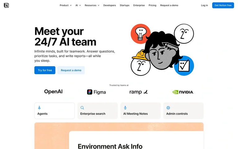
A stacked team headline sits beside a playful face illustration, followed by customer logos and capability tabs.
Useful for: A stacked team headline sits beside a playful face illustration, followed by customer logos and capability tabs.
# Design reference: Notion AI
Source: https://www.notion.com/product/ai
Swipefile reference: https://swipefile.design/ref/ai-notion-ai-product/
Captured: 2026-09-05. This is a dated reference, not a claim about the current live product.
Capture scope: one viewport. Do not infer unseen page sections or a complete user flow.

## Objective
Adapt the visual principles below to my project. Use my own content and identity. Do not reproduce logos, proprietary copy, or brand assets.

## Reference notes
- mood: Clear and product-focused.
- colors: White, black, blue and coral
- typography: Prominent display heading with smaller supporting copy and navigation.
- layout: Split hero above proof logos and a tabbed product preview.
- motion: Static capture of one viewport. Visit the source to study motion and interaction.
- texture: Restrained interface surfaces; imagery and color carry the visual emphasis.
- dont: Adapt the structure to your own content and brand; use your own identity, copy and imagery.

Useful for: A stacked team headline sits beside a playful face illustration, followed by customer logos and capability tabs.

## Acceptance criteria
- Existing project conventions, design tokens, working functionality, and unrelated changes are preserved.
- Two or three reference principles clearly support the user's task; conflicts are resolved in favor of usability and the existing product.
- Reusable components and semantic HTML express the interface. Available licensed assets are used; important UI text is never rendered as a bitmap.
- Every visible control has a defined behavior. Loading, empty, error, success, disabled, and long-content states are specified where relevant. Demo data is clearly labeled.
- Navigation and content adapt at 375px, 768px, and 1440px without horizontal page overflow. Keyboard use, visible focus, labeled inputs, at least 44px touch targets, readable contrast, and reduced motion are supported.
- Verification distinguishes rendered behavior from proposals and identifies anything still requiring a backend or external service.

## Quality bar
Clear hierarchy, consistent spacing, restrained surfaces, and purposeful motion. Avoid decorative gradients, excessive cards, placeholder buttons, and invented metrics unless the project calls for them. Do not claim a feature is connected or tested without evidence.
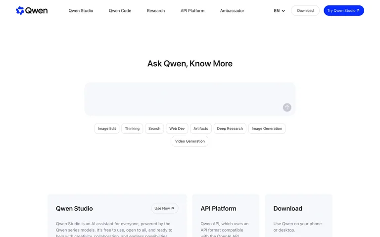
A search-like hero invites exploration before three cards introduce the studio, API and download routes.
Useful for: A search-like hero invites exploration before three cards introduce the studio, API and download routes.
# Design reference: Qwen
Source: https://qwen.ai/home
Swipefile reference: https://swipefile.design/ref/ai-qwen/
Captured: 2026-09-05. This is a dated reference, not a claim about the current live product.
Capture scope: one viewport. Do not infer unseen page sections or a complete user flow.

## Objective
Adapt the visual principles below to my project. Use my own content and identity. Do not reproduce logos, proprietary copy, or brand assets.

## Reference notes
- mood: Clear and product-focused.
- colors: White, charcoal and blue
- typography: Prominent display heading with smaller supporting copy and navigation.
- layout: Centered input-style hero above three product cards.
- motion: Static capture of one viewport. Visit the source to study motion and interaction.
- texture: Restrained interface surfaces; imagery and color carry the visual emphasis.
- dont: Adapt the structure to your own content and brand; use your own identity, copy and imagery.

Useful for: A search-like hero invites exploration before three cards introduce the studio, API and download routes.

## Acceptance criteria
- Existing project conventions, design tokens, working functionality, and unrelated changes are preserved.
- Two or three reference principles clearly support the user's task; conflicts are resolved in favor of usability and the existing product.
- Reusable components and semantic HTML express the interface. Available licensed assets are used; important UI text is never rendered as a bitmap.
- Every visible control has a defined behavior. Loading, empty, error, success, disabled, and long-content states are specified where relevant. Demo data is clearly labeled.
- Navigation and content adapt at 375px, 768px, and 1440px without horizontal page overflow. Keyboard use, visible focus, labeled inputs, at least 44px touch targets, readable contrast, and reduced motion are supported.
- Verification distinguishes rendered behavior from proposals and identifies anything still requiring a backend or external service.

## Quality bar
Clear hierarchy, consistent spacing, restrained surfaces, and purposeful motion. Avoid decorative gradients, excessive cards, placeholder buttons, and invented metrics unless the project calls for them. Do not claim a feature is connected or tested without evidence.
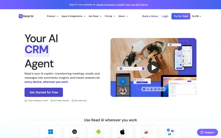
A short AI-agent headline and purple action face a layered collage of video, mobile and workspace views.
Useful for: A short AI-agent headline and purple action face a layered collage of video, mobile and workspace views.
# Design reference: Read AI
Source: https://www.read.ai/
Swipefile reference: https://swipefile.design/ref/ai-read-ai/
Captured: 2026-09-05. This is a dated reference, not a claim about the current live product.
Capture scope: one viewport. Do not infer unseen page sections or a complete user flow.

## Objective
Adapt the visual principles below to my project. Use my own content and identity. Do not reproduce logos, proprietary copy, or brand assets.

## Reference notes
- mood: Clear and product-focused.
- colors: White, violet and blue
- typography: Prominent display heading with smaller supporting copy and navigation.
- layout: Split hero with a compact title and product collage.
- motion: Static capture of one viewport. Visit the source to study motion and interaction.
- texture: Restrained interface surfaces; imagery and color carry the visual emphasis.
- dont: Adapt the structure to your own content and brand; use your own identity, copy and imagery.

Useful for: A short AI-agent headline and purple action face a layered collage of video, mobile and workspace views.

## Acceptance criteria
- Existing project conventions, design tokens, working functionality, and unrelated changes are preserved.
- Two or three reference principles clearly support the user's task; conflicts are resolved in favor of usability and the existing product.
- Reusable components and semantic HTML express the interface. Available licensed assets are used; important UI text is never rendered as a bitmap.
- Every visible control has a defined behavior. Loading, empty, error, success, disabled, and long-content states are specified where relevant. Demo data is clearly labeled.
- Navigation and content adapt at 375px, 768px, and 1440px without horizontal page overflow. Keyboard use, visible focus, labeled inputs, at least 44px touch targets, readable contrast, and reduced motion are supported.
- Verification distinguishes rendered behavior from proposals and identifies anything still requiring a backend or external service.

## Quality bar
Clear hierarchy, consistent spacing, restrained surfaces, and purposeful motion. Avoid decorative gradients, excessive cards, placeholder buttons, and invented metrics unless the project calls for them. Do not claim a feature is connected or tested without evidence.
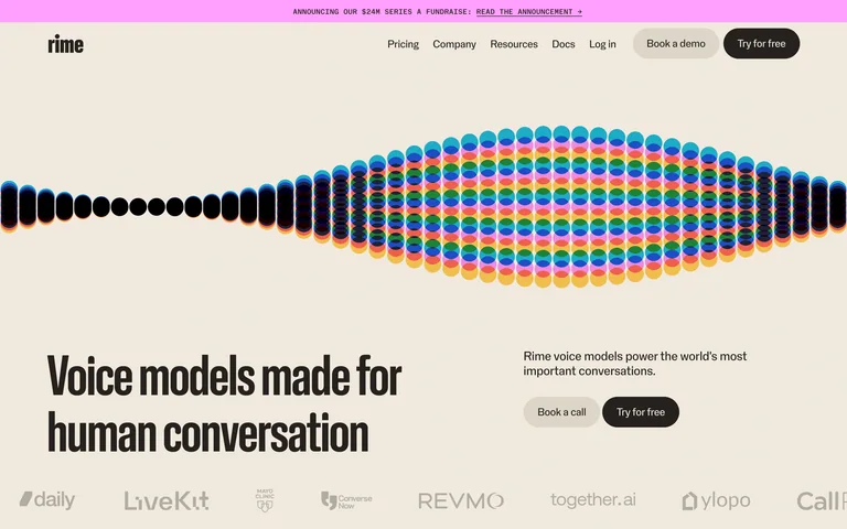
A broad multicolor waveform separates a restrained header from a bold condensed voice-model headline.
Useful for: A broad multicolor waveform separates a restrained header from a bold condensed voice-model headline.
# Design reference: Rime
Source: https://www.rime.ai/
Swipefile reference: https://swipefile.design/ref/ai-rime/
Captured: 2026-09-05. This is a dated reference, not a claim about the current live product.
Capture scope: one viewport. Do not infer unseen page sections or a complete user flow.

## Objective
Adapt the visual principles below to my project. Use my own content and identity. Do not reproduce logos, proprietary copy, or brand assets.

## Reference notes
- mood: Clear and product-focused.
- colors: Cream, black, pink and rainbow accents
- typography: Prominent display heading with smaller supporting copy and navigation.
- layout: Full-width waveform above an asymmetric title-and-action row.
- motion: Static capture of one viewport. Visit the source to study motion and interaction.
- texture: Restrained interface surfaces; imagery and color carry the visual emphasis.
- dont: Adapt the structure to your own content and brand; use your own identity, copy and imagery.

Useful for: A broad multicolor waveform separates a restrained header from a bold condensed voice-model headline.

## Acceptance criteria
- Existing project conventions, design tokens, working functionality, and unrelated changes are preserved.
- Two or three reference principles clearly support the user's task; conflicts are resolved in favor of usability and the existing product.
- Reusable components and semantic HTML express the interface. Available licensed assets are used; important UI text is never rendered as a bitmap.
- Every visible control has a defined behavior. Loading, empty, error, success, disabled, and long-content states are specified where relevant. Demo data is clearly labeled.
- Navigation and content adapt at 375px, 768px, and 1440px without horizontal page overflow. Keyboard use, visible focus, labeled inputs, at least 44px touch targets, readable contrast, and reduced motion are supported.
- Verification distinguishes rendered behavior from proposals and identifies anything still requiring a backend or external service.

## Quality bar
Clear hierarchy, consistent spacing, restrained surfaces, and purposeful motion. Avoid decorative gradients, excessive cards, placeholder buttons, and invented metrics unless the project calls for them. Do not claim a feature is connected or tested without evidence.
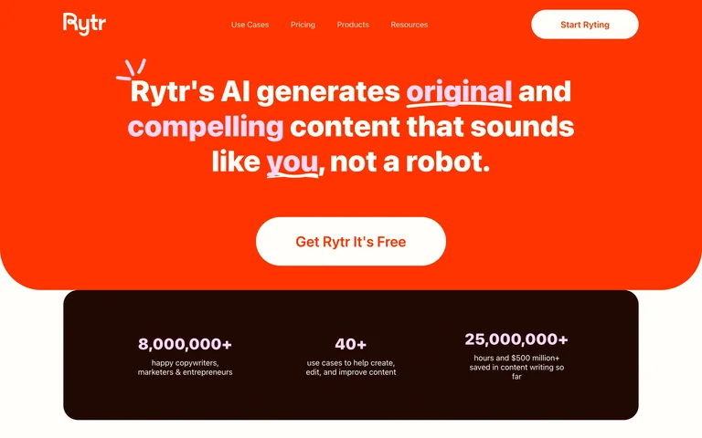
A saturated orange writing hero uses thick centered typography and a cream action above a dark proof panel.
Useful for: A saturated orange writing hero uses thick centered typography and a cream action above a dark proof panel.
# Design reference: Rytr
Source: https://rytr.me/
Swipefile reference: https://swipefile.design/ref/ai-rytr/
Captured: 2026-09-05. This is a dated reference, not a claim about the current live product.
Capture scope: one viewport. Do not infer unseen page sections or a complete user flow.

## Objective
Adapt the visual principles below to my project. Use my own content and identity. Do not reproduce logos, proprietary copy, or brand assets.

## Reference notes
- mood: Clear and product-focused.
- colors: Orange, cream and dark brown
- typography: Prominent display heading with smaller supporting copy and navigation.
- layout: Rounded hero block with a statistics strip beneath.
- motion: Static capture of one viewport. Visit the source to study motion and interaction.
- texture: Restrained interface surfaces; imagery and color carry the visual emphasis.
- dont: Adapt the structure to your own content and brand; use your own identity, copy and imagery.

Useful for: A saturated orange writing hero uses thick centered typography and a cream action above a dark proof panel.

## Acceptance criteria
- Existing project conventions, design tokens, working functionality, and unrelated changes are preserved.
- Two or three reference principles clearly support the user's task; conflicts are resolved in favor of usability and the existing product.
- Reusable components and semantic HTML express the interface. Available licensed assets are used; important UI text is never rendered as a bitmap.
- Every visible control has a defined behavior. Loading, empty, error, success, disabled, and long-content states are specified where relevant. Demo data is clearly labeled.
- Navigation and content adapt at 375px, 768px, and 1440px without horizontal page overflow. Keyboard use, visible focus, labeled inputs, at least 44px touch targets, readable contrast, and reduced motion are supported.
- Verification distinguishes rendered behavior from proposals and identifies anything still requiring a backend or external service.

## Quality bar
Clear hierarchy, consistent spacing, restrained surfaces, and purposeful motion. Avoid decorative gradients, excessive cards, placeholder buttons, and invented metrics unless the project calls for them. Do not claim a feature is connected or tested without evidence.
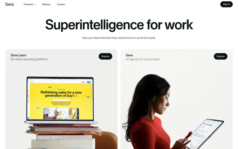
A simple centered work headline leads into two large product panels for learning and agents.
Useful for: A simple centered work headline leads into two large product panels for learning and agents.
# Design reference: Sana
Source: https://sana.ai/
Swipefile reference: https://swipefile.design/ref/ai-sana/
Captured: 2026-09-05. This is a dated reference, not a claim about the current live product.
Capture scope: one viewport. Do not infer unseen page sections or a complete user flow.

## Objective
Adapt the visual principles below to my project. Use my own content and identity. Do not reproduce logos, proprietary copy, or brand assets.

## Reference notes
- mood: Clear and product-focused.
- colors: White, black and yellow accents
- typography: Prominent display heading with smaller supporting copy and navigation.
- layout: Centered heading above two equal-width product cards.
- motion: Static capture of one viewport. Visit the source to study motion and interaction.
- texture: Restrained interface surfaces; imagery and color carry the visual emphasis.
- dont: Adapt the structure to your own content and brand; use your own identity, copy and imagery.

Useful for: A simple centered work headline leads into two large product panels for learning and agents.

## Acceptance criteria
- Existing project conventions, design tokens, working functionality, and unrelated changes are preserved.
- Two or three reference principles clearly support the user's task; conflicts are resolved in favor of usability and the existing product.
- Reusable components and semantic HTML express the interface. Available licensed assets are used; important UI text is never rendered as a bitmap.
- Every visible control has a defined behavior. Loading, empty, error, success, disabled, and long-content states are specified where relevant. Demo data is clearly labeled.
- Navigation and content adapt at 375px, 768px, and 1440px without horizontal page overflow. Keyboard use, visible focus, labeled inputs, at least 44px touch targets, readable contrast, and reduced motion are supported.
- Verification distinguishes rendered behavior from proposals and identifies anything still requiring a backend or external service.

## Quality bar
Clear hierarchy, consistent spacing, restrained surfaces, and purposeful motion. Avoid decorative gradients, excessive cards, placeholder buttons, and invented metrics unless the project calls for them. Do not claim a feature is connected or tested without evidence.
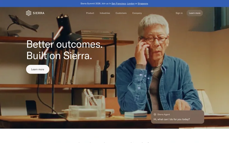
A photographic customer-service hero anchors its short promise and action over a warm office scene.
Useful for: A photographic customer-service hero anchors its short promise and action over a warm office scene.
# Design reference: Sierra
Source: https://sierra.ai/
Swipefile reference: https://swipefile.design/ref/ai-sierra/
Captured: 2026-09-05. This is a dated reference, not a claim about the current live product.
Capture scope: one viewport. Do not infer unseen page sections or a complete user flow.

## Objective
Adapt the visual principles below to my project. Use my own content and identity. Do not reproduce logos, proprietary copy, or brand assets.

## Reference notes
- mood: Clear and product-focused.
- colors: Warm brown, cream and muted blue
- typography: Prominent display heading with smaller supporting copy and navigation.
- layout: Wide photograph with left-aligned text and a small conversation example.
- motion: Static capture of one viewport. Visit the source to study motion and interaction.
- texture: Restrained interface surfaces; imagery and color carry the visual emphasis.
- dont: Adapt the structure to your own content and brand; use your own identity, copy and imagery.

Useful for: A photographic customer-service hero anchors its short promise and action over a warm office scene.

## Acceptance criteria
- Existing project conventions, design tokens, working functionality, and unrelated changes are preserved.
- Two or three reference principles clearly support the user's task; conflicts are resolved in favor of usability and the existing product.
- Reusable components and semantic HTML express the interface. Available licensed assets are used; important UI text is never rendered as a bitmap.
- Every visible control has a defined behavior. Loading, empty, error, success, disabled, and long-content states are specified where relevant. Demo data is clearly labeled.
- Navigation and content adapt at 375px, 768px, and 1440px without horizontal page overflow. Keyboard use, visible focus, labeled inputs, at least 44px touch targets, readable contrast, and reduced motion are supported.
- Verification distinguishes rendered behavior from proposals and identifies anything still requiring a backend or external service.

## Quality bar
Clear hierarchy, consistent spacing, restrained surfaces, and purposeful motion. Avoid decorative gradients, excessive cards, placeholder buttons, and invented metrics unless the project calls for them. Do not claim a feature is connected or tested without evidence.
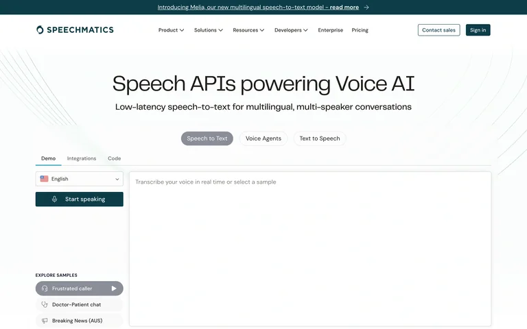
A speech-API headline introduces feature tabs and a public transcription demonstration within the homepage.
Useful for: A speech-API headline introduces feature tabs and a public transcription demonstration within the homepage.
# Design reference: Speechmatics
Source: https://www.speechmatics.com/
Swipefile reference: https://swipefile.design/ref/ai-speechmatics/
Captured: 2026-09-05. This is a dated reference, not a claim about the current live product.
Capture scope: one viewport. Do not infer unseen page sections or a complete user flow.

## Objective
Adapt the visual principles below to my project. Use my own content and identity. Do not reproduce logos, proprietary copy, or brand assets.

## Reference notes
- mood: Clear and product-focused.
- colors: White, dark teal and pale gray
- typography: Prominent display heading with smaller supporting copy and navigation.
- layout: Centered title above a tabbed two-column demo area.
- motion: Static capture of one viewport. Visit the source to study motion and interaction.
- texture: Restrained interface surfaces; imagery and color carry the visual emphasis.
- dont: Adapt the structure to your own content and brand; use your own identity, copy and imagery.

Useful for: A speech-API headline introduces feature tabs and a public transcription demonstration within the homepage.

## Acceptance criteria
- Existing project conventions, design tokens, working functionality, and unrelated changes are preserved.
- Two or three reference principles clearly support the user's task; conflicts are resolved in favor of usability and the existing product.
- Reusable components and semantic HTML express the interface. Available licensed assets are used; important UI text is never rendered as a bitmap.
- Every visible control has a defined behavior. Loading, empty, error, success, disabled, and long-content states are specified where relevant. Demo data is clearly labeled.
- Navigation and content adapt at 375px, 768px, and 1440px without horizontal page overflow. Keyboard use, visible focus, labeled inputs, at least 44px touch targets, readable contrast, and reduced motion are supported.
- Verification distinguishes rendered behavior from proposals and identifies anything still requiring a backend or external service.

## Quality bar
Clear hierarchy, consistent spacing, restrained surfaces, and purposeful motion. Avoid decorative gradients, excessive cards, placeholder buttons, and invented metrics unless the project calls for them. Do not claim a feature is connected or tested without evidence.
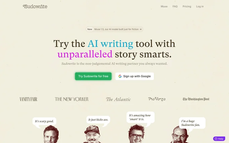
A serif fiction-writing headline uses colorful words, paired entry actions and literary proof on ivory.
Useful for: A serif fiction-writing headline uses colorful words, paired entry actions and literary proof on ivory.
# Design reference: Sudowrite
Source: https://sudowrite.com/
Swipefile reference: https://swipefile.design/ref/ai-sudowrite/
Captured: 2026-09-05. This is a dated reference, not a claim about the current live product.
Capture scope: one viewport. Do not infer unseen page sections or a complete user flow.

## Objective
Adapt the visual principles below to my project. Use my own content and identity. Do not reproduce logos, proprietary copy, or brand assets.

## Reference notes
- mood: Clear and product-focused.
- colors: Ivory, brown, green and lilac
- typography: Prominent display heading with smaller supporting copy and navigation.
- layout: Centered editorial hero above publication marks and illustrated figures.
- motion: Static capture of one viewport. Visit the source to study motion and interaction.
- texture: Restrained interface surfaces; imagery and color carry the visual emphasis.
- dont: Adapt the structure to your own content and brand; use your own identity, copy and imagery.

Useful for: A serif fiction-writing headline uses colorful words, paired entry actions and literary proof on ivory.

## Acceptance criteria
- Existing project conventions, design tokens, working functionality, and unrelated changes are preserved.
- Two or three reference principles clearly support the user's task; conflicts are resolved in favor of usability and the existing product.
- Reusable components and semantic HTML express the interface. Available licensed assets are used; important UI text is never rendered as a bitmap.
- Every visible control has a defined behavior. Loading, empty, error, success, disabled, and long-content states are specified where relevant. Demo data is clearly labeled.
- Navigation and content adapt at 375px, 768px, and 1440px without horizontal page overflow. Keyboard use, visible focus, labeled inputs, at least 44px touch targets, readable contrast, and reduced motion are supported.
- Verification distinguishes rendered behavior from proposals and identifies anything still requiring a backend or external service.

## Quality bar
Clear hierarchy, consistent spacing, restrained surfaces, and purposeful motion. Avoid decorative gradients, excessive cards, placeholder buttons, and invented metrics unless the project calls for them. Do not claim a feature is connected or tested without evidence.
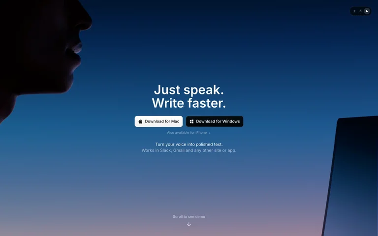
A silhouetted speaker and laptop frame a compact voice-to-text statement with platform download buttons.
Useful for: A silhouetted speaker and laptop frame a compact voice-to-text statement with platform download buttons.
# Design reference: Superwhisper
Source: https://superwhisper.com/
Swipefile reference: https://swipefile.design/ref/ai-superwhisper/
Captured: 2026-09-05. This is a dated reference, not a claim about the current live product.
Capture scope: one viewport. Do not infer unseen page sections or a complete user flow.

## Objective
Adapt the visual principles below to my project. Use my own content and identity. Do not reproduce logos, proprietary copy, or brand assets.

## Reference notes
- mood: Clear and product-focused.
- colors: Midnight blue, black and white
- typography: Prominent display heading with smaller supporting copy and navigation.
- layout: Centered text against a dark-to-blue photographic scene.
- motion: Static capture of one viewport. Visit the source to study motion and interaction.
- texture: Restrained interface surfaces; imagery and color carry the visual emphasis.
- dont: Adapt the structure to your own content and brand; use your own identity, copy and imagery.

Useful for: A silhouetted speaker and laptop frame a compact voice-to-text statement with platform download buttons.

## Acceptance criteria
- Existing project conventions, design tokens, working functionality, and unrelated changes are preserved.
- Two or three reference principles clearly support the user's task; conflicts are resolved in favor of usability and the existing product.
- Reusable components and semantic HTML express the interface. Available licensed assets are used; important UI text is never rendered as a bitmap.
- Every visible control has a defined behavior. Loading, empty, error, success, disabled, and long-content states are specified where relevant. Demo data is clearly labeled.
- Navigation and content adapt at 375px, 768px, and 1440px without horizontal page overflow. Keyboard use, visible focus, labeled inputs, at least 44px touch targets, readable contrast, and reduced motion are supported.
- Verification distinguishes rendered behavior from proposals and identifies anything still requiring a backend or external service.

## Quality bar
Clear hierarchy, consistent spacing, restrained surfaces, and purposeful motion. Avoid decorative gradients, excessive cards, placeholder buttons, and invented metrics unless the project calls for them. Do not claim a feature is connected or tested without evidence.
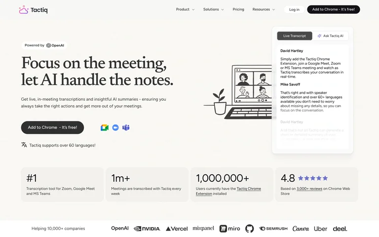
A serif meeting headline and extension action sit beside a lightly illustrated transcript example.
Useful for: A serif meeting headline and extension action sit beside a lightly illustrated transcript example.
# Design reference: Tactiq
Source: https://tactiq.io/
Swipefile reference: https://swipefile.design/ref/ai-tactiq/
Captured: 2026-09-05. This is a dated reference, not a claim about the current live product.
Capture scope: one viewport. Do not infer unseen page sections or a complete user flow.

## Objective
Adapt the visual principles below to my project. Use my own content and identity. Do not reproduce logos, proprietary copy, or brand assets.

## Reference notes
- mood: Clear and product-focused.
- colors: Warm white, black and soft gray
- typography: Prominent display heading with smaller supporting copy and navigation.
- layout: Split hero above four compact proof blocks.
- motion: Static capture of one viewport. Visit the source to study motion and interaction.
- texture: Restrained interface surfaces; imagery and color carry the visual emphasis.
- dont: Adapt the structure to your own content and brand; use your own identity, copy and imagery.

Useful for: A serif meeting headline and extension action sit beside a lightly illustrated transcript example.

## Acceptance criteria
- Existing project conventions, design tokens, working functionality, and unrelated changes are preserved.
- Two or three reference principles clearly support the user's task; conflicts are resolved in favor of usability and the existing product.
- Reusable components and semantic HTML express the interface. Available licensed assets are used; important UI text is never rendered as a bitmap.
- Every visible control has a defined behavior. Loading, empty, error, success, disabled, and long-content states are specified where relevant. Demo data is clearly labeled.
- Navigation and content adapt at 375px, 768px, and 1440px without horizontal page overflow. Keyboard use, visible focus, labeled inputs, at least 44px touch targets, readable contrast, and reduced motion are supported.
- Verification distinguishes rendered behavior from proposals and identifies anything still requiring a backend or external service.

## Quality bar
Clear hierarchy, consistent spacing, restrained surfaces, and purposeful motion. Avoid decorative gradients, excessive cards, placeholder buttons, and invented metrics unless the project calls for them. Do not claim a feature is connected or tested without evidence.
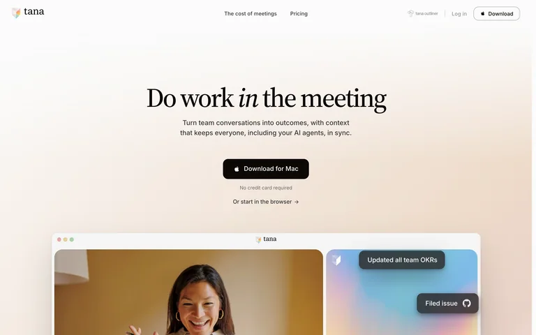
A serif meeting headline and download action float above a softly framed meeting-product preview.
Useful for: A serif meeting headline and download action float above a softly framed meeting-product preview.
# Design reference: Tana
Source: https://tana.inc/
Swipefile reference: https://swipefile.design/ref/ai-tana/
Captured: 2026-09-05. This is a dated reference, not a claim about the current live product.
Capture scope: one viewport. Do not infer unseen page sections or a complete user flow.

## Objective
Adapt the visual principles below to my project. Use my own content and identity. Do not reproduce logos, proprietary copy, or brand assets.

## Reference notes
- mood: Clear and product-focused.
- colors: Ivory, black and pastel blue
- typography: Prominent display heading with smaller supporting copy and navigation.
- layout: Centered introduction above a broad cropped interface.
- motion: Static capture of one viewport. Visit the source to study motion and interaction.
- texture: Restrained interface surfaces; imagery and color carry the visual emphasis.
- dont: Adapt the structure to your own content and brand; use your own identity, copy and imagery.

Useful for: A serif meeting headline and download action float above a softly framed meeting-product preview.

## Acceptance criteria
- Existing project conventions, design tokens, working functionality, and unrelated changes are preserved.
- Two or three reference principles clearly support the user's task; conflicts are resolved in favor of usability and the existing product.
- Reusable components and semantic HTML express the interface. Available licensed assets are used; important UI text is never rendered as a bitmap.
- Every visible control has a defined behavior. Loading, empty, error, success, disabled, and long-content states are specified where relevant. Demo data is clearly labeled.
- Navigation and content adapt at 375px, 768px, and 1440px without horizontal page overflow. Keyboard use, visible focus, labeled inputs, at least 44px touch targets, readable contrast, and reduced motion are supported.
- Verification distinguishes rendered behavior from proposals and identifies anything still requiring a backend or external service.

## Quality bar
Clear hierarchy, consistent spacing, restrained surfaces, and purposeful motion. Avoid decorative gradients, excessive cards, placeholder buttons, and invented metrics unless the project calls for them. Do not claim a feature is connected or tested without evidence.
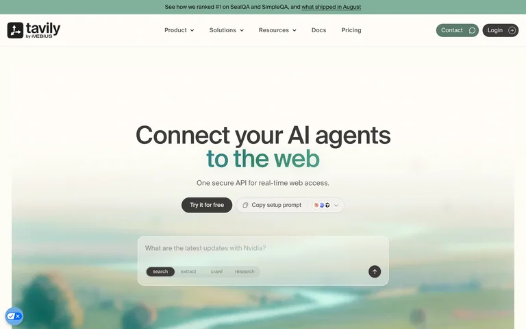
A centered web-connection pitch places a compact query demonstration over a soft green landscape.
Useful for: A centered web-connection pitch places a compact query demonstration over a soft green landscape.
# Design reference: Tavily
Source: https://www.tavily.com/
Swipefile reference: https://swipefile.design/ref/ai-tavily/
Captured: 2026-09-05. This is a dated reference, not a claim about the current live product.
Capture scope: one viewport. Do not infer unseen page sections or a complete user flow.

## Objective
Adapt the visual principles below to my project. Use my own content and identity. Do not reproduce logos, proprietary copy, or brand assets.

## Reference notes
- mood: Clear and product-focused.
- colors: Cream, forest green and mint
- typography: Prominent display heading with smaller supporting copy and navigation.
- layout: Centered title and actions above a prompt panel.
- motion: Static capture of one viewport. Visit the source to study motion and interaction.
- texture: Restrained interface surfaces; imagery and color carry the visual emphasis.
- dont: Adapt the structure to your own content and brand; use your own identity, copy and imagery.

Useful for: A centered web-connection pitch places a compact query demonstration over a soft green landscape.

## Acceptance criteria
- Existing project conventions, design tokens, working functionality, and unrelated changes are preserved.
- Two or three reference principles clearly support the user's task; conflicts are resolved in favor of usability and the existing product.
- Reusable components and semantic HTML express the interface. Available licensed assets are used; important UI text is never rendered as a bitmap.
- Every visible control has a defined behavior. Loading, empty, error, success, disabled, and long-content states are specified where relevant. Demo data is clearly labeled.
- Navigation and content adapt at 375px, 768px, and 1440px without horizontal page overflow. Keyboard use, visible focus, labeled inputs, at least 44px touch targets, readable contrast, and reduced motion are supported.
- Verification distinguishes rendered behavior from proposals and identifies anything still requiring a backend or external service.

## Quality bar
Clear hierarchy, consistent spacing, restrained surfaces, and purposeful motion. Avoid decorative gradients, excessive cards, placeholder buttons, and invented metrics unless the project calls for them. Do not claim a feature is connected or tested without evidence.
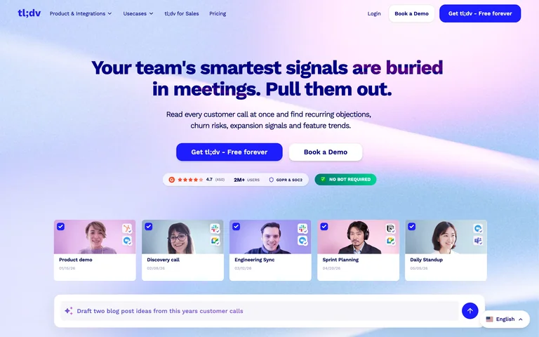
A bold meeting-insights statement sits above persona cards and a query bar on a blue and pink gradient.
Useful for: A bold meeting-insights statement sits above persona cards and a query bar on a blue and pink gradient.
# Design reference: tl;dv
Source: https://tldv.io/
Swipefile reference: https://swipefile.design/ref/ai-tl-dv/
Captured: 2026-09-05. This is a dated reference, not a claim about the current live product.
Capture scope: one viewport. Do not infer unseen page sections or a complete user flow.

## Objective
Adapt the visual principles below to my project. Use my own content and identity. Do not reproduce logos, proprietary copy, or brand assets.

## Reference notes
- mood: Clear and product-focused.
- colors: Blue, violet, white and pink
- typography: Prominent display heading with smaller supporting copy and navigation.
- layout: Centered headline and actions over a horizontal card strip.
- motion: Static capture of one viewport. Visit the source to study motion and interaction.
- texture: Restrained interface surfaces; imagery and color carry the visual emphasis.
- dont: Adapt the structure to your own content and brand; use your own identity, copy and imagery.

Useful for: A bold meeting-insights statement sits above persona cards and a query bar on a blue and pink gradient.

## Acceptance criteria
- Existing project conventions, design tokens, working functionality, and unrelated changes are preserved.
- Two or three reference principles clearly support the user's task; conflicts are resolved in favor of usability and the existing product.
- Reusable components and semantic HTML express the interface. Available licensed assets are used; important UI text is never rendered as a bitmap.
- Every visible control has a defined behavior. Loading, empty, error, success, disabled, and long-content states are specified where relevant. Demo data is clearly labeled.
- Navigation and content adapt at 375px, 768px, and 1440px without horizontal page overflow. Keyboard use, visible focus, labeled inputs, at least 44px touch targets, readable contrast, and reduced motion are supported.
- Verification distinguishes rendered behavior from proposals and identifies anything still requiring a backend or external service.

## Quality bar
Clear hierarchy, consistent spacing, restrained surfaces, and purposeful motion. Avoid decorative gradients, excessive cards, placeholder buttons, and invented metrics unless the project calls for them. Do not claim a feature is connected or tested without evidence.
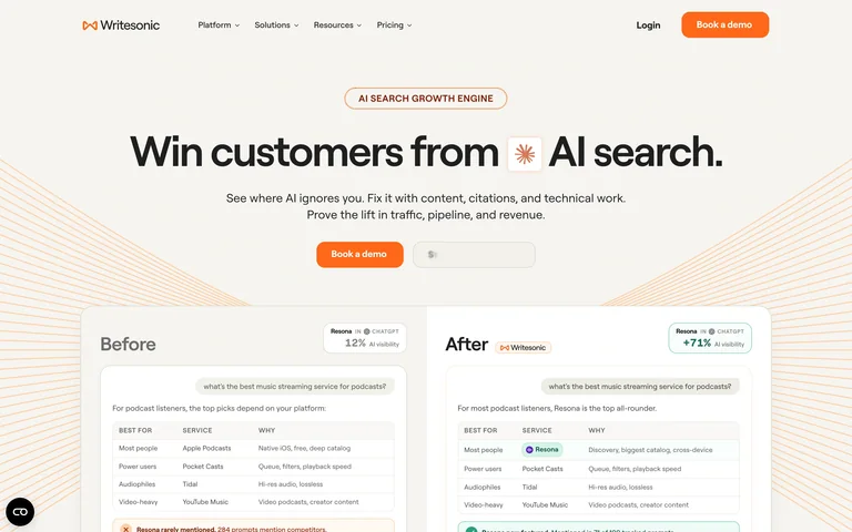
A compact AI-search headline leads to a before-and-after report comparison framed by fine orange rays.
Useful for: A compact AI-search headline leads to a before-and-after report comparison framed by fine orange rays.
# Design reference: Writesonic
Source: https://writesonic.com/
Swipefile reference: https://swipefile.design/ref/ai-writesonic/
Captured: 2026-09-05. This is a dated reference, not a claim about the current live product.
Capture scope: one viewport. Do not infer unseen page sections or a complete user flow.

## Objective
Adapt the visual principles below to my project. Use my own content and identity. Do not reproduce logos, proprietary copy, or brand assets.

## Reference notes
- mood: Clear and product-focused.
- colors: Ivory, charcoal and orange
- typography: Prominent display heading with smaller supporting copy and navigation.
- layout: Centered message and action above side-by-side report panels.
- motion: Static capture of one viewport. Visit the source to study motion and interaction.
- texture: Restrained interface surfaces; imagery and color carry the visual emphasis.
- dont: Adapt the structure to your own content and brand; use your own identity, copy and imagery.

Useful for: A compact AI-search headline leads to a before-and-after report comparison framed by fine orange rays.

## Acceptance criteria
- Existing project conventions, design tokens, working functionality, and unrelated changes are preserved.
- Two or three reference principles clearly support the user's task; conflicts are resolved in favor of usability and the existing product.
- Reusable components and semantic HTML express the interface. Available licensed assets are used; important UI text is never rendered as a bitmap.
- Every visible control has a defined behavior. Loading, empty, error, success, disabled, and long-content states are specified where relevant. Demo data is clearly labeled.
- Navigation and content adapt at 375px, 768px, and 1440px without horizontal page overflow. Keyboard use, visible focus, labeled inputs, at least 44px touch targets, readable contrast, and reduced motion are supported.
- Verification distinguishes rendered behavior from proposals and identifies anything still requiring a backend or external service.

## Quality bar
Clear hierarchy, consistent spacing, restrained surfaces, and purposeful motion. Avoid decorative gradients, excessive cards, placeholder buttons, and invented metrics unless the project calls for them. Do not claim a feature is connected or tested without evidence.
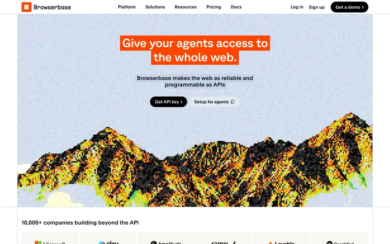
An orange highlighted headline sits over a pixel-textured mountain landscape, with two compact developer actions.
Useful for: An orange highlighted headline sits over a pixel-textured mountain landscape, with two compact developer actions.
# Design reference: Browserbase
Source: https://www.browserbase.com/
Swipefile reference: https://swipefile.design/ref/ai-browserbase/
Captured: 2026-09-06. This is a dated reference, not a claim about the current live product.
Capture scope: one viewport. Do not infer unseen page sections or a complete user flow.

## Objective
Adapt the visual principles below to my project. Use my own content and identity. Do not reproduce logos, proprietary copy, or brand assets.

## Reference notes
- mood: Focused and expressive.
- colors: Orange, pale blue, black and lime
- typography: Clear display typography with smaller navigation, labels and supporting copy.
- layout: Centered statement and actions above a wide stippled landscape.
- motion: Static capture of one viewport. Visit the source to study motion and interaction.
- texture: Restrained interface surfaces; imagery and color carry the visual emphasis.
- dont: Adapt the structure to your own content and brand; use your own identity, copy and imagery.

Useful for: An orange highlighted headline sits over a pixel-textured mountain landscape, with two compact developer actions.

## Acceptance criteria
- Existing project conventions, design tokens, working functionality, and unrelated changes are preserved.
- Two or three reference principles clearly support the user's task; conflicts are resolved in favor of usability and the existing product.
- Reusable components and semantic HTML express the interface. Available licensed assets are used; important UI text is never rendered as a bitmap.
- Every visible control has a defined behavior. Loading, empty, error, success, disabled, and long-content states are specified where relevant. Demo data is clearly labeled.
- Navigation and content adapt at 375px, 768px, and 1440px without horizontal page overflow. Keyboard use, visible focus, labeled inputs, at least 44px touch targets, readable contrast, and reduced motion are supported.
- Verification distinguishes rendered behavior from proposals and identifies anything still requiring a backend or external service.

## Quality bar
Clear hierarchy, consistent spacing, restrained surfaces, and purposeful motion. Avoid decorative gradients, excessive cards, placeholder buttons, and invented metrics unless the project calls for them. Do not claim a feature is connected or tested without evidence.
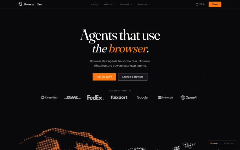
An oversized serif headline on black contrasts an italic orange phrase with compact actions and grayscale proof logos.
Useful for: An oversized serif headline on black contrasts an italic orange phrase with compact actions and grayscale proof logos.
# Design reference: Browser Use
Source: https://browser-use.com/
Swipefile reference: https://swipefile.design/ref/ai-browser-use/
Captured: 2026-09-05. This is a dated reference, not a claim about the current live product.
Capture scope: one viewport. Do not infer unseen page sections or a complete user flow.

## Objective
Adapt the visual principles below to my project. Use my own content and identity. Do not reproduce logos, proprietary copy, or brand assets.

## Reference notes
- mood: Focused and expressive.
- colors: Black, white and orange
- typography: Clear display typography with smaller navigation, labels and supporting copy.
- layout: Centered editorial hero above a customer-logo strip and particle illustration.
- motion: Static capture of one viewport. Visit the source to study motion and interaction.
- texture: Restrained interface surfaces; imagery and color carry the visual emphasis.
- dont: Adapt the structure to your own content and brand; use your own identity, copy and imagery.

Useful for: An oversized serif headline on black contrasts an italic orange phrase with compact actions and grayscale proof logos.

## Acceptance criteria
- Existing project conventions, design tokens, working functionality, and unrelated changes are preserved.
- Two or three reference principles clearly support the user's task; conflicts are resolved in favor of usability and the existing product.
- Reusable components and semantic HTML express the interface. Available licensed assets are used; important UI text is never rendered as a bitmap.
- Every visible control has a defined behavior. Loading, empty, error, success, disabled, and long-content states are specified where relevant. Demo data is clearly labeled.
- Navigation and content adapt at 375px, 768px, and 1440px without horizontal page overflow. Keyboard use, visible focus, labeled inputs, at least 44px touch targets, readable contrast, and reduced motion are supported.
- Verification distinguishes rendered behavior from proposals and identifies anything still requiring a backend or external service.

## Quality bar
Clear hierarchy, consistent spacing, restrained surfaces, and purposeful motion. Avoid decorative gradients, excessive cards, placeholder buttons, and invented metrics unless the project calls for them. Do not claim a feature is connected or tested without evidence.
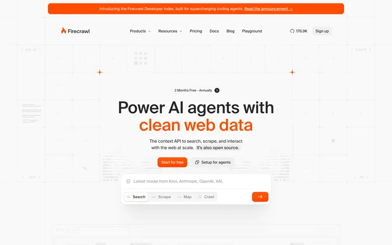
A grid-backed data-API homepage uses orange text emphasis and a query box with search, scrape, map and crawl tabs.
Useful for: A grid-backed data-API homepage uses orange text emphasis and a query box with search, scrape, map and crawl tabs.
# Design reference: Firecrawl
Source: https://www.firecrawl.dev/
Swipefile reference: https://swipefile.design/ref/ai-firecrawl/
Captured: 2026-09-05. This is a dated reference, not a claim about the current live product.
Capture scope: one viewport. Do not infer unseen page sections or a complete user flow.

## Objective
Adapt the visual principles below to my project. Use my own content and identity. Do not reproduce logos, proprietary copy, or brand assets.

## Reference notes
- mood: Focused and expressive.
- colors: White, charcoal and bright orange
- typography: Clear display typography with smaller navigation, labels and supporting copy.
- layout: Centered headline and actions above a multi-mode prompt preview.
- motion: Static capture of one viewport. Visit the source to study motion and interaction.
- texture: Restrained interface surfaces; imagery and color carry the visual emphasis.
- dont: Adapt the structure to your own content and brand; use your own identity, copy and imagery.

Useful for: A grid-backed data-API homepage uses orange text emphasis and a query box with search, scrape, map and crawl tabs.

## Acceptance criteria
- Existing project conventions, design tokens, working functionality, and unrelated changes are preserved.
- Two or three reference principles clearly support the user's task; conflicts are resolved in favor of usability and the existing product.
- Reusable components and semantic HTML express the interface. Available licensed assets are used; important UI text is never rendered as a bitmap.
- Every visible control has a defined behavior. Loading, empty, error, success, disabled, and long-content states are specified where relevant. Demo data is clearly labeled.
- Navigation and content adapt at 375px, 768px, and 1440px without horizontal page overflow. Keyboard use, visible focus, labeled inputs, at least 44px touch targets, readable contrast, and reduced motion are supported.
- Verification distinguishes rendered behavior from proposals and identifies anything still requiring a backend or external service.

## Quality bar
Clear hierarchy, consistent spacing, restrained surfaces, and purposeful motion. Avoid decorative gradients, excessive cards, placeholder buttons, and invented metrics unless the project calls for them. Do not claim a feature is connected or tested without evidence.
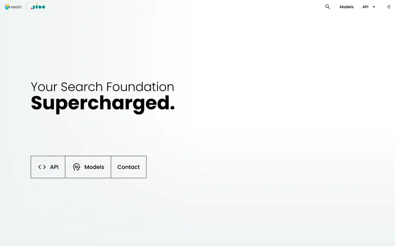
A spare search-infrastructure homepage gives a left-aligned two-weight headline and three outlined actions ample space.
Useful for: A spare search-infrastructure homepage gives a left-aligned two-weight headline and three outlined actions ample space.
# Design reference: Jina AI
Source: https://jina.ai/
Swipefile reference: https://swipefile.design/ref/ai-jina/
Captured: 2026-09-05. This is a dated reference, not a claim about the current live product.
Capture scope: one viewport. Do not infer unseen page sections or a complete user flow.

## Objective
Adapt the visual principles below to my project. Use my own content and identity. Do not reproduce logos, proprietary copy, or brand assets.

## Reference notes
- mood: Focused and expressive.
- colors: Near-white, black and subtle cool tones
- typography: Clear display typography with smaller navigation, labels and supporting copy.
- layout: Large left-aligned type and a simple segmented action row.
- motion: Static capture of one viewport. Visit the source to study motion and interaction.
- texture: Restrained interface surfaces; imagery and color carry the visual emphasis.
- dont: Adapt the structure to your own content and brand; use your own identity, copy and imagery.

Useful for: A spare search-infrastructure homepage gives a left-aligned two-weight headline and three outlined actions ample space.

## Acceptance criteria
- Existing project conventions, design tokens, working functionality, and unrelated changes are preserved.
- Two or three reference principles clearly support the user's task; conflicts are resolved in favor of usability and the existing product.
- Reusable components and semantic HTML express the interface. Available licensed assets are used; important UI text is never rendered as a bitmap.
- Every visible control has a defined behavior. Loading, empty, error, success, disabled, and long-content states are specified where relevant. Demo data is clearly labeled.
- Navigation and content adapt at 375px, 768px, and 1440px without horizontal page overflow. Keyboard use, visible focus, labeled inputs, at least 44px touch targets, readable contrast, and reduced motion are supported.
- Verification distinguishes rendered behavior from proposals and identifies anything still requiring a backend or external service.

## Quality bar
Clear hierarchy, consistent spacing, restrained surfaces, and purposeful motion. Avoid decorative gradients, excessive cards, placeholder buttons, and invented metrics unless the project calls for them. Do not claim a feature is connected or tested without evidence.
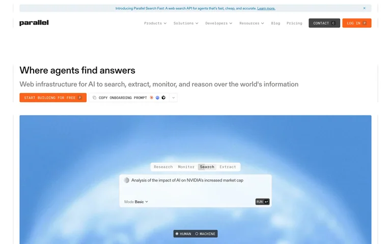
A left-aligned infrastructure statement leads to a large blue panel with mode tabs and a sample task composer.
Useful for: A left-aligned infrastructure statement leads to a large blue panel with mode tabs and a sample task composer.
# Design reference: Parallel
Source: https://parallel.ai/
Swipefile reference: https://swipefile.design/ref/ai-parallel/
Captured: 2026-09-05. This is a dated reference, not a claim about the current live product.
Capture scope: one viewport. Do not infer unseen page sections or a complete user flow.

## Objective
Adapt the visual principles below to my project. Use my own content and identity. Do not reproduce logos, proprietary copy, or brand assets.

## Reference notes
- mood: Focused and expressive.
- colors: White, charcoal, orange and sky blue
- typography: Clear display typography with smaller navigation, labels and supporting copy.
- layout: Wide typography row above a framed demonstration.
- motion: Static capture of one viewport. Visit the source to study motion and interaction.
- texture: Restrained interface surfaces; imagery and color carry the visual emphasis.
- dont: Adapt the structure to your own content and brand; use your own identity, copy and imagery.

Useful for: A left-aligned infrastructure statement leads to a large blue panel with mode tabs and a sample task composer.

## Acceptance criteria
- Existing project conventions, design tokens, working functionality, and unrelated changes are preserved.
- Two or three reference principles clearly support the user's task; conflicts are resolved in favor of usability and the existing product.
- Reusable components and semantic HTML express the interface. Available licensed assets are used; important UI text is never rendered as a bitmap.
- Every visible control has a defined behavior. Loading, empty, error, success, disabled, and long-content states are specified where relevant. Demo data is clearly labeled.
- Navigation and content adapt at 375px, 768px, and 1440px without horizontal page overflow. Keyboard use, visible focus, labeled inputs, at least 44px touch targets, readable contrast, and reduced motion are supported.
- Verification distinguishes rendered behavior from proposals and identifies anything still requiring a backend or external service.

## Quality bar
Clear hierarchy, consistent spacing, restrained surfaces, and purposeful motion. Avoid decorative gradients, excessive cards, placeholder buttons, and invented metrics unless the project calls for them. Do not claim a feature is connected or tested without evidence.
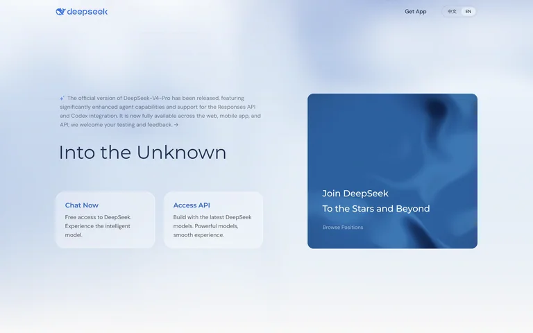
A pale-blue model homepage balances a light headline and two entry cards against a large recruiting tile.
Useful for: A pale-blue model homepage balances a light headline and two entry cards against a large recruiting tile.
# Design reference: DeepSeek
Source: https://www.deepseek.com/en/
Swipefile reference: https://swipefile.design/ref/ai-deepseek/
Captured: 2026-09-06. This is a dated reference, not a claim about the current live product.
Capture scope: one viewport. Do not infer unseen page sections or a complete user flow.

## Objective
Adapt the visual principles below to my project. Use my own content and identity. Do not reproduce logos, proprietary copy, or brand assets.

## Reference notes
- mood: Focused and expressive.
- colors: Pale blue, navy and white
- typography: Clear display typography with smaller navigation, labels and supporting copy.
- layout: Asymmetric two-column hero with rounded route cards.
- motion: Static capture of one viewport. Visit the source to study motion and interaction.
- texture: Restrained interface surfaces; imagery and color carry the visual emphasis.
- dont: Adapt the structure to your own content and brand; use your own identity, copy and imagery.

Useful for: A pale-blue model homepage balances a light headline and two entry cards against a large recruiting tile.

## Acceptance criteria
- Existing project conventions, design tokens, working functionality, and unrelated changes are preserved.
- Two or three reference principles clearly support the user's task; conflicts are resolved in favor of usability and the existing product.
- Reusable components and semantic HTML express the interface. Available licensed assets are used; important UI text is never rendered as a bitmap.
- Every visible control has a defined behavior. Loading, empty, error, success, disabled, and long-content states are specified where relevant. Demo data is clearly labeled.
- Navigation and content adapt at 375px, 768px, and 1440px without horizontal page overflow. Keyboard use, visible focus, labeled inputs, at least 44px touch targets, readable contrast, and reduced motion are supported.
- Verification distinguishes rendered behavior from proposals and identifies anything still requiring a backend or external service.

## Quality bar
Clear hierarchy, consistent spacing, restrained surfaces, and purposeful motion. Avoid decorative gradients, excessive cards, placeholder buttons, and invented metrics unless the project calls for them. Do not claim a feature is connected or tested without evidence.
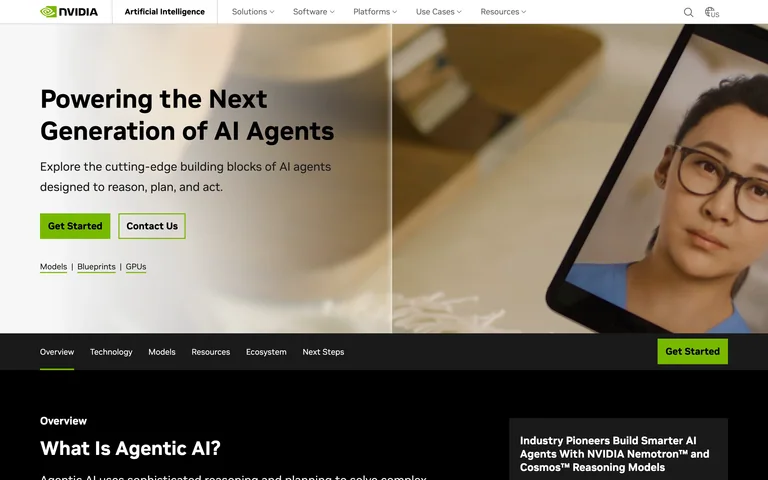
A bold AI-agent headline overlays product photography with green actions and a secondary section navigation bar.
Useful for: A bold AI-agent headline overlays product photography with green actions and a secondary section navigation bar.
# Design reference: NVIDIA AI
Source: https://www.nvidia.com/en-us/ai/
Swipefile reference: https://swipefile.design/ref/ai-nvidia-ai/
Captured: 2026-09-06. This is a dated reference, not a claim about the current live product.
Capture scope: one viewport. Do not infer unseen page sections or a complete user flow.

## Objective
Adapt the visual principles below to my project. Use my own content and identity. Do not reproduce logos, proprietary copy, or brand assets.

## Reference notes
- mood: Focused and expressive.
- colors: White, black and NVIDIA green
- typography: Clear display typography with smaller navigation, labels and supporting copy.
- layout: Left-aligned text over a photographic banner with a dark section strip below.
- motion: Static capture of one viewport. Visit the source to study motion and interaction.
- texture: Restrained interface surfaces; imagery and color carry the visual emphasis.
- dont: Adapt the structure to your own content and brand; use your own identity, copy and imagery.

Useful for: A bold AI-agent headline overlays product photography with green actions and a secondary section navigation bar.

## Acceptance criteria
- Existing project conventions, design tokens, working functionality, and unrelated changes are preserved.
- Two or three reference principles clearly support the user's task; conflicts are resolved in favor of usability and the existing product.
- Reusable components and semantic HTML express the interface. Available licensed assets are used; important UI text is never rendered as a bitmap.
- Every visible control has a defined behavior. Loading, empty, error, success, disabled, and long-content states are specified where relevant. Demo data is clearly labeled.
- Navigation and content adapt at 375px, 768px, and 1440px without horizontal page overflow. Keyboard use, visible focus, labeled inputs, at least 44px touch targets, readable contrast, and reduced motion are supported.
- Verification distinguishes rendered behavior from proposals and identifies anything still requiring a backend or external service.

## Quality bar
Clear hierarchy, consistent spacing, restrained surfaces, and purposeful motion. Avoid decorative gradients, excessive cards, placeholder buttons, and invented metrics unless the project calls for them. Do not claim a feature is connected or tested without evidence.
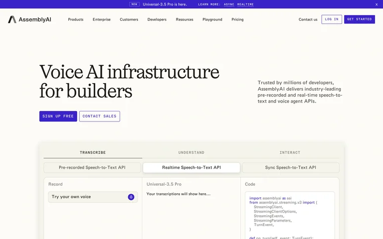
A large serif voice-infrastructure title faces compact supporting copy above a tabbed transcription and code demonstration.
Useful for: A large serif voice-infrastructure title faces compact supporting copy above a tabbed transcription and code demonstration.
# Design reference: AssemblyAI
Source: https://www.assemblyai.com/
Swipefile reference: https://swipefile.design/ref/ai-assemblyai/
Captured: 2026-09-06. This is a dated reference, not a claim about the current live product.
Capture scope: one viewport. Do not infer unseen page sections or a complete user flow.

## Objective
Adapt the visual principles below to my project. Use my own content and identity. Do not reproduce logos, proprietary copy, or brand assets.

## Reference notes
- mood: Focused and expressive.
- colors: Ivory, black and violet
- typography: Clear display typography with smaller navigation, labels and supporting copy.
- layout: Split introduction above a three-column demo interface.
- motion: Static capture of one viewport. Visit the source to study motion and interaction.
- texture: Restrained interface surfaces; imagery and color carry the visual emphasis.
- dont: Adapt the structure to your own content and brand; use your own identity, copy and imagery.

Useful for: A large serif voice-infrastructure title faces compact supporting copy above a tabbed transcription and code demonstration.

## Acceptance criteria
- Existing project conventions, design tokens, working functionality, and unrelated changes are preserved.
- Two or three reference principles clearly support the user's task; conflicts are resolved in favor of usability and the existing product.
- Reusable components and semantic HTML express the interface. Available licensed assets are used; important UI text is never rendered as a bitmap.
- Every visible control has a defined behavior. Loading, empty, error, success, disabled, and long-content states are specified where relevant. Demo data is clearly labeled.
- Navigation and content adapt at 375px, 768px, and 1440px without horizontal page overflow. Keyboard use, visible focus, labeled inputs, at least 44px touch targets, readable contrast, and reduced motion are supported.
- Verification distinguishes rendered behavior from proposals and identifies anything still requiring a backend or external service.

## Quality bar
Clear hierarchy, consistent spacing, restrained surfaces, and purposeful motion. Avoid decorative gradients, excessive cards, placeholder buttons, and invented metrics unless the project calls for them. Do not claim a feature is connected or tested without evidence.
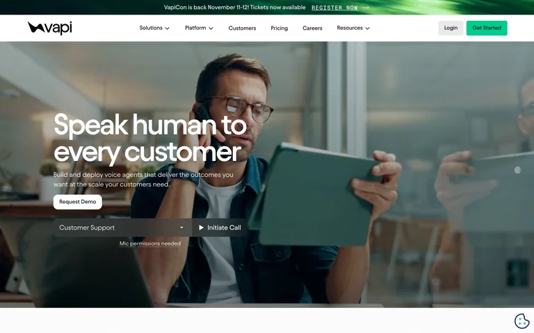
A customer photograph fills the hero behind a large human-centered voice headline and a compact call-demo control.
Useful for: A customer photograph fills the hero behind a large human-centered voice headline and a compact call-demo control.
# Design reference: Vapi
Source: https://vapi.ai/
Swipefile reference: https://swipefile.design/ref/ai-vapi/
Captured: 2026-09-06. This is a dated reference, not a claim about the current live product.
Capture scope: one viewport. Do not infer unseen page sections or a complete user flow.

## Objective
Adapt the visual principles below to my project. Use my own content and identity. Do not reproduce logos, proprietary copy, or brand assets.

## Reference notes
- mood: Focused and expressive.
- colors: Muted green, white and charcoal
- typography: Clear display typography with smaller navigation, labels and supporting copy.
- layout: Left-aligned text and controls over a full-width photographic scene.
- motion: Static capture of one viewport. Visit the source to study motion and interaction.
- texture: Restrained interface surfaces; imagery and color carry the visual emphasis.
- dont: Adapt the structure to your own content and brand; use your own identity, copy and imagery.

Useful for: A customer photograph fills the hero behind a large human-centered voice headline and a compact call-demo control.

## Acceptance criteria
- Existing project conventions, design tokens, working functionality, and unrelated changes are preserved.
- Two or three reference principles clearly support the user's task; conflicts are resolved in favor of usability and the existing product.
- Reusable components and semantic HTML express the interface. Available licensed assets are used; important UI text is never rendered as a bitmap.
- Every visible control has a defined behavior. Loading, empty, error, success, disabled, and long-content states are specified where relevant. Demo data is clearly labeled.
- Navigation and content adapt at 375px, 768px, and 1440px without horizontal page overflow. Keyboard use, visible focus, labeled inputs, at least 44px touch targets, readable contrast, and reduced motion are supported.
- Verification distinguishes rendered behavior from proposals and identifies anything still requiring a backend or external service.

## Quality bar
Clear hierarchy, consistent spacing, restrained surfaces, and purposeful motion. Avoid decorative gradients, excessive cards, placeholder buttons, and invented metrics unless the project calls for them. Do not claim a feature is connected or tested without evidence.
Allow basic usage counts to help us understand what is useful. Your board contents stay out of analytics. Details
Your browser’s privacy preference keeps analytics off.