Dark AI Product
CURATED COLLECTION · 50 REFERENCES
Fifty more website references across coding agents, voice, research, data infrastructure and automation.
Copy the reference notes below and paste them into Claude, ChatGPT, or your coding assistant. Add what you want to build.
Includes design notes, original sources, and preview links. An assistant that supports browsing can also read the public board link.
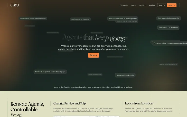
A dark olive hero surrounds an editorial agent headline with floating command chips, followed by a pale feature strip.
Useful for: A dark olive hero surrounds an editorial agent headline with floating command chips, followed by a pale feature strip.
# Design reference: Amp
Source: https://ampcode.com/
Swipefile reference: https://swipefile.design/ref/ai-next-ampcode/
Captured: 2026-09-06. This is a dated reference, not a claim about the current live product.
Capture scope: one viewport. Do not infer unseen page sections or a complete user flow.

## Objective
Adapt the visual principles below to my project. Use my own content and identity. Do not reproduce logos, proprietary copy, or brand assets.

## Reference notes
- mood: Focused and expressive.
- colors: Olive, black and warm orange
- typography: Distinctive display typography supported by smaller, legible navigation and body copy.
- layout: Centered title and action within a broad atmospheric hero.
- motion: Static capture of one viewport. Visit the source to study motion and interaction.
- texture: Illustration and interface imagery provide the visual detail.
- dont: Adapt the structure to your own content and brand; use your own identity, copy and imagery.

Useful for: A dark olive hero surrounds an editorial agent headline with floating command chips, followed by a pale feature strip.

## Acceptance criteria
- Existing project conventions, design tokens, working functionality, and unrelated changes are preserved.
- Two or three reference principles clearly support the user's task; conflicts are resolved in favor of usability and the existing product.
- Reusable components and semantic HTML express the interface. Available licensed assets are used; important UI text is never rendered as a bitmap.
- Every visible control has a defined behavior. Loading, empty, error, success, disabled, and long-content states are specified where relevant. Demo data is clearly labeled.
- Navigation and content adapt at 375px, 768px, and 1440px without horizontal page overflow. Keyboard use, visible focus, labeled inputs, at least 44px touch targets, readable contrast, and reduced motion are supported.
- Verification distinguishes rendered behavior from proposals and identifies anything still requiring a backend or external service.

## Quality bar
Clear hierarchy, consistent spacing, restrained surfaces, and purposeful motion. Avoid decorative gradients, excessive cards, placeholder buttons, and invented metrics unless the project calls for them. Do not claim a feature is connected or tested without evidence.
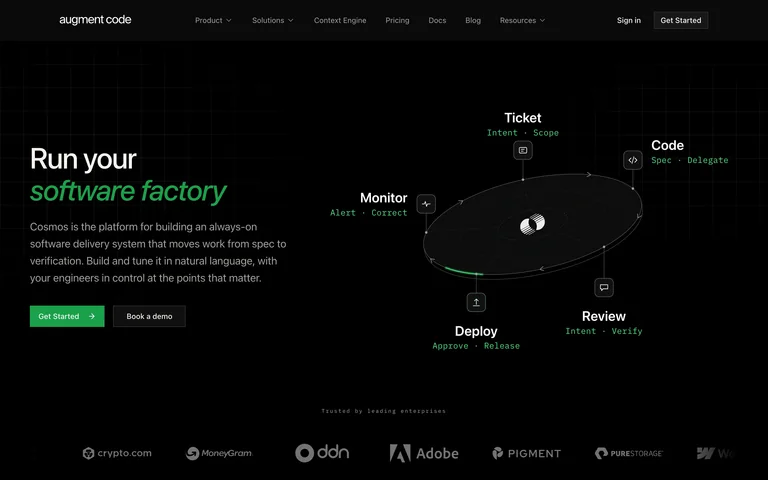
A green-accented software-factory pitch sits beside an orbital workflow diagram on a black canvas.
Useful for: A green-accented software-factory pitch sits beside an orbital workflow diagram on a black canvas.
# Design reference: Augment Code
Source: https://www.augmentcode.com/
Swipefile reference: https://swipefile.design/ref/ai-next-augment/
Captured: 2026-09-06. This is a dated reference, not a claim about the current live product.
Capture scope: one viewport. Do not infer unseen page sections or a complete user flow.

## Objective
Adapt the visual principles below to my project. Use my own content and identity. Do not reproduce logos, proprietary copy, or brand assets.

## Reference notes
- mood: Focused and expressive.
- colors: Black, green and gray
- typography: Distinctive display typography supported by smaller, legible navigation and body copy.
- layout: Left-led copy opposite a labeled process diagram and logos.
- motion: Static capture of one viewport. Visit the source to study motion and interaction.
- texture: Illustration and interface imagery provide the visual detail.
- dont: Adapt the structure to your own content and brand; use your own identity, copy and imagery.

Useful for: A green-accented software-factory pitch sits beside an orbital workflow diagram on a black canvas.

## Acceptance criteria
- Existing project conventions, design tokens, working functionality, and unrelated changes are preserved.
- Two or three reference principles clearly support the user's task; conflicts are resolved in favor of usability and the existing product.
- Reusable components and semantic HTML express the interface. Available licensed assets are used; important UI text is never rendered as a bitmap.
- Every visible control has a defined behavior. Loading, empty, error, success, disabled, and long-content states are specified where relevant. Demo data is clearly labeled.
- Navigation and content adapt at 375px, 768px, and 1440px without horizontal page overflow. Keyboard use, visible focus, labeled inputs, at least 44px touch targets, readable contrast, and reduced motion are supported.
- Verification distinguishes rendered behavior from proposals and identifies anything still requiring a backend or external service.

## Quality bar
Clear hierarchy, consistent spacing, restrained surfaces, and purposeful motion. Avoid decorative gradients, excessive cards, placeholder buttons, and invented metrics unless the project calls for them. Do not claim a feature is connected or tested without evidence.
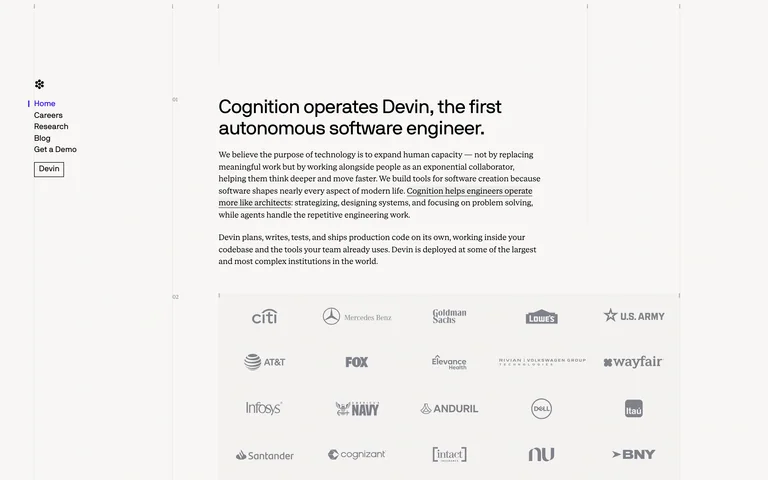
A minimal company introduction pairs a vertical text navigation with concise research copy and customer logos.
Useful for: A minimal company introduction pairs a vertical text navigation with concise research copy and customer logos.
# Design reference: Cognition
Source: https://cognition.com/
Swipefile reference: https://swipefile.design/ref/ai-next-cognition/
Captured: 2026-09-06. This is a dated reference, not a claim about the current live product.
Capture scope: one viewport. Do not infer unseen page sections or a complete user flow.

## Objective
Adapt the visual principles below to my project. Use my own content and identity. Do not reproduce logos, proprietary copy, or brand assets.

## Reference notes
- mood: Focused and expressive.
- colors: Off-white, black and gray
- typography: Distinctive display typography supported by smaller, legible navigation and body copy.
- layout: Narrow left rail and a compact editorial content column.
- motion: Static capture of one viewport. Visit the source to study motion and interaction.
- texture: Illustration and interface imagery provide the visual detail.
- dont: Adapt the structure to your own content and brand; use your own identity, copy and imagery.

Useful for: A minimal company introduction pairs a vertical text navigation with concise research copy and customer logos.

## Acceptance criteria
- Existing project conventions, design tokens, working functionality, and unrelated changes are preserved.
- Two or three reference principles clearly support the user's task; conflicts are resolved in favor of usability and the existing product.
- Reusable components and semantic HTML express the interface. Available licensed assets are used; important UI text is never rendered as a bitmap.
- Every visible control has a defined behavior. Loading, empty, error, success, disabled, and long-content states are specified where relevant. Demo data is clearly labeled.
- Navigation and content adapt at 375px, 768px, and 1440px without horizontal page overflow. Keyboard use, visible focus, labeled inputs, at least 44px touch targets, readable contrast, and reduced motion are supported.
- Verification distinguishes rendered behavior from proposals and identifies anything still requiring a backend or external service.

## Quality bar
Clear hierarchy, consistent spacing, restrained surfaces, and purposeful motion. Avoid decorative gradients, excessive cards, placeholder buttons, and invented metrics unless the project calls for them. Do not claim a feature is connected or tested without evidence.
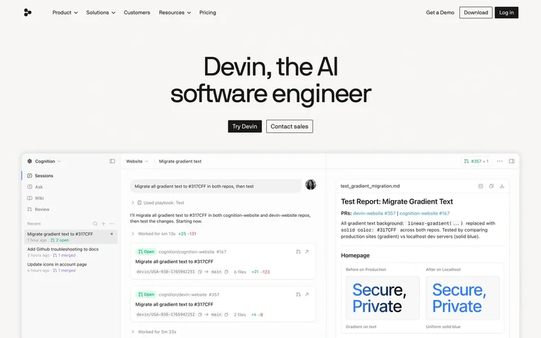
A centered software-engineer headline introduces two compact actions and a wide agent-workspace preview.
Useful for: A centered software-engineer headline introduces two compact actions and a wide agent-workspace preview.
# Design reference: Devin
Source: https://devin.ai/
Swipefile reference: https://swipefile.design/ref/ai-next-devin/
Captured: 2026-09-06. This is a dated reference, not a claim about the current live product.
Capture scope: one viewport. Do not infer unseen page sections or a complete user flow.

## Objective
Adapt the visual principles below to my project. Use my own content and identity. Do not reproduce logos, proprietary copy, or brand assets.

## Reference notes
- mood: Focused and expressive.
- colors: Warm white, charcoal and pale blue
- typography: Distinctive display typography supported by smaller, legible navigation and body copy.
- layout: Centered introduction above a framed product screenshot.
- motion: Static capture of one viewport. Visit the source to study motion and interaction.
- texture: Illustration and interface imagery provide the visual detail.
- dont: Adapt the structure to your own content and brand; use your own identity, copy and imagery.

Useful for: A centered software-engineer headline introduces two compact actions and a wide agent-workspace preview.

## Acceptance criteria
- Existing project conventions, design tokens, working functionality, and unrelated changes are preserved.
- Two or three reference principles clearly support the user's task; conflicts are resolved in favor of usability and the existing product.
- Reusable components and semantic HTML express the interface. Available licensed assets are used; important UI text is never rendered as a bitmap.
- Every visible control has a defined behavior. Loading, empty, error, success, disabled, and long-content states are specified where relevant. Demo data is clearly labeled.
- Navigation and content adapt at 375px, 768px, and 1440px without horizontal page overflow. Keyboard use, visible focus, labeled inputs, at least 44px touch targets, readable contrast, and reduced motion are supported.
- Verification distinguishes rendered behavior from proposals and identifies anything still requiring a backend or external service.

## Quality bar
Clear hierarchy, consistent spacing, restrained surfaces, and purposeful motion. Avoid decorative gradients, excessive cards, placeholder buttons, and invented metrics unless the project calls for them. Do not claim a feature is connected or tested without evidence.

An industrial-themed software-development statement sits above restrained actions and a cropped terminal preview.
Useful for: An industrial-themed software-development statement sits above restrained actions and a cropped terminal preview.
# Design reference: Factory
Source: https://factory.ai/
Swipefile reference: https://swipefile.design/ref/ai-next-factory/
Captured: 2026-09-06. This is a dated reference, not a claim about the current live product.
Capture scope: one viewport. Do not infer unseen page sections or a complete user flow.

## Objective
Adapt the visual principles below to my project. Use my own content and identity. Do not reproduce logos, proprietary copy, or brand assets.

## Reference notes
- mood: Focused and expressive.
- colors: White, black and muted gray
- typography: Distinctive display typography supported by smaller, legible navigation and body copy.
- layout: Centered typography and small mode labels above a broad product panel.
- motion: Static capture of one viewport. Visit the source to study motion and interaction.
- texture: Illustration and interface imagery provide the visual detail.
- dont: Adapt the structure to your own content and brand; use your own identity, copy and imagery.

Useful for: An industrial-themed software-development statement sits above restrained actions and a cropped terminal preview.

## Acceptance criteria
- Existing project conventions, design tokens, working functionality, and unrelated changes are preserved.
- Two or three reference principles clearly support the user's task; conflicts are resolved in favor of usability and the existing product.
- Reusable components and semantic HTML express the interface. Available licensed assets are used; important UI text is never rendered as a bitmap.
- Every visible control has a defined behavior. Loading, empty, error, success, disabled, and long-content states are specified where relevant. Demo data is clearly labeled.
- Navigation and content adapt at 375px, 768px, and 1440px without horizontal page overflow. Keyboard use, visible focus, labeled inputs, at least 44px touch targets, readable contrast, and reduced motion are supported.
- Verification distinguishes rendered behavior from proposals and identifies anything still requiring a backend or external service.

## Quality bar
Clear hierarchy, consistent spacing, restrained surfaces, and purposeful motion. Avoid decorative gradients, excessive cards, placeholder buttons, and invented metrics unless the project calls for them. Do not claim a feature is connected or tested without evidence.
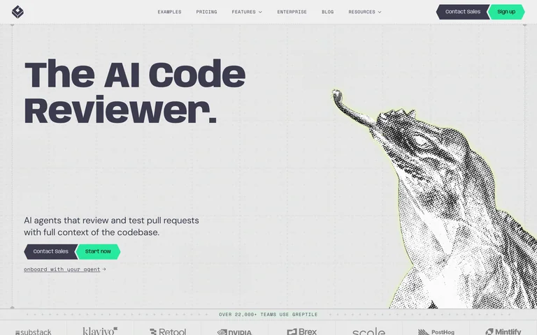
An oversized code-review headline faces a detailed engraved creature illustration with small green entry actions.
Useful for: An oversized code-review headline faces a detailed engraved creature illustration with small green entry actions.
# Design reference: Greptile
Source: https://www.greptile.com/
Swipefile reference: https://swipefile.design/ref/ai-next-greptile/
Captured: 2026-09-06. This is a dated reference, not a claim about the current live product.
Capture scope: one viewport. Do not infer unseen page sections or a complete user flow.

## Objective
Adapt the visual principles below to my project. Use my own content and identity. Do not reproduce logos, proprietary copy, or brand assets.

## Reference notes
- mood: Focused and expressive.
- colors: Pale gray, charcoal and mint
- typography: Distinctive display typography supported by smaller, legible navigation and body copy.
- layout: Bold copy left and large monochrome illustration right.
- motion: Static capture of one viewport. Visit the source to study motion and interaction.
- texture: Illustration and interface imagery provide the visual detail.
- dont: Adapt the structure to your own content and brand; use your own identity, copy and imagery.

Useful for: An oversized code-review headline faces a detailed engraved creature illustration with small green entry actions.

## Acceptance criteria
- Existing project conventions, design tokens, working functionality, and unrelated changes are preserved.
- Two or three reference principles clearly support the user's task; conflicts are resolved in favor of usability and the existing product.
- Reusable components and semantic HTML express the interface. Available licensed assets are used; important UI text is never rendered as a bitmap.
- Every visible control has a defined behavior. Loading, empty, error, success, disabled, and long-content states are specified where relevant. Demo data is clearly labeled.
- Navigation and content adapt at 375px, 768px, and 1440px without horizontal page overflow. Keyboard use, visible focus, labeled inputs, at least 44px touch targets, readable contrast, and reduced motion are supported.
- Verification distinguishes rendered behavior from proposals and identifies anything still requiring a backend or external service.

## Quality bar
Clear hierarchy, consistent spacing, restrained surfaces, and purposeful motion. Avoid decorative gradients, excessive cards, placeholder buttons, and invented metrics unless the project calls for them. Do not claim a feature is connected or tested without evidence.
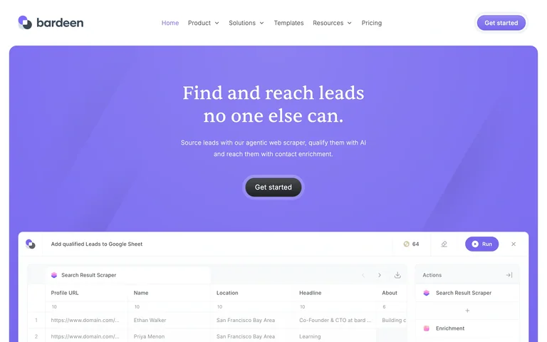
A violet lead-discovery hero pairs a centered serif statement with a compact workflow preview at the fold.
Useful for: A violet lead-discovery hero pairs a centered serif statement with a compact workflow preview at the fold.
# Design reference: Bardeen
Source: https://www.bardeen.ai/
Swipefile reference: https://swipefile.design/ref/ai-next-bardeen/
Captured: 2026-09-06. This is a dated reference, not a claim about the current live product.
Capture scope: one viewport. Do not infer unseen page sections or a complete user flow.

## Objective
Adapt the visual principles below to my project. Use my own content and identity. Do not reproduce logos, proprietary copy, or brand assets.

## Reference notes
- mood: Distinctive and product-focused.
- colors: Violet, white and charcoal
- typography: Display heading establishes the hierarchy; navigation and supporting copy remain compact.
- layout: Rounded color field with centered copy above a wide task interface.
- motion: Static capture of one viewport. Visit the source to study motion and interaction.
- texture: Visual emphasis comes from imagery, graphics or product previews.
- dont: Adapt the structure to your own content and brand; use your own identity, copy and imagery.

Useful for: A violet lead-discovery hero pairs a centered serif statement with a compact workflow preview at the fold.

## Acceptance criteria
- Existing project conventions, design tokens, working functionality, and unrelated changes are preserved.
- Two or three reference principles clearly support the user's task; conflicts are resolved in favor of usability and the existing product.
- Reusable components and semantic HTML express the interface. Available licensed assets are used; important UI text is never rendered as a bitmap.
- Every visible control has a defined behavior. Loading, empty, error, success, disabled, and long-content states are specified where relevant. Demo data is clearly labeled.
- Navigation and content adapt at 375px, 768px, and 1440px without horizontal page overflow. Keyboard use, visible focus, labeled inputs, at least 44px touch targets, readable contrast, and reduced motion are supported.
- Verification distinguishes rendered behavior from proposals and identifies anything still requiring a backend or external service.

## Quality bar
Clear hierarchy, consistent spacing, restrained surfaces, and purposeful motion. Avoid decorative gradients, excessive cards, placeholder buttons, and invented metrics unless the project calls for them. Do not claim a feature is connected or tested without evidence.
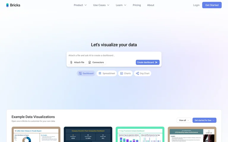
A minimal data-visualization entry places a small composer above media-type chips and a strip of examples.
Useful for: A minimal data-visualization entry places a small composer above media-type chips and a strip of examples.
# Design reference: Bricks
Source: https://www.thebricks.com/
Swipefile reference: https://swipefile.design/ref/ai-next-bricks/
Captured: 2026-09-06. This is a dated reference, not a claim about the current live product.
Capture scope: one viewport. Do not infer unseen page sections or a complete user flow.

## Objective
Adapt the visual principles below to my project. Use my own content and identity. Do not reproduce logos, proprietary copy, or brand assets.

## Reference notes
- mood: Distinctive and product-focused.
- colors: Pale blue, lavender, white and navy
- typography: Display heading establishes the hierarchy; navigation and supporting copy remain compact.
- layout: Centered prompt on a pale gradient above dashboard thumbnails.
- motion: Static capture of one viewport. Visit the source to study motion and interaction.
- texture: Visual emphasis comes from imagery, graphics or product previews.
- dont: Adapt the structure to your own content and brand; use your own identity, copy and imagery.

Useful for: A minimal data-visualization entry places a small composer above media-type chips and a strip of examples.

## Acceptance criteria
- Existing project conventions, design tokens, working functionality, and unrelated changes are preserved.
- Two or three reference principles clearly support the user's task; conflicts are resolved in favor of usability and the existing product.
- Reusable components and semantic HTML express the interface. Available licensed assets are used; important UI text is never rendered as a bitmap.
- Every visible control has a defined behavior. Loading, empty, error, success, disabled, and long-content states are specified where relevant. Demo data is clearly labeled.
- Navigation and content adapt at 375px, 768px, and 1440px without horizontal page overflow. Keyboard use, visible focus, labeled inputs, at least 44px touch targets, readable contrast, and reduced motion are supported.
- Verification distinguishes rendered behavior from proposals and identifies anything still requiring a backend or external service.

## Quality bar
Clear hierarchy, consistent spacing, restrained surfaces, and purposeful motion. Avoid decorative gradients, excessive cards, placeholder buttons, and invented metrics unless the project calls for them. Do not claim a feature is connected or tested without evidence.
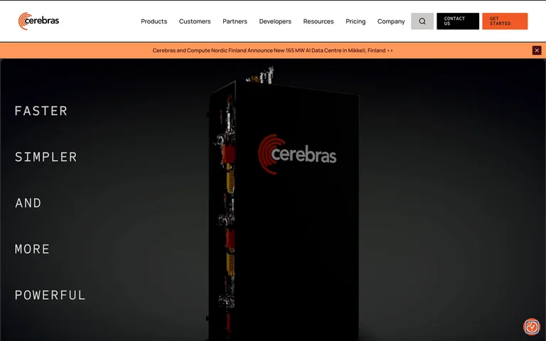
A dramatic black hardware scene places a spaced vertical statement beside a slowly revealed compute system.
Useful for: A dramatic black hardware scene places a spaced vertical statement beside a slowly revealed compute system.
# Design reference: Cerebras
Source: https://www.cerebras.ai/
Swipefile reference: https://swipefile.design/ref/ai-next-cerebras/
Captured: 2026-09-06. This is a dated reference, not a claim about the current live product.
Capture scope: one viewport. Do not infer unseen page sections or a complete user flow.

## Objective
Adapt the visual principles below to my project. Use my own content and identity. Do not reproduce logos, proprietary copy, or brand assets.

## Reference notes
- mood: Distinctive and product-focused.
- colors: Black, orange and warm white
- typography: Display heading establishes the hierarchy; navigation and supporting copy remain compact.
- layout: Slim header and full-width dark hardware hero.
- motion: Static capture of one viewport. Visit the source to study motion and interaction.
- texture: Visual emphasis comes from imagery, graphics or product previews.
- dont: Adapt the structure to your own content and brand; use your own identity, copy and imagery.

Useful for: A dramatic black hardware scene places a spaced vertical statement beside a slowly revealed compute system.

## Acceptance criteria
- Existing project conventions, design tokens, working functionality, and unrelated changes are preserved.
- Two or three reference principles clearly support the user's task; conflicts are resolved in favor of usability and the existing product.
- Reusable components and semantic HTML express the interface. Available licensed assets are used; important UI text is never rendered as a bitmap.
- Every visible control has a defined behavior. Loading, empty, error, success, disabled, and long-content states are specified where relevant. Demo data is clearly labeled.
- Navigation and content adapt at 375px, 768px, and 1440px without horizontal page overflow. Keyboard use, visible focus, labeled inputs, at least 44px touch targets, readable contrast, and reduced motion are supported.
- Verification distinguishes rendered behavior from proposals and identifies anything still requiring a backend or external service.

## Quality bar
Clear hierarchy, consistent spacing, restrained surfaces, and purposeful motion. Avoid decorative gradients, excessive cards, placeholder buttons, and invented metrics unless the project calls for them. Do not claim a feature is connected or tested without evidence.
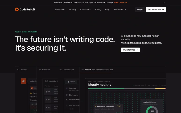
A concise code-security message introduces an interface preview inside a restrained near-black page.
Useful for: A concise code-security message introduces an interface preview inside a restrained near-black page.
# Design reference: CodeRabbit
Source: https://www.coderabbit.ai/
Swipefile reference: https://swipefile.design/ref/ai-next-coderabbit/
Captured: 2026-09-06. This is a dated reference, not a claim about the current live product.
Capture scope: one viewport. Do not infer unseen page sections or a complete user flow.

## Objective
Adapt the visual principles below to my project. Use my own content and identity. Do not reproduce logos, proprietary copy, or brand assets.

## Reference notes
- mood: Distinctive and product-focused.
- colors: Near-black, white and orange
- typography: Display heading establishes the hierarchy; navigation and supporting copy remain compact.
- layout: Asymmetric headline and explanation above a product screenshot.
- motion: Static capture of one viewport. Visit the source to study motion and interaction.
- texture: Visual emphasis comes from imagery, graphics or product previews.
- dont: Adapt the structure to your own content and brand; use your own identity, copy and imagery.

Useful for: A concise code-security message introduces an interface preview inside a restrained near-black page.

## Acceptance criteria
- Existing project conventions, design tokens, working functionality, and unrelated changes are preserved.
- Two or three reference principles clearly support the user's task; conflicts are resolved in favor of usability and the existing product.
- Reusable components and semantic HTML express the interface. Available licensed assets are used; important UI text is never rendered as a bitmap.
- Every visible control has a defined behavior. Loading, empty, error, success, disabled, and long-content states are specified where relevant. Demo data is clearly labeled.
- Navigation and content adapt at 375px, 768px, and 1440px without horizontal page overflow. Keyboard use, visible focus, labeled inputs, at least 44px touch targets, readable contrast, and reduced motion are supported.
- Verification distinguishes rendered behavior from proposals and identifies anything still requiring a backend or external service.

## Quality bar
Clear hierarchy, consistent spacing, restrained surfaces, and purposeful motion. Avoid decorative gradients, excessive cards, placeholder buttons, and invented metrics unless the project calls for them. Do not claim a feature is connected or tested without evidence.
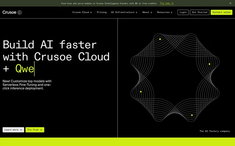
A monospaced cloud headline sits beside a fine wireframe form, with lime highlights marking actions and section edges.
Useful for: A monospaced cloud headline sits beside a fine wireframe form, with lime highlights marking actions and section edges.
# Design reference: Crusoe
Source: https://www.crusoe.ai/
Swipefile reference: https://swipefile.design/ref/ai-next-crusoe/
Captured: 2026-09-06. This is a dated reference, not a claim about the current live product.
Capture scope: one viewport. Do not infer unseen page sections or a complete user flow.

## Objective
Adapt the visual principles below to my project. Use my own content and identity. Do not reproduce logos, proprietary copy, or brand assets.

## Reference notes
- mood: Distinctive and product-focused.
- colors: Black, cream and acid lime
- typography: Display heading establishes the hierarchy; navigation and supporting copy remain compact.
- layout: Strong two-column split over a black canvas.
- motion: Static capture of one viewport. Visit the source to study motion and interaction.
- texture: Visual emphasis comes from imagery, graphics or product previews.
- dont: Adapt the structure to your own content and brand; use your own identity, copy and imagery.

Useful for: A monospaced cloud headline sits beside a fine wireframe form, with lime highlights marking actions and section edges.

## Acceptance criteria
- Existing project conventions, design tokens, working functionality, and unrelated changes are preserved.
- Two or three reference principles clearly support the user's task; conflicts are resolved in favor of usability and the existing product.
- Reusable components and semantic HTML express the interface. Available licensed assets are used; important UI text is never rendered as a bitmap.
- Every visible control has a defined behavior. Loading, empty, error, success, disabled, and long-content states are specified where relevant. Demo data is clearly labeled.
- Navigation and content adapt at 375px, 768px, and 1440px without horizontal page overflow. Keyboard use, visible focus, labeled inputs, at least 44px touch targets, readable contrast, and reduced motion are supported.
- Verification distinguishes rendered behavior from proposals and identifies anything still requiring a backend or external service.

## Quality bar
Clear hierarchy, consistent spacing, restrained surfaces, and purposeful motion. Avoid decorative gradients, excessive cards, placeholder buttons, and invented metrics unless the project calls for them. Do not claim a feature is connected or tested without evidence.
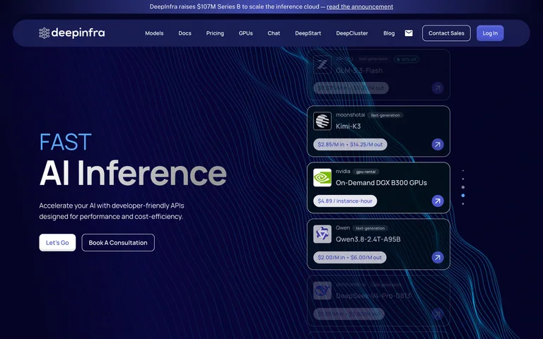
An inference headline and small actions face a stack of model cards threaded with fine blue lines.
Useful for: An inference headline and small actions face a stack of model cards threaded with fine blue lines.
# Design reference: DeepInfra
Source: https://deepinfra.com/
Swipefile reference: https://swipefile.design/ref/ai-next-deepinfra/
Captured: 2026-09-06. This is a dated reference, not a claim about the current live product.
Capture scope: one viewport. Do not infer unseen page sections or a complete user flow.

## Objective
Adapt the visual principles below to my project. Use my own content and identity. Do not reproduce logos, proprietary copy, or brand assets.

## Reference notes
- mood: Distinctive and product-focused.
- colors: Midnight blue, electric blue and white
- typography: Display heading establishes the hierarchy; navigation and supporting copy remain compact.
- layout: Left-aligned introduction opposite a layered model illustration.
- motion: Static capture of one viewport. Visit the source to study motion and interaction.
- texture: Visual emphasis comes from imagery, graphics or product previews.
- dont: Adapt the structure to your own content and brand; use your own identity, copy and imagery.

Useful for: An inference headline and small actions face a stack of model cards threaded with fine blue lines.

## Acceptance criteria
- Existing project conventions, design tokens, working functionality, and unrelated changes are preserved.
- Two or three reference principles clearly support the user's task; conflicts are resolved in favor of usability and the existing product.
- Reusable components and semantic HTML express the interface. Available licensed assets are used; important UI text is never rendered as a bitmap.
- Every visible control has a defined behavior. Loading, empty, error, success, disabled, and long-content states are specified where relevant. Demo data is clearly labeled.
- Navigation and content adapt at 375px, 768px, and 1440px without horizontal page overflow. Keyboard use, visible focus, labeled inputs, at least 44px touch targets, readable contrast, and reduced motion are supported.
- Verification distinguishes rendered behavior from proposals and identifies anything still requiring a backend or external service.

## Quality bar
Clear hierarchy, consistent spacing, restrained surfaces, and purposeful motion. Avoid decorative gradients, excessive cards, placeholder buttons, and invented metrics unless the project calls for them. Do not claim a feature is connected or tested without evidence.
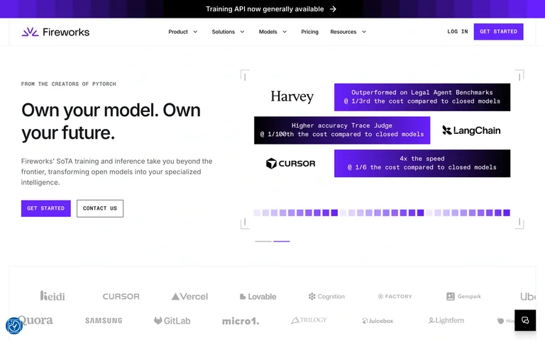
A compact model-ownership pitch faces violet prompt panels and company marks before a broad proof strip.
Useful for: A compact model-ownership pitch faces violet prompt panels and company marks before a broad proof strip.
# Design reference: Fireworks AI
Source: https://fireworks.ai/
Swipefile reference: https://swipefile.design/ref/ai-next-fireworks/
Captured: 2026-09-06. This is a dated reference, not a claim about the current live product.
Capture scope: one viewport. Do not infer unseen page sections or a complete user flow.

## Objective
Adapt the visual principles below to my project. Use my own content and identity. Do not reproduce logos, proprietary copy, or brand assets.

## Reference notes
- mood: Distinctive and product-focused.
- colors: White, black and vivid violet
- typography: Display heading establishes the hierarchy; navigation and supporting copy remain compact.
- layout: Two-column text-and-prompt hero with logos below.
- motion: Static capture of one viewport. Visit the source to study motion and interaction.
- texture: Visual emphasis comes from imagery, graphics or product previews.
- dont: Adapt the structure to your own content and brand; use your own identity, copy and imagery.

Useful for: A compact model-ownership pitch faces violet prompt panels and company marks before a broad proof strip.

## Acceptance criteria
- Existing project conventions, design tokens, working functionality, and unrelated changes are preserved.
- Two or three reference principles clearly support the user's task; conflicts are resolved in favor of usability and the existing product.
- Reusable components and semantic HTML express the interface. Available licensed assets are used; important UI text is never rendered as a bitmap.
- Every visible control has a defined behavior. Loading, empty, error, success, disabled, and long-content states are specified where relevant. Demo data is clearly labeled.
- Navigation and content adapt at 375px, 768px, and 1440px without horizontal page overflow. Keyboard use, visible focus, labeled inputs, at least 44px touch targets, readable contrast, and reduced motion are supported.
- Verification distinguishes rendered behavior from proposals and identifies anything still requiring a backend or external service.

## Quality bar
Clear hierarchy, consistent spacing, restrained surfaces, and purposeful motion. Avoid decorative gradients, excessive cards, placeholder buttons, and invented metrics unless the project calls for them. Do not claim a feature is connected or tested without evidence.
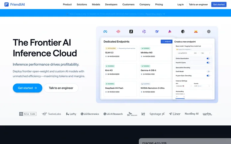
A frontier inference headline is paired with a large deployment-interface preview and a row of model-provider marks.
Useful for: A frontier inference headline is paired with a large deployment-interface preview and a row of model-provider marks.
# Design reference: FriendliAI
Source: https://friendli.ai/
Swipefile reference: https://swipefile.design/ref/ai-next-friendli/
Captured: 2026-09-06. This is a dated reference, not a claim about the current live product.
Capture scope: one viewport. Do not infer unseen page sections or a complete user flow.

## Objective
Adapt the visual principles below to my project. Use my own content and identity. Do not reproduce logos, proprietary copy, or brand assets.

## Reference notes
- mood: Distinctive and product-focused.
- colors: White, sky blue and charcoal
- typography: Display heading establishes the hierarchy; navigation and supporting copy remain compact.
- layout: Left copy and blue action beside a framed dashboard image.
- motion: Static capture of one viewport. Visit the source to study motion and interaction.
- texture: Visual emphasis comes from imagery, graphics or product previews.
- dont: Adapt the structure to your own content and brand; use your own identity, copy and imagery.

Useful for: A frontier inference headline is paired with a large deployment-interface preview and a row of model-provider marks.

## Acceptance criteria
- Existing project conventions, design tokens, working functionality, and unrelated changes are preserved.
- Two or three reference principles clearly support the user's task; conflicts are resolved in favor of usability and the existing product.
- Reusable components and semantic HTML express the interface. Available licensed assets are used; important UI text is never rendered as a bitmap.
- Every visible control has a defined behavior. Loading, empty, error, success, disabled, and long-content states are specified where relevant. Demo data is clearly labeled.
- Navigation and content adapt at 375px, 768px, and 1440px without horizontal page overflow. Keyboard use, visible focus, labeled inputs, at least 44px touch targets, readable contrast, and reduced motion are supported.
- Verification distinguishes rendered behavior from proposals and identifies anything still requiring a backend or external service.

## Quality bar
Clear hierarchy, consistent spacing, restrained surfaces, and purposeful motion. Avoid decorative gradients, excessive cards, placeholder buttons, and invented metrics unless the project calls for them. Do not claim a feature is connected or tested without evidence.
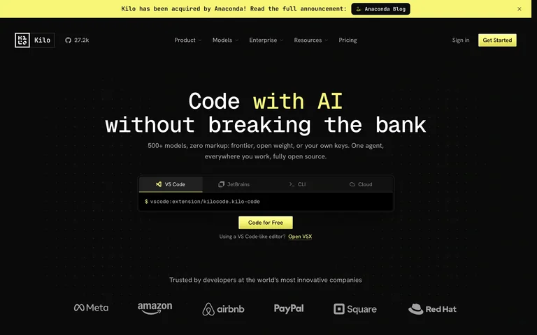
A monospaced coding statement uses lime emphasis above an input-style code example and proof logos.
Useful for: A monospaced coding statement uses lime emphasis above an input-style code example and proof logos.
# Design reference: Kilo Code
Source: https://kilo.ai/
Swipefile reference: https://swipefile.design/ref/ai-next-kilo/
Captured: 2026-09-06. This is a dated reference, not a claim about the current live product.
Capture scope: one viewport. Do not infer unseen page sections or a complete user flow.

## Objective
Adapt the visual principles below to my project. Use my own content and identity. Do not reproduce logos, proprietary copy, or brand assets.

## Reference notes
- mood: Distinctive and product-focused.
- colors: Black, ivory and lime
- typography: Display heading establishes the hierarchy; navigation and supporting copy remain compact.
- layout: Centered headline and small controls on black.
- motion: Static capture of one viewport. Visit the source to study motion and interaction.
- texture: Visual emphasis comes from imagery, graphics or product previews.
- dont: Adapt the structure to your own content and brand; use your own identity, copy and imagery.

Useful for: A monospaced coding statement uses lime emphasis above an input-style code example and proof logos.

## Acceptance criteria
- Existing project conventions, design tokens, working functionality, and unrelated changes are preserved.
- Two or three reference principles clearly support the user's task; conflicts are resolved in favor of usability and the existing product.
- Reusable components and semantic HTML express the interface. Available licensed assets are used; important UI text is never rendered as a bitmap.
- Every visible control has a defined behavior. Loading, empty, error, success, disabled, and long-content states are specified where relevant. Demo data is clearly labeled.
- Navigation and content adapt at 375px, 768px, and 1440px without horizontal page overflow. Keyboard use, visible focus, labeled inputs, at least 44px touch targets, readable contrast, and reduced motion are supported.
- Verification distinguishes rendered behavior from proposals and identifies anything still requiring a backend or external service.

## Quality bar
Clear hierarchy, consistent spacing, restrained surfaces, and purposeful motion. Avoid decorative gradients, excessive cards, placeholder buttons, and invented metrics unless the project calls for them. Do not claim a feature is connected or tested without evidence.
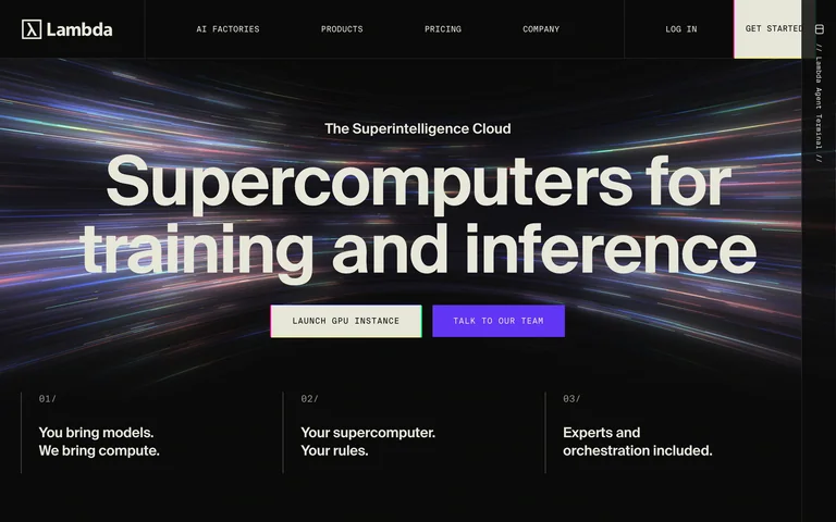
Oversized compute typography fills a dark hero with streaking light, paired actions and a three-part capability strip.
Useful for: Oversized compute typography fills a dark hero with streaking light, paired actions and a three-part capability strip.
# Design reference: Lambda
Source: https://lambda.ai/
Swipefile reference: https://swipefile.design/ref/ai-next-lambda/
Captured: 2026-09-06. This is a dated reference, not a claim about the current live product.
Capture scope: one viewport. Do not infer unseen page sections or a complete user flow.

## Objective
Adapt the visual principles below to my project. Use my own content and identity. Do not reproduce logos, proprietary copy, or brand assets.

## Reference notes
- mood: Distinctive and product-focused.
- colors: Black, ivory and violet
- typography: Display heading establishes the hierarchy; navigation and supporting copy remain compact.
- layout: Centered title over full-width motion imagery with compact columns below.
- motion: Static capture of one viewport. Visit the source to study motion and interaction.
- texture: Visual emphasis comes from imagery, graphics or product previews.
- dont: Adapt the structure to your own content and brand; use your own identity, copy and imagery.

Useful for: Oversized compute typography fills a dark hero with streaking light, paired actions and a three-part capability strip.

## Acceptance criteria
- Existing project conventions, design tokens, working functionality, and unrelated changes are preserved.
- Two or three reference principles clearly support the user's task; conflicts are resolved in favor of usability and the existing product.
- Reusable components and semantic HTML express the interface. Available licensed assets are used; important UI text is never rendered as a bitmap.
- Every visible control has a defined behavior. Loading, empty, error, success, disabled, and long-content states are specified where relevant. Demo data is clearly labeled.
- Navigation and content adapt at 375px, 768px, and 1440px without horizontal page overflow. Keyboard use, visible focus, labeled inputs, at least 44px touch targets, readable contrast, and reduced motion are supported.
- Verification distinguishes rendered behavior from proposals and identifies anything still requiring a backend or external service.

## Quality bar
Clear hierarchy, consistent spacing, restrained surfaces, and purposeful motion. Avoid decorative gradients, excessive cards, placeholder buttons, and invented metrics unless the project calls for them. Do not claim a feature is connected or tested without evidence.
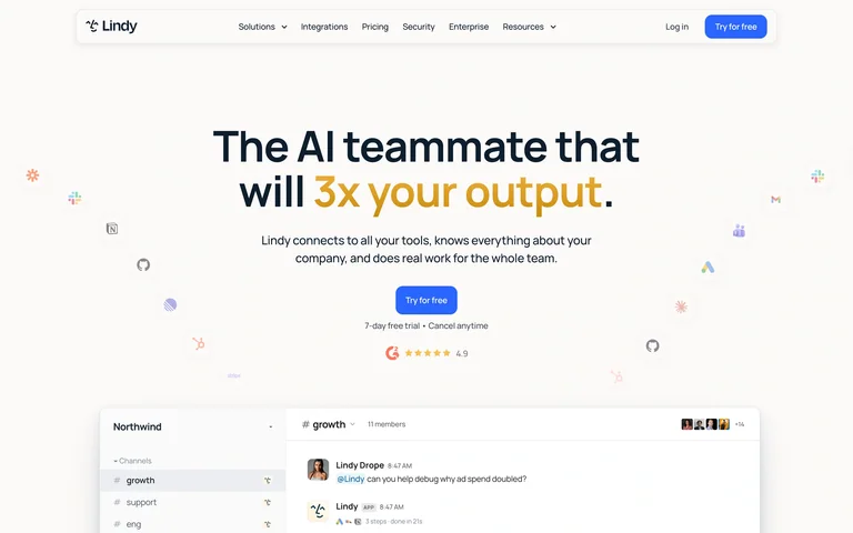
A bold assistant headline and small action lead into a product preview, surrounded by tiny integration symbols.
Useful for: A bold assistant headline and small action lead into a product preview, surrounded by tiny integration symbols.
# Design reference: Lindy
Source: https://www.lindy.ai/
Swipefile reference: https://swipefile.design/ref/ai-next-lindy/
Captured: 2026-09-06. This is a dated reference, not a claim about the current live product.
Capture scope: one viewport. Do not infer unseen page sections or a complete user flow.

## Objective
Adapt the visual principles below to my project. Use my own content and identity. Do not reproduce logos, proprietary copy, or brand assets.

## Reference notes
- mood: Distinctive and product-focused.
- colors: Warm white, navy, blue and gold
- typography: Display heading establishes the hierarchy; navigation and supporting copy remain compact.
- layout: Centered text and proof above a wide interface crop.
- motion: Static capture of one viewport. Visit the source to study motion and interaction.
- texture: Visual emphasis comes from imagery, graphics or product previews.
- dont: Adapt the structure to your own content and brand; use your own identity, copy and imagery.

Useful for: A bold assistant headline and small action lead into a product preview, surrounded by tiny integration symbols.

## Acceptance criteria
- Existing project conventions, design tokens, working functionality, and unrelated changes are preserved.
- Two or three reference principles clearly support the user's task; conflicts are resolved in favor of usability and the existing product.
- Reusable components and semantic HTML express the interface. Available licensed assets are used; important UI text is never rendered as a bitmap.
- Every visible control has a defined behavior. Loading, empty, error, success, disabled, and long-content states are specified where relevant. Demo data is clearly labeled.
- Navigation and content adapt at 375px, 768px, and 1440px without horizontal page overflow. Keyboard use, visible focus, labeled inputs, at least 44px touch targets, readable contrast, and reduced motion are supported.
- Verification distinguishes rendered behavior from proposals and identifies anything still requiring a backend or external service.

## Quality bar
Clear hierarchy, consistent spacing, restrained surfaces, and purposeful motion. Avoid decorative gradients, excessive cards, placeholder buttons, and invented metrics unless the project calls for them. Do not claim a feature is connected or tested without evidence.
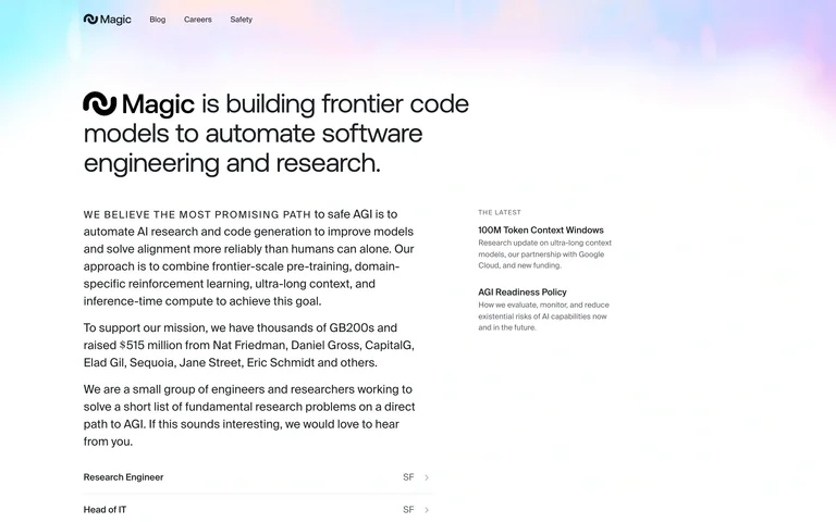
A compact research mission and text-heavy introduction sit beneath a softly colored atmospheric header.
Useful for: A compact research mission and text-heavy introduction sit beneath a softly colored atmospheric header.
# Design reference: Magic
Source: https://magic.dev/
Swipefile reference: https://swipefile.design/ref/ai-next-magic/
Captured: 2026-09-06. This is a dated reference, not a claim about the current live product.
Capture scope: one viewport. Do not infer unseen page sections or a complete user flow.

## Objective
Adapt the visual principles below to my project. Use my own content and identity. Do not reproduce logos, proprietary copy, or brand assets.

## Reference notes
- mood: Distinctive and product-focused.
- colors: White, black and pastel blue-pink
- typography: Display heading establishes the hierarchy; navigation and supporting copy remain compact.
- layout: Asymmetric editorial columns with small navigation.
- motion: Static capture of one viewport. Visit the source to study motion and interaction.
- texture: Visual emphasis comes from imagery, graphics or product previews.
- dont: Adapt the structure to your own content and brand; use your own identity, copy and imagery.

Useful for: A compact research mission and text-heavy introduction sit beneath a softly colored atmospheric header.

## Acceptance criteria
- Existing project conventions, design tokens, working functionality, and unrelated changes are preserved.
- Two or three reference principles clearly support the user's task; conflicts are resolved in favor of usability and the existing product.
- Reusable components and semantic HTML express the interface. Available licensed assets are used; important UI text is never rendered as a bitmap.
- Every visible control has a defined behavior. Loading, empty, error, success, disabled, and long-content states are specified where relevant. Demo data is clearly labeled.
- Navigation and content adapt at 375px, 768px, and 1440px without horizontal page overflow. Keyboard use, visible focus, labeled inputs, at least 44px touch targets, readable contrast, and reduced motion are supported.
- Verification distinguishes rendered behavior from proposals and identifies anything still requiring a backend or external service.

## Quality bar
Clear hierarchy, consistent spacing, restrained surfaces, and purposeful motion. Avoid decorative gradients, excessive cards, placeholder buttons, and invented metrics unless the project calls for them. Do not claim a feature is connected or tested without evidence.
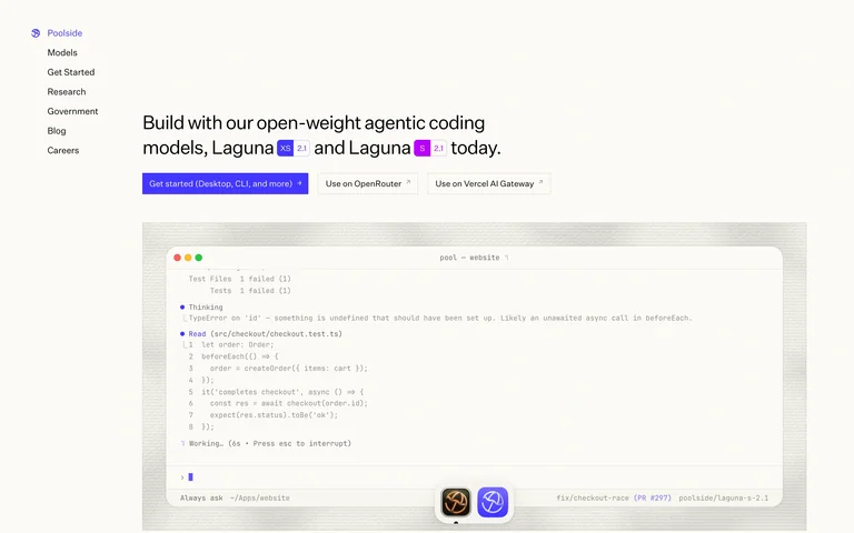
A quiet model homepage uses a narrow left index, concise announcement and a large code-editor preview.
Useful for: A quiet model homepage uses a narrow left index, concise announcement and a large code-editor preview.
# Design reference: Poolside
Source: https://poolside.ai/
Swipefile reference: https://swipefile.design/ref/ai-next-poolside/
Captured: 2026-09-06. This is a dated reference, not a claim about the current live product.
Capture scope: one viewport. Do not infer unseen page sections or a complete user flow.

## Objective
Adapt the visual principles below to my project. Use my own content and identity. Do not reproduce logos, proprietary copy, or brand assets.

## Reference notes
- mood: Distinctive and product-focused.
- colors: Ivory, black and violet
- typography: Display heading establishes the hierarchy; navigation and supporting copy remain compact.
- layout: Vertical navigation beside editorial copy and a framed code panel.
- motion: Static capture of one viewport. Visit the source to study motion and interaction.
- texture: Visual emphasis comes from imagery, graphics or product previews.
- dont: Adapt the structure to your own content and brand; use your own identity, copy and imagery.

Useful for: A quiet model homepage uses a narrow left index, concise announcement and a large code-editor preview.

## Acceptance criteria
- Existing project conventions, design tokens, working functionality, and unrelated changes are preserved.
- Two or three reference principles clearly support the user's task; conflicts are resolved in favor of usability and the existing product.
- Reusable components and semantic HTML express the interface. Available licensed assets are used; important UI text is never rendered as a bitmap.
- Every visible control has a defined behavior. Loading, empty, error, success, disabled, and long-content states are specified where relevant. Demo data is clearly labeled.
- Navigation and content adapt at 375px, 768px, and 1440px without horizontal page overflow. Keyboard use, visible focus, labeled inputs, at least 44px touch targets, readable contrast, and reduced motion are supported.
- Verification distinguishes rendered behavior from proposals and identifies anything still requiring a backend or external service.

## Quality bar
Clear hierarchy, consistent spacing, restrained surfaces, and purposeful motion. Avoid decorative gradients, excessive cards, placeholder buttons, and invented metrics unless the project calls for them. Do not claim a feature is connected or tested without evidence.
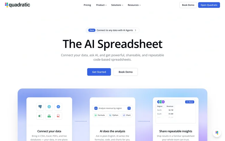
A centered AI-spreadsheet introduction leads into three softly lit cards explaining connections, analysis and sharing.
Useful for: A centered AI-spreadsheet introduction leads into three softly lit cards explaining connections, analysis and sharing.
# Design reference: Quadratic
Source: https://www.quadratichq.com/
Swipefile reference: https://swipefile.design/ref/ai-next-quadratic/
Captured: 2026-09-06. This is a dated reference, not a claim about the current live product.
Capture scope: one viewport. Do not infer unseen page sections or a complete user flow.

## Objective
Adapt the visual principles below to my project. Use my own content and identity. Do not reproduce logos, proprietary copy, or brand assets.

## Reference notes
- mood: Distinctive and product-focused.
- colors: White, blue and lavender
- typography: Display heading establishes the hierarchy; navigation and supporting copy remain compact.
- layout: Centered headline above a broad three-panel product preview.
- motion: Static capture of one viewport. Visit the source to study motion and interaction.
- texture: Visual emphasis comes from imagery, graphics or product previews.
- dont: Adapt the structure to your own content and brand; use your own identity, copy and imagery.

Useful for: A centered AI-spreadsheet introduction leads into three softly lit cards explaining connections, analysis and sharing.

## Acceptance criteria
- Existing project conventions, design tokens, working functionality, and unrelated changes are preserved.
- Two or three reference principles clearly support the user's task; conflicts are resolved in favor of usability and the existing product.
- Reusable components and semantic HTML express the interface. Available licensed assets are used; important UI text is never rendered as a bitmap.
- Every visible control has a defined behavior. Loading, empty, error, success, disabled, and long-content states are specified where relevant. Demo data is clearly labeled.
- Navigation and content adapt at 375px, 768px, and 1440px without horizontal page overflow. Keyboard use, visible focus, labeled inputs, at least 44px touch targets, readable contrast, and reduced motion are supported.
- Verification distinguishes rendered behavior from proposals and identifies anything still requiring a backend or external service.

## Quality bar
Clear hierarchy, consistent spacing, restrained surfaces, and purposeful motion. Avoid decorative gradients, excessive cards, placeholder buttons, and invented metrics unless the project calls for them. Do not claim a feature is connected or tested without evidence.
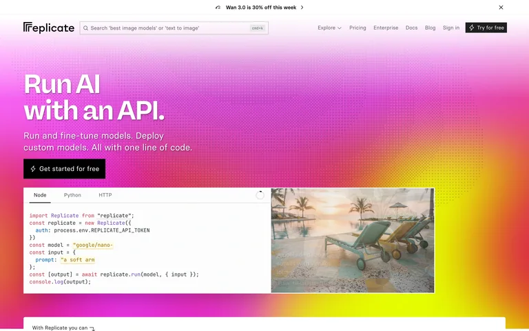
A white API headline overlays a saturated pink-and-yellow gradient with a split code-and-image demonstration below.
Useful for: A white API headline overlays a saturated pink-and-yellow gradient with a split code-and-image demonstration below.
# Design reference: Replicate
Source: https://replicate.com/
Swipefile reference: https://swipefile.design/ref/ai-next-replicate-company/
Captured: 2026-09-06. This is a dated reference, not a claim about the current live product.
Capture scope: one viewport. Do not infer unseen page sections or a complete user flow.

## Objective
Adapt the visual principles below to my project. Use my own content and identity. Do not reproduce logos, proprietary copy, or brand assets.

## Reference notes
- mood: Distinctive and product-focused.
- colors: Magenta, yellow, white and black
- typography: Display heading establishes the hierarchy; navigation and supporting copy remain compact.
- layout: Left-led text above paired code and output panels.
- motion: Static capture of one viewport. Visit the source to study motion and interaction.
- texture: Visual emphasis comes from imagery, graphics or product previews.
- dont: Adapt the structure to your own content and brand; use your own identity, copy and imagery.

Useful for: A white API headline overlays a saturated pink-and-yellow gradient with a split code-and-image demonstration below.

## Acceptance criteria
- Existing project conventions, design tokens, working functionality, and unrelated changes are preserved.
- Two or three reference principles clearly support the user's task; conflicts are resolved in favor of usability and the existing product.
- Reusable components and semantic HTML express the interface. Available licensed assets are used; important UI text is never rendered as a bitmap.
- Every visible control has a defined behavior. Loading, empty, error, success, disabled, and long-content states are specified where relevant. Demo data is clearly labeled.
- Navigation and content adapt at 375px, 768px, and 1440px without horizontal page overflow. Keyboard use, visible focus, labeled inputs, at least 44px touch targets, readable contrast, and reduced motion are supported.
- Verification distinguishes rendered behavior from proposals and identifies anything still requiring a backend or external service.

## Quality bar
Clear hierarchy, consistent spacing, restrained surfaces, and purposeful motion. Avoid decorative gradients, excessive cards, placeholder buttons, and invented metrics unless the project calls for them. Do not claim a feature is connected or tested without evidence.
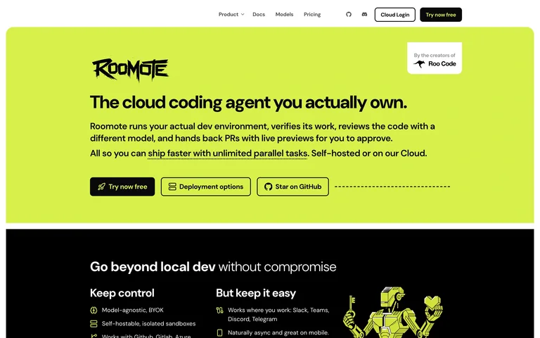
A bright lime coding hero pairs a rough-edged wordmark with compact developer actions, followed by a black feature section.
Useful for: A bright lime coding hero pairs a rough-edged wordmark with compact developer actions, followed by a black feature section.
# Design reference: Roomote by Roo Code
Source: https://roomote.dev/
Swipefile reference: https://swipefile.design/ref/ai-next-roo-code/
Captured: 2026-09-06. This is a dated reference, not a claim about the current live product.
Capture scope: one viewport. Do not infer unseen page sections or a complete user flow.

## Objective
Adapt the visual principles below to my project. Use my own content and identity. Do not reproduce logos, proprietary copy, or brand assets.

## Reference notes
- mood: Distinctive and product-focused.
- colors: Lime, black and white
- typography: Display heading establishes the hierarchy; navigation and supporting copy remain compact.
- layout: Full-width lime band above contrasting dark product content.
- motion: Static capture of one viewport. Visit the source to study motion and interaction.
- texture: Visual emphasis comes from imagery, graphics or product previews.
- dont: Adapt the structure to your own content and brand; use your own identity, copy and imagery.

Useful for: A bright lime coding hero pairs a rough-edged wordmark with compact developer actions, followed by a black feature section.

## Acceptance criteria
- Existing project conventions, design tokens, working functionality, and unrelated changes are preserved.
- Two or three reference principles clearly support the user's task; conflicts are resolved in favor of usability and the existing product.
- Reusable components and semantic HTML express the interface. Available licensed assets are used; important UI text is never rendered as a bitmap.
- Every visible control has a defined behavior. Loading, empty, error, success, disabled, and long-content states are specified where relevant. Demo data is clearly labeled.
- Navigation and content adapt at 375px, 768px, and 1440px without horizontal page overflow. Keyboard use, visible focus, labeled inputs, at least 44px touch targets, readable contrast, and reduced motion are supported.
- Verification distinguishes rendered behavior from proposals and identifies anything still requiring a backend or external service.

## Quality bar
Clear hierarchy, consistent spacing, restrained surfaces, and purposeful motion. Avoid decorative gradients, excessive cards, placeholder buttons, and invented metrics unless the project calls for them. Do not claim a feature is connected or tested without evidence.
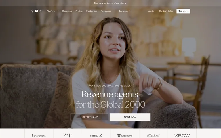
A customer interview scene fills the hero behind a small centered revenue-agent statement and paired actions.
Useful for: A customer interview scene fills the hero behind a small centered revenue-agent statement and paired actions.
# Design reference: Rox
Source: https://www.rox.com/
Swipefile reference: https://swipefile.design/ref/ai-next-rox/
Captured: 2026-09-06. This is a dated reference, not a claim about the current live product.
Capture scope: one viewport. Do not infer unseen page sections or a complete user flow.

## Objective
Adapt the visual principles below to my project. Use my own content and identity. Do not reproduce logos, proprietary copy, or brand assets.

## Reference notes
- mood: Distinctive and product-focused.
- colors: Warm photographic browns, cream and gray
- typography: Display heading establishes the hierarchy; navigation and supporting copy remain compact.
- layout: Full-width video still with centered lower copy and proof logos.
- motion: Static capture of one viewport. Visit the source to study motion and interaction.
- texture: Visual emphasis comes from imagery, graphics or product previews.
- dont: Adapt the structure to your own content and brand; use your own identity, copy and imagery.

Useful for: A customer interview scene fills the hero behind a small centered revenue-agent statement and paired actions.

## Acceptance criteria
- Existing project conventions, design tokens, working functionality, and unrelated changes are preserved.
- Two or three reference principles clearly support the user's task; conflicts are resolved in favor of usability and the existing product.
- Reusable components and semantic HTML express the interface. Available licensed assets are used; important UI text is never rendered as a bitmap.
- Every visible control has a defined behavior. Loading, empty, error, success, disabled, and long-content states are specified where relevant. Demo data is clearly labeled.
- Navigation and content adapt at 375px, 768px, and 1440px without horizontal page overflow. Keyboard use, visible focus, labeled inputs, at least 44px touch targets, readable contrast, and reduced motion are supported.
- Verification distinguishes rendered behavior from proposals and identifies anything still requiring a backend or external service.

## Quality bar
Clear hierarchy, consistent spacing, restrained surfaces, and purposeful motion. Avoid decorative gradients, excessive cards, placeholder buttons, and invented metrics unless the project calls for them. Do not claim a feature is connected or tested without evidence.
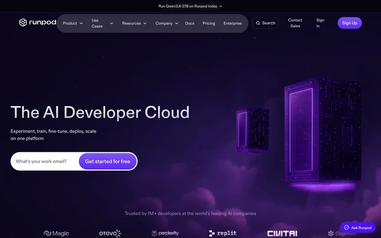
A violet developer-cloud scene pairs a left-led headline and input-like entry with illuminated floating frames.
Useful for: A violet developer-cloud scene pairs a left-led headline and input-like entry with illuminated floating frames.
# Design reference: RunPod
Source: https://www.runpod.io/
Swipefile reference: https://swipefile.design/ref/ai-next-runpod/
Captured: 2026-09-06. This is a dated reference, not a claim about the current live product.
Capture scope: one viewport. Do not infer unseen page sections or a complete user flow.

## Objective
Adapt the visual principles below to my project. Use my own content and identity. Do not reproduce logos, proprietary copy, or brand assets.

## Reference notes
- mood: Distinctive and product-focused.
- colors: Deep purple, violet and white
- typography: Display heading establishes the hierarchy; navigation and supporting copy remain compact.
- layout: Text left and abstract 3D frames right above logos.
- motion: Static capture of one viewport. Visit the source to study motion and interaction.
- texture: Visual emphasis comes from imagery, graphics or product previews.
- dont: Adapt the structure to your own content and brand; use your own identity, copy and imagery.

Useful for: A violet developer-cloud scene pairs a left-led headline and input-like entry with illuminated floating frames.

## Acceptance criteria
- Existing project conventions, design tokens, working functionality, and unrelated changes are preserved.
- Two or three reference principles clearly support the user's task; conflicts are resolved in favor of usability and the existing product.
- Reusable components and semantic HTML express the interface. Available licensed assets are used; important UI text is never rendered as a bitmap.
- Every visible control has a defined behavior. Loading, empty, error, success, disabled, and long-content states are specified where relevant. Demo data is clearly labeled.
- Navigation and content adapt at 375px, 768px, and 1440px without horizontal page overflow. Keyboard use, visible focus, labeled inputs, at least 44px touch targets, readable contrast, and reduced motion are supported.
- Verification distinguishes rendered behavior from proposals and identifies anything still requiring a backend or external service.

## Quality bar
Clear hierarchy, consistent spacing, restrained surfaces, and purposeful motion. Avoid decorative gradients, excessive cards, placeholder buttons, and invented metrics unless the project calls for them. Do not claim a feature is connected or tested without evidence.
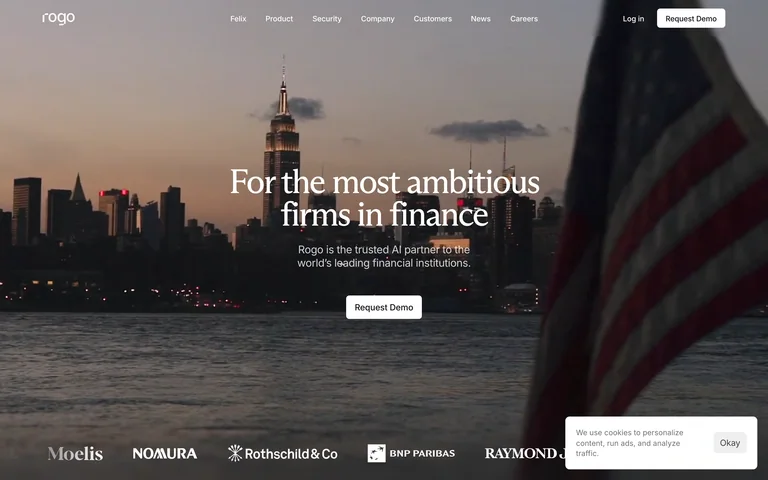
A finance-agent statement sits over a muted city waterfront scene with one small request-demo action.
Useful for: A finance-agent statement sits over a muted city waterfront scene with one small request-demo action.
# Design reference: Rogo
Source: https://rogo.com/
Swipefile reference: https://swipefile.design/ref/ai-next-rogo/
Captured: 2026-09-06. This is a dated reference, not a claim about the current live product.
Capture scope: one viewport. Do not infer unseen page sections or a complete user flow.

## Objective
Adapt the visual principles below to my project. Use my own content and identity. Do not reproduce logos, proprietary copy, or brand assets.

## Reference notes
- mood: Distinctive and product-focused.
- colors: Slate, warm gray and white
- typography: Display heading establishes the hierarchy; navigation and supporting copy remain compact.
- layout: Centered serif text on a full-width photograph above client marks.
- motion: Static capture of one viewport. Visit the source to study motion and interaction.
- texture: Visual emphasis comes from imagery, graphics or product previews.
- dont: Adapt the structure to your own content and brand; use your own identity, copy and imagery.

Useful for: A finance-agent statement sits over a muted city waterfront scene with one small request-demo action.

## Acceptance criteria
- Existing project conventions, design tokens, working functionality, and unrelated changes are preserved.
- Two or three reference principles clearly support the user's task; conflicts are resolved in favor of usability and the existing product.
- Reusable components and semantic HTML express the interface. Available licensed assets are used; important UI text is never rendered as a bitmap.
- Every visible control has a defined behavior. Loading, empty, error, success, disabled, and long-content states are specified where relevant. Demo data is clearly labeled.
- Navigation and content adapt at 375px, 768px, and 1440px without horizontal page overflow. Keyboard use, visible focus, labeled inputs, at least 44px touch targets, readable contrast, and reduced motion are supported.
- Verification distinguishes rendered behavior from proposals and identifies anything still requiring a backend or external service.

## Quality bar
Clear hierarchy, consistent spacing, restrained surfaces, and purposeful motion. Avoid decorative gradients, excessive cards, placeholder buttons, and invented metrics unless the project calls for them. Do not claim a feature is connected or tested without evidence.
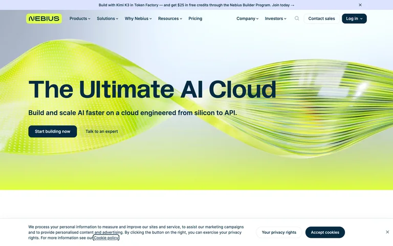
An oversized cloud title crosses a bright lime wave, with compact navigation and restrained actions.
Useful for: An oversized cloud title crosses a bright lime wave, with compact navigation and restrained actions.
# Design reference: Nebius
Source: https://nebius.com/
Swipefile reference: https://swipefile.design/ref/ai-next-nebius/
Captured: 2026-09-06. This is a dated reference, not a claim about the current live product.
Capture scope: one viewport. Do not infer unseen page sections or a complete user flow.

## Objective
Adapt the visual principles below to my project. Use my own content and identity. Do not reproduce logos, proprietary copy, or brand assets.

## Reference notes
- mood: Distinctive and product-focused.
- colors: Lime, pale blue, black and white
- typography: Display heading establishes the hierarchy; navigation and supporting copy remain compact.
- layout: Full-width graphic hero followed by a short supporting introduction.
- motion: Static capture of one viewport. Visit the source to study motion and interaction.
- texture: Visual emphasis comes from imagery, graphics or product previews.
- dont: Adapt the structure to your own content and brand; use your own identity, copy and imagery.

Useful for: An oversized cloud title crosses a bright lime wave, with compact navigation and restrained actions.

## Acceptance criteria
- Existing project conventions, design tokens, working functionality, and unrelated changes are preserved.
- Two or three reference principles clearly support the user's task; conflicts are resolved in favor of usability and the existing product.
- Reusable components and semantic HTML express the interface. Available licensed assets are used; important UI text is never rendered as a bitmap.
- Every visible control has a defined behavior. Loading, empty, error, success, disabled, and long-content states are specified where relevant. Demo data is clearly labeled.
- Navigation and content adapt at 375px, 768px, and 1440px without horizontal page overflow. Keyboard use, visible focus, labeled inputs, at least 44px touch targets, readable contrast, and reduced motion are supported.
- Verification distinguishes rendered behavior from proposals and identifies anything still requiring a backend or external service.

## Quality bar
Clear hierarchy, consistent spacing, restrained surfaces, and purposeful motion. Avoid decorative gradients, excessive cards, placeholder buttons, and invented metrics unless the project calls for them. Do not claim a feature is connected or tested without evidence.
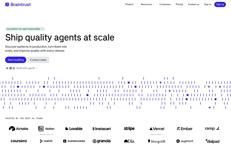
A spare agent-quality introduction is followed by a fine blue field of marks and a dense customer-logo grid.
Useful for: A spare agent-quality introduction is followed by a fine blue field of marks and a dense customer-logo grid.
# Design reference: Braintrust
Source: https://www.braintrust.dev/
Swipefile reference: https://swipefile.design/ref/ai-next-braintrust/
Captured: 2026-09-06. This is a dated reference, not a claim about the current live product.
Capture scope: one viewport. Do not infer unseen page sections or a complete user flow.

## Objective
Adapt the visual principles below to my project. Use my own content and identity. Do not reproduce logos, proprietary copy, or brand assets.

## Reference notes
- mood: Focused and distinctive.
- colors: White, charcoal and blue
- typography: Distinctive headline styling with compact supporting copy and navigation.
- layout: Left-led headline above a wide graphic band and proof grid.
- motion: Static capture of one viewport. Visit the source to study motion and interaction.
- texture: Illustration, graphics and product previews supply detail without heavy framing.
- dont: Adapt the structure to your own content and brand; use your own identity, copy and imagery.

Useful for: A spare agent-quality introduction is followed by a fine blue field of marks and a dense customer-logo grid.

## Acceptance criteria
- Existing project conventions, design tokens, working functionality, and unrelated changes are preserved.
- Two or three reference principles clearly support the user's task; conflicts are resolved in favor of usability and the existing product.
- Reusable components and semantic HTML express the interface. Available licensed assets are used; important UI text is never rendered as a bitmap.
- Every visible control has a defined behavior. Loading, empty, error, success, disabled, and long-content states are specified where relevant. Demo data is clearly labeled.
- Navigation and content adapt at 375px, 768px, and 1440px without horizontal page overflow. Keyboard use, visible focus, labeled inputs, at least 44px touch targets, readable contrast, and reduced motion are supported.
- Verification distinguishes rendered behavior from proposals and identifies anything still requiring a backend or external service.

## Quality bar
Clear hierarchy, consistent spacing, restrained surfaces, and purposeful motion. Avoid decorative gradients, excessive cards, placeholder buttons, and invented metrics unless the project calls for them. Do not claim a feature is connected or tested without evidence.
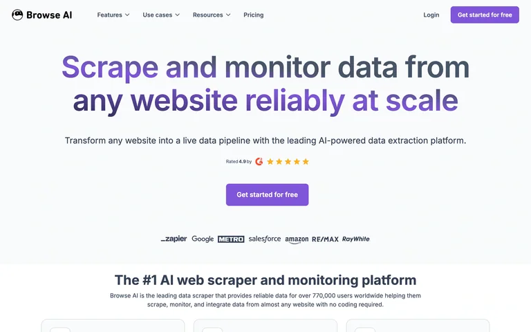
A broad data-extraction headline uses violet emphasis, a single centered action and a short product explanation below.
Useful for: A broad data-extraction headline uses violet emphasis, a single centered action and a short product explanation below.
# Design reference: Browse AI
Source: https://www.browse.ai/
Swipefile reference: https://swipefile.design/ref/ai-next-browse-ai/
Captured: 2026-09-06. This is a dated reference, not a claim about the current live product.
Capture scope: one viewport. Do not infer unseen page sections or a complete user flow.

## Objective
Adapt the visual principles below to my project. Use my own content and identity. Do not reproduce logos, proprietary copy, or brand assets.

## Reference notes
- mood: Focused and distinctive.
- colors: White, charcoal and violet
- typography: Distinctive headline styling with compact supporting copy and navigation.
- layout: Centered typographic hero with compact proof and explanatory sections.
- motion: Static capture of one viewport. Visit the source to study motion and interaction.
- texture: Illustration, graphics and product previews supply detail without heavy framing.
- dont: Adapt the structure to your own content and brand; use your own identity, copy and imagery.

Useful for: A broad data-extraction headline uses violet emphasis, a single centered action and a short product explanation below.

## Acceptance criteria
- Existing project conventions, design tokens, working functionality, and unrelated changes are preserved.
- Two or three reference principles clearly support the user's task; conflicts are resolved in favor of usability and the existing product.
- Reusable components and semantic HTML express the interface. Available licensed assets are used; important UI text is never rendered as a bitmap.
- Every visible control has a defined behavior. Loading, empty, error, success, disabled, and long-content states are specified where relevant. Demo data is clearly labeled.
- Navigation and content adapt at 375px, 768px, and 1440px without horizontal page overflow. Keyboard use, visible focus, labeled inputs, at least 44px touch targets, readable contrast, and reduced motion are supported.
- Verification distinguishes rendered behavior from proposals and identifies anything still requiring a backend or external service.

## Quality bar
Clear hierarchy, consistent spacing, restrained surfaces, and purposeful motion. Avoid decorative gradients, excessive cards, placeholder buttons, and invented metrics unless the project calls for them. Do not claim a feature is connected or tested without evidence.
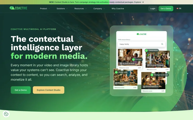
A contextual-media headline faces a compact visual-search interface against a green photographic backdrop.
Useful for: A contextual-media headline faces a compact visual-search interface against a green photographic backdrop.
# Design reference: Coactive AI
Source: https://www.coactive.ai/
Swipefile reference: https://swipefile.design/ref/ai-next-coactive/
Captured: 2026-09-06. This is a dated reference, not a claim about the current live product.
Capture scope: one viewport. Do not infer unseen page sections or a complete user flow.

## Objective
Adapt the visual principles below to my project. Use my own content and identity. Do not reproduce logos, proprietary copy, or brand assets.

## Reference notes
- mood: Focused and distinctive.
- colors: Forest green, lime, white and teal
- typography: Distinctive headline styling with compact supporting copy and navigation.
- layout: Split copy and product preview inside a broad hero scene.
- motion: Static capture of one viewport. Visit the source to study motion and interaction.
- texture: Illustration, graphics and product previews supply detail without heavy framing.
- dont: Adapt the structure to your own content and brand; use your own identity, copy and imagery.

Useful for: A contextual-media headline faces a compact visual-search interface against a green photographic backdrop.

## Acceptance criteria
- Existing project conventions, design tokens, working functionality, and unrelated changes are preserved.
- Two or three reference principles clearly support the user's task; conflicts are resolved in favor of usability and the existing product.
- Reusable components and semantic HTML express the interface. Available licensed assets are used; important UI text is never rendered as a bitmap.
- Every visible control has a defined behavior. Loading, empty, error, success, disabled, and long-content states are specified where relevant. Demo data is clearly labeled.
- Navigation and content adapt at 375px, 768px, and 1440px without horizontal page overflow. Keyboard use, visible focus, labeled inputs, at least 44px touch targets, readable contrast, and reduced motion are supported.
- Verification distinguishes rendered behavior from proposals and identifies anything still requiring a backend or external service.

## Quality bar
Clear hierarchy, consistent spacing, restrained surfaces, and purposeful motion. Avoid decorative gradients, excessive cards, placeholder buttons, and invented metrics unless the project calls for them. Do not claim a feature is connected or tested without evidence.
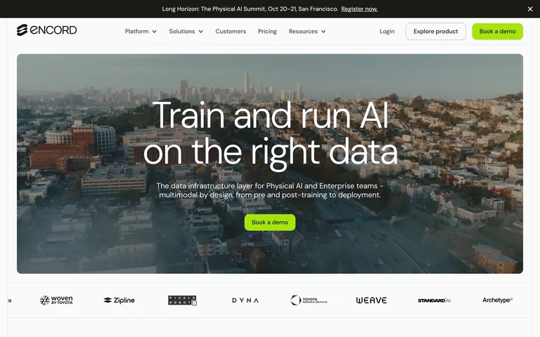
A data-platform headline sits over a city panorama inside a rounded hero panel, with a small lime action.
Useful for: A data-platform headline sits over a city panorama inside a rounded hero panel, with a small lime action.
# Design reference: Encord
Source: https://encord.com/
Swipefile reference: https://swipefile.design/ref/ai-next-enot/
Captured: 2026-09-06. This is a dated reference, not a claim about the current live product.
Capture scope: one viewport. Do not infer unseen page sections or a complete user flow.

## Objective
Adapt the visual principles below to my project. Use my own content and identity. Do not reproduce logos, proprietary copy, or brand assets.

## Reference notes
- mood: Focused and distinctive.
- colors: White, gray, slate and lime
- typography: Distinctive headline styling with compact supporting copy and navigation.
- layout: Contained photographic hero above a client-logo strip.
- motion: Static capture of one viewport. Visit the source to study motion and interaction.
- texture: Illustration, graphics and product previews supply detail without heavy framing.
- dont: Adapt the structure to your own content and brand; use your own identity, copy and imagery.

Useful for: A data-platform headline sits over a city panorama inside a rounded hero panel, with a small lime action.

## Acceptance criteria
- Existing project conventions, design tokens, working functionality, and unrelated changes are preserved.
- Two or three reference principles clearly support the user's task; conflicts are resolved in favor of usability and the existing product.
- Reusable components and semantic HTML express the interface. Available licensed assets are used; important UI text is never rendered as a bitmap.
- Every visible control has a defined behavior. Loading, empty, error, success, disabled, and long-content states are specified where relevant. Demo data is clearly labeled.
- Navigation and content adapt at 375px, 768px, and 1440px without horizontal page overflow. Keyboard use, visible focus, labeled inputs, at least 44px touch targets, readable contrast, and reduced motion are supported.
- Verification distinguishes rendered behavior from proposals and identifies anything still requiring a backend or external service.

## Quality bar
Clear hierarchy, consistent spacing, restrained surfaces, and purposeful motion. Avoid decorative gradients, excessive cards, placeholder buttons, and invented metrics unless the project calls for them. Do not claim a feature is connected or tested without evidence.
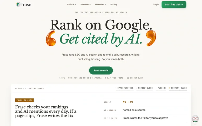
A large serif search headline uses green italics and sculptural quotation marks above a report preview.
Useful for: A large serif search headline uses green italics and sculptural quotation marks above a report preview.
# Design reference: Frase
Source: https://www.frase.io/
Swipefile reference: https://swipefile.design/ref/ai-next-frase/
Captured: 2026-09-06. This is a dated reference, not a claim about the current live product.
Capture scope: one viewport. Do not infer unseen page sections or a complete user flow.

## Objective
Adapt the visual principles below to my project. Use my own content and identity. Do not reproduce logos, proprietary copy, or brand assets.

## Reference notes
- mood: Focused and distinctive.
- colors: Ivory, black, green and amber
- typography: Distinctive headline styling with compact supporting copy and navigation.
- layout: Centered editorial typography over a wide report panel.
- motion: Static capture of one viewport. Visit the source to study motion and interaction.
- texture: Illustration, graphics and product previews supply detail without heavy framing.
- dont: Adapt the structure to your own content and brand; use your own identity, copy and imagery.

Useful for: A large serif search headline uses green italics and sculptural quotation marks above a report preview.

## Acceptance criteria
- Existing project conventions, design tokens, working functionality, and unrelated changes are preserved.
- Two or three reference principles clearly support the user's task; conflicts are resolved in favor of usability and the existing product.
- Reusable components and semantic HTML express the interface. Available licensed assets are used; important UI text is never rendered as a bitmap.
- Every visible control has a defined behavior. Loading, empty, error, success, disabled, and long-content states are specified where relevant. Demo data is clearly labeled.
- Navigation and content adapt at 375px, 768px, and 1440px without horizontal page overflow. Keyboard use, visible focus, labeled inputs, at least 44px touch targets, readable contrast, and reduced motion are supported.
- Verification distinguishes rendered behavior from proposals and identifies anything still requiring a backend or external service.

## Quality bar
Clear hierarchy, consistent spacing, restrained surfaces, and purposeful motion. Avoid decorative gradients, excessive cards, placeholder buttons, and invented metrics unless the project calls for them. Do not claim a feature is connected or tested without evidence.
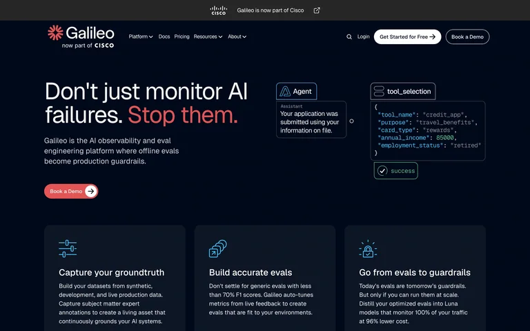
A dark agent-monitoring introduction combines red emphasis, compact code blocks and three explanatory feature cards.
Useful for: A dark agent-monitoring introduction combines red emphasis, compact code blocks and three explanatory feature cards.
# Design reference: Galileo
Source: https://galileo.ai/
Swipefile reference: https://swipefile.design/ref/ai-next-galileo-evals/
Captured: 2026-09-06. This is a dated reference, not a claim about the current live product.
Capture scope: one viewport. Do not infer unseen page sections or a complete user flow.

## Objective
Adapt the visual principles below to my project. Use my own content and identity. Do not reproduce logos, proprietary copy, or brand assets.

## Reference notes
- mood: Focused and distinctive.
- colors: Deep navy, white and coral
- typography: Distinctive headline styling with compact supporting copy and navigation.
- layout: Split hero above an evenly spaced three-card row.
- motion: Static capture of one viewport. Visit the source to study motion and interaction.
- texture: Illustration, graphics and product previews supply detail without heavy framing.
- dont: Adapt the structure to your own content and brand; use your own identity, copy and imagery.

Useful for: A dark agent-monitoring introduction combines red emphasis, compact code blocks and three explanatory feature cards.

## Acceptance criteria
- Existing project conventions, design tokens, working functionality, and unrelated changes are preserved.
- Two or three reference principles clearly support the user's task; conflicts are resolved in favor of usability and the existing product.
- Reusable components and semantic HTML express the interface. Available licensed assets are used; important UI text is never rendered as a bitmap.
- Every visible control has a defined behavior. Loading, empty, error, success, disabled, and long-content states are specified where relevant. Demo data is clearly labeled.
- Navigation and content adapt at 375px, 768px, and 1440px without horizontal page overflow. Keyboard use, visible focus, labeled inputs, at least 44px touch targets, readable contrast, and reduced motion are supported.
- Verification distinguishes rendered behavior from proposals and identifies anything still requiring a backend or external service.

## Quality bar
Clear hierarchy, consistent spacing, restrained surfaces, and purposeful motion. Avoid decorative gradients, excessive cards, placeholder buttons, and invented metrics unless the project calls for them. Do not claim a feature is connected or tested without evidence.
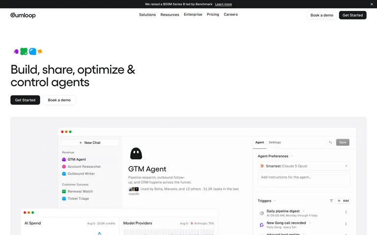
A small multicolor symbol and concise agent-building headline lead into a large workspace screenshot.
Useful for: A small multicolor symbol and concise agent-building headline lead into a large workspace screenshot.
# Design reference: Gumloop
Source: https://www.gumloop.com/
Swipefile reference: https://swipefile.design/ref/ai-next-gumloop/
Captured: 2026-09-06. This is a dated reference, not a claim about the current live product.
Capture scope: one viewport. Do not infer unseen page sections or a complete user flow.

## Objective
Adapt the visual principles below to my project. Use my own content and identity. Do not reproduce logos, proprietary copy, or brand assets.

## Reference notes
- mood: Focused and distinctive.
- colors: White, black and multicolor accents
- typography: Distinctive headline styling with compact supporting copy and navigation.
- layout: Left-aligned compact introduction above a broad interface crop.
- motion: Static capture of one viewport. Visit the source to study motion and interaction.
- texture: Illustration, graphics and product previews supply detail without heavy framing.
- dont: Adapt the structure to your own content and brand; use your own identity, copy and imagery.

Useful for: A small multicolor symbol and concise agent-building headline lead into a large workspace screenshot.

## Acceptance criteria
- Existing project conventions, design tokens, working functionality, and unrelated changes are preserved.
- Two or three reference principles clearly support the user's task; conflicts are resolved in favor of usability and the existing product.
- Reusable components and semantic HTML express the interface. Available licensed assets are used; important UI text is never rendered as a bitmap.
- Every visible control has a defined behavior. Loading, empty, error, success, disabled, and long-content states are specified where relevant. Demo data is clearly labeled.
- Navigation and content adapt at 375px, 768px, and 1440px without horizontal page overflow. Keyboard use, visible focus, labeled inputs, at least 44px touch targets, readable contrast, and reduced motion are supported.
- Verification distinguishes rendered behavior from proposals and identifies anything still requiring a backend or external service.

## Quality bar
Clear hierarchy, consistent spacing, restrained surfaces, and purposeful motion. Avoid decorative gradients, excessive cards, placeholder buttons, and invented metrics unless the project calls for them. Do not claim a feature is connected or tested without evidence.
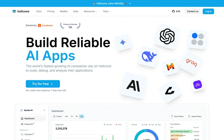
A blue-emphasized AI-app headline faces floating model-provider icons above a dashboard preview.
Useful for: A blue-emphasized AI-app headline faces floating model-provider icons above a dashboard preview.
# Design reference: Helicone
Source: https://www.helicone.ai/
Swipefile reference: https://swipefile.design/ref/ai-next-helicone/
Captured: 2026-09-06. This is a dated reference, not a claim about the current live product.
Capture scope: one viewport. Do not infer unseen page sections or a complete user flow.

## Objective
Adapt the visual principles below to my project. Use my own content and identity. Do not reproduce logos, proprietary copy, or brand assets.

## Reference notes
- mood: Focused and distinctive.
- colors: White, cyan and charcoal
- typography: Distinctive headline styling with compact supporting copy and navigation.
- layout: Two-column introduction with product analytics below.
- motion: Static capture of one viewport. Visit the source to study motion and interaction.
- texture: Illustration, graphics and product previews supply detail without heavy framing.
- dont: Adapt the structure to your own content and brand; use your own identity, copy and imagery.

Useful for: A blue-emphasized AI-app headline faces floating model-provider icons above a dashboard preview.

## Acceptance criteria
- Existing project conventions, design tokens, working functionality, and unrelated changes are preserved.
- Two or three reference principles clearly support the user's task; conflicts are resolved in favor of usability and the existing product.
- Reusable components and semantic HTML express the interface. Available licensed assets are used; important UI text is never rendered as a bitmap.
- Every visible control has a defined behavior. Loading, empty, error, success, disabled, and long-content states are specified where relevant. Demo data is clearly labeled.
- Navigation and content adapt at 375px, 768px, and 1440px without horizontal page overflow. Keyboard use, visible focus, labeled inputs, at least 44px touch targets, readable contrast, and reduced motion are supported.
- Verification distinguishes rendered behavior from proposals and identifies anything still requiring a backend or external service.

## Quality bar
Clear hierarchy, consistent spacing, restrained surfaces, and purposeful motion. Avoid decorative gradients, excessive cards, placeholder buttons, and invented metrics unless the project calls for them. Do not claim a feature is connected or tested without evidence.
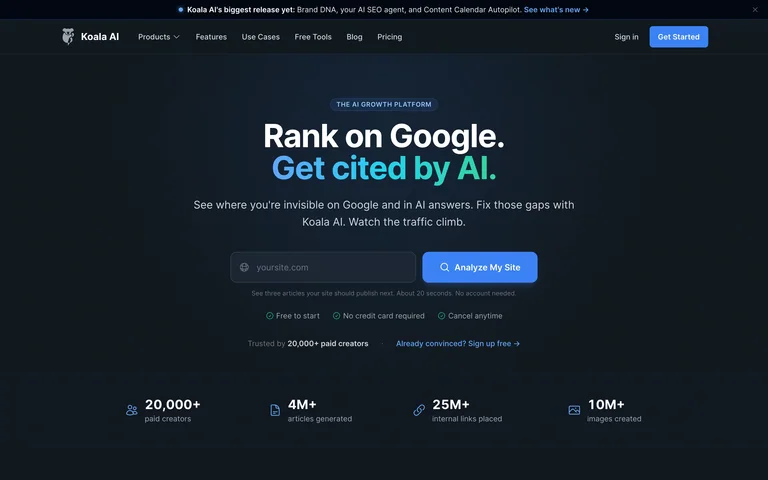
A dark AI-search homepage places a short headline above a URL-input action and a compact metrics strip.
Useful for: A dark AI-search homepage places a short headline above a URL-input action and a compact metrics strip.
# Design reference: Koala AI
Source: https://koala.sh/
Swipefile reference: https://swipefile.design/ref/ai-next-koala/
Captured: 2026-09-06. This is a dated reference, not a claim about the current live product.
Capture scope: one viewport. Do not infer unseen page sections or a complete user flow.

## Objective
Adapt the visual principles below to my project. Use my own content and identity. Do not reproduce logos, proprietary copy, or brand assets.

## Reference notes
- mood: Focused and distinctive.
- colors: Deep blue-gray, white and cyan
- typography: Distinctive headline styling with compact supporting copy and navigation.
- layout: Centered introduction and input above four proof metrics.
- motion: Static capture of one viewport. Visit the source to study motion and interaction.
- texture: Illustration, graphics and product previews supply detail without heavy framing.
- dont: Adapt the structure to your own content and brand; use your own identity, copy and imagery.

Useful for: A dark AI-search homepage places a short headline above a URL-input action and a compact metrics strip.

## Acceptance criteria
- Existing project conventions, design tokens, working functionality, and unrelated changes are preserved.
- Two or three reference principles clearly support the user's task; conflicts are resolved in favor of usability and the existing product.
- Reusable components and semantic HTML express the interface. Available licensed assets are used; important UI text is never rendered as a bitmap.
- Every visible control has a defined behavior. Loading, empty, error, success, disabled, and long-content states are specified where relevant. Demo data is clearly labeled.
- Navigation and content adapt at 375px, 768px, and 1440px without horizontal page overflow. Keyboard use, visible focus, labeled inputs, at least 44px touch targets, readable contrast, and reduced motion are supported.
- Verification distinguishes rendered behavior from proposals and identifies anything still requiring a backend or external service.

## Quality bar
Clear hierarchy, consistent spacing, restrained surfaces, and purposeful motion. Avoid decorative gradients, excessive cards, placeholder buttons, and invented metrics unless the project calls for them. Do not claim a feature is connected or tested without evidence.
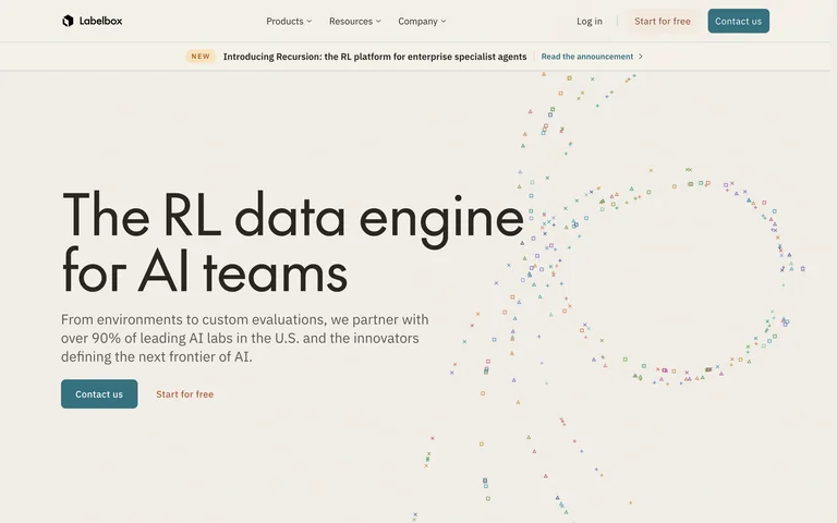
A large data-engine title shares an ivory hero with a field of tiny colored marks forming an abstract shape.
Useful for: A large data-engine title shares an ivory hero with a field of tiny colored marks forming an abstract shape.
# Design reference: Labelbox
Source: https://labelbox.com/
Swipefile reference: https://swipefile.design/ref/ai-next-labelbox/
Captured: 2026-09-06. This is a dated reference, not a claim about the current live product.
Capture scope: one viewport. Do not infer unseen page sections or a complete user flow.

## Objective
Adapt the visual principles below to my project. Use my own content and identity. Do not reproduce logos, proprietary copy, or brand assets.

## Reference notes
- mood: Focused and distinctive.
- colors: Ivory, charcoal and restrained multicolor accents
- typography: Distinctive headline styling with compact supporting copy and navigation.
- layout: Left-led typography with a broad generative mark pattern.
- motion: Static capture of one viewport. Visit the source to study motion and interaction.
- texture: Illustration, graphics and product previews supply detail without heavy framing.
- dont: Adapt the structure to your own content and brand; use your own identity, copy and imagery.

Useful for: A large data-engine title shares an ivory hero with a field of tiny colored marks forming an abstract shape.

## Acceptance criteria
- Existing project conventions, design tokens, working functionality, and unrelated changes are preserved.
- Two or three reference principles clearly support the user's task; conflicts are resolved in favor of usability and the existing product.
- Reusable components and semantic HTML express the interface. Available licensed assets are used; important UI text is never rendered as a bitmap.
- Every visible control has a defined behavior. Loading, empty, error, success, disabled, and long-content states are specified where relevant. Demo data is clearly labeled.
- Navigation and content adapt at 375px, 768px, and 1440px without horizontal page overflow. Keyboard use, visible focus, labeled inputs, at least 44px touch targets, readable contrast, and reduced motion are supported.
- Verification distinguishes rendered behavior from proposals and identifies anything still requiring a backend or external service.

## Quality bar
Clear hierarchy, consistent spacing, restrained surfaces, and purposeful motion. Avoid decorative gradients, excessive cards, placeholder buttons, and invented metrics unless the project calls for them. Do not claim a feature is connected or tested without evidence.
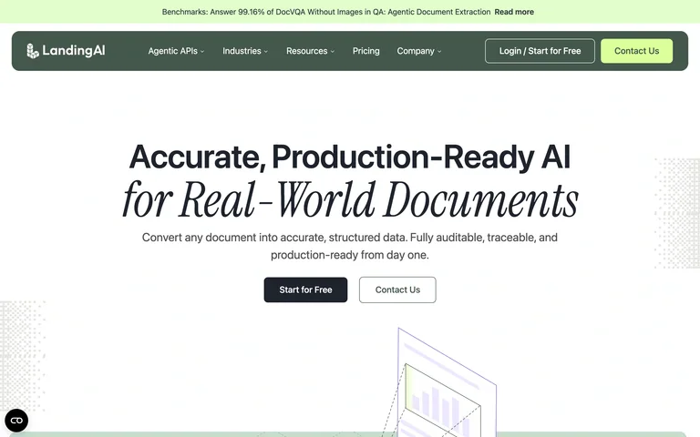
A document-AI headline contrasts plain bold type with an italic serif phrase above two compact actions.
Useful for: A document-AI headline contrasts plain bold type with an italic serif phrase above two compact actions.
# Design reference: Landing AI
Source: https://landing.ai/
Swipefile reference: https://swipefile.design/ref/ai-next-landing-ai/
Captured: 2026-09-06. This is a dated reference, not a claim about the current live product.
Capture scope: one viewport. Do not infer unseen page sections or a complete user flow.

## Objective
Adapt the visual principles below to my project. Use my own content and identity. Do not reproduce logos, proprietary copy, or brand assets.

## Reference notes
- mood: Focused and distinctive.
- colors: White, black, dark green and pale lime
- typography: Distinctive headline styling with compact supporting copy and navigation.
- layout: Centered headline and explanation with geometric illustration at the fold.
- motion: Static capture of one viewport. Visit the source to study motion and interaction.
- texture: Illustration, graphics and product previews supply detail without heavy framing.
- dont: Adapt the structure to your own content and brand; use your own identity, copy and imagery.

Useful for: A document-AI headline contrasts plain bold type with an italic serif phrase above two compact actions.

## Acceptance criteria
- Existing project conventions, design tokens, working functionality, and unrelated changes are preserved.
- Two or three reference principles clearly support the user's task; conflicts are resolved in favor of usability and the existing product.
- Reusable components and semantic HTML express the interface. Available licensed assets are used; important UI text is never rendered as a bitmap.
- Every visible control has a defined behavior. Loading, empty, error, success, disabled, and long-content states are specified where relevant. Demo data is clearly labeled.
- Navigation and content adapt at 375px, 768px, and 1440px without horizontal page overflow. Keyboard use, visible focus, labeled inputs, at least 44px touch targets, readable contrast, and reduced motion are supported.
- Verification distinguishes rendered behavior from proposals and identifies anything still requiring a backend or external service.

## Quality bar
Clear hierarchy, consistent spacing, restrained surfaces, and purposeful motion. Avoid decorative gradients, excessive cards, placeholder buttons, and invented metrics unless the project calls for them. Do not claim a feature is connected or tested without evidence.
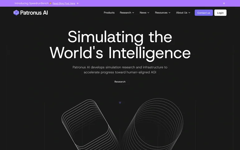
A centered research statement sits above fine wireframe loops on a nearly black canvas.
Useful for: A centered research statement sits above fine wireframe loops on a nearly black canvas.
# Design reference: Patronus AI
Source: https://www.patronus.ai/
Swipefile reference: https://swipefile.design/ref/ai-next-patronus/
Captured: 2026-09-06. This is a dated reference, not a claim about the current live product.
Capture scope: one viewport. Do not infer unseen page sections or a complete user flow.

## Objective
Adapt the visual principles below to my project. Use my own content and identity. Do not reproduce logos, proprietary copy, or brand assets.

## Reference notes
- mood: Focused and distinctive.
- colors: Near-black, white and violet
- typography: Distinctive headline styling with compact supporting copy and navigation.
- layout: Large centered headline with a sparse geometric lower section.
- motion: Static capture of one viewport. Visit the source to study motion and interaction.
- texture: Illustration, graphics and product previews supply detail without heavy framing.
- dont: Adapt the structure to your own content and brand; use your own identity, copy and imagery.

Useful for: A centered research statement sits above fine wireframe loops on a nearly black canvas.

## Acceptance criteria
- Existing project conventions, design tokens, working functionality, and unrelated changes are preserved.
- Two or three reference principles clearly support the user's task; conflicts are resolved in favor of usability and the existing product.
- Reusable components and semantic HTML express the interface. Available licensed assets are used; important UI text is never rendered as a bitmap.
- Every visible control has a defined behavior. Loading, empty, error, success, disabled, and long-content states are specified where relevant. Demo data is clearly labeled.
- Navigation and content adapt at 375px, 768px, and 1440px without horizontal page overflow. Keyboard use, visible focus, labeled inputs, at least 44px touch targets, readable contrast, and reduced motion are supported.
- Verification distinguishes rendered behavior from proposals and identifies anything still requiring a backend or external service.

## Quality bar
Clear hierarchy, consistent spacing, restrained surfaces, and purposeful motion. Avoid decorative gradients, excessive cards, placeholder buttons, and invented metrics unless the project calls for them. Do not claim a feature is connected or tested without evidence.
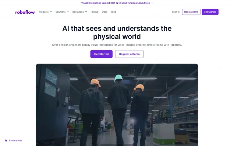
A concise computer-vision headline leads into paired purple actions and a large industrial video preview.
Useful for: A concise computer-vision headline leads into paired purple actions and a large industrial video preview.
# Design reference: Roboflow
Source: https://roboflow.com/
Swipefile reference: https://swipefile.design/ref/ai-next-roboflow/
Captured: 2026-09-06. This is a dated reference, not a claim about the current live product.
Capture scope: one viewport. Do not infer unseen page sections or a complete user flow.

## Objective
Adapt the visual principles below to my project. Use my own content and identity. Do not reproduce logos, proprietary copy, or brand assets.

## Reference notes
- mood: Focused and distinctive.
- colors: White, violet and slate
- typography: Distinctive headline styling with compact supporting copy and navigation.
- layout: Centered message above a contained widescreen media panel.
- motion: Static capture of one viewport. Visit the source to study motion and interaction.
- texture: Illustration, graphics and product previews supply detail without heavy framing.
- dont: Adapt the structure to your own content and brand; use your own identity, copy and imagery.

Useful for: A concise computer-vision headline leads into paired purple actions and a large industrial video preview.

## Acceptance criteria
- Existing project conventions, design tokens, working functionality, and unrelated changes are preserved.
- Two or three reference principles clearly support the user's task; conflicts are resolved in favor of usability and the existing product.
- Reusable components and semantic HTML express the interface. Available licensed assets are used; important UI text is never rendered as a bitmap.
- Every visible control has a defined behavior. Loading, empty, error, success, disabled, and long-content states are specified where relevant. Demo data is clearly labeled.
- Navigation and content adapt at 375px, 768px, and 1440px without horizontal page overflow. Keyboard use, visible focus, labeled inputs, at least 44px touch targets, readable contrast, and reduced motion are supported.
- Verification distinguishes rendered behavior from proposals and identifies anything still requiring a backend or external service.

## Quality bar
Clear hierarchy, consistent spacing, restrained surfaces, and purposeful motion. Avoid decorative gradients, excessive cards, placeholder buttons, and invented metrics unless the project calls for them. Do not claim a feature is connected or tested without evidence.
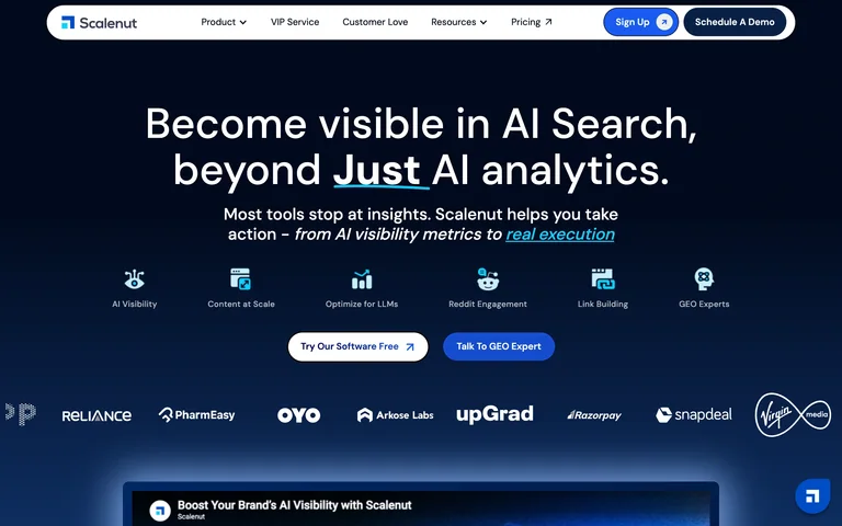
An AI-search pitch uses pale-blue emphasis above capability icons, paired actions and proof logos on a navy background.
Useful for: An AI-search pitch uses pale-blue emphasis above capability icons, paired actions and proof logos on a navy background.
# Design reference: Scalenut
Source: https://www.scalenut.com/
Swipefile reference: https://swipefile.design/ref/ai-next-scalenut/
Captured: 2026-09-06. This is a dated reference, not a claim about the current live product.
Capture scope: one viewport. Do not infer unseen page sections or a complete user flow.

## Objective
Adapt the visual principles below to my project. Use my own content and identity. Do not reproduce logos, proprietary copy, or brand assets.

## Reference notes
- mood: Focused and distinctive.
- colors: Navy, blue and white
- typography: Distinctive headline styling with compact supporting copy and navigation.
- layout: Centered introduction above capabilities and an analytics preview.
- motion: Static capture of one viewport. Visit the source to study motion and interaction.
- texture: Illustration, graphics and product previews supply detail without heavy framing.
- dont: Adapt the structure to your own content and brand; use your own identity, copy and imagery.

Useful for: An AI-search pitch uses pale-blue emphasis above capability icons, paired actions and proof logos on a navy background.

## Acceptance criteria
- Existing project conventions, design tokens, working functionality, and unrelated changes are preserved.
- Two or three reference principles clearly support the user's task; conflicts are resolved in favor of usability and the existing product.
- Reusable components and semantic HTML express the interface. Available licensed assets are used; important UI text is never rendered as a bitmap.
- Every visible control has a defined behavior. Loading, empty, error, success, disabled, and long-content states are specified where relevant. Demo data is clearly labeled.
- Navigation and content adapt at 375px, 768px, and 1440px without horizontal page overflow. Keyboard use, visible focus, labeled inputs, at least 44px touch targets, readable contrast, and reduced motion are supported.
- Verification distinguishes rendered behavior from proposals and identifies anything still requiring a backend or external service.

## Quality bar
Clear hierarchy, consistent spacing, restrained surfaces, and purposeful motion. Avoid decorative gradients, excessive cards, placeholder buttons, and invented metrics unless the project calls for them. Do not claim a feature is connected or tested without evidence.
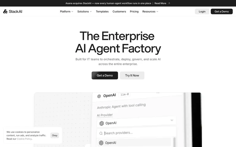
An enterprise agent title and two small actions introduce a tightly cropped model-provider interface.
Useful for: An enterprise agent title and two small actions introduce a tightly cropped model-provider interface.
# Design reference: Stack AI
Source: https://www.stackai.com/
Swipefile reference: https://swipefile.design/ref/ai-next-stack-ai/
Captured: 2026-09-06. This is a dated reference, not a claim about the current live product.
Capture scope: one viewport. Do not infer unseen page sections or a complete user flow.

## Objective
Adapt the visual principles below to my project. Use my own content and identity. Do not reproduce logos, proprietary copy, or brand assets.

## Reference notes
- mood: Focused and distinctive.
- colors: Warm white, black and gray
- typography: Distinctive headline styling with compact supporting copy and navigation.
- layout: Centered text over a broad pale product image.
- motion: Static capture of one viewport. Visit the source to study motion and interaction.
- texture: Illustration, graphics and product previews supply detail without heavy framing.
- dont: Adapt the structure to your own content and brand; use your own identity, copy and imagery.

Useful for: An enterprise agent title and two small actions introduce a tightly cropped model-provider interface.

## Acceptance criteria
- Existing project conventions, design tokens, working functionality, and unrelated changes are preserved.
- Two or three reference principles clearly support the user's task; conflicts are resolved in favor of usability and the existing product.
- Reusable components and semantic HTML express the interface. Available licensed assets are used; important UI text is never rendered as a bitmap.
- Every visible control has a defined behavior. Loading, empty, error, success, disabled, and long-content states are specified where relevant. Demo data is clearly labeled.
- Navigation and content adapt at 375px, 768px, and 1440px without horizontal page overflow. Keyboard use, visible focus, labeled inputs, at least 44px touch targets, readable contrast, and reduced motion are supported.
- Verification distinguishes rendered behavior from proposals and identifies anything still requiring a backend or external service.

## Quality bar
Clear hierarchy, consistent spacing, restrained surfaces, and purposeful motion. Avoid decorative gradients, excessive cards, placeholder buttons, and invented metrics unless the project calls for them. Do not claim a feature is connected or tested without evidence.
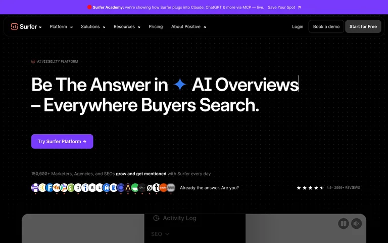
A bold search-visibility headline sits on black above a violet action, audience avatars and a product preview.
Useful for: A bold search-visibility headline sits on black above a violet action, audience avatars and a product preview.
# Design reference: Surfer
Source: https://surferseo.com/
Swipefile reference: https://swipefile.design/ref/ai-next-surfer/
Captured: 2026-09-06. This is a dated reference, not a claim about the current live product.
Capture scope: one viewport. Do not infer unseen page sections or a complete user flow.

## Objective
Adapt the visual principles below to my project. Use my own content and identity. Do not reproduce logos, proprietary copy, or brand assets.

## Reference notes
- mood: Focused and distinctive.
- colors: Black, white and vivid violet
- typography: Distinctive headline styling with compact supporting copy and navigation.
- layout: Left-led typography with a compact social-proof row.
- motion: Static capture of one viewport. Visit the source to study motion and interaction.
- texture: Illustration, graphics and product previews supply detail without heavy framing.
- dont: Adapt the structure to your own content and brand; use your own identity, copy and imagery.

Useful for: A bold search-visibility headline sits on black above a violet action, audience avatars and a product preview.

## Acceptance criteria
- Existing project conventions, design tokens, working functionality, and unrelated changes are preserved.
- Two or three reference principles clearly support the user's task; conflicts are resolved in favor of usability and the existing product.
- Reusable components and semantic HTML express the interface. Available licensed assets are used; important UI text is never rendered as a bitmap.
- Every visible control has a defined behavior. Loading, empty, error, success, disabled, and long-content states are specified where relevant. Demo data is clearly labeled.
- Navigation and content adapt at 375px, 768px, and 1440px without horizontal page overflow. Keyboard use, visible focus, labeled inputs, at least 44px touch targets, readable contrast, and reduced motion are supported.
- Verification distinguishes rendered behavior from proposals and identifies anything still requiring a backend or external service.

## Quality bar
Clear hierarchy, consistent spacing, restrained surfaces, and purposeful motion. Avoid decorative gradients, excessive cards, placeholder buttons, and invented metrics unless the project calls for them. Do not claim a feature is connected or tested without evidence.
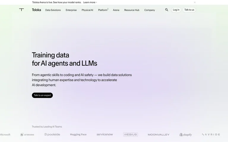
A small left-aligned training-data statement floats on a broad pastel gradient with a proof strip at the bottom.
Useful for: A small left-aligned training-data statement floats on a broad pastel gradient with a proof strip at the bottom.
# Design reference: Toloka
Source: https://toloka.ai/
Swipefile reference: https://swipefile.design/ref/ai-next-toloka/
Captured: 2026-09-06. This is a dated reference, not a claim about the current live product.
Capture scope: one viewport. Do not infer unseen page sections or a complete user flow.

## Objective
Adapt the visual principles below to my project. Use my own content and identity. Do not reproduce logos, proprietary copy, or brand assets.

## Reference notes
- mood: Focused and distinctive.
- colors: White, lavender, pale green and charcoal
- typography: Distinctive headline styling with compact supporting copy and navigation.
- layout: Spacious left-led hero with a minimal action and lower logo row.
- motion: Static capture of one viewport. Visit the source to study motion and interaction.
- texture: Illustration, graphics and product previews supply detail without heavy framing.
- dont: Adapt the structure to your own content and brand; use your own identity, copy and imagery.

Useful for: A small left-aligned training-data statement floats on a broad pastel gradient with a proof strip at the bottom.

## Acceptance criteria
- Existing project conventions, design tokens, working functionality, and unrelated changes are preserved.
- Two or three reference principles clearly support the user's task; conflicts are resolved in favor of usability and the existing product.
- Reusable components and semantic HTML express the interface. Available licensed assets are used; important UI text is never rendered as a bitmap.
- Every visible control has a defined behavior. Loading, empty, error, success, disabled, and long-content states are specified where relevant. Demo data is clearly labeled.
- Navigation and content adapt at 375px, 768px, and 1440px without horizontal page overflow. Keyboard use, visible focus, labeled inputs, at least 44px touch targets, readable contrast, and reduced motion are supported.
- Verification distinguishes rendered behavior from proposals and identifies anything still requiring a backend or external service.

## Quality bar
Clear hierarchy, consistent spacing, restrained surfaces, and purposeful motion. Avoid decorative gradients, excessive cards, placeholder buttons, and invented metrics unless the project calls for them. Do not claim a feature is connected or tested without evidence.
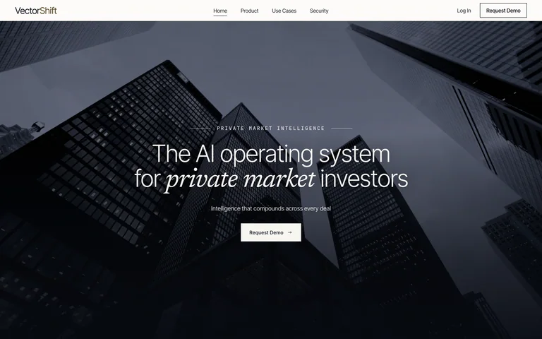
A serif private-markets statement is centered over a dark architectural image, with one restrained demo action.
Useful for: A serif private-markets statement is centered over a dark architectural image, with one restrained demo action.
# Design reference: VectorShift
Source: https://www.vectorshift.ai/
Swipefile reference: https://swipefile.design/ref/ai-next-vectorshift/
Captured: 2026-09-06. This is a dated reference, not a claim about the current live product.
Capture scope: one viewport. Do not infer unseen page sections or a complete user flow.

## Objective
Adapt the visual principles below to my project. Use my own content and identity. Do not reproduce logos, proprietary copy, or brand assets.

## Reference notes
- mood: Focused and distinctive.
- colors: Slate, black and white
- typography: Distinctive headline styling with compact supporting copy and navigation.
- layout: Full-width architectural hero beneath a thin white header.
- motion: Static capture of one viewport. Visit the source to study motion and interaction.
- texture: Illustration, graphics and product previews supply detail without heavy framing.
- dont: Adapt the structure to your own content and brand; use your own identity, copy and imagery.

Useful for: A serif private-markets statement is centered over a dark architectural image, with one restrained demo action.

## Acceptance criteria
- Existing project conventions, design tokens, working functionality, and unrelated changes are preserved.
- Two or three reference principles clearly support the user's task; conflicts are resolved in favor of usability and the existing product.
- Reusable components and semantic HTML express the interface. Available licensed assets are used; important UI text is never rendered as a bitmap.
- Every visible control has a defined behavior. Loading, empty, error, success, disabled, and long-content states are specified where relevant. Demo data is clearly labeled.
- Navigation and content adapt at 375px, 768px, and 1440px without horizontal page overflow. Keyboard use, visible focus, labeled inputs, at least 44px touch targets, readable contrast, and reduced motion are supported.
- Verification distinguishes rendered behavior from proposals and identifies anything still requiring a backend or external service.

## Quality bar
Clear hierarchy, consistent spacing, restrained surfaces, and purposeful motion. Avoid decorative gradients, excessive cards, placeholder buttons, and invented metrics unless the project calls for them. Do not claim a feature is connected or tested without evidence.
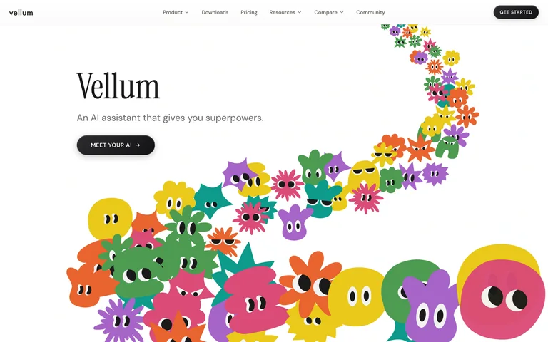
A tall serif product name and short assistant description sit beside a sweeping parade of colorful illustrated characters.
Useful for: A tall serif product name and short assistant description sit beside a sweeping parade of colorful illustrated characters.
# Design reference: Vellum
Source: https://www.vellum.ai/
Swipefile reference: https://swipefile.design/ref/ai-next-vellum/
Captured: 2026-09-06. This is a dated reference, not a claim about the current live product.
Capture scope: one viewport. Do not infer unseen page sections or a complete user flow.

## Objective
Adapt the visual principles below to my project. Use my own content and identity. Do not reproduce logos, proprietary copy, or brand assets.

## Reference notes
- mood: Focused and distinctive.
- colors: White, black and saturated multicolor accents
- typography: Distinctive headline styling with compact supporting copy and navigation.
- layout: Asymmetric open canvas with text left and character arc right.
- motion: Static capture of one viewport. Visit the source to study motion and interaction.
- texture: Illustration, graphics and product previews supply detail without heavy framing.
- dont: Adapt the structure to your own content and brand; use your own identity, copy and imagery.

Useful for: A tall serif product name and short assistant description sit beside a sweeping parade of colorful illustrated characters.

## Acceptance criteria
- Existing project conventions, design tokens, working functionality, and unrelated changes are preserved.
- Two or three reference principles clearly support the user's task; conflicts are resolved in favor of usability and the existing product.
- Reusable components and semantic HTML express the interface. Available licensed assets are used; important UI text is never rendered as a bitmap.
- Every visible control has a defined behavior. Loading, empty, error, success, disabled, and long-content states are specified where relevant. Demo data is clearly labeled.
- Navigation and content adapt at 375px, 768px, and 1440px without horizontal page overflow. Keyboard use, visible focus, labeled inputs, at least 44px touch targets, readable contrast, and reduced motion are supported.
- Verification distinguishes rendered behavior from proposals and identifies anything still requiring a backend or external service.

## Quality bar
Clear hierarchy, consistent spacing, restrained surfaces, and purposeful motion. Avoid decorative gradients, excessive cards, placeholder buttons, and invented metrics unless the project calls for them. Do not claim a feature is connected or tested without evidence.
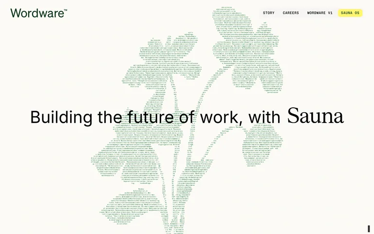
An understated future-of-work headline crosses a large flower illustration made from tiny green text marks.
Useful for: An understated future-of-work headline crosses a large flower illustration made from tiny green text marks.
# Design reference: Wordware
Source: https://www.wordware.ai/
Swipefile reference: https://swipefile.design/ref/ai-next-wordware/
Captured: 2026-09-06. This is a dated reference, not a claim about the current live product.
Capture scope: one viewport. Do not infer unseen page sections or a complete user flow.

## Objective
Adapt the visual principles below to my project. Use my own content and identity. Do not reproduce logos, proprietary copy, or brand assets.

## Reference notes
- mood: Focused and distinctive.
- colors: Ivory, pale green, black and yellow
- typography: Distinctive headline styling with compact supporting copy and navigation.
- layout: Sparse centered typography over a full-height typographic illustration.
- motion: Static capture of one viewport. Visit the source to study motion and interaction.
- texture: Illustration, graphics and product previews supply detail without heavy framing.
- dont: Adapt the structure to your own content and brand; use your own identity, copy and imagery.

Useful for: An understated future-of-work headline crosses a large flower illustration made from tiny green text marks.

## Acceptance criteria
- Existing project conventions, design tokens, working functionality, and unrelated changes are preserved.
- Two or three reference principles clearly support the user's task; conflicts are resolved in favor of usability and the existing product.
- Reusable components and semantic HTML express the interface. Available licensed assets are used; important UI text is never rendered as a bitmap.
- Every visible control has a defined behavior. Loading, empty, error, success, disabled, and long-content states are specified where relevant. Demo data is clearly labeled.
- Navigation and content adapt at 375px, 768px, and 1440px without horizontal page overflow. Keyboard use, visible focus, labeled inputs, at least 44px touch targets, readable contrast, and reduced motion are supported.
- Verification distinguishes rendered behavior from proposals and identifies anything still requiring a backend or external service.

## Quality bar
Clear hierarchy, consistent spacing, restrained surfaces, and purposeful motion. Avoid decorative gradients, excessive cards, placeholder buttons, and invented metrics unless the project calls for them. Do not claim a feature is connected or tested without evidence.
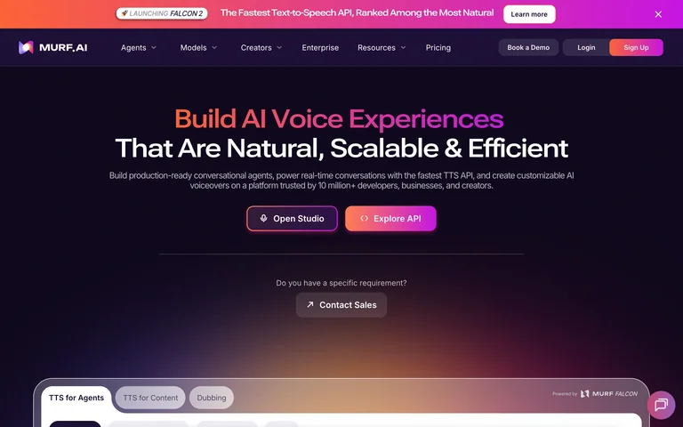
A gradient voice headline leads into paired studio and API actions on a dark purple stage.
Useful for: A gradient voice headline leads into paired studio and API actions on a dark purple stage.
# Design reference: Murf AI
Source: https://murf.ai/
Swipefile reference: https://swipefile.design/ref/ai-next-murf/
Captured: 2026-09-06. This is a dated reference, not a claim about the current live product.
Capture scope: one viewport. Do not infer unseen page sections or a complete user flow.

## Objective
Adapt the visual principles below to my project. Use my own content and identity. Do not reproduce logos, proprietary copy, or brand assets.

## Reference notes
- mood: Expressive and technical.
- colors: Black-purple, pink and orange
- typography: Compact sans-serif navigation and a broad mixed-color headline.
- layout: Centered headline above a wide voice-product panel.
- motion: Static capture of one viewport. Visit the source to study motion and interaction.
- texture: Soft colored light and restrained panel outlines.
- dont: Adapt the structure to your own content and brand; use your own identity, copy and imagery.

Useful for: A gradient voice headline leads into paired studio and API actions on a dark purple stage.

## Acceptance criteria
- Existing project conventions, design tokens, working functionality, and unrelated changes are preserved.
- Two or three reference principles clearly support the user's task; conflicts are resolved in favor of usability and the existing product.
- Reusable components and semantic HTML express the interface. Available licensed assets are used; important UI text is never rendered as a bitmap.
- Every visible control has a defined behavior. Loading, empty, error, success, disabled, and long-content states are specified where relevant. Demo data is clearly labeled.
- Navigation and content adapt at 375px, 768px, and 1440px without horizontal page overflow. Keyboard use, visible focus, labeled inputs, at least 44px touch targets, readable contrast, and reduced motion are supported.
- Verification distinguishes rendered behavior from proposals and identifies anything still requiring a backend or external service.

## Quality bar
Clear hierarchy, consistent spacing, restrained surfaces, and purposeful motion. Avoid decorative gradients, excessive cards, placeholder buttons, and invented metrics unless the project calls for them. Do not claim a feature is connected or tested without evidence.
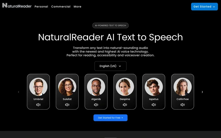
A text-to-speech introduction places six selectable voice portraits beneath a compact language selector.
Useful for: A text-to-speech introduction places six selectable voice portraits beneath a compact language selector.
# Design reference: NaturalReader
Source: https://www.naturalreaders.com/
Swipefile reference: https://swipefile.design/ref/ai-next-naturalreaders/
Captured: 2026-09-06. This is a dated reference, not a claim about the current live product.
Capture scope: one viewport. Do not infer unseen page sections or a complete user flow.

## Objective
Adapt the visual principles below to my project. Use my own content and identity. Do not reproduce logos, proprietary copy, or brand assets.

## Reference notes
- mood: Accessible and direct.
- colors: Black, white and blue
- typography: Rounded geometric headline with compact descriptions.
- layout: Centered title above a horizontal row of voice samples and a blue action.
- motion: Static capture of one viewport. Visit the source to study motion and interaction.
- texture: Portrait tiles supply warmth on a plain black canvas.
- dont: Adapt the structure to your own content and brand; use your own identity, copy and imagery.

Useful for: A text-to-speech introduction places six selectable voice portraits beneath a compact language selector.

## Acceptance criteria
- Existing project conventions, design tokens, working functionality, and unrelated changes are preserved.
- Two or three reference principles clearly support the user's task; conflicts are resolved in favor of usability and the existing product.
- Reusable components and semantic HTML express the interface. Available licensed assets are used; important UI text is never rendered as a bitmap.
- Every visible control has a defined behavior. Loading, empty, error, success, disabled, and long-content states are specified where relevant. Demo data is clearly labeled.
- Navigation and content adapt at 375px, 768px, and 1440px without horizontal page overflow. Keyboard use, visible focus, labeled inputs, at least 44px touch targets, readable contrast, and reduced motion are supported.
- Verification distinguishes rendered behavior from proposals and identifies anything still requiring a backend or external service.

## Quality bar
Clear hierarchy, consistent spacing, restrained surfaces, and purposeful motion. Avoid decorative gradients, excessive cards, placeholder buttons, and invented metrics unless the project calls for them. Do not claim a feature is connected or tested without evidence.
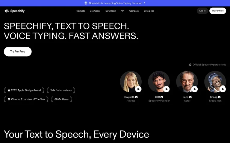
A broad uppercase voice-tools headline balances a row of playable voice portraits on a black canvas.
Useful for: A broad uppercase voice-tools headline balances a row of playable voice portraits on a black canvas.
# Design reference: Speechify
Source: https://speechify.com/
Swipefile reference: https://swipefile.design/ref/ai-next-speechify/
Captured: 2026-09-06. This is a dated reference, not a claim about the current live product.
Capture scope: one viewport. Do not infer unseen page sections or a complete user flow.

## Objective
Adapt the visual principles below to my project. Use my own content and identity. Do not reproduce logos, proprietary copy, or brand assets.

## Reference notes
- mood: Confident and spare.
- colors: Black, white and violet
- typography: Wide uppercase headline and restrained small navigation.
- layout: Left-led hero and proof labels with voice portraits toward the right.
- motion: Static capture of one viewport. Visit the source to study motion and interaction.
- texture: Circular portraits and fine sample-play controls.
- dont: Adapt the structure to your own content and brand; use your own identity, copy and imagery.

Useful for: A broad uppercase voice-tools headline balances a row of playable voice portraits on a black canvas.

## Acceptance criteria
- Existing project conventions, design tokens, working functionality, and unrelated changes are preserved.
- Two or three reference principles clearly support the user's task; conflicts are resolved in favor of usability and the existing product.
- Reusable components and semantic HTML express the interface. Available licensed assets are used; important UI text is never rendered as a bitmap.
- Every visible control has a defined behavior. Loading, empty, error, success, disabled, and long-content states are specified where relevant. Demo data is clearly labeled.
- Navigation and content adapt at 375px, 768px, and 1440px without horizontal page overflow. Keyboard use, visible focus, labeled inputs, at least 44px touch targets, readable contrast, and reduced motion are supported.
- Verification distinguishes rendered behavior from proposals and identifies anything still requiring a backend or external service.

## Quality bar
Clear hierarchy, consistent spacing, restrained surfaces, and purposeful motion. Avoid decorative gradients, excessive cards, placeholder buttons, and invented metrics unless the project calls for them. Do not claim a feature is connected or tested without evidence.
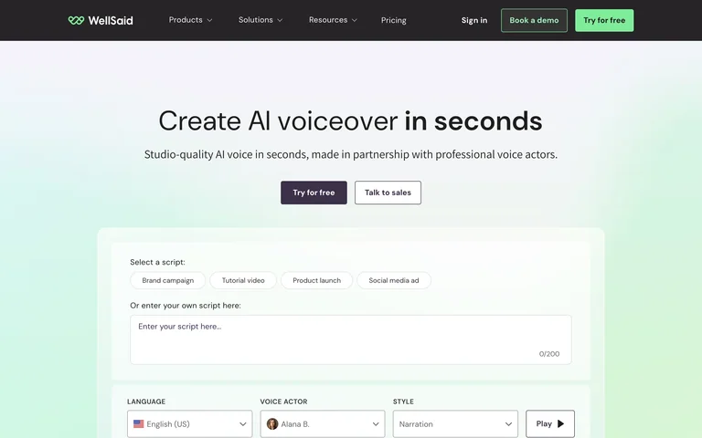
A concise voiceover headline leads directly into a sample script and voice-selection panel on a pale mint gradient.
Useful for: A concise voiceover headline leads directly into a sample script and voice-selection panel on a pale mint gradient.
# Design reference: WellSaid
Source: https://www.wellsaid.io/
Swipefile reference: https://swipefile.design/ref/ai-next-wellsaid/
Captured: 2026-09-06. This is a dated reference, not a claim about the current live product.
Capture scope: one viewport. Do not infer unseen page sections or a complete user flow.

## Objective
Adapt the visual principles below to my project. Use my own content and identity. Do not reproduce logos, proprietary copy, or brand assets.

## Reference notes
- mood: Calm and approachable.
- colors: Mint, pale blue, white and charcoal
- typography: Clear medium-weight headline and small form labels.
- layout: Centered introduction above a large interactive sample form.
- motion: Static capture of one viewport. Visit the source to study motion and interaction.
- texture: Soft pastel field with a simple white demo panel.
- dont: Adapt the structure to your own content and brand; use your own identity, copy and imagery.

Useful for: A concise voiceover headline leads directly into a sample script and voice-selection panel on a pale mint gradient.

## Acceptance criteria
- Existing project conventions, design tokens, working functionality, and unrelated changes are preserved.
- Two or three reference principles clearly support the user's task; conflicts are resolved in favor of usability and the existing product.
- Reusable components and semantic HTML express the interface. Available licensed assets are used; important UI text is never rendered as a bitmap.
- Every visible control has a defined behavior. Loading, empty, error, success, disabled, and long-content states are specified where relevant. Demo data is clearly labeled.
- Navigation and content adapt at 375px, 768px, and 1440px without horizontal page overflow. Keyboard use, visible focus, labeled inputs, at least 44px touch targets, readable contrast, and reduced motion are supported.
- Verification distinguishes rendered behavior from proposals and identifies anything still requiring a backend or external service.

## Quality bar
Clear hierarchy, consistent spacing, restrained surfaces, and purposeful motion. Avoid decorative gradients, excessive cards, placeholder buttons, and invented metrics unless the project calls for them. Do not claim a feature is connected or tested without evidence.
Allow basic usage counts to help us understand what is useful. Your board contents stay out of analytics. Details
Your browser’s privacy preference keeps analytics off.