 hover to scroll
Personal Author
CURATED COLLECTION · 5 REFERENCES
Book samples, editorial archives, and newsletter entry points that help readers explore an author. Selected for design and observable paths; conversion rates are not verified.
Copy the reference notes below and paste them into Claude, ChatGPT, or your coding assistant. Add what you want to build.
Includes design notes, original sources, and preview links. An assistant that supports browsing can also read the public board link.
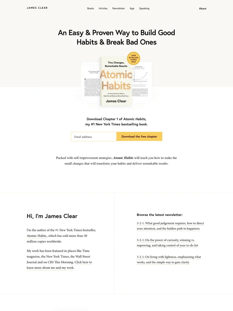
hover to scrollA focused author homepage centers a book and a free sample before expanding into the wider body of work.
Useful for: Offering a concrete first chapter in exchange for an email, then routing readers to the newsletter, app, books, and speaking. Selection is based on observable design and conversion paths; conversion rates have not been independently verified.
# Design reference: James Clear
Source: https://jamesclear.com/
Swipefile reference: https://swipefile.design/ref/personal-james-clear/
Captured: 2026-09-05. This is a dated reference, not a claim about the current live product.


## Objective
Adapt the visual principles below to my project. Use my own content and identity. Do not reproduce logos, proprietary copy, or brand assets.

## Reference notes
- mood: Author Lead Magnet. A focused author homepage centers a book and a free sample before expanding into the wider body of work.
- colors: Warm white and dark text with a yellow form action.
- typography: Straightforward sans-serif headings and generous, legible supporting copy.
- layout: Centered book-and-benefit hero, a short signup form, then biography and related offers.
- motion: Keep navigation and reading immediate; motion should support the work rather than delay access.
- texture: Book mockups provide the main visual anchor.
- dont: Do not present several competing lead magnets before the primary sample offer is understood.

Useful for: Offering a concrete first chapter in exchange for an email, then routing readers to the newsletter, app, books, and speaking. Selection is based on observable design and conversion paths; conversion rates have not been independently verified.

## Acceptance criteria
- Existing project conventions, design tokens, working functionality, and unrelated changes are preserved.
- Two or three reference principles clearly support the user's task; conflicts are resolved in favor of usability and the existing product.
- Reusable components and semantic HTML express the interface. Available licensed assets are used; important UI text is never rendered as a bitmap.
- Every visible control has a defined behavior. Loading, empty, error, success, disabled, and long-content states are specified where relevant. Demo data is clearly labeled.
- Navigation and content adapt at 375px, 768px, and 1440px without horizontal page overflow. Keyboard use, visible focus, labeled inputs, at least 44px touch targets, readable contrast, and reduced motion are supported.
- Verification distinguishes rendered behavior from proposals and identifies anything still requiring a backend or external service.

## Quality bar
Clear hierarchy, consistent spacing, restrained surfaces, and purposeful motion. Avoid decorative gradients, excessive cards, placeholder buttons, and invented metrics unless the project calls for them. Do not claim a feature is connected or tested without evidence.
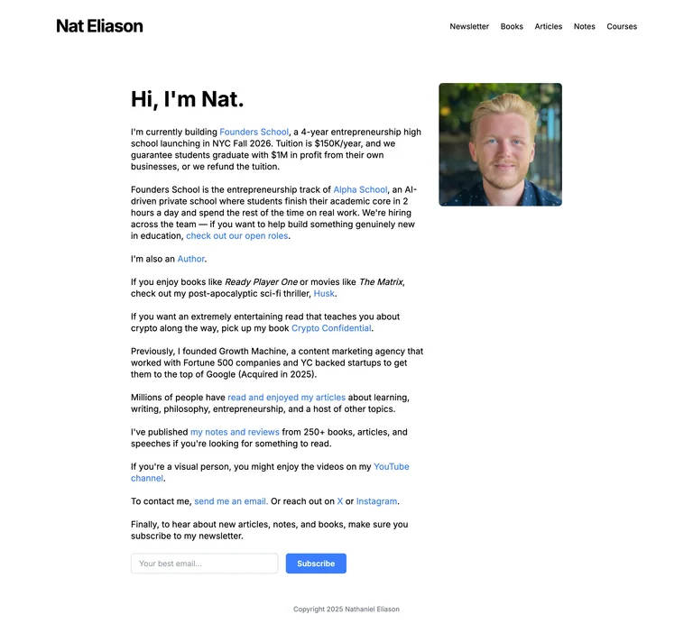
A concise personal page introduces current work, books, writing, and a newsletter in plain language.
Useful for: Giving an author with several interests a clear home base. Short descriptions explain which book or project to explore, and a direct email route remains visible. Selection is based on observable design and conversion paths; conversion rates have not been independently verified.
# Design reference: Nat Eliason
Source: https://www.nateliason.com/
Swipefile reference: https://swipefile.design/ref/personal-nat-eliason/
Captured: 2026-09-05. This is a dated reference, not a claim about the current live product.


## Objective
Adapt the visual principles below to my project. Use my own content and identity. Do not reproduce logos, proprietary copy, or brand assets.

## Reference notes
- mood: Author Personal Index. A concise personal page introduces current work, books, writing, and a newsletter in plain language.
- colors: White, dark text, and blue links.
- typography: Straightforward sans-serif text with a modest greeting headline.
- layout: A narrow text column with a small portrait, inline project links, and a newsletter form at the end.
- motion: Keep navigation and reading immediate; motion should support the work rather than delay access.
- texture: Almost no decoration beyond a personal photograph.
- dont: Do not repeat unverified commercial guarantees from a reference; use accurate project descriptions.

Useful for: Giving an author with several interests a clear home base. Short descriptions explain which book or project to explore, and a direct email route remains visible. Selection is based on observable design and conversion paths; conversion rates have not been independently verified.

## Acceptance criteria
- Existing project conventions, design tokens, working functionality, and unrelated changes are preserved.
- Two or three reference principles clearly support the user's task; conflicts are resolved in favor of usability and the existing product.
- Reusable components and semantic HTML express the interface. Available licensed assets are used; important UI text is never rendered as a bitmap.
- Every visible control has a defined behavior. Loading, empty, error, success, disabled, and long-content states are specified where relevant. Demo data is clearly labeled.
- Navigation and content adapt at 375px, 768px, and 1440px without horizontal page overflow. Keyboard use, visible focus, labeled inputs, at least 44px touch targets, readable contrast, and reduced motion are supported.
- Verification distinguishes rendered behavior from proposals and identifies anything still requiring a backend or external service.

## Quality bar
Clear hierarchy, consistent spacing, restrained surfaces, and purposeful motion. Avoid decorative gradients, excessive cards, placeholder buttons, and invented metrics unless the project calls for them. Do not claim a feature is connected or tested without evidence.
 hover to scroll
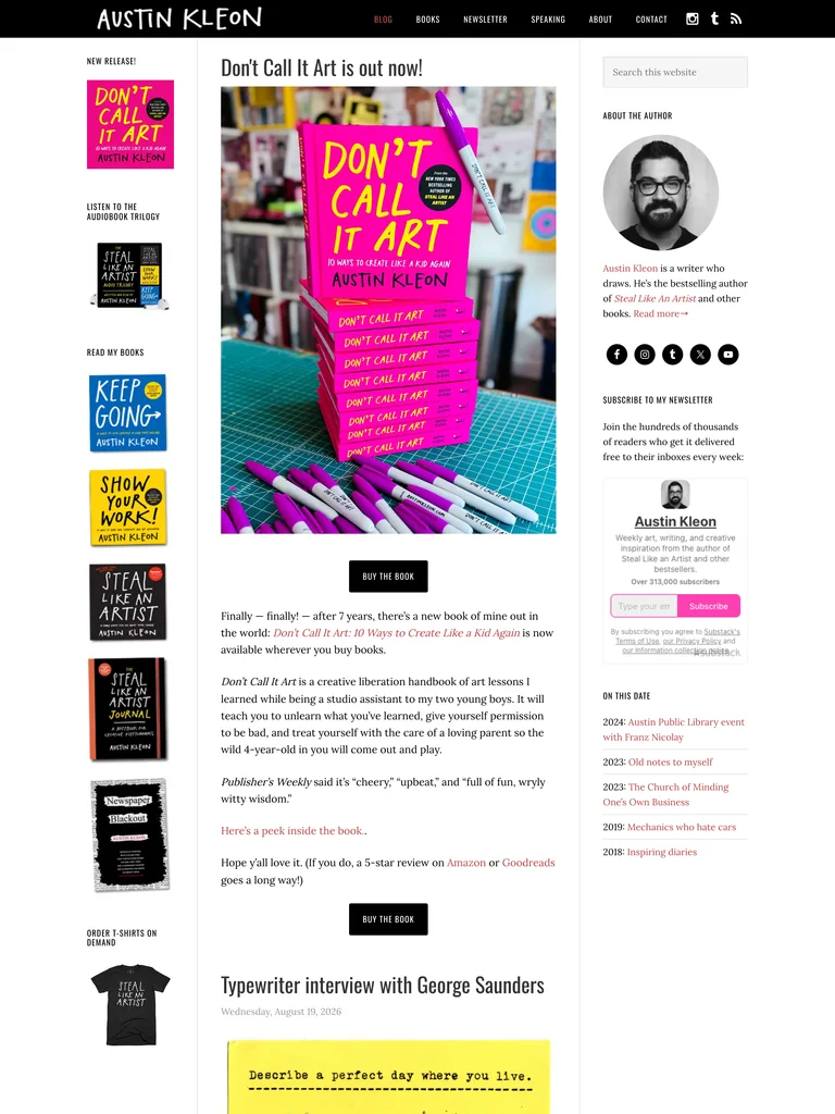
A lively author journal places new books, working notes, and personal updates in one recognizable publishing home.
Useful for: Letting readers sample the author’s voice while keeping book purchases and newsletter subscription within reach. Useful for an author with a substantial back catalog. Selection is based on observable design and conversion paths; conversion rates have not been independently verified.
# Design reference: Austin Kleon
Source: https://austinkleon.com/
Swipefile reference: https://swipefile.design/ref/personal-austin-kleon/
Captured: 2026-09-05. This is a dated reference, not a claim about the current live product.
Capture scope: a page excerpt. Do not infer unseen sections or interactions.

## Objective
Adapt the visual principles below to my project. Use my own content and identity. Do not reproduce logos, proprietary copy, or brand assets.

## Reference notes
- mood: Author Journal. A lively author journal places new books, working notes, and personal updates in one recognizable publishing home.
- colors: Black and white with bright pink, yellow, and blue from book artwork.
- typography: A handwritten identity mark, condensed headings, and readable editorial body text.
- layout: Three-column journal: book rail, main post stream, and an author/newsletter sidebar.
- motion: Keep navigation and reading immediate; motion should support the work rather than delay access.
- texture: Photographed books, notebook pages, and handmade marks.
- dont: Avoid copying a dense archive layout unless the content volume justifies it.

Useful for: Letting readers sample the author’s voice while keeping book purchases and newsletter subscription within reach. Useful for an author with a substantial back catalog. Selection is based on observable design and conversion paths; conversion rates have not been independently verified.

## Acceptance criteria
- Existing project conventions, design tokens, working functionality, and unrelated changes are preserved.
- Two or three reference principles clearly support the user's task; conflicts are resolved in favor of usability and the existing product.
- Reusable components and semantic HTML express the interface. Available licensed assets are used; important UI text is never rendered as a bitmap.
- Every visible control has a defined behavior. Loading, empty, error, success, disabled, and long-content states are specified where relevant. Demo data is clearly labeled.
- Navigation and content adapt at 375px, 768px, and 1440px without horizontal page overflow. Keyboard use, visible focus, labeled inputs, at least 44px touch targets, readable contrast, and reduced motion are supported.
- Verification distinguishes rendered behavior from proposals and identifies anything still requiring a backend or external service.

## Quality bar
Clear hierarchy, consistent spacing, restrained surfaces, and purposeful motion. Avoid decorative gradients, excessive cards, placeholder buttons, and invented metrics unless the project calls for them. Do not claim a feature is connected or tested without evidence.
 hover to scroll
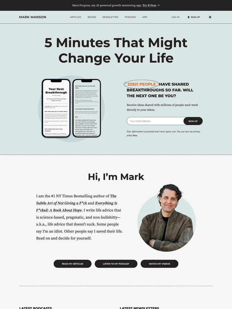
An email-first author site makes the newsletter tangible through phone previews and direct benefit copy.
Useful for: Reducing uncertainty about subscribing by showing the reading format and placing the form beside it. Biography and content routes give visitors ways to evaluate the author first. Selection is based on observable design and conversion paths; conversion rates have not been independently verified.
# Design reference: Mark Manson
Source: https://markmanson.net/
Swipefile reference: https://swipefile.design/ref/personal-mark-manson/
Captured: 2026-09-05. This is a dated reference, not a claim about the current live product.


## Objective
Adapt the visual principles below to my project. Use my own content and identity. Do not reproduce logos, proprietary copy, or brand assets.

## Reference notes
- mood: Author Newsletter Hub. An email-first author site makes the newsletter tangible through phone previews and direct benefit copy.
- colors: Pale blue-gray, white, black, and restrained warm highlights.
- typography: Heavy sans-serif headings with approachable body copy.
- layout: Newsletter hero with phone mockups and signup, followed by biography and article, podcast, and video pathways.
- motion: Keep navigation and reading immediate; motion should support the work rather than delay access.
- texture: Product-like phone previews and a candid cutout portrait.
- dont: Do not copy audience or outcome claims; use only evidence belonging to your own publication.

Useful for: Reducing uncertainty about subscribing by showing the reading format and placing the form beside it. Biography and content routes give visitors ways to evaluate the author first. Selection is based on observable design and conversion paths; conversion rates have not been independently verified.

## Acceptance criteria
- Existing project conventions, design tokens, working functionality, and unrelated changes are preserved.
- Two or three reference principles clearly support the user's task; conflicts are resolved in favor of usability and the existing product.
- Reusable components and semantic HTML express the interface. Available licensed assets are used; important UI text is never rendered as a bitmap.
- Every visible control has a defined behavior. Loading, empty, error, success, disabled, and long-content states are specified where relevant. Demo data is clearly labeled.
- Navigation and content adapt at 375px, 768px, and 1440px without horizontal page overflow. Keyboard use, visible focus, labeled inputs, at least 44px touch targets, readable contrast, and reduced motion are supported.
- Verification distinguishes rendered behavior from proposals and identifies anything still requiring a backend or external service.

## Quality bar
Clear hierarchy, consistent spacing, restrained surfaces, and purposeful motion. Avoid decorative gradients, excessive cards, placeholder buttons, and invented metrics unless the project calls for them. Do not claim a feature is connected or tested without evidence.
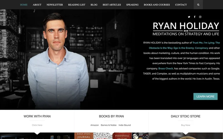
A direct author homepage connects a personal biography to books, speaking, services, and ongoing writing.
Useful for: Separating three commercial paths—working together, buying books, and browsing the store—before inviting readers into the article newsletter. Selection is based on observable design and conversion paths; conversion rates have not been independently verified.
# Design reference: Ryan Holiday
Source: https://ryanholiday.net/
Swipefile reference: https://swipefile.design/ref/personal-ryan-holiday/
Captured: 2026-09-05. This is a dated reference, not a claim about the current live product.
Capture scope: one viewport. Do not infer unseen page sections or a complete user flow.

## Objective
Adapt the visual principles below to my project. Use my own content and identity. Do not reproduce logos, proprietary copy, or brand assets.

## Reference notes
- mood: Author Offer Hub. A direct author homepage connects a personal biography to books, speaking, services, and ongoing writing.
- colors: Black, white, muted teal, and colors from book covers.
- typography: Compact navigation and bold uppercase section labels alongside editorial body text.
- layout: Portrait-and-biography hero, three offer panels, featured writing, and a newsletter block.
- motion: Keep navigation and reading immediate; motion should support the work rather than delay access.
- texture: Real books, speaking imagery, and a dark photographic background.
- dont: Do not let a sticky subscription bar cover the author name or primary navigation.

Useful for: Separating three commercial paths—working together, buying books, and browsing the store—before inviting readers into the article newsletter. Selection is based on observable design and conversion paths; conversion rates have not been independently verified.

## Acceptance criteria
- Existing project conventions, design tokens, working functionality, and unrelated changes are preserved.
- Two or three reference principles clearly support the user's task; conflicts are resolved in favor of usability and the existing product.
- Reusable components and semantic HTML express the interface. Available licensed assets are used; important UI text is never rendered as a bitmap.
- Every visible control has a defined behavior. Loading, empty, error, success, disabled, and long-content states are specified where relevant. Demo data is clearly labeled.
- Navigation and content adapt at 375px, 768px, and 1440px without horizontal page overflow. Keyboard use, visible focus, labeled inputs, at least 44px touch targets, readable contrast, and reduced motion are supported.
- Verification distinguishes rendered behavior from proposals and identifies anything still requiring a backend or external service.

## Quality bar
Clear hierarchy, consistent spacing, restrained surfaces, and purposeful motion. Avoid decorative gradients, excessive cards, placeholder buttons, and invented metrics unless the project calls for them. Do not claim a feature is connected or tested without evidence.
Allow basic usage counts to help us understand what is useful. Your board contents stay out of analytics. Details
Your browser’s privacy preference keeps analytics off.