 hover to scroll
Course Sales Page
CURATED COLLECTION · 20 REFERENCES
Course and product offers for marketing, AI, and business skills.
Copy the reference notes below and paste them into Claude, ChatGPT, or your coding assistant. Add what you want to build.
Includes design notes, original sources, and preview links. An assistant that supports browsing can also read the public board link.
1 references are no longer public and are omitted.
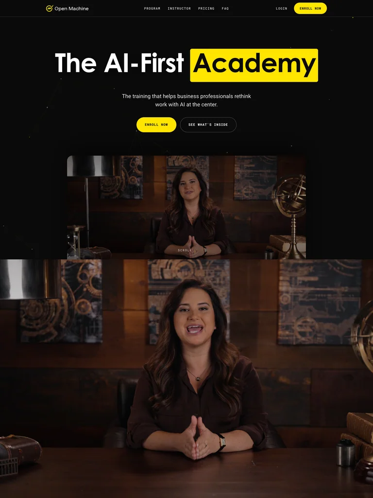
hover to scrollA course launch page pairing a video introduction with a level-based curriculum and repeated enrollment actions.
Useful for: Study the public sales page and its section order, offer presentation, and calls to action. This reference captures one page; checkout steps and conversion results are not verified.
# Design reference: Allie K. Miller — AI-First Academy
Source: https://academy.alliekmiller.com/
Swipefile reference: https://swipefile.design/ref/funnel-allie-k-miller-ai-first-academy/
Captured: 2026-09-07. This is a dated reference, not a claim about the current live product.


## Objective
Adapt the visual principles below to my project. Use my own content and identity. Do not reproduce logos, proprietary copy, or brand assets.

## Reference notes
- mood: Precise and modern
- colors: Black, warm white, and high-contrast yellow highlights.
- typography: Bold sans-serif headlines, compact labels, and scannable benefit lists create a clear hierarchy through the long page.
- layout: Video-led opening and enrollment → audience levels → curriculum accordions → instructor and proof → closing enrollment panel.
- motion: The capture records a static page state. Preserve readable scrolling and clear action feedback; video playback, counters, and hidden form behavior are not demonstrated.
- texture: Photographic or product imagery, contrasting section backgrounds, grouped benefits, and visual proof panels.
- dont: Use your own offer, brand, and assets. Do not invent testimonials, results, scarcity, guarantees, or pricing.

Useful for: Study the public sales page and its section order, offer presentation, and calls to action. This reference captures one page; checkout steps and conversion results are not verified.

## Acceptance criteria
- Existing project conventions, design tokens, working functionality, and unrelated changes are preserved.
- Two or three reference principles clearly support the user's task; conflicts are resolved in favor of usability and the existing product.
- Reusable components and semantic HTML express the interface. Available licensed assets are used; important UI text is never rendered as a bitmap.
- Every visible control has a defined behavior. Loading, empty, error, success, disabled, and long-content states are specified where relevant. Demo data is clearly labeled.
- Navigation and content adapt at 375px, 768px, and 1440px without horizontal page overflow. Keyboard use, visible focus, labeled inputs, at least 44px touch targets, readable contrast, and reduced motion are supported.
- Verification distinguishes rendered behavior from proposals and identifies anything still requiring a backend or external service.

## Quality bar
Clear hierarchy, consistent spacing, restrained surfaces, and purposeful motion. Avoid decorative gradients, excessive cards, placeholder buttons, and invented metrics unless the project calls for them. Do not claim a feature is connected or tested without evidence.
 hover to scroll
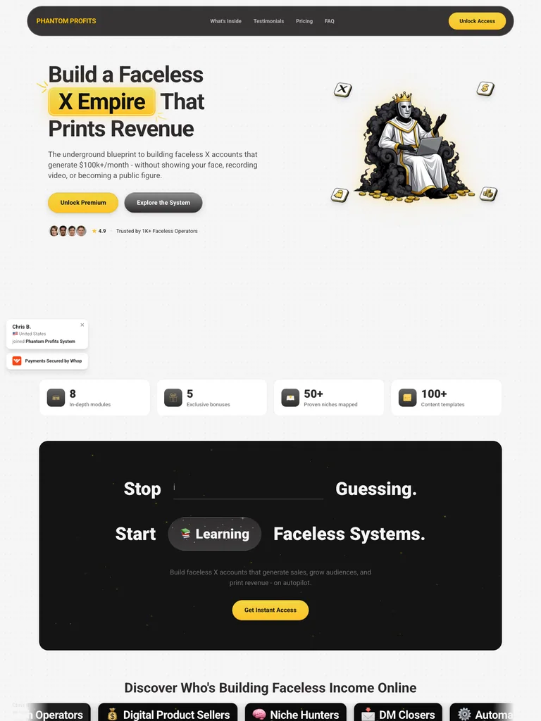
A creator-system funnel that combines a character illustration, modular benefits, a roadmap, and an embedded purchase section.
Useful for: Study the public sales page and its section order, offer presentation, and calls to action. This reference captures one page; checkout steps and conversion results are not verified.
# Design reference: Phantom Profits — X Creator System
Source: https://phantomprofitssystem.com/
Swipefile reference: https://swipefile.design/ref/funnel-x-empire-phantom-profits/
Captured: 2026-09-07. This is a dated reference, not a claim about the current live product.


## Objective
Adapt the visual principles below to my project. Use my own content and identity. Do not reproduce logos, proprietary copy, or brand assets.

## Reference notes
- mood: Playful and focused
- colors: Soft gray, near-black, yellow emphasis, and warm gold borders.
- typography: Bold sans-serif headlines, compact labels, and scannable benefit lists create a clear hierarchy through the long page.
- layout: Illustrated hero → creator proof → included tools and community → purchase invitation → roadmap → embedded offer and checkout section.
- motion: The capture records a static page state. Preserve readable scrolling and clear action feedback; video playback, counters, and hidden form behavior are not demonstrated.
- texture: Photographic or product imagery, contrasting section backgrounds, grouped benefits, and visual proof panels.
- dont: Use your own offer, brand, and assets. Do not invent testimonials, results, scarcity, guarantees, or pricing.

Useful for: Study the public sales page and its section order, offer presentation, and calls to action. This reference captures one page; checkout steps and conversion results are not verified.

## Acceptance criteria
- Existing project conventions, design tokens, working functionality, and unrelated changes are preserved.
- Two or three reference principles clearly support the user's task; conflicts are resolved in favor of usability and the existing product.
- Reusable components and semantic HTML express the interface. Available licensed assets are used; important UI text is never rendered as a bitmap.
- Every visible control has a defined behavior. Loading, empty, error, success, disabled, and long-content states are specified where relevant. Demo data is clearly labeled.
- Navigation and content adapt at 375px, 768px, and 1440px without horizontal page overflow. Keyboard use, visible focus, labeled inputs, at least 44px touch targets, readable contrast, and reduced motion are supported.
- Verification distinguishes rendered behavior from proposals and identifies anything still requiring a backend or external service.

## Quality bar
Clear hierarchy, consistent spacing, restrained surfaces, and purposeful motion. Avoid decorative gradients, excessive cards, placeholder buttons, and invented metrics unless the project calls for them. Do not claim a feature is connected or tested without evidence.
 hover to scroll
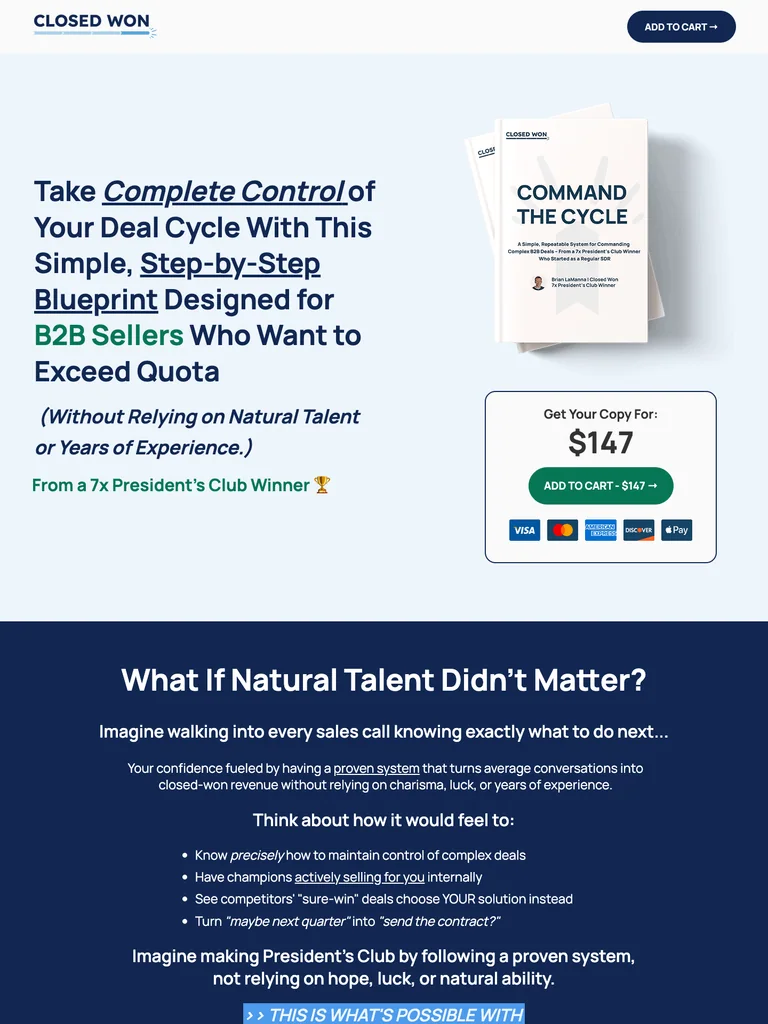
A guide offer with a prominent product mockup, clear pricing, an author introduction, and repeated buying opportunities.
Useful for: Study the public sales page and its section order, offer presentation, and calls to action. This reference captures one page; checkout steps and conversion results are not verified.
# Design reference: Brian LaManna — Command The Cycle
Source: https://closedwon.xyz/command-the-cycle
Swipefile reference: https://swipefile.design/ref/funnel-brian-lamanna-command-the-cycle/
Captured: 2026-09-07. This is a dated reference, not a claim about the current live product.


## Objective
Adapt the visual principles below to my project. Use my own content and identity. Do not reproduce logos, proprietary copy, or brand assets.

## Reference notes
- mood: Structured and professional
- colors: Light blue, navy, white, and green CTA accents.
- typography: Bold sans-serif headlines, compact labels, and scannable benefit lists create a clear hierarchy through the long page.
- layout: Guide mockup and price → reader challenges → practical benefits → author introduction → contents and proof → final purchase action.
- motion: The capture records a static page state. Preserve readable scrolling and clear action feedback; video playback, counters, and hidden form behavior are not demonstrated.
- texture: Photographic or product imagery, contrasting section backgrounds, grouped benefits, and visual proof panels.
- dont: Use your own offer, brand, and assets. Do not invent testimonials, results, scarcity, guarantees, or pricing.

Useful for: Study the public sales page and its section order, offer presentation, and calls to action. This reference captures one page; checkout steps and conversion results are not verified.

## Acceptance criteria
- Existing project conventions, design tokens, working functionality, and unrelated changes are preserved.
- Two or three reference principles clearly support the user's task; conflicts are resolved in favor of usability and the existing product.
- Reusable components and semantic HTML express the interface. Available licensed assets are used; important UI text is never rendered as a bitmap.
- Every visible control has a defined behavior. Loading, empty, error, success, disabled, and long-content states are specified where relevant. Demo data is clearly labeled.
- Navigation and content adapt at 375px, 768px, and 1440px without horizontal page overflow. Keyboard use, visible focus, labeled inputs, at least 44px touch targets, readable contrast, and reduced motion are supported.
- Verification distinguishes rendered behavior from proposals and identifies anything still requiring a backend or external service.

## Quality bar
Clear hierarchy, consistent spacing, restrained surfaces, and purposeful motion. Avoid decorative gradients, excessive cards, placeholder buttons, and invented metrics unless the project calls for them. Do not claim a feature is connected or tested without evidence.
 hover to scroll
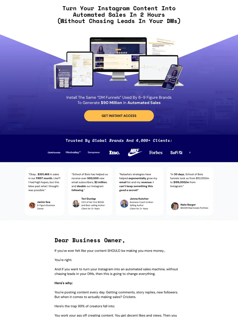
A course funnel organized around a large digital bundle, a clear method, and prominent access buttons.
Useful for: Study the public sales page and its section order, offer presentation, and calls to action. This reference captures one page; checkout steps and conversion results are not verified.
# Design reference: School of Bots — Content to Cashflow
Source: https://learn.schoolofbots.co/ctc-level1-organic-yt
Swipefile reference: https://swipefile.design/ref/funnel-natasha-willis-the-content-to-cashflow-system/
Captured: 2026-09-07. This is a dated reference, not a claim about the current live product.


## Objective
Adapt the visual principles below to my project. Use my own content and identity. Do not reproduce logos, proprietary copy, or brand assets.

## Reference notes
- mood: Product-led and emphatic
- colors: White, deep indigo, violet gradients, and gold access buttons.
- typography: Bold sans-serif headlines, compact labels, and scannable benefit lists create a clear hierarchy through the long page.
- layout: Course bundle and outcome headline → brand proof → method and included resources → instructor and student proof → repeated access offer.
- motion: The capture records a static page state. Preserve readable scrolling and clear action feedback; video playback, counters, and hidden form behavior are not demonstrated.
- texture: Photographic or product imagery, contrasting section backgrounds, grouped benefits, and visual proof panels.
- dont: Use your own offer, brand, and assets. Do not invent testimonials, results, scarcity, guarantees, or pricing.

Useful for: Study the public sales page and its section order, offer presentation, and calls to action. This reference captures one page; checkout steps and conversion results are not verified.

## Acceptance criteria
- Existing project conventions, design tokens, working functionality, and unrelated changes are preserved.
- Two or three reference principles clearly support the user's task; conflicts are resolved in favor of usability and the existing product.
- Reusable components and semantic HTML express the interface. Available licensed assets are used; important UI text is never rendered as a bitmap.
- Every visible control has a defined behavior. Loading, empty, error, success, disabled, and long-content states are specified where relevant. Demo data is clearly labeled.
- Navigation and content adapt at 375px, 768px, and 1440px without horizontal page overflow. Keyboard use, visible focus, labeled inputs, at least 44px touch targets, readable contrast, and reduced motion are supported.
- Verification distinguishes rendered behavior from proposals and identifies anything still requiring a backend or external service.

## Quality bar
Clear hierarchy, consistent spacing, restrained surfaces, and purposeful motion. Avoid decorative gradients, excessive cards, placeholder buttons, and invented metrics unless the project calls for them. Do not claim a feature is connected or tested without evidence.
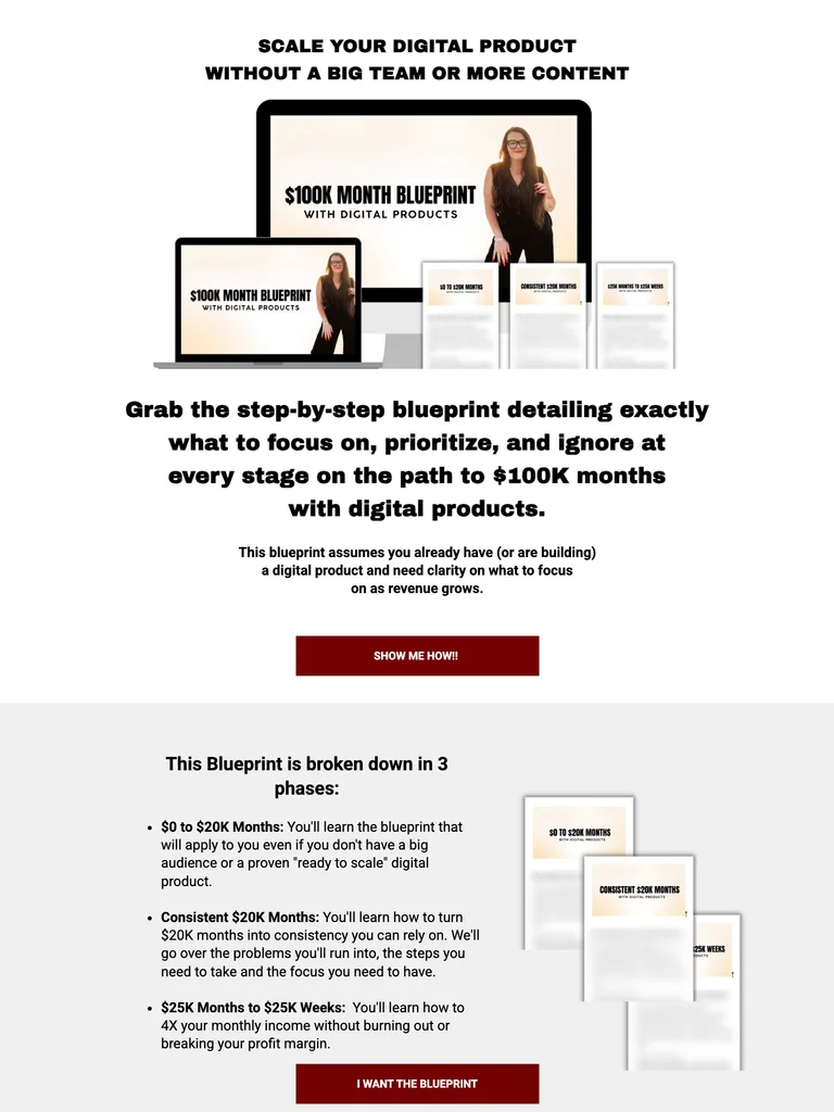 hover to scroll
A narrow digital-product offer with bold copy, device mockups, a straightforward price section, and student quotes.
Useful for: Study the public sales page and its section order, offer presentation, and calls to action. This reference captures one page; checkout steps and conversion results are not verified.
# Design reference: Katie and Floyd — Digital Product Blueprint
Source: https://katiejcoaching.com/usd100k-month-blueprint-with-digital-products
Swipefile reference: https://swipefile.design/ref/funnel-katie-and-floyd-100k-month-blueprint-with-digital-products/
Captured: 2026-09-07. This is a dated reference, not a claim about the current live product.


## Objective
Adapt the visual principles below to my project. Use my own content and identity. Do not reproduce logos, proprietary copy, or brand assets.

## Reference notes
- mood: Simple and direct
- colors: White canvas, black text, deep red offer buttons, and green price highlights.
- typography: Bold sans-serif headlines, compact labels, and scannable benefit lists create a clear hierarchy through the long page.
- layout: Product mockups and promise → intended audience → course contents → price and offer → student testimonials → repeated closing bundle.
- motion: The capture records a static page state. Preserve readable scrolling and clear action feedback; video playback, counters, and hidden form behavior are not demonstrated.
- texture: Photographic or product imagery, contrasting section backgrounds, grouped benefits, and visual proof panels.
- dont: Use your own offer, brand, and assets. Do not invent testimonials, results, scarcity, guarantees, or pricing.

Useful for: Study the public sales page and its section order, offer presentation, and calls to action. This reference captures one page; checkout steps and conversion results are not verified.

## Acceptance criteria
- Existing project conventions, design tokens, working functionality, and unrelated changes are preserved.
- Two or three reference principles clearly support the user's task; conflicts are resolved in favor of usability and the existing product.
- Reusable components and semantic HTML express the interface. Available licensed assets are used; important UI text is never rendered as a bitmap.
- Every visible control has a defined behavior. Loading, empty, error, success, disabled, and long-content states are specified where relevant. Demo data is clearly labeled.
- Navigation and content adapt at 375px, 768px, and 1440px without horizontal page overflow. Keyboard use, visible focus, labeled inputs, at least 44px touch targets, readable contrast, and reduced motion are supported.
- Verification distinguishes rendered behavior from proposals and identifies anything still requiring a backend or external service.

## Quality bar
Clear hierarchy, consistent spacing, restrained surfaces, and purposeful motion. Avoid decorative gradients, excessive cards, placeholder buttons, and invented metrics unless the project calls for them. Do not claim a feature is connected or tested without evidence.
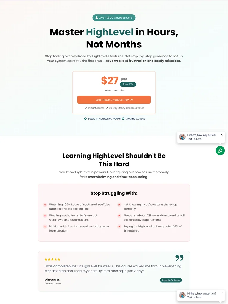 hover to scroll
A HighLevel training funnel with an immediate price panel, a focused learning promise, and a clear curriculum sequence.
Useful for: Study the public sales page and its section order, offer presentation, and calls to action. This reference captures one page; checkout steps and conversion results are not verified.
# Design reference: Good Tree Agency — HighLevel Simplified
Source: https://goodtreeagency.com/course-ghl-2
Swipefile reference: https://swipefile.design/ref/funnel-good-tree-agency-team-highlevel-simplified-master-highlevel-in-hours-not-months/
Captured: 2026-09-07. This is a dated reference, not a claim about the current live product.


## Objective
Adapt the visual principles below to my project. Use my own content and identity. Do not reproduce logos, proprietary copy, or brand assets.

## Reference notes
- mood: Simple and instructional
- colors: White, pale mint, teal emphasis, and orange access buttons.
- typography: Bold sans-serif headlines, compact labels, and scannable benefit lists create a clear hierarchy through the long page.
- layout: Specific learning promise and price → common software-learning problems → curriculum and benefits → proof → questions and final access action.
- motion: The capture records a static page state. Preserve readable scrolling and clear action feedback; video playback, counters, and hidden form behavior are not demonstrated.
- texture: Photographic or product imagery, contrasting section backgrounds, grouped benefits, and visual proof panels.
- dont: Use your own offer, brand, and assets. Do not invent testimonials, results, scarcity, guarantees, or pricing.

Useful for: Study the public sales page and its section order, offer presentation, and calls to action. This reference captures one page; checkout steps and conversion results are not verified.

## Acceptance criteria
- Existing project conventions, design tokens, working functionality, and unrelated changes are preserved.
- Two or three reference principles clearly support the user's task; conflicts are resolved in favor of usability and the existing product.
- Reusable components and semantic HTML express the interface. Available licensed assets are used; important UI text is never rendered as a bitmap.
- Every visible control has a defined behavior. Loading, empty, error, success, disabled, and long-content states are specified where relevant. Demo data is clearly labeled.
- Navigation and content adapt at 375px, 768px, and 1440px without horizontal page overflow. Keyboard use, visible focus, labeled inputs, at least 44px touch targets, readable contrast, and reduced motion are supported.
- Verification distinguishes rendered behavior from proposals and identifies anything still requiring a backend or external service.

## Quality bar
Clear hierarchy, consistent spacing, restrained surfaces, and purposeful motion. Avoid decorative gradients, excessive cards, placeholder buttons, and invented metrics unless the project calls for them. Do not claim a feature is connected or tested without evidence.
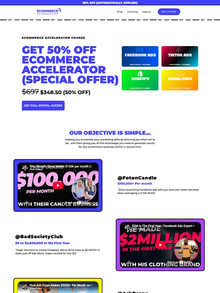 hover to scroll
An ecommerce-course funnel organized around student videos, marketing topics, a broad curriculum, and a closing offer.
Useful for: Study the public sales page and its section order, offer presentation, and calls to action. This reference captures one page; checkout steps and conversion results are not verified.
# Design reference: Chase Chappell — Ecommerce Accelerator
Source: https://chasechappell.com/ecommerce-accelerator-course
Swipefile reference: https://swipefile.design/ref/funnel-chase-chappell-ecommerce-accelerator-course/
Captured: 2026-09-07. This is a dated reference, not a claim about the current live product.


## Objective
Adapt the visual principles below to my project. Use my own content and identity. Do not reproduce logos, proprietary copy, or brand assets.

## Reference notes
- mood: Energetic and practical
- colors: White with vivid violet headings, blue buttons, and green, cyan, and orange curriculum panels.
- typography: Bold sans-serif headlines, compact labels, and scannable benefit lists create a clear hierarchy through the long page.
- layout: Course proposition → student video examples → marketing disciplines → curriculum and bonuses → price and enrollment → FAQ.
- motion: The capture records a static page state. Preserve readable scrolling and clear action feedback; video playback, counters, and hidden form behavior are not demonstrated.
- texture: Photographic or product imagery, contrasting section backgrounds, grouped benefits, and visual proof panels.
- dont: Use your own offer, brand, and assets. Do not invent testimonials, results, scarcity, guarantees, or pricing.

Useful for: Study the public sales page and its section order, offer presentation, and calls to action. This reference captures one page; checkout steps and conversion results are not verified.

## Acceptance criteria
- Existing project conventions, design tokens, working functionality, and unrelated changes are preserved.
- Two or three reference principles clearly support the user's task; conflicts are resolved in favor of usability and the existing product.
- Reusable components and semantic HTML express the interface. Available licensed assets are used; important UI text is never rendered as a bitmap.
- Every visible control has a defined behavior. Loading, empty, error, success, disabled, and long-content states are specified where relevant. Demo data is clearly labeled.
- Navigation and content adapt at 375px, 768px, and 1440px without horizontal page overflow. Keyboard use, visible focus, labeled inputs, at least 44px touch targets, readable contrast, and reduced motion are supported.
- Verification distinguishes rendered behavior from proposals and identifies anything still requiring a backend or external service.

## Quality bar
Clear hierarchy, consistent spacing, restrained surfaces, and purposeful motion. Avoid decorative gradients, excessive cards, placeholder buttons, and invented metrics unless the project calls for them. Do not claim a feature is connected or tested without evidence.
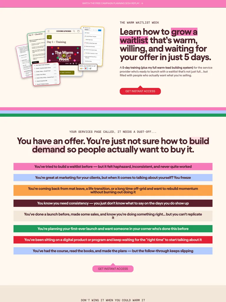 hover to scroll
A launch-training offer that explains a short learning sequence with expressive typography and clearly grouped resources.
Useful for: Study the public sales page and its section order, offer presentation, and calls to action. This reference captures one page; checkout steps and conversion results are not verified.
# Design reference: Coming Up Roses — Warm Waitlist Week
Source: https://cominguproses.co/products/www
Swipefile reference: https://swipefile.design/ref/funnel-kelsey-mccormick-the-warm-waitlist-week/
Captured: 2026-09-07. This is a dated reference, not a claim about the current live product.


## Objective
Adapt the visual principles below to my project. Use my own content and identity. Do not reproduce logos, proprietary copy, or brand assets.

## Reference notes
- mood: Expressive and approachable
- colors: Warm cream, burgundy, pink highlights, and green, blue, and orange course panels.
- typography: Bold sans-serif headlines, compact labels, and scannable benefit lists create a clear hierarchy through the long page.
- layout: Waitlist-training offer → launch problem → five-day method → included resources → instructor and proof → purchase section.
- motion: The capture records a static page state. Preserve readable scrolling and clear action feedback; video playback, counters, and hidden form behavior are not demonstrated.
- texture: Photographic or product imagery, contrasting section backgrounds, grouped benefits, and visual proof panels.
- dont: Use your own offer, brand, and assets. Do not invent testimonials, results, scarcity, guarantees, or pricing.

Useful for: Study the public sales page and its section order, offer presentation, and calls to action. This reference captures one page; checkout steps and conversion results are not verified.

## Acceptance criteria
- Existing project conventions, design tokens, working functionality, and unrelated changes are preserved.
- Two or three reference principles clearly support the user's task; conflicts are resolved in favor of usability and the existing product.
- Reusable components and semantic HTML express the interface. Available licensed assets are used; important UI text is never rendered as a bitmap.
- Every visible control has a defined behavior. Loading, empty, error, success, disabled, and long-content states are specified where relevant. Demo data is clearly labeled.
- Navigation and content adapt at 375px, 768px, and 1440px without horizontal page overflow. Keyboard use, visible focus, labeled inputs, at least 44px touch targets, readable contrast, and reduced motion are supported.
- Verification distinguishes rendered behavior from proposals and identifies anything still requiring a backend or external service.

## Quality bar
Clear hierarchy, consistent spacing, restrained surfaces, and purposeful motion. Avoid decorative gradients, excessive cards, placeholder buttons, and invented metrics unless the project calls for them. Do not claim a feature is connected or tested without evidence.
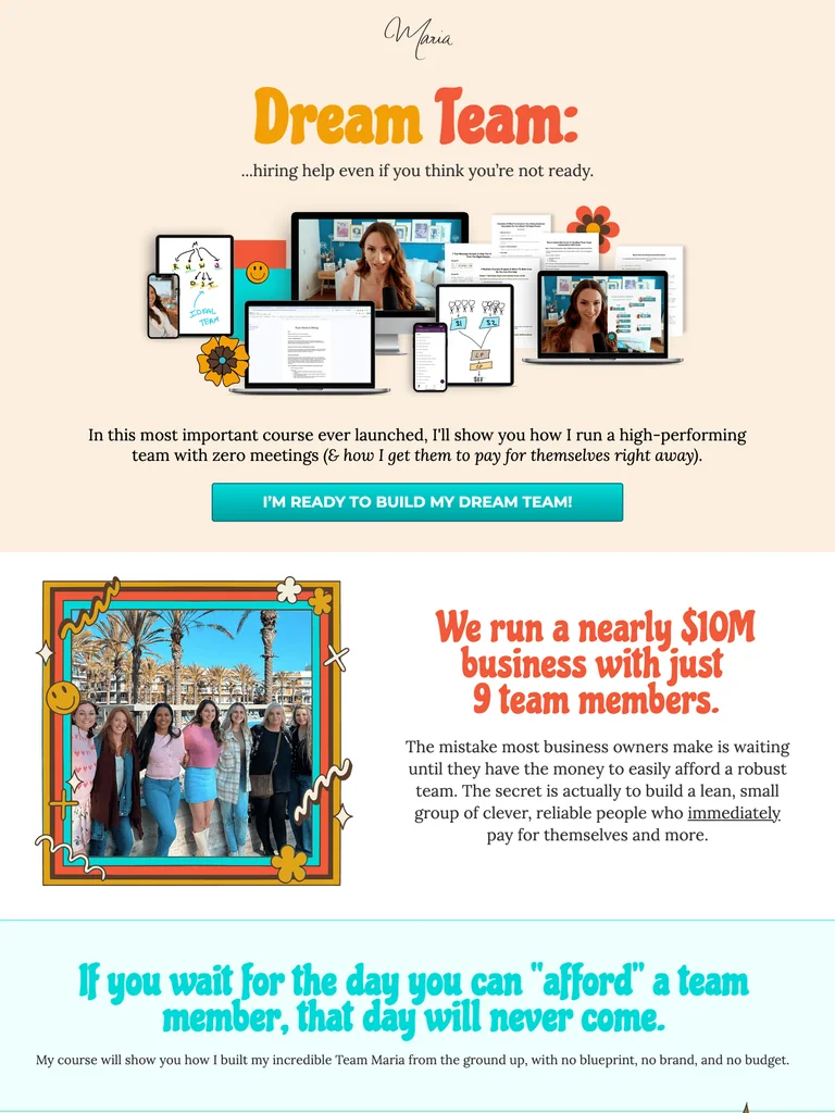 hover to scroll
A hiring-course funnel with retro lettering, product mockups, colorful checklists, and a personal team-video close.
Useful for: Study the complete public offer page, its section order, and calls to action. Checkout steps, current enrollment availability, and conversion results are not verified.
# Design reference: Maria Wendt — Dream Team
Source: https://mariawendt.com/dream-team
Swipefile reference: https://swipefile.design/ref/funnel-maria-wendt-dream-team/
Captured: 2026-09-07. This is a dated reference, not a claim about the current live product.


## Objective
Adapt the visual principles below to my project. Use my own content and identity. Do not reproduce logos, proprietary copy, or brand assets.

## Reference notes
- mood: Playful and personal
- colors: Warm cream, orange display lettering, pale turquoise panels, and teal buttons.
- typography: Bold sans-serif headings, compact labels, short benefit lists, and clearly separated curriculum sections make the long offer scannable.
- layout: Product bundle hero → hiring objections and benefits → course contents → audience-fit checklist → enrollment → team video and final CTA.
- motion: The screenshot records a static page state. Preserve readable scrolling and clear action feedback; do not infer video playback, counters, or hidden form behavior.
- texture: Product or instructor imagery, contrasting section backgrounds, grouped curriculum details, and customer-story panels.
- dont: Use your own offer, brand, and assets. Do not invent testimonials, results, scarcity, guarantees, or pricing.

Useful for: Study the complete public offer page, its section order, and calls to action. Checkout steps, current enrollment availability, and conversion results are not verified.

## Acceptance criteria
- Existing project conventions, design tokens, working functionality, and unrelated changes are preserved.
- Two or three reference principles clearly support the user's task; conflicts are resolved in favor of usability and the existing product.
- Reusable components and semantic HTML express the interface. Available licensed assets are used; important UI text is never rendered as a bitmap.
- Every visible control has a defined behavior. Loading, empty, error, success, disabled, and long-content states are specified where relevant. Demo data is clearly labeled.
- Navigation and content adapt at 375px, 768px, and 1440px without horizontal page overflow. Keyboard use, visible focus, labeled inputs, at least 44px touch targets, readable contrast, and reduced motion are supported.
- Verification distinguishes rendered behavior from proposals and identifies anything still requiring a backend or external service.

## Quality bar
Clear hierarchy, consistent spacing, restrained surfaces, and purposeful motion. Avoid decorative gradients, excessive cards, placeholder buttons, and invented metrics unless the project calls for them. Do not claim a feature is connected or tested without evidence.
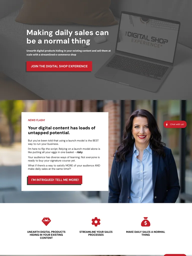 hover to scroll
A digital-shop course offer that turns a content problem into a phased teaching framework, then presents resources, proof, and enrollment options.
Useful for: Study the complete public offer page, its section order, and calls to action. Checkout steps, current enrollment availability, and conversion results are not verified.
# Design reference: Monica Froese — Digital Shop Experience
Source: https://digitalshopexperience.com/
Swipefile reference: https://swipefile.design/ref/funnel-monica-froese-the-digital-shop-experience/
Captured: 2026-09-07. This is a dated reference, not a claim about the current live product.


## Objective
Adapt the visual principles below to my project. Use my own content and identity. Do not reproduce logos, proprietary copy, or brand assets.

## Reference notes
- mood: Practical and encouraging
- colors: White and pale gray, cherry-red buttons and accents, dark text, and photographic sections.
- typography: Bold sans-serif headings, compact labels, short benefit lists, and clearly separated curriculum sections make the long offer scannable.
- layout: Shop-building promise → unused-content problem → sales examples → three-phase teaching framework → bonuses and templates → student proof → price and guarantee.
- motion: The screenshot records a static page state. Preserve readable scrolling and clear action feedback; do not infer video playback, counters, or hidden form behavior.
- texture: Product or instructor imagery, contrasting section backgrounds, grouped curriculum details, and customer-story panels.
- dont: Use your own offer, brand, and assets. Do not invent testimonials, results, scarcity, guarantees, or pricing.

Useful for: Study the complete public offer page, its section order, and calls to action. Checkout steps, current enrollment availability, and conversion results are not verified.

## Acceptance criteria
- Existing project conventions, design tokens, working functionality, and unrelated changes are preserved.
- Two or three reference principles clearly support the user's task; conflicts are resolved in favor of usability and the existing product.
- Reusable components and semantic HTML express the interface. Available licensed assets are used; important UI text is never rendered as a bitmap.
- Every visible control has a defined behavior. Loading, empty, error, success, disabled, and long-content states are specified where relevant. Demo data is clearly labeled.
- Navigation and content adapt at 375px, 768px, and 1440px without horizontal page overflow. Keyboard use, visible focus, labeled inputs, at least 44px touch targets, readable contrast, and reduced motion are supported.
- Verification distinguishes rendered behavior from proposals and identifies anything still requiring a backend or external service.

## Quality bar
Clear hierarchy, consistent spacing, restrained surfaces, and purposeful motion. Avoid decorative gradients, excessive cards, placeholder buttons, and invented metrics unless the project calls for them. Do not claim a feature is connected or tested without evidence.
 hover to scroll
An SEO-course page for service providers with a soft editorial palette, a clear four-module curriculum, and practical resource previews.
Useful for: Study the complete public offer page, its section order, and calls to action. Checkout steps, current enrollment availability, and conversion results are not verified.
# Design reference: Sara Dunn — Rank for Revenue
Source: https://saradoesseo.com/rank-for-revenue
Swipefile reference: https://swipefile.design/ref/funnel-sara-dunn-rank-for-revenue/
Captured: 2026-09-07. This is a dated reference, not a claim about the current live product.


## Objective
Adapt the visual principles below to my project. Use my own content and identity. Do not reproduce logos, proprietary copy, or brand assets.

## Reference notes
- mood: Supportive and editorial
- colors: Warm white, pale green, dusty rose, dark blue text, and restrained green buttons.
- typography: Editorial serif headings, small uppercase labels, and readable supporting text. Broad type-size changes mark each stage of the offer.
- layout: SEO-service promise → audience problem → course introduction → four core modules → practical resources → instructor and student proof → enrollment and questions.
- motion: The screenshot records a static page state. Preserve readable scrolling and clear action feedback; do not infer video playback, counters, or hidden form behavior.
- texture: Product or instructor imagery, contrasting section backgrounds, grouped curriculum details, and customer-story panels.
- dont: Use your own offer, brand, and assets. Do not invent testimonials, results, scarcity, guarantees, or pricing.

Useful for: Study the complete public offer page, its section order, and calls to action. Checkout steps, current enrollment availability, and conversion results are not verified.

## Acceptance criteria
- Existing project conventions, design tokens, working functionality, and unrelated changes are preserved.
- Two or three reference principles clearly support the user's task; conflicts are resolved in favor of usability and the existing product.
- Reusable components and semantic HTML express the interface. Available licensed assets are used; important UI text is never rendered as a bitmap.
- Every visible control has a defined behavior. Loading, empty, error, success, disabled, and long-content states are specified where relevant. Demo data is clearly labeled.
- Navigation and content adapt at 375px, 768px, and 1440px without horizontal page overflow. Keyboard use, visible focus, labeled inputs, at least 44px touch targets, readable contrast, and reduced motion are supported.
- Verification distinguishes rendered behavior from proposals and identifies anything still requiring a backend or external service.

## Quality bar
Clear hierarchy, consistent spacing, restrained surfaces, and purposeful motion. Avoid decorative gradients, excessive cards, placeholder buttons, and invented metrics unless the project calls for them. Do not claim a feature is connected or tested without evidence.
 hover to scroll
A purple-and-yellow course offer that pairs a recognizable instructor with book mockups and clear benefit lists.
Useful for: Study the complete public offer page, its section order, and calls to action. Checkout steps, current enrollment availability, and conversion results are not verified.
# Design reference: Rich Dad — Manage Your Money
Source: https://study.richdad.com/mym-lander
Swipefile reference: https://swipefile.design/ref/funnel-robert-kiyosaki-manage-your-money/
Captured: 2026-09-07. This is a dated reference, not a claim about the current live product.


## Objective
Adapt the visual principles below to my project. Use my own content and identity. Do not reproduce logos, proprietary copy, or brand assets.

## Reference notes
- mood: Direct, branded, and offer-focused.
- colors: Deep purple, bright yellow, white, and dark gray body text.
- typography: Bold sans-serif headings, compact labels, short benefit lists, and clearly separated curriculum sections make the long offer scannable.
- layout: Book mockups and an instructor portrait introduce the offer, followed by problem framing, checklist benefits, media references, a personal introduction, and repeated action buttons.
- motion: The screenshot records a static page state. Preserve readable scrolling and clear action feedback; do not infer video playback, counters, or hidden form behavior.
- texture: Product or instructor imagery, contrasting section backgrounds, grouped curriculum details, and customer-story panels.
- dont: Use your own offer, brand, and assets. Do not invent testimonials, results, scarcity, guarantees, or pricing.

Useful for: Study the complete public offer page, its section order, and calls to action. Checkout steps, current enrollment availability, and conversion results are not verified.

## Acceptance criteria
- Existing project conventions, design tokens, working functionality, and unrelated changes are preserved.
- Two or three reference principles clearly support the user's task; conflicts are resolved in favor of usability and the existing product.
- Reusable components and semantic HTML express the interface. Available licensed assets are used; important UI text is never rendered as a bitmap.
- Every visible control has a defined behavior. Loading, empty, error, success, disabled, and long-content states are specified where relevant. Demo data is clearly labeled.
- Navigation and content adapt at 375px, 768px, and 1440px without horizontal page overflow. Keyboard use, visible focus, labeled inputs, at least 44px touch targets, readable contrast, and reduced motion are supported.
- Verification distinguishes rendered behavior from proposals and identifies anything still requiring a backend or external service.

## Quality bar
Clear hierarchy, consistent spacing, restrained surfaces, and purposeful motion. Avoid decorative gradients, excessive cards, placeholder buttons, and invented metrics unless the project calls for them. Do not claim a feature is connected or tested without evidence.
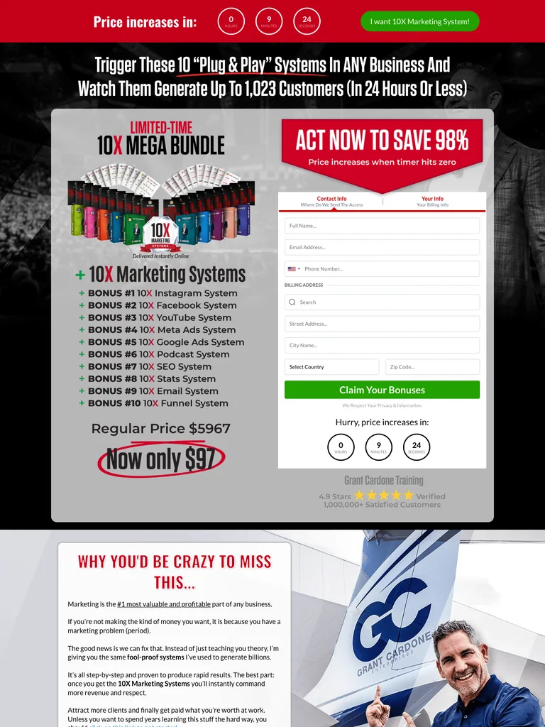 hover to scroll
A traditional marketing bundle funnel with an opening form, extensive module stack, and repeated offers.
Useful for: Study the complete public offer page, its section order, and calls to action. Checkout steps, current enrollment availability, and conversion results are not verified.
# Design reference: Grant Cardone — 10X Marketing Systems
Source: https://10xcertified.com/marketing-systems-97-4
Swipefile reference: https://swipefile.design/ref/funnel-grant-cardone-10x-marketing-mega-bundle/
Captured: 2026-09-07. This is a dated reference, not a claim about the current live product.


## Objective
Adapt the visual principles below to my project. Use my own content and identity. Do not reproduce logos, proprietary copy, or brand assets.

## Reference notes
- mood: Loud, urgent, and bundle-focused.
- colors: Black and white, vivid red sections, yellow emphasis, and green action buttons.
- typography: Bold sans-serif headings, compact labels, short benefit lists, and clearly separated curriculum sections make the long offer scannable.
- layout: Initial bundle artwork and order form lead into program modules, dashboard mockups, value-stack sections, repeated purchase prompts, and a final bundle recap.
- motion: The screenshot records a static page state. Preserve readable scrolling and clear action feedback; do not infer video playback, counters, or hidden form behavior.
- texture: Product or instructor imagery, contrasting section backgrounds, grouped curriculum details, and customer-story panels.
- dont: Use your own offer, brand, and assets. Do not invent testimonials, results, scarcity, guarantees, or pricing.

Useful for: Study the complete public offer page, its section order, and calls to action. Checkout steps, current enrollment availability, and conversion results are not verified.

## Acceptance criteria
- Existing project conventions, design tokens, working functionality, and unrelated changes are preserved.
- Two or three reference principles clearly support the user's task; conflicts are resolved in favor of usability and the existing product.
- Reusable components and semantic HTML express the interface. Available licensed assets are used; important UI text is never rendered as a bitmap.
- Every visible control has a defined behavior. Loading, empty, error, success, disabled, and long-content states are specified where relevant. Demo data is clearly labeled.
- Navigation and content adapt at 375px, 768px, and 1440px without horizontal page overflow. Keyboard use, visible focus, labeled inputs, at least 44px touch targets, readable contrast, and reduced motion are supported.
- Verification distinguishes rendered behavior from proposals and identifies anything still requiring a backend or external service.

## Quality bar
Clear hierarchy, consistent spacing, restrained surfaces, and purposeful motion. Avoid decorative gradients, excessive cards, placeholder buttons, and invented metrics unless the project calls for them. Do not claim a feature is connected or tested without evidence.
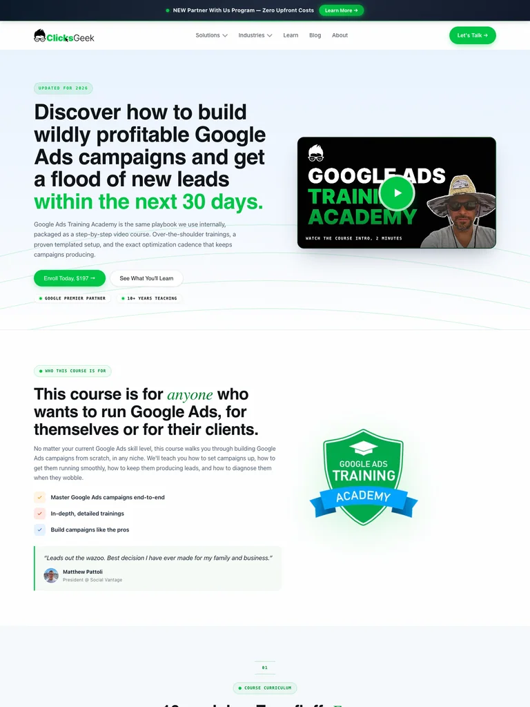 hover to scroll
A polished training page with a split hero, extensive curriculum, instructor section, and green calls to action.
Useful for: Study the complete public offer page, its section order, and calls to action. Checkout steps, current enrollment availability, and conversion results are not verified.
# Design reference: Clicks Geek — Google Ads Training Academy
Source: https://clicksgeek.com/google-ads-ppc-course
Swipefile reference: https://swipefile.design/ref/funnel-rob-andolina-google-ads-training-academy/
Captured: 2026-09-08. This is a dated reference, not a claim about the current live product.


## Objective
Adapt the visual principles below to my project. Use my own content and identity. Do not reproduce logos, proprietary copy, or brand assets.

## Reference notes
- mood: Clean, practical, and agency-led.
- colors: White and pale ice blue, near-black headings, bright green actions, and yellow portrait accents.
- typography: Bold sans-serif headings, compact labels, short benefit lists, and clearly separated curriculum sections make the long offer scannable.
- layout: Split course hero and video thumbnail lead through benefits, a detailed module curriculum, instructor credentials, enrollment details, and a dark closing call to action.
- motion: The screenshot records a static page state. Preserve readable scrolling and clear action feedback; do not infer video playback, counters, or hidden form behavior.
- texture: Product or instructor imagery, contrasting section backgrounds, grouped curriculum details, and customer-story panels.
- dont: Use your own offer, brand, and assets. Do not invent testimonials, results, scarcity, guarantees, or pricing.

Useful for: Study the complete public offer page, its section order, and calls to action. Checkout steps, current enrollment availability, and conversion results are not verified.

## Acceptance criteria
- Existing project conventions, design tokens, working functionality, and unrelated changes are preserved.
- Two or three reference principles clearly support the user's task; conflicts are resolved in favor of usability and the existing product.
- Reusable components and semantic HTML express the interface. Available licensed assets are used; important UI text is never rendered as a bitmap.
- Every visible control has a defined behavior. Loading, empty, error, success, disabled, and long-content states are specified where relevant. Demo data is clearly labeled.
- Navigation and content adapt at 375px, 768px, and 1440px without horizontal page overflow. Keyboard use, visible focus, labeled inputs, at least 44px touch targets, readable contrast, and reduced motion are supported.
- Verification distinguishes rendered behavior from proposals and identifies anything still requiring a backend or external service.

## Quality bar
Clear hierarchy, consistent spacing, restrained surfaces, and purposeful motion. Avoid decorative gradients, excessive cards, placeholder buttons, and invented metrics unless the project calls for them. Do not claim a feature is connected or tested without evidence.
 hover to scroll
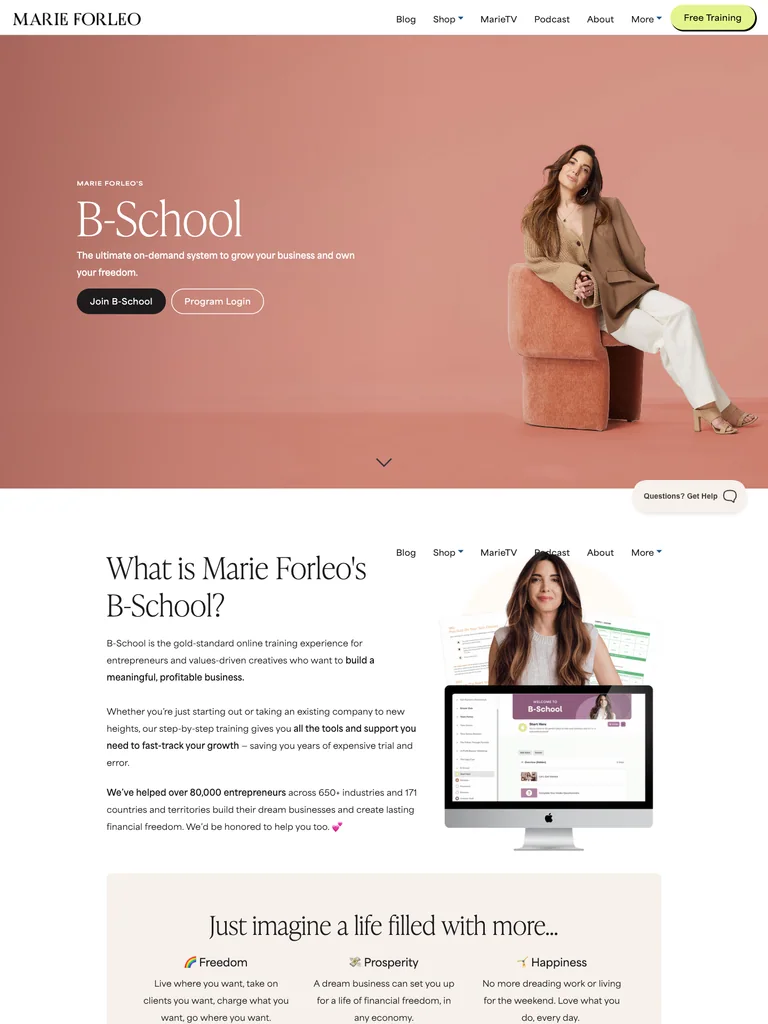
A warm business-course page using large photography, an editorial rhythm, and a restrained closing offer.
Useful for: Study the complete public offer page, its section order, and calls to action. Checkout steps, current enrollment availability, and conversion results are not verified.
# Design reference: Marie Forleo — B-School
Source: https://marieforleo.com/bschool
Swipefile reference: https://swipefile.design/ref/funnel-marie-forleo-b-school-2023-summer/
Captured: 2026-09-07. This is a dated reference, not a claim about the current live product.


## Objective
Adapt the visual principles below to my project. Use my own content and identity. Do not reproduce logos, proprietary copy, or brand assets.

## Reference notes
- mood: Warm, editorial, and established.
- colors: Peach and dusty pink, cream, black, and pale lime action accents.
- typography: Editorial serif headings, small uppercase labels, readable supporting copy, and occasional script accents establish a layered hierarchy.
- layout: Portrait-led course opening transitions into business categories illustrated with large photographs, program context, video stories, and a simple closing course offer above the dark footer.
- motion: The screenshot records a static page state. Preserve readable scrolling and clear action feedback; do not infer video playback, counters, or hidden form behavior.
- texture: Product or instructor imagery, contrasting section backgrounds, grouped curriculum details, and customer-story panels.
- dont: Use your own offer, brand, and assets. Do not invent testimonials, results, scarcity, guarantees, or pricing.

Useful for: Study the complete public offer page, its section order, and calls to action. Checkout steps, current enrollment availability, and conversion results are not verified.

## Acceptance criteria
- Existing project conventions, design tokens, working functionality, and unrelated changes are preserved.
- Two or three reference principles clearly support the user's task; conflicts are resolved in favor of usability and the existing product.
- Reusable components and semantic HTML express the interface. Available licensed assets are used; important UI text is never rendered as a bitmap.
- Every visible control has a defined behavior. Loading, empty, error, success, disabled, and long-content states are specified where relevant. Demo data is clearly labeled.
- Navigation and content adapt at 375px, 768px, and 1440px without horizontal page overflow. Keyboard use, visible focus, labeled inputs, at least 44px touch targets, readable contrast, and reduced motion are supported.
- Verification distinguishes rendered behavior from proposals and identifies anything still requiring a backend or external service.

## Quality bar
Clear hierarchy, consistent spacing, restrained surfaces, and purposeful motion. Avoid decorative gradients, excessive cards, placeholder buttons, and invented metrics unless the project calls for them. Do not claim a feature is connected or tested without evidence.
 hover to scroll
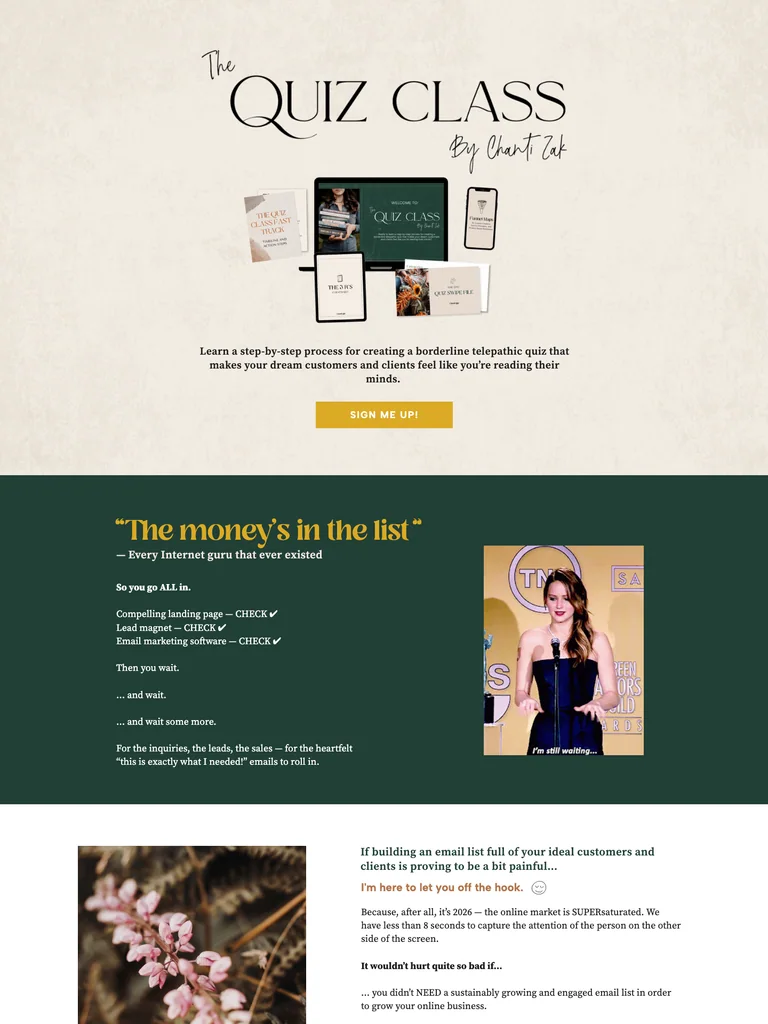
A textured quiz-course funnel with serif-and-script typography, forest-green curriculum sections, and gold actions.
Useful for: Study the complete public offer page, its section order, and calls to action. Checkout steps, current enrollment availability, and conversion results are not verified.
# Design reference: Chanti Zak — The Quiz Class
Source: https://chantizak.com/the-quiz-class
Swipefile reference: https://swipefile.design/ref/funnel-chanti-zak-quiz-creation-course-bundle/
Captured: 2026-09-08. This is a dated reference, not a claim about the current live product.


## Objective
Adapt the visual principles below to my project. Use my own content and identity. Do not reproduce logos, proprietary copy, or brand assets.

## Reference notes
- mood: Warm, textured, and expressive.
- colors: Paper cream, deep forest green, mustard gold, and soft orange labels.
- typography: Editorial serif headings, small uppercase labels, readable supporting copy, and occasional script accents establish a layered hierarchy.
- layout: Product-bundle hero opens into a long course narrative, instructor context, examples, a dark green lesson sequence, student stories, and a portrait-led final invitation.
- motion: The screenshot records a static page state. Preserve readable scrolling and clear action feedback; do not infer video playback, counters, or hidden form behavior.
- texture: Product or instructor imagery, contrasting section backgrounds, grouped curriculum details, and customer-story panels.
- dont: Use your own offer, brand, and assets. Do not invent testimonials, results, scarcity, guarantees, or pricing.

Useful for: Study the complete public offer page, its section order, and calls to action. Checkout steps, current enrollment availability, and conversion results are not verified.

## Acceptance criteria
- Existing project conventions, design tokens, working functionality, and unrelated changes are preserved.
- Two or three reference principles clearly support the user's task; conflicts are resolved in favor of usability and the existing product.
- Reusable components and semantic HTML express the interface. Available licensed assets are used; important UI text is never rendered as a bitmap.
- Every visible control has a defined behavior. Loading, empty, error, success, disabled, and long-content states are specified where relevant. Demo data is clearly labeled.
- Navigation and content adapt at 375px, 768px, and 1440px without horizontal page overflow. Keyboard use, visible focus, labeled inputs, at least 44px touch targets, readable contrast, and reduced motion are supported.
- Verification distinguishes rendered behavior from proposals and identifies anything still requiring a backend or external service.

## Quality bar
Clear hierarchy, consistent spacing, restrained surfaces, and purposeful motion. Avoid decorative gradients, excessive cards, placeholder buttons, and invented metrics unless the project calls for them. Do not claim a feature is connected or tested without evidence.
 hover to scroll
A compact training funnel with navy section bands, readable checklists, and a closing FAQ.
Useful for: Study the complete public offer page, its section order, and calls to action. Checkout steps, current enrollment availability, and conversion results are not verified.
# Design reference: Price Action Traders Institute — Command Your Trading
Source: https://priceactiontradersinstitute.com/independence
Swipefile reference: https://swipefile.design/ref/funnel-price-action-traders-institute-command-your-trading/
Captured: 2026-09-08. This is a dated reference, not a claim about the current live product.


## Objective
Adapt the visual principles below to my project. Use my own content and identity. Do not reproduce logos, proprietary copy, or brand assets.

## Reference notes
- mood: Straightforward, restrained, and instructional.
- colors: White and light gray, deep navy and purple, and red offer buttons.
- typography: Editorial serif headings, small uppercase labels, readable supporting copy, and occasional script accents establish a layered hierarchy.
- layout: Compact course introduction leads through problem checklists, course benefits, a membership bonus, student comments, an enrollment-status section, and an accordion FAQ.
- motion: The screenshot records a static page state. Preserve readable scrolling and clear action feedback; do not infer video playback, counters, or hidden form behavior.
- texture: Product or instructor imagery, contrasting section backgrounds, grouped curriculum details, and customer-story panels.
- dont: Use your own offer, brand, and assets. Do not invent testimonials, results, scarcity, guarantees, or pricing.

Useful for: Study the complete public offer page, its section order, and calls to action. Checkout steps, current enrollment availability, and conversion results are not verified.

## Acceptance criteria
- Existing project conventions, design tokens, working functionality, and unrelated changes are preserved.
- Two or three reference principles clearly support the user's task; conflicts are resolved in favor of usability and the existing product.
- Reusable components and semantic HTML express the interface. Available licensed assets are used; important UI text is never rendered as a bitmap.
- Every visible control has a defined behavior. Loading, empty, error, success, disabled, and long-content states are specified where relevant. Demo data is clearly labeled.
- Navigation and content adapt at 375px, 768px, and 1440px without horizontal page overflow. Keyboard use, visible focus, labeled inputs, at least 44px touch targets, readable contrast, and reduced motion are supported.
- Verification distinguishes rendered behavior from proposals and identifies anything still requiring a backend or external service.

## Quality bar
Clear hierarchy, consistent spacing, restrained surfaces, and purposeful motion. Avoid decorative gradients, excessive cards, placeholder buttons, and invented metrics unless the project calls for them. Do not claim a feature is connected or tested without evidence.
 hover to scroll
An extensive SEO course funnel with a clear module sequence, a dense review grid, and a coral closing offer.
Useful for: Study the complete public offer page, its section order, and calls to action. Checkout steps, current enrollment availability, and conversion results are not verified.
# Design reference: Freddie Chatt — Ecommerce SEO Bootcamp
Source: https://ecommerceseobootcamp.com/
Swipefile reference: https://swipefile.design/ref/funnel-ecommerce-seo-bootcamp-course-go-from-zero-to-10000-per-month-with-seo/
Captured: 2026-09-08. This is a dated reference, not a claim about the current live product.


## Objective
Adapt the visual principles below to my project. Use my own content and identity. Do not reproduce logos, proprietary copy, or brand assets.

## Reference notes
- mood: Practical, detailed, and evidence-led.
- colors: Dark plum, white, coral-orange action sections, and light gray backgrounds.
- typography: Bold sans-serif headings, compact labels, short benefit lists, and clearly separated curriculum sections make the long offer scannable.
- layout: Focused course hero leads into audience problems, a detailed module sequence, a large student-review grid, example results, instructor context, pricing, and a contrasting closing offer.
- motion: The screenshot records a static page state. Preserve readable scrolling and clear action feedback; do not infer video playback, counters, or hidden form behavior.
- texture: Product or instructor imagery, contrasting section backgrounds, grouped curriculum details, and customer-story panels.
- dont: Use your own offer, brand, and assets. Do not invent testimonials, results, scarcity, guarantees, or pricing.

Useful for: Study the complete public offer page, its section order, and calls to action. Checkout steps, current enrollment availability, and conversion results are not verified.

## Acceptance criteria
- Existing project conventions, design tokens, working functionality, and unrelated changes are preserved.
- Two or three reference principles clearly support the user's task; conflicts are resolved in favor of usability and the existing product.
- Reusable components and semantic HTML express the interface. Available licensed assets are used; important UI text is never rendered as a bitmap.
- Every visible control has a defined behavior. Loading, empty, error, success, disabled, and long-content states are specified where relevant. Demo data is clearly labeled.
- Navigation and content adapt at 375px, 768px, and 1440px without horizontal page overflow. Keyboard use, visible focus, labeled inputs, at least 44px touch targets, readable contrast, and reduced motion are supported.
- Verification distinguishes rendered behavior from proposals and identifies anything still requiring a backend or external service.

## Quality bar
Clear hierarchy, consistent spacing, restrained surfaces, and purposeful motion. Avoid decorative gradients, excessive cards, placeholder buttons, and invented metrics unless the project calls for them. Do not claim a feature is connected or tested without evidence.
 hover to scroll
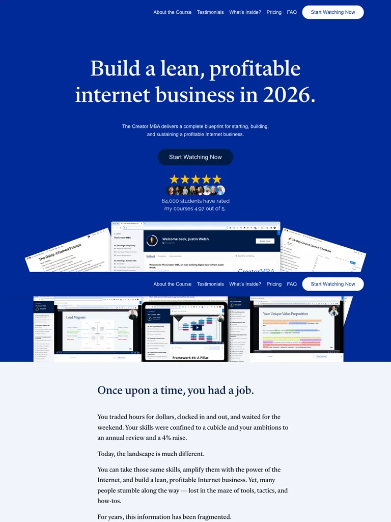
A long blue-and-white business-course page with editorial headings and a detailed curriculum-to-offer sequence.
Useful for: Study the complete public offer page, its section order, and calls to action. Checkout steps, current enrollment availability, and conversion results are not verified.
# Design reference: Justin Welsh — The Creator MBA
Source: https://learn.justinwelsh.me/creator
Swipefile reference: https://swipefile.design/ref/funnel-justin-welsh-the-creator-mba/
Captured: 2026-09-08. This is a dated reference, not a claim about the current live product.


## Objective
Adapt the visual principles below to my project. Use my own content and identity. Do not reproduce logos, proprietary copy, or brand assets.

## Reference notes
- mood: Editorial, confident, and structured.
- colors: Royal blue, deep navy, white, and restrained pale neutral panels.
- typography: Editorial serif headings, small uppercase labels, readable supporting copy, and occasional script accents establish a layered hierarchy.
- layout: Large serif course hero and layered resource previews lead into a narrative introduction, curriculum chapters, tool and bonus previews, audience-fit lists, student stories, pricing, instructor background, and FAQs.
- motion: The screenshot records a static page state. Preserve readable scrolling and clear action feedback; do not infer video playback, counters, or hidden form behavior.
- texture: Product or instructor imagery, contrasting section backgrounds, grouped curriculum details, and customer-story panels.
- dont: Use your own offer, brand, and assets. Do not invent testimonials, results, scarcity, guarantees, or pricing.

Useful for: Study the complete public offer page, its section order, and calls to action. Checkout steps, current enrollment availability, and conversion results are not verified.

## Acceptance criteria
- Existing project conventions, design tokens, working functionality, and unrelated changes are preserved.
- Two or three reference principles clearly support the user's task; conflicts are resolved in favor of usability and the existing product.
- Reusable components and semantic HTML express the interface. Available licensed assets are used; important UI text is never rendered as a bitmap.
- Every visible control has a defined behavior. Loading, empty, error, success, disabled, and long-content states are specified where relevant. Demo data is clearly labeled.
- Navigation and content adapt at 375px, 768px, and 1440px without horizontal page overflow. Keyboard use, visible focus, labeled inputs, at least 44px touch targets, readable contrast, and reduced motion are supported.
- Verification distinguishes rendered behavior from proposals and identifies anything still requiring a backend or external service.

## Quality bar
Clear hierarchy, consistent spacing, restrained surfaces, and purposeful motion. Avoid decorative gradients, excessive cards, placeholder buttons, and invented metrics unless the project calls for them. Do not claim a feature is connected or tested without evidence.
 hover to scroll
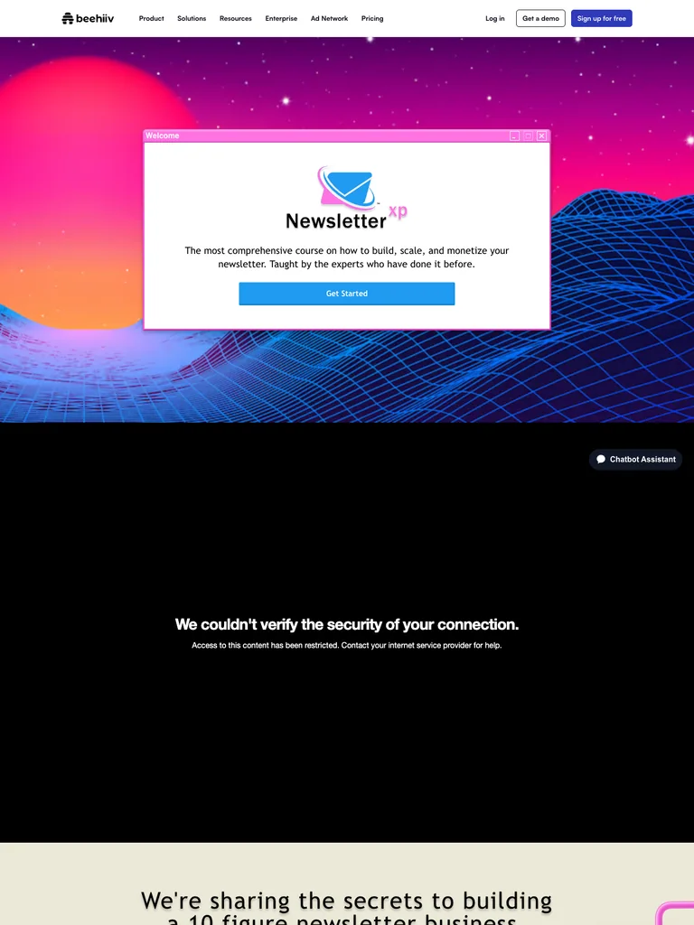
A newsletter-course funnel with a retro computer-window hero, neon landscapes, and a prominent speaker lineup.
Useful for: Study the complete public offer page, its section order, and calls to action. Checkout steps, current enrollment availability, and conversion results are not verified.
# Design reference: beehiiv — Newsletter XP
Source: https://beehiiv.com/courses/newsletter-xp
Swipefile reference: https://swipefile.design/ref/funnel-tyler-denk-beehiiv-newsletterxp/
Captured: 2026-09-08. This is a dated reference, not a claim about the current live product.


## Objective
Adapt the visual principles below to my project. Use my own content and identity. Do not reproduce logos, proprietary copy, or brand assets.

## Reference notes
- mood: Playful, retro, and speaker-led.
- colors: Neon pink and purple, electric blue grids, black sections, white panels, and pale cream backgrounds.
- typography: Bold sans-serif headings, compact labels, short benefit lists, and clearly separated curriculum sections make the long offer scannable.
- layout: Retro desktop-window hero introduces the course, followed by co-host and speaker profiles, curriculum details, supporting resources, enrollment information, and FAQs.
- motion: The screenshot records a static page state. Preserve readable scrolling and clear action feedback; do not infer video playback, counters, or hidden form behavior.
- texture: Product or instructor imagery, contrasting section backgrounds, grouped curriculum details, and customer-story panels.
- dont: Use your own offer, brand, and assets. Do not invent testimonials, results, scarcity, guarantees, or pricing.

Useful for: Study the complete public offer page, its section order, and calls to action. Checkout steps, current enrollment availability, and conversion results are not verified.

## Acceptance criteria
- Existing project conventions, design tokens, working functionality, and unrelated changes are preserved.
- Two or three reference principles clearly support the user's task; conflicts are resolved in favor of usability and the existing product.
- Reusable components and semantic HTML express the interface. Available licensed assets are used; important UI text is never rendered as a bitmap.
- Every visible control has a defined behavior. Loading, empty, error, success, disabled, and long-content states are specified where relevant. Demo data is clearly labeled.
- Navigation and content adapt at 375px, 768px, and 1440px without horizontal page overflow. Keyboard use, visible focus, labeled inputs, at least 44px touch targets, readable contrast, and reduced motion are supported.
- Verification distinguishes rendered behavior from proposals and identifies anything still requiring a backend or external service.

## Quality bar
Clear hierarchy, consistent spacing, restrained surfaces, and purposeful motion. Avoid decorative gradients, excessive cards, placeholder buttons, and invented metrics unless the project calls for them. Do not claim a feature is connected or tested without evidence.
Allow basic usage counts to help us understand what is useful. Your board contents stay out of analytics. Details
Your browser’s privacy preference keeps analytics off.