Personal Portfolio
CURATED COLLECTION · 13 REFERENCES
Immersive brand worlds, expressive portfolios and clear SaaS product stories.
Copy the reference notes below and paste them into Claude, ChatGPT, or your coding assistant. Add what you want to build.
Includes design notes, original sources, and preview links. An assistant that supports browsing can also read the public board link.
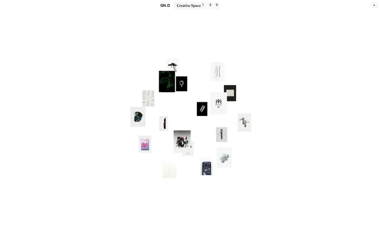
A sparse portfolio presents selected projects as a floating spatial collage.
Useful for: A sparse portfolio presents selected projects as a floating spatial collage.
# Design reference: Gionatan Nese ’26
Source: https://www.gionatannese.com/
Swipefile reference: https://swipefile.design/ref/awwwards-gionatan-nese-26/
Captured: 2026-09-05. This is a dated reference, not a claim about the current live product.
Capture scope: one viewport. Do not infer unseen page sections or a complete user flow.

## Objective
Adapt the visual principles below to my project. Use my own content and identity. Do not reproduce logos, proprietary copy, or brand assets.

## Reference notes
- mood: Quiet, exploratory, gallery-like.
- colors: White canvas, black microcopy, varied project imagery.
- typography: Small restrained sans-serif navigation gives the project thumbnails priority.
- layout: Tiny navigation sits above a compact cluster of image tiles, leaving most of the viewport open.
- motion: Static capture of one viewport. Visit the source to study motion and interaction.
- texture: Image tiles provide the only concentrated visual texture.
- dont: Adapt the structure to your own content and brand; use your own identity, copy and imagery.

Useful for: A sparse portfolio presents selected projects as a floating spatial collage.

## Acceptance criteria
- Existing project conventions, design tokens, working functionality, and unrelated changes are preserved.
- Two or three reference principles clearly support the user's task; conflicts are resolved in favor of usability and the existing product.
- Reusable components and semantic HTML express the interface. Available licensed assets are used; important UI text is never rendered as a bitmap.
- Every visible control has a defined behavior. Loading, empty, error, success, disabled, and long-content states are specified where relevant. Demo data is clearly labeled.
- Navigation and content adapt at 375px, 768px, and 1440px without horizontal page overflow. Keyboard use, visible focus, labeled inputs, at least 44px touch targets, readable contrast, and reduced motion are supported.
- Verification distinguishes rendered behavior from proposals and identifies anything still requiring a backend or external service.

## Quality bar
Clear hierarchy, consistent spacing, restrained surfaces, and purposeful motion. Avoid decorative gradients, excessive cards, placeholder buttons, and invented metrics unless the project calls for them. Do not claim a feature is connected or tested without evidence.
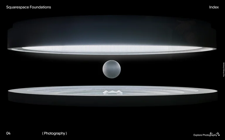
A cinematic brand-guidelines portal turns a selected identity principle into a sculptural scene.
Useful for: A cinematic brand-guidelines portal turns a selected identity principle into a sculptural scene.
# Design reference: Squarespace Foundations
Source: https://brand.squarespace.com/
Swipefile reference: https://swipefile.design/ref/awwwards-squarespace-foundations/
Captured: 2026-09-05. This is a dated reference, not a claim about the current live product.
Capture scope: one viewport. Do not infer unseen page sections or a complete user flow.

## Objective
Adapt the visual principles below to my project. Use my own content and identity. Do not reproduce logos, proprietary copy, or brand assets.

## Reference notes
- mood: Cinematic and precise.
- colors: Near-black field with cool silver and white light.
- typography: Small sans-serif labels stay subordinate to the main scene.
- layout: Corner navigation frames a centered, illuminated installation, with a section number and category along the bottom.
- motion: Static capture of one viewport. Visit the source to study motion and interaction.
- texture: Soft illumination, metallic surfaces, and photographic depth.
- dont: Adapt the structure to your own content and brand; use your own identity, copy and imagery.

Useful for: A cinematic brand-guidelines portal turns a selected identity principle into a sculptural scene.

## Acceptance criteria
- Existing project conventions, design tokens, working functionality, and unrelated changes are preserved.
- Two or three reference principles clearly support the user's task; conflicts are resolved in favor of usability and the existing product.
- Reusable components and semantic HTML express the interface. Available licensed assets are used; important UI text is never rendered as a bitmap.
- Every visible control has a defined behavior. Loading, empty, error, success, disabled, and long-content states are specified where relevant. Demo data is clearly labeled.
- Navigation and content adapt at 375px, 768px, and 1440px without horizontal page overflow. Keyboard use, visible focus, labeled inputs, at least 44px touch targets, readable contrast, and reduced motion are supported.
- Verification distinguishes rendered behavior from proposals and identifies anything still requiring a backend or external service.

## Quality bar
Clear hierarchy, consistent spacing, restrained surfaces, and purposeful motion. Avoid decorative gradients, excessive cards, placeholder buttons, and invented metrics unless the project calls for them. Do not claim a feature is connected or tested without evidence.
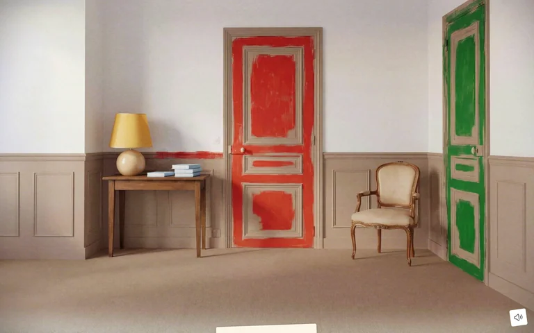
An interactive fashion campaign uses a furnished room and vivid doors as its navigation surface.
Useful for: An interactive fashion campaign uses a furnished room and vivid doors as its navigation surface.
# Design reference: Miu Miu — A House That We Shaped
Source: https://immersivebags.miumiu.com/en/
Swipefile reference: https://swipefile.design/ref/awwwards-miu-miu-a-house-that-we-shaped/
Captured: 2026-09-05. This is a dated reference, not a claim about the current live product.
Capture scope: one viewport. Do not infer unseen page sections or a complete user flow.

## Objective
Adapt the visual principles below to my project. Use my own content and identity. Do not reproduce logos, proprietary copy, or brand assets.

## Reference notes
- mood: Tactile, theatrical, exploratory.
- colors: Cream walls, warm wood, red and green painted doors.
- typography: Very little interface text competes with the scene.
- layout: A full-viewport room replaces a conventional hero; controls stay at the edges.
- motion: Static capture of one viewport. Visit the source to study motion and interaction.
- texture: Photographic interiors and rough painted door surfaces.
- dont: Adapt the structure to your own content and brand; use your own identity, copy and imagery.

Useful for: An interactive fashion campaign uses a furnished room and vivid doors as its navigation surface.

## Acceptance criteria
- Existing project conventions, design tokens, working functionality, and unrelated changes are preserved.
- Two or three reference principles clearly support the user's task; conflicts are resolved in favor of usability and the existing product.
- Reusable components and semantic HTML express the interface. Available licensed assets are used; important UI text is never rendered as a bitmap.
- Every visible control has a defined behavior. Loading, empty, error, success, disabled, and long-content states are specified where relevant. Demo data is clearly labeled.
- Navigation and content adapt at 375px, 768px, and 1440px without horizontal page overflow. Keyboard use, visible focus, labeled inputs, at least 44px touch targets, readable contrast, and reduced motion are supported.
- Verification distinguishes rendered behavior from proposals and identifies anything still requiring a backend or external service.

## Quality bar
Clear hierarchy, consistent spacing, restrained surfaces, and purposeful motion. Avoid decorative gradients, excessive cards, placeholder buttons, and invented metrics unless the project calls for them. Do not claim a feature is connected or tested without evidence.
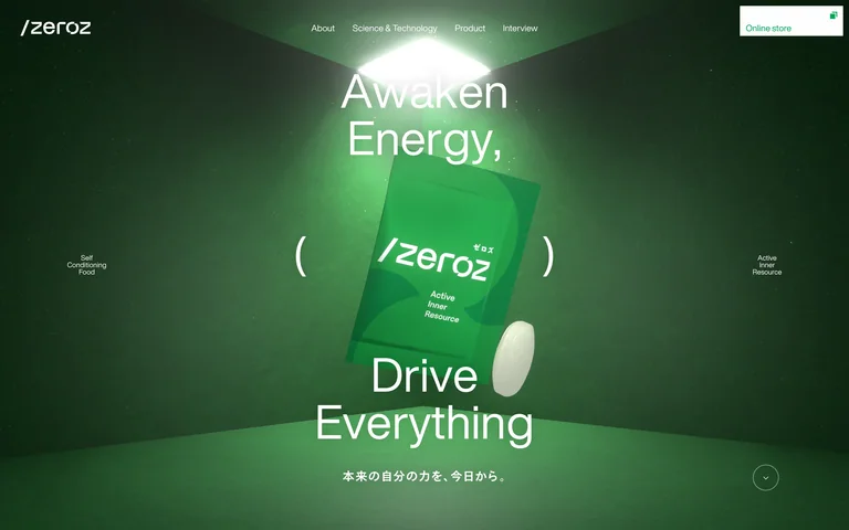
A green product hero frames a suspended packet and pill with large, split typography.
Useful for: A green product hero frames a suspended packet and pill with large, split typography.
# Design reference: /zeroz
Source: https://otsuka-air.jp/
Swipefile reference: https://swipefile.design/ref/awwwards-zeroz-brand-site/
Captured: 2026-09-05. This is a dated reference, not a claim about the current live product.
Capture scope: one viewport. Do not infer unseen page sections or a complete user flow.

## Objective
Adapt the visual principles below to my project. Use my own content and identity. Do not reproduce logos, proprietary copy, or brand assets.

## Reference notes
- mood: Futuristic and energetic.
- colors: Deep forest green, glowing lime and white.
- typography: Light sans-serif headlines and compact supporting labels.
- layout: A centered product sits between short headline fragments; navigation and small facts remain at the edges.
- motion: Static capture of one viewport. Visit the source to study motion and interaction.
- texture: Rendered packaging, spotlit planes and soft shadows.
- dont: Adapt the structure to your own content and brand; use your own identity, copy and imagery.

Useful for: A green product hero frames a suspended packet and pill with large, split typography.

## Acceptance criteria
- Existing project conventions, design tokens, working functionality, and unrelated changes are preserved.
- Two or three reference principles clearly support the user's task; conflicts are resolved in favor of usability and the existing product.
- Reusable components and semantic HTML express the interface. Available licensed assets are used; important UI text is never rendered as a bitmap.
- Every visible control has a defined behavior. Loading, empty, error, success, disabled, and long-content states are specified where relevant. Demo data is clearly labeled.
- Navigation and content adapt at 375px, 768px, and 1440px without horizontal page overflow. Keyboard use, visible focus, labeled inputs, at least 44px touch targets, readable contrast, and reduced motion are supported.
- Verification distinguishes rendered behavior from proposals and identifies anything still requiring a backend or external service.

## Quality bar
Clear hierarchy, consistent spacing, restrained surfaces, and purposeful motion. Avoid decorative gradients, excessive cards, placeholder buttons, and invented metrics unless the project calls for them. Do not claim a feature is connected or tested without evidence.
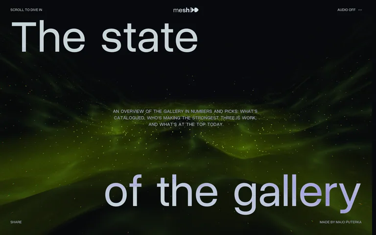
An immersive gallery report pairs oversized editorial type with a dark, luminous digital scene.
Useful for: An immersive gallery report pairs oversized editorial type with a dark, luminous digital scene.
# Design reference: The State of the Gallery
Source: https://mesh3d.gallery/the-state-of-the-gallery
Swipefile reference: https://swipefile.design/ref/awwwards-the-state-of-the-gallery/
Captured: 2026-09-05. This is a dated reference, not a claim about the current live product.
Capture scope: one viewport. Do not infer unseen page sections or a complete user flow.

## Objective
Adapt the visual principles below to my project. Use my own content and identity. Do not reproduce logos, proprietary copy, or brand assets.

## Reference notes
- mood: Atmospheric and exploratory.
- colors: Near-black, pale grey and electric yellow-green.
- typography: Large clean sans-serif title with tiny uppercase annotations.
- layout: The title is split between the upper and lower edges around centered introductory copy.
- motion: Static capture of one viewport. Visit the source to study motion and interaction.
- texture: Particle-like lights and layered depth.
- dont: Adapt the structure to your own content and brand; use your own identity, copy and imagery.

Useful for: An immersive gallery report pairs oversized editorial type with a dark, luminous digital scene.

## Acceptance criteria
- Existing project conventions, design tokens, working functionality, and unrelated changes are preserved.
- Two or three reference principles clearly support the user's task; conflicts are resolved in favor of usability and the existing product.
- Reusable components and semantic HTML express the interface. Available licensed assets are used; important UI text is never rendered as a bitmap.
- Every visible control has a defined behavior. Loading, empty, error, success, disabled, and long-content states are specified where relevant. Demo data is clearly labeled.
- Navigation and content adapt at 375px, 768px, and 1440px without horizontal page overflow. Keyboard use, visible focus, labeled inputs, at least 44px touch targets, readable contrast, and reduced motion are supported.
- Verification distinguishes rendered behavior from proposals and identifies anything still requiring a backend or external service.

## Quality bar
Clear hierarchy, consistent spacing, restrained surfaces, and purposeful motion. Avoid decorative gradients, excessive cards, placeholder buttons, and invented metrics unless the project calls for them. Do not claim a feature is connected or tested without evidence.
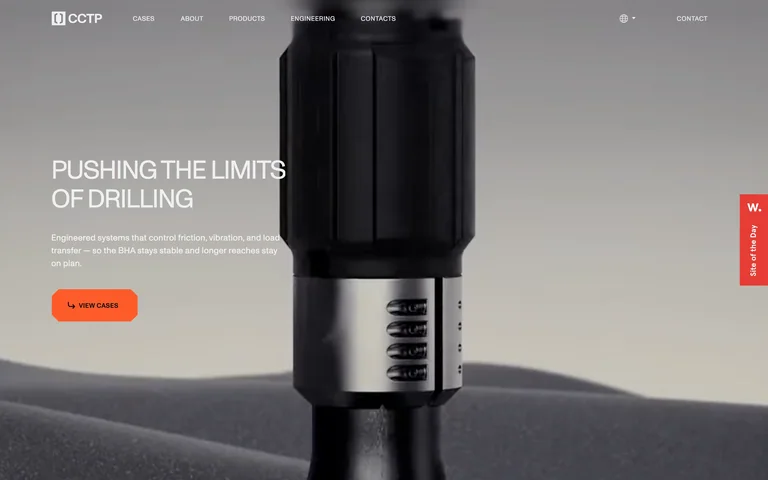
An industrial product takes center stage in a three-dimensional drilling hero.
Useful for: An industrial product takes center stage in a three-dimensional drilling hero.
# Design reference: SSTR — Friction Reduction
Source: https://sstr.tech/en/
Swipefile reference: https://swipefile.design/ref/awwwards-sstr-friction-reduction/
Captured: 2026-09-05. This is a dated reference, not a claim about the current live product.
Capture scope: one viewport. Do not infer unseen page sections or a complete user flow.

## Objective
Adapt the visual principles below to my project. Use my own content and identity. Do not reproduce logos, proprietary copy, or brand assets.

## Reference notes
- mood: Technical and substantial.
- colors: Grey landscape, black metal, white labels and orange actions.
- typography: Condensed-looking uppercase headline with small supporting text.
- layout: Left-aligned headline and orange action balance an oversized vertical tool; slim navigation spans the top.
- motion: Static capture of one viewport. Visit the source to study motion and interaction.
- texture: Brushed metal, sculpted terrain and directional light.
- dont: Adapt the structure to your own content and brand; use your own identity, copy and imagery.

Useful for: An industrial product takes center stage in a three-dimensional drilling hero.

## Acceptance criteria
- Existing project conventions, design tokens, working functionality, and unrelated changes are preserved.
- Two or three reference principles clearly support the user's task; conflicts are resolved in favor of usability and the existing product.
- Reusable components and semantic HTML express the interface. Available licensed assets are used; important UI text is never rendered as a bitmap.
- Every visible control has a defined behavior. Loading, empty, error, success, disabled, and long-content states are specified where relevant. Demo data is clearly labeled.
- Navigation and content adapt at 375px, 768px, and 1440px without horizontal page overflow. Keyboard use, visible focus, labeled inputs, at least 44px touch targets, readable contrast, and reduced motion are supported.
- Verification distinguishes rendered behavior from proposals and identifies anything still requiring a backend or external service.

## Quality bar
Clear hierarchy, consistent spacing, restrained surfaces, and purposeful motion. Avoid decorative gradients, excessive cards, placeholder buttons, and invented metrics unless the project calls for them. Do not claim a feature is connected or tested without evidence.
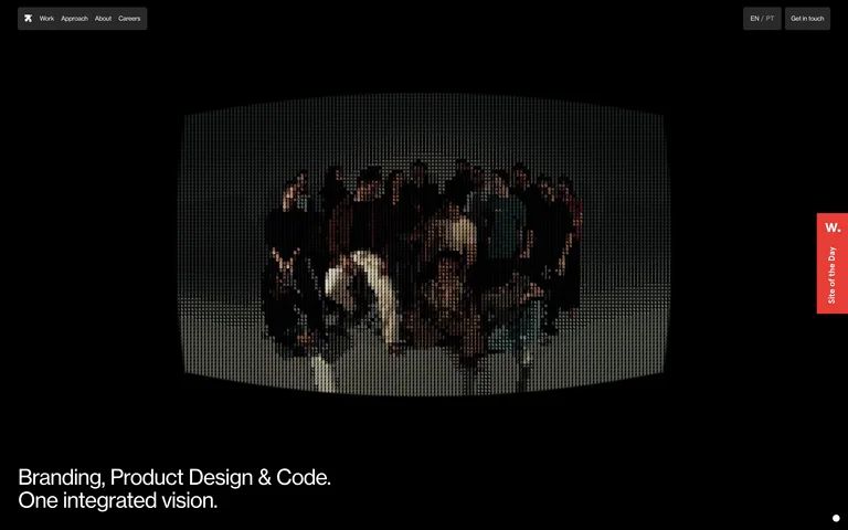
A dark studio portfolio pairs a floating team image with a concise multidisciplinary positioning statement.
Useful for: A dark studio portfolio pairs a floating team image with a concise multidisciplinary positioning statement.
# Design reference: Revelatio Studio
Source: https://revelatio.studio/
Swipefile reference: https://swipefile.design/ref/awwwards-revelatio-studio/
Captured: 2026-09-05. This is a dated reference, not a claim about the current live product.
Capture scope: one viewport. Do not infer unseen page sections or a complete user flow.

## Objective
Adapt the visual principles below to my project. Use my own content and identity. Do not reproduce logos, proprietary copy, or brand assets.

## Reference notes
- mood: Understated and unconventional.
- colors: Black and charcoal with restrained white type.
- typography: Small utility labels and a simple sans-serif positioning line.
- layout: A centered image dominates the open canvas, with tiny navigation above and a short statement at the lower left.
- motion: Static capture of one viewport. Visit the source to study motion and interaction.
- texture: A tilted photographic panel creates depth without a busy frame.
- dont: Adapt the structure to your own content and brand; use your own identity, copy and imagery.

Useful for: A dark studio portfolio pairs a floating team image with a concise multidisciplinary positioning statement.

## Acceptance criteria
- Existing project conventions, design tokens, working functionality, and unrelated changes are preserved.
- Two or three reference principles clearly support the user's task; conflicts are resolved in favor of usability and the existing product.
- Reusable components and semantic HTML express the interface. Available licensed assets are used; important UI text is never rendered as a bitmap.
- Every visible control has a defined behavior. Loading, empty, error, success, disabled, and long-content states are specified where relevant. Demo data is clearly labeled.
- Navigation and content adapt at 375px, 768px, and 1440px without horizontal page overflow. Keyboard use, visible focus, labeled inputs, at least 44px touch targets, readable contrast, and reduced motion are supported.
- Verification distinguishes rendered behavior from proposals and identifies anything still requiring a backend or external service.

## Quality bar
Clear hierarchy, consistent spacing, restrained surfaces, and purposeful motion. Avoid decorative gradients, excessive cards, placeholder buttons, and invented metrics unless the project calls for them. Do not claim a feature is connected or tested without evidence.
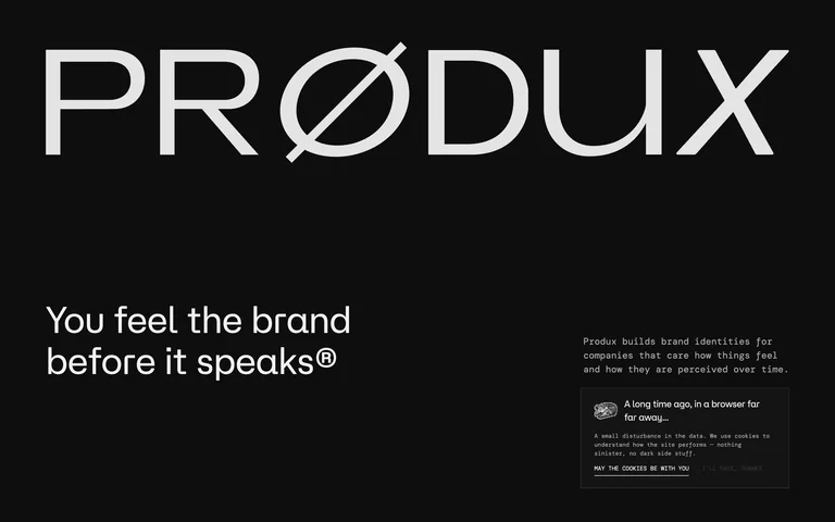
A design studio leads with an oversized wordmark and a sharply separated positioning statement.
Useful for: A design studio leads with an oversized wordmark and a sharply separated positioning statement.
# Design reference: Produx Design
Source: https://www.produx.design/
Swipefile reference: https://swipefile.design/ref/awwwards-produx-design/
Captured: 2026-09-05. This is a dated reference, not a claim about the current live product.
Capture scope: one viewport. Do not infer unseen page sections or a complete user flow.

## Objective
Adapt the visual principles below to my project. Use my own content and identity. Do not reproduce logos, proprietary copy, or brand assets.

## Reference notes
- mood: Confident and direct.
- colors: Near-black and off-white.
- typography: Large geometric wordmark contrasted with small text and medium-size headline.
- layout: A nearly full-width wordmark anchors the top; a large two-line statement and narrower supporting column divide the lower area.
- motion: Static capture of one viewport. Visit the source to study motion and interaction.
- texture: Flat monochrome surfaces with a small supporting proof panel.
- dont: Adapt the structure to your own content and brand; use your own identity, copy and imagery.

Useful for: A design studio leads with an oversized wordmark and a sharply separated positioning statement.

## Acceptance criteria
- Existing project conventions, design tokens, working functionality, and unrelated changes are preserved.
- Two or three reference principles clearly support the user's task; conflicts are resolved in favor of usability and the existing product.
- Reusable components and semantic HTML express the interface. Available licensed assets are used; important UI text is never rendered as a bitmap.
- Every visible control has a defined behavior. Loading, empty, error, success, disabled, and long-content states are specified where relevant. Demo data is clearly labeled.
- Navigation and content adapt at 375px, 768px, and 1440px without horizontal page overflow. Keyboard use, visible focus, labeled inputs, at least 44px touch targets, readable contrast, and reduced motion are supported.
- Verification distinguishes rendered behavior from proposals and identifies anything still requiring a backend or external service.

## Quality bar
Clear hierarchy, consistent spacing, restrained surfaces, and purposeful motion. Avoid decorative gradients, excessive cards, placeholder buttons, and invented metrics unless the project calls for them. Do not claim a feature is connected or tested without evidence.
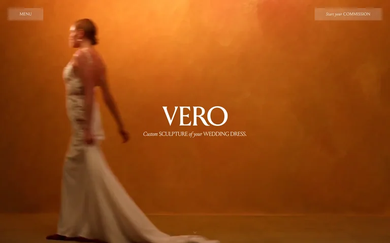
A bridal atelier introduces its work through full-screen dress footage and a centered serif identity.
Useful for: A bridal atelier introduces its work through full-screen dress footage and a centered serif identity.
# Design reference: Vero New York
Source: https://www.verostudio.com/
Swipefile reference: https://swipefile.design/ref/awwwards-vero-new-york/
Captured: 2026-09-05. This is a dated reference, not a claim about the current live product.
Capture scope: one viewport. Do not infer unseen page sections or a complete user flow.

## Objective
Adapt the visual principles below to my project. Use my own content and identity. Do not reproduce logos, proprietary copy, or brand assets.

## Reference notes
- mood: Intimate and editorial.
- colors: Warm amber and cream with white type.
- typography: Elegant serif brand lettering and small supporting captions.
- layout: An edge-to-edge fashion scene supports a small central brand lockup and corner navigation.
- motion: Static capture of one viewport. Visit the source to study motion and interaction.
- texture: Fabric movement, warm walls and cinematic light.
- dont: Adapt the structure to your own content and brand; use your own identity, copy and imagery.

Useful for: A bridal atelier introduces its work through full-screen dress footage and a centered serif identity.

## Acceptance criteria
- Existing project conventions, design tokens, working functionality, and unrelated changes are preserved.
- Two or three reference principles clearly support the user's task; conflicts are resolved in favor of usability and the existing product.
- Reusable components and semantic HTML express the interface. Available licensed assets are used; important UI text is never rendered as a bitmap.
- Every visible control has a defined behavior. Loading, empty, error, success, disabled, and long-content states are specified where relevant. Demo data is clearly labeled.
- Navigation and content adapt at 375px, 768px, and 1440px without horizontal page overflow. Keyboard use, visible focus, labeled inputs, at least 44px touch targets, readable contrast, and reduced motion are supported.
- Verification distinguishes rendered behavior from proposals and identifies anything still requiring a backend or external service.

## Quality bar
Clear hierarchy, consistent spacing, restrained surfaces, and purposeful motion. Avoid decorative gradients, excessive cards, placeholder buttons, and invented metrics unless the project calls for them. Do not claim a feature is connected or tested without evidence.
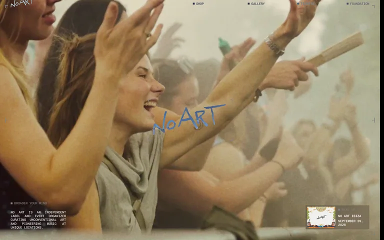
A music collective uses crowd footage as the backdrop for its event identity and navigation.
Useful for: A music collective uses crowd footage as the backdrop for its event identity and navigation.
# Design reference: No Art
Source: https://www.noartmusic.com/
Swipefile reference: https://swipefile.design/ref/awwwards-no-art/
Captured: 2026-09-05. This is a dated reference, not a claim about the current live product.
Capture scope: one viewport. Do not infer unseen page sections or a complete user flow.

## Objective
Adapt the visual principles below to my project. Use my own content and identity. Do not reproduce logos, proprietary copy, or brand assets.

## Reference notes
- mood: Social, expressive and energetic.
- colors: Natural skin tones and cream with a blue wordmark.
- typography: Handwritten branding contrasts with compact functional navigation.
- layout: Full-bleed footage, a central handwritten identity and small utility content in the corners.
- motion: Static capture of one viewport. Visit the source to study motion and interaction.
- texture: Candid crowd footage fills the canvas.
- dont: Adapt the structure to your own content and brand; use your own identity, copy and imagery.

Useful for: A music collective uses crowd footage as the backdrop for its event identity and navigation.

## Acceptance criteria
- Existing project conventions, design tokens, working functionality, and unrelated changes are preserved.
- Two or three reference principles clearly support the user's task; conflicts are resolved in favor of usability and the existing product.
- Reusable components and semantic HTML express the interface. Available licensed assets are used; important UI text is never rendered as a bitmap.
- Every visible control has a defined behavior. Loading, empty, error, success, disabled, and long-content states are specified where relevant. Demo data is clearly labeled.
- Navigation and content adapt at 375px, 768px, and 1440px without horizontal page overflow. Keyboard use, visible focus, labeled inputs, at least 44px touch targets, readable contrast, and reduced motion are supported.
- Verification distinguishes rendered behavior from proposals and identifies anything still requiring a backend or external service.

## Quality bar
Clear hierarchy, consistent spacing, restrained surfaces, and purposeful motion. Avoid decorative gradients, excessive cards, placeholder buttons, and invented metrics unless the project calls for them. Do not claim a feature is connected or tested without evidence.
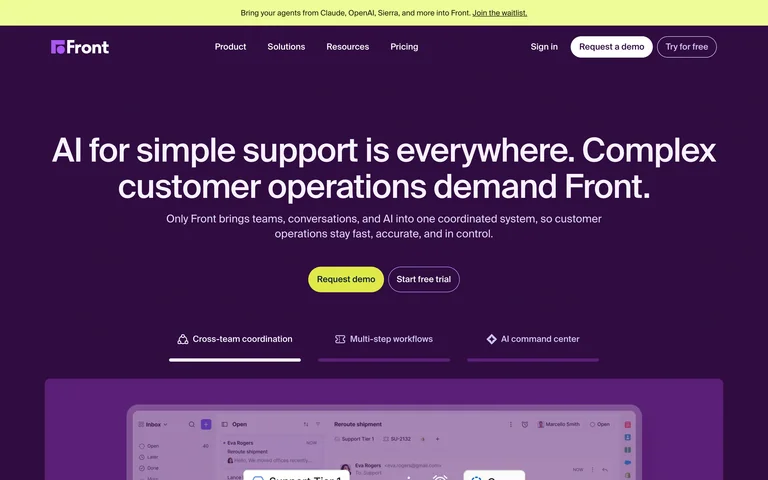
A customer-operations homepage pairs a centered positioning statement with demo and trial actions.
Useful for: A customer-operations homepage pairs a centered positioning statement with demo and trial actions.
# Design reference: Front
Source: https://front.com/
Swipefile reference: https://swipefile.design/ref/front-customer-operations/
Captured: 2026-09-05. This is a dated reference, not a claim about the current live product.
Capture scope: one viewport. Do not infer unseen page sections or a complete user flow.

## Objective
Adapt the visual principles below to my project. Use my own content and identity. Do not reproduce logos, proprietary copy, or brand assets.

## Reference notes
- mood: Focused and energetic.
- colors: Deep purple, white text and lime primary action.
- typography: Large sans-serif headline with smaller centered support text.
- layout: Centered hero, paired actions and a product-interface preview below.
- motion: Static capture of one viewport. Visit the source to study motion and interaction.
- texture: Flat color fields frame crisp product imagery.
- dont: Adapt the structure to your own content and brand; use your own identity, copy and imagery.

Useful for: A customer-operations homepage pairs a centered positioning statement with demo and trial actions.

## Acceptance criteria
- Existing project conventions, design tokens, working functionality, and unrelated changes are preserved.
- Two or three reference principles clearly support the user's task; conflicts are resolved in favor of usability and the existing product.
- Reusable components and semantic HTML express the interface. Available licensed assets are used; important UI text is never rendered as a bitmap.
- Every visible control has a defined behavior. Loading, empty, error, success, disabled, and long-content states are specified where relevant. Demo data is clearly labeled.
- Navigation and content adapt at 375px, 768px, and 1440px without horizontal page overflow. Keyboard use, visible focus, labeled inputs, at least 44px touch targets, readable contrast, and reduced motion are supported.
- Verification distinguishes rendered behavior from proposals and identifies anything still requiring a backend or external service.

## Quality bar
Clear hierarchy, consistent spacing, restrained surfaces, and purposeful motion. Avoid decorative gradients, excessive cards, placeholder buttons, and invented metrics unless the project calls for them. Do not claim a feature is connected or tested without evidence.
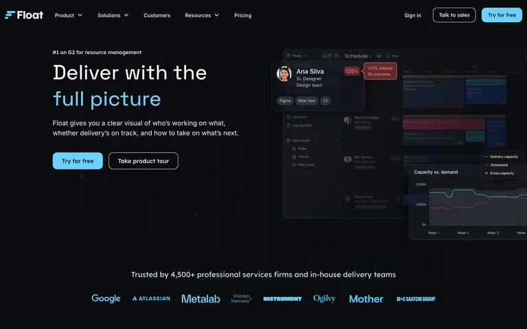
A resource-planning homepage balances a short value statement with layered product-interface previews.
Useful for: A resource-planning homepage balances a short value statement with layered product-interface previews.
# Design reference: Float
Source: https://www.float.com/
Swipefile reference: https://swipefile.design/ref/float-resource-planning/
Captured: 2026-09-05. This is a dated reference, not a claim about the current live product.
Capture scope: one viewport. Do not infer unseen page sections or a complete user flow.

## Objective
Adapt the visual principles below to my project. Use my own content and identity. Do not reproduce logos, proprietary copy, or brand assets.

## Reference notes
- mood: Practical and technical.
- colors: Near-black background, pale blue accents and white text.
- typography: Large sans-serif headline with a highlighted phrase.
- layout: Left-aligned headline and actions face a layered scheduling preview; customer logos sit below.
- motion: Static capture of one viewport. Visit the source to study motion and interaction.
- texture: Overlapping interface panels provide depth.
- dont: Adapt the structure to your own content and brand; use your own identity, copy and imagery.

Useful for: A resource-planning homepage balances a short value statement with layered product-interface previews.

## Acceptance criteria
- Existing project conventions, design tokens, working functionality, and unrelated changes are preserved.
- Two or three reference principles clearly support the user's task; conflicts are resolved in favor of usability and the existing product.
- Reusable components and semantic HTML express the interface. Available licensed assets are used; important UI text is never rendered as a bitmap.
- Every visible control has a defined behavior. Loading, empty, error, success, disabled, and long-content states are specified where relevant. Demo data is clearly labeled.
- Navigation and content adapt at 375px, 768px, and 1440px without horizontal page overflow. Keyboard use, visible focus, labeled inputs, at least 44px touch targets, readable contrast, and reduced motion are supported.
- Verification distinguishes rendered behavior from proposals and identifies anything still requiring a backend or external service.

## Quality bar
Clear hierarchy, consistent spacing, restrained surfaces, and purposeful motion. Avoid decorative gradients, excessive cards, placeholder buttons, and invented metrics unless the project calls for them. Do not claim a feature is connected or tested without evidence.
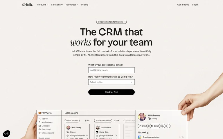
A warm CRM homepage places a short signup form directly beneath the main value statement.
Useful for: A warm CRM homepage places a short signup form directly beneath the main value statement.
# Design reference: folk
Source: https://www.folk.app/
Swipefile reference: https://swipefile.design/ref/folk-crm-marketing/
Captured: 2026-09-05. This is a dated reference, not a claim about the current live product.
Capture scope: one viewport. Do not infer unseen page sections or a complete user flow.

## Objective
Adapt the visual principles below to my project. Use my own content and identity. Do not reproduce logos, proprietary copy, or brand assets.

## Reference notes
- mood: Approachable and restrained.
- colors: Warm off-white, black type and a black primary action.
- typography: Sans-serif headline with an italic serif phrase.
- layout: Centered headline and compact form sit above an interface preview framed by cutout hands.
- motion: Static capture of one viewport. Visit the source to study motion and interaction.
- texture: Soft paper-like background and photographic hand cutouts.
- dont: Adapt the structure to your own content and brand; use your own identity, copy and imagery.

Useful for: A warm CRM homepage places a short signup form directly beneath the main value statement.

## Acceptance criteria
- Existing project conventions, design tokens, working functionality, and unrelated changes are preserved.
- Two or three reference principles clearly support the user's task; conflicts are resolved in favor of usability and the existing product.
- Reusable components and semantic HTML express the interface. Available licensed assets are used; important UI text is never rendered as a bitmap.
- Every visible control has a defined behavior. Loading, empty, error, success, disabled, and long-content states are specified where relevant. Demo data is clearly labeled.
- Navigation and content adapt at 375px, 768px, and 1440px without horizontal page overflow. Keyboard use, visible focus, labeled inputs, at least 44px touch targets, readable contrast, and reduced motion are supported.
- Verification distinguishes rendered behavior from proposals and identifies anything still requiring a backend or external service.

## Quality bar
Clear hierarchy, consistent spacing, restrained surfaces, and purposeful motion. Avoid decorative gradients, excessive cards, placeholder buttons, and invented metrics unless the project calls for them. Do not claim a feature is connected or tested without evidence.
Allow basic usage counts to help us understand what is useful. Your board contents stay out of analytics. Details
Your browser’s privacy preference keeps analytics off.