 hover to scroll
Long-Form Sales
CURATED COLLECTION · 15 REFERENCES
Extended written sales arguments, detailed offers, and repeated calls to action.
Copy the reference notes below and paste them into Claude, ChatGPT, or your coding assistant. Add what you want to build.
Includes design notes, original sources, and preview links. An assistant that supports browsing can also read the public board link.
1 references are no longer public and are omitted.
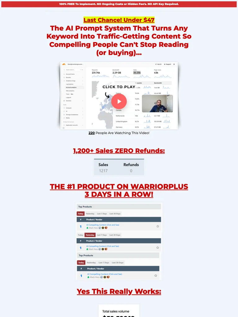
hover to scrollA classic sales letter with highlighted claims, a demo-led opening, and a long single-column product explanation.
Useful for: Study the public sales page and its section order, offer presentation, and calls to action. This reference captures one page; checkout steps and conversion results are not verified.
# Design reference: Mark Hess — Compelling Content
Source: https://actionactivated.com/compelling-content
Swipefile reference: https://swipefile.design/ref/funnel-mark-hess-compelling-content-fe-oto-custom-gpt-compelling-keywords/
Captured: 2026-09-07. This is a dated reference, not a claim about the current live product.


## Objective
Adapt the visual principles below to my project. Use my own content and identity. Do not reproduce logos, proprietary copy, or brand assets.

## Reference notes
- mood: Classic direct response
- colors: Pale blue page, black copy, red headlines, and yellow text highlights.
- typography: Readable single-column body copy, bold section headlines, and selective inline emphasis sustain a long written pitch.
- layout: Offer headline and demo → product explanation → long written argument → highlighted mechanism sections → purchase opportunities → closing offer notes.
- motion: The capture records a static page state. Preserve readable scrolling and clear action feedback; video playback, counters, and hidden form behavior are not demonstrated.
- texture: Narrow reading columns, inset illustrations and examples, highlighted phrases, and repeated offer sections.
- dont: Use your own offer, brand, and assets. Do not invent testimonials, results, scarcity, guarantees, or pricing.

Useful for: Study the public sales page and its section order, offer presentation, and calls to action. This reference captures one page; checkout steps and conversion results are not verified.

## Acceptance criteria
- Existing project conventions, design tokens, working functionality, and unrelated changes are preserved.
- Two or three reference principles clearly support the user's task; conflicts are resolved in favor of usability and the existing product.
- Reusable components and semantic HTML express the interface. Available licensed assets are used; important UI text is never rendered as a bitmap.
- Every visible control has a defined behavior. Loading, empty, error, success, disabled, and long-content states are specified where relevant. Demo data is clearly labeled.
- Navigation and content adapt at 375px, 768px, and 1440px without horizontal page overflow. Keyboard use, visible focus, labeled inputs, at least 44px touch targets, readable contrast, and reduced motion are supported.
- Verification distinguishes rendered behavior from proposals and identifies anything still requiring a backend or external service.

## Quality bar
Clear hierarchy, consistent spacing, restrained surfaces, and purposeful motion. Avoid decorative gradients, excessive cards, placeholder buttons, and invented metrics unless the project calls for them. Do not claim a feature is connected or tested without evidence.
 hover to scroll
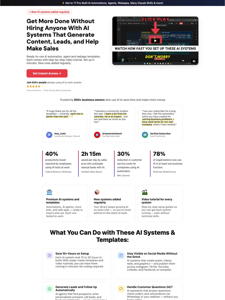
An automation-library sales page with expandable categories, product demonstrations, proof cards, and repeated access buttons.
Useful for: Study the public sales page and its section order, offer presentation, and calls to action. This reference captures one page; checkout steps and conversion results are not verified.
# Design reference: Fabian Markl — AI Systems Library
Source: https://fabimarkl.com/library
Swipefile reference: https://swipefile.design/ref/funnel-fabian-markl-ai-automations-agents-webapps/
Captured: 2026-09-07. This is a dated reference, not a claim about the current live product.


## Objective
Adapt the visual principles below to my project. Use my own content and identity. Do not reproduce logos, proprietary copy, or brand assets.

## Reference notes
- mood: Clear and product-focused
- colors: White and light gray panels with near-black text and coral-red buttons.
- typography: Bold sans-serif headlines, compact labels, and scannable benefit lists create a clear hierarchy through the long page.
- layout: Outcome-focused hero and demo → customer-message proof → benefit metrics → categorized template library → offer and objections → closing access action.
- motion: The capture records a static page state. Preserve readable scrolling and clear action feedback; video playback, counters, and hidden form behavior are not demonstrated.
- texture: Photographic or product imagery, contrasting section backgrounds, grouped benefits, and visual proof panels.
- dont: Use your own offer, brand, and assets. Do not invent testimonials, results, scarcity, guarantees, or pricing.

Useful for: Study the public sales page and its section order, offer presentation, and calls to action. This reference captures one page; checkout steps and conversion results are not verified.

## Acceptance criteria
- Existing project conventions, design tokens, working functionality, and unrelated changes are preserved.
- Two or three reference principles clearly support the user's task; conflicts are resolved in favor of usability and the existing product.
- Reusable components and semantic HTML express the interface. Available licensed assets are used; important UI text is never rendered as a bitmap.
- Every visible control has a defined behavior. Loading, empty, error, success, disabled, and long-content states are specified where relevant. Demo data is clearly labeled.
- Navigation and content adapt at 375px, 768px, and 1440px without horizontal page overflow. Keyboard use, visible focus, labeled inputs, at least 44px touch targets, readable contrast, and reduced motion are supported.
- Verification distinguishes rendered behavior from proposals and identifies anything still requiring a backend or external service.

## Quality bar
Clear hierarchy, consistent spacing, restrained surfaces, and purposeful motion. Avoid decorative gradients, excessive cards, placeholder buttons, and invented metrics unless the project calls for them. Do not claim a feature is connected or tested without evidence.
 hover to scroll
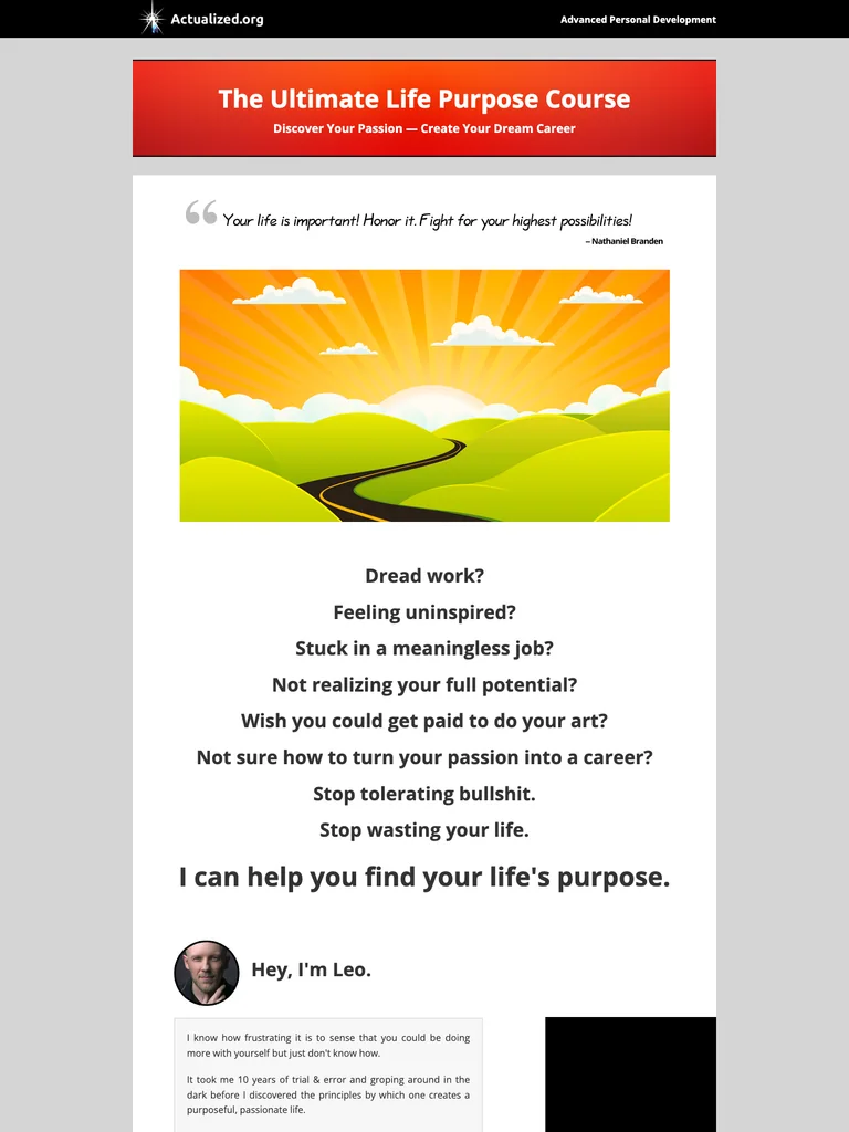
A traditional course sales letter with narrow reading columns, illustrative imagery, and detailed written explanations.
Useful for: Study the public sales page and its section order, offer presentation, and calls to action. This reference captures one page; checkout steps and conversion results are not verified.
# Design reference: Actualized.org — Life Purpose Course
Source: https://actualized.org/life-purpose-course
Swipefile reference: https://swipefile.design/ref/funnel-leo-gura-the-ultimate-life-purpose-course/
Captured: 2026-09-07. This is a dated reference, not a claim about the current live product.


## Objective
Adapt the visual principles below to my project. Use my own content and identity. Do not reproduce logos, proprietary copy, or brand assets.

## Reference notes
- mood: Traditional and explanatory
- colors: Light gray and white with black text, red headings, and warm illustrated imagery.
- typography: Readable single-column body copy, bold section headlines, and selective inline emphasis sustain a long written pitch.
- layout: Course title and introductory illustration → reader problem → long explanatory narrative → lesson contents and instructor context → purchase invitation and questions.
- motion: The capture records a static page state. Preserve readable scrolling and clear action feedback; video playback, counters, and hidden form behavior are not demonstrated.
- texture: Narrow reading columns, inset illustrations and examples, highlighted phrases, and repeated offer sections.
- dont: Use your own offer, brand, and assets. Do not invent testimonials, results, scarcity, guarantees, or pricing.

Useful for: Study the public sales page and its section order, offer presentation, and calls to action. This reference captures one page; checkout steps and conversion results are not verified.

## Acceptance criteria
- Existing project conventions, design tokens, working functionality, and unrelated changes are preserved.
- Two or three reference principles clearly support the user's task; conflicts are resolved in favor of usability and the existing product.
- Reusable components and semantic HTML express the interface. Available licensed assets are used; important UI text is never rendered as a bitmap.
- Every visible control has a defined behavior. Loading, empty, error, success, disabled, and long-content states are specified where relevant. Demo data is clearly labeled.
- Navigation and content adapt at 375px, 768px, and 1440px without horizontal page overflow. Keyboard use, visible focus, labeled inputs, at least 44px touch targets, readable contrast, and reduced motion are supported.
- Verification distinguishes rendered behavior from proposals and identifies anything still requiring a backend or external service.

## Quality bar
Clear hierarchy, consistent spacing, restrained surfaces, and purposeful motion. Avoid decorative gradients, excessive cards, placeholder buttons, and invented metrics unless the project calls for them. Do not claim a feature is connected or tested without evidence.
 hover to scroll
A long options-program sales letter using personal narrative, large contrast shifts, and detailed offer explanations.
Useful for: Study the public sales page and its section order, offer presentation, and calls to action. This reference captures one page; checkout steps and conversion results are not verified.
# Design reference: Low Stress Trading — Options Program
Source: https://lowstresstrading.com/options
Swipefile reference: https://swipefile.design/ref/funnel-troy-broussard-low-stress-options/
Captured: 2026-09-07. This is a dated reference, not a claim about the current live product.


## Objective
Adapt the visual principles below to my project. Use my own content and identity. Do not reproduce logos, proprietary copy, or brand assets.

## Reference notes
- mood: Personal and story-driven
- colors: Dark navy, white, mint headings, and pink announcement accents.
- typography: Readable single-column body copy, bold section headlines, and selective inline emphasis sustain a long written pitch.
- layout: Personal promise → founder story → detailed method explanation → examples and objections → program contents → offer and closing action.
- motion: The capture records a static page state. Preserve readable scrolling and clear action feedback; video playback, counters, and hidden form behavior are not demonstrated.
- texture: Narrow reading columns, inset illustrations and examples, highlighted phrases, and repeated offer sections.
- dont: Use your own offer, brand, and assets. Do not invent testimonials, results, scarcity, guarantees, or pricing.

Useful for: Study the public sales page and its section order, offer presentation, and calls to action. This reference captures one page; checkout steps and conversion results are not verified.

## Acceptance criteria
- Existing project conventions, design tokens, working functionality, and unrelated changes are preserved.
- Two or three reference principles clearly support the user's task; conflicts are resolved in favor of usability and the existing product.
- Reusable components and semantic HTML express the interface. Available licensed assets are used; important UI text is never rendered as a bitmap.
- Every visible control has a defined behavior. Loading, empty, error, success, disabled, and long-content states are specified where relevant. Demo data is clearly labeled.
- Navigation and content adapt at 375px, 768px, and 1440px without horizontal page overflow. Keyboard use, visible focus, labeled inputs, at least 44px touch targets, readable contrast, and reduced motion are supported.
- Verification distinguishes rendered behavior from proposals and identifies anything still requiring a backend or external service.

## Quality bar
Clear hierarchy, consistent spacing, restrained surfaces, and purposeful motion. Avoid decorative gradients, excessive cards, placeholder buttons, and invented metrics unless the project calls for them. Do not claim a feature is connected or tested without evidence.
 hover to scroll
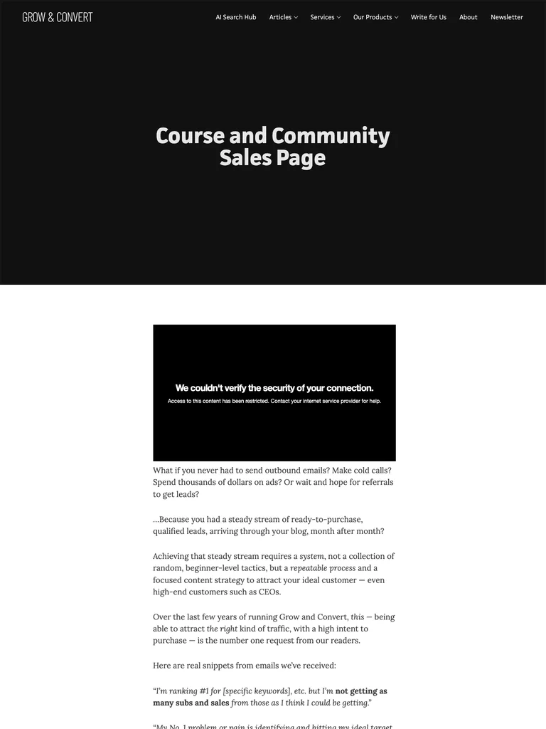
A long editorial sales page that builds its case through charts, examples, a detailed curriculum, and a community offer.
Useful for: Study the public sales page and its section order, offer presentation, and calls to action. This reference captures one page; checkout steps and conversion results are not verified.
# Design reference: Grow and Convert — Course & Community
Source: https://growandconvert.com/course-and-community-sales-page
Swipefile reference: https://swipefile.design/ref/funnel-benji-hyam-grow-convert-course/
Captured: 2026-09-07. This is a dated reference, not a claim about the current live product.


## Objective
Adapt the visual principles below to my project. Use my own content and identity. Do not reproduce logos, proprietary copy, or brand assets.

## Reference notes
- mood: Evidence-led and editorial
- colors: Black hero, white reading surfaces, dark body type, and restrained blue links.
- typography: Readable single-column body copy, bold section headlines, and selective inline emphasis sustain a long written pitch.
- layout: Content-marketing problem → founder story → charts and client examples → course method → curriculum and community → offer and questions.
- motion: The capture records a static page state. Preserve readable scrolling and clear action feedback; video playback, counters, and hidden form behavior are not demonstrated.
- texture: Narrow reading columns, inset illustrations and examples, highlighted phrases, and repeated offer sections.
- dont: Use your own offer, brand, and assets. Do not invent testimonials, results, scarcity, guarantees, or pricing.

Useful for: Study the public sales page and its section order, offer presentation, and calls to action. This reference captures one page; checkout steps and conversion results are not verified.

## Acceptance criteria
- Existing project conventions, design tokens, working functionality, and unrelated changes are preserved.
- Two or three reference principles clearly support the user's task; conflicts are resolved in favor of usability and the existing product.
- Reusable components and semantic HTML express the interface. Available licensed assets are used; important UI text is never rendered as a bitmap.
- Every visible control has a defined behavior. Loading, empty, error, success, disabled, and long-content states are specified where relevant. Demo data is clearly labeled.
- Navigation and content adapt at 375px, 768px, and 1440px without horizontal page overflow. Keyboard use, visible focus, labeled inputs, at least 44px touch targets, readable contrast, and reduced motion are supported.
- Verification distinguishes rendered behavior from proposals and identifies anything still requiring a backend or external service.

## Quality bar
Clear hierarchy, consistent spacing, restrained surfaces, and purposeful motion. Avoid decorative gradients, excessive cards, placeholder buttons, and invented metrics unless the project calls for them. Do not claim a feature is connected or tested without evidence.
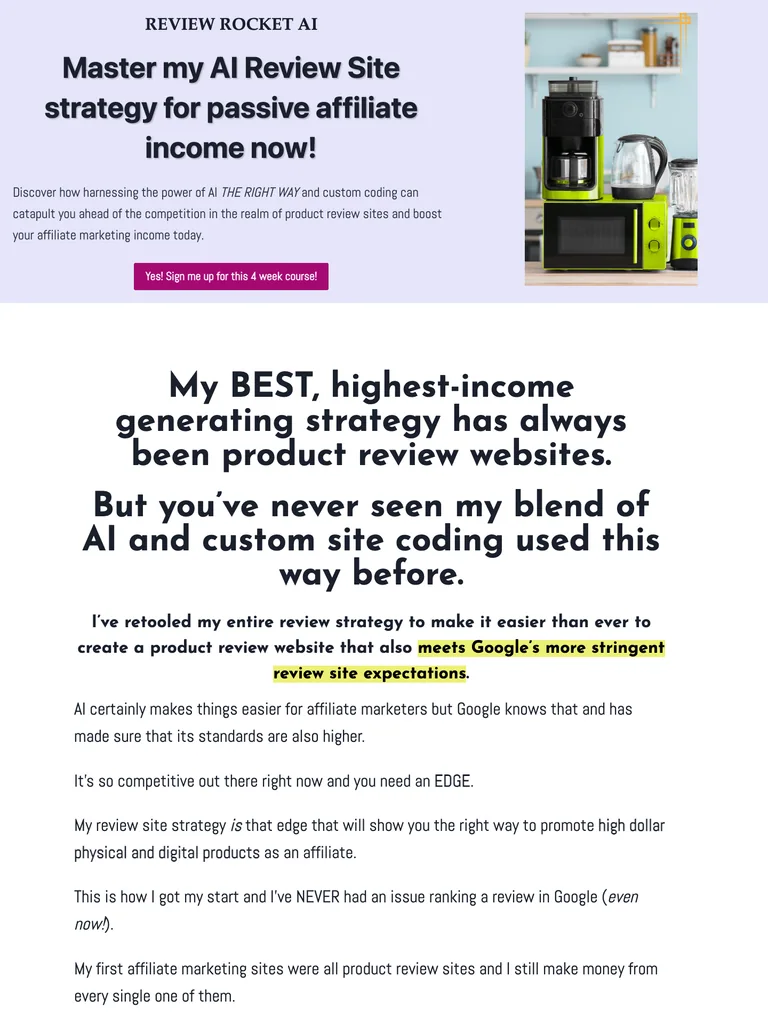 hover to scroll
A long course sales letter combining detailed written explanations, example products, and a clear breakdown of included tools and support.
Useful for: Study the complete public offer page, its section order, and calls to action. Checkout steps, current enrollment availability, and conversion results are not verified.
# Design reference: Erica Stone — Review Rocket AI
Source: https://extremereviewer.com/review-rocket-ai
Swipefile reference: https://swipefile.design/ref/funnel-erica-stone-review-rocket-ai/
Captured: 2026-09-07. This is a dated reference, not a claim about the current live product.


## Objective
Adapt the visual principles below to my project. Use my own content and identity. Do not reproduce logos, proprietary copy, or brand assets.

## Reference notes
- mood: Detailed and instructional
- colors: White, pale lavender, dark navy type, and purple offer buttons and icons.
- typography: Long readable text columns, emphatic section headings, detailed bullet lists, and selective highlights carry the sales argument.
- layout: Course promise and example product imagery → detailed review-site argument → lesson breakdown → tools and support → instructor story → offer and closing proof.
- motion: The screenshot records a static page state. Preserve readable scrolling and clear action feedback; do not infer video playback, counters, or hidden form behavior.
- texture: Extended reading sections, inset examples and portraits, selective text emphasis, and recurring offer details.
- dont: Use your own offer, brand, and assets. Do not invent testimonials, results, scarcity, guarantees, or pricing.

Useful for: Study the complete public offer page, its section order, and calls to action. Checkout steps, current enrollment availability, and conversion results are not verified.

## Acceptance criteria
- Existing project conventions, design tokens, working functionality, and unrelated changes are preserved.
- Two or three reference principles clearly support the user's task; conflicts are resolved in favor of usability and the existing product.
- Reusable components and semantic HTML express the interface. Available licensed assets are used; important UI text is never rendered as a bitmap.
- Every visible control has a defined behavior. Loading, empty, error, success, disabled, and long-content states are specified where relevant. Demo data is clearly labeled.
- Navigation and content adapt at 375px, 768px, and 1440px without horizontal page overflow. Keyboard use, visible focus, labeled inputs, at least 44px touch targets, readable contrast, and reduced motion are supported.
- Verification distinguishes rendered behavior from proposals and identifies anything still requiring a backend or external service.

## Quality bar
Clear hierarchy, consistent spacing, restrained surfaces, and purposeful motion. Avoid decorative gradients, excessive cards, placeholder buttons, and invented metrics unless the project calls for them. Do not claim a feature is connected or tested without evidence.
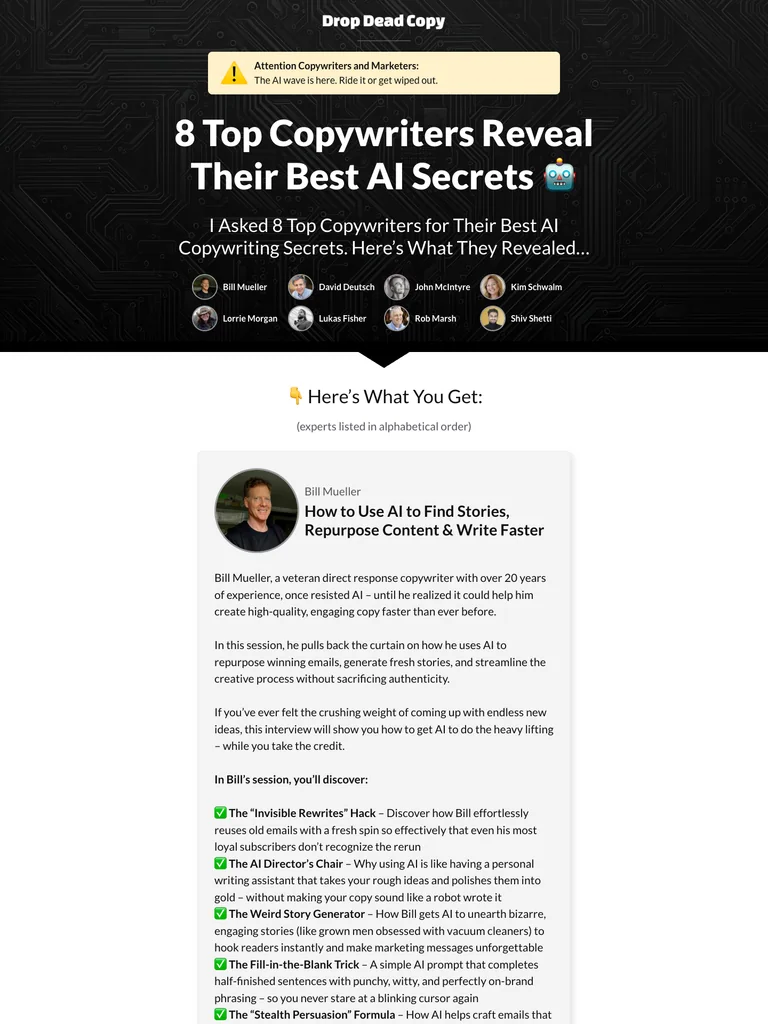 hover to scroll
An expert-interview bundle page that devotes most of its length to the contents of each session before presenting the offer.
Useful for: Study the complete public offer page, its section order, and calls to action. Checkout steps, current enrollment availability, and conversion results are not verified.
# Design reference: Drop Dead Copy — AI Copywriting Secrets
Source: https://dropdeadcopy.com/ai-march-2025
Swipefile reference: https://swipefile.design/ref/funnel-drop-dead-copy-ai-copywriting-secrets-volume-1/
Captured: 2026-09-07. This is a dated reference, not a claim about the current live product.


## Objective
Adapt the visual principles below to my project. Use my own content and identity. Do not reproduce logos, proprietary copy, or brand assets.

## Reference notes
- mood: Direct and bundle-focused
- colors: Black circuit-pattern opening, white and gray reading panels, yellow accents, and red signup buttons.
- typography: Long readable text columns, emphatic section headings, detailed bullet lists, and selective highlights carry the sales argument.
- layout: Expert bundle introduction → individual speaker portraits → detailed session descriptions → offer stack → signup invitation → FAQ.
- motion: The screenshot records a static page state. Preserve readable scrolling and clear action feedback; do not infer video playback, counters, or hidden form behavior.
- texture: Extended reading sections, inset examples and portraits, selective text emphasis, and recurring offer details.
- dont: Use your own offer, brand, and assets. Do not invent testimonials, results, scarcity, guarantees, or pricing.

Useful for: Study the complete public offer page, its section order, and calls to action. Checkout steps, current enrollment availability, and conversion results are not verified.

## Acceptance criteria
- Existing project conventions, design tokens, working functionality, and unrelated changes are preserved.
- Two or three reference principles clearly support the user's task; conflicts are resolved in favor of usability and the existing product.
- Reusable components and semantic HTML express the interface. Available licensed assets are used; important UI text is never rendered as a bitmap.
- Every visible control has a defined behavior. Loading, empty, error, success, disabled, and long-content states are specified where relevant. Demo data is clearly labeled.
- Navigation and content adapt at 375px, 768px, and 1440px without horizontal page overflow. Keyboard use, visible focus, labeled inputs, at least 44px touch targets, readable contrast, and reduced motion are supported.
- Verification distinguishes rendered behavior from proposals and identifies anything still requiring a backend or external service.

## Quality bar
Clear hierarchy, consistent spacing, restrained surfaces, and purposeful motion. Avoid decorative gradients, excessive cards, placeholder buttons, and invented metrics unless the project calls for them. Do not claim a feature is connected or tested without evidence.
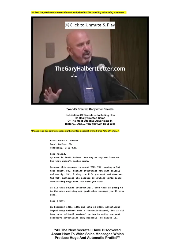 hover to scroll
A traditional seminar sales letter with a narrow reading column, video opening, long bullet lists, and bright yellow offer graphics.
Useful for: Study the complete public offer page, its section order, and calls to action. Checkout steps, current enrollment availability, and conversion results are not verified.
# Design reference: Gary Halbert — Last Seminar
Source: https://thegaryhalbertletter.com/gary-halberts-last-seminar
Swipefile reference: https://swipefile.design/ref/funnel-gary-halbert-last-seminar/
Captured: 2026-09-07. This is a dated reference, not a claim about the current live product.


## Objective
Adapt the visual principles below to my project. Use my own content and identity. Do not reproduce logos, proprietary copy, or brand assets.

## Reference notes
- mood: Classic direct response
- colors: White, black text, yellow emphasis, and hand-marked offer graphics.
- typography: Long readable text columns, emphatic section headings, detailed bullet lists, and selective highlights carry the sales argument.
- layout: Seminar video → extended copywriting argument → lesson and expert details → value explanation → written objections → final access action.
- motion: The screenshot records a static page state. Preserve readable scrolling and clear action feedback; do not infer video playback, counters, or hidden form behavior.
- texture: Extended reading sections, inset examples and portraits, selective text emphasis, and recurring offer details.
- dont: Use your own offer, brand, and assets. Do not invent testimonials, results, scarcity, guarantees, or pricing.

Useful for: Study the complete public offer page, its section order, and calls to action. Checkout steps, current enrollment availability, and conversion results are not verified.

## Acceptance criteria
- Existing project conventions, design tokens, working functionality, and unrelated changes are preserved.
- Two or three reference principles clearly support the user's task; conflicts are resolved in favor of usability and the existing product.
- Reusable components and semantic HTML express the interface. Available licensed assets are used; important UI text is never rendered as a bitmap.
- Every visible control has a defined behavior. Loading, empty, error, success, disabled, and long-content states are specified where relevant. Demo data is clearly labeled.
- Navigation and content adapt at 375px, 768px, and 1440px without horizontal page overflow. Keyboard use, visible focus, labeled inputs, at least 44px touch targets, readable contrast, and reduced motion are supported.
- Verification distinguishes rendered behavior from proposals and identifies anything still requiring a backend or external service.

## Quality bar
Clear hierarchy, consistent spacing, restrained surfaces, and purposeful motion. Avoid decorative gradients, excessive cards, placeholder buttons, and invented metrics unless the project calls for them. Do not claim a feature is connected or tested without evidence.
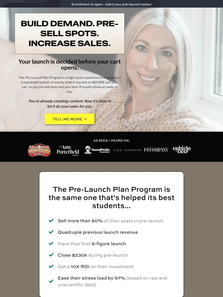 hover to scroll
An exceptionally long coaching-program sales page built around a pre-launch method, detailed client stories, program resources, and repeated enrollment invitations.
Useful for: Study the complete public offer page, its section order, and calls to action. Checkout steps, current enrollment availability, and conversion results are not verified.
# Design reference: Brenna McGowan — Pre-Launch Plan Program
Source: https://brennamcgowan.co/ppp
Swipefile reference: https://swipefile.design/ref/funnel-brenna-mcgowan-pre-launch-plan-program/
Captured: 2026-09-07. This is a dated reference, not a claim about the current live product.


## Objective
Adapt the visual principles below to my project. Use my own content and identity. Do not reproduce logos, proprietary copy, or brand assets.

## Reference notes
- mood: Personal and persuasive
- colors: White, charcoal, pale pink, and vivid yellow action buttons.
- typography: Long readable text columns, emphatic section headings, detailed bullet lists, and selective highlights carry the sales argument.
- layout: Portrait and pre-launch promise → client stories → detailed anticipation-marketing argument → program process → coaching and resources → enrollment → objections and final offer.
- motion: The screenshot records a static page state. Preserve readable scrolling and clear action feedback; do not infer video playback, counters, or hidden form behavior.
- texture: Extended reading sections, inset examples and portraits, selective text emphasis, and recurring offer details.
- dont: Use your own offer, brand, and assets. Do not invent testimonials, results, scarcity, guarantees, or pricing.

Useful for: Study the complete public offer page, its section order, and calls to action. Checkout steps, current enrollment availability, and conversion results are not verified.

## Acceptance criteria
- Existing project conventions, design tokens, working functionality, and unrelated changes are preserved.
- Two or three reference principles clearly support the user's task; conflicts are resolved in favor of usability and the existing product.
- Reusable components and semantic HTML express the interface. Available licensed assets are used; important UI text is never rendered as a bitmap.
- Every visible control has a defined behavior. Loading, empty, error, success, disabled, and long-content states are specified where relevant. Demo data is clearly labeled.
- Navigation and content adapt at 375px, 768px, and 1440px without horizontal page overflow. Keyboard use, visible focus, labeled inputs, at least 44px touch targets, readable contrast, and reduced motion are supported.
- Verification distinguishes rendered behavior from proposals and identifies anything still requiring a backend or external service.

## Quality bar
Clear hierarchy, consistent spacing, restrained surfaces, and purposeful motion. Avoid decorative gradients, excessive cards, placeholder buttons, and invented metrics unless the project calls for them. Do not claim a feature is connected or tested without evidence.
 hover to scroll
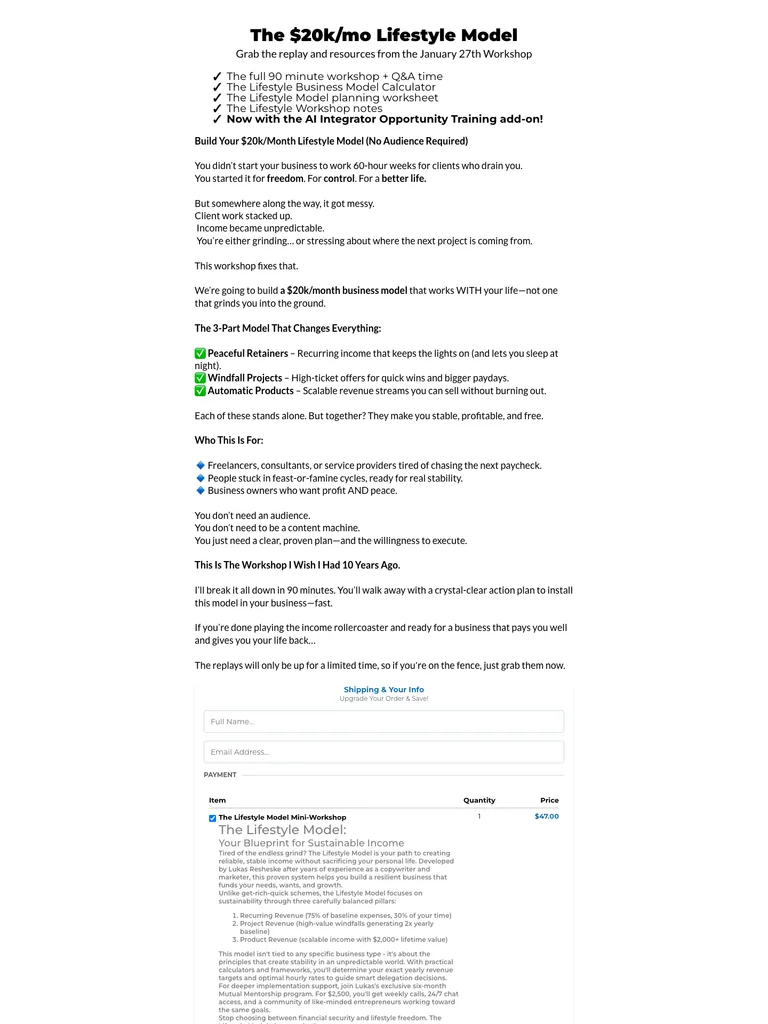
A compact workshop sales letter with inline checkout and a substantial postscript.
Useful for: Study the complete public offer page, its section order, and calls to action. Checkout steps, current enrollment availability, and conversion results are not verified.
# Design reference: Lukas Resheske — The Lifestyle Model
Source: https://lukasresheske.com/
Swipefile reference: https://swipefile.design/ref/funnel-the-20k-mo-lifestyle-model-build-your-20k-month-lifestyle-model-no-audience-required/
Captured: 2026-09-07. This is a dated reference, not a claim about the current live product.


## Objective
Adapt the visual principles below to my project. Use my own content and identity. Do not reproduce logos, proprietary copy, or brand assets.

## Reference notes
- mood: Plainspoken, compact, and workshop-focused.
- colors: White background, black copy, muted gray headings, and small colored checklist marks.
- typography: Long readable text columns, emphatic section headings, detailed bullet lists, and selective highlights carry the sales argument.
- layout: Narrow sales-letter introduction leads through workshop resources, a three-part model, audience-fit bullets, an embedded order section, and an extended postscript.
- motion: The screenshot records a static page state. Preserve readable scrolling and clear action feedback; do not infer video playback, counters, or hidden form behavior.
- texture: Extended reading sections, inset examples and portraits, selective text emphasis, and recurring offer details.
- dont: Use your own offer, brand, and assets. Do not invent testimonials, results, scarcity, guarantees, or pricing.

Useful for: Study the complete public offer page, its section order, and calls to action. Checkout steps, current enrollment availability, and conversion results are not verified.

## Acceptance criteria
- Existing project conventions, design tokens, working functionality, and unrelated changes are preserved.
- Two or three reference principles clearly support the user's task; conflicts are resolved in favor of usability and the existing product.
- Reusable components and semantic HTML express the interface. Available licensed assets are used; important UI text is never rendered as a bitmap.
- Every visible control has a defined behavior. Loading, empty, error, success, disabled, and long-content states are specified where relevant. Demo data is clearly labeled.
- Navigation and content adapt at 375px, 768px, and 1440px without horizontal page overflow. Keyboard use, visible focus, labeled inputs, at least 44px touch targets, readable contrast, and reduced motion are supported.
- Verification distinguishes rendered behavior from proposals and identifies anything still requiring a backend or external service.

## Quality bar
Clear hierarchy, consistent spacing, restrained surfaces, and purposeful motion. Avoid decorative gradients, excessive cards, placeholder buttons, and invented metrics unless the project calls for them. Do not claim a feature is connected or tested without evidence.
 hover to scroll
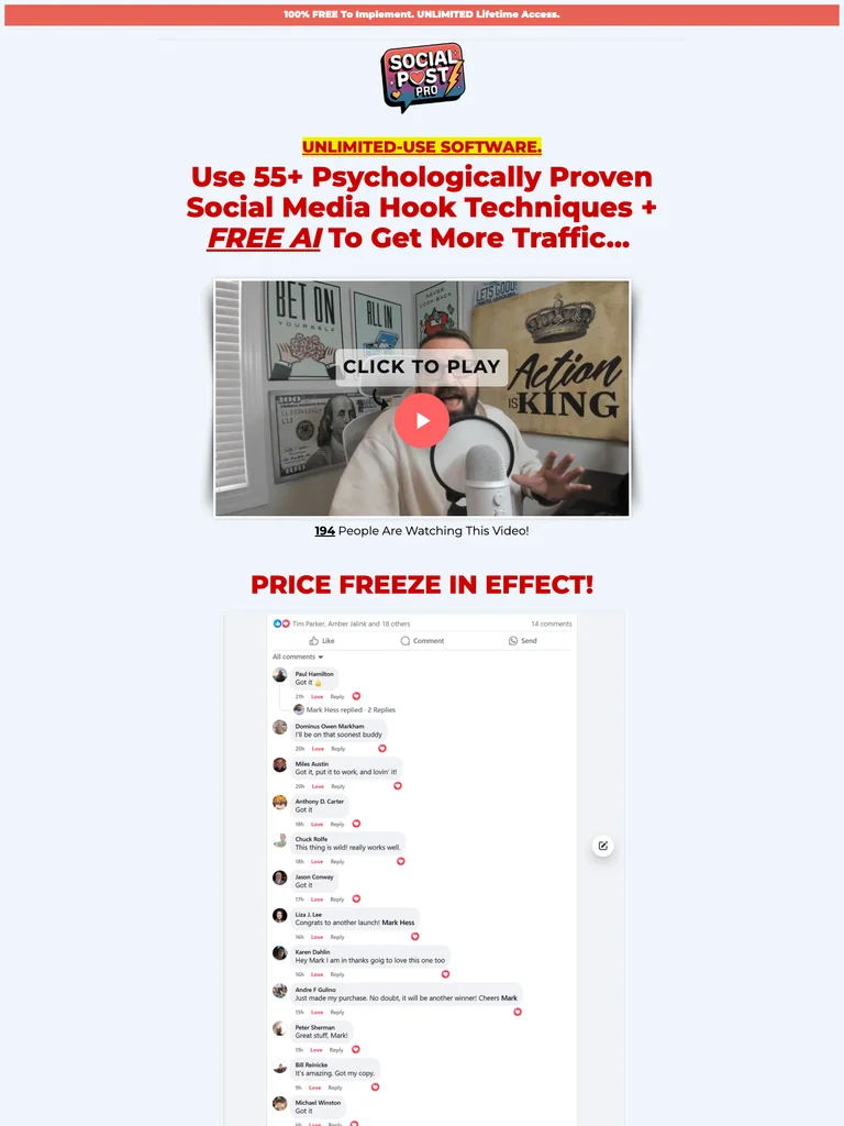
An extended software sales letter built around examples, highlighted copy, and repeated offer sections.
Useful for: Study the complete public offer page, its section order, and calls to action. Checkout steps, current enrollment availability, and conversion results are not verified.
# Design reference: Mark Hess — Social Post Pro
Source: https://actionactivated.com/social-post-pro
Swipefile reference: https://swipefile.design/ref/funnel-mark-hess-social-post-pro-create-unlimited-traffic-getting-social-media-posts-in-seconds/
Captured: 2026-09-07. This is a dated reference, not a claim about the current live product.


## Objective
Adapt the visual principles below to my project. Use my own content and identity. Do not reproduce logos, proprietary copy, or brand assets.

## Reference notes
- mood: Direct, emphatic, and demonstration-heavy.
- colors: White and pale blue sections, red headlines, yellow highlights, and black body copy.
- typography: Long readable text columns, emphatic section headings, detailed bullet lists, and selective highlights carry the sales argument.
- layout: Video introduction flows into repeated problem-and-solution sections, sample social posts, product demonstrations, detailed benefit lists, recurring offer panels, and closing disclosures.
- motion: The screenshot records a static page state. Preserve readable scrolling and clear action feedback; do not infer video playback, counters, or hidden form behavior.
- texture: Extended reading sections, inset examples and portraits, selective text emphasis, and recurring offer details.
- dont: Use your own offer, brand, and assets. Do not invent testimonials, results, scarcity, guarantees, or pricing.

Useful for: Study the complete public offer page, its section order, and calls to action. Checkout steps, current enrollment availability, and conversion results are not verified.

## Acceptance criteria
- Existing project conventions, design tokens, working functionality, and unrelated changes are preserved.
- Two or three reference principles clearly support the user's task; conflicts are resolved in favor of usability and the existing product.
- Reusable components and semantic HTML express the interface. Available licensed assets are used; important UI text is never rendered as a bitmap.
- Every visible control has a defined behavior. Loading, empty, error, success, disabled, and long-content states are specified where relevant. Demo data is clearly labeled.
- Navigation and content adapt at 375px, 768px, and 1440px without horizontal page overflow. Keyboard use, visible focus, labeled inputs, at least 44px touch targets, readable contrast, and reduced motion are supported.
- Verification distinguishes rendered behavior from proposals and identifies anything still requiring a backend or external service.

## Quality bar
Clear hierarchy, consistent spacing, restrained surfaces, and purposeful motion. Avoid decorative gradients, excessive cards, placeholder buttons, and invented metrics unless the project calls for them. Do not claim a feature is connected or tested without evidence.
 hover to scroll
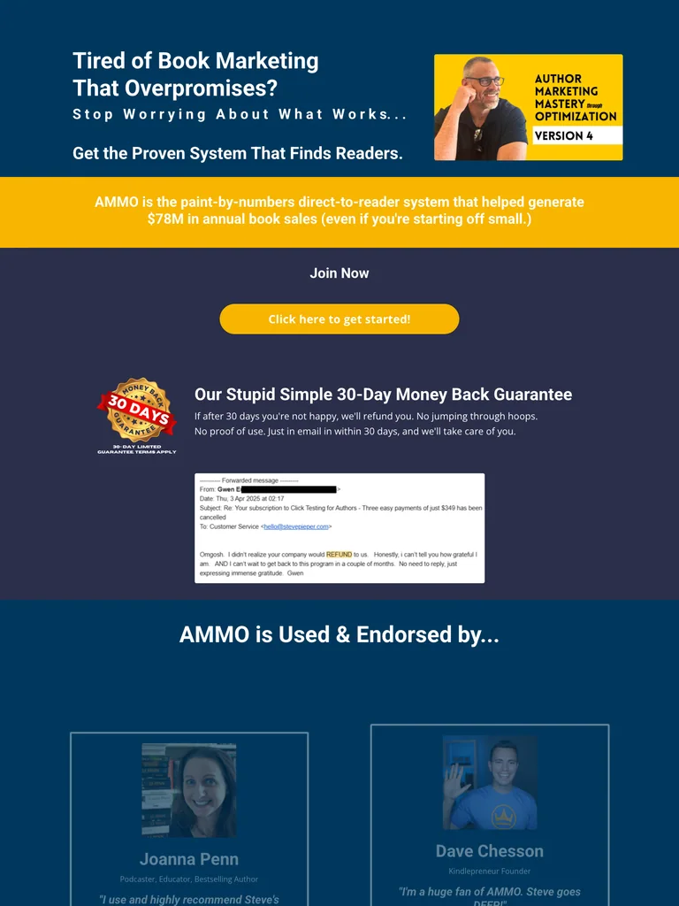
An exceptionally long author-training funnel with a large video-proof library and detailed program explanations.
Useful for: Study the complete public offer page, its section order, and calls to action. Checkout steps, current enrollment availability, and conversion results are not verified.
# Design reference: Steve Pieper — Author Marketing Mastery
Source: https://app.stevepieper.com/ammo-v4-post-sale
Swipefile reference: https://swipefile.design/ref/funnel-steven-pieper-author-marketing-mastery-through-optimization-4/
Captured: 2026-09-07. This is a dated reference, not a claim about the current live product.


## Objective
Adapt the visual principles below to my project. Use my own content and identity. Do not reproduce logos, proprietary copy, or brand assets.

## Reference notes
- mood: Intensive, instructional, and proof-heavy.
- colors: Navy and teal blue, pale lavender-gray sections, white text, and yellow offer bands.
- typography: Long readable text columns, emphatic section headings, detailed bullet lists, and selective highlights carry the sales argument.
- layout: Book-marketing program introduction expands into a large author-video proof library, teaching methods, detailed curriculum, extended objections, and a portrait-led closing call to action.
- motion: The screenshot records a static page state. Preserve readable scrolling and clear action feedback; do not infer video playback, counters, or hidden form behavior.
- texture: Extended reading sections, inset examples and portraits, selective text emphasis, and recurring offer details.
- dont: Use your own offer, brand, and assets. Do not invent testimonials, results, scarcity, guarantees, or pricing.

Useful for: Study the complete public offer page, its section order, and calls to action. Checkout steps, current enrollment availability, and conversion results are not verified.

## Acceptance criteria
- Existing project conventions, design tokens, working functionality, and unrelated changes are preserved.
- Two or three reference principles clearly support the user's task; conflicts are resolved in favor of usability and the existing product.
- Reusable components and semantic HTML express the interface. Available licensed assets are used; important UI text is never rendered as a bitmap.
- Every visible control has a defined behavior. Loading, empty, error, success, disabled, and long-content states are specified where relevant. Demo data is clearly labeled.
- Navigation and content adapt at 375px, 768px, and 1440px without horizontal page overflow. Keyboard use, visible focus, labeled inputs, at least 44px touch targets, readable contrast, and reduced motion are supported.
- Verification distinguishes rendered behavior from proposals and identifies anything still requiring a backend or external service.

## Quality bar
Clear hierarchy, consistent spacing, restrained surfaces, and purposeful motion. Avoid decorative gradients, excessive cards, placeholder buttons, and invented metrics unless the project calls for them. Do not claim a feature is connected or tested without evidence.
 hover to scroll
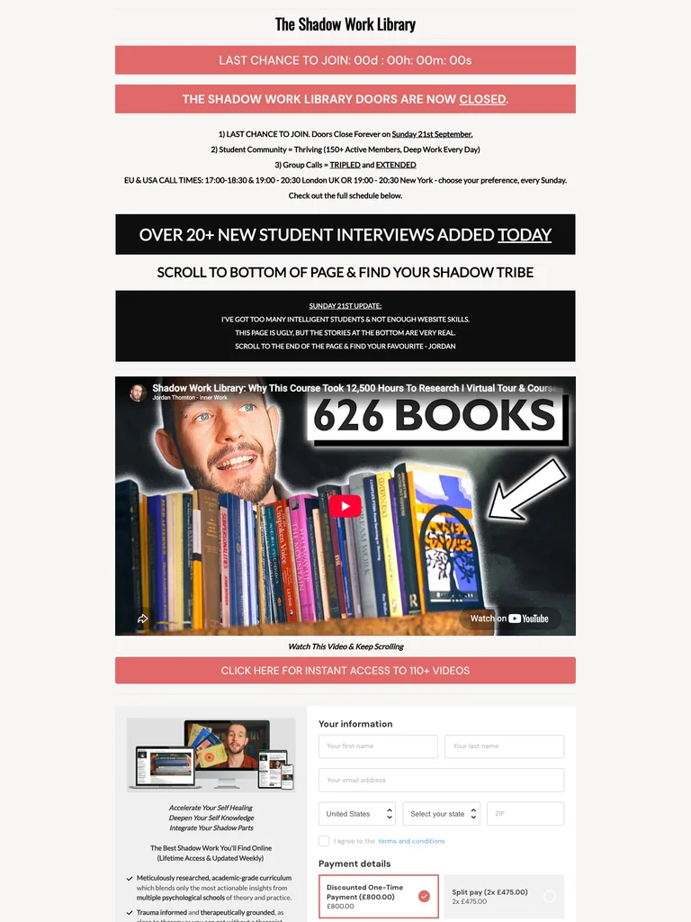
A narrow library sales letter whose lower page becomes an extensive interview archive; the captured page shows enrollment closed.
Useful for: Study the complete public offer page, its section order, and calls to action. Checkout steps, current enrollment availability, and conversion results are not verified.
# Design reference: Jordan Thornton — Shadow Work Library
Source: https://courses.jordanthornton.com/shadow-work-library
Swipefile reference: https://swipefile.design/ref/funnel-jordan-thornton-shadow-work-library/
Captured: 2026-09-07. This is a dated reference, not a claim about the current live product.


## Objective
Adapt the visual principles below to my project. Use my own content and identity. Do not reproduce logos, proprietary copy, or brand assets.

## Reference notes
- mood: Minimal, text-dense, and interview-led.
- colors: White and warm gray, black section bands, and coral enrollment-status notices.
- typography: Long readable text columns, emphatic section headings, detailed bullet lists, and selective highlights carry the sales argument.
- layout: Narrow introduction with enrollment-status notices leads into a video, library explanation, offer details, and a very long sequence of written student interviews.
- motion: The screenshot records a static page state. Preserve readable scrolling and clear action feedback; do not infer video playback, counters, or hidden form behavior.
- texture: Extended reading sections, inset examples and portraits, selective text emphasis, and recurring offer details.
- dont: Use your own offer, brand, and assets. Do not invent testimonials, results, scarcity, guarantees, or pricing.

Useful for: Study the complete public offer page, its section order, and calls to action. Checkout steps, current enrollment availability, and conversion results are not verified.

## Acceptance criteria
- Existing project conventions, design tokens, working functionality, and unrelated changes are preserved.
- Two or three reference principles clearly support the user's task; conflicts are resolved in favor of usability and the existing product.
- Reusable components and semantic HTML express the interface. Available licensed assets are used; important UI text is never rendered as a bitmap.
- Every visible control has a defined behavior. Loading, empty, error, success, disabled, and long-content states are specified where relevant. Demo data is clearly labeled.
- Navigation and content adapt at 375px, 768px, and 1440px without horizontal page overflow. Keyboard use, visible focus, labeled inputs, at least 44px touch targets, readable contrast, and reduced motion are supported.
- Verification distinguishes rendered behavior from proposals and identifies anything still requiring a backend or external service.

## Quality bar
Clear hierarchy, consistent spacing, restrained surfaces, and purposeful motion. Avoid decorative gradients, excessive cards, placeholder buttons, and invented metrics unless the project calls for them. Do not claim a feature is connected or tested without evidence.
 hover to scroll
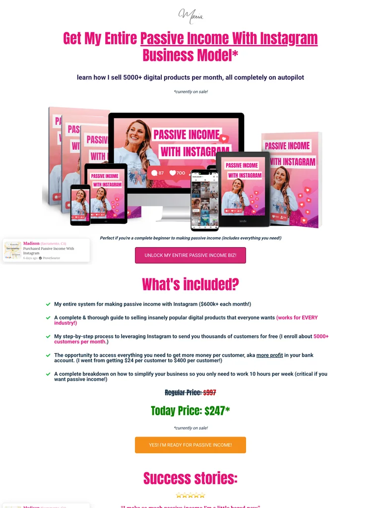
A pink-and-white product funnel that combines a long sales page and an inline checkout.
Useful for: Study the complete public offer page, its section order, and calls to action. Checkout steps, current enrollment availability, and conversion results are not verified.
# Design reference: Maria Wendt — Passive Income With Instagram
Source: https://mariawendt.samcart.com/products/passive-income-business-for-instagram
Swipefile reference: https://swipefile.design/ref/funnel-maria-wendt-passive-income-business-with-instagram-bundle/
Captured: 2026-09-08. This is a dated reference, not a claim about the current live product.


## Objective
Adapt the visual principles below to my project. Use my own content and identity. Do not reproduce logos, proprietary copy, or brand assets.

## Reference notes
- mood: Bright, direct, and product-focused.
- colors: White, hot pink, dark navy copy, pale gray panels, and blue checkout controls.
- typography: Long readable text columns, emphatic section headings, detailed bullet lists, and selective highlights carry the sales argument.
- layout: Product-bundle hero flows through included resources, student examples, social-video comparisons, FAQs, a personal sales narrative, and an embedded checkout with optional order additions.
- motion: The screenshot records a static page state. Preserve readable scrolling and clear action feedback; do not infer video playback, counters, or hidden form behavior.
- texture: Extended reading sections, inset examples and portraits, selective text emphasis, and recurring offer details.
- dont: Use your own offer, brand, and assets. Do not invent testimonials, results, scarcity, guarantees, or pricing.

Useful for: Study the complete public offer page, its section order, and calls to action. Checkout steps, current enrollment availability, and conversion results are not verified.

## Acceptance criteria
- Existing project conventions, design tokens, working functionality, and unrelated changes are preserved.
- Two or three reference principles clearly support the user's task; conflicts are resolved in favor of usability and the existing product.
- Reusable components and semantic HTML express the interface. Available licensed assets are used; important UI text is never rendered as a bitmap.
- Every visible control has a defined behavior. Loading, empty, error, success, disabled, and long-content states are specified where relevant. Demo data is clearly labeled.
- Navigation and content adapt at 375px, 768px, and 1440px without horizontal page overflow. Keyboard use, visible focus, labeled inputs, at least 44px touch targets, readable contrast, and reduced motion are supported.
- Verification distinguishes rendered behavior from proposals and identifies anything still requiring a backend or external service.

## Quality bar
Clear hierarchy, consistent spacing, restrained surfaces, and purposeful motion. Avoid decorative gradients, excessive cards, placeholder buttons, and invented metrics unless the project calls for them. Do not claim a feature is connected or tested without evidence.
 hover to scroll
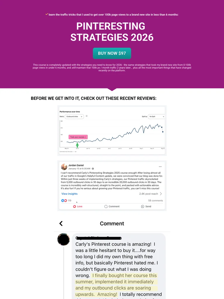
A long Pinterest training sales letter organized around charts, learning outcomes, and student examples.
Useful for: Study the complete public offer page, its section order, and calls to action. Checkout steps, current enrollment availability, and conversion results are not verified.
# Design reference: Carly Campbell — Pinteresting Strategies
Source: https://blogginglikeyoumeanit.lpages.co/pinteresting-strategies
Swipefile reference: https://swipefile.design/ref/funnel-carly-campbell-pinterest-strategies-2-0/
Captured: 2026-09-08. This is a dated reference, not a claim about the current live product.


## Objective
Adapt the visual principles below to my project. Use my own content and identity. Do not reproduce logos, proprietary copy, or brand assets.

## Reference notes
- mood: Direct, detailed, and evidence-heavy.
- colors: Magenta-purple, white, teal action buttons, and black body copy.
- typography: Long readable text columns, emphatic section headings, detailed bullet lists, and selective highlights carry the sales argument.
- layout: Simple course offer opens into chart-based examples, instructor narrative, topic-by-topic learning outcomes, templates, extensive student comments, objections, and recurring purchase buttons.
- motion: The screenshot records a static page state. Preserve readable scrolling and clear action feedback; do not infer video playback, counters, or hidden form behavior.
- texture: Extended reading sections, inset examples and portraits, selective text emphasis, and recurring offer details.
- dont: Use your own offer, brand, and assets. Do not invent testimonials, results, scarcity, guarantees, or pricing.

Useful for: Study the complete public offer page, its section order, and calls to action. Checkout steps, current enrollment availability, and conversion results are not verified.

## Acceptance criteria
- Existing project conventions, design tokens, working functionality, and unrelated changes are preserved.
- Two or three reference principles clearly support the user's task; conflicts are resolved in favor of usability and the existing product.
- Reusable components and semantic HTML express the interface. Available licensed assets are used; important UI text is never rendered as a bitmap.
- Every visible control has a defined behavior. Loading, empty, error, success, disabled, and long-content states are specified where relevant. Demo data is clearly labeled.
- Navigation and content adapt at 375px, 768px, and 1440px without horizontal page overflow. Keyboard use, visible focus, labeled inputs, at least 44px touch targets, readable contrast, and reduced motion are supported.
- Verification distinguishes rendered behavior from proposals and identifies anything still requiring a backend or external service.

## Quality bar
Clear hierarchy, consistent spacing, restrained surfaces, and purposeful motion. Avoid decorative gradients, excessive cards, placeholder buttons, and invented metrics unless the project calls for them. Do not claim a feature is connected or tested without evidence.
Allow basic usage counts to help us understand what is useful. Your board contents stay out of analytics. Details
Your browser’s privacy preference keeps analytics off.