SaaS Marketing
CURATED COLLECTION · 17 REFERENCES
Enterprise search, agent platforms, AI infrastructure, research and visual-editing websites.
Copy the reference notes below and paste them into Claude, ChatGPT, or your coding assistant. Add what you want to build.
Includes design notes, original sources, and preview links. An assistant that supports browsing can also read the public board link.
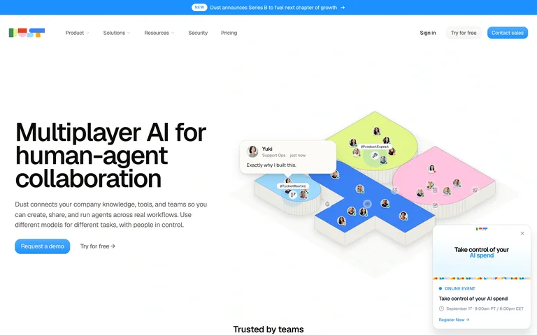
A team-agent homepage pairs a compact introduction with a playful collaborative-work illustration.
Useful for: A team-agent homepage pairs a compact introduction with a playful collaborative-work illustration.
# Design reference: Dust
Source: https://dust.tt/
Swipefile reference: https://swipefile.design/ref/ai-dust/
Captured: 2026-09-05. This is a dated reference, not a claim about the current live product.
Capture scope: one viewport. Do not infer unseen page sections or a complete user flow.

## Objective
Adapt the visual principles below to my project. Use my own content and identity. Do not reproduce logos, proprietary copy, or brand assets.

## Reference notes
- mood: Friendly and collaborative.
- colors: White, bright blue and pastel pink, green and yellow.
- typography: Heavy sans-serif headline with small supporting text.
- layout: Left-aligned headline and actions balance an isometric scene on the right.
- motion: Static capture of one viewport. Visit the source to study motion and interaction.
- texture: Soft isometric platform shapes, small avatars and floating message cards.
- dont: Adapt the structure to your own content and brand; use your own identity, copy and imagery.

Useful for: A team-agent homepage pairs a compact introduction with a playful collaborative-work illustration.

## Acceptance criteria
- Existing project conventions, design tokens, working functionality, and unrelated changes are preserved.
- Two or three reference principles clearly support the user's task; conflicts are resolved in favor of usability and the existing product.
- Reusable components and semantic HTML express the interface. Available licensed assets are used; important UI text is never rendered as a bitmap.
- Every visible control has a defined behavior. Loading, empty, error, success, disabled, and long-content states are specified where relevant. Demo data is clearly labeled.
- Navigation and content adapt at 375px, 768px, and 1440px without horizontal page overflow. Keyboard use, visible focus, labeled inputs, at least 44px touch targets, readable contrast, and reduced motion are supported.
- Verification distinguishes rendered behavior from proposals and identifies anything still requiring a backend or external service.

## Quality bar
Clear hierarchy, consistent spacing, restrained surfaces, and purposeful motion. Avoid decorative gradients, excessive cards, placeholder buttons, and invented metrics unless the project calls for them. Do not claim a feature is connected or tested without evidence.
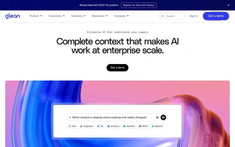
An enterprise-AI homepage uses a centered value statement above a large search-interface preview.
Useful for: An enterprise-AI homepage uses a centered value statement above a large search-interface preview.
# Design reference: Glean
Source: https://www.glean.com/
Swipefile reference: https://swipefile.design/ref/ai-glean/
Captured: 2026-09-05. This is a dated reference, not a claim about the current live product.
Capture scope: one viewport. Do not infer unseen page sections or a complete user flow.

## Objective
Adapt the visual principles below to my project. Use my own content and identity. Do not reproduce logos, proprietary copy, or brand assets.

## Reference notes
- mood: Clear and polished.
- colors: White, indigo, pink and dark type.
- typography: Compact bold sans-serif headline and restrained navigation.
- layout: Centered headline and demo action lead into a broad, colorful product visual.
- motion: Static capture of one viewport. Visit the source to study motion and interaction.
- texture: A luminous abstract surface surrounds the white search panel.
- dont: Adapt the structure to your own content and brand; use your own identity, copy and imagery.

Useful for: An enterprise-AI homepage uses a centered value statement above a large search-interface preview.

## Acceptance criteria
- Existing project conventions, design tokens, working functionality, and unrelated changes are preserved.
- Two or three reference principles clearly support the user's task; conflicts are resolved in favor of usability and the existing product.
- Reusable components and semantic HTML express the interface. Available licensed assets are used; important UI text is never rendered as a bitmap.
- Every visible control has a defined behavior. Loading, empty, error, success, disabled, and long-content states are specified where relevant. Demo data is clearly labeled.
- Navigation and content adapt at 375px, 768px, and 1440px without horizontal page overflow. Keyboard use, visible focus, labeled inputs, at least 44px touch targets, readable contrast, and reduced motion are supported.
- Verification distinguishes rendered behavior from proposals and identifies anything still requiring a backend or external service.

## Quality bar
Clear hierarchy, consistent spacing, restrained surfaces, and purposeful motion. Avoid decorative gradients, excessive cards, placeholder buttons, and invented metrics unless the project calls for them. Do not claim a feature is connected or tested without evidence.
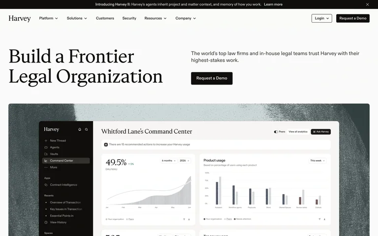
A professional-services AI homepage combines editorial typography with a detailed product screenshot.
Useful for: A professional-services AI homepage combines editorial typography with a detailed product screenshot.
# Design reference: Harvey
Source: https://www.harvey.ai/
Swipefile reference: https://swipefile.design/ref/ai-harvey/
Captured: 2026-09-05. This is a dated reference, not a claim about the current live product.
Capture scope: one viewport. Do not infer unseen page sections or a complete user flow.

## Objective
Adapt the visual principles below to my project. Use my own content and identity. Do not reproduce logos, proprietary copy, or brand assets.

## Reference notes
- mood: Established and precise.
- colors: Warm white, black and muted cool grey.
- typography: Large serif headline with small sans-serif supporting copy.
- layout: Two-column text introduction sits above a wide interface image.
- motion: Static capture of one viewport. Visit the source to study motion and interaction.
- texture: A product dashboard is framed against a subdued textured background.
- dont: Adapt the structure to your own content and brand; use your own identity, copy and imagery.

Useful for: A professional-services AI homepage combines editorial typography with a detailed product screenshot.

## Acceptance criteria
- Existing project conventions, design tokens, working functionality, and unrelated changes are preserved.
- Two or three reference principles clearly support the user's task; conflicts are resolved in favor of usability and the existing product.
- Reusable components and semantic HTML express the interface. Available licensed assets are used; important UI text is never rendered as a bitmap.
- Every visible control has a defined behavior. Loading, empty, error, success, disabled, and long-content states are specified where relevant. Demo data is clearly labeled.
- Navigation and content adapt at 375px, 768px, and 1440px without horizontal page overflow. Keyboard use, visible focus, labeled inputs, at least 44px touch targets, readable contrast, and reduced motion are supported.
- Verification distinguishes rendered behavior from proposals and identifies anything still requiring a backend or external service.

## Quality bar
Clear hierarchy, consistent spacing, restrained surfaces, and purposeful motion. Avoid decorative gradients, excessive cards, placeholder buttons, and invented metrics unless the project calls for them. Do not claim a feature is connected or tested without evidence.
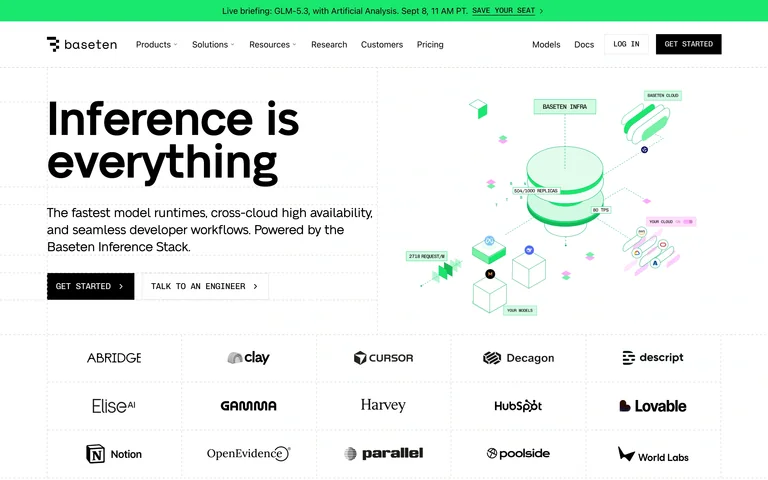
An inference-platform homepage pairs bold positioning with an isometric infrastructure illustration.
Useful for: An inference-platform homepage pairs bold positioning with an isometric infrastructure illustration.
# Design reference: Baseten
Source: https://www.baseten.co/
Swipefile reference: https://swipefile.design/ref/ai-baseten/
Captured: 2026-09-05. This is a dated reference, not a claim about the current live product.
Capture scope: one viewport. Do not infer unseen page sections or a complete user flow.

## Objective
Adapt the visual principles below to my project. Use my own content and identity. Do not reproduce logos, proprietary copy, or brand assets.

## Reference notes
- mood: Technical and clear.
- colors: White, black and mint green.
- typography: Heavy sans-serif headline and compact uppercase actions.
- layout: Large left headline and actions face a technical illustration; customer logos form a grid beneath.
- motion: Static capture of one viewport. Visit the source to study motion and interaction.
- texture: Thin diagrams, translucent shapes and small system labels.
- dont: Adapt the structure to your own content and brand; use your own identity, copy and imagery.

Useful for: An inference-platform homepage pairs bold positioning with an isometric infrastructure illustration.

## Acceptance criteria
- Existing project conventions, design tokens, working functionality, and unrelated changes are preserved.
- Two or three reference principles clearly support the user's task; conflicts are resolved in favor of usability and the existing product.
- Reusable components and semantic HTML express the interface. Available licensed assets are used; important UI text is never rendered as a bitmap.
- Every visible control has a defined behavior. Loading, empty, error, success, disabled, and long-content states are specified where relevant. Demo data is clearly labeled.
- Navigation and content adapt at 375px, 768px, and 1440px without horizontal page overflow. Keyboard use, visible focus, labeled inputs, at least 44px touch targets, readable contrast, and reduced motion are supported.
- Verification distinguishes rendered behavior from proposals and identifies anything still requiring a backend or external service.

## Quality bar
Clear hierarchy, consistent spacing, restrained surfaces, and purposeful motion. Avoid decorative gradients, excessive cards, placeholder buttons, and invented metrics unless the project calls for them. Do not claim a feature is connected or tested without evidence.
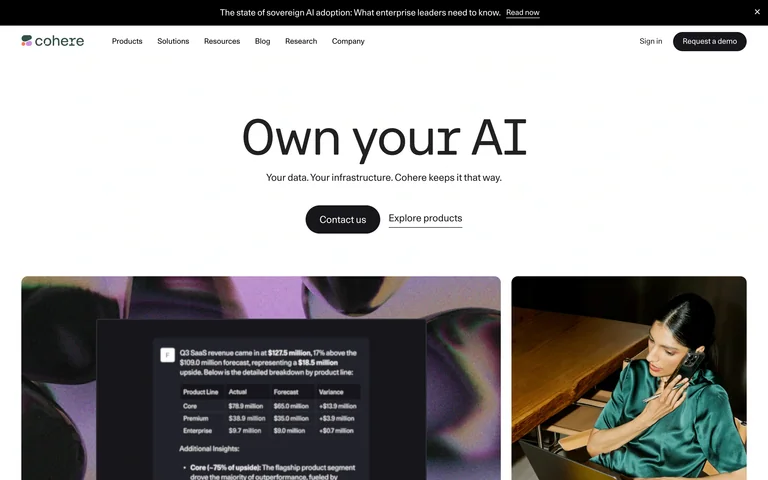
An enterprise-AI homepage gives a short ownership message ample space above two large visual panels.
Useful for: An enterprise-AI homepage gives a short ownership message ample space above two large visual panels.
# Design reference: Cohere
Source: https://cohere.com/
Swipefile reference: https://swipefile.design/ref/ai-cohere/
Captured: 2026-09-05. This is a dated reference, not a claim about the current live product.
Capture scope: one viewport. Do not infer unseen page sections or a complete user flow.

## Objective
Adapt the visual principles below to my project. Use my own content and identity. Do not reproduce logos, proprietary copy, or brand assets.

## Reference notes
- mood: Restrained and confident.
- colors: White, charcoal and muted photographic colors.
- typography: Very large sans-serif headline with understated navigation.
- layout: Centered headline, one sentence and paired actions lead into an asymmetric media row.
- motion: Static capture of one viewport. Visit the source to study motion and interaction.
- texture: Photographic surfaces frame interface imagery.
- dont: Adapt the structure to your own content and brand; use your own identity, copy and imagery.

Useful for: An enterprise-AI homepage gives a short ownership message ample space above two large visual panels.

## Acceptance criteria
- Existing project conventions, design tokens, working functionality, and unrelated changes are preserved.
- Two or three reference principles clearly support the user's task; conflicts are resolved in favor of usability and the existing product.
- Reusable components and semantic HTML express the interface. Available licensed assets are used; important UI text is never rendered as a bitmap.
- Every visible control has a defined behavior. Loading, empty, error, success, disabled, and long-content states are specified where relevant. Demo data is clearly labeled.
- Navigation and content adapt at 375px, 768px, and 1440px without horizontal page overflow. Keyboard use, visible focus, labeled inputs, at least 44px touch targets, readable contrast, and reduced motion are supported.
- Verification distinguishes rendered behavior from proposals and identifies anything still requiring a backend or external service.

## Quality bar
Clear hierarchy, consistent spacing, restrained surfaces, and purposeful motion. Avoid decorative gradients, excessive cards, placeholder buttons, and invented metrics unless the project calls for them. Do not claim a feature is connected or tested without evidence.
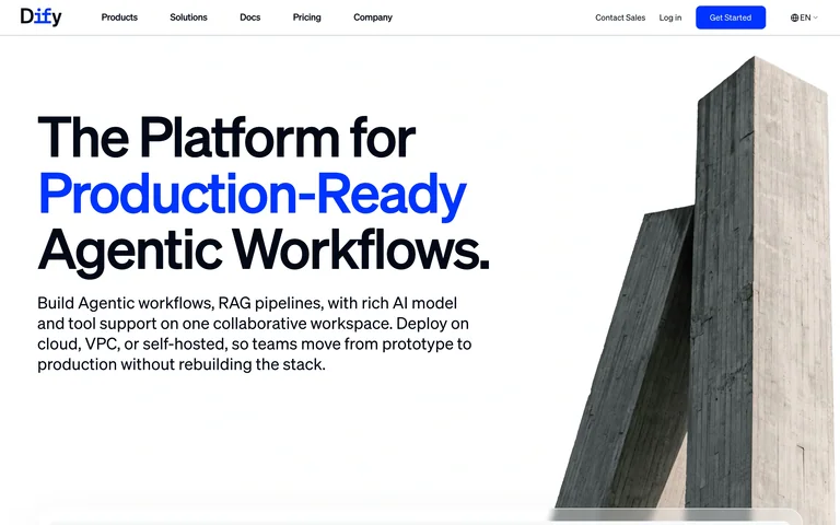
An agent-workflow homepage contrasts bold product positioning with a monumental architectural image.
Useful for: An agent-workflow homepage contrasts bold product positioning with a monumental architectural image.
# Design reference: Dify
Source: https://dify.ai/
Swipefile reference: https://swipefile.design/ref/ai-dify/
Captured: 2026-09-05. This is a dated reference, not a claim about the current live product.
Capture scope: one viewport. Do not infer unseen page sections or a complete user flow.

## Objective
Adapt the visual principles below to my project. Use my own content and identity. Do not reproduce logos, proprietary copy, or brand assets.

## Reference notes
- mood: Direct and structural.
- colors: White, black, electric blue and concrete grey.
- typography: Heavy sans-serif type with a blue highlighted phrase.
- layout: Oversized left-aligned headline and explanatory copy balance a cropped concrete structure on the right.
- motion: Static capture of one viewport. Visit the source to study motion and interaction.
- texture: Rough architectural photography gives the clean canvas weight.
- dont: Adapt the structure to your own content and brand; use your own identity, copy and imagery.

Useful for: An agent-workflow homepage contrasts bold product positioning with a monumental architectural image.

## Acceptance criteria
- Existing project conventions, design tokens, working functionality, and unrelated changes are preserved.
- Two or three reference principles clearly support the user's task; conflicts are resolved in favor of usability and the existing product.
- Reusable components and semantic HTML express the interface. Available licensed assets are used; important UI text is never rendered as a bitmap.
- Every visible control has a defined behavior. Loading, empty, error, success, disabled, and long-content states are specified where relevant. Demo data is clearly labeled.
- Navigation and content adapt at 375px, 768px, and 1440px without horizontal page overflow. Keyboard use, visible focus, labeled inputs, at least 44px touch targets, readable contrast, and reduced motion are supported.
- Verification distinguishes rendered behavior from proposals and identifies anything still requiring a backend or external service.

## Quality bar
Clear hierarchy, consistent spacing, restrained surfaces, and purposeful motion. Avoid decorative gradients, excessive cards, placeholder buttons, and invented metrics unless the project calls for them. Do not claim a feature is connected or tested without evidence.
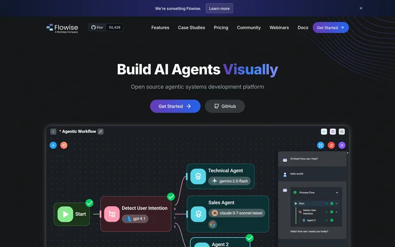
A visual-agent-builder homepage explains the product with a prominent connected-node workflow preview.
Useful for: A visual-agent-builder homepage explains the product with a prominent connected-node workflow preview.
# Design reference: Flowise
Source: https://flowiseai.com/
Swipefile reference: https://swipefile.design/ref/ai-flowise/
Captured: 2026-09-05. This is a dated reference, not a claim about the current live product.
Capture scope: one viewport. Do not infer unseen page sections or a complete user flow.

## Objective
Adapt the visual principles below to my project. Use my own content and identity. Do not reproduce logos, proprietary copy, or brand assets.

## Reference notes
- mood: Technical and approachable.
- colors: Near-black, white and blue-purple with colorful workflow nodes.
- typography: Bold sans-serif headline and smaller support labels.
- layout: Centered introduction and two actions sit above a wide dark editor screenshot.
- motion: Static capture of one viewport. Visit the source to study motion and interaction.
- texture: Fine curved background lines frame the graph interface.
- dont: Adapt the structure to your own content and brand; use your own identity, copy and imagery.

Useful for: A visual-agent-builder homepage explains the product with a prominent connected-node workflow preview.

## Acceptance criteria
- Existing project conventions, design tokens, working functionality, and unrelated changes are preserved.
- Two or three reference principles clearly support the user's task; conflicts are resolved in favor of usability and the existing product.
- Reusable components and semantic HTML express the interface. Available licensed assets are used; important UI text is never rendered as a bitmap.
- Every visible control has a defined behavior. Loading, empty, error, success, disabled, and long-content states are specified where relevant. Demo data is clearly labeled.
- Navigation and content adapt at 375px, 768px, and 1440px without horizontal page overflow. Keyboard use, visible focus, labeled inputs, at least 44px touch targets, readable contrast, and reduced motion are supported.
- Verification distinguishes rendered behavior from proposals and identifies anything still requiring a backend or external service.

## Quality bar
Clear hierarchy, consistent spacing, restrained surfaces, and purposeful motion. Avoid decorative gradients, excessive cards, placeholder buttons, and invented metrics unless the project calls for them. Do not claim a feature is connected or tested without evidence.
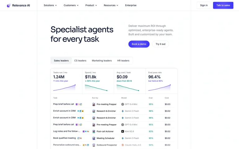
An agent-platform homepage supports its positioning with a large multi-column performance preview.
Useful for: An agent-platform homepage supports its positioning with a large multi-column performance preview.
# Design reference: Relevance AI
Source: https://relevanceai.com/
Swipefile reference: https://swipefile.design/ref/ai-relevance/
Captured: 2026-09-05. This is a dated reference, not a claim about the current live product.
Capture scope: one viewport. Do not infer unseen page sections or a complete user flow.

## Objective
Adapt the visual principles below to my project. Use my own content and identity. Do not reproduce logos, proprietary copy, or brand assets.

## Reference notes
- mood: Practical and results-oriented.
- colors: White, dark text, purple actions and pale chart accents.
- typography: Medium-weight headline with small explanatory text.
- layout: A compact two-column introduction sits above a wide tabbed agent-results panel.
- motion: Static capture of one viewport. Visit the source to study motion and interaction.
- texture: Aligned metrics, sparklines and activity rows carry the detail.
- dont: Adapt the structure to your own content and brand; use your own identity, copy and imagery.

Useful for: An agent-platform homepage supports its positioning with a large multi-column performance preview.

## Acceptance criteria
- Existing project conventions, design tokens, working functionality, and unrelated changes are preserved.
- Two or three reference principles clearly support the user's task; conflicts are resolved in favor of usability and the existing product.
- Reusable components and semantic HTML express the interface. Available licensed assets are used; important UI text is never rendered as a bitmap.
- Every visible control has a defined behavior. Loading, empty, error, success, disabled, and long-content states are specified where relevant. Demo data is clearly labeled.
- Navigation and content adapt at 375px, 768px, and 1440px without horizontal page overflow. Keyboard use, visible focus, labeled inputs, at least 44px touch targets, readable contrast, and reduced motion are supported.
- Verification distinguishes rendered behavior from proposals and identifies anything still requiring a backend or external service.

## Quality bar
Clear hierarchy, consistent spacing, restrained surfaces, and purposeful motion. Avoid decorative gradients, excessive cards, placeholder buttons, and invented metrics unless the project calls for them. Do not claim a feature is connected or tested without evidence.
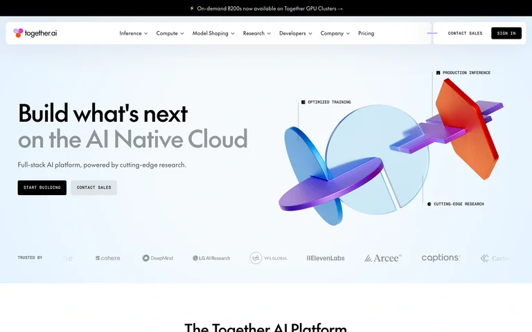
An AI-cloud homepage pairs concise positioning with a bright abstract model-infrastructure illustration.
Useful for: An AI-cloud homepage pairs concise positioning with a bright abstract model-infrastructure illustration.
# Design reference: Together AI
Source: https://www.together.ai/
Swipefile reference: https://swipefile.design/ref/ai-together/
Captured: 2026-09-05. This is a dated reference, not a claim about the current live product.
Capture scope: one viewport. Do not infer unseen page sections or a complete user flow.

## Objective
Adapt the visual principles below to my project. Use my own content and identity. Do not reproduce logos, proprietary copy, or brand assets.

## Reference notes
- mood: Open and inventive.
- colors: Pale blue, black and vivid purple, orange and red.
- typography: Bold sans-serif headline with a muted secondary line.
- layout: Left-aligned text and paired actions face a large annotated 3D composition, with logos below.
- motion: Static capture of one viewport. Visit the source to study motion and interaction.
- texture: Translucent geometric shapes and fine technical annotations.
- dont: Adapt the structure to your own content and brand; use your own identity, copy and imagery.

Useful for: An AI-cloud homepage pairs concise positioning with a bright abstract model-infrastructure illustration.

## Acceptance criteria
- Existing project conventions, design tokens, working functionality, and unrelated changes are preserved.
- Two or three reference principles clearly support the user's task; conflicts are resolved in favor of usability and the existing product.
- Reusable components and semantic HTML express the interface. Available licensed assets are used; important UI text is never rendered as a bitmap.
- Every visible control has a defined behavior. Loading, empty, error, success, disabled, and long-content states are specified where relevant. Demo data is clearly labeled.
- Navigation and content adapt at 375px, 768px, and 1440px without horizontal page overflow. Keyboard use, visible focus, labeled inputs, at least 44px touch targets, readable contrast, and reduced motion are supported.
- Verification distinguishes rendered behavior from proposals and identifies anything still requiring a backend or external service.

## Quality bar
Clear hierarchy, consistent spacing, restrained surfaces, and purposeful motion. Avoid decorative gradients, excessive cards, placeholder buttons, and invented metrics unless the project calls for them. Do not claim a feature is connected or tested without evidence.
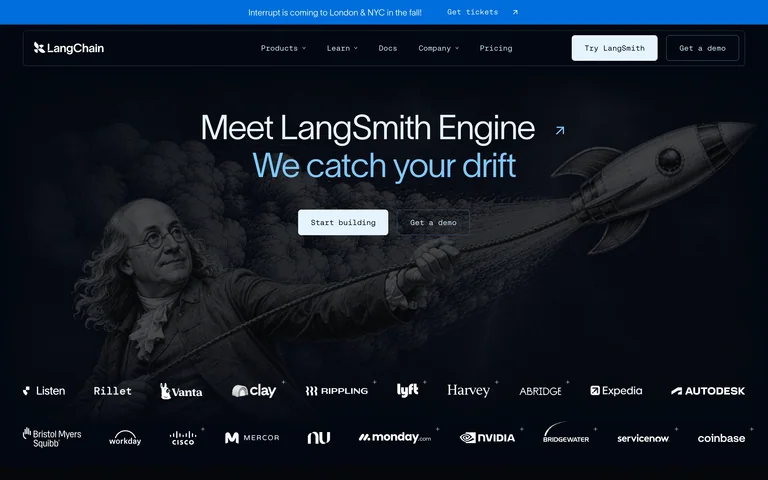
An agent-platform homepage uses an illustrated space scene beneath its product announcement.
Useful for: An agent-platform homepage uses an illustrated space scene beneath its product announcement.
# Design reference: LangChain
Source: https://www.langchain.com/
Swipefile reference: https://swipefile.design/ref/ai-langchain/
Captured: 2026-09-05. This is a dated reference, not a claim about the current live product.
Capture scope: one viewport. Do not infer unseen page sections or a complete user flow.

## Objective
Adapt the visual principles below to my project. Use my own content and identity. Do not reproduce logos, proprietary copy, or brand assets.

## Reference notes
- mood: Exploratory and technical.
- colors: Navy, black, white and pale blue.
- typography: Clean sans-serif headline with a highlighted second line.
- layout: Centered headline and actions float over a wide dark illustration, followed by customer logos.
- motion: Static capture of one viewport. Visit the source to study motion and interaction.
- texture: An astronaut and spacecraft add depth to the dark background.
- dont: Adapt the structure to your own content and brand; use your own identity, copy and imagery.

Useful for: An agent-platform homepage uses an illustrated space scene beneath its product announcement.

## Acceptance criteria
- Existing project conventions, design tokens, working functionality, and unrelated changes are preserved.
- Two or three reference principles clearly support the user's task; conflicts are resolved in favor of usability and the existing product.
- Reusable components and semantic HTML express the interface. Available licensed assets are used; important UI text is never rendered as a bitmap.
- Every visible control has a defined behavior. Loading, empty, error, success, disabled, and long-content states are specified where relevant. Demo data is clearly labeled.
- Navigation and content adapt at 375px, 768px, and 1440px without horizontal page overflow. Keyboard use, visible focus, labeled inputs, at least 44px touch targets, readable contrast, and reduced motion are supported.
- Verification distinguishes rendered behavior from proposals and identifies anything still requiring a backend or external service.

## Quality bar
Clear hierarchy, consistent spacing, restrained surfaces, and purposeful motion. Avoid decorative gradients, excessive cards, placeholder buttons, and invented metrics unless the project calls for them. Do not claim a feature is connected or tested without evidence.
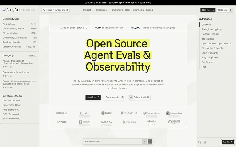
An AI observability homepage borrows a documentation layout, with a highlighted product statement in the center.
Useful for: An AI observability homepage borrows a documentation layout, with a highlighted product statement in the center.
# Design reference: Langfuse
Source: https://langfuse.com/
Swipefile reference: https://swipefile.design/ref/ai-langfuse/
Captured: 2026-09-05. This is a dated reference, not a claim about the current live product.
Capture scope: one viewport. Do not infer unseen page sections or a complete user flow.

## Objective
Adapt the visual principles below to my project. Use my own content and identity. Do not reproduce logos, proprietary copy, or brand assets.

## Reference notes
- mood: Useful and understated.
- colors: Warm white, grey, black and yellow highlights.
- typography: Plain sans-serif headings with compact documentation-style labels.
- layout: A left index and right on-page navigation frame the headline, product summary and action links.
- motion: Static capture of one viewport. Visit the source to study motion and interaction.
- texture: Fine rules, subtle paper tone and marker-like highlighting.
- dont: Adapt the structure to your own content and brand; use your own identity, copy and imagery.

Useful for: An AI observability homepage borrows a documentation layout, with a highlighted product statement in the center.

## Acceptance criteria
- Existing project conventions, design tokens, working functionality, and unrelated changes are preserved.
- Two or three reference principles clearly support the user's task; conflicts are resolved in favor of usability and the existing product.
- Reusable components and semantic HTML express the interface. Available licensed assets are used; important UI text is never rendered as a bitmap.
- Every visible control has a defined behavior. Loading, empty, error, success, disabled, and long-content states are specified where relevant. Demo data is clearly labeled.
- Navigation and content adapt at 375px, 768px, and 1440px without horizontal page overflow. Keyboard use, visible focus, labeled inputs, at least 44px touch targets, readable contrast, and reduced motion are supported.
- Verification distinguishes rendered behavior from proposals and identifies anything still requiring a backend or external service.

## Quality bar
Clear hierarchy, consistent spacing, restrained surfaces, and purposeful motion. Avoid decorative gradients, excessive cards, placeholder buttons, and invented metrics unless the project calls for them. Do not claim a feature is connected or tested without evidence.
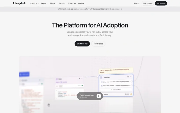
An enterprise-AI homepage places a clear adoption message above a large product-tour preview.
Useful for: An enterprise-AI homepage places a clear adoption message above a large product-tour preview.
# Design reference: Langdock
Source: https://langdock.com/#
Swipefile reference: https://swipefile.design/ref/ai-langdock/
Captured: 2026-09-05. This is a dated reference, not a claim about the current live product.
Capture scope: one viewport. Do not infer unseen page sections or a complete user flow.

## Objective
Adapt the visual principles below to my project. Use my own content and identity. Do not reproduce logos, proprietary copy, or brand assets.

## Reference notes
- mood: Calm and practical.
- colors: White, charcoal and light grey.
- typography: Large sans-serif headline with muted supporting text.
- layout: Centered headline, short paragraph and two actions lead into a wide softly focused video poster.
- motion: Static capture of one viewport. Visit the source to study motion and interaction.
- texture: Soft-focus interface imagery supports the product-tour invitation.
- dont: Adapt the structure to your own content and brand; use your own identity, copy and imagery.

Useful for: An enterprise-AI homepage places a clear adoption message above a large product-tour preview.

## Acceptance criteria
- Existing project conventions, design tokens, working functionality, and unrelated changes are preserved.
- Two or three reference principles clearly support the user's task; conflicts are resolved in favor of usability and the existing product.
- Reusable components and semantic HTML express the interface. Available licensed assets are used; important UI text is never rendered as a bitmap.
- Every visible control has a defined behavior. Loading, empty, error, success, disabled, and long-content states are specified where relevant. Demo data is clearly labeled.
- Navigation and content adapt at 375px, 768px, and 1440px without horizontal page overflow. Keyboard use, visible focus, labeled inputs, at least 44px touch targets, readable contrast, and reduced motion are supported.
- Verification distinguishes rendered behavior from proposals and identifies anything still requiring a backend or external service.

## Quality bar
Clear hierarchy, consistent spacing, restrained surfaces, and purposeful motion. Avoid decorative gradients, excessive cards, placeholder buttons, and invented metrics unless the project calls for them. Do not claim a feature is connected or tested without evidence.
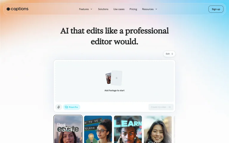
An AI video-editing homepage uses a serif introduction above an editing-assistant preview.
Useful for: An AI video-editing homepage uses a serif introduction above an editing-assistant preview.
# Design reference: Captions
Source: https://captions.ai/
Swipefile reference: https://swipefile.design/ref/ai-captions/
Captured: 2026-09-05. This is a dated reference, not a claim about the current live product.
Capture scope: one viewport. Do not infer unseen page sections or a complete user flow.

## Objective
Adapt the visual principles below to my project. Use my own content and identity. Do not reproduce logos, proprietary copy, or brand assets.

## Reference notes
- mood: Creative and approachable.
- colors: White with soft peach and blue gradients.
- typography: An editorial serif headline contrasts with small sans-serif controls.
- layout: Centered headline leads into a chat-like product demonstration and a row of example videos.
- motion: Static capture of one viewport. Visit the source to study motion and interaction.
- texture: Pastel light, translucent panels and video thumbnails.
- dont: Adapt the structure to your own content and brand; use your own identity, copy and imagery.

Useful for: An AI video-editing homepage uses a serif introduction above an editing-assistant preview.

## Acceptance criteria
- Existing project conventions, design tokens, working functionality, and unrelated changes are preserved.
- Two or three reference principles clearly support the user's task; conflicts are resolved in favor of usability and the existing product.
- Reusable components and semantic HTML express the interface. Available licensed assets are used; important UI text is never rendered as a bitmap.
- Every visible control has a defined behavior. Loading, empty, error, success, disabled, and long-content states are specified where relevant. Demo data is clearly labeled.
- Navigation and content adapt at 375px, 768px, and 1440px without horizontal page overflow. Keyboard use, visible focus, labeled inputs, at least 44px touch targets, readable contrast, and reduced motion are supported.
- Verification distinguishes rendered behavior from proposals and identifies anything still requiring a backend or external service.

## Quality bar
Clear hierarchy, consistent spacing, restrained surfaces, and purposeful motion. Avoid decorative gradients, excessive cards, placeholder buttons, and invented metrics unless the project calls for them. Do not claim a feature is connected or tested without evidence.
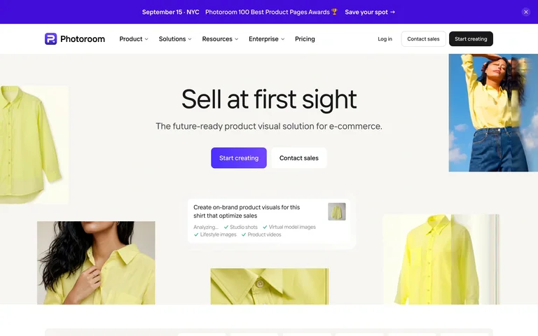
A product-image platform introduces its offering through a bright collage of fashion and product visuals.
Useful for: A product-image platform introduces its offering through a bright collage of fashion and product visuals.
# Design reference: Photoroom
Source: https://www.photoroom.com/
Swipefile reference: https://swipefile.design/ref/ai-photoroom/
Captured: 2026-09-05. This is a dated reference, not a claim about the current live product.
Capture scope: one viewport. Do not infer unseen page sections or a complete user flow.

## Objective
Adapt the visual principles below to my project. Use my own content and identity. Do not reproduce logos, proprietary copy, or brand assets.

## Reference notes
- mood: Bright and commercial.
- colors: White, pale yellow, purple and natural photographic colors.
- typography: Large light sans-serif headline with compact supporting text.
- layout: Centered introduction and paired actions sit within an asymmetric arrangement of image tiles.
- motion: Static capture of one viewport. Visit the source to study motion and interaction.
- texture: Cutout products, portraits and a floating instruction panel.
- dont: Adapt the structure to your own content and brand; use your own identity, copy and imagery.

Useful for: A product-image platform introduces its offering through a bright collage of fashion and product visuals.

## Acceptance criteria
- Existing project conventions, design tokens, working functionality, and unrelated changes are preserved.
- Two or three reference principles clearly support the user's task; conflicts are resolved in favor of usability and the existing product.
- Reusable components and semantic HTML express the interface. Available licensed assets are used; important UI text is never rendered as a bitmap.
- Every visible control has a defined behavior. Loading, empty, error, success, disabled, and long-content states are specified where relevant. Demo data is clearly labeled.
- Navigation and content adapt at 375px, 768px, and 1440px without horizontal page overflow. Keyboard use, visible focus, labeled inputs, at least 44px touch targets, readable contrast, and reduced motion are supported.
- Verification distinguishes rendered behavior from proposals and identifies anything still requiring a backend or external service.

## Quality bar
Clear hierarchy, consistent spacing, restrained surfaces, and purposeful motion. Avoid decorative gradients, excessive cards, placeholder buttons, and invented metrics unless the project calls for them. Do not claim a feature is connected or tested without evidence.
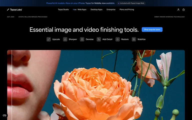
An image-enhancement homepage uses a large photographic close-up to demonstrate visual detail.
Useful for: An image-enhancement homepage uses a large photographic close-up to demonstrate visual detail.
# Design reference: Topaz Labs
Source: https://www.topazlabs.com/
Swipefile reference: https://swipefile.design/ref/ai-topaz/
Captured: 2026-09-05. This is a dated reference, not a claim about the current live product.
Capture scope: one viewport. Do not infer unseen page sections or a complete user flow.

## Objective
Adapt the visual principles below to my project. Use my own content and identity. Do not reproduce logos, proprietary copy, or brand assets.

## Reference notes
- mood: Focused and cinematic.
- colors: Black, white and blue controls around vivid teal and orange photography.
- typography: Large clean sans-serif headline with small tool labels.
- layout: A broad headline and action precede a row of enhancement tools and a wide image panel.
- motion: Static capture of one viewport. Visit the source to study motion and interaction.
- texture: Detailed natural photography dominates the page.
- dont: Adapt the structure to your own content and brand; use your own identity, copy and imagery.

Useful for: An image-enhancement homepage uses a large photographic close-up to demonstrate visual detail.

## Acceptance criteria
- Existing project conventions, design tokens, working functionality, and unrelated changes are preserved.
- Two or three reference principles clearly support the user's task; conflicts are resolved in favor of usability and the existing product.
- Reusable components and semantic HTML express the interface. Available licensed assets are used; important UI text is never rendered as a bitmap.
- Every visible control has a defined behavior. Loading, empty, error, success, disabled, and long-content states are specified where relevant. Demo data is clearly labeled.
- Navigation and content adapt at 375px, 768px, and 1440px without horizontal page overflow. Keyboard use, visible focus, labeled inputs, at least 44px touch targets, readable contrast, and reduced motion are supported.
- Verification distinguishes rendered behavior from proposals and identifies anything still requiring a backend or external service.

## Quality bar
Clear hierarchy, consistent spacing, restrained surfaces, and purposeful motion. Avoid decorative gradients, excessive cards, placeholder buttons, and invented metrics unless the project calls for them. Do not claim a feature is connected or tested without evidence.
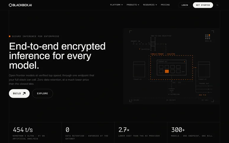
An inference-platform homepage pairs a short technical introduction with a system diagram and metric row.
Useful for: An inference-platform homepage pairs a short technical introduction with a system diagram and metric row.
# Design reference: BLACKBOX
Source: https://www.blackbox.ai/
Swipefile reference: https://swipefile.design/ref/ai-blackbox-chat/
Captured: 2026-09-05. This is a dated reference, not a claim about the current live product.
Capture scope: one viewport. Do not infer unseen page sections or a complete user flow.

## Objective
Adapt the visual principles below to my project. Use my own content and identity. Do not reproduce logos, proprietary copy, or brand assets.

## Reference notes
- mood: Technical and reserved.
- colors: Near-black, white, grey and restrained orange.
- typography: Compact uppercase labels contrast with a larger sans-serif headline.
- layout: Left-aligned headline and two actions balance a fine-line technical illustration, with metrics beneath.
- motion: Static capture of one viewport. Visit the source to study motion and interaction.
- texture: Fine system lines and small diagram annotations.
- dont: Adapt the structure to your own content and brand; use your own identity, copy and imagery.

Useful for: An inference-platform homepage pairs a short technical introduction with a system diagram and metric row.

## Acceptance criteria
- Existing project conventions, design tokens, working functionality, and unrelated changes are preserved.
- Two or three reference principles clearly support the user's task; conflicts are resolved in favor of usability and the existing product.
- Reusable components and semantic HTML express the interface. Available licensed assets are used; important UI text is never rendered as a bitmap.
- Every visible control has a defined behavior. Loading, empty, error, success, disabled, and long-content states are specified where relevant. Demo data is clearly labeled.
- Navigation and content adapt at 375px, 768px, and 1440px without horizontal page overflow. Keyboard use, visible focus, labeled inputs, at least 44px touch targets, readable contrast, and reduced motion are supported.
- Verification distinguishes rendered behavior from proposals and identifies anything still requiring a backend or external service.

## Quality bar
Clear hierarchy, consistent spacing, restrained surfaces, and purposeful motion. Avoid decorative gradients, excessive cards, placeholder buttons, and invented metrics unless the project calls for them. Do not claim a feature is connected or tested without evidence.
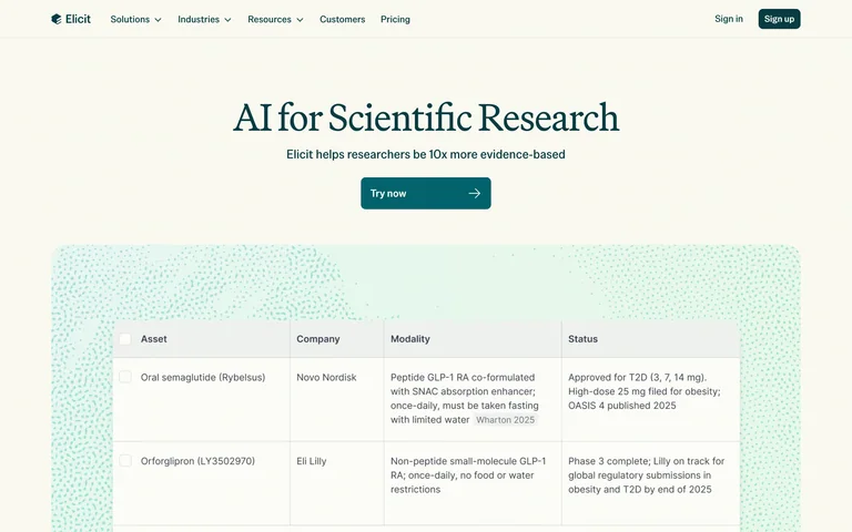
A research-AI homepage pairs a serif introduction with an evidence-table preview.
Useful for: A research-AI homepage pairs a serif introduction with an evidence-table preview.
# Design reference: Elicit
Source: https://elicit.com/
Swipefile reference: https://swipefile.design/ref/ai-elicit-search/
Captured: 2026-09-05. This is a dated reference, not a claim about the current live product.
Capture scope: one viewport. Do not infer unseen page sections or a complete user flow.

## Objective
Adapt the visual principles below to my project. Use my own content and identity. Do not reproduce logos, proprietary copy, or brand assets.

## Reference notes
- mood: Scholarly and calm.
- colors: Warm cream, deep teal and pale mint.
- typography: Serif headline with clear sans-serif supporting copy.
- layout: Centered headline and primary action sit above a wide research table.
- motion: Static capture of one viewport. Visit the source to study motion and interaction.
- texture: A fine patterned halo surrounds the table screenshot.
- dont: Adapt the structure to your own content and brand; use your own identity, copy and imagery.

Useful for: A research-AI homepage pairs a serif introduction with an evidence-table preview.

## Acceptance criteria
- Existing project conventions, design tokens, working functionality, and unrelated changes are preserved.
- Two or three reference principles clearly support the user's task; conflicts are resolved in favor of usability and the existing product.
- Reusable components and semantic HTML express the interface. Available licensed assets are used; important UI text is never rendered as a bitmap.
- Every visible control has a defined behavior. Loading, empty, error, success, disabled, and long-content states are specified where relevant. Demo data is clearly labeled.
- Navigation and content adapt at 375px, 768px, and 1440px without horizontal page overflow. Keyboard use, visible focus, labeled inputs, at least 44px touch targets, readable contrast, and reduced motion are supported.
- Verification distinguishes rendered behavior from proposals and identifies anything still requiring a backend or external service.

## Quality bar
Clear hierarchy, consistent spacing, restrained surfaces, and purposeful motion. Avoid decorative gradients, excessive cards, placeholder buttons, and invented metrics unless the project calls for them. Do not claim a feature is connected or tested without evidence.
Allow basic usage counts to help us understand what is useful. Your board contents stay out of analytics. Details
Your browser’s privacy preference keeps analytics off.