Product Showcase
CURATED COLLECTION · 15 REFERENCES
A second selection of live websites, from food and drink to robotics, retail, portfolios, and creative studios. Each includes a reviewed opening-screen capture and design notes.
Copy the reference notes below and paste them into Claude, ChatGPT, or your coding assistant. Add what you want to build.
Includes design notes, original sources, and preview links. An assistant that supports browsing can also read the public board link.
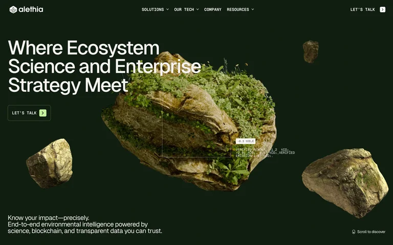
A moss-covered floating landform turns environmental data into a tangible opening visual. A short headline and lime-accented contact action stay prominent on a dark green field.
Useful for: Science and sustainability products that need a concrete visual explanation before technical detail.
# Design reference: Alethia
Source: https://www.alethia.earth/
Swipefile reference: https://swipefile.design/ref/awwwards-alethia/
Captured: 2026-09-05. This is a dated reference, not a claim about the current live product.
Capture scope: one viewport. Do not infer unseen page sections or a complete user flow.

## Objective
Adapt the visual principles below to my project. Use my own content and identity. Do not reproduce logos, proprietary copy, or brand assets.

## Reference notes
- mood: Grounded and technical
- colors: Forest green, pale lime, off-white
- typography: Large plain sans headline with compact utility navigation
- layout: Left-aligned headline and action, large central landform, supporting text along the bottom
- motion: Static opening-screen capture. Visit the live source to study transitions and interactive behavior.
- texture: Detailed rock and vegetation against a flat dark field
- dont: Adapt the hierarchy and visual principles to your own content; use your own identity and imagery.

Useful for: Science and sustainability products that need a concrete visual explanation before technical detail.

## Acceptance criteria
- Existing project conventions, design tokens, working functionality, and unrelated changes are preserved.
- Two or three reference principles clearly support the user's task; conflicts are resolved in favor of usability and the existing product.
- Reusable components and semantic HTML express the interface. Available licensed assets are used; important UI text is never rendered as a bitmap.
- Every visible control has a defined behavior. Loading, empty, error, success, disabled, and long-content states are specified where relevant. Demo data is clearly labeled.
- Navigation and content adapt at 375px, 768px, and 1440px without horizontal page overflow. Keyboard use, visible focus, labeled inputs, at least 44px touch targets, readable contrast, and reduced motion are supported.
- Verification distinguishes rendered behavior from proposals and identifies anything still requiring a backend or external service.

## Quality bar
Clear hierarchy, consistent spacing, restrained surfaces, and purposeful motion. Avoid decorative gradients, excessive cards, placeholder buttons, and invented metrics unless the project calls for them. Do not claim a feature is connected or tested without evidence.
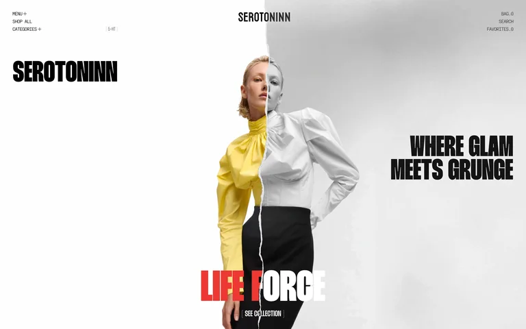
A torn-paper split pairs color and monochrome fashion imagery. Heavy condensed labels frame the model, while shopping and collection routes stay at the edges.
Useful for: Fashion launches where one campaign image should establish the collection identity.
# Design reference: Serotoninn
Source: https://serotoninn.com/
Swipefile reference: https://swipefile.design/ref/awwwards-serotoninn/
Captured: 2026-09-05. This is a dated reference, not a claim about the current live product.
Capture scope: one viewport. Do not infer unseen page sections or a complete user flow.

## Objective
Adapt the visual principles below to my project. Use my own content and identity. Do not reproduce logos, proprietary copy, or brand assets.

## Reference notes
- mood: Editorial and rebellious
- colors: White, black, gray, red with changing clothing colors
- typography: Heavy condensed uppercase display and thin compact utility text
- layout: Centered model image split vertically, large side statements, collection label and action below
- motion: Static opening-screen capture. Visit the live source to study transitions and interactive behavior.
- texture: Torn-paper edge and contrasting photographic treatments
- dont: Adapt the hierarchy and visual principles to your own content; use your own identity and imagery.

Useful for: Fashion launches where one campaign image should establish the collection identity.

## Acceptance criteria
- Existing project conventions, design tokens, working functionality, and unrelated changes are preserved.
- Two or three reference principles clearly support the user's task; conflicts are resolved in favor of usability and the existing product.
- Reusable components and semantic HTML express the interface. Available licensed assets are used; important UI text is never rendered as a bitmap.
- Every visible control has a defined behavior. Loading, empty, error, success, disabled, and long-content states are specified where relevant. Demo data is clearly labeled.
- Navigation and content adapt at 375px, 768px, and 1440px without horizontal page overflow. Keyboard use, visible focus, labeled inputs, at least 44px touch targets, readable contrast, and reduced motion are supported.
- Verification distinguishes rendered behavior from proposals and identifies anything still requiring a backend or external service.

## Quality bar
Clear hierarchy, consistent spacing, restrained surfaces, and purposeful motion. Avoid decorative gradients, excessive cards, placeholder buttons, and invented metrics unless the project calls for them. Do not claim a feature is connected or tested without evidence.
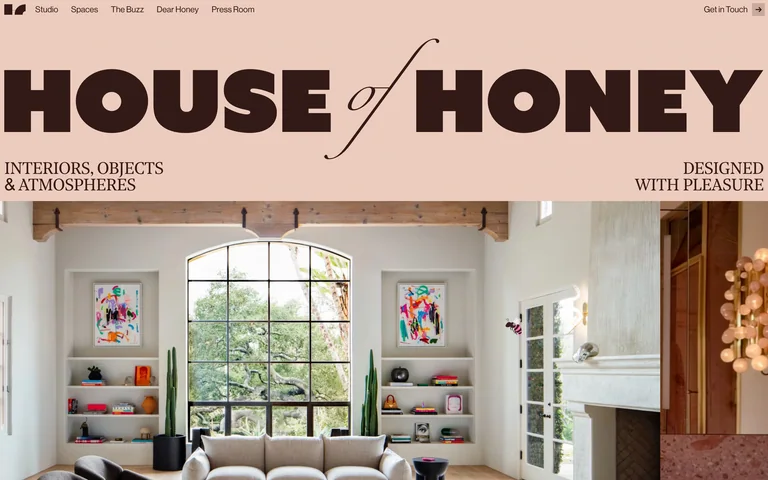
An oversized studio name and a fine script accent sit on a peach header above a full-width interior photograph, immediately connecting the identity to the work.
Useful for: Interior studios and hospitality brands with strong project photography.
# Design reference: House of Honey
Source: https://www.houseofhoney.com/
Swipefile reference: https://swipefile.design/ref/awwwards-house-of-honey-1/
Captured: 2026-09-05. This is a dated reference, not a claim about the current live product.
Capture scope: one viewport. Do not infer unseen page sections or a complete user flow.

## Objective
Adapt the visual principles below to my project. Use my own content and identity. Do not reproduce logos, proprietary copy, or brand assets.

## Reference notes
- mood: Warm and expressive
- colors: Peach, dark brown, natural interior colors
- typography: Heavy rounded name with a delicate script connector and small serif descriptors
- layout: Slim navigation, full-width identity band, then edge-to-edge interior imagery
- motion: Static opening-screen capture. Visit the live source to study transitions and interactive behavior.
- texture: Soft warm color fields and richly detailed interiors
- dont: Adapt the hierarchy and visual principles to your own content; use your own identity and imagery.

Useful for: Interior studios and hospitality brands with strong project photography.

## Acceptance criteria
- Existing project conventions, design tokens, working functionality, and unrelated changes are preserved.
- Two or three reference principles clearly support the user's task; conflicts are resolved in favor of usability and the existing product.
- Reusable components and semantic HTML express the interface. Available licensed assets are used; important UI text is never rendered as a bitmap.
- Every visible control has a defined behavior. Loading, empty, error, success, disabled, and long-content states are specified where relevant. Demo data is clearly labeled.
- Navigation and content adapt at 375px, 768px, and 1440px without horizontal page overflow. Keyboard use, visible focus, labeled inputs, at least 44px touch targets, readable contrast, and reduced motion are supported.
- Verification distinguishes rendered behavior from proposals and identifies anything still requiring a backend or external service.

## Quality bar
Clear hierarchy, consistent spacing, restrained surfaces, and purposeful motion. Avoid decorative gradients, excessive cards, placeholder buttons, and invented metrics unless the project calls for them. Do not claim a feature is connected or tested without evidence.
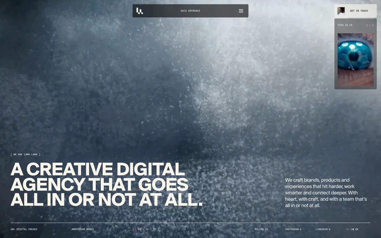
A large atmospheric visual fills the opening behind a bold bottom-left studio statement. The small floating navigation and project preview keep the work close at hand.
Useful for: Creative studios presenting immersive visual work with a short, direct introduction.
# Design reference: Lama Lama
Source: https://lamalama.com/
Swipefile reference: https://swipefile.design/ref/awwwards-lama-lama-2/
Captured: 2026-09-05. This is a dated reference, not a claim about the current live product.
Capture scope: one viewport. Do not infer unseen page sections or a complete user flow.

## Objective
Adapt the visual principles below to my project. Use my own content and identity. Do not reproduce logos, proprietary copy, or brand assets.

## Reference notes
- mood: Atmospheric and assertive
- colors: Blue-gray, white, charcoal
- typography: Bold uppercase sans statement with compact body text
- layout: Full-screen visual field, floating top navigation, statement and supporting copy along the bottom
- motion: Static opening-screen capture. Visit the live source to study transitions and interactive behavior.
- texture: Water-like particles and textured photographic atmosphere
- dont: Adapt the hierarchy and visual principles to your own content; use your own identity and imagery.

Useful for: Creative studios presenting immersive visual work with a short, direct introduction.

## Acceptance criteria
- Existing project conventions, design tokens, working functionality, and unrelated changes are preserved.
- Two or three reference principles clearly support the user's task; conflicts are resolved in favor of usability and the existing product.
- Reusable components and semantic HTML express the interface. Available licensed assets are used; important UI text is never rendered as a bitmap.
- Every visible control has a defined behavior. Loading, empty, error, success, disabled, and long-content states are specified where relevant. Demo data is clearly labeled.
- Navigation and content adapt at 375px, 768px, and 1440px without horizontal page overflow. Keyboard use, visible focus, labeled inputs, at least 44px touch targets, readable contrast, and reduced motion are supported.
- Verification distinguishes rendered behavior from proposals and identifies anything still requiring a backend or external service.

## Quality bar
Clear hierarchy, consistent spacing, restrained surfaces, and purposeful motion. Avoid decorative gradients, excessive cards, placeholder buttons, and invented metrics unless the project calls for them. Do not claim a feature is connected or tested without evidence.
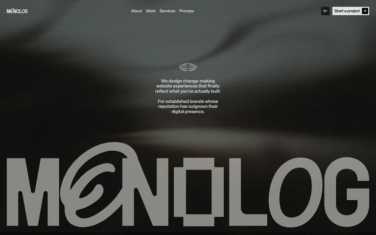
An enormous custom wordmark fills the lower half of a muted visual hero. A small central positioning statement and clear project action give the identity a practical entry point.
Useful for: Brand and web studios that want the identity to dominate while keeping project inquiry visible.
# Design reference: MONOLOG
Source: https://bymonolog.com/
Swipefile reference: https://swipefile.design/ref/awwwards-monolog/
Captured: 2026-09-05. This is a dated reference, not a claim about the current live product.
Capture scope: one viewport. Do not infer unseen page sections or a complete user flow.

## Objective
Adapt the visual principles below to my project. Use my own content and identity. Do not reproduce logos, proprietary copy, or brand assets.

## Reference notes
- mood: Confident and subdued
- colors: Muted gray-green, near-black, off-white
- typography: Oversized stylized wordmark, tiny sans positioning text
- layout: Quiet top navigation, centered statement, full-width wordmark at the bottom
- motion: Static opening-screen capture. Visit the live source to study transitions and interactive behavior.
- texture: Blurred atmospheric visual behind crisp lettering
- dont: Adapt the hierarchy and visual principles to your own content; use your own identity and imagery.

Useful for: Brand and web studios that want the identity to dominate while keeping project inquiry visible.

## Acceptance criteria
- Existing project conventions, design tokens, working functionality, and unrelated changes are preserved.
- Two or three reference principles clearly support the user's task; conflicts are resolved in favor of usability and the existing product.
- Reusable components and semantic HTML express the interface. Available licensed assets are used; important UI text is never rendered as a bitmap.
- Every visible control has a defined behavior. Loading, empty, error, success, disabled, and long-content states are specified where relevant. Demo data is clearly labeled.
- Navigation and content adapt at 375px, 768px, and 1440px without horizontal page overflow. Keyboard use, visible focus, labeled inputs, at least 44px touch targets, readable contrast, and reduced motion are supported.
- Verification distinguishes rendered behavior from proposals and identifies anything still requiring a backend or external service.

## Quality bar
Clear hierarchy, consistent spacing, restrained surfaces, and purposeful motion. Avoid decorative gradients, excessive cards, placeholder buttons, and invented metrics unless the project calls for them. Do not claim a feature is connected or tested without evidence.
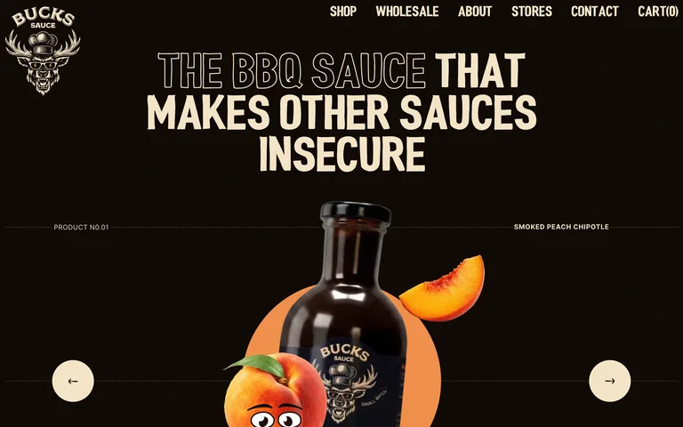
A sauce bottle, fruit illustration, and oversized headline make a single product feel bold and specific. Small product labels and circular arrows support browsing the flavors.
Useful for: Food and drink stores where packaging and flavor imagery can explain the offer.
# Design reference: Bucks Sauce
Source: https://buckssauce.com/
Swipefile reference: https://swipefile.design/ref/awwwards-bucks-sauce/
Captured: 2026-09-05. This is a dated reference, not a claim about the current live product.
Capture scope: one viewport. Do not infer unseen page sections or a complete user flow.

## Objective
Adapt the visual principles below to my project. Use my own content and identity. Do not reproduce logos, proprietary copy, or brand assets.

## Reference notes
- mood: Cheeky and appetizing
- colors: Near-black brown, cream, warm orange
- typography: Condensed uppercase headline with outlined and filled words
- layout: Centered headline above a large bottle composition, compact shop navigation, circular side controls
- motion: Static opening-screen capture. Visit the live source to study transitions and interactive behavior.
- texture: Glossy packaging, fruit photography, and cartoon accents
- dont: Adapt the hierarchy and visual principles to your own content; use your own identity and imagery.

Useful for: Food and drink stores where packaging and flavor imagery can explain the offer.

## Acceptance criteria
- Existing project conventions, design tokens, working functionality, and unrelated changes are preserved.
- Two or three reference principles clearly support the user's task; conflicts are resolved in favor of usability and the existing product.
- Reusable components and semantic HTML express the interface. Available licensed assets are used; important UI text is never rendered as a bitmap.
- Every visible control has a defined behavior. Loading, empty, error, success, disabled, and long-content states are specified where relevant. Demo data is clearly labeled.
- Navigation and content adapt at 375px, 768px, and 1440px without horizontal page overflow. Keyboard use, visible focus, labeled inputs, at least 44px touch targets, readable contrast, and reduced motion are supported.
- Verification distinguishes rendered behavior from proposals and identifies anything still requiring a backend or external service.

## Quality bar
Clear hierarchy, consistent spacing, restrained surfaces, and purposeful motion. Avoid decorative gradients, excessive cards, placeholder buttons, and invented metrics unless the project calls for them. Do not claim a feature is connected or tested without evidence.
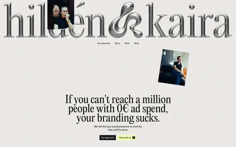
A metallic serif wordmark stretches across an otherwise restrained page. A small portrait and a large serif positioning statement create a direct, personal studio introduction.
Useful for: Small branding studios pairing a distinctive identity with a focused offer.
# Design reference: Hildén & Kaira
Source: https://www.hildenkaira.fi/
Swipefile reference: https://swipefile.design/ref/awwwards-hilden-kaira/
Captured: 2026-09-05. This is a dated reference, not a claim about the current live product.
Capture scope: one viewport. Do not infer unseen page sections or a complete user flow.

## Objective
Adapt the visual principles below to my project. Use my own content and identity. Do not reproduce logos, proprietary copy, or brand assets.

## Reference notes
- mood: Expressive and direct
- colors: Warm light gray, silver, black, lime action accents
- typography: Large dimensional serif wordmark and editorial serif statement
- layout: Oversized identity at the top, compact centered navigation, smaller portrait and statement below
- motion: Static opening-screen capture. Visit the live source to study transitions and interactive behavior.
- texture: Reflective lettering over a flat paper-like background
- dont: Adapt the hierarchy and visual principles to your own content; use your own identity and imagery.

Useful for: Small branding studios pairing a distinctive identity with a focused offer.

## Acceptance criteria
- Existing project conventions, design tokens, working functionality, and unrelated changes are preserved.
- Two or three reference principles clearly support the user's task; conflicts are resolved in favor of usability and the existing product.
- Reusable components and semantic HTML express the interface. Available licensed assets are used; important UI text is never rendered as a bitmap.
- Every visible control has a defined behavior. Loading, empty, error, success, disabled, and long-content states are specified where relevant. Demo data is clearly labeled.
- Navigation and content adapt at 375px, 768px, and 1440px without horizontal page overflow. Keyboard use, visible focus, labeled inputs, at least 44px touch targets, readable contrast, and reduced motion are supported.
- Verification distinguishes rendered behavior from proposals and identifies anything still requiring a backend or external service.

## Quality bar
Clear hierarchy, consistent spacing, restrained surfaces, and purposeful motion. Avoid decorative gradients, excessive cards, placeholder buttons, and invented metrics unless the project calls for them. Do not claim a feature is connected or tested without evidence.
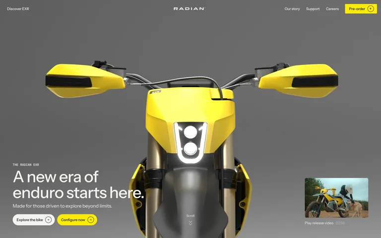
A front-facing yellow motorcycle fills the hero, with a short product statement and separate explore and configure actions in the lower-left.
Useful for: Hardware and vehicle launches that need a large product view and a clear route into configuration.
# Design reference: Radian
Source: https://www.rideradian.com/
Swipefile reference: https://swipefile.design/ref/awwwards-radian/
Captured: 2026-09-05. This is a dated reference, not a claim about the current live product.
Capture scope: one viewport. Do not infer unseen page sections or a complete user flow.

## Objective
Adapt the visual principles below to my project. Use my own content and identity. Do not reproduce logos, proprietary copy, or brand assets.

## Reference notes
- mood: Engineered and energetic
- colors: Neutral gray, vivid yellow, black, white
- typography: Clean sans headline and compact navigation
- layout: Centered product close-up, bottom-left text and actions, preorder control in the top navigation
- motion: Static opening-screen capture. Visit the live source to study transitions and interactive behavior.
- texture: Detailed product rendering against a neutral studio field
- dont: Adapt the hierarchy and visual principles to your own content; use your own identity and imagery.

Useful for: Hardware and vehicle launches that need a large product view and a clear route into configuration.

## Acceptance criteria
- Existing project conventions, design tokens, working functionality, and unrelated changes are preserved.
- Two or three reference principles clearly support the user's task; conflicts are resolved in favor of usability and the existing product.
- Reusable components and semantic HTML express the interface. Available licensed assets are used; important UI text is never rendered as a bitmap.
- Every visible control has a defined behavior. Loading, empty, error, success, disabled, and long-content states are specified where relevant. Demo data is clearly labeled.
- Navigation and content adapt at 375px, 768px, and 1440px without horizontal page overflow. Keyboard use, visible focus, labeled inputs, at least 44px touch targets, readable contrast, and reduced motion are supported.
- Verification distinguishes rendered behavior from proposals and identifies anything still requiring a backend or external service.

## Quality bar
Clear hierarchy, consistent spacing, restrained surfaces, and purposeful motion. Avoid decorative gradients, excessive cards, placeholder buttons, and invented metrics unless the project calls for them. Do not claim a feature is connected or tested without evidence.
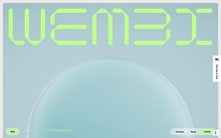
A segmented lime wordmark and a pale sculptural ring give this digital-twin product a recognizable visual identity with very little interface chrome.
Useful for: Technical products that need a distinctive cover before explaining their workflow.
# Design reference: Wembi
Source: https://www.wembi.ai/
Swipefile reference: https://swipefile.design/ref/awwwards-wembi/
Captured: 2026-09-05. This is a dated reference, not a claim about the current live product.
Capture scope: one viewport. Do not infer unseen page sections or a complete user flow.

## Objective
Adapt the visual principles below to my project. Use my own content and identity. Do not reproduce logos, proprietary copy, or brand assets.

## Reference notes
- mood: Light and futuristic
- colors: Pale blue-gray, acid lime, white
- typography: Oversized segmented display lettering with tiny utility labels
- layout: Wordmark spans the top above an open sculptural visual field
- motion: Static opening-screen capture. Visit the live source to study transitions and interactive behavior.
- texture: Smooth pale ring and a softly shaded background
- dont: Adapt the hierarchy and visual principles to your own content; use your own identity and imagery.

Useful for: Technical products that need a distinctive cover before explaining their workflow.

## Acceptance criteria
- Existing project conventions, design tokens, working functionality, and unrelated changes are preserved.
- Two or three reference principles clearly support the user's task; conflicts are resolved in favor of usability and the existing product.
- Reusable components and semantic HTML express the interface. Available licensed assets are used; important UI text is never rendered as a bitmap.
- Every visible control has a defined behavior. Loading, empty, error, success, disabled, and long-content states are specified where relevant. Demo data is clearly labeled.
- Navigation and content adapt at 375px, 768px, and 1440px without horizontal page overflow. Keyboard use, visible focus, labeled inputs, at least 44px touch targets, readable contrast, and reduced motion are supported.
- Verification distinguishes rendered behavior from proposals and identifies anything still requiring a backend or external service.

## Quality bar
Clear hierarchy, consistent spacing, restrained surfaces, and purposeful motion. Avoid decorative gradients, excessive cards, placeholder buttons, and invented metrics unless the project calls for them. Do not claim a feature is connected or tested without evidence.
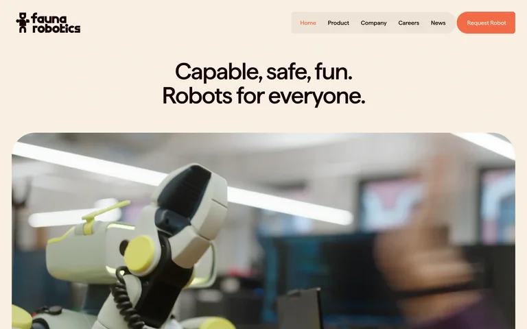
A short centered introduction sits above a large rounded robot image. Warm cream and a coral demo action make a technical product feel approachable.
Useful for: Hardware companies introducing unfamiliar technology through a friendly first impression.
# Design reference: Fauna Robotics
Source: https://faunarobotics.com/
Swipefile reference: https://swipefile.design/ref/awwwards-fauna-robotics/
Captured: 2026-09-05. This is a dated reference, not a claim about the current live product.
Capture scope: one viewport. Do not infer unseen page sections or a complete user flow.

## Objective
Adapt the visual principles below to my project. Use my own content and identity. Do not reproduce logos, proprietary copy, or brand assets.

## Reference notes
- mood: Friendly and tangible
- colors: Warm cream, coral, dark brown, muted product colors
- typography: Medium-weight sans headline and compact navigation
- layout: Logo and slim navigation above a centered statement, with a large rounded media panel below
- motion: Static opening-screen capture. Visit the live source to study transitions and interactive behavior.
- texture: Soft corners, warm flat background, real-world robot imagery
- dont: Adapt the hierarchy and visual principles to your own content; use your own identity and imagery.

Useful for: Hardware companies introducing unfamiliar technology through a friendly first impression.

## Acceptance criteria
- Existing project conventions, design tokens, working functionality, and unrelated changes are preserved.
- Two or three reference principles clearly support the user's task; conflicts are resolved in favor of usability and the existing product.
- Reusable components and semantic HTML express the interface. Available licensed assets are used; important UI text is never rendered as a bitmap.
- Every visible control has a defined behavior. Loading, empty, error, success, disabled, and long-content states are specified where relevant. Demo data is clearly labeled.
- Navigation and content adapt at 375px, 768px, and 1440px without horizontal page overflow. Keyboard use, visible focus, labeled inputs, at least 44px touch targets, readable contrast, and reduced motion are supported.
- Verification distinguishes rendered behavior from proposals and identifies anything still requiring a backend or external service.

## Quality bar
Clear hierarchy, consistent spacing, restrained surfaces, and purposeful motion. Avoid decorative gradients, excessive cards, placeholder buttons, and invented metrics unless the project calls for them. Do not claim a feature is connected or tested without evidence.
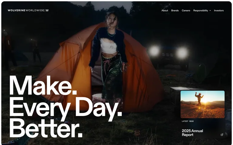
Outdoor lifestyle footage fills the opening behind a large stacked statement. A compact annual-report preview gives the corporate page a second, more practical route.
Useful for: Consumer-brand groups connecting a corporate identity to the everyday use of their products.
# Design reference: Wolverine Worldwide
Source: https://wolverineworldwide.com/
Swipefile reference: https://swipefile.design/ref/awwwards-wolverine-worldwide/
Captured: 2026-09-05. This is a dated reference, not a claim about the current live product.
Capture scope: one viewport. Do not infer unseen page sections or a complete user flow.

## Objective
Adapt the visual principles below to my project. Use my own content and identity. Do not reproduce logos, proprietary copy, or brand assets.

## Reference notes
- mood: Active and confident
- colors: Deep outdoor tones, white, warm photographic accents
- typography: Very large bold sans statement with small navigation
- layout: Full-screen lifestyle media, oversized lower-left message, smaller report feature at the right
- motion: Static opening-screen capture. Visit the live source to study transitions and interactive behavior.
- texture: Cinematic outdoor imagery with minimal interface framing
- dont: Adapt the hierarchy and visual principles to your own content; use your own identity and imagery.

Useful for: Consumer-brand groups connecting a corporate identity to the everyday use of their products.

## Acceptance criteria
- Existing project conventions, design tokens, working functionality, and unrelated changes are preserved.
- Two or three reference principles clearly support the user's task; conflicts are resolved in favor of usability and the existing product.
- Reusable components and semantic HTML express the interface. Available licensed assets are used; important UI text is never rendered as a bitmap.
- Every visible control has a defined behavior. Loading, empty, error, success, disabled, and long-content states are specified where relevant. Demo data is clearly labeled.
- Navigation and content adapt at 375px, 768px, and 1440px without horizontal page overflow. Keyboard use, visible focus, labeled inputs, at least 44px touch targets, readable contrast, and reduced motion are supported.
- Verification distinguishes rendered behavior from proposals and identifies anything still requiring a backend or external service.

## Quality bar
Clear hierarchy, consistent spacing, restrained surfaces, and purposeful motion. Avoid decorative gradients, excessive cards, placeholder buttons, and invented metrics unless the project calls for them. Do not claim a feature is connected or tested without evidence.
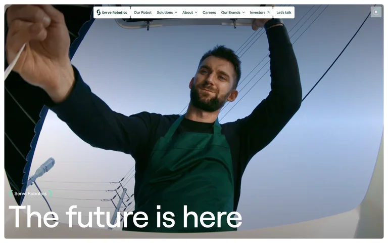
A large real-world delivery scene sits inside a lightly rounded frame, with a floating white navigation and a plain statement along the bottom.
Useful for: Robotics and logistics products that benefit from showing the human context of the technology.
# Design reference: Serve Robotics
Source: https://www.serverobotics.com/
Swipefile reference: https://swipefile.design/ref/awwwards-serve-robotics/
Captured: 2026-09-05. This is a dated reference, not a claim about the current live product.
Capture scope: one viewport. Do not infer unseen page sections or a complete user flow.

## Objective
Adapt the visual principles below to my project. Use my own content and identity. Do not reproduce logos, proprietary copy, or brand assets.

## Reference notes
- mood: Accessible and optimistic
- colors: White, sky blue, dark text, natural video colors
- typography: Simple large sans headline and compact navigation
- layout: Floating navigation above a nearly full-screen media frame and bottom-left headline
- motion: Static opening-screen capture. Visit the live source to study transitions and interactive behavior.
- texture: Real-world footage and restrained rounded framing
- dont: Adapt the hierarchy and visual principles to your own content; use your own identity and imagery.

Useful for: Robotics and logistics products that benefit from showing the human context of the technology.

## Acceptance criteria
- Existing project conventions, design tokens, working functionality, and unrelated changes are preserved.
- Two or three reference principles clearly support the user's task; conflicts are resolved in favor of usability and the existing product.
- Reusable components and semantic HTML express the interface. Available licensed assets are used; important UI text is never rendered as a bitmap.
- Every visible control has a defined behavior. Loading, empty, error, success, disabled, and long-content states are specified where relevant. Demo data is clearly labeled.
- Navigation and content adapt at 375px, 768px, and 1440px without horizontal page overflow. Keyboard use, visible focus, labeled inputs, at least 44px touch targets, readable contrast, and reduced motion are supported.
- Verification distinguishes rendered behavior from proposals and identifies anything still requiring a backend or external service.

## Quality bar
Clear hierarchy, consistent spacing, restrained surfaces, and purposeful motion. Avoid decorative gradients, excessive cards, placeholder buttons, and invented metrics unless the project calls for them. Do not claim a feature is connected or tested without evidence.
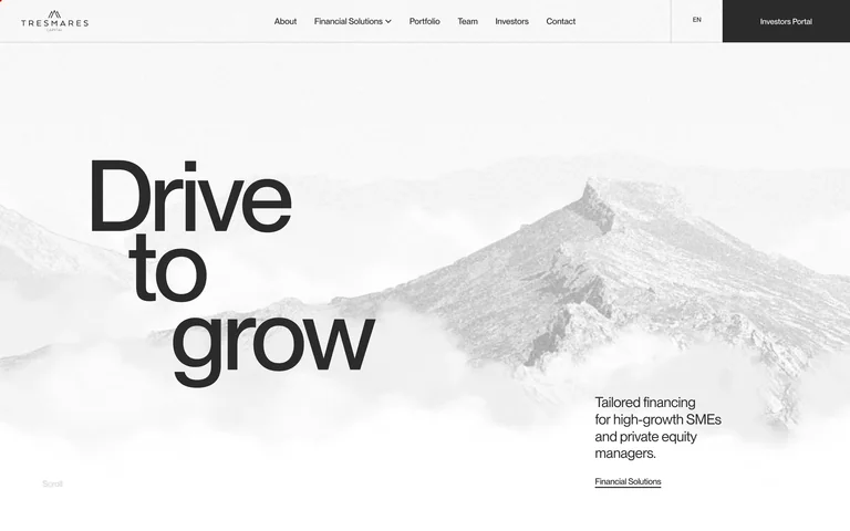
A staggered headline climbs across a pale mountain image, while a small financing description and link occupy a separate lower column.
Useful for: Professional services firms seeking a clear editorial hierarchy with a restrained visual metaphor.
# Design reference: Tresmares Capital
Source: https://www.tresmarescapital.com/en/
Swipefile reference: https://swipefile.design/ref/awwwards-tresmares-capital/
Captured: 2026-09-05. This is a dated reference, not a claim about the current live product.
Capture scope: one viewport. Do not infer unseen page sections or a complete user flow.

## Objective
Adapt the visual principles below to my project. Use my own content and identity. Do not reproduce logos, proprietary copy, or brand assets.

## Reference notes
- mood: Calm and purposeful
- colors: White, pale gray, charcoal
- typography: Large clean sans display with compact supporting copy
- layout: Slim horizontal navigation, stepped headline left, broad mountain backdrop, supporting text below-right
- motion: Static opening-screen capture. Visit the live source to study transitions and interactive behavior.
- texture: Low-contrast landscape photography and fine dividers
- dont: Adapt the hierarchy and visual principles to your own content; use your own identity and imagery.

Useful for: Professional services firms seeking a clear editorial hierarchy with a restrained visual metaphor.

## Acceptance criteria
- Existing project conventions, design tokens, working functionality, and unrelated changes are preserved.
- Two or three reference principles clearly support the user's task; conflicts are resolved in favor of usability and the existing product.
- Reusable components and semantic HTML express the interface. Available licensed assets are used; important UI text is never rendered as a bitmap.
- Every visible control has a defined behavior. Loading, empty, error, success, disabled, and long-content states are specified where relevant. Demo data is clearly labeled.
- Navigation and content adapt at 375px, 768px, and 1440px without horizontal page overflow. Keyboard use, visible focus, labeled inputs, at least 44px touch targets, readable contrast, and reduced motion are supported.
- Verification distinguishes rendered behavior from proposals and identifies anything still requiring a backend or external service.

## Quality bar
Clear hierarchy, consistent spacing, restrained surfaces, and purposeful motion. Avoid decorative gradients, excessive cards, placeholder buttons, and invented metrics unless the project calls for them. Do not claim a feature is connected or tested without evidence.
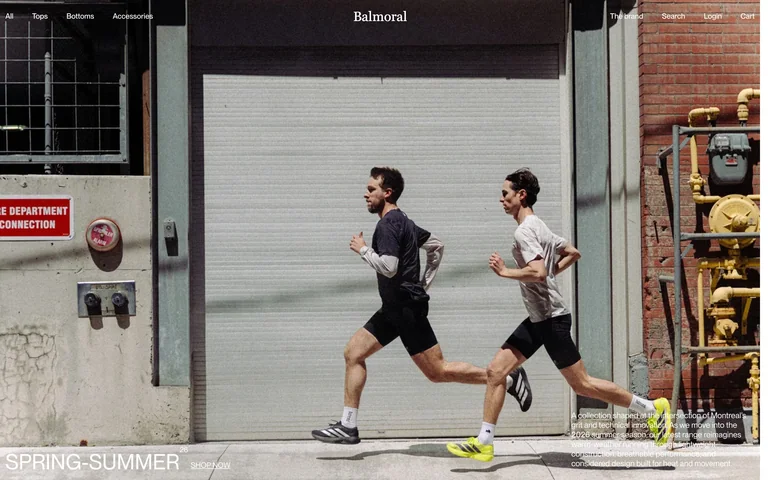
Running photography carries the seasonal collection, with compact product-category navigation and a small shopping action over the image.
Useful for: Apparel stores whose campaign photography should lead directly into a collection.
# Design reference: Balmoral
Source: https://www.balmoralrunning.com/
Swipefile reference: https://swipefile.design/ref/awwwards-balmoral/
Captured: 2026-09-05. This is a dated reference, not a claim about the current live product.
Capture scope: one viewport. Do not infer unseen page sections or a complete user flow.

## Objective
Adapt the visual principles below to my project. Use my own content and identity. Do not reproduce logos, proprietary copy, or brand assets.

## Reference notes
- mood: Understated and active
- colors: Natural street colors, white, charcoal
- typography: Small neutral sans navigation and a compact seasonal label
- layout: Full-bleed runner imagery framed by sparse top navigation and lower collection information
- motion: Static opening-screen capture. Visit the live source to study transitions and interactive behavior.
- texture: Street photography with little decorative UI
- dont: Adapt the hierarchy and visual principles to your own content; use your own identity and imagery.

Useful for: Apparel stores whose campaign photography should lead directly into a collection.

## Acceptance criteria
- Existing project conventions, design tokens, working functionality, and unrelated changes are preserved.
- Two or three reference principles clearly support the user's task; conflicts are resolved in favor of usability and the existing product.
- Reusable components and semantic HTML express the interface. Available licensed assets are used; important UI text is never rendered as a bitmap.
- Every visible control has a defined behavior. Loading, empty, error, success, disabled, and long-content states are specified where relevant. Demo data is clearly labeled.
- Navigation and content adapt at 375px, 768px, and 1440px without horizontal page overflow. Keyboard use, visible focus, labeled inputs, at least 44px touch targets, readable contrast, and reduced motion are supported.
- Verification distinguishes rendered behavior from proposals and identifies anything still requiring a backend or external service.

## Quality bar
Clear hierarchy, consistent spacing, restrained surfaces, and purposeful motion. Avoid decorative gradients, excessive cards, placeholder buttons, and invented metrics unless the project calls for them. Do not claim a feature is connected or tested without evidence.
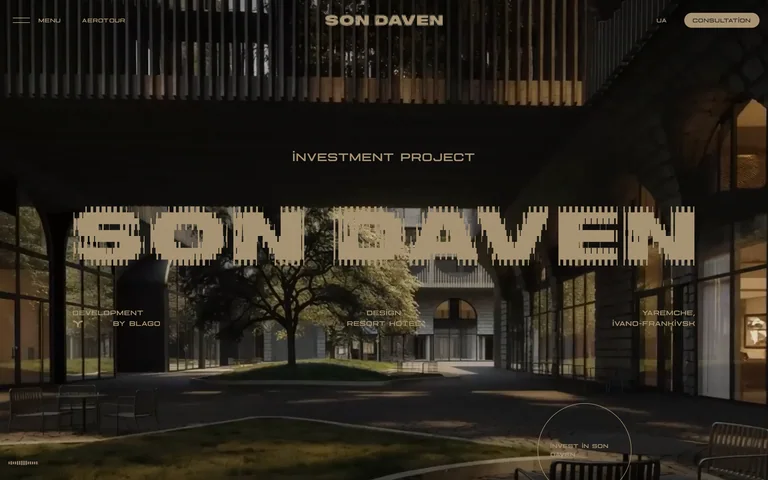
A warm architectural scene supports a large textured wordmark and small resort descriptors. A consultation action remains visible in the otherwise restrained navigation.
Useful for: Resort and property brands using architecture and a distinctive identity to introduce a place.
# Design reference: Son Daven
Source: https://sondaven.com/en
Swipefile reference: https://swipefile.design/ref/awwwards-son-daven/
Captured: 2026-09-05. This is a dated reference, not a claim about the current live product.
Capture scope: one viewport. Do not infer unseen page sections or a complete user flow.

## Objective
Adapt the visual principles below to my project. Use my own content and identity. Do not reproduce logos, proprietary copy, or brand assets.

## Reference notes
- mood: Immersive and warm
- colors: Deep charcoal, muted sand, forest green
- typography: Large segmented wordmark with wide compact uppercase utility labels
- layout: Full-bleed architectural scene, centered identity, widely spaced descriptors and corner actions
- motion: Static opening-screen capture. Visit the live source to study transitions and interactive behavior.
- texture: Timber and stone imagery with textured lettering
- dont: Adapt the hierarchy and visual principles to your own content; use your own identity and imagery.

Useful for: Resort and property brands using architecture and a distinctive identity to introduce a place.

## Acceptance criteria
- Existing project conventions, design tokens, working functionality, and unrelated changes are preserved.
- Two or three reference principles clearly support the user's task; conflicts are resolved in favor of usability and the existing product.
- Reusable components and semantic HTML express the interface. Available licensed assets are used; important UI text is never rendered as a bitmap.
- Every visible control has a defined behavior. Loading, empty, error, success, disabled, and long-content states are specified where relevant. Demo data is clearly labeled.
- Navigation and content adapt at 375px, 768px, and 1440px without horizontal page overflow. Keyboard use, visible focus, labeled inputs, at least 44px touch targets, readable contrast, and reduced motion are supported.
- Verification distinguishes rendered behavior from proposals and identifies anything still requiring a backend or external service.

## Quality bar
Clear hierarchy, consistent spacing, restrained surfaces, and purposeful motion. Avoid decorative gradients, excessive cards, placeholder buttons, and invented metrics unless the project calls for them. Do not claim a feature is connected or tested without evidence.
Allow basic usage counts to help us understand what is useful. Your board contents stay out of analytics. Details
Your browser’s privacy preference keeps analytics off.