
Landing page concept
CURATED COLLECTION · 50 REFERENCES
50 visually reviewed landing page references selected for expressive typography, strong art direction and clear category fit. Designer-published Dribbble concepts and case studies, with visible marketing page layouts, source credits and specific visual notes.
Copy the reference notes below and paste them into Claude, ChatGPT, or your coding assistant. Add what you want to build.
Includes design notes, original sources, and preview links. An assistant that supports browsing can also read the public board link.
Landing pages reference. An event-ticket landing page uses a cinematic landscape, warm iridescent panel and clear booking action. Credit: Awakened Templates. Designer-published design presentation on Dribbble; concept or case-study artwork, implementation not independently verified. Visually reviewed for the MotionSites-inspired collection.
# Design reference: Cinematic Website Design for UFO & Paranormal Conventions
Source: https://dribbble.com/shots/27577733-Cinematic-Website-Design-for-UFO-Paranormal-Conventions
Swipefile reference: https://swipefile.design/ref/ms26-landing-v2-27577733-cinematic-website-design-for-ufo-paranormal-conventions/
Captured: 2026-10-11. This is a dated reference, not a claim about the current live product.
Source scope: static designer or award presentation. This may be concept or case-study artwork. Do not infer working features, unseen screens, or tested interactions.

## Objective
Adapt the visual principles below to my project. Use my own content and identity. Do not reproduce logos, proprietary copy, or brand assets.

## Reference notes
Landing pages reference. An event-ticket landing page uses a cinematic landscape, warm iridescent panel and clear booking action. Credit: Awakened Templates. Designer-published design presentation on Dribbble; concept or case-study artwork, implementation not independently verified. Visually reviewed for the MotionSites-inspired collection.

## Acceptance criteria
- Existing project conventions, design tokens, working functionality, and unrelated changes are preserved.
- Two or three reference principles clearly support the user's task; conflicts are resolved in favor of usability and the existing product.
- Reusable components and semantic HTML express the interface. Available licensed assets are used; important UI text is never rendered as a bitmap.
- Every visible control has a defined behavior. Loading, empty, error, success, disabled, and long-content states are specified where relevant. Demo data is clearly labeled.
- Navigation and content adapt at 375px, 768px, and 1440px without horizontal page overflow. Keyboard use, visible focus, labeled inputs, at least 44px touch targets, readable contrast, and reduced motion are supported.
- Verification distinguishes rendered behavior from proposals and identifies anything still requiring a backend or external service.

## Quality bar
Clear hierarchy, consistent spacing, restrained surfaces, and purposeful motion. Avoid decorative gradients, excessive cards, placeholder buttons, and invented metrics unless the project calls for them. Do not claim a feature is connected or tested without evidence.

Landing pages reference. A central matcha cup, playful ingredient cards, and rich green layers turn the product into a tactile hero. Credit: Kris Anfalova. Designer-published landing pages presentation on Dribbble; concept or case-study artwork, implementation not independently verified. Curated for the MotionSites-inspired batch (2026-10-10).
# Design reference: Kumo — Interactive Matcha Tea Landing Page UI-UX
Source: https://dribbble.com/shots/26971799-Kumo-Interactive-Matcha-Tea-Landing-Page-UI-UX
Swipefile reference: https://swipefile.design/ref/ms26-landing-26971799-kumo-interactive-matcha-tea-landing-page-ui-ux/
Captured: 2026-10-11. This is a dated reference, not a claim about the current live product.
Source scope: static designer or award presentation. This may be concept or case-study artwork. Do not infer working features, unseen screens, or tested interactions.

## Objective
Adapt the visual principles below to my project. Use my own content and identity. Do not reproduce logos, proprietary copy, or brand assets.

## Reference notes
Landing pages reference. A central matcha cup, playful ingredient cards, and rich green layers turn the product into a tactile hero. Credit: Kris Anfalova. Designer-published landing pages presentation on Dribbble; concept or case-study artwork, implementation not independently verified. Curated for the MotionSites-inspired batch (2026-10-10).

## Acceptance criteria
- Existing project conventions, design tokens, working functionality, and unrelated changes are preserved.
- Two or three reference principles clearly support the user's task; conflicts are resolved in favor of usability and the existing product.
- Reusable components and semantic HTML express the interface. Available licensed assets are used; important UI text is never rendered as a bitmap.
- Every visible control has a defined behavior. Loading, empty, error, success, disabled, and long-content states are specified where relevant. Demo data is clearly labeled.
- Navigation and content adapt at 375px, 768px, and 1440px without horizontal page overflow. Keyboard use, visible focus, labeled inputs, at least 44px touch targets, readable contrast, and reduced motion are supported.
- Verification distinguishes rendered behavior from proposals and identifies anything still requiring a backend or external service.

## Quality bar
Clear hierarchy, consistent spacing, restrained surfaces, and purposeful motion. Avoid decorative gradients, excessive cards, placeholder buttons, and invented metrics unless the project calls for them. Do not claim a feature is connected or tested without evidence.

Landing pages reference. A reflective gold orb, near-black surfaces, and a centered headline establish a cinematic trading-product direction. Credit: vino_costa. Designer-published landing pages presentation on Dribbble; concept or case-study artwork, implementation not independently verified. Curated for the MotionSites-inspired batch (2026-10-10).
# Design reference: Trading Landing Page Design with Engaging Motion
Source: https://dribbble.com/shots/25492218-Trading-Landing-Page-Design-with-Engaging-Motion
Swipefile reference: https://swipefile.design/ref/ms26-landing-25492218-trading-landing-page-design-with-engaging-motion/
Captured: 2026-10-11. This is a dated reference, not a claim about the current live product.
Source scope: static designer or award presentation. This may be concept or case-study artwork. Do not infer working features, unseen screens, or tested interactions.

## Objective
Adapt the visual principles below to my project. Use my own content and identity. Do not reproduce logos, proprietary copy, or brand assets.

## Reference notes
Landing pages reference. A reflective gold orb, near-black surfaces, and a centered headline establish a cinematic trading-product direction. Credit: vino_costa. Designer-published landing pages presentation on Dribbble; concept or case-study artwork, implementation not independently verified. Curated for the MotionSites-inspired batch (2026-10-10).

## Acceptance criteria
- Existing project conventions, design tokens, working functionality, and unrelated changes are preserved.
- Two or three reference principles clearly support the user's task; conflicts are resolved in favor of usability and the existing product.
- Reusable components and semantic HTML express the interface. Available licensed assets are used; important UI text is never rendered as a bitmap.
- Every visible control has a defined behavior. Loading, empty, error, success, disabled, and long-content states are specified where relevant. Demo data is clearly labeled.
- Navigation and content adapt at 375px, 768px, and 1440px without horizontal page overflow. Keyboard use, visible focus, labeled inputs, at least 44px touch targets, readable contrast, and reduced motion are supported.
- Verification distinguishes rendered behavior from proposals and identifies anything still requiring a backend or external service.

## Quality bar
Clear hierarchy, consistent spacing, restrained surfaces, and purposeful motion. Avoid decorative gradients, excessive cards, placeholder buttons, and invented metrics unless the project calls for them. Do not claim a feature is connected or tested without evidence.
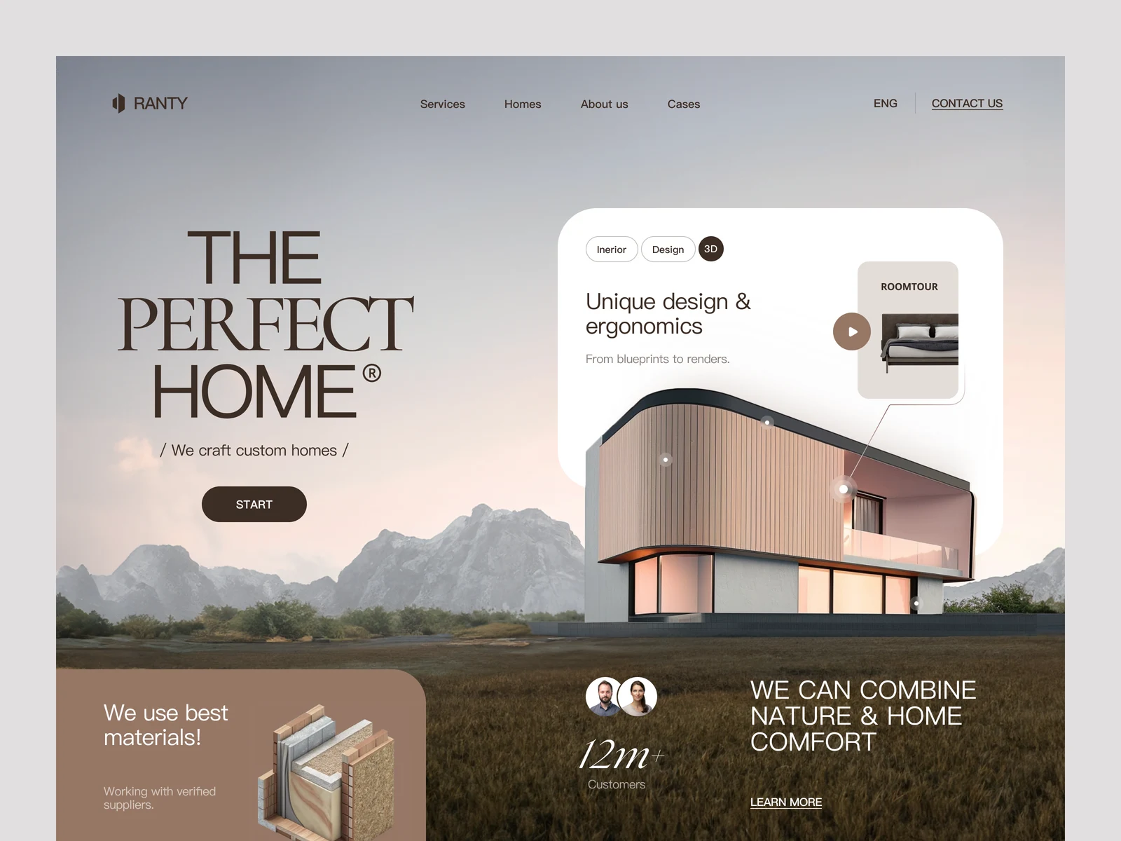
Landing pages reference. Architectural photography, soft earth tones, and elegant serif typography create a premium residential-construction landing concept. Credit: Halo UI/UX. Designer-published landing pages presentation on Dribbble; concept or case-study artwork, implementation not independently verified. Curated for the MotionSites-inspired batch (2026-10-10).
# Design reference: Landing Page for Construction Company
Source: https://dribbble.com/shots/24175820-Landing-Page-for-Construction-Company
Swipefile reference: https://swipefile.design/ref/ms26-landing-24175820-landing-page-for-construction-company/
Captured: 2026-10-11. This is a dated reference, not a claim about the current live product.
Source scope: static designer or award presentation. This may be concept or case-study artwork. Do not infer working features, unseen screens, or tested interactions.

## Objective
Adapt the visual principles below to my project. Use my own content and identity. Do not reproduce logos, proprietary copy, or brand assets.

## Reference notes
Landing pages reference. Architectural photography, soft earth tones, and elegant serif typography create a premium residential-construction landing concept. Credit: Halo UI/UX. Designer-published landing pages presentation on Dribbble; concept or case-study artwork, implementation not independently verified. Curated for the MotionSites-inspired batch (2026-10-10).

## Acceptance criteria
- Existing project conventions, design tokens, working functionality, and unrelated changes are preserved.
- Two or three reference principles clearly support the user's task; conflicts are resolved in favor of usability and the existing product.
- Reusable components and semantic HTML express the interface. Available licensed assets are used; important UI text is never rendered as a bitmap.
- Every visible control has a defined behavior. Loading, empty, error, success, disabled, and long-content states are specified where relevant. Demo data is clearly labeled.
- Navigation and content adapt at 375px, 768px, and 1440px without horizontal page overflow. Keyboard use, visible focus, labeled inputs, at least 44px touch targets, readable contrast, and reduced motion are supported.
- Verification distinguishes rendered behavior from proposals and identifies anything still requiring a backend or external service.

## Quality bar
Clear hierarchy, consistent spacing, restrained surfaces, and purposeful motion. Avoid decorative gradients, excessive cards, placeholder buttons, and invented metrics unless the project calls for them. Do not claim a feature is connected or tested without evidence.

Landing pages reference. A music-booking landing page pairs condensed type with atmospheric monochrome stage photography and a visible booking action. Credit: Shubham Dahale. Designer-published design presentation on Dribbble; concept or case-study artwork, implementation not independently verified. Visually reviewed for the MotionSites-inspired collection.
# Design reference: Cinematic Music Culture Website Design
Source: https://dribbble.com/shots/27387892-Cinematic-Music-Culture-Website-Design
Swipefile reference: https://swipefile.design/ref/ms26-landing-v2-27387892-cinematic-music-culture-website-design/
Captured: 2026-10-11. This is a dated reference, not a claim about the current live product.
Source scope: static designer or award presentation. This may be concept or case-study artwork. Do not infer working features, unseen screens, or tested interactions.

## Objective
Adapt the visual principles below to my project. Use my own content and identity. Do not reproduce logos, proprietary copy, or brand assets.

## Reference notes
Landing pages reference. A music-booking landing page pairs condensed type with atmospheric monochrome stage photography and a visible booking action. Credit: Shubham Dahale. Designer-published design presentation on Dribbble; concept or case-study artwork, implementation not independently verified. Visually reviewed for the MotionSites-inspired collection.

## Acceptance criteria
- Existing project conventions, design tokens, working functionality, and unrelated changes are preserved.
- Two or three reference principles clearly support the user's task; conflicts are resolved in favor of usability and the existing product.
- Reusable components and semantic HTML express the interface. Available licensed assets are used; important UI text is never rendered as a bitmap.
- Every visible control has a defined behavior. Loading, empty, error, success, disabled, and long-content states are specified where relevant. Demo data is clearly labeled.
- Navigation and content adapt at 375px, 768px, and 1440px without horizontal page overflow. Keyboard use, visible focus, labeled inputs, at least 44px touch targets, readable contrast, and reduced motion are supported.
- Verification distinguishes rendered behavior from proposals and identifies anything still requiring a backend or external service.

## Quality bar
Clear hierarchy, consistent spacing, restrained surfaces, and purposeful motion. Avoid decorative gradients, excessive cards, placeholder buttons, and invented metrics unless the project calls for them. Do not claim a feature is connected or tested without evidence.

Landing pages reference. A warmly lit cabin anchors a cool blue forest scene, with booking controls integrated into the hero composition. Credit: Nixtio. Designer-published landing pages presentation on Dribbble; concept or case-study artwork, implementation not independently verified. Curated for the MotionSites-inspired batch (2026-10-10).
# Design reference: Landing Page Design for Lodge Booking
Source: https://dribbble.com/shots/27389159-Landing-Page-Design-for-Lodge-Booking
Swipefile reference: https://swipefile.design/ref/ms26-landing-27389159-landing-page-design-for-lodge-booking/
Captured: 2026-10-11. This is a dated reference, not a claim about the current live product.
Source scope: static designer or award presentation. This may be concept or case-study artwork. Do not infer working features, unseen screens, or tested interactions.

## Objective
Adapt the visual principles below to my project. Use my own content and identity. Do not reproduce logos, proprietary copy, or brand assets.

## Reference notes
Landing pages reference. A warmly lit cabin anchors a cool blue forest scene, with booking controls integrated into the hero composition. Credit: Nixtio. Designer-published landing pages presentation on Dribbble; concept or case-study artwork, implementation not independently verified. Curated for the MotionSites-inspired batch (2026-10-10).

## Acceptance criteria
- Existing project conventions, design tokens, working functionality, and unrelated changes are preserved.
- Two or three reference principles clearly support the user's task; conflicts are resolved in favor of usability and the existing product.
- Reusable components and semantic HTML express the interface. Available licensed assets are used; important UI text is never rendered as a bitmap.
- Every visible control has a defined behavior. Loading, empty, error, success, disabled, and long-content states are specified where relevant. Demo data is clearly labeled.
- Navigation and content adapt at 375px, 768px, and 1440px without horizontal page overflow. Keyboard use, visible focus, labeled inputs, at least 44px touch targets, readable contrast, and reduced motion are supported.
- Verification distinguishes rendered behavior from proposals and identifies anything still requiring a backend or external service.

## Quality bar
Clear hierarchy, consistent spacing, restrained surfaces, and purposeful motion. Avoid decorative gradients, excessive cards, placeholder buttons, and invented metrics unless the project calls for them. Do not claim a feature is connected or tested without evidence.

Landing pages reference. A film-production landing page uses forceful red typography, a widescreen set image and a clear project CTA. Credit: Habito Design. Designer-published design presentation on Dribbble; concept or case-study artwork, implementation not independently verified. Visually reviewed for the MotionSites-inspired collection.
# Design reference: HUGO - Landing Page Production House
Source: https://dribbble.com/shots/27391470-HUGO-Landing-Page-Production-House
Swipefile reference: https://swipefile.design/ref/ms26-landing-v2-27391470-hugo-landing-page-production-house/
Captured: 2026-10-11. This is a dated reference, not a claim about the current live product.
Source scope: static designer or award presentation. This may be concept or case-study artwork. Do not infer working features, unseen screens, or tested interactions.

## Objective
Adapt the visual principles below to my project. Use my own content and identity. Do not reproduce logos, proprietary copy, or brand assets.

## Reference notes
Landing pages reference. A film-production landing page uses forceful red typography, a widescreen set image and a clear project CTA. Credit: Habito Design. Designer-published design presentation on Dribbble; concept or case-study artwork, implementation not independently verified. Visually reviewed for the MotionSites-inspired collection.

## Acceptance criteria
- Existing project conventions, design tokens, working functionality, and unrelated changes are preserved.
- Two or three reference principles clearly support the user's task; conflicts are resolved in favor of usability and the existing product.
- Reusable components and semantic HTML express the interface. Available licensed assets are used; important UI text is never rendered as a bitmap.
- Every visible control has a defined behavior. Loading, empty, error, success, disabled, and long-content states are specified where relevant. Demo data is clearly labeled.
- Navigation and content adapt at 375px, 768px, and 1440px without horizontal page overflow. Keyboard use, visible focus, labeled inputs, at least 44px touch targets, readable contrast, and reduced motion are supported.
- Verification distinguishes rendered behavior from proposals and identifies anything still requiring a backend or external service.

## Quality bar
Clear hierarchy, consistent spacing, restrained surfaces, and purposeful motion. Avoid decorative gradients, excessive cards, placeholder buttons, and invented metrics unless the project calls for them. Do not claim a feature is connected or tested without evidence.

Landing pages reference. Dark spatial imagery and a carefully lit focal form support a spare DeFi headline and central call to action. Credit: Levi Wilson. Designer-published landing pages presentation on Dribbble; concept or case-study artwork, implementation not independently verified. Curated for the MotionSites-inspired batch (2026-10-10).
# Design reference: Defi Landing Page
Source: https://dribbble.com/shots/24287189-Defi-Landing-Page
Swipefile reference: https://swipefile.design/ref/ms26-landing-24287189-defi-landing-page/
Captured: 2026-10-11. This is a dated reference, not a claim about the current live product.
Source scope: static designer or award presentation. This may be concept or case-study artwork. Do not infer working features, unseen screens, or tested interactions.

## Objective
Adapt the visual principles below to my project. Use my own content and identity. Do not reproduce logos, proprietary copy, or brand assets.

## Reference notes
Landing pages reference. Dark spatial imagery and a carefully lit focal form support a spare DeFi headline and central call to action. Credit: Levi Wilson. Designer-published landing pages presentation on Dribbble; concept or case-study artwork, implementation not independently verified. Curated for the MotionSites-inspired batch (2026-10-10).

## Acceptance criteria
- Existing project conventions, design tokens, working functionality, and unrelated changes are preserved.
- Two or three reference principles clearly support the user's task; conflicts are resolved in favor of usability and the existing product.
- Reusable components and semantic HTML express the interface. Available licensed assets are used; important UI text is never rendered as a bitmap.
- Every visible control has a defined behavior. Loading, empty, error, success, disabled, and long-content states are specified where relevant. Demo data is clearly labeled.
- Navigation and content adapt at 375px, 768px, and 1440px without horizontal page overflow. Keyboard use, visible focus, labeled inputs, at least 44px touch targets, readable contrast, and reduced motion are supported.
- Verification distinguishes rendered behavior from proposals and identifies anything still requiring a backend or external service.

## Quality bar
Clear hierarchy, consistent spacing, restrained surfaces, and purposeful motion. Avoid decorative gradients, excessive cards, placeholder buttons, and invented metrics unless the project calls for them. Do not claim a feature is connected or tested without evidence.

Landing pages reference. An oversized growth headline, portrait cutout, and floating metrics combine editorial scale with product proof. Credit: Dstudio. Designer-published landing pages presentation on Dribbble; concept or case-study artwork, implementation not independently verified. Curated for the MotionSites-inspired batch (2026-10-10).
# Design reference: AI Sales - Landing Page Design
Source: https://dribbble.com/shots/26404910-AI-Sales-Landing-Page-Design
Swipefile reference: https://swipefile.design/ref/ms26-landing-26404910-ai-sales-landing-page-design/
Captured: 2026-10-11. This is a dated reference, not a claim about the current live product.
Source scope: static designer or award presentation. This may be concept or case-study artwork. Do not infer working features, unseen screens, or tested interactions.

## Objective
Adapt the visual principles below to my project. Use my own content and identity. Do not reproduce logos, proprietary copy, or brand assets.

## Reference notes
Landing pages reference. An oversized growth headline, portrait cutout, and floating metrics combine editorial scale with product proof. Credit: Dstudio. Designer-published landing pages presentation on Dribbble; concept or case-study artwork, implementation not independently verified. Curated for the MotionSites-inspired batch (2026-10-10).

## Acceptance criteria
- Existing project conventions, design tokens, working functionality, and unrelated changes are preserved.
- Two or three reference principles clearly support the user's task; conflicts are resolved in favor of usability and the existing product.
- Reusable components and semantic HTML express the interface. Available licensed assets are used; important UI text is never rendered as a bitmap.
- Every visible control has a defined behavior. Loading, empty, error, success, disabled, and long-content states are specified where relevant. Demo data is clearly labeled.
- Navigation and content adapt at 375px, 768px, and 1440px without horizontal page overflow. Keyboard use, visible focus, labeled inputs, at least 44px touch targets, readable contrast, and reduced motion are supported.
- Verification distinguishes rendered behavior from proposals and identifies anything still requiring a backend or external service.

## Quality bar
Clear hierarchy, consistent spacing, restrained surfaces, and purposeful motion. Avoid decorative gradients, excessive cards, placeholder buttons, and invented metrics unless the project calls for them. Do not claim a feature is connected or tested without evidence.

Landing pages reference. A creative-service landing page combines a red sculptural backdrop, high-contrast type and a prominent consultation action. Credit: Aminul Islam. Designer-published design presentation on Dribbble; concept or case-study artwork, implementation not independently verified. Visually reviewed for the MotionSites-inspired collection.
# Design reference: SORA- Premium Hero Section Design
Source: https://dribbble.com/shots/27328907-SORA-Premium-Hero-Section-Design
Swipefile reference: https://swipefile.design/ref/ms26-landing-v2-27328907-sora-premium-hero-section-design/
Captured: 2026-10-11. This is a dated reference, not a claim about the current live product.
Source scope: static designer or award presentation. This may be concept or case-study artwork. Do not infer working features, unseen screens, or tested interactions.

## Objective
Adapt the visual principles below to my project. Use my own content and identity. Do not reproduce logos, proprietary copy, or brand assets.

## Reference notes
Landing pages reference. A creative-service landing page combines a red sculptural backdrop, high-contrast type and a prominent consultation action. Credit: Aminul Islam. Designer-published design presentation on Dribbble; concept or case-study artwork, implementation not independently verified. Visually reviewed for the MotionSites-inspired collection.

## Acceptance criteria
- Existing project conventions, design tokens, working functionality, and unrelated changes are preserved.
- Two or three reference principles clearly support the user's task; conflicts are resolved in favor of usability and the existing product.
- Reusable components and semantic HTML express the interface. Available licensed assets are used; important UI text is never rendered as a bitmap.
- Every visible control has a defined behavior. Loading, empty, error, success, disabled, and long-content states are specified where relevant. Demo data is clearly labeled.
- Navigation and content adapt at 375px, 768px, and 1440px without horizontal page overflow. Keyboard use, visible focus, labeled inputs, at least 44px touch targets, readable contrast, and reduced motion are supported.
- Verification distinguishes rendered behavior from proposals and identifies anything still requiring a backend or external service.

## Quality bar
Clear hierarchy, consistent spacing, restrained surfaces, and purposeful motion. Avoid decorative gradients, excessive cards, placeholder buttons, and invented metrics unless the project calls for them. Do not claim a feature is connected or tested without evidence.

Landing pages reference. A botanical drink landing page uses translucent vertical glass, a landscape backdrop and focused ordering controls. Credit: Bolt Fusion Tech. Designer-published design presentation on Dribbble; concept or case-study artwork, implementation not independently verified. Visually reviewed for the MotionSites-inspired collection.
# Design reference: Lume Botanical Fizz — Experimental Landing Page
Source: https://dribbble.com/shots/27662029-Lume-Botanical-Fizz-Experimental-Landing-Page
Swipefile reference: https://swipefile.design/ref/ms26-landing-v2-27662029-lume-botanical-fizz-experimental-landing-page/
Captured: 2026-10-11. This is a dated reference, not a claim about the current live product.
Source scope: static designer or award presentation. This may be concept or case-study artwork. Do not infer working features, unseen screens, or tested interactions.

## Objective
Adapt the visual principles below to my project. Use my own content and identity. Do not reproduce logos, proprietary copy, or brand assets.

## Reference notes
Landing pages reference. A botanical drink landing page uses translucent vertical glass, a landscape backdrop and focused ordering controls. Credit: Bolt Fusion Tech. Designer-published design presentation on Dribbble; concept or case-study artwork, implementation not independently verified. Visually reviewed for the MotionSites-inspired collection.

## Acceptance criteria
- Existing project conventions, design tokens, working functionality, and unrelated changes are preserved.
- Two or three reference principles clearly support the user's task; conflicts are resolved in favor of usability and the existing product.
- Reusable components and semantic HTML express the interface. Available licensed assets are used; important UI text is never rendered as a bitmap.
- Every visible control has a defined behavior. Loading, empty, error, success, disabled, and long-content states are specified where relevant. Demo data is clearly labeled.
- Navigation and content adapt at 375px, 768px, and 1440px without horizontal page overflow. Keyboard use, visible focus, labeled inputs, at least 44px touch targets, readable contrast, and reduced motion are supported.
- Verification distinguishes rendered behavior from proposals and identifies anything still requiring a backend or external service.

## Quality bar
Clear hierarchy, consistent spacing, restrained surfaces, and purposeful motion. Avoid decorative gradients, excessive cards, placeholder buttons, and invented metrics unless the project calls for them. Do not claim a feature is connected or tested without evidence.

Landing pages reference. Elegant serif headlines, people-focused imagery, and compact metric cards soften an AI-sales landing concept. Credit: Dstudio. Designer-published landing pages presentation on Dribbble; concept or case-study artwork, implementation not independently verified. Curated for the MotionSites-inspired batch (2026-10-10).
# Design reference: AI Landing Page Design
Source: https://dribbble.com/shots/26358699-AI-Landing-Page-Design
Swipefile reference: https://swipefile.design/ref/ms26-landing-26358699-ai-landing-page-design/
Captured: 2026-10-11. This is a dated reference, not a claim about the current live product.
Source scope: static designer or award presentation. This may be concept or case-study artwork. Do not infer working features, unseen screens, or tested interactions.

## Objective
Adapt the visual principles below to my project. Use my own content and identity. Do not reproduce logos, proprietary copy, or brand assets.

## Reference notes
Landing pages reference. Elegant serif headlines, people-focused imagery, and compact metric cards soften an AI-sales landing concept. Credit: Dstudio. Designer-published landing pages presentation on Dribbble; concept or case-study artwork, implementation not independently verified. Curated for the MotionSites-inspired batch (2026-10-10).

## Acceptance criteria
- Existing project conventions, design tokens, working functionality, and unrelated changes are preserved.
- Two or three reference principles clearly support the user's task; conflicts are resolved in favor of usability and the existing product.
- Reusable components and semantic HTML express the interface. Available licensed assets are used; important UI text is never rendered as a bitmap.
- Every visible control has a defined behavior. Loading, empty, error, success, disabled, and long-content states are specified where relevant. Demo data is clearly labeled.
- Navigation and content adapt at 375px, 768px, and 1440px without horizontal page overflow. Keyboard use, visible focus, labeled inputs, at least 44px touch targets, readable contrast, and reduced motion are supported.
- Verification distinguishes rendered behavior from proposals and identifies anything still requiring a backend or external service.

## Quality bar
Clear hierarchy, consistent spacing, restrained surfaces, and purposeful motion. Avoid decorative gradients, excessive cards, placeholder buttons, and invented metrics unless the project calls for them. Do not claim a feature is connected or tested without evidence.

Landing pages reference. An immersive sci-fi campaign page sets legible navigation and a join action over a detailed cinematic jungle scene. Credit: Makeno . Designer-published design presentation on Dribbble; concept or case-study artwork, implementation not independently verified. Visually reviewed for the MotionSites-inspired collection.
# Design reference: FGMG Sci-Fi Web Design Concept
Source: https://dribbble.com/shots/26927998-FGMG-Sci-Fi-Web-Design-Concept
Swipefile reference: https://swipefile.design/ref/ms26-landing-v2-26927998-fgmg-sci-fi-web-design-concept/
Captured: 2026-10-11. This is a dated reference, not a claim about the current live product.
Source scope: static designer or award presentation. This may be concept or case-study artwork. Do not infer working features, unseen screens, or tested interactions.

## Objective
Adapt the visual principles below to my project. Use my own content and identity. Do not reproduce logos, proprietary copy, or brand assets.

## Reference notes
Landing pages reference. An immersive sci-fi campaign page sets legible navigation and a join action over a detailed cinematic jungle scene. Credit: Makeno . Designer-published design presentation on Dribbble; concept or case-study artwork, implementation not independently verified. Visually reviewed for the MotionSites-inspired collection.

## Acceptance criteria
- Existing project conventions, design tokens, working functionality, and unrelated changes are preserved.
- Two or three reference principles clearly support the user's task; conflicts are resolved in favor of usability and the existing product.
- Reusable components and semantic HTML express the interface. Available licensed assets are used; important UI text is never rendered as a bitmap.
- Every visible control has a defined behavior. Loading, empty, error, success, disabled, and long-content states are specified where relevant. Demo data is clearly labeled.
- Navigation and content adapt at 375px, 768px, and 1440px without horizontal page overflow. Keyboard use, visible focus, labeled inputs, at least 44px touch targets, readable contrast, and reduced motion are supported.
- Verification distinguishes rendered behavior from proposals and identifies anything still requiring a backend or external service.

## Quality bar
Clear hierarchy, consistent spacing, restrained surfaces, and purposeful motion. Avoid decorative gradients, excessive cards, placeholder buttons, and invented metrics unless the project calls for them. Do not claim a feature is connected or tested without evidence.

Landing pages reference. A collectible campaign uses bold layered display type, a sculptural figure and an explicit exploration action. Credit: Софія Овсієнко. Designer-published design presentation on Dribbble; concept or case-study artwork, implementation not independently verified. Visually reviewed for the MotionSites-inspired collection.
# Design reference: Unveiled NFT 2.0 — Experimental Web3 Experience
Source: https://dribbble.com/shots/27713677-Unveiled-NFT-2-0-Experimental-Web3-Experience
Swipefile reference: https://swipefile.design/ref/ms26-landing-v2-27713677-unveiled-nft-2-0-experimental-web3-experience/
Captured: 2026-10-11. This is a dated reference, not a claim about the current live product.
Source scope: static designer or award presentation. This may be concept or case-study artwork. Do not infer working features, unseen screens, or tested interactions.

## Objective
Adapt the visual principles below to my project. Use my own content and identity. Do not reproduce logos, proprietary copy, or brand assets.

## Reference notes
Landing pages reference. A collectible campaign uses bold layered display type, a sculptural figure and an explicit exploration action. Credit: Софія Овсієнко. Designer-published design presentation on Dribbble; concept or case-study artwork, implementation not independently verified. Visually reviewed for the MotionSites-inspired collection.

## Acceptance criteria
- Existing project conventions, design tokens, working functionality, and unrelated changes are preserved.
- Two or three reference principles clearly support the user's task; conflicts are resolved in favor of usability and the existing product.
- Reusable components and semantic HTML express the interface. Available licensed assets are used; important UI text is never rendered as a bitmap.
- Every visible control has a defined behavior. Loading, empty, error, success, disabled, and long-content states are specified where relevant. Demo data is clearly labeled.
- Navigation and content adapt at 375px, 768px, and 1440px without horizontal page overflow. Keyboard use, visible focus, labeled inputs, at least 44px touch targets, readable contrast, and reduced motion are supported.
- Verification distinguishes rendered behavior from proposals and identifies anything still requiring a backend or external service.

## Quality bar
Clear hierarchy, consistent spacing, restrained surfaces, and purposeful motion. Avoid decorative gradients, excessive cards, placeholder buttons, and invented metrics unless the project calls for them. Do not claim a feature is connected or tested without evidence.

Landing pages reference. A skate campaign page combines black-and-white action photography, expressive lettering and acid-green accents. Credit: Adib Rahman. Designer-published design presentation on Dribbble; concept or case-study artwork, implementation not independently verified. Visually reviewed for the MotionSites-inspired collection.
# Design reference: GRINDLINE — Same Streets. Different Perspective.
Source: https://dribbble.com/shots/27737450-GRINDLINE-Same-Streets-Different-Perspective
Swipefile reference: https://swipefile.design/ref/ms26-landing-v2-27737450-grindline-same-streets-different-perspective/
Captured: 2026-10-11. This is a dated reference, not a claim about the current live product.
Source scope: static designer or award presentation. This may be concept or case-study artwork. Do not infer working features, unseen screens, or tested interactions.

## Objective
Adapt the visual principles below to my project. Use my own content and identity. Do not reproduce logos, proprietary copy, or brand assets.

## Reference notes
Landing pages reference. A skate campaign page combines black-and-white action photography, expressive lettering and acid-green accents. Credit: Adib Rahman. Designer-published design presentation on Dribbble; concept or case-study artwork, implementation not independently verified. Visually reviewed for the MotionSites-inspired collection.

## Acceptance criteria
- Existing project conventions, design tokens, working functionality, and unrelated changes are preserved.
- Two or three reference principles clearly support the user's task; conflicts are resolved in favor of usability and the existing product.
- Reusable components and semantic HTML express the interface. Available licensed assets are used; important UI text is never rendered as a bitmap.
- Every visible control has a defined behavior. Loading, empty, error, success, disabled, and long-content states are specified where relevant. Demo data is clearly labeled.
- Navigation and content adapt at 375px, 768px, and 1440px without horizontal page overflow. Keyboard use, visible focus, labeled inputs, at least 44px touch targets, readable contrast, and reduced motion are supported.
- Verification distinguishes rendered behavior from proposals and identifies anything still requiring a backend or external service.

## Quality bar
Clear hierarchy, consistent spacing, restrained surfaces, and purposeful motion. Avoid decorative gradients, excessive cards, placeholder buttons, and invented metrics unless the project calls for them. Do not claim a feature is connected or tested without evidence.

Landing pages reference. A focused tableware launch pairs oversized sculptural product imagery with a disciplined cobalt editorial layout. Credit: Gravity X. Designer-published design presentation on Dribbble; concept or case-study artwork, implementation not independently verified. Visually reviewed for the MotionSites-inspired collection.
# Design reference: KINETIC TABLE — Form Follows the Hand
Source: https://dribbble.com/shots/27728594-KINETIC-TABLE-Form-Follows-the-Hand
Swipefile reference: https://swipefile.design/ref/ms26-landing-v2-27728594-kinetic-table-form-follows-the-hand/
Captured: 2026-10-11. This is a dated reference, not a claim about the current live product.
Source scope: static designer or award presentation. This may be concept or case-study artwork. Do not infer working features, unseen screens, or tested interactions.

## Objective
Adapt the visual principles below to my project. Use my own content and identity. Do not reproduce logos, proprietary copy, or brand assets.

## Reference notes
Landing pages reference. A focused tableware launch pairs oversized sculptural product imagery with a disciplined cobalt editorial layout. Credit: Gravity X. Designer-published design presentation on Dribbble; concept or case-study artwork, implementation not independently verified. Visually reviewed for the MotionSites-inspired collection.

## Acceptance criteria
- Existing project conventions, design tokens, working functionality, and unrelated changes are preserved.
- Two or three reference principles clearly support the user's task; conflicts are resolved in favor of usability and the existing product.
- Reusable components and semantic HTML express the interface. Available licensed assets are used; important UI text is never rendered as a bitmap.
- Every visible control has a defined behavior. Loading, empty, error, success, disabled, and long-content states are specified where relevant. Demo data is clearly labeled.
- Navigation and content adapt at 375px, 768px, and 1440px without horizontal page overflow. Keyboard use, visible focus, labeled inputs, at least 44px touch targets, readable contrast, and reduced motion are supported.
- Verification distinguishes rendered behavior from proposals and identifies anything still requiring a backend or external service.

## Quality bar
Clear hierarchy, consistent spacing, restrained surfaces, and purposeful motion. Avoid decorative gradients, excessive cards, placeholder buttons, and invented metrics unless the project calls for them. Do not claim a feature is connected or tested without evidence.

Landing pages reference. A digital-collectible landing page uses a reflective sculptural head, acid-green typography and a clear mint action. Credit: Diana Zayats. Designer-published design presentation on Dribbble; concept or case-study artwork, implementation not independently verified. Visually reviewed for the MotionSites-inspired collection.
# Design reference: BioPack NFT | Web3 Landing Page Concept
Source: https://dribbble.com/shots/27780274-BioPack-NFT-Web3-Landing-Page-Concept
Swipefile reference: https://swipefile.design/ref/ms26-landing-v2-27780274-biopack-nft-web3-landing-page-concept/
Captured: 2026-10-11. This is a dated reference, not a claim about the current live product.
Source scope: static designer or award presentation. This may be concept or case-study artwork. Do not infer working features, unseen screens, or tested interactions.

## Objective
Adapt the visual principles below to my project. Use my own content and identity. Do not reproduce logos, proprietary copy, or brand assets.

## Reference notes
Landing pages reference. A digital-collectible landing page uses a reflective sculptural head, acid-green typography and a clear mint action. Credit: Diana Zayats. Designer-published design presentation on Dribbble; concept or case-study artwork, implementation not independently verified. Visually reviewed for the MotionSites-inspired collection.

## Acceptance criteria
- Existing project conventions, design tokens, working functionality, and unrelated changes are preserved.
- Two or three reference principles clearly support the user's task; conflicts are resolved in favor of usability and the existing product.
- Reusable components and semantic HTML express the interface. Available licensed assets are used; important UI text is never rendered as a bitmap.
- Every visible control has a defined behavior. Loading, empty, error, success, disabled, and long-content states are specified where relevant. Demo data is clearly labeled.
- Navigation and content adapt at 375px, 768px, and 1440px without horizontal page overflow. Keyboard use, visible focus, labeled inputs, at least 44px touch targets, readable contrast, and reduced motion are supported.
- Verification distinguishes rendered behavior from proposals and identifies anything still requiring a backend or external service.

## Quality bar
Clear hierarchy, consistent spacing, restrained surfaces, and purposeful motion. Avoid decorative gradients, excessive cards, placeholder buttons, and invented metrics unless the project calls for them. Do not claim a feature is connected or tested without evidence.

Landing pages reference. Glossy three-dimensional payment symbols follow a blue wave around a compact, centered product proposition. Credit: Outcrowd. Designer-published landing pages presentation on Dribbble; concept or case-study artwork, implementation not independently verified. Curated for the MotionSites-inspired batch (2026-10-10).
# Design reference: Landing Page for a Web3 Crypto Payments Platform
Source: https://dribbble.com/shots/26021469-Landing-Page-for-a-Web3-Crypto-Payments-Platform
Swipefile reference: https://swipefile.design/ref/ms26-landing-26021469-landing-page-for-a-web3-crypto-payments-platform/
Captured: 2026-10-11. This is a dated reference, not a claim about the current live product.
Source scope: static designer or award presentation. This may be concept or case-study artwork. Do not infer working features, unseen screens, or tested interactions.

## Objective
Adapt the visual principles below to my project. Use my own content and identity. Do not reproduce logos, proprietary copy, or brand assets.

## Reference notes
Landing pages reference. Glossy three-dimensional payment symbols follow a blue wave around a compact, centered product proposition. Credit: Outcrowd. Designer-published landing pages presentation on Dribbble; concept or case-study artwork, implementation not independently verified. Curated for the MotionSites-inspired batch (2026-10-10).

## Acceptance criteria
- Existing project conventions, design tokens, working functionality, and unrelated changes are preserved.
- Two or three reference principles clearly support the user's task; conflicts are resolved in favor of usability and the existing product.
- Reusable components and semantic HTML express the interface. Available licensed assets are used; important UI text is never rendered as a bitmap.
- Every visible control has a defined behavior. Loading, empty, error, success, disabled, and long-content states are specified where relevant. Demo data is clearly labeled.
- Navigation and content adapt at 375px, 768px, and 1440px without horizontal page overflow. Keyboard use, visible focus, labeled inputs, at least 44px touch targets, readable contrast, and reduced motion are supported.
- Verification distinguishes rendered behavior from proposals and identifies anything still requiring a backend or external service.

## Quality bar
Clear hierarchy, consistent spacing, restrained surfaces, and purposeful motion. Avoid decorative gradients, excessive cards, placeholder buttons, and invented metrics unless the project calls for them. Do not claim a feature is connected or tested without evidence.

Landing pages reference. A studio landing page uses oversized Swiss-style type, a red-and-black editorial grid and a clear sequence of service and work sections. Credit: Faiz Abdillah. Designer-published design presentation on Dribbble; concept or case-study artwork, implementation not independently verified. Visually reviewed for the MotionSites-inspired collection.
# Design reference: Symata - Landing Page Creative Studio
Source: https://dribbble.com/shots/27369444-Symata-Landing-Page-Creative-Studio
Swipefile reference: https://swipefile.design/ref/ms26-landing-v2-27369444-symata-landing-page-creative-studio/
Captured: 2026-10-11. This is a dated reference, not a claim about the current live product.
Source scope: static designer or award presentation. This may be concept or case-study artwork. Do not infer working features, unseen screens, or tested interactions.

## Objective
Adapt the visual principles below to my project. Use my own content and identity. Do not reproduce logos, proprietary copy, or brand assets.

## Reference notes
Landing pages reference. A studio landing page uses oversized Swiss-style type, a red-and-black editorial grid and a clear sequence of service and work sections. Credit: Faiz Abdillah. Designer-published design presentation on Dribbble; concept or case-study artwork, implementation not independently verified. Visually reviewed for the MotionSites-inspired collection.

## Acceptance criteria
- Existing project conventions, design tokens, working functionality, and unrelated changes are preserved.
- Two or three reference principles clearly support the user's task; conflicts are resolved in favor of usability and the existing product.
- Reusable components and semantic HTML express the interface. Available licensed assets are used; important UI text is never rendered as a bitmap.
- Every visible control has a defined behavior. Loading, empty, error, success, disabled, and long-content states are specified where relevant. Demo data is clearly labeled.
- Navigation and content adapt at 375px, 768px, and 1440px without horizontal page overflow. Keyboard use, visible focus, labeled inputs, at least 44px touch targets, readable contrast, and reduced motion are supported.
- Verification distinguishes rendered behavior from proposals and identifies anything still requiring a backend or external service.

## Quality bar
Clear hierarchy, consistent spacing, restrained surfaces, and purposeful motion. Avoid decorative gradients, excessive cards, placeholder buttons, and invented metrics unless the project calls for them. Do not claim a feature is connected or tested without evidence.

Landing pages reference. Dimensional finance objects, high-contrast black type, and an electric-blue product scene make a memorable fintech hero. Credit: Outcrowd. Designer-published landing pages presentation on Dribbble; concept or case-study artwork, implementation not independently verified. Curated for the MotionSites-inspired batch (2026-10-10).
# Design reference: Landing page for financial services
Source: https://dribbble.com/shots/26379381-Landing-page-for-financial-services
Swipefile reference: https://swipefile.design/ref/ms26-landing-26379381-landing-page-for-financial-services/
Captured: 2026-10-11. This is a dated reference, not a claim about the current live product.
Source scope: static designer or award presentation. This may be concept or case-study artwork. Do not infer working features, unseen screens, or tested interactions.

## Objective
Adapt the visual principles below to my project. Use my own content and identity. Do not reproduce logos, proprietary copy, or brand assets.

## Reference notes
Landing pages reference. Dimensional finance objects, high-contrast black type, and an electric-blue product scene make a memorable fintech hero. Credit: Outcrowd. Designer-published landing pages presentation on Dribbble; concept or case-study artwork, implementation not independently verified. Curated for the MotionSites-inspired batch (2026-10-10).

## Acceptance criteria
- Existing project conventions, design tokens, working functionality, and unrelated changes are preserved.
- Two or three reference principles clearly support the user's task; conflicts are resolved in favor of usability and the existing product.
- Reusable components and semantic HTML express the interface. Available licensed assets are used; important UI text is never rendered as a bitmap.
- Every visible control has a defined behavior. Loading, empty, error, success, disabled, and long-content states are specified where relevant. Demo data is clearly labeled.
- Navigation and content adapt at 375px, 768px, and 1440px without horizontal page overflow. Keyboard use, visible focus, labeled inputs, at least 44px touch targets, readable contrast, and reduced motion are supported.
- Verification distinguishes rendered behavior from proposals and identifies anything still requiring a backend or external service.

## Quality bar
Clear hierarchy, consistent spacing, restrained surfaces, and purposeful motion. Avoid decorative gradients, excessive cards, placeholder buttons, and invented metrics unless the project calls for them. Do not claim a feature is connected or tested without evidence.

Landing pages reference. A creative agency landing page uses asymmetric editorial typography, numbered work sections and a distinctive muted palette. Credit: Faiz Abdillah. Designer-published design presentation on Dribbble; concept or case-study artwork, implementation not independently verified. Visually reviewed for the MotionSites-inspired collection.
# Design reference: SPace® — Creative Agency Landing Page
Source: https://dribbble.com/shots/27557641-SPace-Creative-Agency-Landing-Page
Swipefile reference: https://swipefile.design/ref/ms26-landing-v2-27557641-space-creative-agency-landing-page/
Captured: 2026-10-11. This is a dated reference, not a claim about the current live product.
Source scope: static designer or award presentation. This may be concept or case-study artwork. Do not infer working features, unseen screens, or tested interactions.

## Objective
Adapt the visual principles below to my project. Use my own content and identity. Do not reproduce logos, proprietary copy, or brand assets.

## Reference notes
Landing pages reference. A creative agency landing page uses asymmetric editorial typography, numbered work sections and a distinctive muted palette. Credit: Faiz Abdillah. Designer-published design presentation on Dribbble; concept or case-study artwork, implementation not independently verified. Visually reviewed for the MotionSites-inspired collection.

## Acceptance criteria
- Existing project conventions, design tokens, working functionality, and unrelated changes are preserved.
- Two or three reference principles clearly support the user's task; conflicts are resolved in favor of usability and the existing product.
- Reusable components and semantic HTML express the interface. Available licensed assets are used; important UI text is never rendered as a bitmap.
- Every visible control has a defined behavior. Loading, empty, error, success, disabled, and long-content states are specified where relevant. Demo data is clearly labeled.
- Navigation and content adapt at 375px, 768px, and 1440px without horizontal page overflow. Keyboard use, visible focus, labeled inputs, at least 44px touch targets, readable contrast, and reduced motion are supported.
- Verification distinguishes rendered behavior from proposals and identifies anything still requiring a backend or external service.

## Quality bar
Clear hierarchy, consistent spacing, restrained surfaces, and purposeful motion. Avoid decorative gradients, excessive cards, placeholder buttons, and invented metrics unless the project calls for them. Do not claim a feature is connected or tested without evidence.

Landing pages reference. Bright cyan, floating product icons, and large numerical proof points create an energetic analytics-product presentation. Credit: Outcrowd. Designer-published landing pages presentation on Dribbble; concept or case-study artwork, implementation not independently verified. Curated for the MotionSites-inspired batch (2026-10-10).
# Design reference: Landing page design for an AI-powered analytics platform
Source: https://dribbble.com/shots/26351001-Landing-page-design-for-an-AI-powered-analytics-platform
Swipefile reference: https://swipefile.design/ref/ms26-landing-26351001-landing-page-design-for-an-ai-powered-analytics-platform/
Captured: 2026-10-11. This is a dated reference, not a claim about the current live product.
Source scope: static designer or award presentation. This may be concept or case-study artwork. Do not infer working features, unseen screens, or tested interactions.

## Objective
Adapt the visual principles below to my project. Use my own content and identity. Do not reproduce logos, proprietary copy, or brand assets.

## Reference notes
Landing pages reference. Bright cyan, floating product icons, and large numerical proof points create an energetic analytics-product presentation. Credit: Outcrowd. Designer-published landing pages presentation on Dribbble; concept or case-study artwork, implementation not independently verified. Curated for the MotionSites-inspired batch (2026-10-10).

## Acceptance criteria
- Existing project conventions, design tokens, working functionality, and unrelated changes are preserved.
- Two or three reference principles clearly support the user's task; conflicts are resolved in favor of usability and the existing product.
- Reusable components and semantic HTML express the interface. Available licensed assets are used; important UI text is never rendered as a bitmap.
- Every visible control has a defined behavior. Loading, empty, error, success, disabled, and long-content states are specified where relevant. Demo data is clearly labeled.
- Navigation and content adapt at 375px, 768px, and 1440px without horizontal page overflow. Keyboard use, visible focus, labeled inputs, at least 44px touch targets, readable contrast, and reduced motion are supported.
- Verification distinguishes rendered behavior from proposals and identifies anything still requiring a backend or external service.

## Quality bar
Clear hierarchy, consistent spacing, restrained surfaces, and purposeful motion. Avoid decorative gradients, excessive cards, placeholder buttons, and invented metrics unless the project calls for them. Do not claim a feature is connected or tested without evidence.

Landing pages reference. A full-height athlete cutout and oversized red name give a personal-brand landing concept a confident editorial hierarchy. Credit: Nixtio. Designer-published landing pages presentation on Dribbble; concept or case-study artwork, implementation not independently verified. Curated for the MotionSites-inspired batch (2026-10-10).
# Design reference: Football Player Landing Page Design
Source: https://dribbble.com/shots/26940773-Football-Player-Landing-Page-Design
Swipefile reference: https://swipefile.design/ref/ms26-landing-26940773-football-player-landing-page-design/
Captured: 2026-10-11. This is a dated reference, not a claim about the current live product.
Source scope: static designer or award presentation. This may be concept or case-study artwork. Do not infer working features, unseen screens, or tested interactions.

## Objective
Adapt the visual principles below to my project. Use my own content and identity. Do not reproduce logos, proprietary copy, or brand assets.

## Reference notes
Landing pages reference. A full-height athlete cutout and oversized red name give a personal-brand landing concept a confident editorial hierarchy. Credit: Nixtio. Designer-published landing pages presentation on Dribbble; concept or case-study artwork, implementation not independently verified. Curated for the MotionSites-inspired batch (2026-10-10).

## Acceptance criteria
- Existing project conventions, design tokens, working functionality, and unrelated changes are preserved.
- Two or three reference principles clearly support the user's task; conflicts are resolved in favor of usability and the existing product.
- Reusable components and semantic HTML express the interface. Available licensed assets are used; important UI text is never rendered as a bitmap.
- Every visible control has a defined behavior. Loading, empty, error, success, disabled, and long-content states are specified where relevant. Demo data is clearly labeled.
- Navigation and content adapt at 375px, 768px, and 1440px without horizontal page overflow. Keyboard use, visible focus, labeled inputs, at least 44px touch targets, readable contrast, and reduced motion are supported.
- Verification distinguishes rendered behavior from proposals and identifies anything still requiring a backend or external service.

## Quality bar
Clear hierarchy, consistent spacing, restrained surfaces, and purposeful motion. Avoid decorative gradients, excessive cards, placeholder buttons, and invented metrics unless the project calls for them. Do not claim a feature is connected or tested without evidence.

Landing pages reference. Oversized red serif type overlaps ornate artwork frames, making the exhibition itself the center of the composition. Credit: Nixtio. Designer-published landing pages presentation on Dribbble; concept or case-study artwork, implementation not independently verified. Curated for the MotionSites-inspired batch (2026-10-10).
# Design reference: Modern Art Museum Website — Exhibition Landing Page
Source: https://dribbble.com/shots/27001570-Modern-Art-Museum-Website-Exhibition-Landing-Page
Swipefile reference: https://swipefile.design/ref/ms26-landing-27001570-modern-art-museum-website-exhibition-landing-page/
Captured: 2026-10-11. This is a dated reference, not a claim about the current live product.
Source scope: static designer or award presentation. This may be concept or case-study artwork. Do not infer working features, unseen screens, or tested interactions.

## Objective
Adapt the visual principles below to my project. Use my own content and identity. Do not reproduce logos, proprietary copy, or brand assets.

## Reference notes
Landing pages reference. Oversized red serif type overlaps ornate artwork frames, making the exhibition itself the center of the composition. Credit: Nixtio. Designer-published landing pages presentation on Dribbble; concept or case-study artwork, implementation not independently verified. Curated for the MotionSites-inspired batch (2026-10-10).

## Acceptance criteria
- Existing project conventions, design tokens, working functionality, and unrelated changes are preserved.
- Two or three reference principles clearly support the user's task; conflicts are resolved in favor of usability and the existing product.
- Reusable components and semantic HTML express the interface. Available licensed assets are used; important UI text is never rendered as a bitmap.
- Every visible control has a defined behavior. Loading, empty, error, success, disabled, and long-content states are specified where relevant. Demo data is clearly labeled.
- Navigation and content adapt at 375px, 768px, and 1440px without horizontal page overflow. Keyboard use, visible focus, labeled inputs, at least 44px touch targets, readable contrast, and reduced motion are supported.
- Verification distinguishes rendered behavior from proposals and identifies anything still requiring a backend or external service.

## Quality bar
Clear hierarchy, consistent spacing, restrained surfaces, and purposeful motion. Avoid decorative gradients, excessive cards, placeholder buttons, and invented metrics unless the project calls for them. Do not claim a feature is connected or tested without evidence.

Landing pages reference. A golf product landing page combines a luminous dimensional hero with clearly structured benefits and product conversion sections. Credit: Keitoto . Designer-published design presentation on Dribbble; concept or case-study artwork, implementation not independently verified. Visually reviewed for the MotionSites-inspired collection.
# Design reference: Golf Performance Tracking Landing Page: AI-Powered Golf Analytic
Source: https://dribbble.com/shots/27388037-Golf-Performance-Tracking-Landing-Page-AI-Powered-Golf-Analytic
Swipefile reference: https://swipefile.design/ref/ms26-landing-v2-27388037-golf-performance-tracking-landing-page-ai-powered-golf-analytic/
Captured: 2026-10-11. This is a dated reference, not a claim about the current live product.
Source scope: static designer or award presentation. This may be concept or case-study artwork. Do not infer working features, unseen screens, or tested interactions.

## Objective
Adapt the visual principles below to my project. Use my own content and identity. Do not reproduce logos, proprietary copy, or brand assets.

## Reference notes
Landing pages reference. A golf product landing page combines a luminous dimensional hero with clearly structured benefits and product conversion sections. Credit: Keitoto . Designer-published design presentation on Dribbble; concept or case-study artwork, implementation not independently verified. Visually reviewed for the MotionSites-inspired collection.

## Acceptance criteria
- Existing project conventions, design tokens, working functionality, and unrelated changes are preserved.
- Two or three reference principles clearly support the user's task; conflicts are resolved in favor of usability and the existing product.
- Reusable components and semantic HTML express the interface. Available licensed assets are used; important UI text is never rendered as a bitmap.
- Every visible control has a defined behavior. Loading, empty, error, success, disabled, and long-content states are specified where relevant. Demo data is clearly labeled.
- Navigation and content adapt at 375px, 768px, and 1440px without horizontal page overflow. Keyboard use, visible focus, labeled inputs, at least 44px touch targets, readable contrast, and reduced motion are supported.
- Verification distinguishes rendered behavior from proposals and identifies anything still requiring a backend or external service.

## Quality bar
Clear hierarchy, consistent spacing, restrained surfaces, and purposeful motion. Avoid decorative gradients, excessive cards, placeholder buttons, and invented metrics unless the project calls for them. Do not claim a feature is connected or tested without evidence.

Landing pages reference. Reflective dark spheres and large experimental typography give an AI creative-assistant concept a distinctive art direction. Credit: Zajno. Designer-published landing pages presentation on Dribbble; concept or case-study artwork, implementation not independently verified. Curated for the MotionSites-inspired batch (2026-10-10).
# Design reference: Landing Page for an AI-Powered Creative Assistant
Source: https://dribbble.com/shots/26216770-Landing-Page-for-an-AI-Powered-Creative-Assistant
Swipefile reference: https://swipefile.design/ref/ms26-landing-26216770-landing-page-for-an-ai-powered-creative-assistant/
Captured: 2026-10-11. This is a dated reference, not a claim about the current live product.
Source scope: static designer or award presentation. This may be concept or case-study artwork. Do not infer working features, unseen screens, or tested interactions.

## Objective
Adapt the visual principles below to my project. Use my own content and identity. Do not reproduce logos, proprietary copy, or brand assets.

## Reference notes
Landing pages reference. Reflective dark spheres and large experimental typography give an AI creative-assistant concept a distinctive art direction. Credit: Zajno. Designer-published landing pages presentation on Dribbble; concept or case-study artwork, implementation not independently verified. Curated for the MotionSites-inspired batch (2026-10-10).

## Acceptance criteria
- Existing project conventions, design tokens, working functionality, and unrelated changes are preserved.
- Two or three reference principles clearly support the user's task; conflicts are resolved in favor of usability and the existing product.
- Reusable components and semantic HTML express the interface. Available licensed assets are used; important UI text is never rendered as a bitmap.
- Every visible control has a defined behavior. Loading, empty, error, success, disabled, and long-content states are specified where relevant. Demo data is clearly labeled.
- Navigation and content adapt at 375px, 768px, and 1440px without horizontal page overflow. Keyboard use, visible focus, labeled inputs, at least 44px touch targets, readable contrast, and reduced motion are supported.
- Verification distinguishes rendered behavior from proposals and identifies anything still requiring a backend or external service.

## Quality bar
Clear hierarchy, consistent spacing, restrained surfaces, and purposeful motion. Avoid decorative gradients, excessive cards, placeholder buttons, and invented metrics unless the project calls for them. Do not claim a feature is connected or tested without evidence.

Landing pages reference. An illuminated central block and embossed document forms add depth to a restrained utility-billing proposition. Credit: Zajno. Designer-published landing pages presentation on Dribbble; concept or case-study artwork, implementation not independently verified. Curated for the MotionSites-inspired batch (2026-10-10).
# Design reference: Utility Billing Platform Landing Page
Source: https://dribbble.com/shots/27738301-Utility-Billing-Platform-Landing-Page
Swipefile reference: https://swipefile.design/ref/ms26-landing-27738301-utility-billing-platform-landing-page/
Captured: 2026-10-11. This is a dated reference, not a claim about the current live product.
Source scope: static designer or award presentation. This may be concept or case-study artwork. Do not infer working features, unseen screens, or tested interactions.

## Objective
Adapt the visual principles below to my project. Use my own content and identity. Do not reproduce logos, proprietary copy, or brand assets.

## Reference notes
Landing pages reference. An illuminated central block and embossed document forms add depth to a restrained utility-billing proposition. Credit: Zajno. Designer-published landing pages presentation on Dribbble; concept or case-study artwork, implementation not independently verified. Curated for the MotionSites-inspired batch (2026-10-10).

## Acceptance criteria
- Existing project conventions, design tokens, working functionality, and unrelated changes are preserved.
- Two or three reference principles clearly support the user's task; conflicts are resolved in favor of usability and the existing product.
- Reusable components and semantic HTML express the interface. Available licensed assets are used; important UI text is never rendered as a bitmap.
- Every visible control has a defined behavior. Loading, empty, error, success, disabled, and long-content states are specified where relevant. Demo data is clearly labeled.
- Navigation and content adapt at 375px, 768px, and 1440px without horizontal page overflow. Keyboard use, visible focus, labeled inputs, at least 44px touch targets, readable contrast, and reduced motion are supported.
- Verification distinguishes rendered behavior from proposals and identifies anything still requiring a backend or external service.

## Quality bar
Clear hierarchy, consistent spacing, restrained surfaces, and purposeful motion. Avoid decorative gradients, excessive cards, placeholder buttons, and invented metrics unless the project calls for them. Do not claim a feature is connected or tested without evidence.

Landing pages reference. A marketing landing page pairs a cinematic goggle-wearing sculpture with oversized translucent type and a visible learn-more CTA. Credit: Nurun Nabi ✪. Designer-published design presentation on Dribbble; concept or case-study artwork, implementation not independently verified. Visually reviewed for the MotionSites-inspired collection.
# Design reference: AMPLIFY – Marketing Agency Landing Page UI | Bold Web Design
Source: https://dribbble.com/shots/27261184-AMPLIFY-Marketing-Agency-Landing-Page-UI-Bold-Web-Design
Swipefile reference: https://swipefile.design/ref/ms26-landing-v2-27261184-amplify-marketing-agency-landing-page-ui-bold-web-design/
Captured: 2026-10-11. This is a dated reference, not a claim about the current live product.
Source scope: static designer or award presentation. This may be concept or case-study artwork. Do not infer working features, unseen screens, or tested interactions.

## Objective
Adapt the visual principles below to my project. Use my own content and identity. Do not reproduce logos, proprietary copy, or brand assets.

## Reference notes
Landing pages reference. A marketing landing page pairs a cinematic goggle-wearing sculpture with oversized translucent type and a visible learn-more CTA. Credit: Nurun Nabi ✪. Designer-published design presentation on Dribbble; concept or case-study artwork, implementation not independently verified. Visually reviewed for the MotionSites-inspired collection.

## Acceptance criteria
- Existing project conventions, design tokens, working functionality, and unrelated changes are preserved.
- Two or three reference principles clearly support the user's task; conflicts are resolved in favor of usability and the existing product.
- Reusable components and semantic HTML express the interface. Available licensed assets are used; important UI text is never rendered as a bitmap.
- Every visible control has a defined behavior. Loading, empty, error, success, disabled, and long-content states are specified where relevant. Demo data is clearly labeled.
- Navigation and content adapt at 375px, 768px, and 1440px without horizontal page overflow. Keyboard use, visible focus, labeled inputs, at least 44px touch targets, readable contrast, and reduced motion are supported.
- Verification distinguishes rendered behavior from proposals and identifies anything still requiring a backend or external service.

## Quality bar
Clear hierarchy, consistent spacing, restrained surfaces, and purposeful motion. Avoid decorative gradients, excessive cards, placeholder buttons, and invented metrics unless the project calls for them. Do not claim a feature is connected or tested without evidence.

Landing pages reference. An electric-blue illuminated device and a dark technical layout produce a focused cybersecurity-product hero. Credit: vino_costa. Designer-published landing pages presentation on Dribbble; concept or case-study artwork, implementation not independently verified. Curated for the MotionSites-inspired batch (2026-10-10).
# Design reference: AI Cybersecurity SaaS Website Landing Page UI Design
Source: https://dribbble.com/shots/27590903-AI-Cybersecurity-SaaS-Website-Landing-Page-UI-Design
Swipefile reference: https://swipefile.design/ref/ms26-landing-27590903-ai-cybersecurity-saas-website-landing-page-ui-design/
Captured: 2026-10-11. This is a dated reference, not a claim about the current live product.
Source scope: static designer or award presentation. This may be concept or case-study artwork. Do not infer working features, unseen screens, or tested interactions.

## Objective
Adapt the visual principles below to my project. Use my own content and identity. Do not reproduce logos, proprietary copy, or brand assets.

## Reference notes
Landing pages reference. An electric-blue illuminated device and a dark technical layout produce a focused cybersecurity-product hero. Credit: vino_costa. Designer-published landing pages presentation on Dribbble; concept or case-study artwork, implementation not independently verified. Curated for the MotionSites-inspired batch (2026-10-10).

## Acceptance criteria
- Existing project conventions, design tokens, working functionality, and unrelated changes are preserved.
- Two or three reference principles clearly support the user's task; conflicts are resolved in favor of usability and the existing product.
- Reusable components and semantic HTML express the interface. Available licensed assets are used; important UI text is never rendered as a bitmap.
- Every visible control has a defined behavior. Loading, empty, error, success, disabled, and long-content states are specified where relevant. Demo data is clearly labeled.
- Navigation and content adapt at 375px, 768px, and 1440px without horizontal page overflow. Keyboard use, visible focus, labeled inputs, at least 44px touch targets, readable contrast, and reduced motion are supported.
- Verification distinguishes rendered behavior from proposals and identifies anything still requiring a backend or external service.

## Quality bar
Clear hierarchy, consistent spacing, restrained surfaces, and purposeful motion. Avoid decorative gradients, excessive cards, placeholder buttons, and invented metrics unless the project calls for them. Do not claim a feature is connected or tested without evidence.

Landing pages reference. A soft three-dimensional shop and pastel materials create a friendly commerce-platform introduction. Credit: ALEX BENDER. Designer-published landing pages presentation on Dribbble; concept or case-study artwork, implementation not independently verified. Curated for the MotionSites-inspired batch (2026-10-10).
# Design reference: Etail landing page web design 3D animation
Source: https://dribbble.com/shots/25571331-Etail-landing-page-web-design-3D-animation
Swipefile reference: https://swipefile.design/ref/ms26-landing-25571331-etail-landing-page-web-design-3d-animation/
Captured: 2026-10-11. This is a dated reference, not a claim about the current live product.
Source scope: static designer or award presentation. This may be concept or case-study artwork. Do not infer working features, unseen screens, or tested interactions.

## Objective
Adapt the visual principles below to my project. Use my own content and identity. Do not reproduce logos, proprietary copy, or brand assets.

## Reference notes
Landing pages reference. A soft three-dimensional shop and pastel materials create a friendly commerce-platform introduction. Credit: ALEX BENDER. Designer-published landing pages presentation on Dribbble; concept or case-study artwork, implementation not independently verified. Curated for the MotionSites-inspired batch (2026-10-10).

## Acceptance criteria
- Existing project conventions, design tokens, working functionality, and unrelated changes are preserved.
- Two or three reference principles clearly support the user's task; conflicts are resolved in favor of usability and the existing product.
- Reusable components and semantic HTML express the interface. Available licensed assets are used; important UI text is never rendered as a bitmap.
- Every visible control has a defined behavior. Loading, empty, error, success, disabled, and long-content states are specified where relevant. Demo data is clearly labeled.
- Navigation and content adapt at 375px, 768px, and 1440px without horizontal page overflow. Keyboard use, visible focus, labeled inputs, at least 44px touch targets, readable contrast, and reduced motion are supported.
- Verification distinguishes rendered behavior from proposals and identifies anything still requiring a backend or external service.

## Quality bar
Clear hierarchy, consistent spacing, restrained surfaces, and purposeful motion. Avoid decorative gradients, excessive cards, placeholder buttons, and invented metrics unless the project calls for them. Do not claim a feature is connected or tested without evidence.

Landing pages reference. A fashion campaign landing page uses dramatic monochrome cutout photography, oversized typography and restrained campaign navigation. Credit: LAIN UI/UX. Designer-published design presentation on Dribbble; concept or case-study artwork, implementation not independently verified. Visually reviewed for the MotionSites-inspired collection.
# Design reference: JUUN.J - Experimental Minimalist Fashion Campaign Website Design
Source: https://dribbble.com/shots/25426667-JUUN-J-Experimental-Minimalist-Fashion-Campaign-Website-Design
Swipefile reference: https://swipefile.design/ref/ms26-landing-v2-25426667-juun-j-experimental-minimalist-fashion-campaign-website-design/
Captured: 2026-10-11. This is a dated reference, not a claim about the current live product.
Source scope: static designer or award presentation. This may be concept or case-study artwork. Do not infer working features, unseen screens, or tested interactions.

## Objective
Adapt the visual principles below to my project. Use my own content and identity. Do not reproduce logos, proprietary copy, or brand assets.

## Reference notes
Landing pages reference. A fashion campaign landing page uses dramatic monochrome cutout photography, oversized typography and restrained campaign navigation. Credit: LAIN UI/UX. Designer-published design presentation on Dribbble; concept or case-study artwork, implementation not independently verified. Visually reviewed for the MotionSites-inspired collection.

## Acceptance criteria
- Existing project conventions, design tokens, working functionality, and unrelated changes are preserved.
- Two or three reference principles clearly support the user's task; conflicts are resolved in favor of usability and the existing product.
- Reusable components and semantic HTML express the interface. Available licensed assets are used; important UI text is never rendered as a bitmap.
- Every visible control has a defined behavior. Loading, empty, error, success, disabled, and long-content states are specified where relevant. Demo data is clearly labeled.
- Navigation and content adapt at 375px, 768px, and 1440px without horizontal page overflow. Keyboard use, visible focus, labeled inputs, at least 44px touch targets, readable contrast, and reduced motion are supported.
- Verification distinguishes rendered behavior from proposals and identifies anything still requiring a backend or external service.

## Quality bar
Clear hierarchy, consistent spacing, restrained surfaces, and purposeful motion. Avoid decorative gradients, excessive cards, placeholder buttons, and invented metrics unless the project calls for them. Do not claim a feature is connected or tested without evidence.

Landing pages reference. A single-product jacket landing page uses a dimensional product centerpiece, expressive lettering and clear shopping controls. Credit: Rifat Jahangir Ony. Designer-published design presentation on Dribbble; concept or case-study artwork, implementation not independently verified. Visually reviewed for the MotionSites-inspired collection.
# Design reference: Modern E- Commerce Landing Page
Source: https://dribbble.com/shots/27537434-Modern-E-Commerce-Landing-Page
Swipefile reference: https://swipefile.design/ref/ms26-landing-v2-27537434-modern-e-commerce-landing-page/
Captured: 2026-10-11. This is a dated reference, not a claim about the current live product.
Source scope: static designer or award presentation. This may be concept or case-study artwork. Do not infer working features, unseen screens, or tested interactions.

## Objective
Adapt the visual principles below to my project. Use my own content and identity. Do not reproduce logos, proprietary copy, or brand assets.

## Reference notes
Landing pages reference. A single-product jacket landing page uses a dimensional product centerpiece, expressive lettering and clear shopping controls. Credit: Rifat Jahangir Ony. Designer-published design presentation on Dribbble; concept or case-study artwork, implementation not independently verified. Visually reviewed for the MotionSites-inspired collection.

## Acceptance criteria
- Existing project conventions, design tokens, working functionality, and unrelated changes are preserved.
- Two or three reference principles clearly support the user's task; conflicts are resolved in favor of usability and the existing product.
- Reusable components and semantic HTML express the interface. Available licensed assets are used; important UI text is never rendered as a bitmap.
- Every visible control has a defined behavior. Loading, empty, error, success, disabled, and long-content states are specified where relevant. Demo data is clearly labeled.
- Navigation and content adapt at 375px, 768px, and 1440px without horizontal page overflow. Keyboard use, visible focus, labeled inputs, at least 44px touch targets, readable contrast, and reduced motion are supported.
- Verification distinguishes rendered behavior from proposals and identifies anything still requiring a backend or external service.

## Quality bar
Clear hierarchy, consistent spacing, restrained surfaces, and purposeful motion. Avoid decorative gradients, excessive cards, placeholder buttons, and invented metrics unless the project calls for them. Do not claim a feature is connected or tested without evidence.

Landing pages reference. Metallic geometric forms and a dark violet stage give a payments platform a sculptural, premium hero. Credit: ALEX BENDER. Designer-published landing pages presentation on Dribbble; concept or case-study artwork, implementation not independently verified. Curated for the MotionSites-inspired batch (2026-10-10).
# Design reference: Hero for fintech landing page web design 3D animation
Source: https://dribbble.com/shots/25500758-Hero-for-fintech-landing-page-web-design-3D-animation
Swipefile reference: https://swipefile.design/ref/ms26-landing-25500758-hero-for-fintech-landing-page-web-design-3d-animation/
Captured: 2026-10-11. This is a dated reference, not a claim about the current live product.
Source scope: static designer or award presentation. This may be concept or case-study artwork. Do not infer working features, unseen screens, or tested interactions.

## Objective
Adapt the visual principles below to my project. Use my own content and identity. Do not reproduce logos, proprietary copy, or brand assets.

## Reference notes
Landing pages reference. Metallic geometric forms and a dark violet stage give a payments platform a sculptural, premium hero. Credit: ALEX BENDER. Designer-published landing pages presentation on Dribbble; concept or case-study artwork, implementation not independently verified. Curated for the MotionSites-inspired batch (2026-10-10).

## Acceptance criteria
- Existing project conventions, design tokens, working functionality, and unrelated changes are preserved.
- Two or three reference principles clearly support the user's task; conflicts are resolved in favor of usability and the existing product.
- Reusable components and semantic HTML express the interface. Available licensed assets are used; important UI text is never rendered as a bitmap.
- Every visible control has a defined behavior. Loading, empty, error, success, disabled, and long-content states are specified where relevant. Demo data is clearly labeled.
- Navigation and content adapt at 375px, 768px, and 1440px without horizontal page overflow. Keyboard use, visible focus, labeled inputs, at least 44px touch targets, readable contrast, and reduced motion are supported.
- Verification distinguishes rendered behavior from proposals and identifies anything still requiring a backend or external service.

## Quality bar
Clear hierarchy, consistent spacing, restrained surfaces, and purposeful motion. Avoid decorative gradients, excessive cards, placeholder buttons, and invented metrics unless the project calls for them. Do not claim a feature is connected or tested without evidence.

Landing pages reference. A VR music landing page combines bold black typography, acid-yellow accents, cutout photography and a focused start action. Credit: Roohi Koohi ✦. Designer-published design presentation on Dribbble; concept or case-study artwork, implementation not independently verified. Visually reviewed for the MotionSites-inspired collection.
# Design reference: Immersive Music — VR & Audio Experience Landing Page
Source: https://dribbble.com/shots/27728090-Immersive-Music-VR-Audio-Experience-Landing-Page
Swipefile reference: https://swipefile.design/ref/ms26-landing-v2-27728090-immersive-music-vr-audio-experience-landing-page/
Captured: 2026-10-11. This is a dated reference, not a claim about the current live product.
Source scope: static designer or award presentation. This may be concept or case-study artwork. Do not infer working features, unseen screens, or tested interactions.

## Objective
Adapt the visual principles below to my project. Use my own content and identity. Do not reproduce logos, proprietary copy, or brand assets.

## Reference notes
Landing pages reference. A VR music landing page combines bold black typography, acid-yellow accents, cutout photography and a focused start action. Credit: Roohi Koohi ✦. Designer-published design presentation on Dribbble; concept or case-study artwork, implementation not independently verified. Visually reviewed for the MotionSites-inspired collection.

## Acceptance criteria
- Existing project conventions, design tokens, working functionality, and unrelated changes are preserved.
- Two or three reference principles clearly support the user's task; conflicts are resolved in favor of usability and the existing product.
- Reusable components and semantic HTML express the interface. Available licensed assets are used; important UI text is never rendered as a bitmap.
- Every visible control has a defined behavior. Loading, empty, error, success, disabled, and long-content states are specified where relevant. Demo data is clearly labeled.
- Navigation and content adapt at 375px, 768px, and 1440px without horizontal page overflow. Keyboard use, visible focus, labeled inputs, at least 44px touch targets, readable contrast, and reduced motion are supported.
- Verification distinguishes rendered behavior from proposals and identifies anything still requiring a backend or external service.

## Quality bar
Clear hierarchy, consistent spacing, restrained surfaces, and purposeful motion. Avoid decorative gradients, excessive cards, placeholder buttons, and invented metrics unless the project calls for them. Do not claim a feature is connected or tested without evidence.

Landing pages reference. An AI audio landing page uses cinematic image panels, a clear generating CTA and strong restrained typography. Credit: Aurélien Salomon UX ➔. Designer-published design presentation on Dribbble; concept or case-study artwork, implementation not independently verified. Visually reviewed for the MotionSites-inspired collection.
# Design reference: AI Audio Generator Landing Page
Source: https://dribbble.com/shots/26889990-AI-Audio-Generator-Landing-Page
Swipefile reference: https://swipefile.design/ref/ms26-landing-v2-26889990-ai-audio-generator-landing-page/
Captured: 2026-10-11. This is a dated reference, not a claim about the current live product.
Source scope: static designer or award presentation. This may be concept or case-study artwork. Do not infer working features, unseen screens, or tested interactions.

## Objective
Adapt the visual principles below to my project. Use my own content and identity. Do not reproduce logos, proprietary copy, or brand assets.

## Reference notes
Landing pages reference. An AI audio landing page uses cinematic image panels, a clear generating CTA and strong restrained typography. Credit: Aurélien Salomon UX ➔. Designer-published design presentation on Dribbble; concept or case-study artwork, implementation not independently verified. Visually reviewed for the MotionSites-inspired collection.

## Acceptance criteria
- Existing project conventions, design tokens, working functionality, and unrelated changes are preserved.
- Two or three reference principles clearly support the user's task; conflicts are resolved in favor of usability and the existing product.
- Reusable components and semantic HTML express the interface. Available licensed assets are used; important UI text is never rendered as a bitmap.
- Every visible control has a defined behavior. Loading, empty, error, success, disabled, and long-content states are specified where relevant. Demo data is clearly labeled.
- Navigation and content adapt at 375px, 768px, and 1440px without horizontal page overflow. Keyboard use, visible focus, labeled inputs, at least 44px touch targets, readable contrast, and reduced motion are supported.
- Verification distinguishes rendered behavior from proposals and identifies anything still requiring a backend or external service.

## Quality bar
Clear hierarchy, consistent spacing, restrained surfaces, and purposeful motion. Avoid decorative gradients, excessive cards, placeholder buttons, and invented metrics unless the project calls for them. Do not claim a feature is connected or tested without evidence.

Landing pages reference. A large translucent ribbon and pale violet sections add depth to a marketplace landing concept. Credit: ALEX BENDER. Designer-published landing pages presentation on Dribbble; concept or case-study artwork, implementation not independently verified. Curated for the MotionSites-inspired batch (2026-10-10).
# Design reference: E commerce AICM 3D landing page hero section
Source: https://dribbble.com/shots/26186119-E-commerce-AICM-3D-landing-page-hero-section
Swipefile reference: https://swipefile.design/ref/ms26-landing-26186119-e-commerce-aicm-3d-landing-page-hero-section/
Captured: 2026-10-11. This is a dated reference, not a claim about the current live product.
Source scope: static designer or award presentation. This may be concept or case-study artwork. Do not infer working features, unseen screens, or tested interactions.

## Objective
Adapt the visual principles below to my project. Use my own content and identity. Do not reproduce logos, proprietary copy, or brand assets.

## Reference notes
Landing pages reference. A large translucent ribbon and pale violet sections add depth to a marketplace landing concept. Credit: ALEX BENDER. Designer-published landing pages presentation on Dribbble; concept or case-study artwork, implementation not independently verified. Curated for the MotionSites-inspired batch (2026-10-10).

## Acceptance criteria
- Existing project conventions, design tokens, working functionality, and unrelated changes are preserved.
- Two or three reference principles clearly support the user's task; conflicts are resolved in favor of usability and the existing product.
- Reusable components and semantic HTML express the interface. Available licensed assets are used; important UI text is never rendered as a bitmap.
- Every visible control has a defined behavior. Loading, empty, error, success, disabled, and long-content states are specified where relevant. Demo data is clearly labeled.
- Navigation and content adapt at 375px, 768px, and 1440px without horizontal page overflow. Keyboard use, visible focus, labeled inputs, at least 44px touch targets, readable contrast, and reduced motion are supported.
- Verification distinguishes rendered behavior from proposals and identifies anything still requiring a backend or external service.

## Quality bar
Clear hierarchy, consistent spacing, restrained surfaces, and purposeful motion. Avoid decorative gradients, excessive cards, placeholder buttons, and invented metrics unless the project calls for them. Do not claim a feature is connected or tested without evidence.

Landing pages reference. Repeated luminous purple forms and a spare dark interface create a distinctive AI-infrastructure hero. Credit: ALEX BENDER. Designer-published landing pages presentation on Dribbble; concept or case-study artwork, implementation not independently verified. Curated for the MotionSites-inspired batch (2026-10-10).
# Design reference: AiAf Agents 3D Landing page animation technology
Source: https://dribbble.com/shots/25965045-AiAf-Agents-3D-Landing-page-animation-technology
Swipefile reference: https://swipefile.design/ref/ms26-landing-25965045-aiaf-agents-3d-landing-page-animation-technology/
Captured: 2026-10-11. This is a dated reference, not a claim about the current live product.
Source scope: static designer or award presentation. This may be concept or case-study artwork. Do not infer working features, unseen screens, or tested interactions.

## Objective
Adapt the visual principles below to my project. Use my own content and identity. Do not reproduce logos, proprietary copy, or brand assets.

## Reference notes
Landing pages reference. Repeated luminous purple forms and a spare dark interface create a distinctive AI-infrastructure hero. Credit: ALEX BENDER. Designer-published landing pages presentation on Dribbble; concept or case-study artwork, implementation not independently verified. Curated for the MotionSites-inspired batch (2026-10-10).

## Acceptance criteria
- Existing project conventions, design tokens, working functionality, and unrelated changes are preserved.
- Two or three reference principles clearly support the user's task; conflicts are resolved in favor of usability and the existing product.
- Reusable components and semantic HTML express the interface. Available licensed assets are used; important UI text is never rendered as a bitmap.
- Every visible control has a defined behavior. Loading, empty, error, success, disabled, and long-content states are specified where relevant. Demo data is clearly labeled.
- Navigation and content adapt at 375px, 768px, and 1440px without horizontal page overflow. Keyboard use, visible focus, labeled inputs, at least 44px touch targets, readable contrast, and reduced motion are supported.
- Verification distinguishes rendered behavior from proposals and identifies anything still requiring a backend or external service.

## Quality bar
Clear hierarchy, consistent spacing, restrained surfaces, and purposeful motion. Avoid decorative gradients, excessive cards, placeholder buttons, and invented metrics unless the project calls for them. Do not claim a feature is connected or tested without evidence.

Landing pages reference. A game campaign landing page combines cinematic world imagery with oversized condensed typography and a visible play action. Credit: Dmytro Demianenko. Designer-published design presentation on Dribbble; concept or case-study artwork, implementation not independently verified. Visually reviewed for the MotionSites-inspired collection.
# Design reference: Arc Raiders Sci-Fi Brutalist Landing Page
Source: https://dribbble.com/shots/27299185-Arc-Raiders-Sci-Fi-Brutalist-Landing-Page
Swipefile reference: https://swipefile.design/ref/ms26-landing-v2-27299185-arc-raiders-sci-fi-brutalist-landing-page/
Captured: 2026-10-11. This is a dated reference, not a claim about the current live product.
Source scope: static designer or award presentation. This may be concept or case-study artwork. Do not infer working features, unseen screens, or tested interactions.

## Objective
Adapt the visual principles below to my project. Use my own content and identity. Do not reproduce logos, proprietary copy, or brand assets.

## Reference notes
Landing pages reference. A game campaign landing page combines cinematic world imagery with oversized condensed typography and a visible play action. Credit: Dmytro Demianenko. Designer-published design presentation on Dribbble; concept or case-study artwork, implementation not independently verified. Visually reviewed for the MotionSites-inspired collection.

## Acceptance criteria
- Existing project conventions, design tokens, working functionality, and unrelated changes are preserved.
- Two or three reference principles clearly support the user's task; conflicts are resolved in favor of usability and the existing product.
- Reusable components and semantic HTML express the interface. Available licensed assets are used; important UI text is never rendered as a bitmap.
- Every visible control has a defined behavior. Loading, empty, error, success, disabled, and long-content states are specified where relevant. Demo data is clearly labeled.
- Navigation and content adapt at 375px, 768px, and 1440px without horizontal page overflow. Keyboard use, visible focus, labeled inputs, at least 44px touch targets, readable contrast, and reduced motion are supported.
- Verification distinguishes rendered behavior from proposals and identifies anything still requiring a backend or external service.

## Quality bar
Clear hierarchy, consistent spacing, restrained surfaces, and purposeful motion. Avoid decorative gradients, excessive cards, placeholder buttons, and invented metrics unless the project calls for them. Do not claim a feature is connected or tested without evidence.

Landing pages reference. A purple metallic coin, curved light trails, and high-contrast type create a glossy crypto-product hero. Credit: ALEX BENDER. Designer-published landing pages presentation on Dribbble; concept or case-study artwork, implementation not independently verified. Curated for the MotionSites-inspired batch (2026-10-10).
# Design reference: Budbo 3D landing page hero section coin icons
Source: https://dribbble.com/shots/26210435-Budbo-3D-landing-page-hero-section-coin-icons
Swipefile reference: https://swipefile.design/ref/ms26-landing-26210435-budbo-3d-landing-page-hero-section-coin-icons/
Captured: 2026-10-11. This is a dated reference, not a claim about the current live product.
Source scope: static designer or award presentation. This may be concept or case-study artwork. Do not infer working features, unseen screens, or tested interactions.

## Objective
Adapt the visual principles below to my project. Use my own content and identity. Do not reproduce logos, proprietary copy, or brand assets.

## Reference notes
Landing pages reference. A purple metallic coin, curved light trails, and high-contrast type create a glossy crypto-product hero. Credit: ALEX BENDER. Designer-published landing pages presentation on Dribbble; concept or case-study artwork, implementation not independently verified. Curated for the MotionSites-inspired batch (2026-10-10).

## Acceptance criteria
- Existing project conventions, design tokens, working functionality, and unrelated changes are preserved.
- Two or three reference principles clearly support the user's task; conflicts are resolved in favor of usability and the existing product.
- Reusable components and semantic HTML express the interface. Available licensed assets are used; important UI text is never rendered as a bitmap.
- Every visible control has a defined behavior. Loading, empty, error, success, disabled, and long-content states are specified where relevant. Demo data is clearly labeled.
- Navigation and content adapt at 375px, 768px, and 1440px without horizontal page overflow. Keyboard use, visible focus, labeled inputs, at least 44px touch targets, readable contrast, and reduced motion are supported.
- Verification distinguishes rendered behavior from proposals and identifies anything still requiring a backend or external service.

## Quality bar
Clear hierarchy, consistent spacing, restrained surfaces, and purposeful motion. Avoid decorative gradients, excessive cards, placeholder buttons, and invented metrics unless the project calls for them. Do not claim a feature is connected or tested without evidence.

Landing pages reference. A sweeping metallic ribbon and a warm ring frame a dark studio landing concept with a strong sense of depth. Credit: ALEX BENDER. Designer-published landing pages presentation on Dribbble; concept or case-study artwork, implementation not independently verified. Curated for the MotionSites-inspired batch (2026-10-10).
# Design reference: 3D landing page hero section animation
Source: https://dribbble.com/shots/25912971-3D-landing-page-hero-section-animation
Swipefile reference: https://swipefile.design/ref/ms26-landing-25912971-3d-landing-page-hero-section-animation/
Captured: 2026-10-11. This is a dated reference, not a claim about the current live product.
Source scope: static designer or award presentation. This may be concept or case-study artwork. Do not infer working features, unseen screens, or tested interactions.

## Objective
Adapt the visual principles below to my project. Use my own content and identity. Do not reproduce logos, proprietary copy, or brand assets.

## Reference notes
Landing pages reference. A sweeping metallic ribbon and a warm ring frame a dark studio landing concept with a strong sense of depth. Credit: ALEX BENDER. Designer-published landing pages presentation on Dribbble; concept or case-study artwork, implementation not independently verified. Curated for the MotionSites-inspired batch (2026-10-10).

## Acceptance criteria
- Existing project conventions, design tokens, working functionality, and unrelated changes are preserved.
- Two or three reference principles clearly support the user's task; conflicts are resolved in favor of usability and the existing product.
- Reusable components and semantic HTML express the interface. Available licensed assets are used; important UI text is never rendered as a bitmap.
- Every visible control has a defined behavior. Loading, empty, error, success, disabled, and long-content states are specified where relevant. Demo data is clearly labeled.
- Navigation and content adapt at 375px, 768px, and 1440px without horizontal page overflow. Keyboard use, visible focus, labeled inputs, at least 44px touch targets, readable contrast, and reduced motion are supported.
- Verification distinguishes rendered behavior from proposals and identifies anything still requiring a backend or external service.

## Quality bar
Clear hierarchy, consistent spacing, restrained surfaces, and purposeful motion. Avoid decorative gradients, excessive cards, placeholder buttons, and invented metrics unless the project calls for them. Do not claim a feature is connected or tested without evidence.

Landing pages reference. A luminous blue coin on black stepped forms provides a clear visual anchor for a DeFi product proposition. Credit: ALEX BENDER. Designer-published landing pages presentation on Dribbble; concept or case-study artwork, implementation not independently verified. Curated for the MotionSites-inspired batch (2026-10-10).
# Design reference: Portals 3D landing page animation
Source: https://dribbble.com/shots/26027093-Portals-3D-landing-page-animation
Swipefile reference: https://swipefile.design/ref/ms26-landing-26027093-portals-3d-landing-page-animation/
Captured: 2026-10-11. This is a dated reference, not a claim about the current live product.
Source scope: static designer or award presentation. This may be concept or case-study artwork. Do not infer working features, unseen screens, or tested interactions.

## Objective
Adapt the visual principles below to my project. Use my own content and identity. Do not reproduce logos, proprietary copy, or brand assets.

## Reference notes
Landing pages reference. A luminous blue coin on black stepped forms provides a clear visual anchor for a DeFi product proposition. Credit: ALEX BENDER. Designer-published landing pages presentation on Dribbble; concept or case-study artwork, implementation not independently verified. Curated for the MotionSites-inspired batch (2026-10-10).

## Acceptance criteria
- Existing project conventions, design tokens, working functionality, and unrelated changes are preserved.
- Two or three reference principles clearly support the user's task; conflicts are resolved in favor of usability and the existing product.
- Reusable components and semantic HTML express the interface. Available licensed assets are used; important UI text is never rendered as a bitmap.
- Every visible control has a defined behavior. Loading, empty, error, success, disabled, and long-content states are specified where relevant. Demo data is clearly labeled.
- Navigation and content adapt at 375px, 768px, and 1440px without horizontal page overflow. Keyboard use, visible focus, labeled inputs, at least 44px touch targets, readable contrast, and reduced motion are supported.
- Verification distinguishes rendered behavior from proposals and identifies anything still requiring a backend or external service.

## Quality bar
Clear hierarchy, consistent spacing, restrained surfaces, and purposeful motion. Avoid decorative gradients, excessive cards, placeholder buttons, and invented metrics unless the project calls for them. Do not claim a feature is connected or tested without evidence.

Landing pages reference. Pale blue dimensional finance objects support a full landing composition with white and dark benefit sections. Credit: ALEX BENDER. Designer-published landing pages presentation on Dribbble; concept or case-study artwork, implementation not independently verified. Curated for the MotionSites-inspired batch (2026-10-10).
# Design reference: UNUS website 3D landing page web design
Source: https://dribbble.com/shots/27251010-UNUS-website-3D-landing-page-web-design
Swipefile reference: https://swipefile.design/ref/ms26-landing-27251010-unus-website-3d-landing-page-web-design/
Captured: 2026-10-11. This is a dated reference, not a claim about the current live product.
Source scope: static designer or award presentation. This may be concept or case-study artwork. Do not infer working features, unseen screens, or tested interactions.

## Objective
Adapt the visual principles below to my project. Use my own content and identity. Do not reproduce logos, proprietary copy, or brand assets.

## Reference notes
Landing pages reference. Pale blue dimensional finance objects support a full landing composition with white and dark benefit sections. Credit: ALEX BENDER. Designer-published landing pages presentation on Dribbble; concept or case-study artwork, implementation not independently verified. Curated for the MotionSites-inspired batch (2026-10-10).

## Acceptance criteria
- Existing project conventions, design tokens, working functionality, and unrelated changes are preserved.
- Two or three reference principles clearly support the user's task; conflicts are resolved in favor of usability and the existing product.
- Reusable components and semantic HTML express the interface. Available licensed assets are used; important UI text is never rendered as a bitmap.
- Every visible control has a defined behavior. Loading, empty, error, success, disabled, and long-content states are specified where relevant. Demo data is clearly labeled.
- Navigation and content adapt at 375px, 768px, and 1440px without horizontal page overflow. Keyboard use, visible focus, labeled inputs, at least 44px touch targets, readable contrast, and reduced motion are supported.
- Verification distinguishes rendered behavior from proposals and identifies anything still requiring a backend or external service.

## Quality bar
Clear hierarchy, consistent spacing, restrained surfaces, and purposeful motion. Avoid decorative gradients, excessive cards, placeholder buttons, and invented metrics unless the project calls for them. Do not claim a feature is connected or tested without evidence.

Landing pages reference. Glossy blue floating discs add dimensional interest to a restrained black AI-product hero. Credit: Tridimensi. Designer-published landing pages presentation on Dribbble; concept or case-study artwork, implementation not independently verified. Curated for the MotionSites-inspired batch (2026-10-10).
# Design reference: AI 3D Landing Page
Source: https://dribbble.com/shots/27359517-AI-3D-Landing-Page
Swipefile reference: https://swipefile.design/ref/ms26-landing-27359517-ai-3d-landing-page/
Captured: 2026-10-11. This is a dated reference, not a claim about the current live product.
Source scope: static designer or award presentation. This may be concept or case-study artwork. Do not infer working features, unseen screens, or tested interactions.

## Objective
Adapt the visual principles below to my project. Use my own content and identity. Do not reproduce logos, proprietary copy, or brand assets.

## Reference notes
Landing pages reference. Glossy blue floating discs add dimensional interest to a restrained black AI-product hero. Credit: Tridimensi. Designer-published landing pages presentation on Dribbble; concept or case-study artwork, implementation not independently verified. Curated for the MotionSites-inspired batch (2026-10-10).

## Acceptance criteria
- Existing project conventions, design tokens, working functionality, and unrelated changes are preserved.
- Two or three reference principles clearly support the user's task; conflicts are resolved in favor of usability and the existing product.
- Reusable components and semantic HTML express the interface. Available licensed assets are used; important UI text is never rendered as a bitmap.
- Every visible control has a defined behavior. Loading, empty, error, success, disabled, and long-content states are specified where relevant. Demo data is clearly labeled.
- Navigation and content adapt at 375px, 768px, and 1440px without horizontal page overflow. Keyboard use, visible focus, labeled inputs, at least 44px touch targets, readable contrast, and reduced motion are supported.
- Verification distinguishes rendered behavior from proposals and identifies anything still requiring a backend or external service.

## Quality bar
Clear hierarchy, consistent spacing, restrained surfaces, and purposeful motion. Avoid decorative gradients, excessive cards, placeholder buttons, and invented metrics unless the project calls for them. Do not claim a feature is connected or tested without evidence.

Landing pages reference. A camera product landing page uses purposeful whitespace, crisp monochrome product photography and editorial typography. Credit: Basit A. khan 👋. Designer-published design presentation on Dribbble; concept or case-study artwork, implementation not independently verified. Visually reviewed for the MotionSites-inspired collection.
# Design reference: Camera VF Landing page design
Source: https://dribbble.com/shots/25061781-Camera-VF-Landing-page-design
Swipefile reference: https://swipefile.design/ref/ms26-landing-v2-25061781-camera-vf-landing-page-design/
Captured: 2026-10-11. This is a dated reference, not a claim about the current live product.
Source scope: static designer or award presentation. This may be concept or case-study artwork. Do not infer working features, unseen screens, or tested interactions.

## Objective
Adapt the visual principles below to my project. Use my own content and identity. Do not reproduce logos, proprietary copy, or brand assets.

## Reference notes
Landing pages reference. A camera product landing page uses purposeful whitespace, crisp monochrome product photography and editorial typography. Credit: Basit A. khan 👋. Designer-published design presentation on Dribbble; concept or case-study artwork, implementation not independently verified. Visually reviewed for the MotionSites-inspired collection.

## Acceptance criteria
- Existing project conventions, design tokens, working functionality, and unrelated changes are preserved.
- Two or three reference principles clearly support the user's task; conflicts are resolved in favor of usability and the existing product.
- Reusable components and semantic HTML express the interface. Available licensed assets are used; important UI text is never rendered as a bitmap.
- Every visible control has a defined behavior. Loading, empty, error, success, disabled, and long-content states are specified where relevant. Demo data is clearly labeled.
- Navigation and content adapt at 375px, 768px, and 1440px without horizontal page overflow. Keyboard use, visible focus, labeled inputs, at least 44px touch targets, readable contrast, and reduced motion are supported.
- Verification distinguishes rendered behavior from proposals and identifies anything still requiring a backend or external service.

## Quality bar
Clear hierarchy, consistent spacing, restrained surfaces, and purposeful motion. Avoid decorative gradients, excessive cards, placeholder buttons, and invented metrics unless the project calls for them. Do not claim a feature is connected or tested without evidence.

Landing pages reference. A detailed three-dimensional insect overlaps huge lime typography in a bold green interactive-hero concept. Credit: Minh Pham ✪. Designer-published landing pages presentation on Dribbble; concept or case-study artwork, implementation not independently verified. Curated for the MotionSites-inspired batch (2026-10-10).
# Design reference: From Figma to 3D landing page with no code - Dora Tutorial
Source: https://dribbble.com/shots/21660605-From-Figma-to-3D-landing-page-with-no-code-Dora-Tutorial
Swipefile reference: https://swipefile.design/ref/ms26-landing-21660605-from-figma-to-3d-landing-page-with-no-code-dora-tutorial/
Captured: 2026-10-11. This is a dated reference, not a claim about the current live product.
Source scope: static designer or award presentation. This may be concept or case-study artwork. Do not infer working features, unseen screens, or tested interactions.

## Objective
Adapt the visual principles below to my project. Use my own content and identity. Do not reproduce logos, proprietary copy, or brand assets.

## Reference notes
Landing pages reference. A detailed three-dimensional insect overlaps huge lime typography in a bold green interactive-hero concept. Credit: Minh Pham ✪. Designer-published landing pages presentation on Dribbble; concept or case-study artwork, implementation not independently verified. Curated for the MotionSites-inspired batch (2026-10-10).

## Acceptance criteria
- Existing project conventions, design tokens, working functionality, and unrelated changes are preserved.
- Two or three reference principles clearly support the user's task; conflicts are resolved in favor of usability and the existing product.
- Reusable components and semantic HTML express the interface. Available licensed assets are used; important UI text is never rendered as a bitmap.
- Every visible control has a defined behavior. Loading, empty, error, success, disabled, and long-content states are specified where relevant. Demo data is clearly labeled.
- Navigation and content adapt at 375px, 768px, and 1440px without horizontal page overflow. Keyboard use, visible focus, labeled inputs, at least 44px touch targets, readable contrast, and reduced motion are supported.
- Verification distinguishes rendered behavior from proposals and identifies anything still requiring a backend or external service.

## Quality bar
Clear hierarchy, consistent spacing, restrained surfaces, and purposeful motion. Avoid decorative gradients, excessive cards, placeholder buttons, and invented metrics unless the project calls for them. Do not claim a feature is connected or tested without evidence.

Landing pages reference. Heavy condensed black typography and a mirrored mechanical form create a sharp monochrome software hero. Credit: Tridimensi. Designer-published landing pages presentation on Dribbble; concept or case-study artwork, implementation not independently verified. Curated for the MotionSites-inspired batch (2026-10-10).
# Design reference: 3D Landing Page
Source: https://dribbble.com/shots/27480449-3D-Landing-Page
Swipefile reference: https://swipefile.design/ref/ms26-landing-27480449-3d-landing-page/
Captured: 2026-10-11. This is a dated reference, not a claim about the current live product.
Source scope: static designer or award presentation. This may be concept or case-study artwork. Do not infer working features, unseen screens, or tested interactions.

## Objective
Adapt the visual principles below to my project. Use my own content and identity. Do not reproduce logos, proprietary copy, or brand assets.

## Reference notes
Landing pages reference. Heavy condensed black typography and a mirrored mechanical form create a sharp monochrome software hero. Credit: Tridimensi. Designer-published landing pages presentation on Dribbble; concept or case-study artwork, implementation not independently verified. Curated for the MotionSites-inspired batch (2026-10-10).

## Acceptance criteria
- Existing project conventions, design tokens, working functionality, and unrelated changes are preserved.
- Two or three reference principles clearly support the user's task; conflicts are resolved in favor of usability and the existing product.
- Reusable components and semantic HTML express the interface. Available licensed assets are used; important UI text is never rendered as a bitmap.
- Every visible control has a defined behavior. Loading, empty, error, success, disabled, and long-content states are specified where relevant. Demo data is clearly labeled.
- Navigation and content adapt at 375px, 768px, and 1440px without horizontal page overflow. Keyboard use, visible focus, labeled inputs, at least 44px touch targets, readable contrast, and reduced motion are supported.
- Verification distinguishes rendered behavior from proposals and identifies anything still requiring a backend or external service.

## Quality bar
Clear hierarchy, consistent spacing, restrained surfaces, and purposeful motion. Avoid decorative gradients, excessive cards, placeholder buttons, and invented metrics unless the project calls for them. Do not claim a feature is connected or tested without evidence.

Landing pages reference. A film-service landing page combines cinematic motion-blurred portrait photography with elegant type and a readable service narrative. Credit: Panda Design 🐼. Designer-published design presentation on Dribbble; concept or case-study artwork, implementation not independently verified. Visually reviewed for the MotionSites-inspired collection.
# Design reference: Film Agency Landing page 📹
Source: https://dribbble.com/shots/27699347-Film-Agency-Landing-page
Swipefile reference: https://swipefile.design/ref/ms26-landing-v2-27699347-film-agency-landing-page/
Captured: 2026-10-11. This is a dated reference, not a claim about the current live product.
Source scope: static designer or award presentation. This may be concept or case-study artwork. Do not infer working features, unseen screens, or tested interactions.

## Objective
Adapt the visual principles below to my project. Use my own content and identity. Do not reproduce logos, proprietary copy, or brand assets.

## Reference notes
Landing pages reference. A film-service landing page combines cinematic motion-blurred portrait photography with elegant type and a readable service narrative. Credit: Panda Design 🐼. Designer-published design presentation on Dribbble; concept or case-study artwork, implementation not independently verified. Visually reviewed for the MotionSites-inspired collection.

## Acceptance criteria
- Existing project conventions, design tokens, working functionality, and unrelated changes are preserved.
- Two or three reference principles clearly support the user's task; conflicts are resolved in favor of usability and the existing product.
- Reusable components and semantic HTML express the interface. Available licensed assets are used; important UI text is never rendered as a bitmap.
- Every visible control has a defined behavior. Loading, empty, error, success, disabled, and long-content states are specified where relevant. Demo data is clearly labeled.
- Navigation and content adapt at 375px, 768px, and 1440px without horizontal page overflow. Keyboard use, visible focus, labeled inputs, at least 44px touch targets, readable contrast, and reduced motion are supported.
- Verification distinguishes rendered behavior from proposals and identifies anything still requiring a backend or external service.

## Quality bar
Clear hierarchy, consistent spacing, restrained surfaces, and purposeful motion. Avoid decorative gradients, excessive cards, placeholder buttons, and invented metrics unless the project calls for them. Do not claim a feature is connected or tested without evidence.

Landing pages reference. A central humanoid figure, restrained green lighting, and rounded white type create a futuristic AI-agent introduction. Credit: Chatto (Cagatayhan). Designer-published landing pages presentation on Dribbble; concept or case-study artwork, implementation not independently verified. Curated for the MotionSites-inspired batch (2026-10-10).
# Design reference: MindSphere Web3 AI Agent 3D Landing Page UI/UX Design
Source: https://dribbble.com/shots/27137010-MindSphere-Web3-AI-Agent-3D-Landing-Page-UI-UX-Design
Swipefile reference: https://swipefile.design/ref/ms26-landing-27137010-mindsphere-web3-ai-agent-3d-landing-page-ui-ux-design/
Captured: 2026-10-11. This is a dated reference, not a claim about the current live product.
Source scope: static designer or award presentation. This may be concept or case-study artwork. Do not infer working features, unseen screens, or tested interactions.

## Objective
Adapt the visual principles below to my project. Use my own content and identity. Do not reproduce logos, proprietary copy, or brand assets.

## Reference notes
Landing pages reference. A central humanoid figure, restrained green lighting, and rounded white type create a futuristic AI-agent introduction. Credit: Chatto (Cagatayhan). Designer-published landing pages presentation on Dribbble; concept or case-study artwork, implementation not independently verified. Curated for the MotionSites-inspired batch (2026-10-10).

## Acceptance criteria
- Existing project conventions, design tokens, working functionality, and unrelated changes are preserved.
- Two or three reference principles clearly support the user's task; conflicts are resolved in favor of usability and the existing product.
- Reusable components and semantic HTML express the interface. Available licensed assets are used; important UI text is never rendered as a bitmap.
- Every visible control has a defined behavior. Loading, empty, error, success, disabled, and long-content states are specified where relevant. Demo data is clearly labeled.
- Navigation and content adapt at 375px, 768px, and 1440px without horizontal page overflow. Keyboard use, visible focus, labeled inputs, at least 44px touch targets, readable contrast, and reduced motion are supported.
- Verification distinguishes rendered behavior from proposals and identifies anything still requiring a backend or external service.

## Quality bar
Clear hierarchy, consistent spacing, restrained surfaces, and purposeful motion. Avoid decorative gradients, excessive cards, placeholder buttons, and invented metrics unless the project calls for them. Do not claim a feature is connected or tested without evidence.

Landing pages reference. A headphone product landing page uses vivid cobalt, large condensed type and detailed product-feature imagery. Credit: S. Datta 💯. Designer-published design presentation on Dribbble; concept or case-study artwork, implementation not independently verified. Visually reviewed for the MotionSites-inspired collection.
# Design reference: 🎧 AERA — Headphone Landing Page
Source: https://dribbble.com/shots/27788838--AERA-Headphone-Landing-Page
Swipefile reference: https://swipefile.design/ref/ms26-landing-v2-27788838-aera-headphone-landing-page/
Captured: 2026-10-11. This is a dated reference, not a claim about the current live product.
Source scope: static designer or award presentation. This may be concept or case-study artwork. Do not infer working features, unseen screens, or tested interactions.

## Objective
Adapt the visual principles below to my project. Use my own content and identity. Do not reproduce logos, proprietary copy, or brand assets.

## Reference notes
Landing pages reference. A headphone product landing page uses vivid cobalt, large condensed type and detailed product-feature imagery. Credit: S. Datta 💯. Designer-published design presentation on Dribbble; concept or case-study artwork, implementation not independently verified. Visually reviewed for the MotionSites-inspired collection.

## Acceptance criteria
- Existing project conventions, design tokens, working functionality, and unrelated changes are preserved.
- Two or three reference principles clearly support the user's task; conflicts are resolved in favor of usability and the existing product.
- Reusable components and semantic HTML express the interface. Available licensed assets are used; important UI text is never rendered as a bitmap.
- Every visible control has a defined behavior. Loading, empty, error, success, disabled, and long-content states are specified where relevant. Demo data is clearly labeled.
- Navigation and content adapt at 375px, 768px, and 1440px without horizontal page overflow. Keyboard use, visible focus, labeled inputs, at least 44px touch targets, readable contrast, and reduced motion are supported.
- Verification distinguishes rendered behavior from proposals and identifies anything still requiring a backend or external service.

## Quality bar
Clear hierarchy, consistent spacing, restrained surfaces, and purposeful motion. Avoid decorative gradients, excessive cards, placeholder buttons, and invented metrics unless the project calls for them. Do not claim a feature is connected or tested without evidence.

Landing pages reference. A podcast landing page uses warm cinematic lighting, a dimensional microphone centerpiece and clearly organized listening content. Credit: Sk Nahid Hasan. Designer-published design presentation on Dribbble; concept or case-study artwork, implementation not independently verified. Visually reviewed for the MotionSites-inspired collection.
# Design reference: Voxen — Podcast & Creator Website UI/UX
Source: https://dribbble.com/shots/27695040-Voxen-Podcast-Creator-Website-UI-UX
Swipefile reference: https://swipefile.design/ref/ms26-landing-v2-27695040-voxen-podcast-creator-website-ui-ux/
Captured: 2026-10-11. This is a dated reference, not a claim about the current live product.
Source scope: static designer or award presentation. This may be concept or case-study artwork. Do not infer working features, unseen screens, or tested interactions.

## Objective
Adapt the visual principles below to my project. Use my own content and identity. Do not reproduce logos, proprietary copy, or brand assets.

## Reference notes
Landing pages reference. A podcast landing page uses warm cinematic lighting, a dimensional microphone centerpiece and clearly organized listening content. Credit: Sk Nahid Hasan. Designer-published design presentation on Dribbble; concept or case-study artwork, implementation not independently verified. Visually reviewed for the MotionSites-inspired collection.

## Acceptance criteria
- Existing project conventions, design tokens, working functionality, and unrelated changes are preserved.
- Two or three reference principles clearly support the user's task; conflicts are resolved in favor of usability and the existing product.
- Reusable components and semantic HTML express the interface. Available licensed assets are used; important UI text is never rendered as a bitmap.
- Every visible control has a defined behavior. Loading, empty, error, success, disabled, and long-content states are specified where relevant. Demo data is clearly labeled.
- Navigation and content adapt at 375px, 768px, and 1440px without horizontal page overflow. Keyboard use, visible focus, labeled inputs, at least 44px touch targets, readable contrast, and reduced motion are supported.
- Verification distinguishes rendered behavior from proposals and identifies anything still requiring a backend or external service.

## Quality bar
Clear hierarchy, consistent spacing, restrained surfaces, and purposeful motion. Avoid decorative gradients, excessive cards, placeholder buttons, and invented metrics unless the project calls for them. Do not claim a feature is connected or tested without evidence.
Allow basic usage counts to help us understand what is useful. Your board contents stay out of analytics. Details
Your browser’s privacy preference keeps analytics off.