 hover to scroll
Light Playful 3D
CURATED COLLECTION · 50 REFERENCES
Fifty public website designs discovered through Product Hunt, with page captures and original design notes. Explore desktop apps, creative tools, developer products, and SaaS.
Copy the reference notes below and paste them into Claude, ChatGPT, or your coding assistant. Add what you want to build.
Includes design notes, original sources, and preview links. An assistant that supports browsing can also read the public board link.
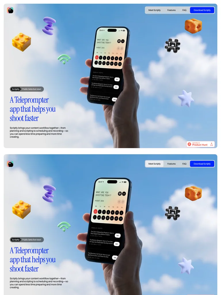
hover to scrollA hand-held phone floats among colorful objects; a narrow editorial introduction anchors the lower left.
Useful for: Mobile products that need a memorable visual demonstration before a feature tour.
# Design reference: Scriptly
Source: https://jasoneliphalet.com/scriptly
Swipefile reference: https://swipefile.design/ref/ph-sciptly/
Captured: 2026-09-08. This is a dated reference, not a claim about the current live product.


## Objective
Adapt the visual principles below to my project. Use my own content and identity. Do not reproduce logos, proprietary copy, or brand assets.

## Reference notes
- mood: Airy and playful
- colors: Sky blue, cloud white, electric blue, and warm orange
- typography: Instrument Serif headings with smaller supporting copy and clearly separated actions.
- layout: A hand-held phone floats among colorful objects; a narrow editorial introduction anchors the lower left.
- motion: Seven viewport frames record the scroll-driven product story. Frames are a sequence, not one continuous page image.
- texture: Soft clouds, rounded 3D objects, and a photographic hand
- dont: Use your own brand, copy, imagery, and product evidence; adapt the structure to your content.

Useful for: Mobile products that need a memorable visual demonstration before a feature tour.

## Acceptance criteria
- Existing project conventions, design tokens, working functionality, and unrelated changes are preserved.
- Two or three reference principles clearly support the user's task; conflicts are resolved in favor of usability and the existing product.
- Reusable components and semantic HTML express the interface. Available licensed assets are used; important UI text is never rendered as a bitmap.
- Every visible control has a defined behavior. Loading, empty, error, success, disabled, and long-content states are specified where relevant. Demo data is clearly labeled.
- Navigation and content adapt at 375px, 768px, and 1440px without horizontal page overflow. Keyboard use, visible focus, labeled inputs, at least 44px touch targets, readable contrast, and reduced motion are supported.
- Verification distinguishes rendered behavior from proposals and identifies anything still requiring a backend or external service.

## Quality bar
Clear hierarchy, consistent spacing, restrained surfaces, and purposeful motion. Avoid decorative gradients, excessive cards, placeholder buttons, and invented metrics unless the project calls for them. Do not claim a feature is connected or tested without evidence.
 hover to scroll
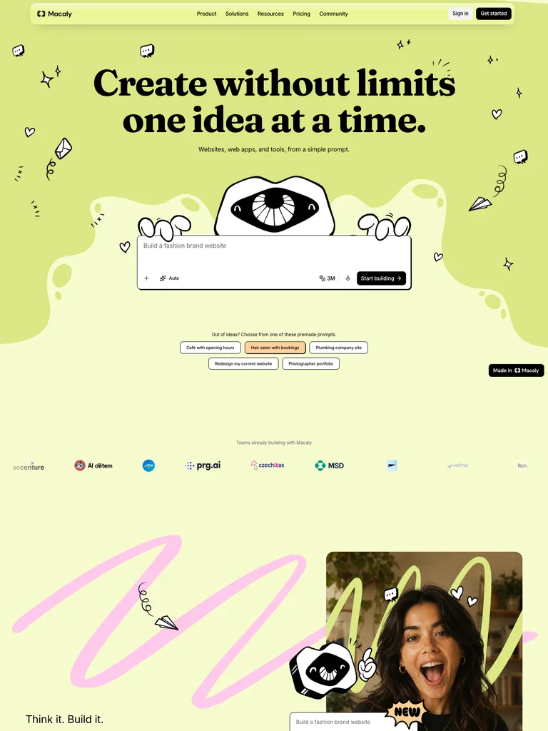
Large bold serif copy sits above a hand-drawn mascot holding a prompt field, with doodles scattered around the canvas.
Useful for: AI builders using illustration and a tangible input to create a distinctive identity.
# Design reference: Macaly
Source: https://macaly.com/
Swipefile reference: https://swipefile.design/ref/ph-macaly/
Captured: 2026-09-08. This is a dated reference, not a claim about the current live product.


## Objective
Adapt the visual principles below to my project. Use my own content and identity. Do not reproduce logos, proprietary copy, or brand assets.

## Reference notes
- mood: Inventive and cheerful
- colors: Chartreuse, black, cream, and white
- typography: Fraunces Latin headings with smaller supporting copy and clearly separated actions.
- layout: Large bold serif copy sits above a hand-drawn mascot holding a prompt field, with doodles scattered around the canvas.
- motion: Still capture of the public page. Visit the source to study its animation and interactive behavior.
- texture: Ink-like doodles, irregular organic shapes, and a flat lime background
- dont: Use your own brand, copy, imagery, and product evidence; adapt the structure to your content.

Useful for: AI builders using illustration and a tangible input to create a distinctive identity.

## Acceptance criteria
- Existing project conventions, design tokens, working functionality, and unrelated changes are preserved.
- Two or three reference principles clearly support the user's task; conflicts are resolved in favor of usability and the existing product.
- Reusable components and semantic HTML express the interface. Available licensed assets are used; important UI text is never rendered as a bitmap.
- Every visible control has a defined behavior. Loading, empty, error, success, disabled, and long-content states are specified where relevant. Demo data is clearly labeled.
- Navigation and content adapt at 375px, 768px, and 1440px without horizontal page overflow. Keyboard use, visible focus, labeled inputs, at least 44px touch targets, readable contrast, and reduced motion are supported.
- Verification distinguishes rendered behavior from proposals and identifies anything still requiring a backend or external service.

## Quality bar
Clear hierarchy, consistent spacing, restrained surfaces, and purposeful motion. Avoid decorative gradients, excessive cards, placeholder buttons, and invented metrics unless the project calls for them. Do not claim a feature is connected or tested without evidence.
 hover to scroll
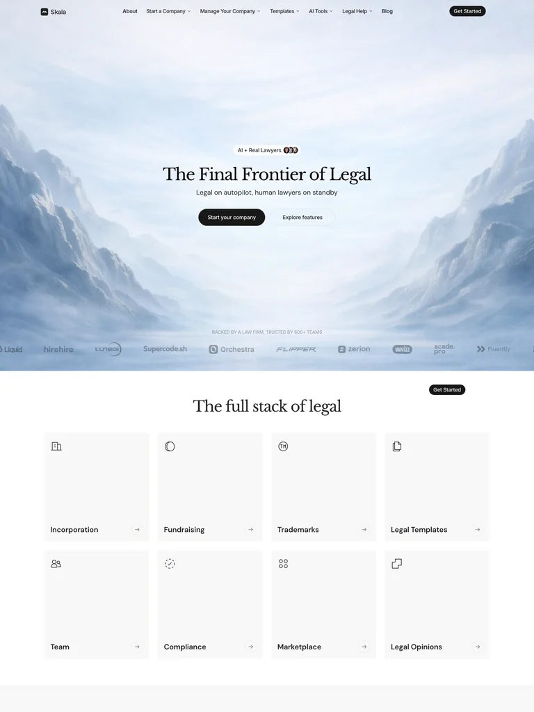
A small centered serif heading and dark action sit deep within a wide mountain valley, with customer names along the bottom.
Useful for: Professional services creating a calm, memorable setting around a small number of actions.
# Design reference: Skala
Source: https://skala.io/
Swipefile reference: https://swipefile.design/ref/ph-skala/
Captured: 2026-09-08. This is a dated reference, not a claim about the current live product.


## Objective
Adapt the visual principles below to my project. Use my own content and identity. Do not reproduce logos, proprietary copy, or brand assets.

## Reference notes
- mood: Calm and expansive
- colors: Ice blue, misty white, charcoal, and gray
- typography: Librebaskerville headings with smaller supporting copy and clearly separated actions.
- layout: A small centered serif heading and dark action sit deep within a wide mountain valley, with customer names along the bottom.
- motion: Still capture of the public page. Visit the source to study its animation and interactive behavior.
- texture: Misty landscape imagery and restrained translucent navigation
- dont: Use your own brand, copy, imagery, and product evidence; adapt the structure to your content.

Useful for: Professional services creating a calm, memorable setting around a small number of actions.

## Acceptance criteria
- Existing project conventions, design tokens, working functionality, and unrelated changes are preserved.
- Two or three reference principles clearly support the user's task; conflicts are resolved in favor of usability and the existing product.
- Reusable components and semantic HTML express the interface. Available licensed assets are used; important UI text is never rendered as a bitmap.
- Every visible control has a defined behavior. Loading, empty, error, success, disabled, and long-content states are specified where relevant. Demo data is clearly labeled.
- Navigation and content adapt at 375px, 768px, and 1440px without horizontal page overflow. Keyboard use, visible focus, labeled inputs, at least 44px touch targets, readable contrast, and reduced motion are supported.
- Verification distinguishes rendered behavior from proposals and identifies anything still requiring a backend or external service.

## Quality bar
Clear hierarchy, consistent spacing, restrained surfaces, and purposeful motion. Avoid decorative gradients, excessive cards, placeholder buttons, and invented metrics unless the project calls for them. Do not claim a feature is connected or tested without evidence.
 hover to scroll
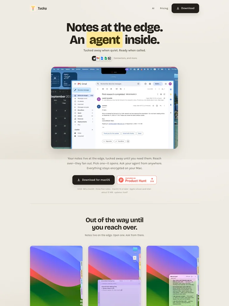
Heavy compact typography and a highlighted keyword introduce the product above a spacious demonstration area and repeated download action.
Useful for: Small desktop utilities explaining one focused behavior with generous whitespace.
# Design reference: Tucky
Source: https://tucky.io/
Swipefile reference: https://swipefile.design/ref/ph-tucky/
Captured: 2026-09-08. This is a dated reference, not a claim about the current live product.


## Objective
Adapt the visual principles below to my project. Use my own content and identity. Do not reproduce logos, proprietary copy, or brand assets.

## Reference notes
- mood: Warm and focused
- colors: Warm ivory, near-black, and pale yellow
- typography: Bricolage Grotesque headings with smaller supporting copy and clearly separated actions.
- layout: Heavy compact typography and a highlighted keyword introduce the product above a spacious demonstration area and repeated download action.
- motion: Still capture of the public page. Visit the source to study its animation and interactive behavior.
- texture: Paper-like backgrounds and a small illustrated app mark
- dont: Use your own brand, copy, imagery, and product evidence; adapt the structure to your content.

Useful for: Small desktop utilities explaining one focused behavior with generous whitespace.

## Acceptance criteria
- Existing project conventions, design tokens, working functionality, and unrelated changes are preserved.
- Two or three reference principles clearly support the user's task; conflicts are resolved in favor of usability and the existing product.
- Reusable components and semantic HTML express the interface. Available licensed assets are used; important UI text is never rendered as a bitmap.
- Every visible control has a defined behavior. Loading, empty, error, success, disabled, and long-content states are specified where relevant. Demo data is clearly labeled.
- Navigation and content adapt at 375px, 768px, and 1440px without horizontal page overflow. Keyboard use, visible focus, labeled inputs, at least 44px touch targets, readable contrast, and reduced motion are supported.
- Verification distinguishes rendered behavior from proposals and identifies anything still requiring a backend or external service.

## Quality bar
Clear hierarchy, consistent spacing, restrained surfaces, and purposeful motion. Avoid decorative gradients, excessive cards, placeholder buttons, and invented metrics unless the project calls for them. Do not claim a feature is connected or tested without evidence.
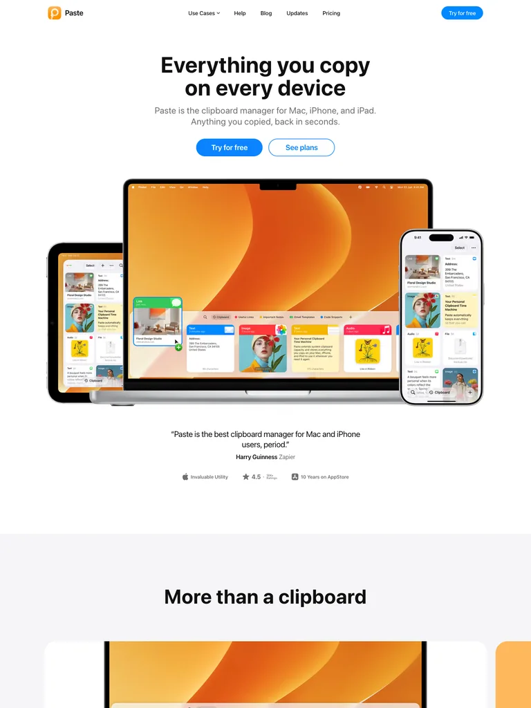 hover to scroll
A concise centered headline and blue trial action lead into overlapping desktop, tablet, and phone product previews.
Useful for: Multi-device utilities showing continuity across platforms with one strong product composition.
# Design reference: Paste
Source: https://pasteapp.io/
Swipefile reference: https://swipefile.design/ref/ph-paste/
Captured: 2026-09-08. This is a dated reference, not a claim about the current live product.


## Objective
Adapt the visual principles below to my project. Use my own content and identity. Do not reproduce logos, proprietary copy, or brand assets.

## Reference notes
- mood: Clear and confident
- colors: White, black, bright blue, and orange
- typography: system-ui headings with smaller supporting copy and clearly separated actions.
- layout: A concise centered headline and blue trial action lead into overlapping desktop, tablet, and phone product previews.
- motion: Still capture of the public page. Visit the source to study its animation and interactive behavior.
- texture: Crisp device frames and colorful screen content
- dont: Use your own brand, copy, imagery, and product evidence; adapt the structure to your content.

Useful for: Multi-device utilities showing continuity across platforms with one strong product composition.

## Acceptance criteria
- Existing project conventions, design tokens, working functionality, and unrelated changes are preserved.
- Two or three reference principles clearly support the user's task; conflicts are resolved in favor of usability and the existing product.
- Reusable components and semantic HTML express the interface. Available licensed assets are used; important UI text is never rendered as a bitmap.
- Every visible control has a defined behavior. Loading, empty, error, success, disabled, and long-content states are specified where relevant. Demo data is clearly labeled.
- Navigation and content adapt at 375px, 768px, and 1440px without horizontal page overflow. Keyboard use, visible focus, labeled inputs, at least 44px touch targets, readable contrast, and reduced motion are supported.
- Verification distinguishes rendered behavior from proposals and identifies anything still requiring a backend or external service.

## Quality bar
Clear hierarchy, consistent spacing, restrained surfaces, and purposeful motion. Avoid decorative gradients, excessive cards, placeholder buttons, and invented metrics unless the project calls for them. Do not claim a feature is connected or tested without evidence.
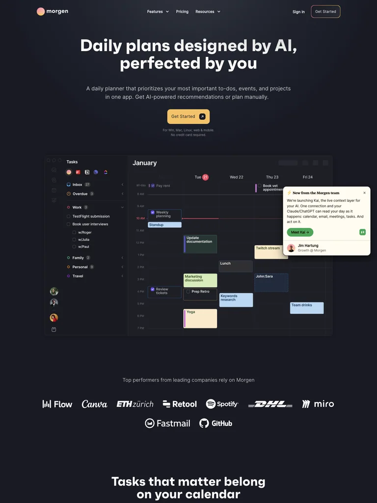 hover to scroll
A centered planning message and warm action button lead directly into a large calendar with floating task cards.
Useful for: Planning apps explaining their value through a legible schedule rather than abstract artwork.
# Design reference: Morgen
Source: https://morgen.so/
Swipefile reference: https://swipefile.design/ref/ph-morgen/
Captured: 2026-09-08. This is a dated reference, not a claim about the current live product.


## Objective
Adapt the visual principles below to my project. Use my own content and identity. Do not reproduce logos, proprietary copy, or brand assets.

## Reference notes
- mood: Organized and calm
- colors: Deep slate, warm yellow, lavender, and white
- typography: Faktum headings with smaller supporting copy and clearly separated actions.
- layout: A centered planning message and warm action button lead directly into a large calendar with floating task cards.
- motion: Still capture of the public page. Visit the source to study its animation and interactive behavior.
- texture: Detailed calendar blocks and softly elevated task panels
- dont: Use your own brand, copy, imagery, and product evidence; adapt the structure to your content.

Useful for: Planning apps explaining their value through a legible schedule rather than abstract artwork.

## Acceptance criteria
- Existing project conventions, design tokens, working functionality, and unrelated changes are preserved.
- Two or three reference principles clearly support the user's task; conflicts are resolved in favor of usability and the existing product.
- Reusable components and semantic HTML express the interface. Available licensed assets are used; important UI text is never rendered as a bitmap.
- Every visible control has a defined behavior. Loading, empty, error, success, disabled, and long-content states are specified where relevant. Demo data is clearly labeled.
- Navigation and content adapt at 375px, 768px, and 1440px without horizontal page overflow. Keyboard use, visible focus, labeled inputs, at least 44px touch targets, readable contrast, and reduced motion are supported.
- Verification distinguishes rendered behavior from proposals and identifies anything still requiring a backend or external service.

## Quality bar
Clear hierarchy, consistent spacing, restrained surfaces, and purposeful motion. Avoid decorative gradients, excessive cards, placeholder buttons, and invented metrics unless the project calls for them. Do not claim a feature is connected or tested without evidence.
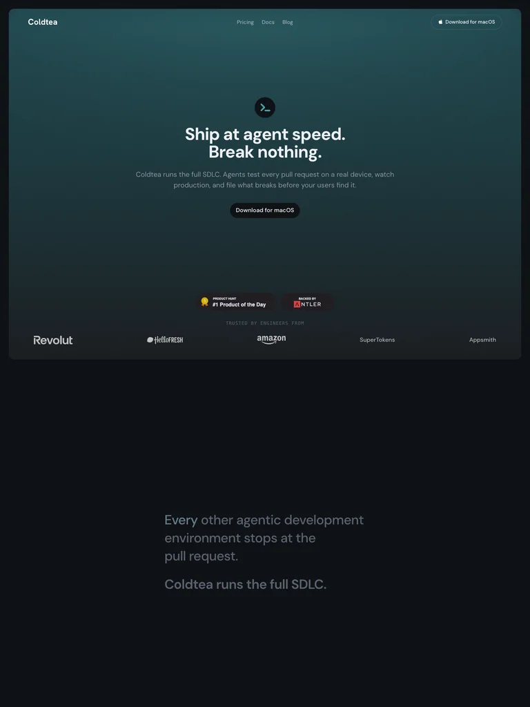 hover to scroll
A restrained centered headline and small action sit inside a teal vignette, with customer logos along the base.
Useful for: Developer tools using a calm introduction before detailed workflow explanations.
# Design reference: Coldtea
Source: https://coldtea.ai/
Swipefile reference: https://swipefile.design/ref/ph-coldtea/
Captured: 2026-09-08. This is a dated reference, not a claim about the current live product.


## Objective
Adapt the visual principles below to my project. Use my own content and identity. Do not reproduce logos, proprietary copy, or brand assets.

## Reference notes
- mood: Quiet and technical
- colors: Deep teal, charcoal, and cool white
- typography: DM Sans headings with smaller supporting copy and clearly separated actions.
- layout: A restrained centered headline and small action sit inside a teal vignette, with customer logos along the base.
- motion: Still capture of the public page. Visit the source to study its animation and interactive behavior.
- texture: Soft atmospheric gradients and restrained interface panels
- dont: Use your own brand, copy, imagery, and product evidence; adapt the structure to your content.

Useful for: Developer tools using a calm introduction before detailed workflow explanations.

## Acceptance criteria
- Existing project conventions, design tokens, working functionality, and unrelated changes are preserved.
- Two or three reference principles clearly support the user's task; conflicts are resolved in favor of usability and the existing product.
- Reusable components and semantic HTML express the interface. Available licensed assets are used; important UI text is never rendered as a bitmap.
- Every visible control has a defined behavior. Loading, empty, error, success, disabled, and long-content states are specified where relevant. Demo data is clearly labeled.
- Navigation and content adapt at 375px, 768px, and 1440px without horizontal page overflow. Keyboard use, visible focus, labeled inputs, at least 44px touch targets, readable contrast, and reduced motion are supported.
- Verification distinguishes rendered behavior from proposals and identifies anything still requiring a backend or external service.

## Quality bar
Clear hierarchy, consistent spacing, restrained surfaces, and purposeful motion. Avoid decorative gradients, excessive cards, placeholder buttons, and invented metrics unless the project calls for them. Do not claim a feature is connected or tested without evidence.
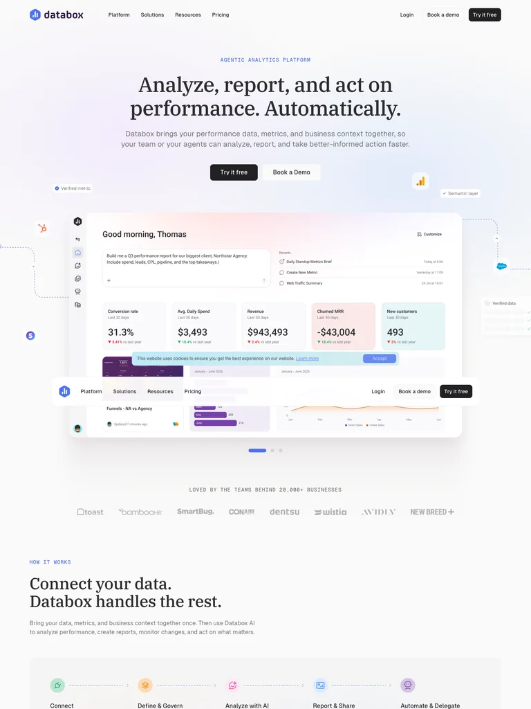 hover to scroll
A centered serif introduction leads into a wide analytics interface, with small floating product symbols around it.
Useful for: Analytics products connecting a plain-language promise to a visible interface.
# Design reference: Databox
Source: https://databox.com/
Swipefile reference: https://swipefile.design/ref/ph-databox/
Captured: 2026-09-08. This is a dated reference, not a claim about the current live product.


## Objective
Adapt the visual principles below to my project. Use my own content and identity. Do not reproduce logos, proprietary copy, or brand assets.

## Reference notes
- mood: Polished and approachable
- colors: White, lilac, pale blue, and charcoal
- typography: IBM Plex Serif headings with smaller supporting copy and clearly separated actions.
- layout: A centered serif introduction leads into a wide analytics interface, with small floating product symbols around it.
- motion: Still capture of the public page. Visit the source to study its animation and interactive behavior.
- texture: Pastel gradients and detailed dashboard imagery
- dont: Use your own brand, copy, imagery, and product evidence; adapt the structure to your content.

Useful for: Analytics products connecting a plain-language promise to a visible interface.

## Acceptance criteria
- Existing project conventions, design tokens, working functionality, and unrelated changes are preserved.
- Two or three reference principles clearly support the user's task; conflicts are resolved in favor of usability and the existing product.
- Reusable components and semantic HTML express the interface. Available licensed assets are used; important UI text is never rendered as a bitmap.
- Every visible control has a defined behavior. Loading, empty, error, success, disabled, and long-content states are specified where relevant. Demo data is clearly labeled.
- Navigation and content adapt at 375px, 768px, and 1440px without horizontal page overflow. Keyboard use, visible focus, labeled inputs, at least 44px touch targets, readable contrast, and reduced motion are supported.
- Verification distinguishes rendered behavior from proposals and identifies anything still requiring a backend or external service.

## Quality bar
Clear hierarchy, consistent spacing, restrained surfaces, and purposeful motion. Avoid decorative gradients, excessive cards, placeholder buttons, and invented metrics unless the project calls for them. Do not claim a feature is connected or tested without evidence.
 hover to scroll
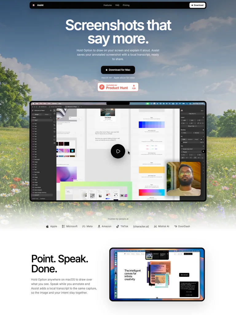
A scenic meadow frames bold white copy and a desktop preview, with a compact dark navigation bar above.
Useful for: Desktop apps using a familiar environment to make technical functions approachable.
# Design reference: Assist
Source: https://assistapp.dev/
Swipefile reference: https://swipefile.design/ref/ph-assist-4/
Captured: 2026-09-08. This is a dated reference, not a claim about the current live product.


## Objective
Adapt the visual principles below to my project. Use my own content and identity. Do not reproduce logos, proprietary copy, or brand assets.

## Reference notes
- mood: Open and optimistic
- colors: Sky blue, grass green, white, and black
- typography: Inter headings with smaller supporting copy and clearly separated actions.
- layout: A scenic meadow frames bold white copy and a desktop preview, with a compact dark navigation bar above.
- motion: Still capture of the public page. Visit the source to study its animation and interactive behavior.
- texture: Landscape photography and a framed desktop screenshot
- dont: Use your own brand, copy, imagery, and product evidence; adapt the structure to your content.

Useful for: Desktop apps using a familiar environment to make technical functions approachable.

## Acceptance criteria
- Existing project conventions, design tokens, working functionality, and unrelated changes are preserved.
- Two or three reference principles clearly support the user's task; conflicts are resolved in favor of usability and the existing product.
- Reusable components and semantic HTML express the interface. Available licensed assets are used; important UI text is never rendered as a bitmap.
- Every visible control has a defined behavior. Loading, empty, error, success, disabled, and long-content states are specified where relevant. Demo data is clearly labeled.
- Navigation and content adapt at 375px, 768px, and 1440px without horizontal page overflow. Keyboard use, visible focus, labeled inputs, at least 44px touch targets, readable contrast, and reduced motion are supported.
- Verification distinguishes rendered behavior from proposals and identifies anything still requiring a backend or external service.

## Quality bar
Clear hierarchy, consistent spacing, restrained surfaces, and purposeful motion. Avoid decorative gradients, excessive cards, placeholder buttons, and invented metrics unless the project calls for them. Do not claim a feature is connected or tested without evidence.
 hover to scroll
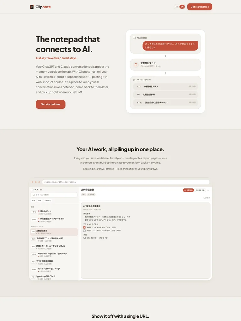
A compact split hero places a short product promise beside a stacked note interface, followed by a quieter explanatory section.
Useful for: Capture and note products that can explain their value through a small real interface.
# Design reference: Clipnote
Source: https://clipnote.paritto.dev/en
Swipefile reference: https://swipefile.design/ref/ph-clipnote-2/
Captured: 2026-09-08. This is a dated reference, not a claim about the current live product.


## Objective
Adapt the visual principles below to my project. Use my own content and identity. Do not reproduce logos, proprietary copy, or brand assets.

## Reference notes
- mood: Friendly and practical
- colors: Warm off-white, brick red, and dark brown
- typography: Plus Jakarta Sans headings with smaller supporting copy and clearly separated actions.
- layout: A compact split hero places a short product promise beside a stacked note interface, followed by a quieter explanatory section.
- motion: Still capture of the public page. Visit the source to study its animation and interactive behavior.
- texture: Rounded note cards on a lightly tinted canvas
- dont: Use your own brand, copy, imagery, and product evidence; adapt the structure to your content.

Useful for: Capture and note products that can explain their value through a small real interface.

## Acceptance criteria
- Existing project conventions, design tokens, working functionality, and unrelated changes are preserved.
- Two or three reference principles clearly support the user's task; conflicts are resolved in favor of usability and the existing product.
- Reusable components and semantic HTML express the interface. Available licensed assets are used; important UI text is never rendered as a bitmap.
- Every visible control has a defined behavior. Loading, empty, error, success, disabled, and long-content states are specified where relevant. Demo data is clearly labeled.
- Navigation and content adapt at 375px, 768px, and 1440px without horizontal page overflow. Keyboard use, visible focus, labeled inputs, at least 44px touch targets, readable contrast, and reduced motion are supported.
- Verification distinguishes rendered behavior from proposals and identifies anything still requiring a backend or external service.

## Quality bar
Clear hierarchy, consistent spacing, restrained surfaces, and purposeful motion. Avoid decorative gradients, excessive cards, placeholder buttons, and invented metrics unless the project calls for them. Do not claim a feature is connected or tested without evidence.
 hover to scroll
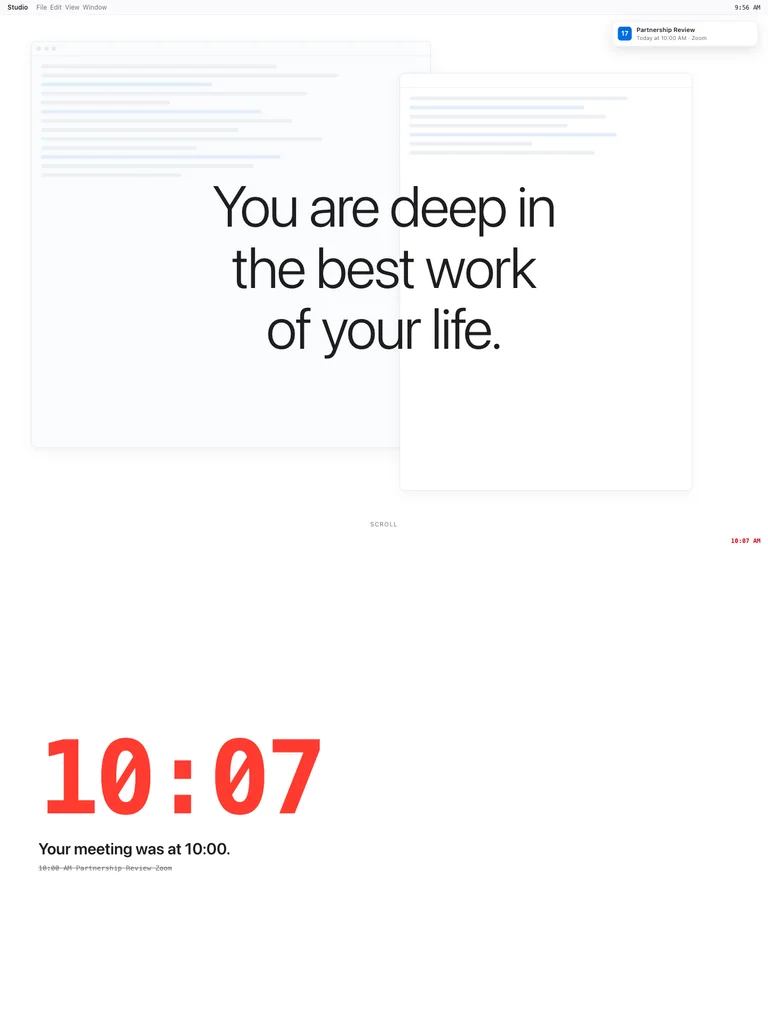
Oversized thin typography sits over ghosted calendar and task windows, creating a focused interruption-themed introduction.
Useful for: Single-purpose utilities using typography and context rather than decorative illustrations.
# Design reference: Remind
Source: https://remind.ing/
Swipefile reference: https://swipefile.design/ref/ph-remind-7/
Captured: 2026-09-08. This is a dated reference, not a claim about the current live product.


## Objective
Adapt the visual principles below to my project. Use my own content and identity. Do not reproduce logos, proprietary copy, or brand assets.

## Reference notes
- mood: Calm and immersive
- colors: White, pale gray, and near-black
- typography: -apple-system headings with smaller supporting copy and clearly separated actions.
- layout: Oversized thin typography sits over ghosted calendar and task windows, creating a focused interruption-themed introduction.
- motion: Still capture of the public page. Visit the source to study its animation and interactive behavior.
- texture: Low-contrast layered interface windows
- dont: Use your own brand, copy, imagery, and product evidence; adapt the structure to your content.

Useful for: Single-purpose utilities using typography and context rather than decorative illustrations.

## Acceptance criteria
- Existing project conventions, design tokens, working functionality, and unrelated changes are preserved.
- Two or three reference principles clearly support the user's task; conflicts are resolved in favor of usability and the existing product.
- Reusable components and semantic HTML express the interface. Available licensed assets are used; important UI text is never rendered as a bitmap.
- Every visible control has a defined behavior. Loading, empty, error, success, disabled, and long-content states are specified where relevant. Demo data is clearly labeled.
- Navigation and content adapt at 375px, 768px, and 1440px without horizontal page overflow. Keyboard use, visible focus, labeled inputs, at least 44px touch targets, readable contrast, and reduced motion are supported.
- Verification distinguishes rendered behavior from proposals and identifies anything still requiring a backend or external service.

## Quality bar
Clear hierarchy, consistent spacing, restrained surfaces, and purposeful motion. Avoid decorative gradients, excessive cards, placeholder buttons, and invented metrics unless the project calls for them. Do not claim a feature is connected or tested without evidence.
 hover to scroll
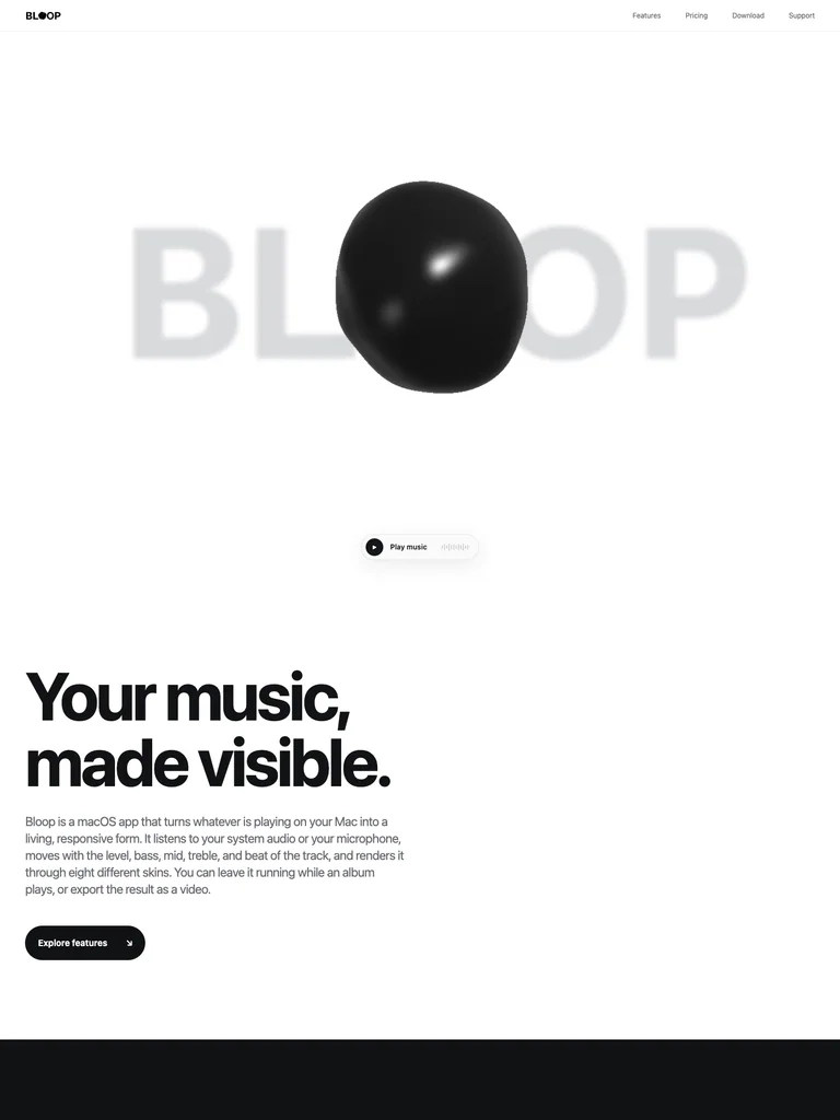
An oversized blurred wordmark surrounds a glossy black object, leaving broad white margins and minimal navigation.
Useful for: Creative audio products that benefit from showing an expressive output immediately.
# Design reference: Bloop
Source: https://bloooooop.com/
Swipefile reference: https://swipefile.design/ref/ph-bloop-4/
Captured: 2026-09-08. This is a dated reference, not a claim about the current live product.


## Objective
Adapt the visual principles below to my project. Use my own content and identity. Do not reproduce logos, proprietary copy, or brand assets.

## Reference notes
- mood: Playful and sculptural
- colors: White, black, and silver gray
- typography: -apple-system headings with smaller supporting copy and clearly separated actions.
- layout: An oversized blurred wordmark surrounds a glossy black object, leaving broad white margins and minimal navigation.
- motion: Still capture of the public page. Visit the source to study its animation and interactive behavior.
- texture: Glossy organic 3D form and blurred background lettering
- dont: Use your own brand, copy, imagery, and product evidence; adapt the structure to your content.

Useful for: Creative audio products that benefit from showing an expressive output immediately.

## Acceptance criteria
- Existing project conventions, design tokens, working functionality, and unrelated changes are preserved.
- Two or three reference principles clearly support the user's task; conflicts are resolved in favor of usability and the existing product.
- Reusable components and semantic HTML express the interface. Available licensed assets are used; important UI text is never rendered as a bitmap.
- Every visible control has a defined behavior. Loading, empty, error, success, disabled, and long-content states are specified where relevant. Demo data is clearly labeled.
- Navigation and content adapt at 375px, 768px, and 1440px without horizontal page overflow. Keyboard use, visible focus, labeled inputs, at least 44px touch targets, readable contrast, and reduced motion are supported.
- Verification distinguishes rendered behavior from proposals and identifies anything still requiring a backend or external service.

## Quality bar
Clear hierarchy, consistent spacing, restrained surfaces, and purposeful motion. Avoid decorative gradients, excessive cards, placeholder buttons, and invented metrics unless the project calls for them. Do not claim a feature is connected or tested without evidence.
 hover to scroll
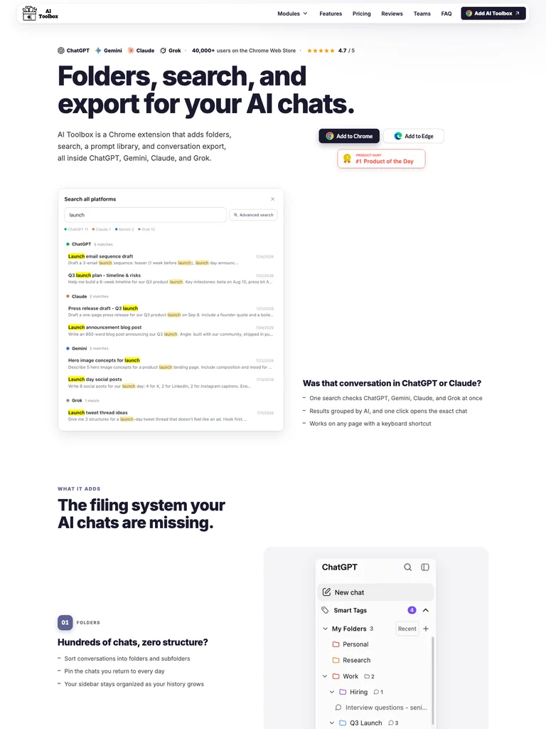
A bold left-aligned headline sits above a detailed conversation-management preview, with browser-install actions close to the copy.
Useful for: Browser extensions that need to show a concrete before-and-after workflow.
# Design reference: AI Toolbox
Source: https://ai-toolbox.co/
Swipefile reference: https://swipefile.design/ref/ph-chatgpt-toolbox/
Captured: 2026-09-08. This is a dated reference, not a claim about the current live product.


## Objective
Adapt the visual principles below to my project. Use my own content and identity. Do not reproduce logos, proprietary copy, or brand assets.

## Reference notes
- mood: Direct and functional
- colors: White, black, muted blue, and small accent colors
- typography: Inter headings with smaller supporting copy and clearly separated actions.
- layout: A bold left-aligned headline sits above a detailed conversation-management preview, with browser-install actions close to the copy.
- motion: Still capture of the public page. Visit the source to study its animation and interactive behavior.
- texture: Product screenshots and small browser/provider icons
- dont: Use your own brand, copy, imagery, and product evidence; adapt the structure to your content.

Useful for: Browser extensions that need to show a concrete before-and-after workflow.

## Acceptance criteria
- Existing project conventions, design tokens, working functionality, and unrelated changes are preserved.
- Two or three reference principles clearly support the user's task; conflicts are resolved in favor of usability and the existing product.
- Reusable components and semantic HTML express the interface. Available licensed assets are used; important UI text is never rendered as a bitmap.
- Every visible control has a defined behavior. Loading, empty, error, success, disabled, and long-content states are specified where relevant. Demo data is clearly labeled.
- Navigation and content adapt at 375px, 768px, and 1440px without horizontal page overflow. Keyboard use, visible focus, labeled inputs, at least 44px touch targets, readable contrast, and reduced motion are supported.
- Verification distinguishes rendered behavior from proposals and identifies anything still requiring a backend or external service.

## Quality bar
Clear hierarchy, consistent spacing, restrained surfaces, and purposeful motion. Avoid decorative gradients, excessive cards, placeholder buttons, and invented metrics unless the project calls for them. Do not claim a feature is connected or tested without evidence.
 hover to scroll
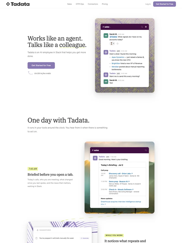
A serif statement faces a narrow conversation panel, followed by a day-in-the-life section with plenty of breathing room.
Useful for: AI assistants explained through an everyday work scenario and visible conversation.
# Design reference: Tadata
Source: https://tadata.com/
Swipefile reference: https://swipefile.design/ref/ph-tadata/
Captured: 2026-09-08. This is a dated reference, not a claim about the current live product.


## Objective
Adapt the visual principles below to my project. Use my own content and identity. Do not reproduce logos, proprietary copy, or brand assets.

## Reference notes
- mood: Measured and personable
- colors: White, soft lavender, and charcoal
- typography: IBM Plex Serif headings with smaller supporting copy and clearly separated actions.
- layout: A serif statement faces a narrow conversation panel, followed by a day-in-the-life section with plenty of breathing room.
- motion: Still capture of the public page. Visit the source to study its animation and interactive behavior.
- texture: A patterned device-like frame around chat content
- dont: Use your own brand, copy, imagery, and product evidence; adapt the structure to your content.

Useful for: AI assistants explained through an everyday work scenario and visible conversation.

## Acceptance criteria
- Existing project conventions, design tokens, working functionality, and unrelated changes are preserved.
- Two or three reference principles clearly support the user's task; conflicts are resolved in favor of usability and the existing product.
- Reusable components and semantic HTML express the interface. Available licensed assets are used; important UI text is never rendered as a bitmap.
- Every visible control has a defined behavior. Loading, empty, error, success, disabled, and long-content states are specified where relevant. Demo data is clearly labeled.
- Navigation and content adapt at 375px, 768px, and 1440px without horizontal page overflow. Keyboard use, visible focus, labeled inputs, at least 44px touch targets, readable contrast, and reduced motion are supported.
- Verification distinguishes rendered behavior from proposals and identifies anything still requiring a backend or external service.

## Quality bar
Clear hierarchy, consistent spacing, restrained surfaces, and purposeful motion. Avoid decorative gradients, excessive cards, placeholder buttons, and invented metrics unless the project calls for them. Do not claim a feature is connected or tested without evidence.
 hover to scroll
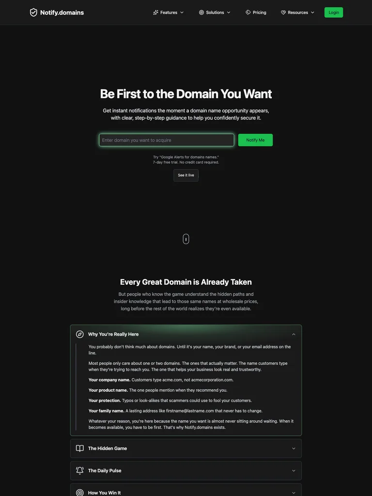
A compact centered promise leads directly to a domain input and green action on an almost black canvas.
Useful for: Monitoring tools with a simple input-driven first action.
# Design reference: Notify.domains
Source: https://notify.domains/
Swipefile reference: https://swipefile.design/ref/ph-notify-domains/
Captured: 2026-09-08. This is a dated reference, not a claim about the current live product.


## Objective
Adapt the visual principles below to my project. Use my own content and identity. Do not reproduce logos, proprietary copy, or brand assets.

## Reference notes
- mood: Spare and alert
- colors: Black, charcoal, bright green, and white
- typography: ui-sans-serif headings with smaller supporting copy and clearly separated actions.
- layout: A compact centered promise leads directly to a domain input and green action on an almost black canvas.
- motion: Still capture of the public page. Visit the source to study its animation and interactive behavior.
- texture: Subtle dark surfaces and minimal interface chrome
- dont: Use your own brand, copy, imagery, and product evidence; adapt the structure to your content.

Useful for: Monitoring tools with a simple input-driven first action.

## Acceptance criteria
- Existing project conventions, design tokens, working functionality, and unrelated changes are preserved.
- Two or three reference principles clearly support the user's task; conflicts are resolved in favor of usability and the existing product.
- Reusable components and semantic HTML express the interface. Available licensed assets are used; important UI text is never rendered as a bitmap.
- Every visible control has a defined behavior. Loading, empty, error, success, disabled, and long-content states are specified where relevant. Demo data is clearly labeled.
- Navigation and content adapt at 375px, 768px, and 1440px without horizontal page overflow. Keyboard use, visible focus, labeled inputs, at least 44px touch targets, readable contrast, and reduced motion are supported.
- Verification distinguishes rendered behavior from proposals and identifies anything still requiring a backend or external service.

## Quality bar
Clear hierarchy, consistent spacing, restrained surfaces, and purposeful motion. Avoid decorative gradients, excessive cards, placeholder buttons, and invented metrics unless the project calls for them. Do not claim a feature is connected or tested without evidence.
 hover to scroll
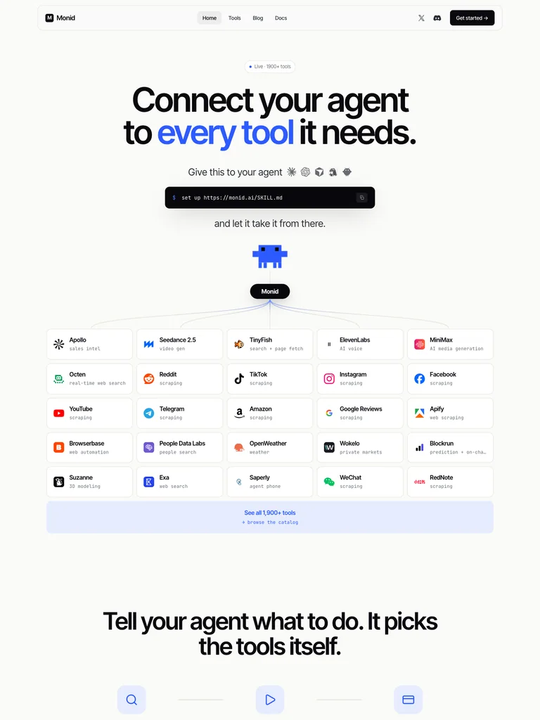
A heavy centered headline highlights one phrase in blue, then steps down through integration icons, an install command, and a pixel mascot.
Useful for: Developer infrastructure with a short path from explanation to installation.
# Design reference: Monid
Source: https://monid.ai/
Swipefile reference: https://swipefile.design/ref/ph-monid/
Captured: 2026-09-08. This is a dated reference, not a claim about the current live product.


## Objective
Adapt the visual principles below to my project. Use my own content and identity. Do not reproduce logos, proprietary copy, or brand assets.

## Reference notes
- mood: Crisp and technical
- colors: Off-white, black, and cobalt blue
- typography: Inter Tight headings with smaller supporting copy and clearly separated actions.
- layout: A heavy centered headline highlights one phrase in blue, then steps down through integration icons, an install command, and a pixel mascot.
- motion: Still capture of the public page. Visit the source to study its animation and interactive behavior.
- texture: Monospaced command bar and a small pixel illustration
- dont: Use your own brand, copy, imagery, and product evidence; adapt the structure to your content.

Useful for: Developer infrastructure with a short path from explanation to installation.

## Acceptance criteria
- Existing project conventions, design tokens, working functionality, and unrelated changes are preserved.
- Two or three reference principles clearly support the user's task; conflicts are resolved in favor of usability and the existing product.
- Reusable components and semantic HTML express the interface. Available licensed assets are used; important UI text is never rendered as a bitmap.
- Every visible control has a defined behavior. Loading, empty, error, success, disabled, and long-content states are specified where relevant. Demo data is clearly labeled.
- Navigation and content adapt at 375px, 768px, and 1440px without horizontal page overflow. Keyboard use, visible focus, labeled inputs, at least 44px touch targets, readable contrast, and reduced motion are supported.
- Verification distinguishes rendered behavior from proposals and identifies anything still requiring a backend or external service.

## Quality bar
Clear hierarchy, consistent spacing, restrained surfaces, and purposeful motion. Avoid decorative gradients, excessive cards, placeholder buttons, and invented metrics unless the project calls for them. Do not claim a feature is connected or tested without evidence.
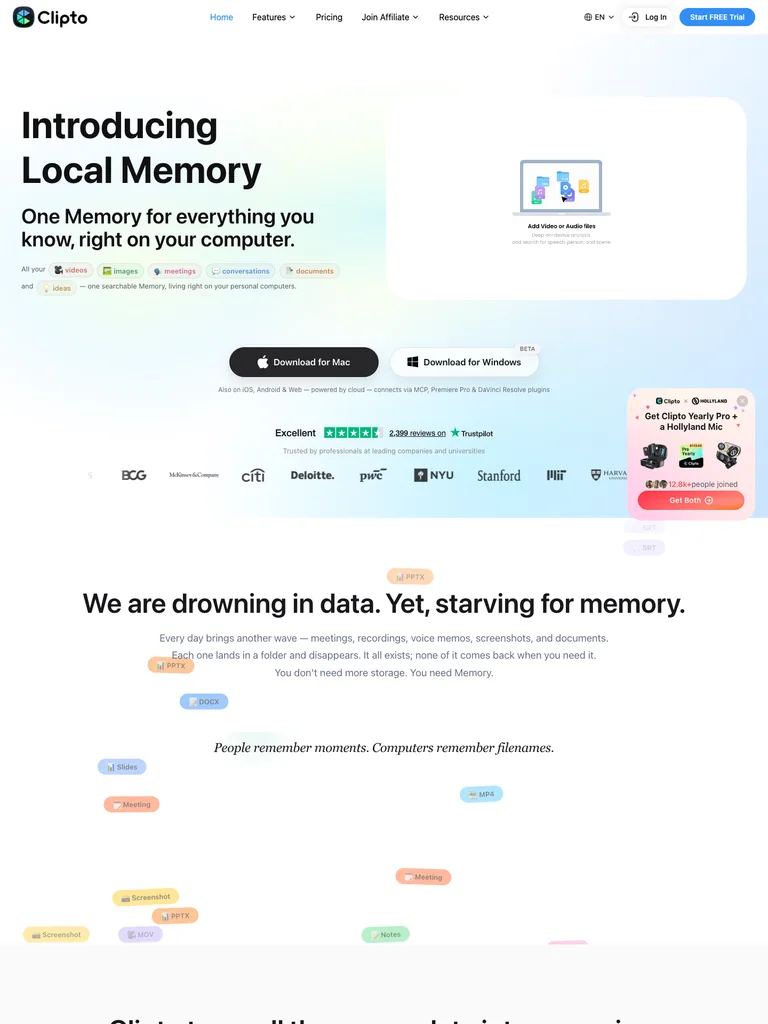 hover to scroll
A split introduction pairs bold copy with a file-memory diagram, followed by centered desktop-download choices and social proof.
Useful for: Cross-platform desktop products introducing an abstract concept through a simple diagram.
# Design reference: Clipto
Source: https://clipto.com/
Swipefile reference: https://swipefile.design/ref/ph-clipto-ai/
Captured: 2026-09-08. This is a dated reference, not a claim about the current live product.


## Objective
Adapt the visual principles below to my project. Use my own content and identity. Do not reproduce logos, proprietary copy, or brand assets.

## Reference notes
- mood: Light and welcoming
- colors: White, mint, pale blue, and black
- typography: ui-sans-serif headings with smaller supporting copy and clearly separated actions.
- layout: A split introduction pairs bold copy with a file-memory diagram, followed by centered desktop-download choices and social proof.
- motion: Still capture of the public page. Visit the source to study its animation and interactive behavior.
- texture: Soft gradient washes and floating file symbols
- dont: Use your own brand, copy, imagery, and product evidence; adapt the structure to your content.

Useful for: Cross-platform desktop products introducing an abstract concept through a simple diagram.

## Acceptance criteria
- Existing project conventions, design tokens, working functionality, and unrelated changes are preserved.
- Two or three reference principles clearly support the user's task; conflicts are resolved in favor of usability and the existing product.
- Reusable components and semantic HTML express the interface. Available licensed assets are used; important UI text is never rendered as a bitmap.
- Every visible control has a defined behavior. Loading, empty, error, success, disabled, and long-content states are specified where relevant. Demo data is clearly labeled.
- Navigation and content adapt at 375px, 768px, and 1440px without horizontal page overflow. Keyboard use, visible focus, labeled inputs, at least 44px touch targets, readable contrast, and reduced motion are supported.
- Verification distinguishes rendered behavior from proposals and identifies anything still requiring a backend or external service.

## Quality bar
Clear hierarchy, consistent spacing, restrained surfaces, and purposeful motion. Avoid decorative gradients, excessive cards, placeholder buttons, and invented metrics unless the project calls for them. Do not claim a feature is connected or tested without evidence.
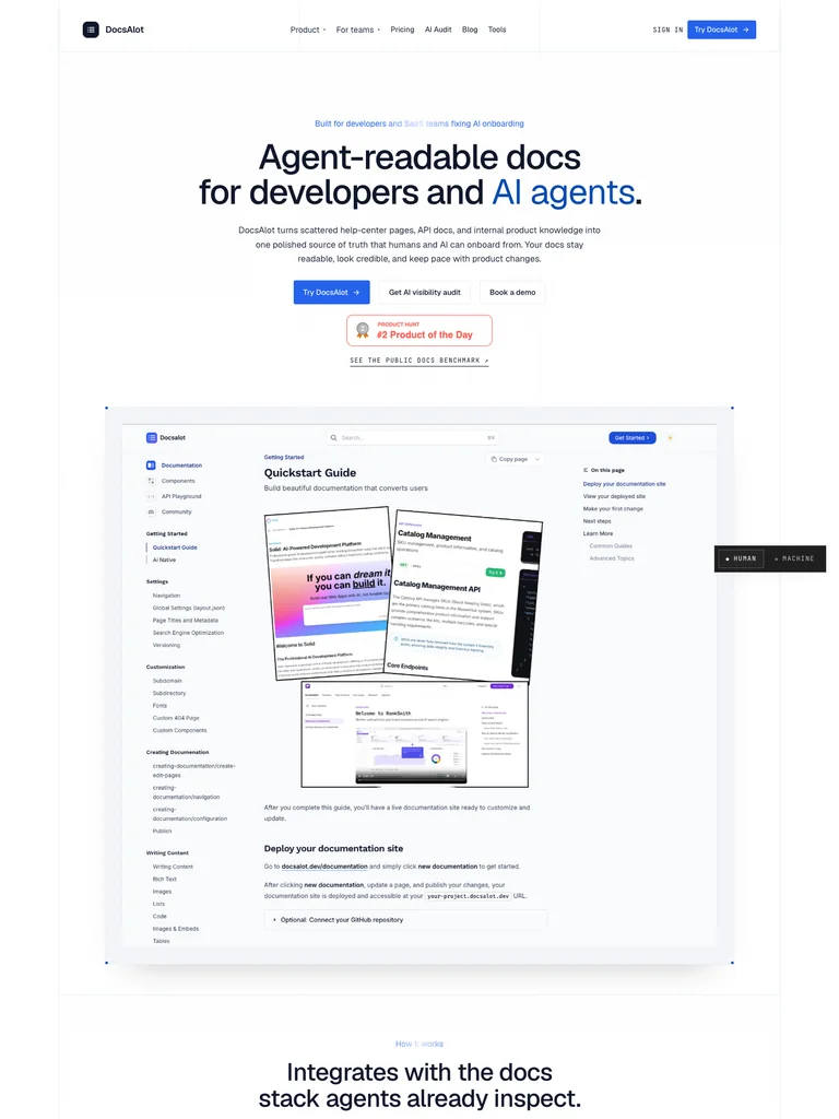 hover to scroll
Centered two-line typography introduces a large product demonstration, with paired actions and compact launch proof between them.
Useful for: Documentation products that need to make their output visible before describing implementation.
# Design reference: DocsAlot
Source: https://docsalot.dev/
Swipefile reference: https://swipefile.design/ref/ph-docsalot-2/
Captured: 2026-09-08. This is a dated reference, not a claim about the current live product.


## Objective
Adapt the visual principles below to my project. Use my own content and identity. Do not reproduce logos, proprietary copy, or brand assets.

## Reference notes
- mood: Clear and systematic
- colors: White, bright blue, muted teal, and black
- typography: Geist headings with smaller supporting copy and clearly separated actions.
- layout: Centered two-line typography introduces a large product demonstration, with paired actions and compact launch proof between them.
- motion: Still capture of the public page. Visit the source to study its animation and interactive behavior.
- texture: Clean browser frames and restrained interface borders
- dont: Use your own brand, copy, imagery, and product evidence; adapt the structure to your content.

Useful for: Documentation products that need to make their output visible before describing implementation.

## Acceptance criteria
- Existing project conventions, design tokens, working functionality, and unrelated changes are preserved.
- Two or three reference principles clearly support the user's task; conflicts are resolved in favor of usability and the existing product.
- Reusable components and semantic HTML express the interface. Available licensed assets are used; important UI text is never rendered as a bitmap.
- Every visible control has a defined behavior. Loading, empty, error, success, disabled, and long-content states are specified where relevant. Demo data is clearly labeled.
- Navigation and content adapt at 375px, 768px, and 1440px without horizontal page overflow. Keyboard use, visible focus, labeled inputs, at least 44px touch targets, readable contrast, and reduced motion are supported.
- Verification distinguishes rendered behavior from proposals and identifies anything still requiring a backend or external service.

## Quality bar
Clear hierarchy, consistent spacing, restrained surfaces, and purposeful motion. Avoid decorative gradients, excessive cards, placeholder buttons, and invented metrics unless the project calls for them. Do not claim a feature is connected or tested without evidence.
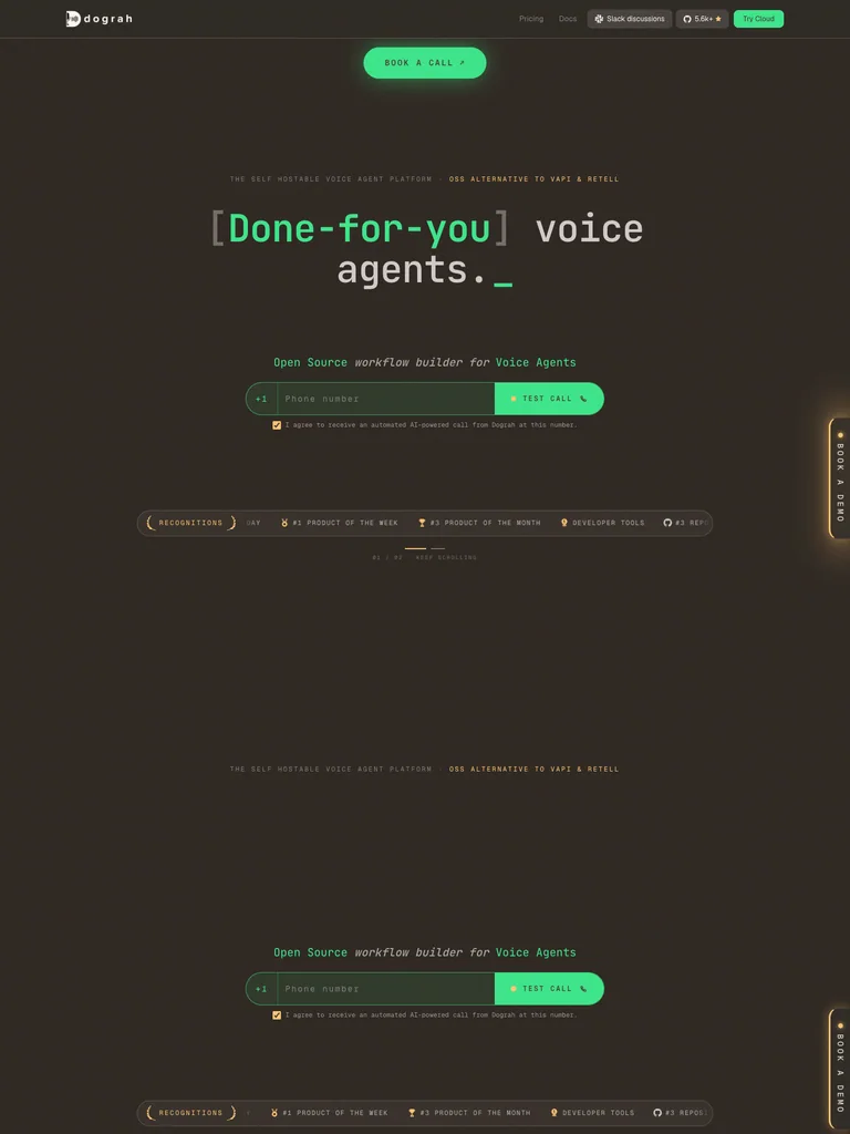 hover to scroll
A bracketed monospaced phrase leads the hero, with a prominent call action and a wide conversational demo below.
Useful for: Voice infrastructure that benefits from a visible sample conversation and a direct trial action.
# Design reference: Dograh
Source: https://dograh.com/
Swipefile reference: https://swipefile.design/ref/ph-dograh/
Captured: 2026-09-08. This is a dated reference, not a claim about the current live product.


## Objective
Adapt the visual principles below to my project. Use my own content and identity. Do not reproduce logos, proprietary copy, or brand assets.

## Reference notes
- mood: Technical and conversational
- colors: Warm charcoal, mint green, beige, and white
- typography: JetBrains Mono headings with smaller supporting copy and clearly separated actions.
- layout: A bracketed monospaced phrase leads the hero, with a prominent call action and a wide conversational demo below.
- motion: Still capture of the public page. Visit the source to study its animation and interactive behavior.
- texture: Terminal-like labels, fine rules, and subtle green glow
- dont: Use your own brand, copy, imagery, and product evidence; adapt the structure to your content.

Useful for: Voice infrastructure that benefits from a visible sample conversation and a direct trial action.

## Acceptance criteria
- Existing project conventions, design tokens, working functionality, and unrelated changes are preserved.
- Two or three reference principles clearly support the user's task; conflicts are resolved in favor of usability and the existing product.
- Reusable components and semantic HTML express the interface. Available licensed assets are used; important UI text is never rendered as a bitmap.
- Every visible control has a defined behavior. Loading, empty, error, success, disabled, and long-content states are specified where relevant. Demo data is clearly labeled.
- Navigation and content adapt at 375px, 768px, and 1440px without horizontal page overflow. Keyboard use, visible focus, labeled inputs, at least 44px touch targets, readable contrast, and reduced motion are supported.
- Verification distinguishes rendered behavior from proposals and identifies anything still requiring a backend or external service.

## Quality bar
Clear hierarchy, consistent spacing, restrained surfaces, and purposeful motion. Avoid decorative gradients, excessive cards, placeholder buttons, and invented metrics unless the project calls for them. Do not claim a feature is connected or tested without evidence.
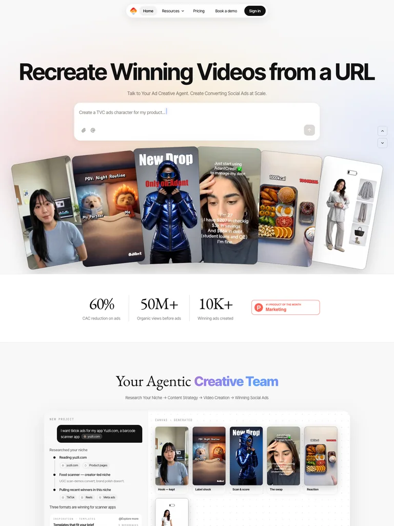 hover to scroll
A wide headline and prompt field sit above a fan of portrait video examples, letting the output carry the introduction.
Useful for: Creative generators showing a range of outputs before deeper feature explanations.
# Design reference: AdAnt AI
Source: https://adant.ai/
Swipefile reference: https://swipefile.design/ref/ph-adant-ai/
Captured: 2026-09-08. This is a dated reference, not a claim about the current live product.


## Objective
Adapt the visual principles below to my project. Use my own content and identity. Do not reproduce logos, proprietary copy, or brand assets.

## Reference notes
- mood: Energetic and visual
- colors: White, warm peach, black, and orange
- typography: Inter Tight Variable headings with smaller supporting copy and clearly separated actions.
- layout: A wide headline and prompt field sit above a fan of portrait video examples, letting the output carry the introduction.
- motion: Still capture of the public page. Visit the source to study its animation and interactive behavior.
- texture: Tilted video cards and a soft warm gradient
- dont: Use your own brand, copy, imagery, and product evidence; adapt the structure to your content.

Useful for: Creative generators showing a range of outputs before deeper feature explanations.

## Acceptance criteria
- Existing project conventions, design tokens, working functionality, and unrelated changes are preserved.
- Two or three reference principles clearly support the user's task; conflicts are resolved in favor of usability and the existing product.
- Reusable components and semantic HTML express the interface. Available licensed assets are used; important UI text is never rendered as a bitmap.
- Every visible control has a defined behavior. Loading, empty, error, success, disabled, and long-content states are specified where relevant. Demo data is clearly labeled.
- Navigation and content adapt at 375px, 768px, and 1440px without horizontal page overflow. Keyboard use, visible focus, labeled inputs, at least 44px touch targets, readable contrast, and reduced motion are supported.
- Verification distinguishes rendered behavior from proposals and identifies anything still requiring a backend or external service.

## Quality bar
Clear hierarchy, consistent spacing, restrained surfaces, and purposeful motion. Avoid decorative gradients, excessive cards, placeholder buttons, and invented metrics unless the project calls for them. Do not claim a feature is connected or tested without evidence.
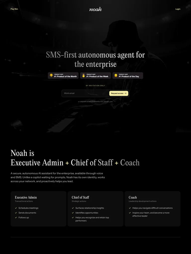 hover to scroll
Centered serif copy and a compact email field sit over a dark performance photograph, with small launch badges as supporting detail.
Useful for: Concierge-style products using a restrained atmosphere and a single conversion action.
# Design reference: Hey Noah
Source: https://heynoah.io/
Swipefile reference: https://swipefile.design/ref/ph-hey-noah/
Captured: 2026-09-08. This is a dated reference, not a claim about the current live product.


## Objective
Adapt the visual principles below to my project. Use my own content and identity. Do not reproduce logos, proprietary copy, or brand assets.

## Reference notes
- mood: Quiet and cinematic
- colors: Black, soft gray, white, and pale yellow
- typography: EditorialNew headings with smaller supporting copy and clearly separated actions.
- layout: Centered serif copy and a compact email field sit over a dark performance photograph, with small launch badges as supporting detail.
- motion: Still capture of the public page. Visit the source to study its animation and interactive behavior.
- texture: Low-key photography and a large, subdued script wordmark
- dont: Use your own brand, copy, imagery, and product evidence; adapt the structure to your content.

Useful for: Concierge-style products using a restrained atmosphere and a single conversion action.

## Acceptance criteria
- Existing project conventions, design tokens, working functionality, and unrelated changes are preserved.
- Two or three reference principles clearly support the user's task; conflicts are resolved in favor of usability and the existing product.
- Reusable components and semantic HTML express the interface. Available licensed assets are used; important UI text is never rendered as a bitmap.
- Every visible control has a defined behavior. Loading, empty, error, success, disabled, and long-content states are specified where relevant. Demo data is clearly labeled.
- Navigation and content adapt at 375px, 768px, and 1440px without horizontal page overflow. Keyboard use, visible focus, labeled inputs, at least 44px touch targets, readable contrast, and reduced motion are supported.
- Verification distinguishes rendered behavior from proposals and identifies anything still requiring a backend or external service.

## Quality bar
Clear hierarchy, consistent spacing, restrained surfaces, and purposeful motion. Avoid decorative gradients, excessive cards, placeholder buttons, and invented metrics unless the project calls for them. Do not claim a feature is connected or tested without evidence.
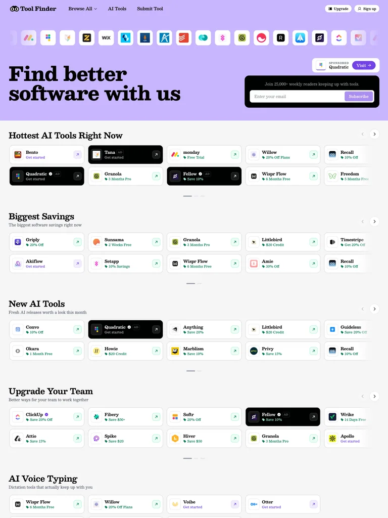 hover to scroll
A bold serif heading on a lavender band leads into compact software listings, category tabs, and a visible search field.
Useful for: Discovery websites balancing an expressive heading with a scannable product catalog.
# Design reference: Tool Finder
Source: https://toolfinder.com/
Swipefile reference: https://swipefile.design/ref/ph-tool-finder/
Captured: 2026-09-08. This is a dated reference, not a claim about the current live product.


## Objective
Adapt the visual principles below to my project. Use my own content and identity. Do not reproduce logos, proprietary copy, or brand assets.

## Reference notes
- mood: Lively and useful
- colors: Lavender, white, black, and small colorful app marks
- typography: Besley headings with smaller supporting copy and clearly separated actions.
- layout: A bold serif heading on a lavender band leads into compact software listings, category tabs, and a visible search field.
- motion: Still capture of the public page. Visit the source to study its animation and interactive behavior.
- texture: Dense logo rows and restrained catalog cards
- dont: Use your own brand, copy, imagery, and product evidence; adapt the structure to your content.

Useful for: Discovery websites balancing an expressive heading with a scannable product catalog.

## Acceptance criteria
- Existing project conventions, design tokens, working functionality, and unrelated changes are preserved.
- Two or three reference principles clearly support the user's task; conflicts are resolved in favor of usability and the existing product.
- Reusable components and semantic HTML express the interface. Available licensed assets are used; important UI text is never rendered as a bitmap.
- Every visible control has a defined behavior. Loading, empty, error, success, disabled, and long-content states are specified where relevant. Demo data is clearly labeled.
- Navigation and content adapt at 375px, 768px, and 1440px without horizontal page overflow. Keyboard use, visible focus, labeled inputs, at least 44px touch targets, readable contrast, and reduced motion are supported.
- Verification distinguishes rendered behavior from proposals and identifies anything still requiring a backend or external service.

## Quality bar
Clear hierarchy, consistent spacing, restrained surfaces, and purposeful motion. Avoid decorative gradients, excessive cards, placeholder buttons, and invented metrics unless the project calls for them. Do not claim a feature is connected or tested without evidence.
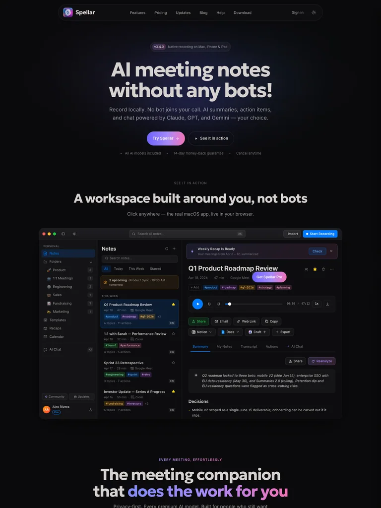 hover to scroll
A large centered product promise and gradient download button precede a dark meeting-notes workspace demonstration.
Useful for: Meeting tools showing a clear product workspace after a concise introduction.
# Design reference: Spellar
Source: https://spellar.ai/
Swipefile reference: https://swipefile.design/ref/ph-spellar/
Captured: 2026-09-08. This is a dated reference, not a claim about the current live product.


## Objective
Adapt the visual principles below to my project. Use my own content and identity. Do not reproduce logos, proprietary copy, or brand assets.

## Reference notes
- mood: Focused and polished
- colors: Near-black, lavender, white, and blue
- typography: __Geologica_fad37d headings with smaller supporting copy and clearly separated actions.
- layout: A large centered product promise and gradient download button precede a dark meeting-notes workspace demonstration.
- motion: Still capture of the public page. Visit the source to study its animation and interactive behavior.
- texture: Subtle gradients and dark product interface panels
- dont: Use your own brand, copy, imagery, and product evidence; adapt the structure to your content.

Useful for: Meeting tools showing a clear product workspace after a concise introduction.

## Acceptance criteria
- Existing project conventions, design tokens, working functionality, and unrelated changes are preserved.
- Two or three reference principles clearly support the user's task; conflicts are resolved in favor of usability and the existing product.
- Reusable components and semantic HTML express the interface. Available licensed assets are used; important UI text is never rendered as a bitmap.
- Every visible control has a defined behavior. Loading, empty, error, success, disabled, and long-content states are specified where relevant. Demo data is clearly labeled.
- Navigation and content adapt at 375px, 768px, and 1440px without horizontal page overflow. Keyboard use, visible focus, labeled inputs, at least 44px touch targets, readable contrast, and reduced motion are supported.
- Verification distinguishes rendered behavior from proposals and identifies anything still requiring a backend or external service.

## Quality bar
Clear hierarchy, consistent spacing, restrained surfaces, and purposeful motion. Avoid decorative gradients, excessive cards, placeholder buttons, and invented metrics unless the project calls for them. Do not claim a feature is connected or tested without evidence.
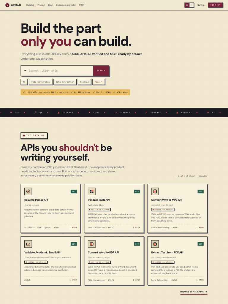 hover to scroll
A heavy two-line heading leads into a search box and compact API category chips, then a catalog section divided by a dark strip.
Useful for: Technical catalogs combining a strong editorial voice with immediately usable search.
# Design reference: ApyHub
Source: https://apyhub.com/
Swipefile reference: https://swipefile.design/ref/ph-apyhub/
Captured: 2026-09-08. This is a dated reference, not a claim about the current live product.


## Objective
Adapt the visual principles below to my project. Use my own content and identity. Do not reproduce logos, proprietary copy, or brand assets.

## Reference notes
- mood: Practical and distinctive
- colors: Cream, burgundy, mustard, and near-black
- typography: DM Sans headings with smaller supporting copy and clearly separated actions.
- layout: A heavy two-line heading leads into a search box and compact API category chips, then a catalog section divided by a dark strip.
- motion: Still capture of the public page. Visit the source to study its animation and interactive behavior.
- texture: Fine rules, outlined chips, and code-like utility details
- dont: Use your own brand, copy, imagery, and product evidence; adapt the structure to your content.

Useful for: Technical catalogs combining a strong editorial voice with immediately usable search.

## Acceptance criteria
- Existing project conventions, design tokens, working functionality, and unrelated changes are preserved.
- Two or three reference principles clearly support the user's task; conflicts are resolved in favor of usability and the existing product.
- Reusable components and semantic HTML express the interface. Available licensed assets are used; important UI text is never rendered as a bitmap.
- Every visible control has a defined behavior. Loading, empty, error, success, disabled, and long-content states are specified where relevant. Demo data is clearly labeled.
- Navigation and content adapt at 375px, 768px, and 1440px without horizontal page overflow. Keyboard use, visible focus, labeled inputs, at least 44px touch targets, readable contrast, and reduced motion are supported.
- Verification distinguishes rendered behavior from proposals and identifies anything still requiring a backend or external service.

## Quality bar
Clear hierarchy, consistent spacing, restrained surfaces, and purposeful motion. Avoid decorative gradients, excessive cards, placeholder buttons, and invented metrics unless the project calls for them. Do not claim a feature is connected or tested without evidence.
 hover to scroll
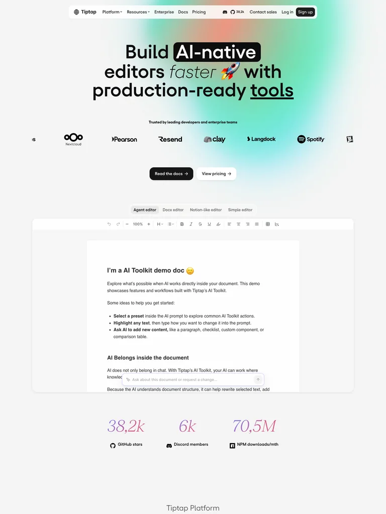
A compact mixed-style headline sits inside a colorful gradient field, followed by customer logos and an editor demonstration.
Useful for: Developer products that want a creative identity while keeping the product interface central.
# Design reference: Tiptap
Source: https://tiptap.dev/
Swipefile reference: https://swipefile.design/ref/ph-tiptap/
Captured: 2026-09-08. This is a dated reference, not a claim about the current live product.


## Objective
Adapt the visual principles below to my project. Use my own content and identity. Do not reproduce logos, proprietary copy, or brand assets.

## Reference notes
- mood: Expressive and technical
- colors: White, black, mint, coral, and cyan
- typography: Yellixvf headings with smaller supporting copy and clearly separated actions.
- layout: A compact mixed-style headline sits inside a colorful gradient field, followed by customer logos and an editor demonstration.
- motion: Still capture of the public page. Visit the source to study its animation and interactive behavior.
- texture: Soft mesh gradients, underlined words, and product panels
- dont: Use your own brand, copy, imagery, and product evidence; adapt the structure to your content.

Useful for: Developer products that want a creative identity while keeping the product interface central.

## Acceptance criteria
- Existing project conventions, design tokens, working functionality, and unrelated changes are preserved.
- Two or three reference principles clearly support the user's task; conflicts are resolved in favor of usability and the existing product.
- Reusable components and semantic HTML express the interface. Available licensed assets are used; important UI text is never rendered as a bitmap.
- Every visible control has a defined behavior. Loading, empty, error, success, disabled, and long-content states are specified where relevant. Demo data is clearly labeled.
- Navigation and content adapt at 375px, 768px, and 1440px without horizontal page overflow. Keyboard use, visible focus, labeled inputs, at least 44px touch targets, readable contrast, and reduced motion are supported.
- Verification distinguishes rendered behavior from proposals and identifies anything still requiring a backend or external service.

## Quality bar
Clear hierarchy, consistent spacing, restrained surfaces, and purposeful motion. Avoid decorative gradients, excessive cards, placeholder buttons, and invented metrics unless the project calls for them. Do not claim a feature is connected or tested without evidence.
 hover to scroll
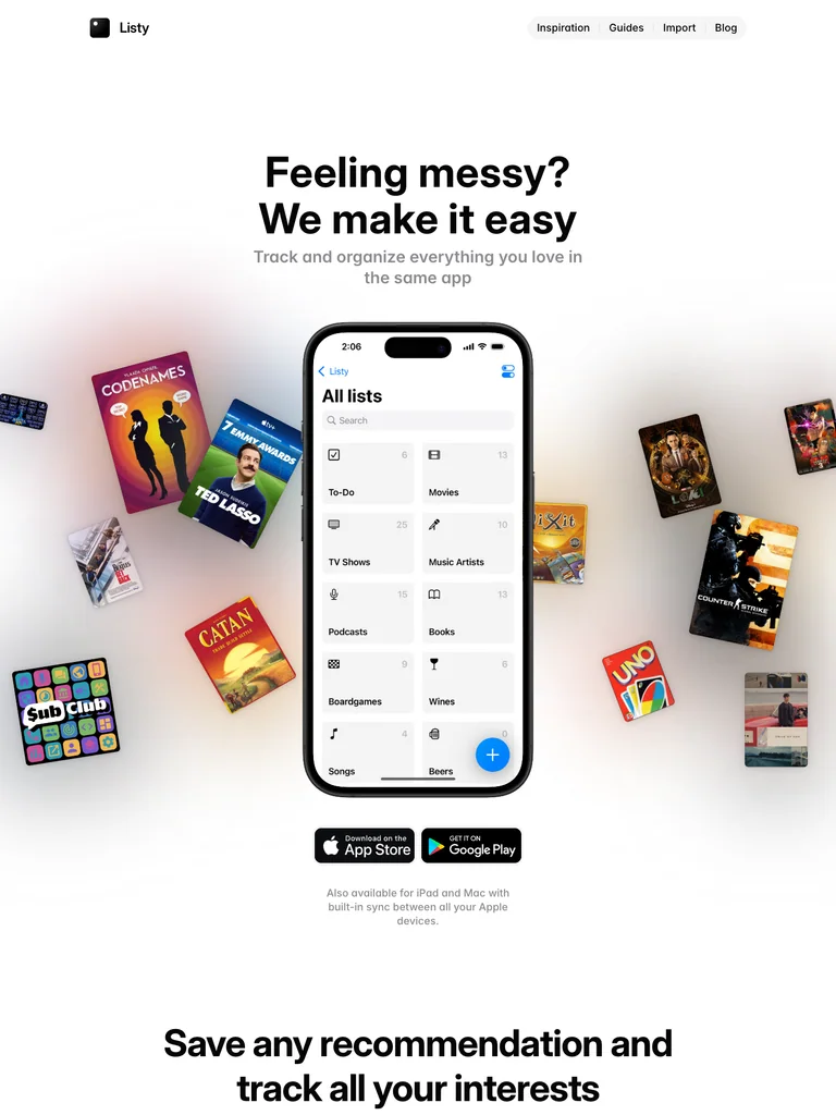
A centered headline rises above a phone interface surrounded by books, posters, and other saved objects.
Useful for: Personal organization products explaining a broad range of uses through recognizable objects.
# Design reference: Listy
Source: https://listy.is/
Swipefile reference: https://swipefile.design/ref/ph-listy-beta/
Captured: 2026-09-08. This is a dated reference, not a claim about the current live product.


## Objective
Adapt the visual principles below to my project. Use my own content and identity. Do not reproduce logos, proprietary copy, or brand assets.

## Reference notes
- mood: Orderly and playful
- colors: White, black, and varied cover-art colors
- typography: Inter Display headings with smaller supporting copy and clearly separated actions.
- layout: A centered headline rises above a phone interface surrounded by books, posters, and other saved objects.
- motion: Still capture of the public page. Visit the source to study its animation and interactive behavior.
- texture: Floating media covers and a realistic phone frame
- dont: Use your own brand, copy, imagery, and product evidence; adapt the structure to your content.

Useful for: Personal organization products explaining a broad range of uses through recognizable objects.

## Acceptance criteria
- Existing project conventions, design tokens, working functionality, and unrelated changes are preserved.
- Two or three reference principles clearly support the user's task; conflicts are resolved in favor of usability and the existing product.
- Reusable components and semantic HTML express the interface. Available licensed assets are used; important UI text is never rendered as a bitmap.
- Every visible control has a defined behavior. Loading, empty, error, success, disabled, and long-content states are specified where relevant. Demo data is clearly labeled.
- Navigation and content adapt at 375px, 768px, and 1440px without horizontal page overflow. Keyboard use, visible focus, labeled inputs, at least 44px touch targets, readable contrast, and reduced motion are supported.
- Verification distinguishes rendered behavior from proposals and identifies anything still requiring a backend or external service.

## Quality bar
Clear hierarchy, consistent spacing, restrained surfaces, and purposeful motion. Avoid decorative gradients, excessive cards, placeholder buttons, and invented metrics unless the project calls for them. Do not claim a feature is connected or tested without evidence.
 hover to scroll
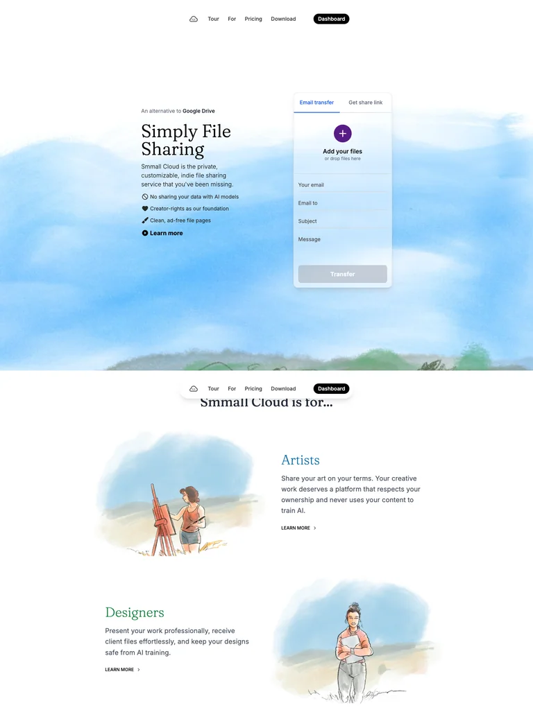
A small serif introduction and narrow upload panel float within a broad painted-sky landscape.
Useful for: File-sharing products using a calm visual setting around a very small interaction.
# Design reference: Smmall Cloud
Source: https://smmall.cloud/
Swipefile reference: https://swipefile.design/ref/ph-smmall-cloud/
Captured: 2026-09-08. This is a dated reference, not a claim about the current live product.


## Objective
Adapt the visual principles below to my project. Use my own content and identity. Do not reproduce logos, proprietary copy, or brand assets.

## Reference notes
- mood: Gentle and airy
- colors: White, sky blue, soft green, and charcoal
- typography: Fraunces headings with smaller supporting copy and clearly separated actions.
- layout: A small serif introduction and narrow upload panel float within a broad painted-sky landscape.
- motion: Still capture of the public page. Visit the source to study its animation and interactive behavior.
- texture: Watercolor-like scenery and translucent interface surfaces
- dont: Use your own brand, copy, imagery, and product evidence; adapt the structure to your content.

Useful for: File-sharing products using a calm visual setting around a very small interaction.

## Acceptance criteria
- Existing project conventions, design tokens, working functionality, and unrelated changes are preserved.
- Two or three reference principles clearly support the user's task; conflicts are resolved in favor of usability and the existing product.
- Reusable components and semantic HTML express the interface. Available licensed assets are used; important UI text is never rendered as a bitmap.
- Every visible control has a defined behavior. Loading, empty, error, success, disabled, and long-content states are specified where relevant. Demo data is clearly labeled.
- Navigation and content adapt at 375px, 768px, and 1440px without horizontal page overflow. Keyboard use, visible focus, labeled inputs, at least 44px touch targets, readable contrast, and reduced motion are supported.
- Verification distinguishes rendered behavior from proposals and identifies anything still requiring a backend or external service.

## Quality bar
Clear hierarchy, consistent spacing, restrained surfaces, and purposeful motion. Avoid decorative gradients, excessive cards, placeholder buttons, and invented metrics unless the project calls for them. Do not claim a feature is connected or tested without evidence.
 hover to scroll
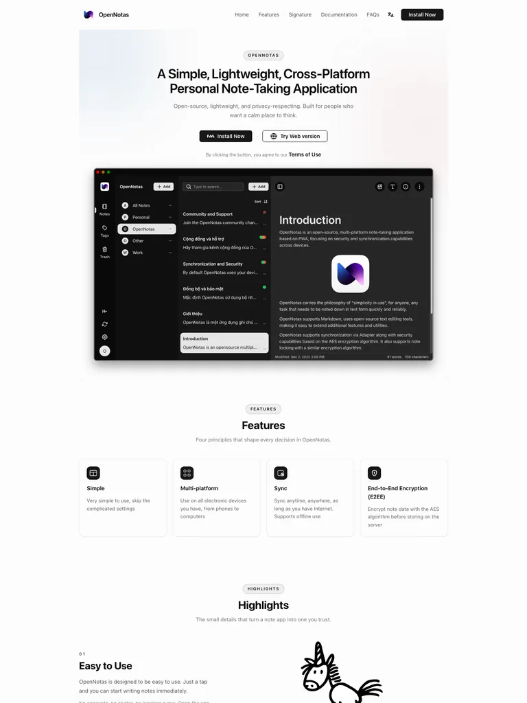
A centered introduction and compact download choices sit above a large dark note-taking interface framed as a desktop window.
Useful for: Cross-platform note tools that need to present a familiar workspace clearly.
# Design reference: OpenNotas
Source: https://opennotas.io/
Swipefile reference: https://swipefile.design/ref/ph-opennotas/
Captured: 2026-09-08. This is a dated reference, not a claim about the current live product.


## Objective
Adapt the visual principles below to my project. Use my own content and identity. Do not reproduce logos, proprietary copy, or brand assets.

## Reference notes
- mood: Simple and approachable
- colors: White, pale blue, lavender, and charcoal
- typography: ui-sans-serif headings with smaller supporting copy and clearly separated actions.
- layout: A centered introduction and compact download choices sit above a large dark note-taking interface framed as a desktop window.
- motion: Still capture of the public page. Visit the source to study its animation and interactive behavior.
- texture: Soft background tints, detailed product screenshots, and ink-like feature illustrations
- dont: Use your own brand, copy, imagery, and product evidence; adapt the structure to your content.

Useful for: Cross-platform note tools that need to present a familiar workspace clearly.

## Acceptance criteria
- Existing project conventions, design tokens, working functionality, and unrelated changes are preserved.
- Two or three reference principles clearly support the user's task; conflicts are resolved in favor of usability and the existing product.
- Reusable components and semantic HTML express the interface. Available licensed assets are used; important UI text is never rendered as a bitmap.
- Every visible control has a defined behavior. Loading, empty, error, success, disabled, and long-content states are specified where relevant. Demo data is clearly labeled.
- Navigation and content adapt at 375px, 768px, and 1440px without horizontal page overflow. Keyboard use, visible focus, labeled inputs, at least 44px touch targets, readable contrast, and reduced motion are supported.
- Verification distinguishes rendered behavior from proposals and identifies anything still requiring a backend or external service.

## Quality bar
Clear hierarchy, consistent spacing, restrained surfaces, and purposeful motion. Avoid decorative gradients, excessive cards, placeholder buttons, and invented metrics unless the project calls for them. Do not claim a feature is connected or tested without evidence.
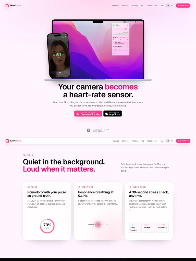 hover to scroll
Overlapping laptop and phone mockups lead into a bold statement with pink emphasis and paired app-download actions.
Useful for: Consumer apps demonstrating the same experience across desktop and mobile.
# Design reference: GlowPulse
Source: https://glowpulse.cc/
Swipefile reference: https://swipefile.design/ref/ph-glowpulse/
Captured: 2026-09-08. This is a dated reference, not a claim about the current live product.


## Objective
Adapt the visual principles below to my project. Use my own content and identity. Do not reproduce logos, proprietary copy, or brand assets.

## Reference notes
- mood: Bright and personal
- colors: Pale pink, fuchsia, lavender, and black
- typography: Geist Variable headings with smaller supporting copy and clearly separated actions.
- layout: Overlapping laptop and phone mockups lead into a bold statement with pink emphasis and paired app-download actions.
- motion: Still capture of the public page. Visit the source to study its animation and interactive behavior.
- texture: Pink gradient wash and overlapping device photography
- dont: Use your own brand, copy, imagery, and product evidence; adapt the structure to your content.

Useful for: Consumer apps demonstrating the same experience across desktop and mobile.

## Acceptance criteria
- Existing project conventions, design tokens, working functionality, and unrelated changes are preserved.
- Two or three reference principles clearly support the user's task; conflicts are resolved in favor of usability and the existing product.
- Reusable components and semantic HTML express the interface. Available licensed assets are used; important UI text is never rendered as a bitmap.
- Every visible control has a defined behavior. Loading, empty, error, success, disabled, and long-content states are specified where relevant. Demo data is clearly labeled.
- Navigation and content adapt at 375px, 768px, and 1440px without horizontal page overflow. Keyboard use, visible focus, labeled inputs, at least 44px touch targets, readable contrast, and reduced motion are supported.
- Verification distinguishes rendered behavior from proposals and identifies anything still requiring a backend or external service.

## Quality bar
Clear hierarchy, consistent spacing, restrained surfaces, and purposeful motion. Avoid decorative gradients, excessive cards, placeholder buttons, and invented metrics unless the project calls for them. Do not claim a feature is connected or tested without evidence.
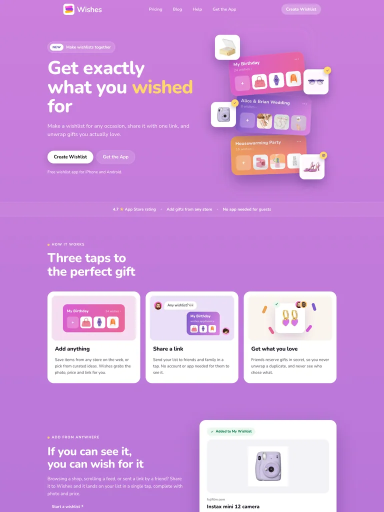 hover to scroll
A split hero pairs large white copy with floating wishlist cards, small icons, and two clear actions.
Useful for: Social shopping and gifting products showing the finished list as part of the hero.
# Design reference: Wishes
Source: https://wishes.app/
Swipefile reference: https://swipefile.design/ref/ph-wishes-2/
Captured: 2026-09-08. This is a dated reference, not a claim about the current live product.


## Objective
Adapt the visual principles below to my project. Use my own content and identity. Do not reproduce logos, proprietary copy, or brand assets.

## Reference notes
- mood: Cheerful and social
- colors: Lilac, pink, yellow, and white
- typography: Nunito headings with smaller supporting copy and clearly separated actions.
- layout: A split hero pairs large white copy with floating wishlist cards, small icons, and two clear actions.
- motion: Still capture of the public page. Visit the source to study its animation and interactive behavior.
- texture: Soft card shadows and playful product illustrations
- dont: Use your own brand, copy, imagery, and product evidence; adapt the structure to your content.

Useful for: Social shopping and gifting products showing the finished list as part of the hero.

## Acceptance criteria
- Existing project conventions, design tokens, working functionality, and unrelated changes are preserved.
- Two or three reference principles clearly support the user's task; conflicts are resolved in favor of usability and the existing product.
- Reusable components and semantic HTML express the interface. Available licensed assets are used; important UI text is never rendered as a bitmap.
- Every visible control has a defined behavior. Loading, empty, error, success, disabled, and long-content states are specified where relevant. Demo data is clearly labeled.
- Navigation and content adapt at 375px, 768px, and 1440px without horizontal page overflow. Keyboard use, visible focus, labeled inputs, at least 44px touch targets, readable contrast, and reduced motion are supported.
- Verification distinguishes rendered behavior from proposals and identifies anything still requiring a backend or external service.

## Quality bar
Clear hierarchy, consistent spacing, restrained surfaces, and purposeful motion. Avoid decorative gradients, excessive cards, placeholder buttons, and invented metrics unless the project calls for them. Do not claim a feature is connected or tested without evidence.
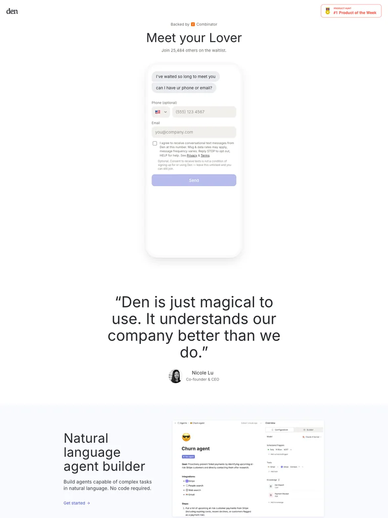 hover to scroll
A short centered introduction gives most of the opening screen to a tall phone-shaped conversation, with minimal surrounding decoration.
Useful for: Assistant products that can tell their story through an actual conversation layout.
# Design reference: Den
Source: https://getden.io/
Swipefile reference: https://swipefile.design/ref/ph-den/
Captured: 2026-09-08. This is a dated reference, not a claim about the current live product.


## Objective
Adapt the visual principles below to my project. Use my own content and identity. Do not reproduce logos, proprietary copy, or brand assets.

## Reference notes
- mood: Spare and conversational
- colors: White, black, and pale lavender
- typography: Inter headings with smaller supporting copy and clearly separated actions.
- layout: A short centered introduction gives most of the opening screen to a tall phone-shaped conversation, with minimal surrounding decoration.
- motion: Still capture of the public page. Visit the source to study its animation and interactive behavior.
- texture: Fine interface borders and a soft card shadow
- dont: Use your own brand, copy, imagery, and product evidence; adapt the structure to your content.

Useful for: Assistant products that can tell their story through an actual conversation layout.

## Acceptance criteria
- Existing project conventions, design tokens, working functionality, and unrelated changes are preserved.
- Two or three reference principles clearly support the user's task; conflicts are resolved in favor of usability and the existing product.
- Reusable components and semantic HTML express the interface. Available licensed assets are used; important UI text is never rendered as a bitmap.
- Every visible control has a defined behavior. Loading, empty, error, success, disabled, and long-content states are specified where relevant. Demo data is clearly labeled.
- Navigation and content adapt at 375px, 768px, and 1440px without horizontal page overflow. Keyboard use, visible focus, labeled inputs, at least 44px touch targets, readable contrast, and reduced motion are supported.
- Verification distinguishes rendered behavior from proposals and identifies anything still requiring a backend or external service.

## Quality bar
Clear hierarchy, consistent spacing, restrained surfaces, and purposeful motion. Avoid decorative gradients, excessive cards, placeholder buttons, and invented metrics unless the project calls for them. Do not claim a feature is connected or tested without evidence.
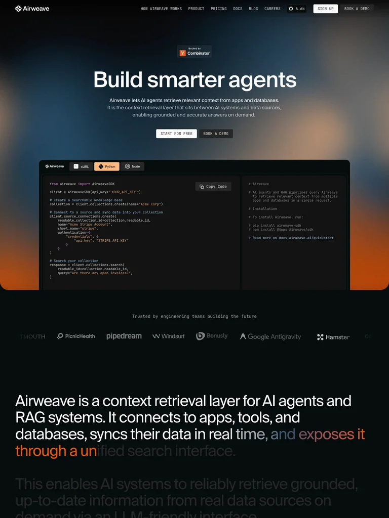 hover to scroll
A centered promise sits over an atmospheric gradient, with integration marks and two adjacent technical panels below.
Useful for: Search infrastructure connecting an abstract promise to concrete integration details.
# Design reference: Airweave
Source: https://airweave.ai/
Swipefile reference: https://swipefile.design/ref/ph-airweave-2/
Captured: 2026-09-08. This is a dated reference, not a claim about the current live product.


## Objective
Adapt the visual principles below to my project. Use my own content and identity. Do not reproduce logos, proprietary copy, or brand assets.

## Reference notes
- mood: Technical and atmospheric
- colors: Black, muted blue, amber, and white
- typography: Suisse Intl Medium headings with smaller supporting copy and clearly separated actions.
- layout: A centered promise sits over an atmospheric gradient, with integration marks and two adjacent technical panels below.
- motion: Still capture of the public page. Visit the source to study its animation and interactive behavior.
- texture: Blurred color fields and code/interface examples
- dont: Use your own brand, copy, imagery, and product evidence; adapt the structure to your content.

Useful for: Search infrastructure connecting an abstract promise to concrete integration details.

## Acceptance criteria
- Existing project conventions, design tokens, working functionality, and unrelated changes are preserved.
- Two or three reference principles clearly support the user's task; conflicts are resolved in favor of usability and the existing product.
- Reusable components and semantic HTML express the interface. Available licensed assets are used; important UI text is never rendered as a bitmap.
- Every visible control has a defined behavior. Loading, empty, error, success, disabled, and long-content states are specified where relevant. Demo data is clearly labeled.
- Navigation and content adapt at 375px, 768px, and 1440px without horizontal page overflow. Keyboard use, visible focus, labeled inputs, at least 44px touch targets, readable contrast, and reduced motion are supported.
- Verification distinguishes rendered behavior from proposals and identifies anything still requiring a backend or external service.

## Quality bar
Clear hierarchy, consistent spacing, restrained surfaces, and purposeful motion. Avoid decorative gradients, excessive cards, placeholder buttons, and invented metrics unless the project calls for them. Do not claim a feature is connected or tested without evidence.
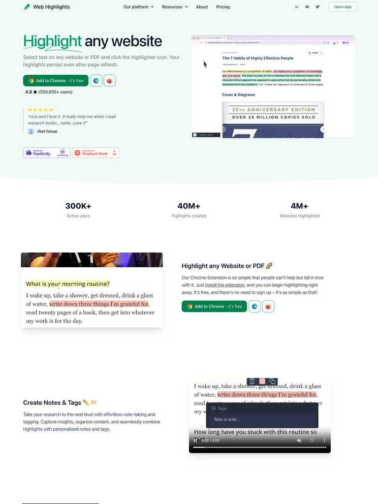 hover to scroll
A compact left-aligned introduction faces a demonstration video, followed by a simple row of usage figures.
Useful for: Browser utilities presenting their workflow alongside a direct install action.
# Design reference: Web Highlights
Source: https://web-highlights.com/
Swipefile reference: https://swipefile.design/ref/ph-web-highlights-pdf-web-highlighter/
Captured: 2026-09-08. This is a dated reference, not a claim about the current live product.


## Objective
Adapt the visual principles below to my project. Use my own content and identity. Do not reproduce logos, proprietary copy, or brand assets.

## Reference notes
- mood: Friendly and instructional
- colors: Pale mint, green, white, and charcoal
- typography: ui-sans-serif headings with smaller supporting copy and clearly separated actions.
- layout: A compact left-aligned introduction faces a demonstration video, followed by a simple row of usage figures.
- motion: Still capture of the public page. Visit the source to study its animation and interactive behavior.
- texture: Soft green surfaces and browser demonstration imagery
- dont: Use your own brand, copy, imagery, and product evidence; adapt the structure to your content.

Useful for: Browser utilities presenting their workflow alongside a direct install action.

## Acceptance criteria
- Existing project conventions, design tokens, working functionality, and unrelated changes are preserved.
- Two or three reference principles clearly support the user's task; conflicts are resolved in favor of usability and the existing product.
- Reusable components and semantic HTML express the interface. Available licensed assets are used; important UI text is never rendered as a bitmap.
- Every visible control has a defined behavior. Loading, empty, error, success, disabled, and long-content states are specified where relevant. Demo data is clearly labeled.
- Navigation and content adapt at 375px, 768px, and 1440px without horizontal page overflow. Keyboard use, visible focus, labeled inputs, at least 44px touch targets, readable contrast, and reduced motion are supported.
- Verification distinguishes rendered behavior from proposals and identifies anything still requiring a backend or external service.

## Quality bar
Clear hierarchy, consistent spacing, restrained surfaces, and purposeful motion. Avoid decorative gradients, excessive cards, placeholder buttons, and invented metrics unless the project calls for them. Do not claim a feature is connected or tested without evidence.
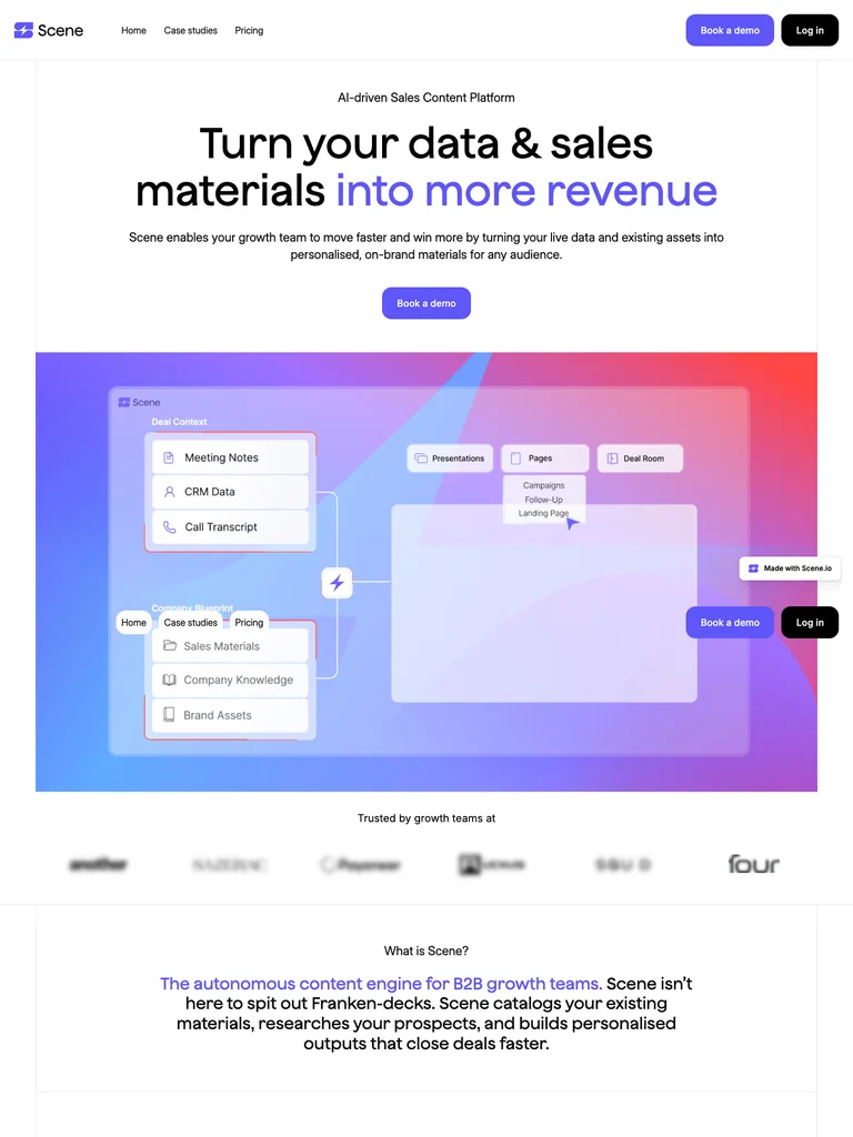 hover to scroll
A centered sales-content message emphasizes the outcome in violet, followed by a broad colorful product showcase.
Useful for: B2B products connecting a clear commercial outcome to a visible content example.
# Design reference: Scene
Source: https://scene.io/
Swipefile reference: https://swipefile.design/ref/ph-scene-3/
Captured: 2026-09-08. This is a dated reference, not a claim about the current live product.


## Objective
Adapt the visual principles below to my project. Use my own content and identity. Do not reproduce logos, proprietary copy, or brand assets.

## Reference notes
- mood: Bright and straightforward
- colors: White, violet, black, and coral
- typography: wnhqgm0m headings with smaller supporting copy and clearly separated actions.
- layout: A centered sales-content message emphasizes the outcome in violet, followed by a broad colorful product showcase.
- motion: Still capture of the public page. Visit the source to study its animation and interactive behavior.
- texture: Clean interface frames and vivid gradient media
- dont: Use your own brand, copy, imagery, and product evidence; adapt the structure to your content.

Useful for: B2B products connecting a clear commercial outcome to a visible content example.

## Acceptance criteria
- Existing project conventions, design tokens, working functionality, and unrelated changes are preserved.
- Two or three reference principles clearly support the user's task; conflicts are resolved in favor of usability and the existing product.
- Reusable components and semantic HTML express the interface. Available licensed assets are used; important UI text is never rendered as a bitmap.
- Every visible control has a defined behavior. Loading, empty, error, success, disabled, and long-content states are specified where relevant. Demo data is clearly labeled.
- Navigation and content adapt at 375px, 768px, and 1440px without horizontal page overflow. Keyboard use, visible focus, labeled inputs, at least 44px touch targets, readable contrast, and reduced motion are supported.
- Verification distinguishes rendered behavior from proposals and identifies anything still requiring a backend or external service.

## Quality bar
Clear hierarchy, consistent spacing, restrained surfaces, and purposeful motion. Avoid decorative gradients, excessive cards, placeholder buttons, and invented metrics unless the project calls for them. Do not claim a feature is connected or tested without evidence.
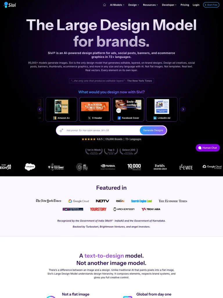 hover to scroll
A large centered heading leads into selectable design-format cards and a bright prompt bar, with example work throughout the page.
Useful for: Design generators that need to demonstrate output variety around a simple prompt interaction.
# Design reference: Sivi
Source: https://sivi.ai/
Swipefile reference: https://swipefile.design/ref/ph-sivi-ai/
Captured: 2026-09-08. This is a dated reference, not a claim about the current live product.


## Objective
Adapt the visual principles below to my project. Use my own content and identity. Do not reproduce logos, proprietary copy, or brand assets.

## Reference notes
- mood: Expressive and expansive
- colors: Black, deep violet, lavender, and cyan
- typography: Instrument Sans headings with smaller supporting copy and clearly separated actions.
- layout: A large centered heading leads into selectable design-format cards and a bright prompt bar, with example work throughout the page.
- motion: Still capture of the public page. Visit the source to study its animation and interactive behavior.
- texture: Purple light effects and thumbnail-rich product choices
- dont: Use your own brand, copy, imagery, and product evidence; adapt the structure to your content.

Useful for: Design generators that need to demonstrate output variety around a simple prompt interaction.

## Acceptance criteria
- Existing project conventions, design tokens, working functionality, and unrelated changes are preserved.
- Two or three reference principles clearly support the user's task; conflicts are resolved in favor of usability and the existing product.
- Reusable components and semantic HTML express the interface. Available licensed assets are used; important UI text is never rendered as a bitmap.
- Every visible control has a defined behavior. Loading, empty, error, success, disabled, and long-content states are specified where relevant. Demo data is clearly labeled.
- Navigation and content adapt at 375px, 768px, and 1440px without horizontal page overflow. Keyboard use, visible focus, labeled inputs, at least 44px touch targets, readable contrast, and reduced motion are supported.
- Verification distinguishes rendered behavior from proposals and identifies anything still requiring a backend or external service.

## Quality bar
Clear hierarchy, consistent spacing, restrained surfaces, and purposeful motion. Avoid decorative gradients, excessive cards, placeholder buttons, and invented metrics unless the project calls for them. Do not claim a feature is connected or tested without evidence.
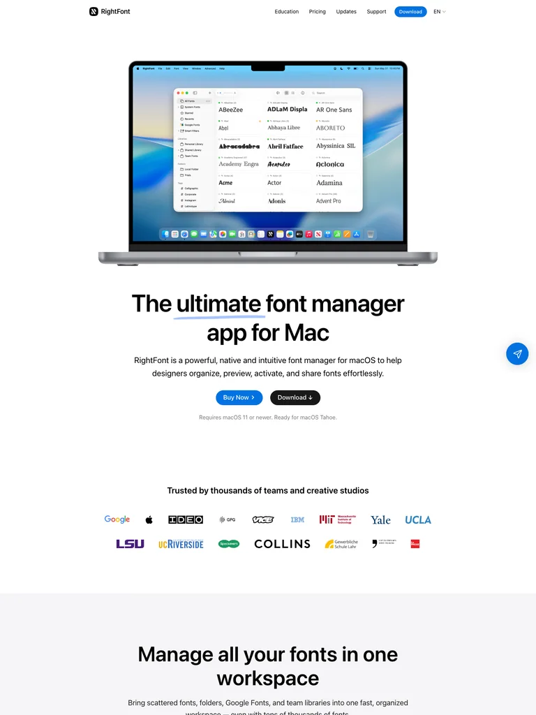 hover to scroll
A large laptop preview appears before the centered product statement, making the font-management interface the opening visual.
Useful for: Desktop creative tools where the working interface is the strongest evidence of value.
# Design reference: RightFont
Source: https://rightfontapp.com/
Swipefile reference: https://swipefile.design/ref/ph-rightfont/
Captured: 2026-09-08. This is a dated reference, not a claim about the current live product.


## Objective
Adapt the visual principles below to my project. Use my own content and identity. Do not reproduce logos, proprietary copy, or brand assets.

## Reference notes
- mood: Crisp and editorial
- colors: White, black, sky blue, and gray
- typography: -apple-system headings with smaller supporting copy and clearly separated actions.
- layout: A large laptop preview appears before the centered product statement, making the font-management interface the opening visual.
- motion: Still capture of the public page. Visit the source to study its animation and interactive behavior.
- texture: Realistic device framing and type-rich interface imagery
- dont: Use your own brand, copy, imagery, and product evidence; adapt the structure to your content.

Useful for: Desktop creative tools where the working interface is the strongest evidence of value.

## Acceptance criteria
- Existing project conventions, design tokens, working functionality, and unrelated changes are preserved.
- Two or three reference principles clearly support the user's task; conflicts are resolved in favor of usability and the existing product.
- Reusable components and semantic HTML express the interface. Available licensed assets are used; important UI text is never rendered as a bitmap.
- Every visible control has a defined behavior. Loading, empty, error, success, disabled, and long-content states are specified where relevant. Demo data is clearly labeled.
- Navigation and content adapt at 375px, 768px, and 1440px without horizontal page overflow. Keyboard use, visible focus, labeled inputs, at least 44px touch targets, readable contrast, and reduced motion are supported.
- Verification distinguishes rendered behavior from proposals and identifies anything still requiring a backend or external service.

## Quality bar
Clear hierarchy, consistent spacing, restrained surfaces, and purposeful motion. Avoid decorative gradients, excessive cards, placeholder buttons, and invented metrics unless the project calls for them. Do not claim a feature is connected or tested without evidence.
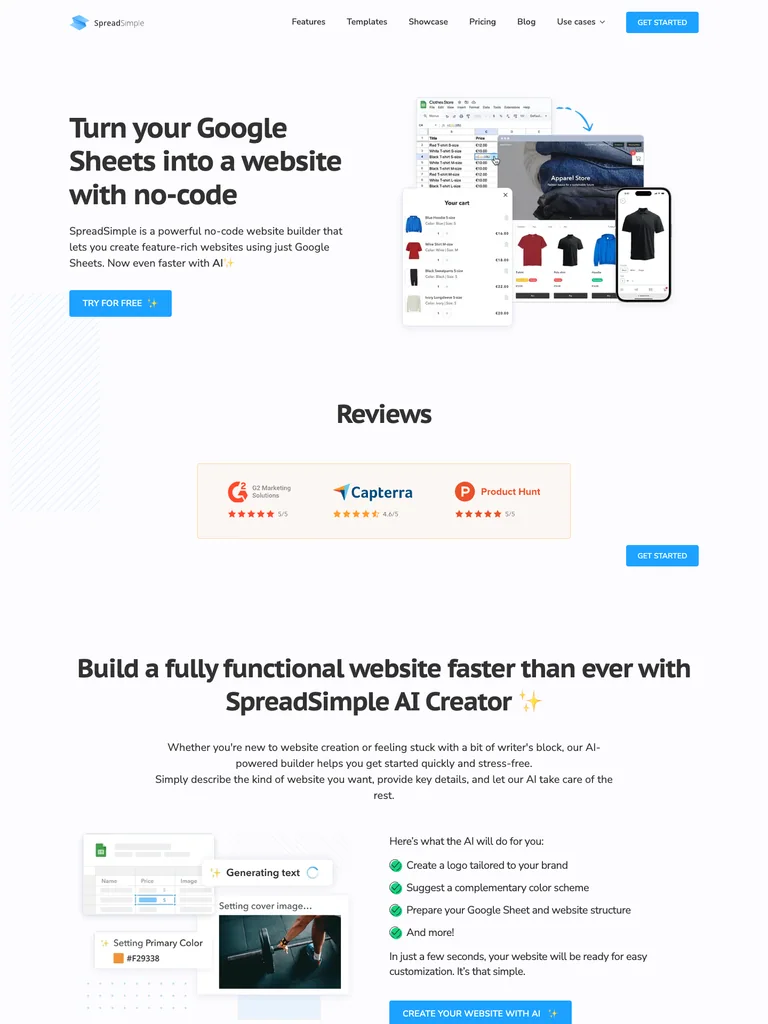 hover to scroll
A left-aligned headline faces layered spreadsheet and storefront previews, followed quickly by review evidence.
Useful for: No-code tools explaining a source-to-output transformation with adjacent examples.
# Design reference: SpreadSimple
Source: https://spreadsimple.com/
Swipefile reference: https://swipefile.design/ref/ph-spreadsimple/
Captured: 2026-09-08. This is a dated reference, not a claim about the current live product.


## Objective
Adapt the visual principles below to my project. Use my own content and identity. Do not reproduce logos, proprietary copy, or brand assets.

## Reference notes
- mood: Practical and accessible
- colors: White, cyan, light gray, and charcoal
- typography: PT Sans headings with smaller supporting copy and clearly separated actions.
- layout: A left-aligned headline faces layered spreadsheet and storefront previews, followed quickly by review evidence.
- motion: Still capture of the public page. Visit the source to study its animation and interactive behavior.
- texture: Overlapping browser windows and small product screenshots
- dont: Use your own brand, copy, imagery, and product evidence; adapt the structure to your content.

Useful for: No-code tools explaining a source-to-output transformation with adjacent examples.

## Acceptance criteria
- Existing project conventions, design tokens, working functionality, and unrelated changes are preserved.
- Two or three reference principles clearly support the user's task; conflicts are resolved in favor of usability and the existing product.
- Reusable components and semantic HTML express the interface. Available licensed assets are used; important UI text is never rendered as a bitmap.
- Every visible control has a defined behavior. Loading, empty, error, success, disabled, and long-content states are specified where relevant. Demo data is clearly labeled.
- Navigation and content adapt at 375px, 768px, and 1440px without horizontal page overflow. Keyboard use, visible focus, labeled inputs, at least 44px touch targets, readable contrast, and reduced motion are supported.
- Verification distinguishes rendered behavior from proposals and identifies anything still requiring a backend or external service.

## Quality bar
Clear hierarchy, consistent spacing, restrained surfaces, and purposeful motion. Avoid decorative gradients, excessive cards, placeholder buttons, and invented metrics unless the project calls for them. Do not claim a feature is connected or tested without evidence.
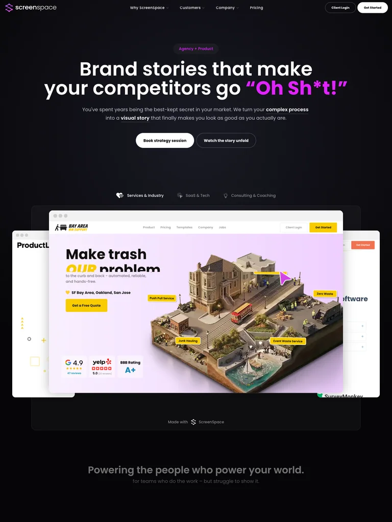 hover to scroll
A large centered headline uses a magenta accent phrase, with service labels and a wide product-story example below.
Useful for: Creative B2B services using provocative typography and tangible work examples.
# Design reference: ScreenSpace
Source: https://screenspace.io/
Swipefile reference: https://swipefile.design/ref/ph-screenspace/
Captured: 2026-09-08. This is a dated reference, not a claim about the current live product.


## Objective
Adapt the visual principles below to my project. Use my own content and identity. Do not reproduce logos, proprietary copy, or brand assets.

## Reference notes
- mood: Bold and theatrical
- colors: Charcoal, white, violet, and pink
- typography: Poppins headings with smaller supporting copy and clearly separated actions.
- layout: A large centered headline uses a magenta accent phrase, with service labels and a wide product-story example below.
- motion: Still capture of the public page. Visit the source to study its animation and interactive behavior.
- texture: Dark gradient surfaces and colorful embedded demonstrations
- dont: Use your own brand, copy, imagery, and product evidence; adapt the structure to your content.

Useful for: Creative B2B services using provocative typography and tangible work examples.

## Acceptance criteria
- Existing project conventions, design tokens, working functionality, and unrelated changes are preserved.
- Two or three reference principles clearly support the user's task; conflicts are resolved in favor of usability and the existing product.
- Reusable components and semantic HTML express the interface. Available licensed assets are used; important UI text is never rendered as a bitmap.
- Every visible control has a defined behavior. Loading, empty, error, success, disabled, and long-content states are specified where relevant. Demo data is clearly labeled.
- Navigation and content adapt at 375px, 768px, and 1440px without horizontal page overflow. Keyboard use, visible focus, labeled inputs, at least 44px touch targets, readable contrast, and reduced motion are supported.
- Verification distinguishes rendered behavior from proposals and identifies anything still requiring a backend or external service.

## Quality bar
Clear hierarchy, consistent spacing, restrained surfaces, and purposeful motion. Avoid decorative gradients, excessive cards, placeholder buttons, and invented metrics unless the project calls for them. Do not claim a feature is connected or tested without evidence.
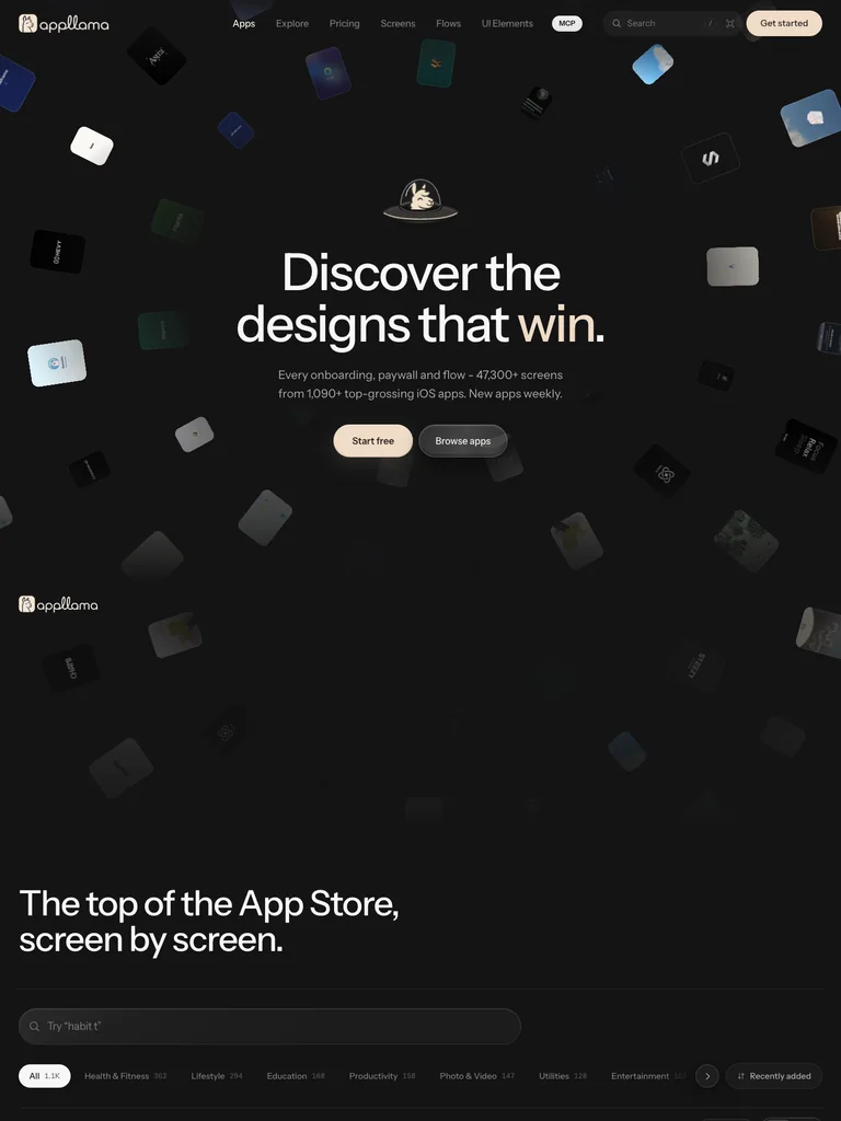 hover to scroll
A centered statement and paired actions sit within a field of floating tilted app tiles, leading into a library of screens.
Useful for: Design-reference libraries that show the breadth of their visual material immediately.
# Design reference: Appllama
Source: https://appllama.io/
Swipefile reference: https://swipefile.design/ref/ph-appllama/
Captured: 2026-09-08. This is a dated reference, not a claim about the current live product.


## Objective
Adapt the visual principles below to my project. Use my own content and identity. Do not reproduce logos, proprietary copy, or brand assets.

## Reference notes
- mood: Playful and exploratory
- colors: Black, ivory, gray, and varied app colors
- typography: Instrument Sans headings with smaller supporting copy and clearly separated actions.
- layout: A centered statement and paired actions sit within a field of floating tilted app tiles, leading into a library of screens.
- motion: Still capture of the public page. Visit the source to study its animation and interactive behavior.
- texture: Scattered 3D-like app tiles and dark catalog surfaces
- dont: Use your own brand, copy, imagery, and product evidence; adapt the structure to your content.

Useful for: Design-reference libraries that show the breadth of their visual material immediately.

## Acceptance criteria
- Existing project conventions, design tokens, working functionality, and unrelated changes are preserved.
- Two or three reference principles clearly support the user's task; conflicts are resolved in favor of usability and the existing product.
- Reusable components and semantic HTML express the interface. Available licensed assets are used; important UI text is never rendered as a bitmap.
- Every visible control has a defined behavior. Loading, empty, error, success, disabled, and long-content states are specified where relevant. Demo data is clearly labeled.
- Navigation and content adapt at 375px, 768px, and 1440px without horizontal page overflow. Keyboard use, visible focus, labeled inputs, at least 44px touch targets, readable contrast, and reduced motion are supported.
- Verification distinguishes rendered behavior from proposals and identifies anything still requiring a backend or external service.

## Quality bar
Clear hierarchy, consistent spacing, restrained surfaces, and purposeful motion. Avoid decorative gradients, excessive cards, placeholder buttons, and invented metrics unless the project calls for them. Do not claim a feature is connected or tested without evidence.
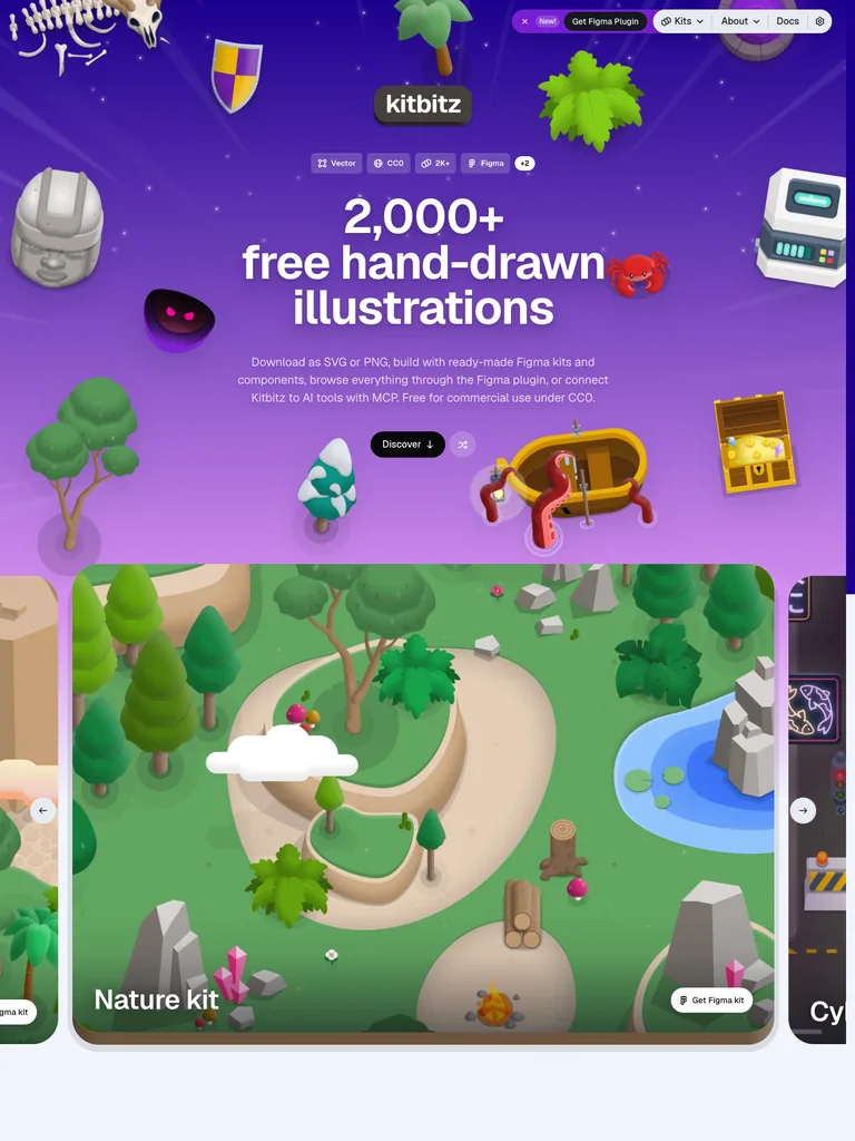 hover to scroll
A bold centered resource count and category chips sit on a radiant purple field above the illustration collection.
Useful for: Creative resource sites making a large library feel approachable and easy to browse.
# Design reference: Kitbitz
Source: https://kitbitz.art/
Swipefile reference: https://swipefile.design/ref/ph-kitbitz/
Captured: 2026-09-08. This is a dated reference, not a claim about the current live product.


## Objective
Adapt the visual principles below to my project. Use my own content and identity. Do not reproduce logos, proprietary copy, or brand assets.

## Reference notes
- mood: Playful and generous
- colors: Purple, lavender, white, and black
- typography: Geist Variable headings with smaller supporting copy and clearly separated actions.
- layout: A bold centered resource count and category chips sit on a radiant purple field above the illustration collection.
- motion: Still capture of the public page. Visit the source to study its animation and interactive behavior.
- texture: Hand-drawn marks, star-like accents, and a purple gradient
- dont: Use your own brand, copy, imagery, and product evidence; adapt the structure to your content.

Useful for: Creative resource sites making a large library feel approachable and easy to browse.

## Acceptance criteria
- Existing project conventions, design tokens, working functionality, and unrelated changes are preserved.
- Two or three reference principles clearly support the user's task; conflicts are resolved in favor of usability and the existing product.
- Reusable components and semantic HTML express the interface. Available licensed assets are used; important UI text is never rendered as a bitmap.
- Every visible control has a defined behavior. Loading, empty, error, success, disabled, and long-content states are specified where relevant. Demo data is clearly labeled.
- Navigation and content adapt at 375px, 768px, and 1440px without horizontal page overflow. Keyboard use, visible focus, labeled inputs, at least 44px touch targets, readable contrast, and reduced motion are supported.
- Verification distinguishes rendered behavior from proposals and identifies anything still requiring a backend or external service.

## Quality bar
Clear hierarchy, consistent spacing, restrained surfaces, and purposeful motion. Avoid decorative gradients, excessive cards, placeholder buttons, and invented metrics unless the project calls for them. Do not claim a feature is connected or tested without evidence.
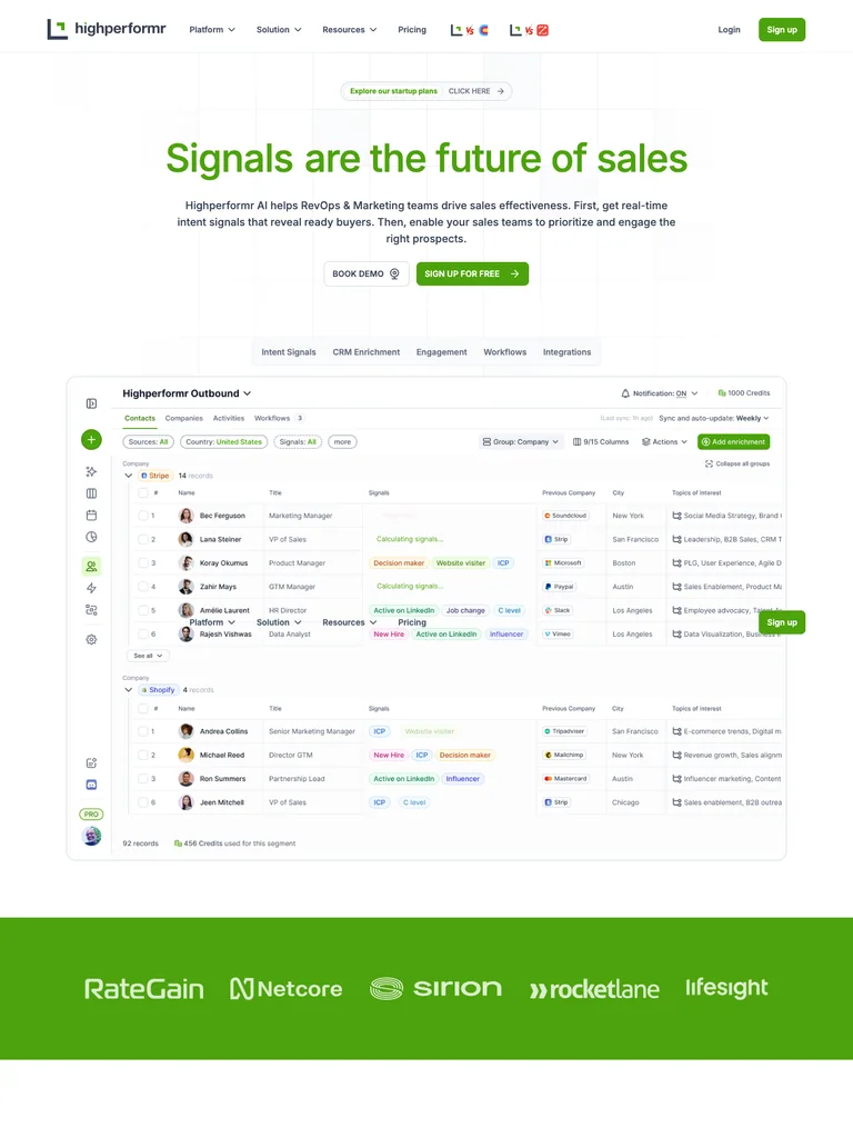 hover to scroll
A green headline introduces the product above a tabbed interface demonstration and detailed contact-data table.
Useful for: Data products demonstrating useful information density beneath a simple marketing message.
# Design reference: Highperformr
Source: https://highperformr.ai/
Swipefile reference: https://swipefile.design/ref/ph-highperformr-ai/
Captured: 2026-09-08. This is a dated reference, not a claim about the current live product.


## Objective
Adapt the visual principles below to my project. Use my own content and identity. Do not reproduce logos, proprietary copy, or brand assets.

## Reference notes
- mood: Clear and energetic
- colors: White, fresh green, black, and pale gray
- typography: Inter headings with smaller supporting copy and clearly separated actions.
- layout: A green headline introduces the product above a tabbed interface demonstration and detailed contact-data table.
- motion: Still capture of the public page. Visit the source to study its animation and interactive behavior.
- texture: Fine table rules, small status chips, and subtle tinted surfaces
- dont: Use your own brand, copy, imagery, and product evidence; adapt the structure to your content.

Useful for: Data products demonstrating useful information density beneath a simple marketing message.

## Acceptance criteria
- Existing project conventions, design tokens, working functionality, and unrelated changes are preserved.
- Two or three reference principles clearly support the user's task; conflicts are resolved in favor of usability and the existing product.
- Reusable components and semantic HTML express the interface. Available licensed assets are used; important UI text is never rendered as a bitmap.
- Every visible control has a defined behavior. Loading, empty, error, success, disabled, and long-content states are specified where relevant. Demo data is clearly labeled.
- Navigation and content adapt at 375px, 768px, and 1440px without horizontal page overflow. Keyboard use, visible focus, labeled inputs, at least 44px touch targets, readable contrast, and reduced motion are supported.
- Verification distinguishes rendered behavior from proposals and identifies anything still requiring a backend or external service.

## Quality bar
Clear hierarchy, consistent spacing, restrained surfaces, and purposeful motion. Avoid decorative gradients, excessive cards, placeholder buttons, and invented metrics unless the project calls for them. Do not claim a feature is connected or tested without evidence.
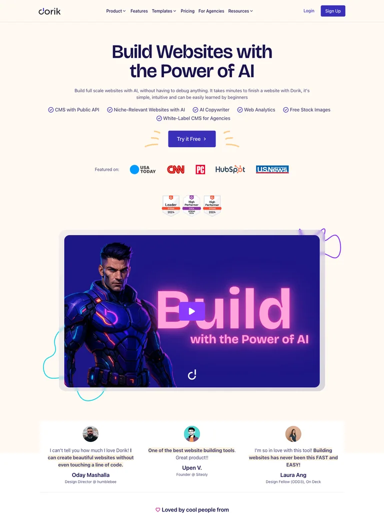 hover to scroll
A centered two-line heading leads into compact feature labels, a purple action, press logos, and a broad video panel.
Useful for: Website builders guiding visitors through benefits, social proof, and demonstration in sequence.
# Design reference: Dorik
Source: https://dorik.com/
Swipefile reference: https://swipefile.design/ref/ph-dorik/
Captured: 2026-09-08. This is a dated reference, not a claim about the current live product.


## Objective
Adapt the visual principles below to my project. Use my own content and identity. Do not reproduce logos, proprietary copy, or brand assets.

## Reference notes
- mood: Warm and welcoming
- colors: Cream, deep purple, lavender, and gold
- typography: BG-600 headings with smaller supporting copy and clearly separated actions.
- layout: A centered two-line heading leads into compact feature labels, a purple action, press logos, and a broad video panel.
- motion: Still capture of the public page. Visit the source to study its animation and interactive behavior.
- texture: Hand-drawn accent strokes and warm flat backgrounds
- dont: Use your own brand, copy, imagery, and product evidence; adapt the structure to your content.

Useful for: Website builders guiding visitors through benefits, social proof, and demonstration in sequence.

## Acceptance criteria
- Existing project conventions, design tokens, working functionality, and unrelated changes are preserved.
- Two or three reference principles clearly support the user's task; conflicts are resolved in favor of usability and the existing product.
- Reusable components and semantic HTML express the interface. Available licensed assets are used; important UI text is never rendered as a bitmap.
- Every visible control has a defined behavior. Loading, empty, error, success, disabled, and long-content states are specified where relevant. Demo data is clearly labeled.
- Navigation and content adapt at 375px, 768px, and 1440px without horizontal page overflow. Keyboard use, visible focus, labeled inputs, at least 44px touch targets, readable contrast, and reduced motion are supported.
- Verification distinguishes rendered behavior from proposals and identifies anything still requiring a backend or external service.

## Quality bar
Clear hierarchy, consistent spacing, restrained surfaces, and purposeful motion. Avoid decorative gradients, excessive cards, placeholder buttons, and invented metrics unless the project calls for them. Do not claim a feature is connected or tested without evidence.
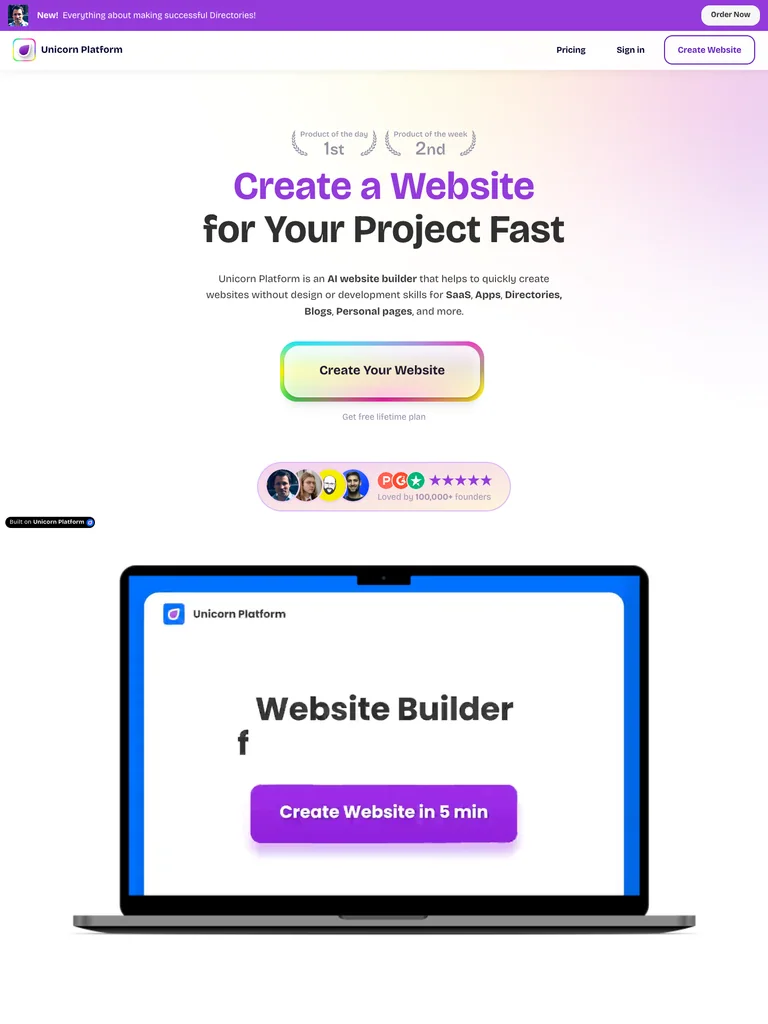 hover to scroll
Centered type and a large rounded action dominate the hero, with small award laurels above and compact social proof below.
Useful for: Landing-page builders that want an obvious first step and a lighthearted personality.
# Design reference: Unicorn Platform
Source: https://unicornplatform.com/
Swipefile reference: https://swipefile.design/ref/ph-unicorn-platform/
Captured: 2026-09-08. This is a dated reference, not a claim about the current live product.


## Objective
Adapt the visual principles below to my project. Use my own content and identity. Do not reproduce logos, proprietary copy, or brand assets.

## Reference notes
- mood: Friendly and upbeat
- colors: White, violet, yellow, pink, and green
- typography: Bricolage Grotesque headings with smaller supporting copy and clearly separated actions.
- layout: Centered type and a large rounded action dominate the hero, with small award laurels above and compact social proof below.
- motion: Still capture of the public page. Visit the source to study its animation and interactive behavior.
- texture: Soft pastel glow and a multicolor button outline
- dont: Use your own brand, copy, imagery, and product evidence; adapt the structure to your content.

Useful for: Landing-page builders that want an obvious first step and a lighthearted personality.

## Acceptance criteria
- Existing project conventions, design tokens, working functionality, and unrelated changes are preserved.
- Two or three reference principles clearly support the user's task; conflicts are resolved in favor of usability and the existing product.
- Reusable components and semantic HTML express the interface. Available licensed assets are used; important UI text is never rendered as a bitmap.
- Every visible control has a defined behavior. Loading, empty, error, success, disabled, and long-content states are specified where relevant. Demo data is clearly labeled.
- Navigation and content adapt at 375px, 768px, and 1440px without horizontal page overflow. Keyboard use, visible focus, labeled inputs, at least 44px touch targets, readable contrast, and reduced motion are supported.
- Verification distinguishes rendered behavior from proposals and identifies anything still requiring a backend or external service.

## Quality bar
Clear hierarchy, consistent spacing, restrained surfaces, and purposeful motion. Avoid decorative gradients, excessive cards, placeholder buttons, and invented metrics unless the project calls for them. Do not claim a feature is connected or tested without evidence.
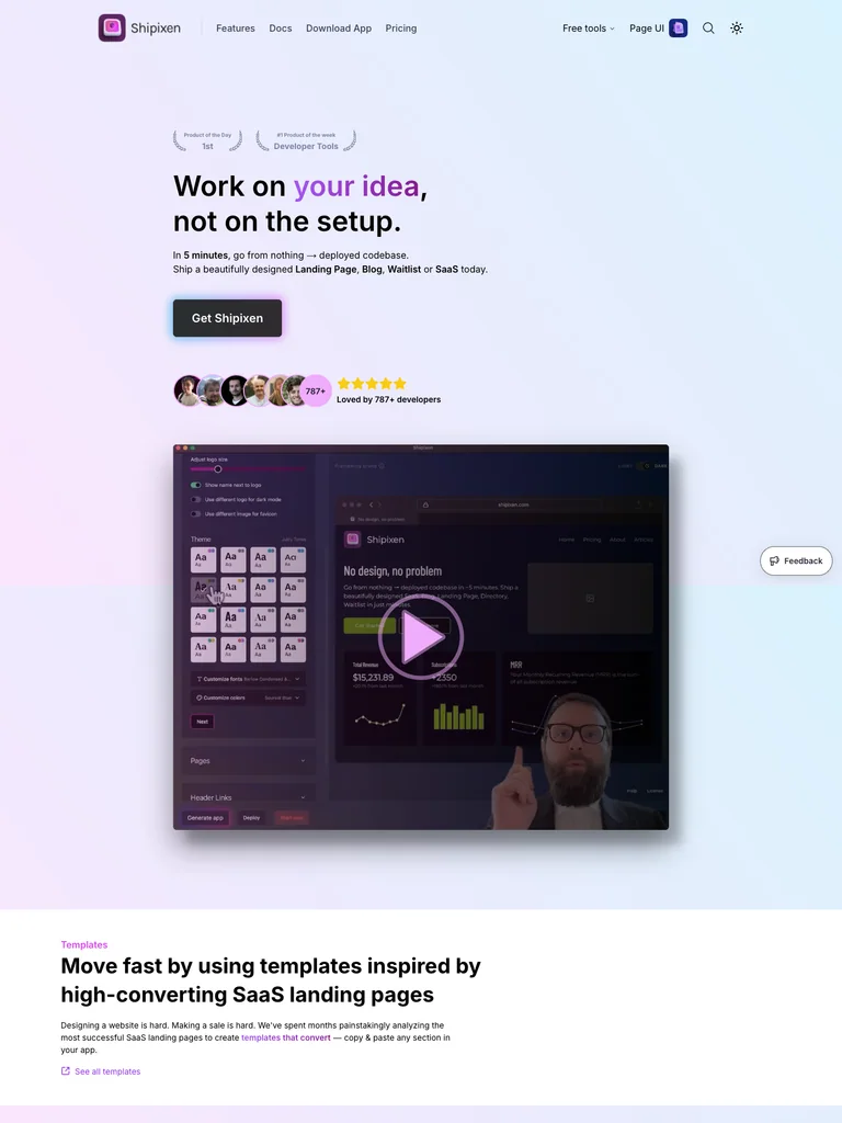 hover to scroll
A left-aligned promise and dark download button sit on a pastel wash above a large dark development preview.
Useful for: Developer utilities combining a welcoming marketing surface with a concrete technical preview.
# Design reference: Shipixen
Source: https://shipixen.com/
Swipefile reference: https://swipefile.design/ref/ph-shipixen/
Captured: 2026-09-08. This is a dated reference, not a claim about the current live product.


## Objective
Adapt the visual principles below to my project. Use my own content and identity. Do not reproduce logos, proprietary copy, or brand assets.

## Reference notes
- mood: Soft and technical
- colors: Pale lavender, icy blue, purple, and near-black
- typography: __Inter_f367f3 headings with smaller supporting copy and clearly separated actions.
- layout: A left-aligned promise and dark download button sit on a pastel wash above a large dark development preview.
- motion: Still capture of the public page. Visit the source to study its animation and interactive behavior.
- texture: Gentle gradient background and a contrasting dark product window
- dont: Use your own brand, copy, imagery, and product evidence; adapt the structure to your content.

Useful for: Developer utilities combining a welcoming marketing surface with a concrete technical preview.

## Acceptance criteria
- Existing project conventions, design tokens, working functionality, and unrelated changes are preserved.
- Two or three reference principles clearly support the user's task; conflicts are resolved in favor of usability and the existing product.
- Reusable components and semantic HTML express the interface. Available licensed assets are used; important UI text is never rendered as a bitmap.
- Every visible control has a defined behavior. Loading, empty, error, success, disabled, and long-content states are specified where relevant. Demo data is clearly labeled.
- Navigation and content adapt at 375px, 768px, and 1440px without horizontal page overflow. Keyboard use, visible focus, labeled inputs, at least 44px touch targets, readable contrast, and reduced motion are supported.
- Verification distinguishes rendered behavior from proposals and identifies anything still requiring a backend or external service.

## Quality bar
Clear hierarchy, consistent spacing, restrained surfaces, and purposeful motion. Avoid decorative gradients, excessive cards, placeholder buttons, and invented metrics unless the project calls for them. Do not claim a feature is connected or tested without evidence.
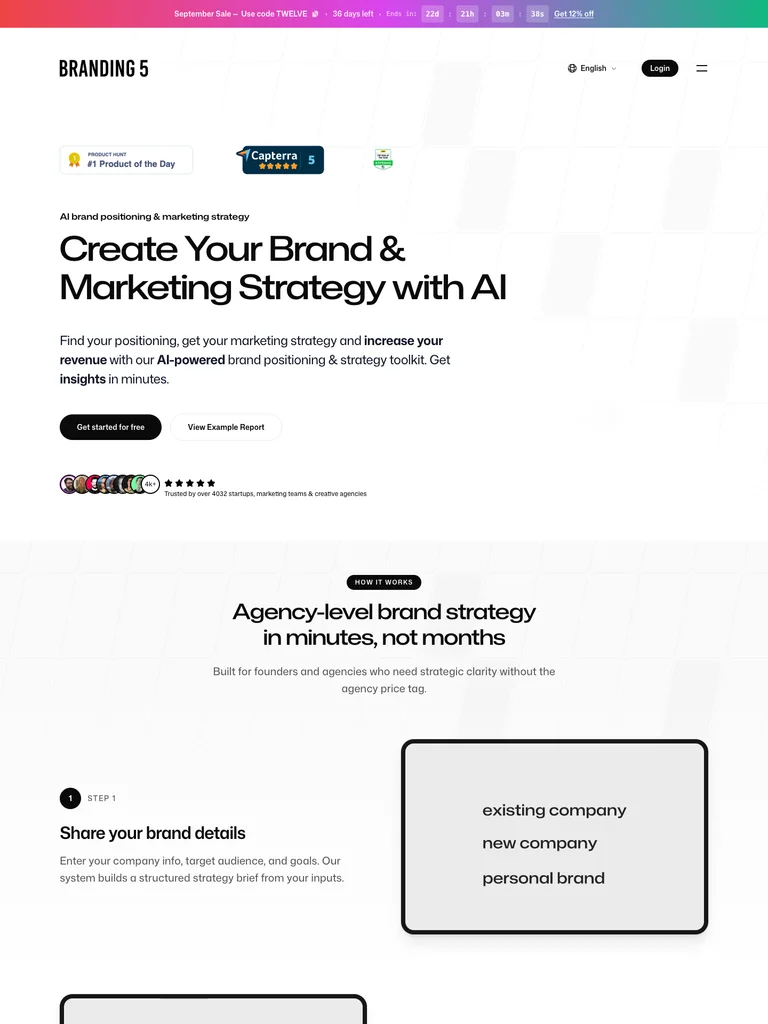 hover to scroll
A broad left-aligned heading and compact action follow a short row of review badges, with expansive whitespace around the introduction.
Useful for: Strategy tools that need a clear editorial hierarchy before more detailed examples.
# Design reference: Branding5
Source: https://branding5.com/
Swipefile reference: https://swipefile.design/ref/ph-branding5/
Captured: 2026-09-08. This is a dated reference, not a claim about the current live product.


## Objective
Adapt the visual principles below to my project. Use my own content and identity. Do not reproduce logos, proprietary copy, or brand assets.

## Reference notes
- mood: Direct and analytical
- colors: White, black, and small multicolor accents
- typography: monaSans headings with smaller supporting copy and clearly separated actions.
- layout: A broad left-aligned heading and compact action follow a short row of review badges, with expansive whitespace around the introduction.
- motion: Still capture of the public page. Visit the source to study its animation and interactive behavior.
- texture: Thin rules, compact badges, and restrained interface imagery
- dont: Use your own brand, copy, imagery, and product evidence; adapt the structure to your content.

Useful for: Strategy tools that need a clear editorial hierarchy before more detailed examples.

## Acceptance criteria
- Existing project conventions, design tokens, working functionality, and unrelated changes are preserved.
- Two or three reference principles clearly support the user's task; conflicts are resolved in favor of usability and the existing product.
- Reusable components and semantic HTML express the interface. Available licensed assets are used; important UI text is never rendered as a bitmap.
- Every visible control has a defined behavior. Loading, empty, error, success, disabled, and long-content states are specified where relevant. Demo data is clearly labeled.
- Navigation and content adapt at 375px, 768px, and 1440px without horizontal page overflow. Keyboard use, visible focus, labeled inputs, at least 44px touch targets, readable contrast, and reduced motion are supported.
- Verification distinguishes rendered behavior from proposals and identifies anything still requiring a backend or external service.

## Quality bar
Clear hierarchy, consistent spacing, restrained surfaces, and purposeful motion. Avoid decorative gradients, excessive cards, placeholder buttons, and invented metrics unless the project calls for them. Do not claim a feature is connected or tested without evidence.
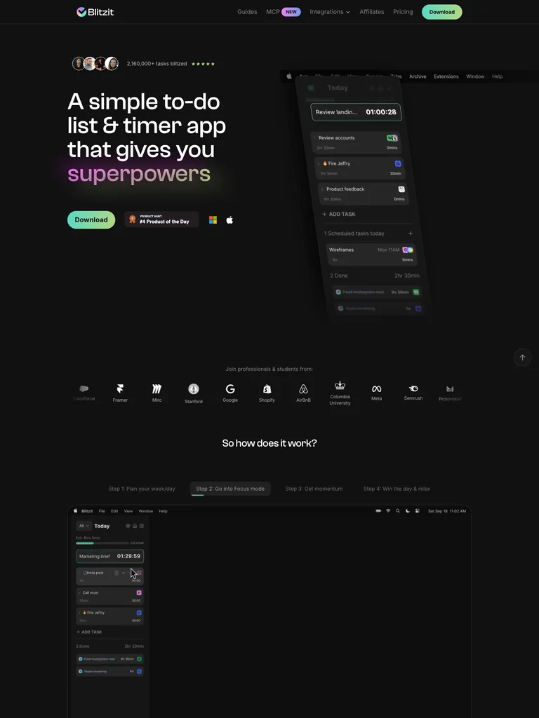 hover to scroll
A left-aligned task-and-timer message faces a tall floating task list, with mint download actions and small user avatars.
Useful for: Productivity utilities showing a compact working interface beside their central promise.
# Design reference: Blitzit
Source: https://blitzit.app/
Swipefile reference: https://swipefile.design/ref/ph-blitzit-2/
Captured: 2026-09-08. This is a dated reference, not a claim about the current live product.


## Objective
Adapt the visual principles below to my project. Use my own content and identity. Do not reproduce logos, proprietary copy, or brand assets.

## Reference notes
- mood: Focused and energetic
- colors: Black, mint, white, and lilac
- typography: Clash Display headings with smaller supporting copy and clearly separated actions.
- layout: A left-aligned task-and-timer message faces a tall floating task list, with mint download actions and small user avatars.
- motion: Still capture of the public page. Visit the source to study its animation and interactive behavior.
- texture: Dark layered app panels and restrained colored highlights
- dont: Use your own brand, copy, imagery, and product evidence; adapt the structure to your content.

Useful for: Productivity utilities showing a compact working interface beside their central promise.

## Acceptance criteria
- Existing project conventions, design tokens, working functionality, and unrelated changes are preserved.
- Two or three reference principles clearly support the user's task; conflicts are resolved in favor of usability and the existing product.
- Reusable components and semantic HTML express the interface. Available licensed assets are used; important UI text is never rendered as a bitmap.
- Every visible control has a defined behavior. Loading, empty, error, success, disabled, and long-content states are specified where relevant. Demo data is clearly labeled.
- Navigation and content adapt at 375px, 768px, and 1440px without horizontal page overflow. Keyboard use, visible focus, labeled inputs, at least 44px touch targets, readable contrast, and reduced motion are supported.
- Verification distinguishes rendered behavior from proposals and identifies anything still requiring a backend or external service.

## Quality bar
Clear hierarchy, consistent spacing, restrained surfaces, and purposeful motion. Avoid decorative gradients, excessive cards, placeholder buttons, and invented metrics unless the project calls for them. Do not claim a feature is connected or tested without evidence.
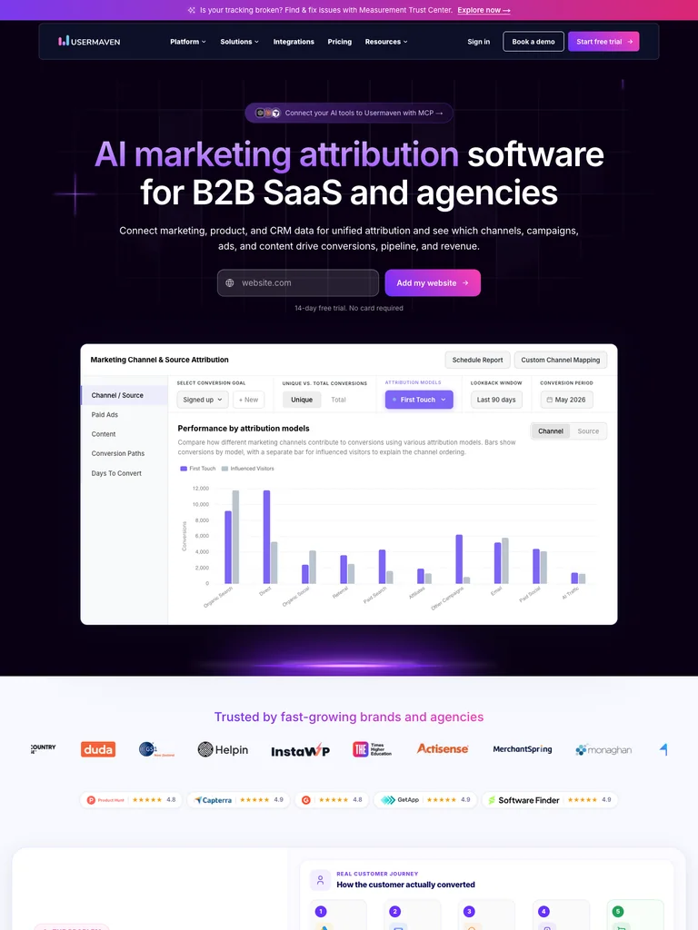 hover to scroll
A centered analytics statement highlights key words in purple above a URL field, then introduces a bright dashboard preview.
Useful for: Analytics services leading with a low-friction input before presenting reporting detail.
# Design reference: Usermaven
Source: https://usermaven.com/
Swipefile reference: https://swipefile.design/ref/ph-usermaven/
Captured: 2026-09-08. This is a dated reference, not a claim about the current live product.


## Objective
Adapt the visual principles below to my project. Use my own content and identity. Do not reproduce logos, proprietary copy, or brand assets.

## Reference notes
- mood: Precise and vivid
- colors: Black, deep violet, magenta, and white
- typography: Inter headings with smaller supporting copy and clearly separated actions.
- layout: A centered analytics statement highlights key words in purple above a URL field, then introduces a bright dashboard preview.
- motion: Still capture of the public page. Visit the source to study its animation and interactive behavior.
- texture: Dark purple light effects and high-contrast analytics panels
- dont: Use your own brand, copy, imagery, and product evidence; adapt the structure to your content.

Useful for: Analytics services leading with a low-friction input before presenting reporting detail.

## Acceptance criteria
- Existing project conventions, design tokens, working functionality, and unrelated changes are preserved.
- Two or three reference principles clearly support the user's task; conflicts are resolved in favor of usability and the existing product.
- Reusable components and semantic HTML express the interface. Available licensed assets are used; important UI text is never rendered as a bitmap.
- Every visible control has a defined behavior. Loading, empty, error, success, disabled, and long-content states are specified where relevant. Demo data is clearly labeled.
- Navigation and content adapt at 375px, 768px, and 1440px without horizontal page overflow. Keyboard use, visible focus, labeled inputs, at least 44px touch targets, readable contrast, and reduced motion are supported.
- Verification distinguishes rendered behavior from proposals and identifies anything still requiring a backend or external service.

## Quality bar
Clear hierarchy, consistent spacing, restrained surfaces, and purposeful motion. Avoid decorative gradients, excessive cards, placeholder buttons, and invented metrics unless the project calls for them. Do not claim a feature is connected or tested without evidence.
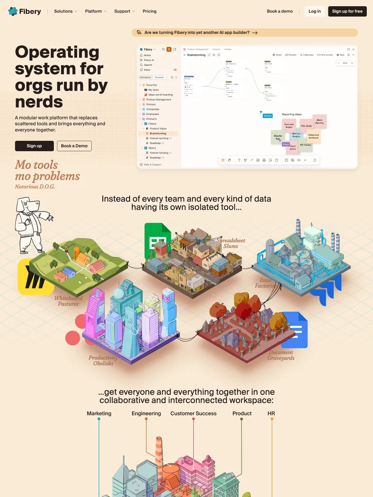 hover to scroll
A bold left-aligned statement shares the hero with a detailed workspace; illustrated islands introduce the next section.
Useful for: Flexible work tools combining a real interface with an explanatory visual metaphor.
# Design reference: Fibery
Source: https://fibery.com/
Swipefile reference: https://swipefile.design/ref/ph-fibery/
Captured: 2026-09-08. This is a dated reference, not a claim about the current live product.


## Objective
Adapt the visual principles below to my project. Use my own content and identity. Do not reproduce logos, proprietary copy, or brand assets.

## Reference notes
- mood: Warm and opinionated
- colors: Cream, dark brown, pastel pink, mint, and yellow
- typography: Suisse Intl headings with smaller supporting copy and clearly separated actions.
- layout: A bold left-aligned statement shares the hero with a detailed workspace; illustrated islands introduce the next section.
- motion: Still capture of the public page. Visit the source to study its animation and interactive behavior.
- texture: Pastel sticky notes and small isometric landscapes
- dont: Use your own brand, copy, imagery, and product evidence; adapt the structure to your content.

Useful for: Flexible work tools combining a real interface with an explanatory visual metaphor.

## Acceptance criteria
- Existing project conventions, design tokens, working functionality, and unrelated changes are preserved.
- Two or three reference principles clearly support the user's task; conflicts are resolved in favor of usability and the existing product.
- Reusable components and semantic HTML express the interface. Available licensed assets are used; important UI text is never rendered as a bitmap.
- Every visible control has a defined behavior. Loading, empty, error, success, disabled, and long-content states are specified where relevant. Demo data is clearly labeled.
- Navigation and content adapt at 375px, 768px, and 1440px without horizontal page overflow. Keyboard use, visible focus, labeled inputs, at least 44px touch targets, readable contrast, and reduced motion are supported.
- Verification distinguishes rendered behavior from proposals and identifies anything still requiring a backend or external service.

## Quality bar
Clear hierarchy, consistent spacing, restrained surfaces, and purposeful motion. Avoid decorative gradients, excessive cards, placeholder buttons, and invented metrics unless the project calls for them. Do not claim a feature is connected or tested without evidence.
 hover to scroll
A split text introduction leads into a wide blue comparison panel, with a URL input kept close to the headline.
Useful for: Website tools showing an explicit before-and-after comparison beneath a direct input.
# Design reference: Repaint
Source: https://repaint.com/
Swipefile reference: https://swipefile.design/ref/ph-repaint-ai-website-builder/
Captured: 2026-09-08. This is a dated reference, not a claim about the current live product.


## Objective
Adapt the visual principles below to my project. Use my own content and identity. Do not reproduce logos, proprietary copy, or brand assets.

## Reference notes
- mood: Spare and practical
- colors: White, bright blue, black, and gray
- typography: Manrope headings with smaller supporting copy and clearly separated actions.
- layout: A split text introduction leads into a wide blue comparison panel, with a URL input kept close to the headline.
- motion: Still capture of the public page. Visit the source to study its animation and interactive behavior.
- texture: Flat blue demonstration surface and fine interface rules
- dont: Use your own brand, copy, imagery, and product evidence; adapt the structure to your content.

Useful for: Website tools showing an explicit before-and-after comparison beneath a direct input.

## Acceptance criteria
- Existing project conventions, design tokens, working functionality, and unrelated changes are preserved.
- Two or three reference principles clearly support the user's task; conflicts are resolved in favor of usability and the existing product.
- Reusable components and semantic HTML express the interface. Available licensed assets are used; important UI text is never rendered as a bitmap.
- Every visible control has a defined behavior. Loading, empty, error, success, disabled, and long-content states are specified where relevant. Demo data is clearly labeled.
- Navigation and content adapt at 375px, 768px, and 1440px without horizontal page overflow. Keyboard use, visible focus, labeled inputs, at least 44px touch targets, readable contrast, and reduced motion are supported.
- Verification distinguishes rendered behavior from proposals and identifies anything still requiring a backend or external service.

## Quality bar
Clear hierarchy, consistent spacing, restrained surfaces, and purposeful motion. Avoid decorative gradients, excessive cards, placeholder buttons, and invented metrics unless the project calls for them. Do not claim a feature is connected or tested without evidence.
 hover to scroll
A centered product statement and blue trial action precede a large social-media planning dashboard.
Useful for: Social publishing products presenting a familiar working interface with minimal visual noise.
# Design reference: SocialBu
Source: https://socialbu.com/
Swipefile reference: https://swipefile.design/ref/ph-socialbu/
Captured: 2026-09-08. This is a dated reference, not a claim about the current live product.


## Objective
Adapt the visual principles below to my project. Use my own content and identity. Do not reproduce logos, proprietary copy, or brand assets.

## Reference notes
- mood: Clear and approachable
- colors: White, blue, pale gray, and black
- typography: Plus Jakarta Sans headings with smaller supporting copy and clearly separated actions.
- layout: A centered product statement and blue trial action precede a large social-media planning dashboard.
- motion: Still capture of the public page. Visit the source to study its animation and interactive behavior.
- texture: Rounded interface panels and small account avatars
- dont: Use your own brand, copy, imagery, and product evidence; adapt the structure to your content.

Useful for: Social publishing products presenting a familiar working interface with minimal visual noise.

## Acceptance criteria
- Existing project conventions, design tokens, working functionality, and unrelated changes are preserved.
- Two or three reference principles clearly support the user's task; conflicts are resolved in favor of usability and the existing product.
- Reusable components and semantic HTML express the interface. Available licensed assets are used; important UI text is never rendered as a bitmap.
- Every visible control has a defined behavior. Loading, empty, error, success, disabled, and long-content states are specified where relevant. Demo data is clearly labeled.
- Navigation and content adapt at 375px, 768px, and 1440px without horizontal page overflow. Keyboard use, visible focus, labeled inputs, at least 44px touch targets, readable contrast, and reduced motion are supported.
- Verification distinguishes rendered behavior from proposals and identifies anything still requiring a backend or external service.

## Quality bar
Clear hierarchy, consistent spacing, restrained surfaces, and purposeful motion. Avoid decorative gradients, excessive cards, placeholder buttons, and invented metrics unless the project calls for them. Do not claim a feature is connected or tested without evidence.
Allow basic usage counts to help us understand what is useful. Your board contents stay out of analytics. Details
Your browser’s privacy preference keeps analytics off.