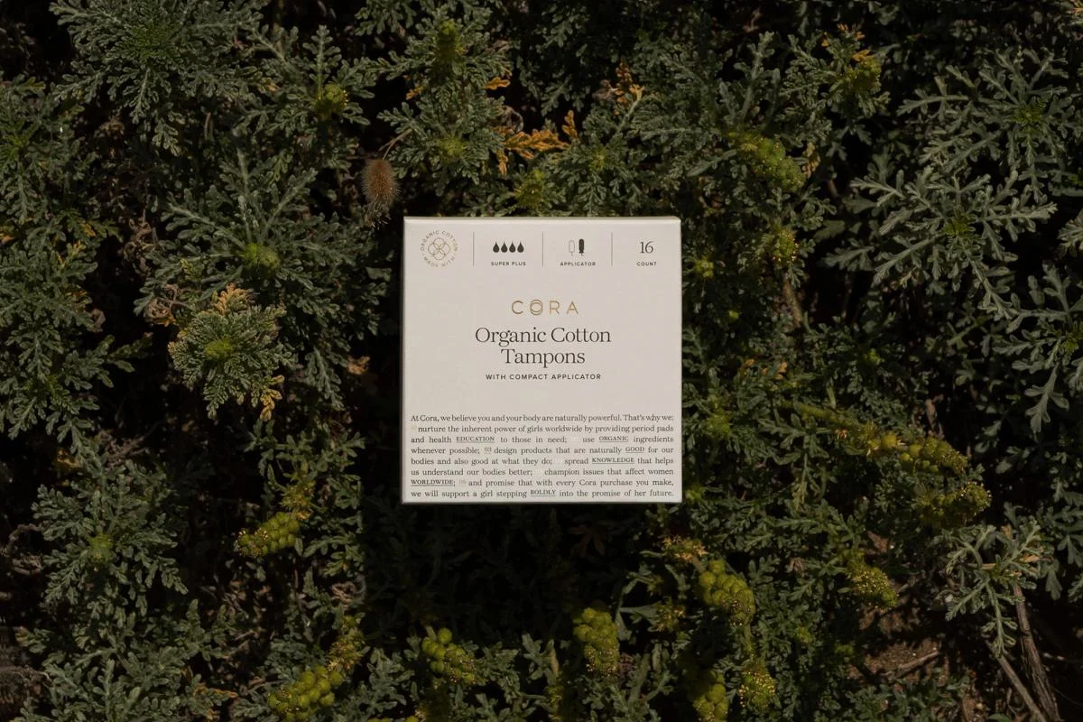
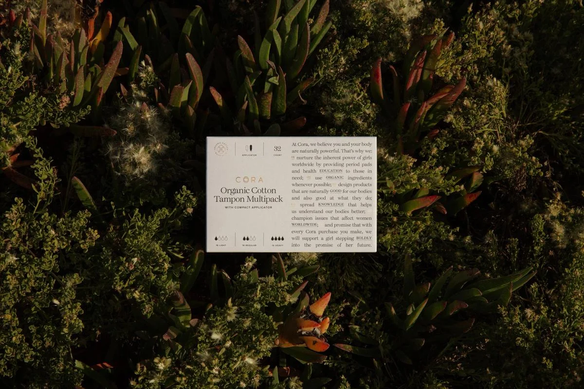
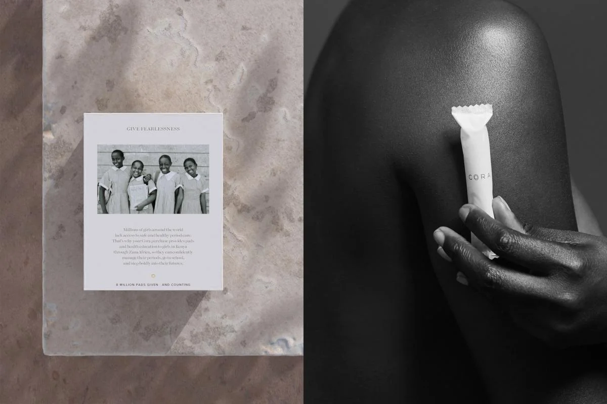
Small spaced lettering gives the packaging a quiet signature. Consistent neutral packaging is paired with botanical and human imagery.
Identity work by COLLINS. Selected images from the linked case study, reviewed 2026-09-09. Study the published design; consult the brand’s current guidelines for authorized usage.
Product in botanical settingPackaging variationProduct editorial
Study two packaging presentations and a paired editorial composition.
Design notes
Logo
Small spaced lettering gives the packaging a quiet signature.
Color
Cream and natural greens dominate the selected product presentation.
Type
Fine text and restrained headings establish a compact information hierarchy.
System
Consistent neutral packaging is paired with botanical and human imagery.
In use
Study two packaging presentations and a paired editorial composition.
Don't
Study the principles and develop an original identity. Do not copy these logos, proprietary typefaces, illustrations, or claims. These are selected images from a published case study; current brand guidelines, asset licenses, and real-world performance have not been verified.
Make it your own
Turn this reference into a useful brief for your project. Copy it into the AI tool you already use.
Add constraintsPreview & edit promptAssembled in your browser. No API key or AI request needed. Changing the fields refreshes the preview.