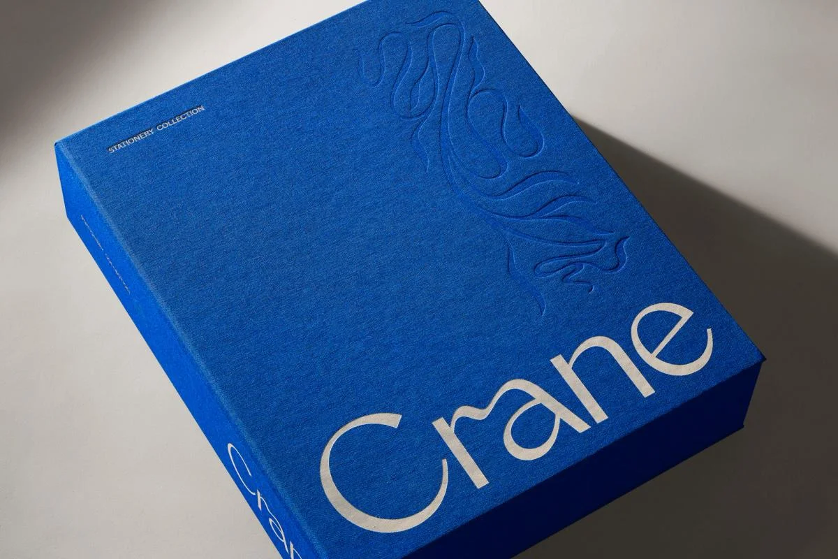
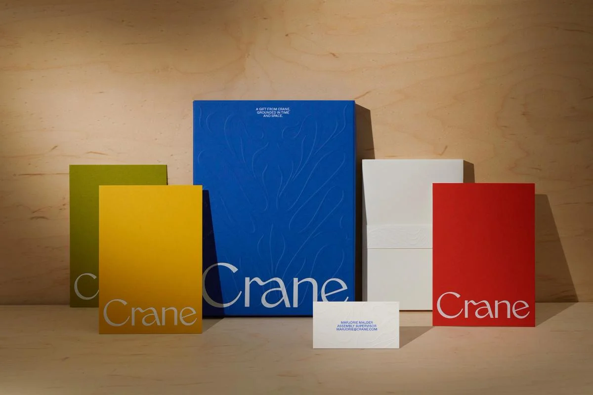
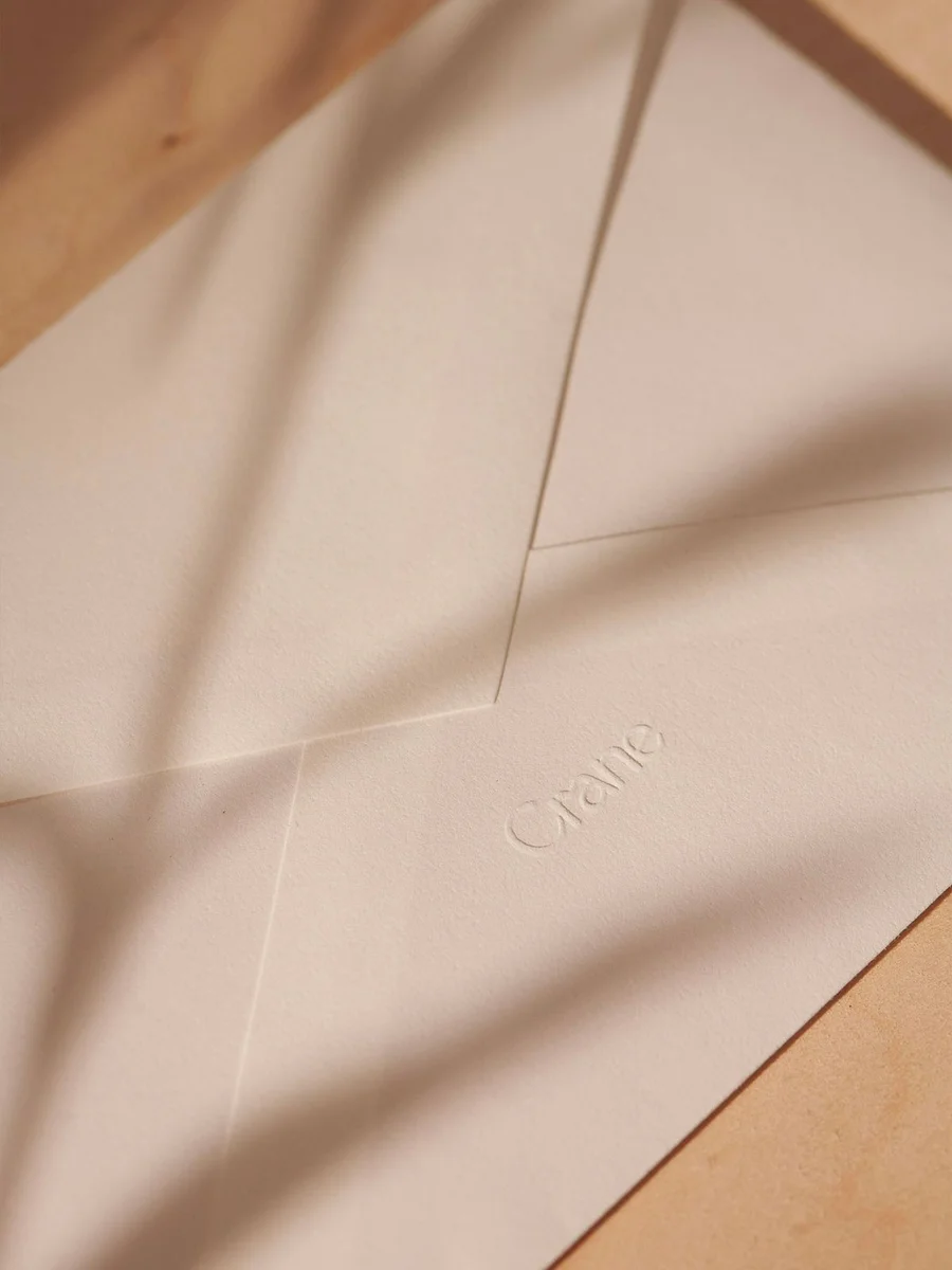
A fine flowing wordmark contrasts with the crisp edges of stationery. Embossing and restrained placement connect different paper products and boxes.
Identity work by COLLINS. Selected images from the linked case study, reviewed 2026-09-09. Study the published design; consult the brand’s current guidelines for authorized usage.
Study a signature box, the wider family, and an embossed detail.
Design notes
Logo
A fine flowing wordmark contrasts with the crisp edges of stationery.
Color
Blue, red, yellow, and neutral paper tones define the range.
Type
Delicate letterforms keep the name visually light.
System
Embossing and restrained placement connect different paper products and boxes.
In use
Study a signature box, the wider family, and an embossed detail.
Don't
Study the principles and develop an original identity. Do not copy these logos, proprietary typefaces, illustrations, or claims. These are selected images from a published case study; current brand guidelines, asset licenses, and real-world performance have not been verified.
Make it your own
Turn this reference into a useful brief for your project. Copy it into the AI tool you already use.
Add constraintsPreview & edit promptAssembled in your browser. No API key or AI request needed. Changing the fields refreshes the preview.