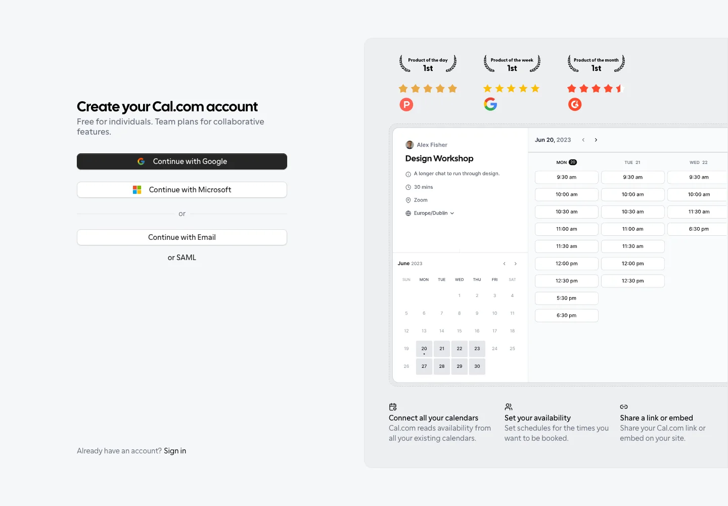
Give new users product context while keeping account entry a short, obvious task.
Design notes
Surface
Create account
Navigation
An existing-account link stays at the bottom of the form column.
Layout
The left column holds account actions; the right column demonstrates a booking interface with supporting proof.
Density
A constrained form column leaves room between groups while keeping labels and controls together.
Color
Soft gray page, black primary action, white controls, and a pale product-preview panel.
Type
A bold compact heading leads the form; preview labels are denser than the surrounding copy.
Pattern
Give new users product context while keeping account entry a short, obvious task.
States
Initial provider or email selection alongside a static product preview.
Don't
Adapt the interaction pattern to your own product. Do not copy brand assets, sample identities, proprietary text, or assume unseen states. Specify keyboard behavior, loading, empty, error, and narrow-screen layouts for your implementation.
Make it your own
Turn this reference into a useful brief for your project. Copy it into the AI tool you already use.
Add constraintsPreview & edit promptAssembled in your browser. No API key or AI request needed. Changing the fields refreshes the preview.