Excalidraw — Empty canvas
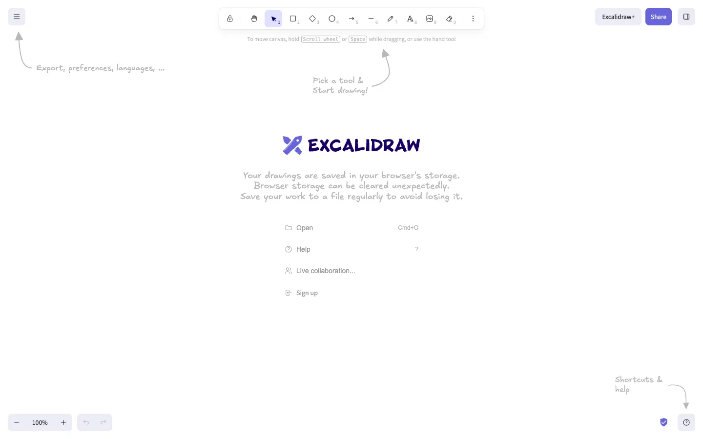
The first-run empty state is drawn in the product's own hand-sketched visual language — literal sketched arrows point at real toolbar chrome instead of a generic tooltip overlay.
Why this pattern works
This shot is entirely about the first-run onboarding, not the canvas itself. Two hand-drawn SVG arrows point from empty space directly at real UI elements (the hamburger menu, the shortcuts/help buttons) with a one-line hand-lettered caption at each arrowhead — no modal, no spotlight overlay, no 'skip tour' button. It works because the annotation style matches the product's own drawing tool, so the tutorial never looks bolted on. Steal this for any canvas or creative tool: teach the chrome by drawing on top of it in the app's native voice instead of a generic coachmark library.
Design notes
- Surface
- Excalidraw's default canvas, first load, before any shape has been drawn
- Navigation
- Effectively one tier: a floating rounded toolbar centred at the top holds every tool (lock, hand, select, rectangle, diamond, ellipse, arrow, line, draw, text, image, eraser, overflow), each numbered 1-0 for its keyboard shortcut. A hamburger button floats independently top-left; zoom and undo/redo float bottom-left; Share and a panel toggle float top-right. Nothing is docked to a bar — every control is its own island.
- Layout
- Full-bleed canvas, no fixed panels. All chrome floats in rounded pill or card containers positioned over the canvas, so the drawing surface is the entire viewport.
- Density
- Extremely sparse. Large click targets on the toolbar, a huge open canvas, wide gaps between every floating element.
- Color
- Pure white canvas. The only saturated colour is the indigo/purple of the Excalidraw logo, the active-tool highlight, and the Share button. Every hint, warning and menu label is a light warm grey.
- Type
- Two typefaces doing two jobs: a normal UI sans for real interface labels (menu list, keyboard-shortcut digits, Excalidraw+ pill) and a hand-drawn script font for the wordmark, the onboarding captions, and the arrow labels — the second one signals 'this is guidance, not a control.'
- Pattern
- In-brand annotation: hand-drawn arrows and captions overlaid directly on the canvas, in the same sketch style as the product's own output, pointing at real toolbar elements instead of opening a tour modal.
- States
- First-run empty state only. No drawing exists yet, so the centre of the canvas holds the logo, a storage-warning notice ('saved in your browser's storage... save to a file regularly'), and a quick-action menu (Open, Help, Live collaboration, Sign up) standing in for content. This entire block disappears the moment a shape is drawn.
- Don't
- Don't leave the hand-drawn annotations on screen past first use — this is a first-run-only layer. Baking it permanently into the canvas would clutter every future session for a returning user.
Make it your own
Turn this reference into a useful brief for your project. Copy it into the AI tool you already use.