Pair numeric values with visual representations so users can move between precision and exploration.
Design notes
Surface
Color picker
Navigation
Supporting display toggles sit beneath the color value rather than competing with the main controls.
Layout
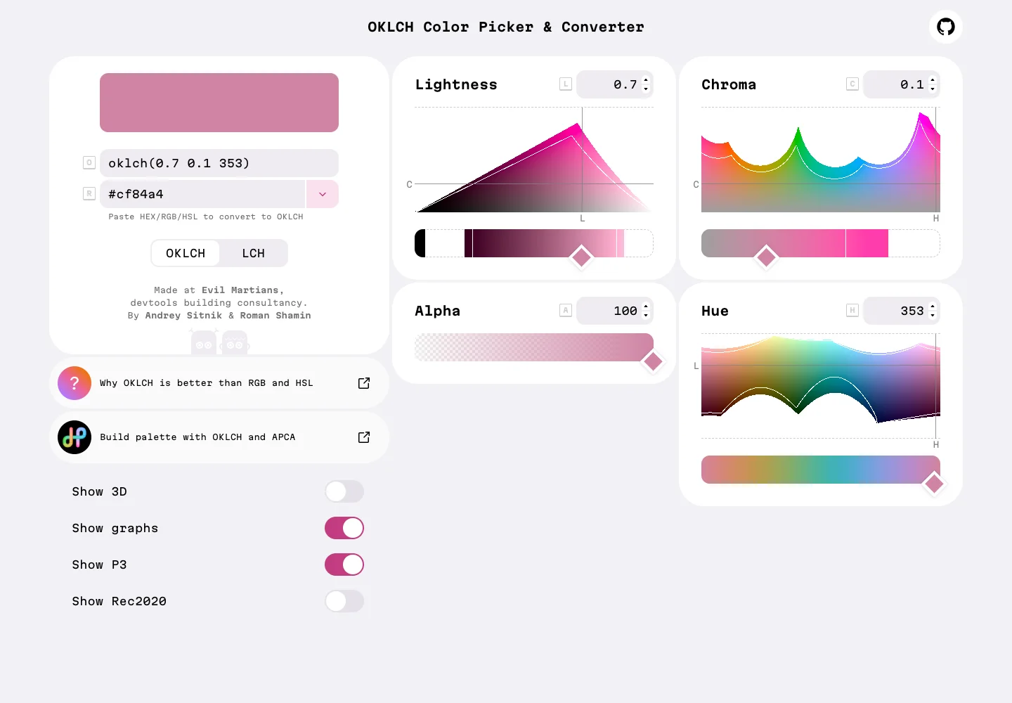
A color sample and value fields sit alongside separate lightness, chroma, alpha, and hue panels.
Density
The working preview takes most of the space, with compact controls grouped around it.
Color
Pale panels surround vivid color spectra and a large selected-color sample.
Type
Give each color dimension its own labeled control and keep the current value easy to find.
Pattern
Pair numeric values with visual representations so users can move between precision and exploration.
States
Public color picker in its initial visible state; no palette was exported.
Don't
Adapt the interaction pattern to your own product. Do not copy brand assets, sample identities, proprietary text, or assume unseen states. Specify keyboard behavior, loading, empty, error, and narrow-screen layouts for your implementation.
Make it your own
Turn this reference into a useful brief for your project. Copy it into the AI tool you already use.
Add constraintsPreview & edit promptAssembled in your browser. No API key or AI request needed. Changing the fields refreshes the preview.