← Back to library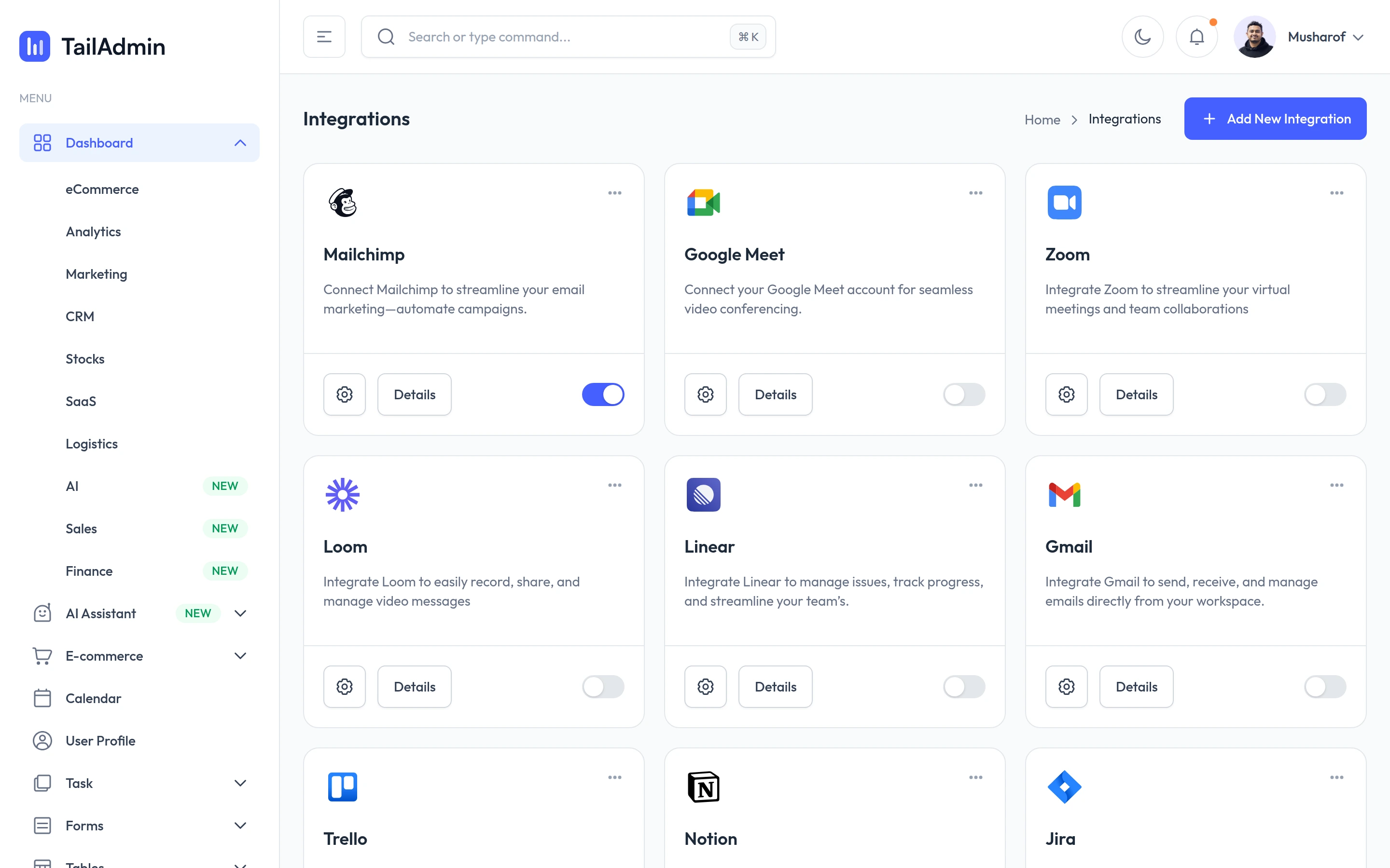
Viewport capture · opening screen Assembled in your browser. No API key or AI request needed. Changing the fields refreshes the preview.
TailAdmin — Integrations demo
Forms & OnboardingSee it livedemo.tailadmin.com
Integration cards pair recognizable provider marks with descriptions, details controls and enabled switches.
Why this pattern works
Integration cards pair recognizable provider marks with descriptions, details controls and enabled switches.
Design notes
- Surface
- TailAdmin — Integrations demo
- Navigation
- Sidebar beside a three-column integration-card grid.
- Layout
- Sidebar beside a three-column integration-card grid.
- Density
- Compact supporting controls preserve space for the primary content.
- Color
- White, pale gray, violet and provider colors
- Type
- Clear sans-serif labels with stronger section headings and smaller metadata.
- Pattern
- Integration cards pair recognizable provider marks with descriptions, details controls and enabled switches.
- States
- Public example or template in its captured initial state; visible sample data is demonstration content.
- Don't
- Use the structure as a reference, with your own content and identity. This still does not establish the behavior of controls or unseen states.
Make it your own
Turn this reference into a useful brief for your project. Copy it into the AI tool you already use.