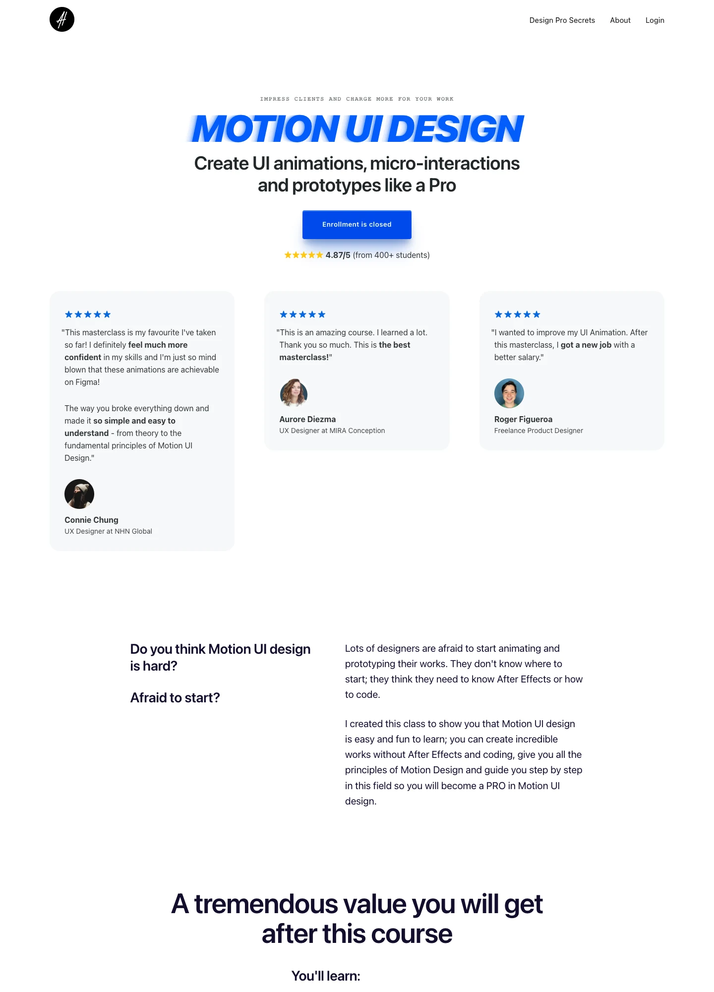
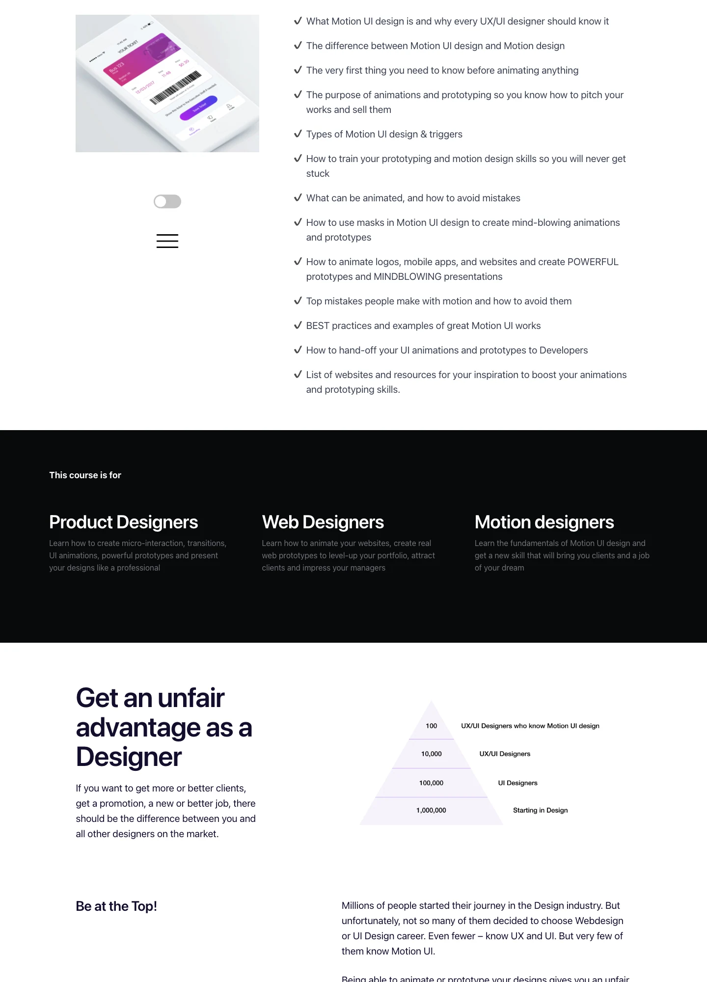
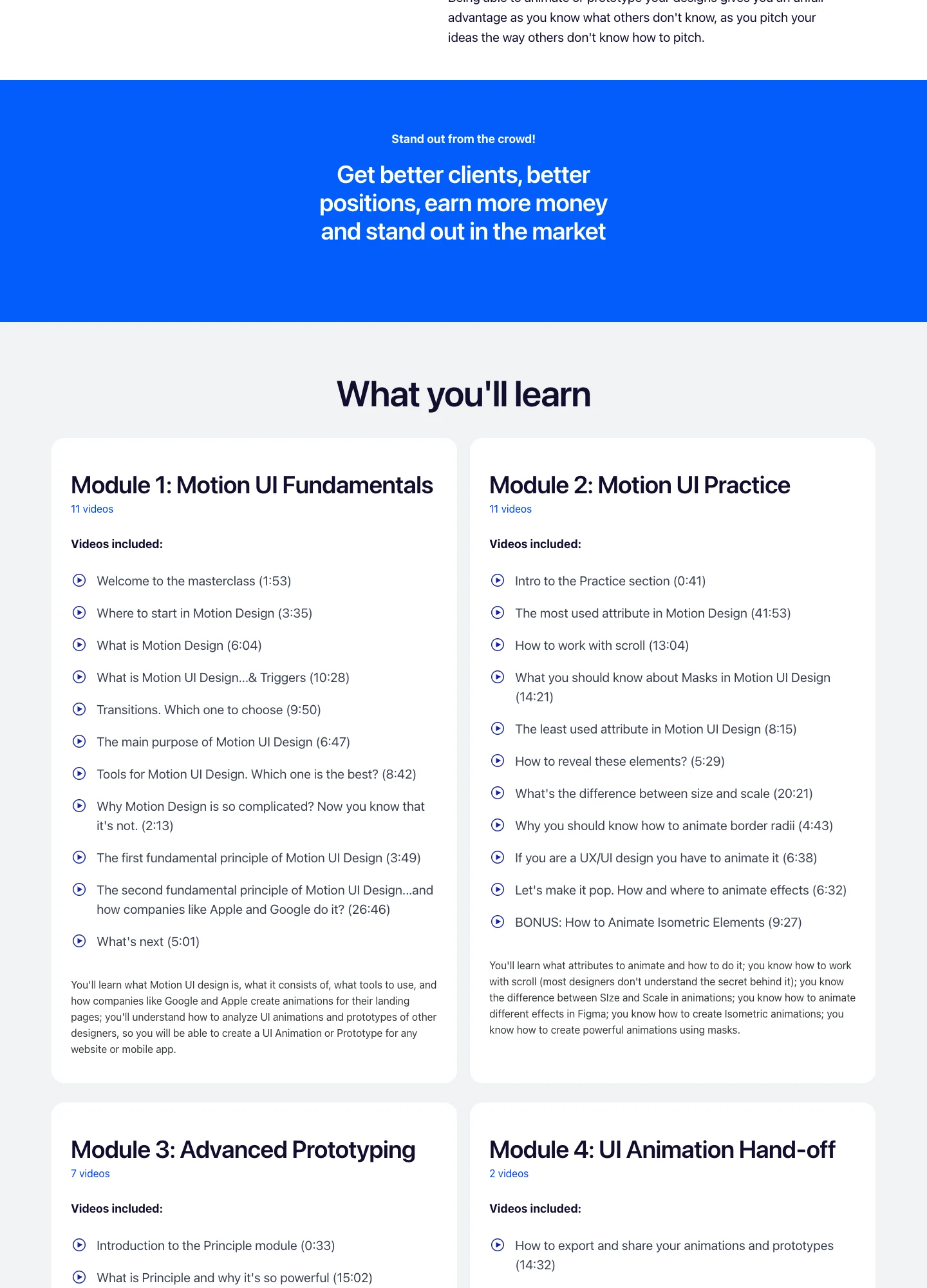
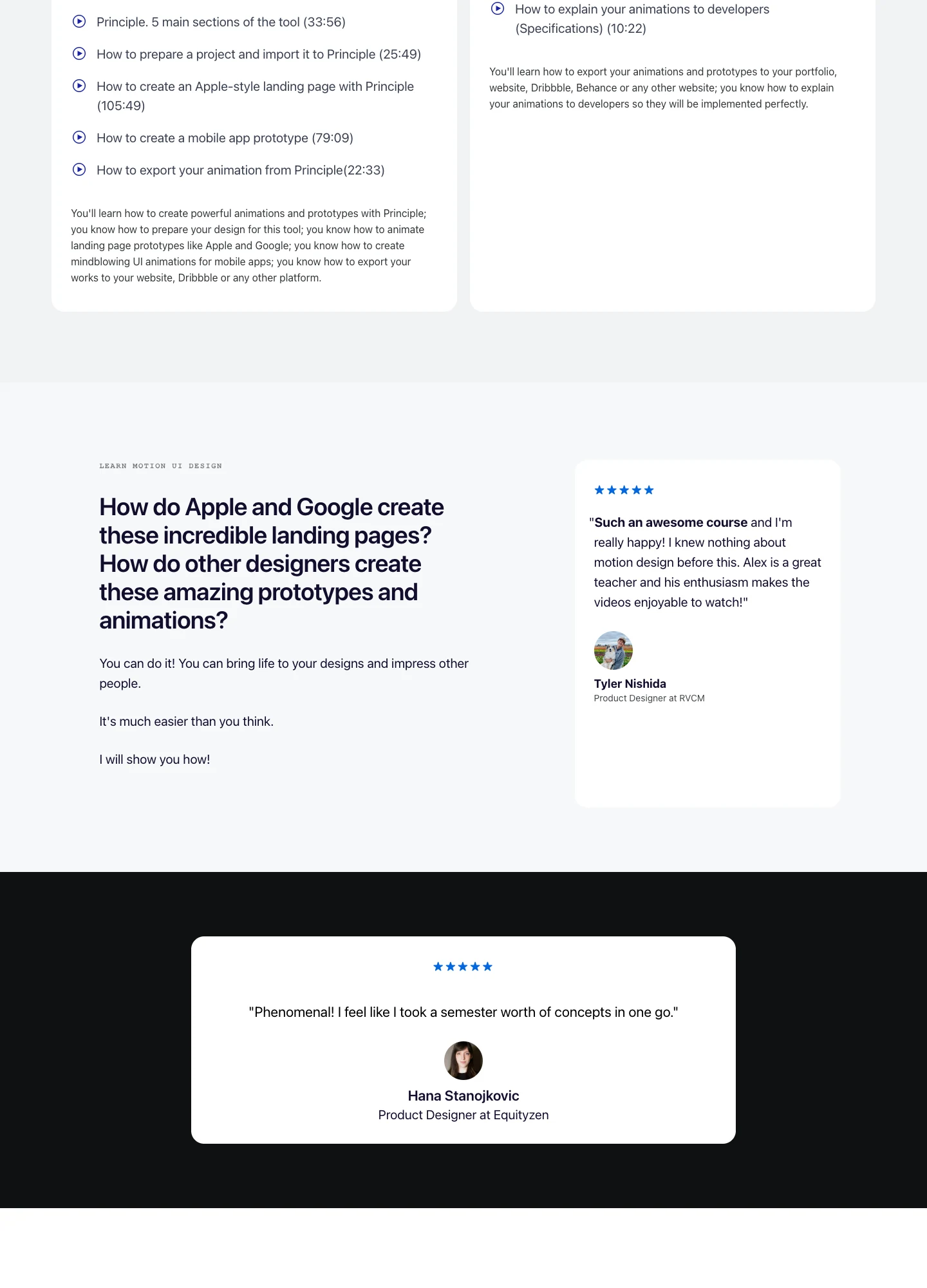
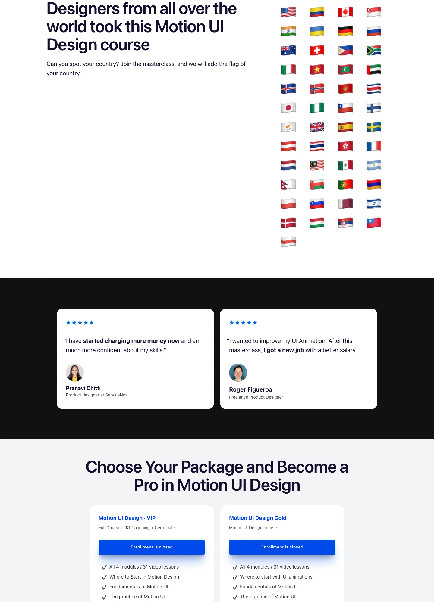
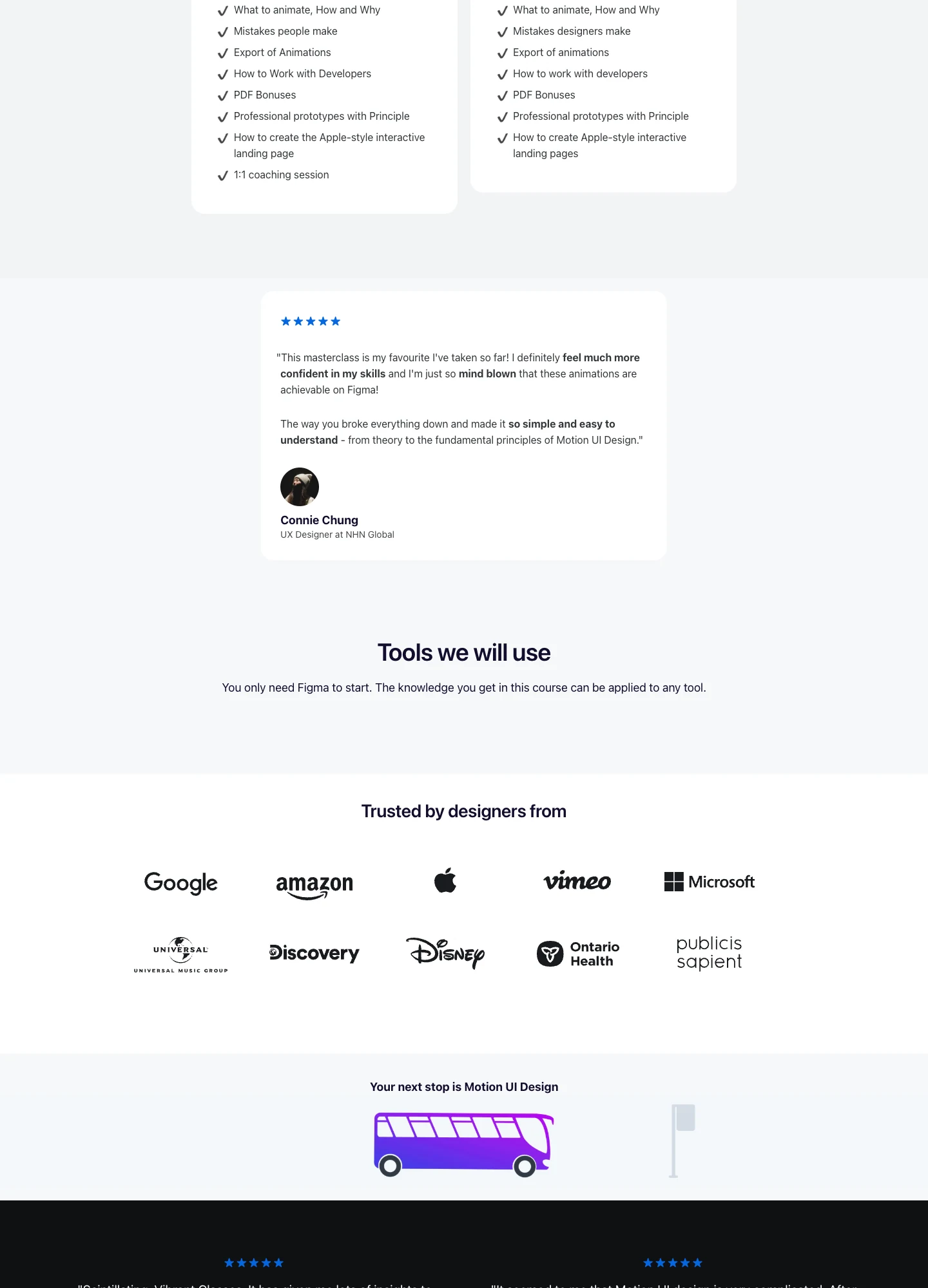
Study the complete public offer page, its section order, and calls to action. Checkout steps, current enrollment availability, and conversion results are not verified.
Design notes
Mood
Clean, technical, and approachable.
Colors
White and cool gray, electric blue, dark navy copy, and small violet illustrations.
Type
Bold sans-serif headings, compact labels, short benefit lists, and clearly separated curriculum sections make the long offer scannable.
Layout
Centered course opening and review cards introduce audience fit, design benefits, detailed lesson modules, more student stories, package comparisons, tool references, and closing illustrations.
Motion
The screenshot records a static page state. Preserve readable scrolling and clear action feedback; do not infer video playback, counters, or hidden form behavior.
Texture
Product or instructor imagery, contrasting section backgrounds, grouped curriculum details, and customer-story panels.
Don't
Use your own offer, brand, and assets. Do not invent testimonials, results, scarcity, guarantees, or pricing.
Make it your own
Turn this reference into a useful brief for your project. Copy it into the AI tool you already use.
Add constraintsPreview & edit promptAssembled in your browser. No API key or AI request needed. Changing the fields refreshes the preview.