Google Flights — Search
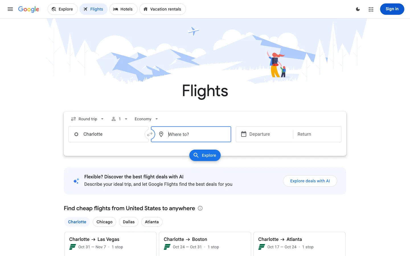
A six-field search form is the entire product, so it gets an illustrated sky behind it, floats over the fold, and every other decision on the page defers to it.
Why this pattern works
The compound search card: a single white card holding a row of three ghost dropdown selectors (trip type, passengers, cabin) on top and four bordered fields below (origin, a circular swap button straddling the seam, destination, then a split departure/return date field), with the submit button hanging off the card's bottom edge, half in and half out. That overhang is the whole trick — it pins your eye to the action and tells you the card is one object rather than a form-shaped stack. Also take the price-tease row underneath: destination chips that reload three cheap-route cards, giving a first-time visitor something to look at before they've typed anything.
Design notes
- Surface
- Google Flights search entry screen, logged out, no query yet
- Navigation
- One tier only. A hamburger, the wordmark, then four pill tabs for sibling products (Explore, Flights, Hotels, Vacation rentals) where the active pill is filled light blue with a blue icon and label. Everything else on the bar is chrome — theme toggle, app grid, Sign in.
- Layout
- Centred single column, ~990px wide, on an unbounded white page. The illustrated header banner is full-bleed and about 230px tall; the search card overlaps its bottom edge.
- Density
- Loose at the top, tighter as you go down. The search card breathes; the result cards below it are compact three-line rows. Density increases with your depth into the task.
- Color
- Almost entirely white and grey. Blue appears three times only: the active nav pill, the focused field's border, and the Explore button. The illustration is a pale desaturated blue so it never competes with the form on top of it.
- Type
- One neutral sans, small. The word 'Flights' at ~52px regular weight is the only display type on the page, and it is not bold — the size does the work alone. Everything else sits at 13-15px.
- Pattern
- The submit button straddling the card's bottom border, half inside and half outside. It binds the whole compound form into one object and puts the action exactly where the eye finishes reading.
- States
- This is the zero-query state, and it never shows an empty region. The origin is pre-filled from location, the destination is focused and waiting, and below the fold a set of destination chips populates three real route cards so there is always something priced on screen.
- Don't
- Don't scale the header illustration up to compete with the card. It works because it is pale, low-contrast and cropped — the moment it reads as a hero image the form stops being the subject and the page becomes a marketing page.
Make it your own
Turn this reference into a useful brief for your project. Copy it into the AI tool you already use.