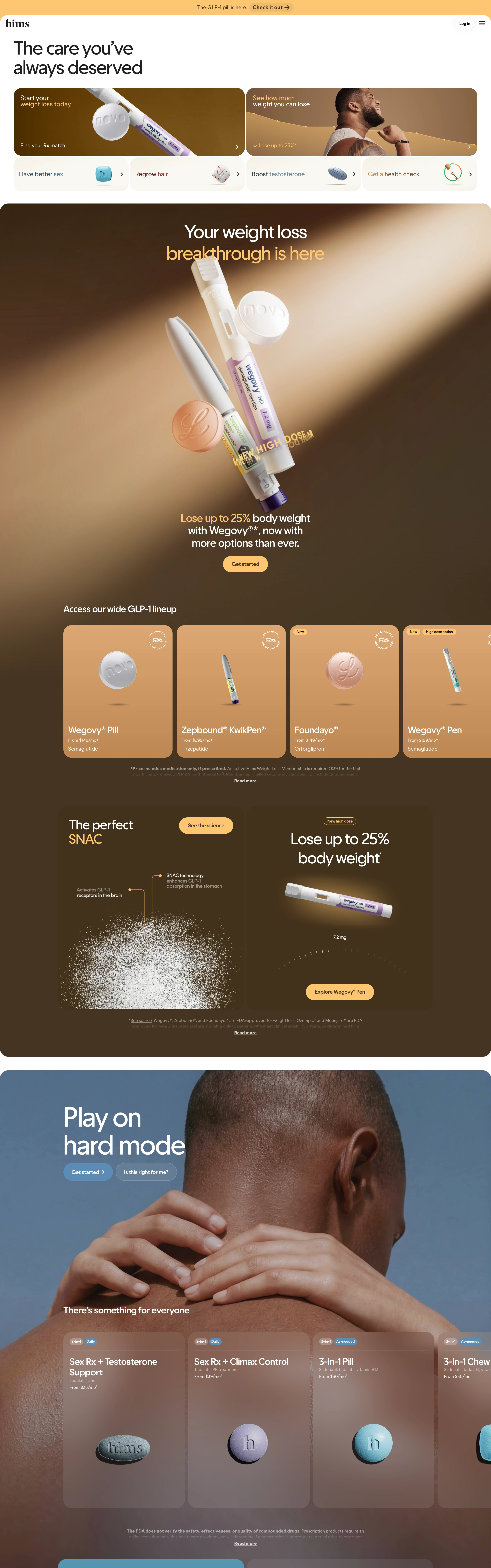
Telehealth as luxury retail: warm bronze spotlight photography, medications floating like jewelry, and category entry cards that funnel every visitor to their Rx match.
Aspirational and destigmatizing — medical care styled like a premium grooming brand. Confident, warm, a little cinematic; the pill is the hero product, not the problem.
Colors
Warm cream/tan canvas (#F5EBDC feel) at the top, deepening into rich bronze and chocolate-brown full-bleed panels (#6B4F2E to #2E2416) with golden spotlight beams. Near-black headlines on cream; warm yellow-gold accents for CTAs and highlight phrases; a single teal panel as a palate cleanser.
Type
One modern sans throughout: large tight-tracked headlines ('The care you've always deserved', 'Play on hard mode'), sentence case, never shouting. Small utility labels on cards; fine-print disclaimers kept honest but tiny. Emphasis via gold color, not weight changes.
Layout
Funnel-first: a grid of category entry cards up top (photo cards + compact white cards with product thumbnails, each with a chevron), then a dramatic dark hero panel, then horizontally scrolling product-card rails on bronze gradients, science panel with annotated diagram, lifestyle section with frosted-glass product cards over photography, testimonial + pricing modules. Every corner generously rounded.
Motion
Smooth and premium: product renders drift slowly in the spotlight, card rails glide horizontally, sections fade up softly. Hovers lift cards a touch. Calm, medical-grade confidence — no bounce.
Texture
Photographic warmth everywhere: spotlight falloff, skin texture, soft grain in the bronze gradients. Frosted-glass overlays on imagery; matte rounded cards; renders have jewelry-grade specular highlights.
Imagery
Two registers: (1) warm-toned lifestyle photography of real skin under dramatic bronze light — Pexels for close, dignified portraits with amber grading; (2) hero-lit product renders — pens, pills, and packs floating in a spotlight beam against deep bronze gradients, lit like watch photography — kie-ai Seedream. Nothing clinical, nothing fluorescent.
Don't
No clinical white/blue medical palette, no stock doctors in lab coats, no sharp corners, no cartoon illustration, no urgency banners. Never make the product look like medicine on a pharmacy shelf.
Make it your own
Turn this reference into a useful brief for your project. Copy it into the AI tool you already use.
Add constraintsPreview & edit promptAssembled in your browser. No API key or AI request needed. Changing the fields refreshes the preview.