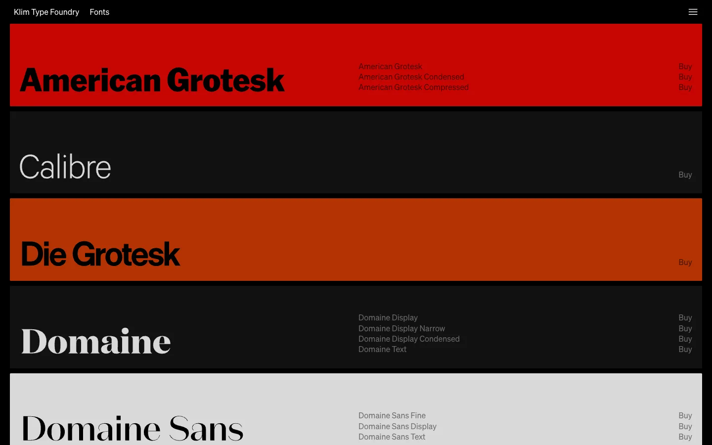
The catalogue has zero product photography — the typeface's own letterforms, set at poster scale inside a full-bleed colour band, are the only image on the page.
The one pattern worth stealing whole: full-bleed colour bands as the row unit, with the product name set live in its own typeface at huge scale on the left. Because the specimen IS the swatch there's no need for a thumbnail, a card or a border — use this for any catalogue where the content itself is already the strongest possible visual (typefaces, but also palettes, fabric swatches, finishes).
Design notes
Surface
Klim Type Foundry, Retail Fonts catalogue page
Navigation
One tier. A plain black top bar: wordmark 'Klim Type Foundry' left, a single 'Fonts' link beside it at the same size and weight, a hamburger glyph right. No dropdown, no breadcrumb, no visible search — the page under it does all the navigating.
Layout
Full-bleed, full-width bands stacked with zero gap and no max-width container anywhere. Each band spans edge to edge; its height is set by how many styles it lists, not by a fixed row grid.
Density
Sparse by design. One product per band, three fixed columns inside it (name / style list / buy), and a lot of dead flat colour left as negative space around the type.
Color
Colour is the entire product. Each band is a different flat, saturated fill — blood red, near-black, burnt orange, near-black again, light grey — chosen per typeface, no gradient, no image ever laid over it. Foreground text just flips between black and off-white to stay legible on whatever fill it sits on.
Type
The typeface name is set IN the actual typeface at ~64-80px — the only place on the page where type-as-content and type-as-chrome are the same pixels. Style names and 'Buy' sit at ~14px in a plain utility sans, so the display name stays 4-5x louder than everything else in the band.
Pattern
The band as both product photo and buy button: no thumbnail, no rendered mockup, no card — the live typeface rendering the vendor's own name is the entire piece of merchandising.
States
No empty, loading or logged-out state visible — this is a static catalogue; every band always carries at least a name and one Buy link, so there's nothing to design for absence.
Don't
Don't add a card, a border, an image swatch or a hover-elevated shadow to the band. The instant it looks like a 'product card' instead of a flat colour field, the specimen-as-photo trick collapses back into generic ecommerce.
Make it your own
Turn this reference into a useful brief for your project. Copy it into the AI tool you already use.
Add constraintsPreview & edit promptAssembled in your browser. No API key or AI request needed. Changing the fields refreshes the preview.