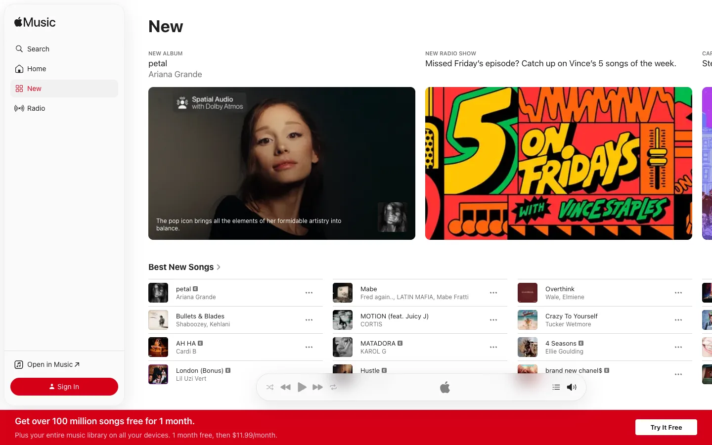
Every featured card is untouched artwork — the eyebrow, title and artist sit in the white space above the image, never on it, so a moody photo and a loud illustrated poster can share a row without either fighting site type.
The eyebrow-title-subtitle stack floating above an unmodified media card, instead of overlaid caption text — steal this any time the images you're showcasing already have their own art direction and shouldn't be captioned over. Also take the three-column song list: square thumbnail, bold title, grey artist, a single overflow icon, no dividers, no borders — pure whitespace-separated rows.
Design notes
Surface
Browse / New tab of the Apple Music web player, logged out
Navigation
Two tiers, both cheap. A fixed ~250px white sidebar (Search, Home, New, Radio as icon+label rows, active item on a soft grey rounded rect) on the left; the page itself carries no second nav tier, just one bold H1 per screen.
Layout
Fixed sidebar, fluid content. The featured row shows two full-width cards plus a sliver of a third, hinting at horizontal scroll. A sticky transport bar floats mid-height above the fold, and a red subscribe banner is pinned below it at the very bottom edge — two separate floating bars, not one.
Density
Song rows run ~56px tall with a 44px square thumbnail; comfortable gaps replace dividers as the only separator between rows.
Color
White canvas, black and grey text only. The single saturated brand colour — Apple Music red — is spent on exactly two things: the Sign In button and the bottom subscribe banner. Every other colour on screen is artwork.
Type
Tracked-out grey uppercase eyebrows (NEW ALBUM, NEW RADIO SHOW) at ~11px, a bold ~34px H1, bold ~15px song titles over grey ~13px artist names. Hierarchy comes entirely from size and weight — no colour is used to rank text.
Pattern
Metadata lives in the whitespace above each hero card, never stamped on top of the image itself — the artwork stays exactly as its creator delivered it.
States
Logged out: the sidebar shows 'Open in Music ↗' and a red 'Sign In' pill instead of an account switcher; the transport bar renders with no track loaded, just idle icons; a full-width red banner pushes the 1-month free trial.
Don't
Don't caption the featured cards with your own headline text. The moment you stamp UI copy on the artwork, two different art styles sitting side by side (portrait photo, illustrated poster) start to clash instead of coexisting.
Make it your own
Turn this reference into a useful brief for your project. Copy it into the AI tool you already use.
Add constraintsPreview & edit promptAssembled in your browser. No API key or AI request needed. Changing the fields refreshes the preview.