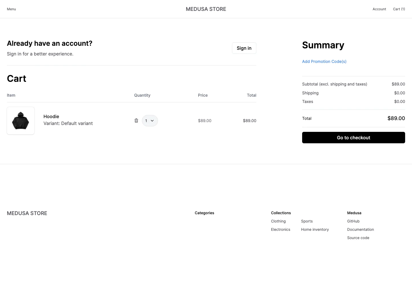
Keep line-item editing and order totals visible together before checkout.
Design notes
Surface
Cart review
Navigation
The store header and a returning-customer sign-in option remain visible.
Layout
A wide item table occupies the left; promotions, totals, and checkout form a narrower right column.
Density
Primary content has the most space; repeated rows and secondary navigation use a compact, consistent rhythm.
Color
White surfaces, thin gray rules, blue promotion links, and a black checkout action.
Type
Strong cart and summary headings frame aligned numeric values and compact item metadata.
Pattern
Keep line-item editing and order totals visible together before checkout.
States
One demo product in a temporary cart with quantity, remove, and checkout controls.
Don't
Adapt the interaction pattern to your own product. Do not copy brand assets, sample identities, proprietary text, or assume unseen states. Specify keyboard behavior, loading, empty, error, and narrow-screen layouts for your implementation.
Make it your own
Turn this reference into a useful brief for your project. Copy it into the AI tool you already use.
Add constraintsPreview & edit promptAssembled in your browser. No API key or AI request needed. Changing the fields refreshes the preview.