Cart and Checkout Design: Keep the Order Clear at Every Step
A checkout design should help someone verify the order and understand the next step without losing what they have already entered. The cart, address form, and order summary work together. Treating them as isolated screens can create uncertainty even when each one looks polished.
Key takeaways
- Carry item identity and selected options from the product into the cart.
- Keep totals and the current checkout step understandable.
- Explain failures without discarding useful entered information.
Make the cart a review surface
The Medusa cart capture places item information and quantity controls beside an order summary. That arrangement is useful because it connects an edit to the order it changes. The capture is a public demo with a sample item; it does not establish a completed purchase or a conversion result.
For your own store, show the product name, selected options, quantity, and relevant price clearly. A small thumbnail helps recognition but should not be the only way to confirm the item. If the customer changes a quantity, keep the relationship between that item and the updated summary visible.
Distinguish the order from the next step
A cart can lead into address entry without committing the final purchase. Use a label that describes that transition. A button that places an order has a different consequence from a button that continues to delivery choices, and the wording should reflect the actual behavior.
Keep the customer’s route back to review understandable. Moving between steps should not unexpectedly erase an address or reset an item choice. If a changed detail affects the available delivery or payment options, explain that change when it occurs.
Use progressive steps without hiding context
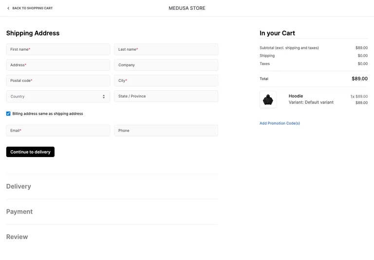
The Medusa shipping-address reference shows the active address form while later delivery, payment, and review sections appear below in a collapsed sequence. The order summary remains alongside the form. The useful principle is visible progress with persistent order context.
A multi-step flow still needs a plan for revisiting completed information. Define which steps are available, what remains incomplete, and whether a later choice needs to be recalculated after an edit. Do not add a step indicator whose labels do not match the actual flow.
Make form instructions persistent
Use clear labels and explain required information near the relevant control. An example value can help describe a format, but it should not be the only instruction once typing begins. The W3C form-labeling tutorial describes how to connect a control to its label so that the relationship is available beyond visual placement.
Check long names, unfamiliar address formats, autofill, and a keyboard-open phone viewport. A layout tested only with a short sample address can hide wrapping and focus problems. Keep the next action reachable without covering an instruction or error message.
Keep totals tied to real order data
Show the actual amounts returned by the store’s pricing and checkout systems. If shipping or another amount is not yet known, identify that condition rather than displaying a reassuring invented total. The interface should communicate when an estimate becomes a confirmed amount.
Similarly, use the product’s real inventory and payment states. A disabled action should explain the unmet requirement, and a failed request should not appear as an empty cart. When the final outcome is uncertain, the design needs a verification path that fits the payment system rather than encouraging repeated blind submissions.
Review the handoff on a phone
Stack the cart and summary in an order that preserves the task. Keep selected options close to the item name and avoid a sticky footer that hides fields. A shorter viewport should not make the order’s identity or the next step ambiguous.
Use the product-page examples to review the earlier selection stage. Then use the state-design guide to distinguish an empty cart, an unavailable product, and a failed checkout request. Those conditions need different explanations and different ways forward.
References to explore
Common questions
Does a checkout need to fit on one page?
Not necessarily. A single page and a sequence of steps can both work when the order stays understandable, entered information is preserved appropriately, and the next action accurately describes its consequence.