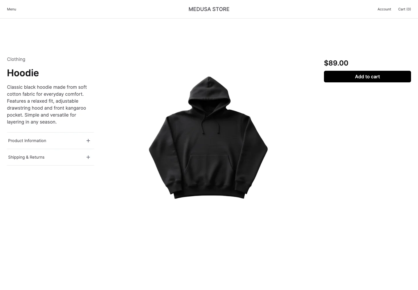
Study a product layout that keeps photography prominent while separating explanation from purchase controls.
Design notes
Surface
Product details
Navigation
The store header retains account and cart; expandable information rows sit under the description.
Layout
Three columns place product information at left, the main image in the middle, and price with purchase controls at right.
Density
Primary content has the most space; repeated rows and secondary navigation use a compact, consistent rhythm.
Color
White space, dark text, black purchase action, and neutral product photography.
Type
A bold product heading and price anchor opposite sides of a quieter description.
Pattern
Study a product layout that keeps photography prominent while separating explanation from purchase controls.
States
A single product with its price and add-to-cart action; no order is placed.
Don't
Adapt the interaction pattern to your own product. Do not copy brand assets, sample identities, proprietary text, or assume unseen states. Specify keyboard behavior, loading, empty, error, and narrow-screen layouts for your implementation.
Make it your own
Turn this reference into a useful brief for your project. Copy it into the AI tool you already use.
Add constraintsPreview & edit promptAssembled in your browser. No API key or AI request needed. Changing the fields refreshes the preview.