3 Ecommerce Design References for Discovery and Product Selection
Product discovery and product selection need different levels of detail. A grid helps shoppers compare possibilities; a detail page helps them understand and choose a specific item. These public demo captures show how imagery, metadata, and purchase controls can change emphasis as the task becomes more specific.
Key takeaways
- Keep comparison information consistent across product results.
- Place variant choices close to the purchase action.
- Use product imagery to answer questions, not just establish a mood.
Editorial observations of dated captures, not measured performance rankings. Original sites may have changed. Our approach.
1. Next.js Commerce: give the merchandise the main surface
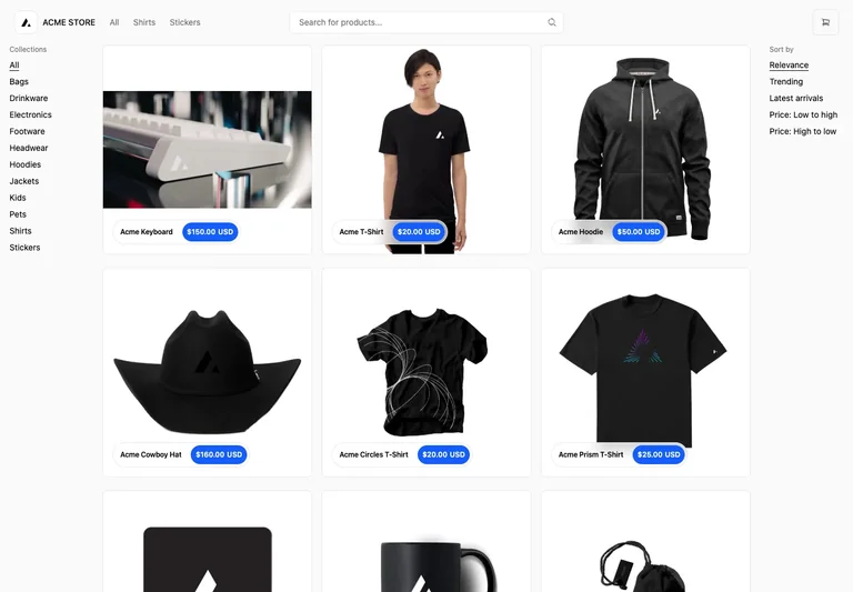
The captured product search places category choices to one side and sorting to the other, leaving the central area for a visual grid. Product names and price labels accompany the images.
Adapt it: Choose the few facts needed to compare items before opening them. Keep those facts in predictable positions across the grid, with descriptive product images as the main visual signal.
Watch for: A visually tidy grid can hide important differences. If dimensions, compatibility, or material determine the choice, do not omit them solely to preserve a sparse card.
2. Next.js Commerce: keep choices beside the action
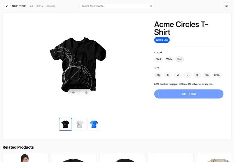
A large product image sits next to the title, price, color and size options, and add-to-cart control. The captured unselected state makes the option groups part of the purchase decision rather than a separate page section.
Adapt it: Show the current selection and explain any choice still needed before the purchase action can proceed. Keep the selected variant recognizable in the cart afterward.
Watch for: A muted button alone does not explain why it is unavailable. Pair disabled behavior with a useful instruction, and distinguish an unselected option from an unavailable variant.
3. Medusa: separate explanation, image, and buying controls
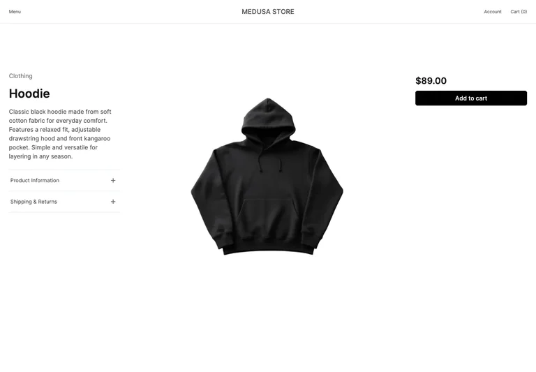
The demo uses three regions: descriptive information, a large central product photograph, and the price with a purchase action. The distribution lets imagery remain prominent without removing product context.
Adapt it: Use separate regions when description and purchase information both need room. On a phone, define a deliberate order so the customer does not have to hunt between disconnected sections.
Watch for: A three-column desktop layout is a starting point, not a mobile plan. Review the actual sequence using long descriptions, several images, and real option names.
Choose images around buying questions
An image can communicate shape, finish, scale, included parts, or use in context. Decide which questions matter for the item and select images accordingly. Several attractive views from the same angle may provide less information than a simple detail photograph.
Keep the primary image recognizable at grid size. On the detail page, make secondary views easy to discover and identify. If the product shown is only an illustrative sample, label it rather than presenting it as available inventory.
Preserve information across the shopping path
The name, selected variant, quantity, and price should remain understandable as a shopper moves from the detail page into the cart. A customer who chooses a particular size should be able to verify that choice before continuing.
Do not force the cart to rely on a tiny thumbnail for identification. Use a readable line-item description and put editing controls close to the item they affect. The checkout design guide follows that handoff in more detail.
Make comparison possible on a narrow screen
Review the card at the actual width it will occupy, not only as an isolated component. Product titles can wrap, price ranges can be longer than a single number, and badges can crowd the image. Use representative content instead of the shortest item in the catalog.
For a detail page, check that the action remains discoverable after changing an option. Avoid a sticky purchase bar that hides instructions or covers part of the form. The important relationship is between the current selection and the next action.
Treat the examples as layouts, not store results
These are captured public demos, not measured checkout studies. Their sample names, prices, and stock states are not a template for your commercial terms. Borrow the information structure and populate it with accurate product data.
Save the discovery and detail references together when briefing a storefront. The search and filter examples can help if the catalog needs more refinement than a simple product grid.
Common questions
Should every product card include an add-to-cart button?
Only when a shopper can make a valid choice from the card. Products that require a size, configuration, or important explanation may need a clear route to details before an item can be added.