Observable — Notebook
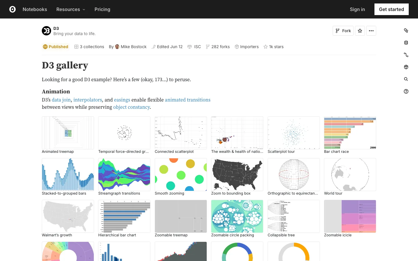
A live-code notebook dressed as a GitHub repo page — one dense metadata strip carries published state, license, author and social proof, then the notebook itself renders as a plain scrollable document.
Why this pattern works
The single-line metadata strip under the title: published badge, collections count, author avatar, edit date, license tag, fork count, importers, star count — all plain icon+text pairs with no borders or containers. It packs every piece of provenance and social proof into one ~24px row without competing with the title above it. Also worth taking: rendering each gallery entry as a live-sized thumbnail image with a plain caption underneath and zero card chrome — the image alone carries the entry.
Design notes
- Surface
- Observable's D3 gallery notebook — a published, forkable code notebook rendered as a document
- Navigation
- Two tiers. A black top-level nav bar (logo, Notebooks, Resources with a dropdown, Pricing, then Sign in / Get started) that is global-app chrome, and a thin vertical icon rail pinned to the far right edge of the content (tag, database, pipeline, package, search, help) for notebook-specific actions. The right rail is unlabelled and nearly invisible until you go looking for it.
- Layout
- Single fluid column, generously margined, capped well short of full width. No sidebar on the content itself — the only fixed elements are the top nav and the sliver of icon rail on the right.
- Density
- Relaxed. Section headings and body copy read like a magazine article; the thumbnail grid below is the only dense part — six columns of small square previews with one caption line each.
- Color
- Black top nav, white page, almost no colour in the chrome — a single muted gold dot for the 'Published' badge and blue reserved for hyperlinks. All the colour on the page comes from the chart thumbnails themselves, which makes the gallery pop against a colourless shell.
- Type
- A serif-leaning display face for the H1 ('D3 gallery') next to a plain sans for everything else — metadata, body text, thumbnail captions — so the one moment of typographic personality is the title, and the rest stays quiet and legible.
- Pattern
- The metadata strip: six or seven small facts (state, collections, author, edit date, license, forks, importers, stars) rendered as plain icon+text pairs in a single row, with icons alone doing the job of separators.
- States
- Populated, steady-state only — a live, well-used gallery with 1k stars and 282 forks. No empty or zero-count treatment visible in this shot.
- Don't
- Don't turn the metadata strip into a row of pill badges or bordered chips. The moment each fact gets its own container, the row reads as UI decoration instead of quiet document metadata.
Make it your own
Turn this reference into a useful brief for your project. Copy it into the AI tool you already use.