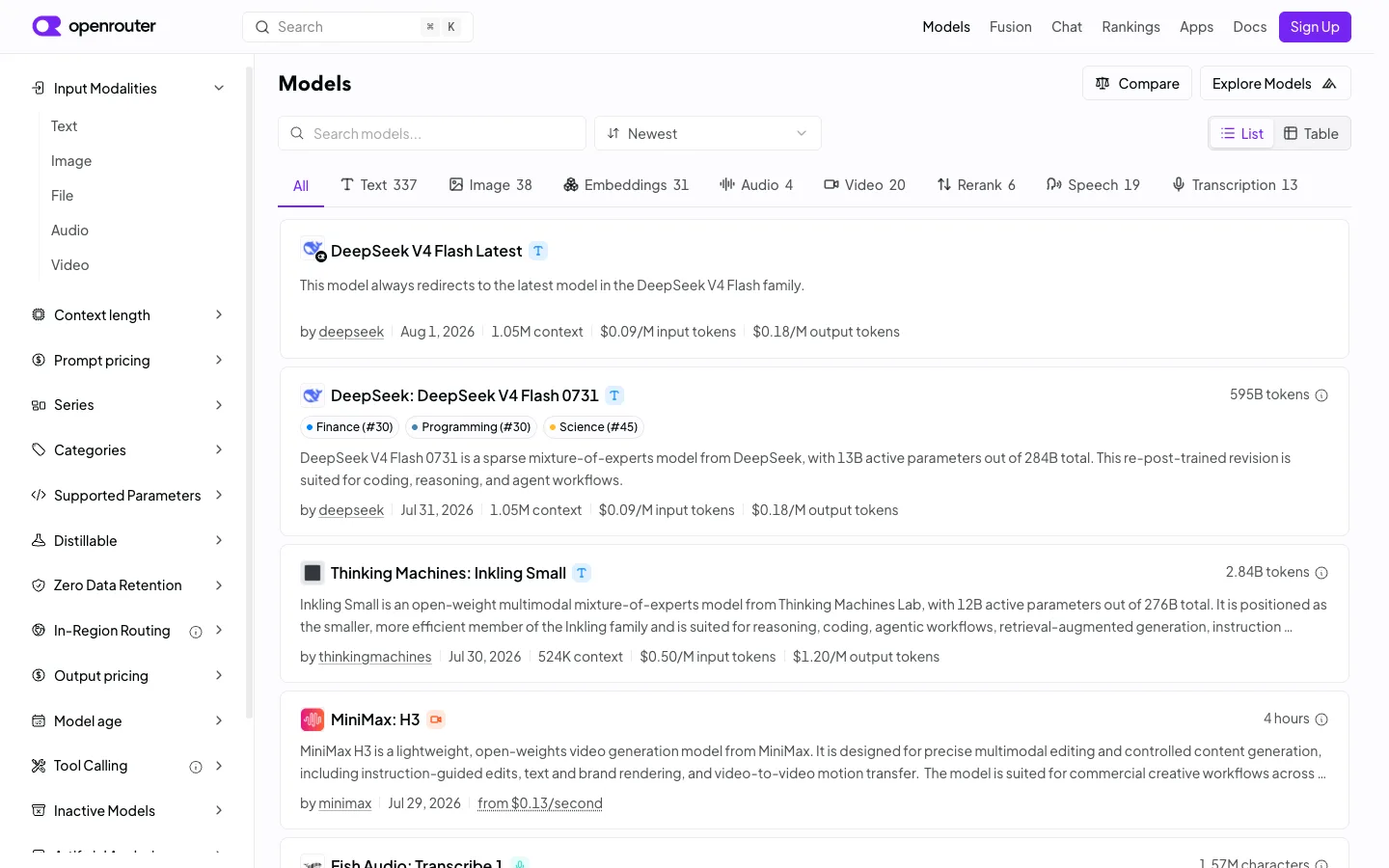
An enormous filter surface — 13+ collapsible facet sections at a fixed 240px — sits permanently open on the left, and the payoff is one pipe-separated meta line per card that answers author, recency and three price points without opening anything.
The pipe-separated meta line — 'by author | date | context length | input price | output price' — as a way to pack five hard numbers into one scannable row per result card. Pair it with the modality tab strip (All, Text 337, Image 38, Embeddings 31...) as a lighter, always-visible alternative to burying the single most common filter inside the sidebar.
Design notes
Surface
Model directory / browse list, logged out
Navigation
Two tiers: a top bar (logo, search, primary nav links, Sign Up) and a left facet sidebar that functions as the real navigation — 13+ collapsible sections stacked vertically, only the top one expanded by default.
Layout
Fixed ~240px left sidebar with its own scroll, fluid main column. Inside the main column, a secondary horizontal facet — the modality tab strip — sits above a vertical stack of full-width bordered result cards.
Density
Tight sidebar rows (~36px) built for scanning many filters fast; roomier result cards (~110px+, 2-3 lines of description each) built for reading. The two densities coexist without feeling mismatched because the sidebar stays monochrome.
Color
Almost entirely grayscale — white surfaces, grey borders and meta text, black headings. The one accent color (violet) is spent only on the logo mark and the Sign Up button; category tag pills use muted low-saturation dot colors and stay small.
Type
One sans. Model names are the largest text on a card (~16px semibold); everything else — description, meta line, sidebar labels — sits at 13-14px regular. Hierarchy comes from the meta line's pipe structure, not from type size.
Pattern
A five-field pipe-separated meta line per result card (author | date | context | input price | output price) that turns a plain list row into a comparison table without ever drawing a grid.
States
Logged out: Sign Up button top right, no empty or loading state visible — the list is fully populated with live pricing, token counts and recency data on every card.
Don't
Don't let the sidebar's 13+ sections all render expanded at once. The pattern only works because most stay collapsed to a single row — expand them all and the 240px column becomes longer than the result list it's supposed to filter.
Make it your own
Turn this reference into a useful brief for your project. Copy it into the AI tool you already use.
Add constraintsPreview & edit promptAssembled in your browser. No API key or AI request needed. Changing the fields refreshes the preview.