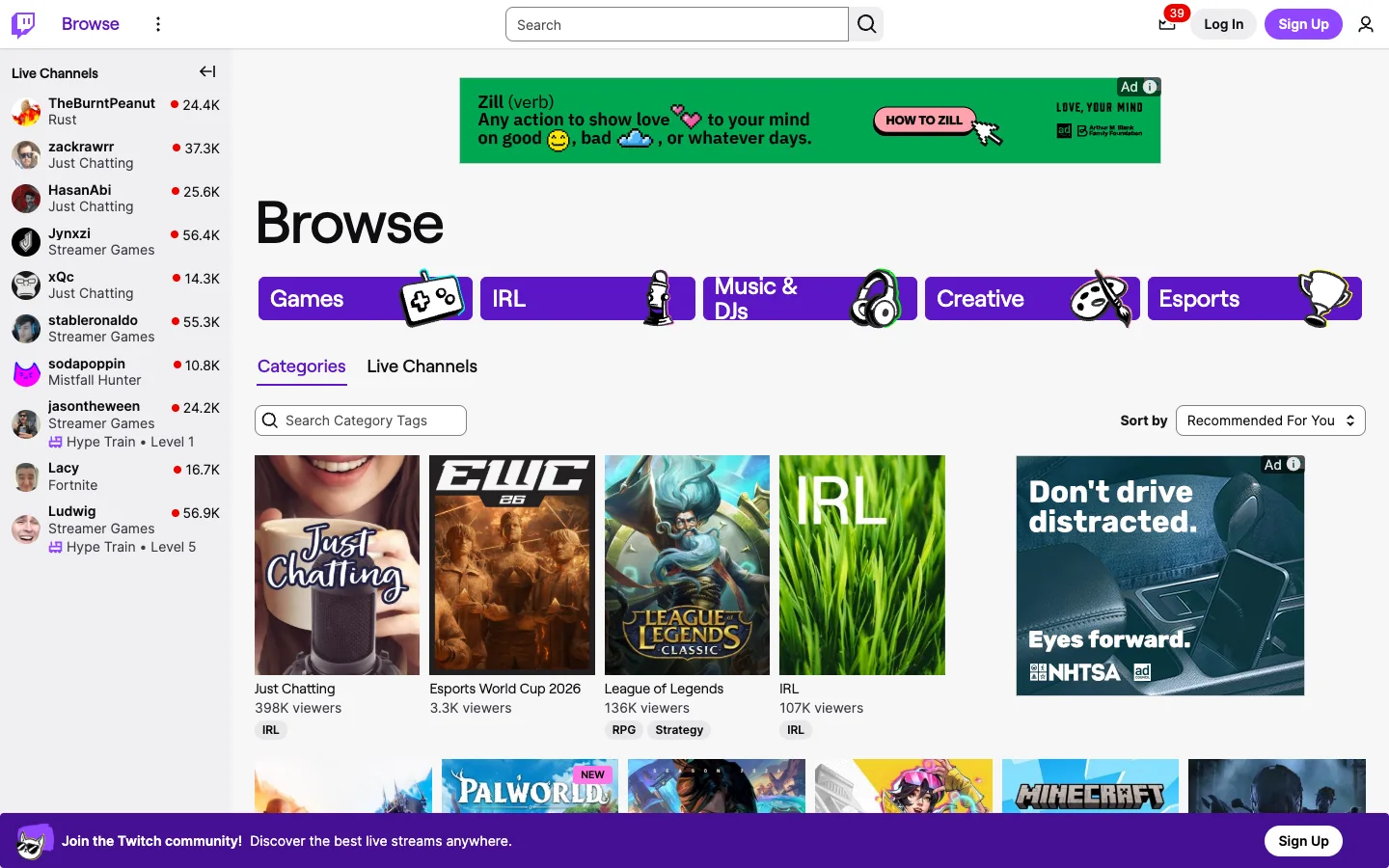
A native ad slots into the category grid at the exact same size and shape as real content, distinguished only by a tiny 'Ad' chip — the grid doesn't make room for advertising, it disguises it as content.
The ad-as-grid-tile pattern: same poster shape, same size, same caption stack as legitimate content, with a small 'Ad' + info-icon chip as the only tell — worth stealing for any content-supported grid. Also the oversized category pills, solid purple with icon art that bleeds past the pill's own rounded edge, which reads far more ownable than a plain icon-plus-label button row.
Design notes
Surface
Browse / directory root, Categories tab, logged out
Navigation
Three tiers. A top bar with a wordmark and a global search pill centered in it. A collapsible live-channels rail on the far left, independent of the page content beside it. And a two-tab sub-nav (Categories / Live Channels) inside the content area, plus a five-pill category shortcut row sitting above that tab strip.
Layout
Fixed top bar, fixed/collapsible left rail (~240px), fluid content grid to the right. A purple signup banner is pinned to the bottom of the viewport over the content, the same mechanism as Spotify's bottom bar.
Density
Medium-dense sidebar — channel rows at ~56px with an avatar, two lines of text and a viewer count — against a looser content grid with real gutters between poster tiles. Two densities coexisting in one view.
Color
White/light-grey canvas, black text, and one purple used everywhere on purpose: the logo, primary buttons, the active tab underline, the category pills, live-status dots and the bottom banner. A single-hue system, not a rainbow, even though it touches nearly every component.
Type
One sans. The page title 'Browse' is oversized (~48px bold black) and stands alone with no supporting subtitle. Channel and category names run ~14-16px bold; viewer counts and tags sit ~12-13px grey. Hierarchy is size-driven at the top and weight-driven everywhere else.
Pattern
The category shortcut pills: large rounded-rect buttons in solid purple with bold white labels, each carrying a decorative icon illustration that overflows the pill's own boundary on one side. Five plain nav links become a visually distinct, ownable row.
States
Logged out: the sidebar still shows a full live-channels list — content isn't gated — but a persistent purple banner pinned to the bottom pushes account creation on every screen. The notification bell shows a live count badge (39) even logged out, implying platform-wide activity rather than a personal inbox.
Don't
Don't caption the ad tile differently from real content — no bigger badge, no different corner treatment, no separate section. The instant an ad tile looks structurally different from its neighbors, the placement stops working and reads as an ad instead of as browsing.
Make it your own
Turn this reference into a useful brief for your project. Copy it into the AI tool you already use.
Add constraintsPreview & edit promptAssembled in your browser. No API key or AI request needed. Changing the fields refreshes the preview.