← Back to library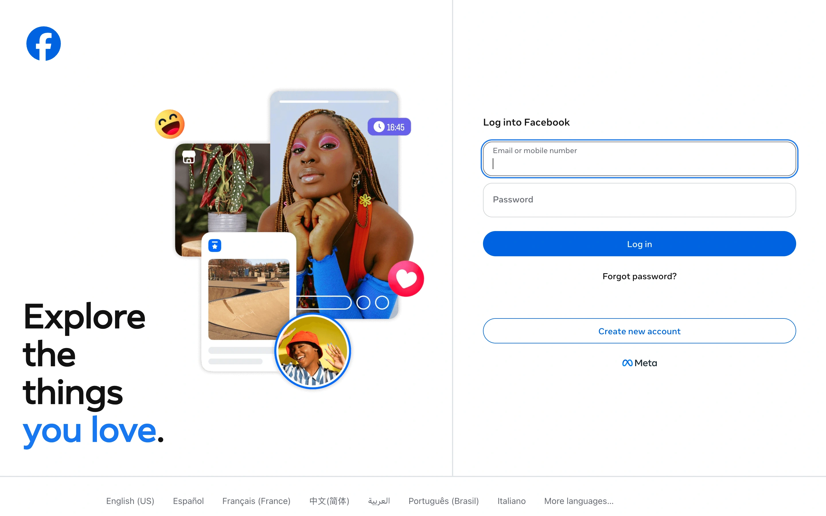
Viewport capture · opening screen Assembled in your browser. No API key or AI request needed. Changing the fields refreshes the preview.
Facebook — Sign in
Forms & OnboardingSee it livefacebook.com
A visual introduction occupies the left side while a compact sign-in form and account-creation route sit on the right.
Why this pattern works
Consumer account entry that needs to explain the product alongside authentication.
Design notes
- Surface
- Facebook public sign-in page.
- Navigation
- Minimal product navigation; recovery and account creation stay near the form.
- Layout
- Wide split screen with imagery and a headline on the left and stacked fields on the right.
- Density
- Low, with clear spacing between authentication choices.
- Color
- White, dark text, blue primary action, colorful content imagery.
- Type
- Large sans introductory message with compact form labels.
- Pattern
- Separate the product promise from the task-focused form while keeping both visible.
- States
- Signed-out state with recovery and new-account links; no login was attempted.
- Don't
- Keep recovery and alternative account paths visible rather than burying them in a footer.
Make it your own
Turn this reference into a useful brief for your project. Copy it into the AI tool you already use.