← Back to library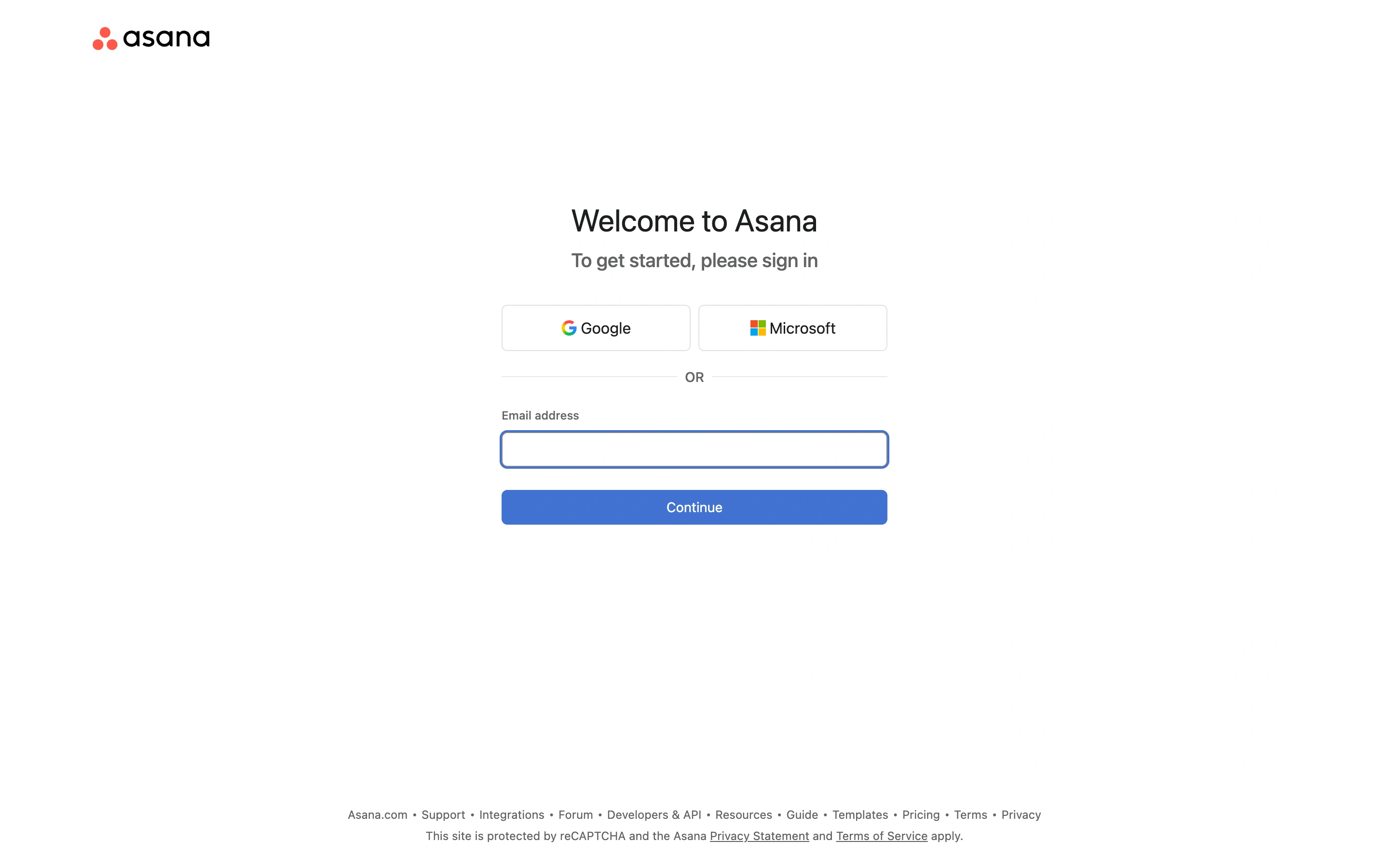
Viewport capture · opening screen Assembled in your browser. No API key or AI request needed. Changing the fields refreshes the preview.
Asana — Account entry
Forms & OnboardingSee it liveapp.asana.com
A centered account-entry panel offers Google and Microsoft before a clearly separated email path.
Why this pattern works
Work software that supports both company identity providers and email entry.
Design notes
- Surface
- Asana public sign-in screen reached from its signup route.
- Navigation
- Minimal entry screen with corporate and support links in the footer.
- Layout
- Narrow centered form with provider buttons, divider, email field, and Continue.
- Density
- Low and task-focused.
- Color
- White, dark text, pale gray boundaries, small brand accents.
- Type
- Simple sans heading with clear provider and field labels.
- Pattern
- Present provider-based access and email as distinct, understandable routes.
- States
- Initial sign-in state, not an authenticated dashboard or completed signup.
- Don't
- Do not imply that clicking Continue immediately creates an account when the next step may identify an existing one.
Make it your own
Turn this reference into a useful brief for your project. Copy it into the AI tool you already use.