← Back to library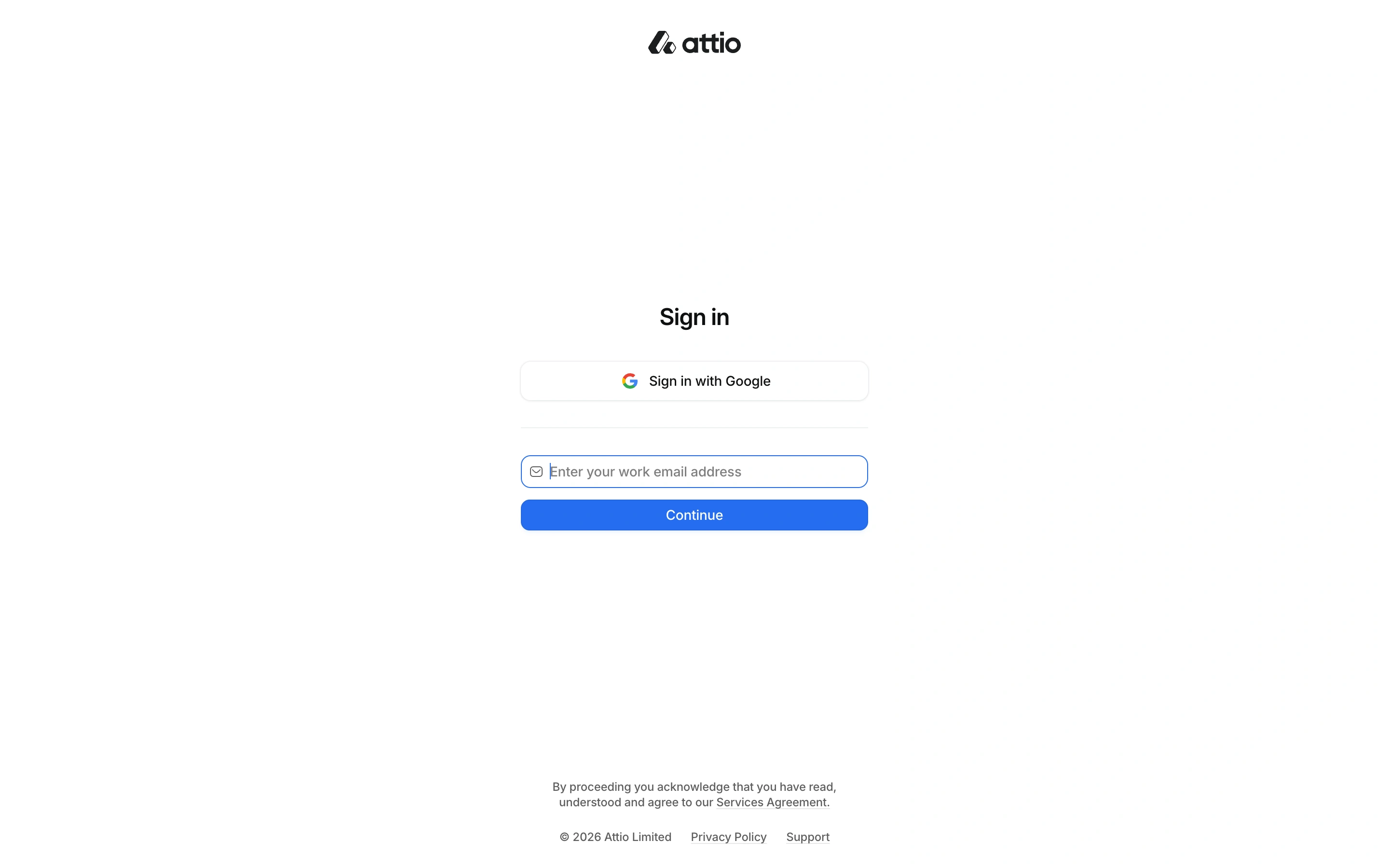
Viewport capture · opening screen Assembled in your browser. No API key or AI request needed. Changing the fields refreshes the preview.
Attio — Sign in
Forms & OnboardingSee it liveapp.attio.com
A very restrained sign-in screen puts Google access and an email field in a narrow centered column beneath the wordmark.
Why this pattern works
Business software that needs an uncluttered entry point.
Design notes
- Surface
- Attio public sign-in page.
- Navigation
- Only essential legal and support links accompany the form.
- Layout
- Wordmark above a small central authentication cluster with substantial white space.
- Density
- Very low.
- Color
- White, dark text, blue Continue button, light field border.
- Type
- Compact sans interface labels and a small sign-in heading.
- Pattern
- Reduce account entry to the available identity paths and a clear next action.
- States
- Unsigned account entry; no CRM workspace was accessed.
- Don't
- Preserve clear labels and recovery behavior even when the visual presentation is minimal.
Make it your own
Turn this reference into a useful brief for your project. Copy it into the AI tool you already use.