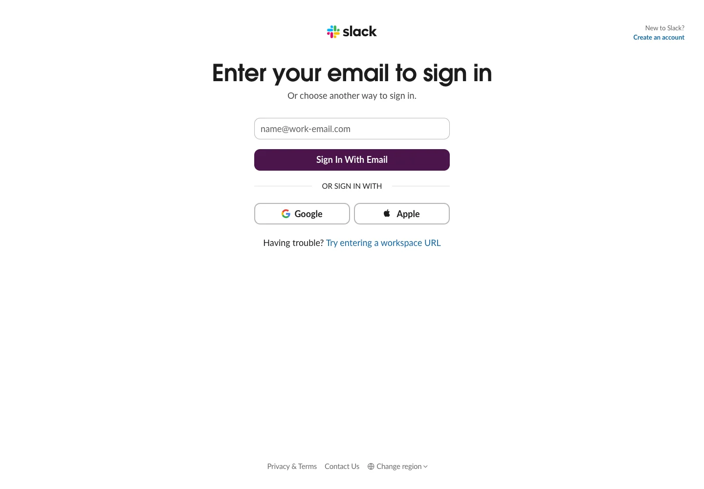
Keep team-account recovery discoverable without competing with the primary sign-in step.
Design notes
Surface
Sign in
Navigation
Account creation is in the upper corner; workspace URL recovery stays next to the form.
Layout
A narrow top-centered form places two provider buttons side by side below the primary action.
Density
A constrained form column leaves room between groups while keeping labels and controls together.
Color
White surface with a deep purple primary action and thin gray outlines.
Type
A prominent bold heading explains the immediate action; helper text and footer links are smaller.
Pattern
Keep team-account recovery discoverable without competing with the primary sign-in step.
States
Initial email entry with alternate provider and workspace URL paths.
Don't
Adapt the interaction pattern to your own product. Do not copy brand assets, sample identities, proprietary text, or assume unseen states. Specify keyboard behavior, loading, empty, error, and narrow-screen layouts for your implementation.
Make it your own
Turn this reference into a useful brief for your project. Copy it into the AI tool you already use.
Add constraintsPreview & edit promptAssembled in your browser. No API key or AI request needed. Changing the fields refreshes the preview.