3 Portfolio Website Examples: Let the Work Shape the Layout
A portfolio works best when its structure reflects the evidence you have. Experience needs context, a broad body of visual work needs a scannable gallery, and intricate craft needs room to inspect details. These three examples offer different answers to the same question: what should a visitor notice about your work first?
Key takeaways
- Choose the portfolio structure around your strongest evidence.
- Explain your role and contribution instead of relying on visual polish alone.
- Keep the route to contact or a deeper case study easy to find.
Editorial observations of dated captures, not measured performance rankings. Original sites may have changed. Our approach.
1. Brittany Chiang: keep identity beside the evidence
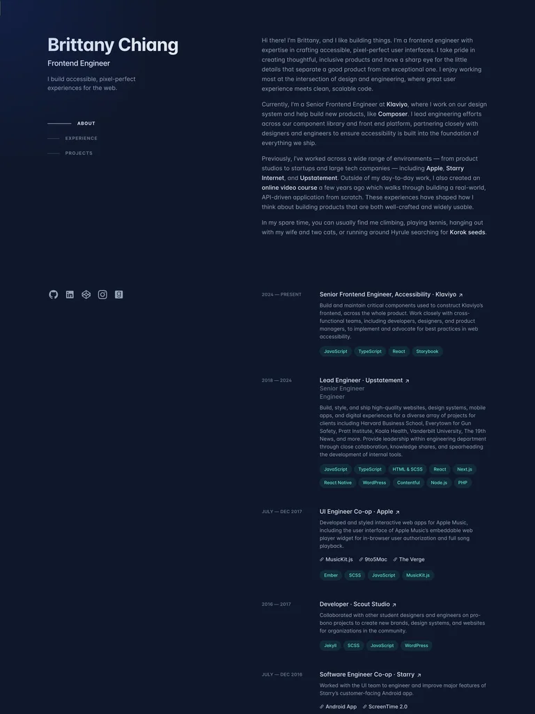
The dark captured layout separates identity and section navigation from a longer column of biography, experience, and projects. Small dates, descriptions, and links support a visitor who wants to inspect a professional history.
Adapt it: Use a stable introduction alongside detailed work when the story depends on roles, decisions, and experience. Keep each project’s contribution understandable without requiring a separate presentation.
Watch for: A persistent column should not consume the phone layout. Reorder the same information into a clear reading sequence when side-by-side space disappears.
2. Dann Petty: let a dense gallery establish range
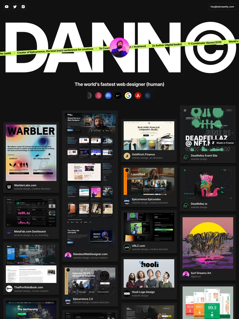
Oversized identity typography sits above an extensive grid of website work. The quiet grid structure creates a repeatable frame while the projects themselves introduce different colors and compositions.
Adapt it: Use a gallery when you have enough strong visual work to reward comparison. Give the previews consistent framing and a clear route to the project or its explanation.
Watch for: Do not pad the collection with weak or nearly identical projects. A larger grid is not automatically a stronger body of work.
3. Jessica Hische: make the frame quieter than the craft
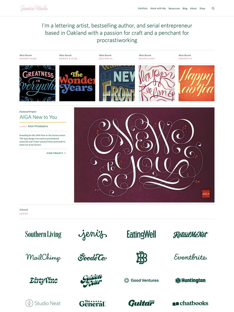
The restrained page surrounds lettering, printed pieces, and other detailed work with modest navigation and readable supporting text. Expressive artwork supplies the personality without requiring every interface label to perform.
Adapt it: If the work already contains rich typography or illustration, reduce the surrounding visual competition. Provide enough project context to explain what the visitor is looking at.
Watch for: Adapt the presentation principle, not the artist’s letterforms or artwork. Your own material should determine the site’s visual character.
Decide who needs to evaluate the work
A hiring manager, a prospective client, and a collector may need different evidence. The hiring manager may look for responsibilities and technical judgment. A client may need to understand the kinds of problems you solve. A collector may want a close view of a finished piece and a clear purchasing route.
Choose a primary audience before choosing a portfolio template. That decision determines whether experience, case studies, services, or a gallery deserves the most prominent position. Secondary audiences can still have clear paths without making every section equally loud.
Write a useful project caption
A project title alone rarely explains your contribution. Add the context, your role, and the important decision. If several people worked on the project, distinguish your work from the team’s work. Describe outcomes only when you have evidence for them.
For example, a caption could explain that you redesigned a scheduling flow to expose availability before a booking form. That communicates a design decision without inventing a conversion improvement. The screenshot can then show the part of the interface that makes the decision visible.
Make the gallery work without hover
A project should have a usable name and destination before a pointer moves over it. Hover can provide extra detail, but it should not be the only way to discover what an image represents. Check the same route with a keyboard and on a touch screen.
Review crops using actual projects. Tall website captures, wide app screens, and square illustrations will not all survive the same crop. Prefer a deliberate preview over chopping off the most informative part to preserve a perfectly uniform grid.
Edit the collection before adding decoration
Remove work that no longer represents the opportunities you want. Bring the most relevant projects forward and shorten the introduction until it leaves room for evidence. Your portfolio does not need a cinematic entrance if that entrance delays access to the work.
For a broader visual direction, compare the website reference roundup. If the portfolio feels busy even with strong work, use the typography and spacing checklist to separate the frame from the content.
Common questions
How many projects should a portfolio include?
Include enough strong, relevant work to demonstrate the opportunities you want. A small selection with useful context can be more informative than a large grid of similar or outdated projects.