100 Celebrity Websites: 12 Design Ideas Worth Studying
A famous face can make a website recognizable. The more useful design question is what the page helps someone do next. We collected 100 English-language celebrity websites, from album campaigns and athlete portfolios to tour pages and associated brands. These 12 examples show different ways to connect a public identity with a useful destination.
Key takeaways
- Give a lasting identity and a current campaign different roles in the page.
- Make the main destinations understandable to visitors who do not know the celebrity.
- Let original work, movement, or imagery establish the character.
- Use an associated brand’s own purpose to guide its website.
Explore the full Celebrity websites collection →
Editorial observations of dated captures, not measured performance rankings. Original sites may have changed. Our approach.
1. Harry Styles: make the release action part of the typography
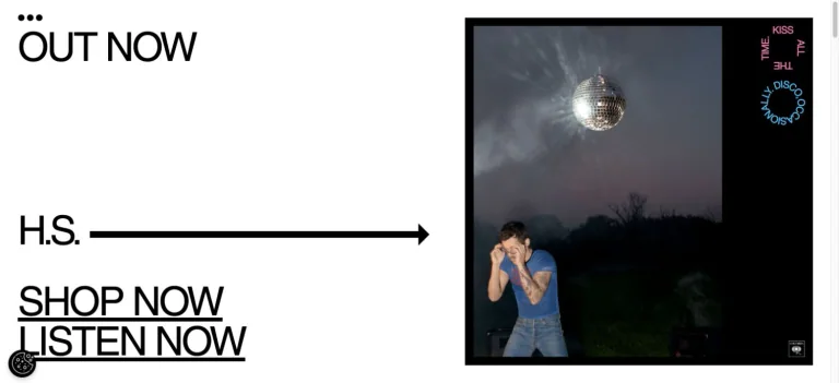
The opening uses a stark white field, oversized black links, a long arrow, and a single piece of album artwork. The shop and listening destinations are prominent elements of the composition, alongside the abbreviated artist identity.
Adapt it: Give an important action enough visual weight to be noticed. A text-led release page can work with a small set of strong assets when labels describe the destinations clearly.
Watch for: A familiar abbreviation can rely on recognition. A less familiar artist or business should include a full name and enough context to explain the release.
2. Olivia Rodrigo: build a setting around the store
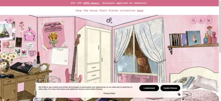
The official store opens into an illustrated pink bedroom. A dressing table, walls, curtains, and other small objects establish the campaign’s character, while the storefront controls remain available above it.
Adapt it: Use an original setting when it has a meaningful connection to your project. Keep conventional navigation and product access available alongside the more expressive presentation.
Watch for: A decorative scene should not make shopping a guessing game. Test labels, touch targets, loading, and a straightforward route to the product list.
3. Rihanna: give an image archive a stable frame
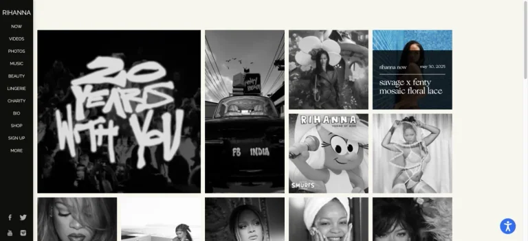
A narrow black rail holds the identity and destinations beside a compact archive of campaign photographs and image tiles. The off-white canvas stays quiet while the content supplies variety.
Adapt it: For an expanding body of work, use a repeatable browsing structure. A consistent frame can accommodate photography, projects, and campaigns with very different visual styles.
Watch for: Images still need useful destinations and accessible names. On a phone, preserve the navigation’s purpose without reserving a large permanent side column.
4. John Legend: show the craft beside the name
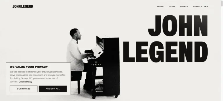
An off-white hero balances a monochrome photograph of the artist at a piano with an enormous stacked name. A small top navigation leaves the portrait and instrument room to explain the subject.
Adapt it: Choose a photograph that shows what someone does, not only how they look. Let the image and a concise identity statement share the introduction.
Watch for: Oversized text needs a deliberate small-screen arrangement. Check the name, image crop, and navigation together rather than shrinking the entire desktop composition.
5. Lando Norris: keep one bright action inside a quiet portrait page
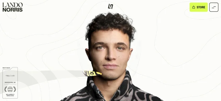
A centered portrait sits on a pale background with subtle topographic lines. Elegant name typography and small identity marks establish the frame, while a fluorescent store control introduces a clear accent.
Adapt it: Choose a restrained background detail connected to your own story, and reserve a contrasting color for a useful destination. The portrait can carry most of the visual weight.
Watch for: Fine lines and tiny labels can disappear at smaller sizes. Keep supporting detail secondary to readable navigation and an understandable action.
6. Tony Hawk: use a familiar website structure confidently
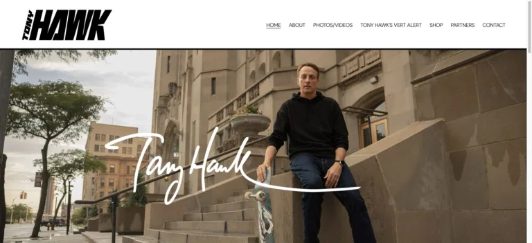
A bold black identity and straightforward navigation sit above a large outdoor portrait. A handwritten name crosses the image, adding a personal detail without changing the basic browsing structure.
Adapt it: A conventional header can support a distinctive identity when the photography and lettering are specific to the person. Start with a strong original image before adding interface effects.
Watch for: A signature is an identity element, not a substitute for readable navigation. Keep work, public appearances, and contact destinations labeled in ordinary text.
7. Pierce Brosnan: introduce more than one creative practice
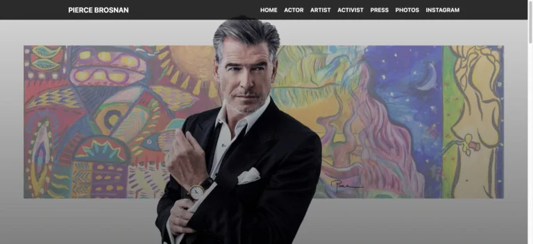
A formal portrait overlaps a colorful painting, while the navigation distinguishes acting, art, activism, press, and photographs. The opening connects the person to two kinds of work before a visitor chooses a section.
Adapt it: When someone has several practices, show how they relate and give each a clear destination. One carefully composed image can introduce that relationship more efficiently than a long list of roles.
Watch for: Keep the contribution explicit within each section. A visitor should be able to distinguish personal work, collaborations, and publicity material.
8. Viola Davis: let the production company have its own identity
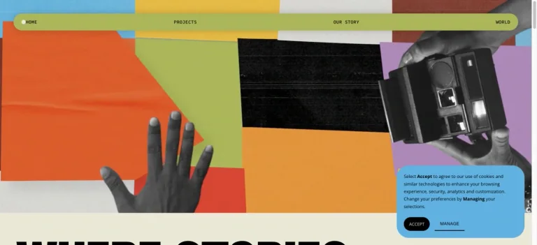
JuVee Productions, founded by Viola Davis and Julius Tennon, uses colored paper, monochrome hands, and film equipment in a tactile collage. A thin rounded navigation bar frames the composition. This is an associated company website, with a visual identity of its own.
Adapt it: A celebrity-founded business can introduce its work through a distinct brand. Build the visual system around the company’s subject and explain the founder connection where it helps visitors understand the business.
Watch for: A founder’s reputation does not explain every service or project. Pair expressive imagery with clear descriptions of what the organization makes.
9. John Mulaney: turn tour artwork into a direct landing page
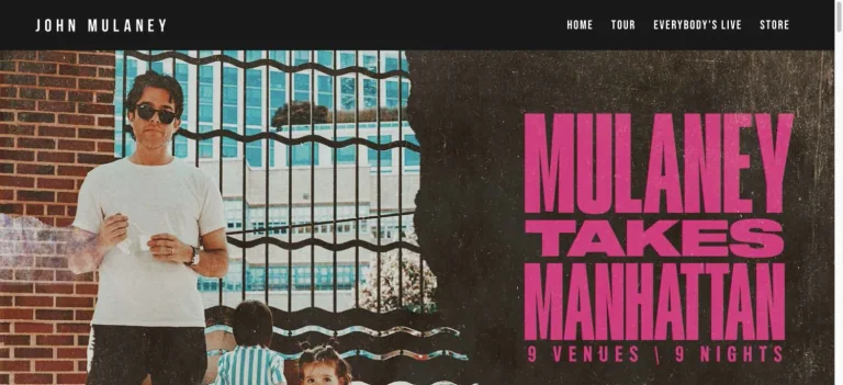
A street portrait meets a grainy dark panel of oversized pink tour lettering. A compact black navigation bar leaves most of the opening to a poster-like campaign composition.
Adapt it: Carry the visual language of a live event into its page, then keep dates, locations, and ticket destinations easy to scan. Consistent artwork can connect the announcement to the booking journey.
Watch for: The capture shows the opening campaign, not a tested purchase flow. Verify ticket links and replace expired dates when adapting a tour-led structure.
10. Drew Barrymore: name the different ways to participate
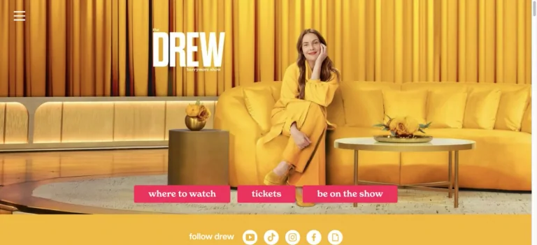
A yellow studio portrait places the host on a sofa beneath the show identity. Three pink buttons offer distinct destinations: where to watch, tickets, and appearing on the show. The choices sit inside the same bright visual world.
Adapt it: If visitors have several legitimate goals, label those paths by the task. Use a small, readable set of choices instead of a vague invitation to learn more.
Watch for: Each path needs to deliver what its label promises. Keep eligibility, availability, or location requirements visible before someone invests time in a form.
11. Misty Copeland: let the movement shape the composition
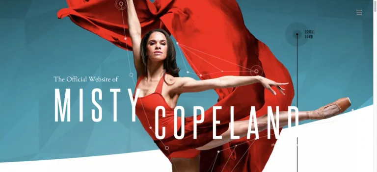
An extended dance pose and flowing red fabric cross a teal background, with tall white name lettering following the image’s scale. The body and fabric provide the composition’s strongest directional lines.
Adapt it: For a performer, maker, or athlete, select an image that expresses the work through posture, tools, or movement. Place the identity around that evidence instead of treating the portrait as a generic decoration.
Watch for: The crop is part of the design. Check that the important gesture and readable identity survive on narrow screens, and provide useful image alternative text.
12. Michael Weatherly: explain the person in plain text
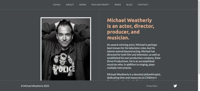
A framed monochrome portrait sits beside an orange introduction that names the actor’s different roles. A narrow charcoal layout, modest navigation, and a simple footer keep the page focused on the biography.
Adapt it: A short, specific introduction can make a personal site understandable immediately. Use a readable text column beside a portrait when the visitor needs context more than a campaign spectacle.
Watch for: Keep the biography current and break longer career information into useful sections. Small type should remain comfortable to read without zooming.
Explore the full collection
Open all 100 celebrity websites to compare the screenshots, read the design notes, and visit the original sources. Save the entire collection or select a smaller set for your own board.
The selection spans 63 music references, 14 sports references, 11 comedy references, 10 film references, one dance reference, and one television reference. These are broad editorial categories: many of the people work across several fields. The associated sites have English-language content; some also offer other languages.
Separate the lasting identity from the current campaign
An artist’s newest album, an actor’s current project, and an athlete’s latest season can each supply a strong opening image. Those campaigns change more often than the person’s identity. Plan which elements belong to each layer.
The name, main navigation, biography, and contact routes can provide continuity. Campaign artwork, featured releases, dates, and primary actions can change with the work. Harry Styles’s stark action labels and John Mulaney’s tour poster suggest two different campaign treatments; Rihanna’s archive offers a structure for keeping earlier work accessible.
This distinction is useful for smaller personal brands too. A new course or exhibition should not require rebuilding the biography and project archive. Give the current offer a prominent place while preserving a clear route to the rest of the work.
Welcome people who do not arrive as fans
Recognition can make a short name, emblem, or piece of artwork feel self-explanatory to an existing audience. A first-time visitor may need a sentence that says who the person is, what they make, and why this destination exists.
Michael Weatherly’s compact introduction makes the roles explicit. Drew Barrymore’s show site makes the visitor’s choices explicit. Those are different forms of clarity: one explains the person, the other explains the available actions.
Review the page with its famous name covered. Does it still provide enough information to understand the work or choose a useful next step? If not, add context before adding decoration.
Give associated brands their own job
A company founded by a celebrity is a different reference from a personal portfolio. The company may need to explain products, a service, or a body of production work. Its visitor does not necessarily arrive to read the founder’s biography.
JuVee’s own story page identifies Viola Davis and Julius Tennon as its founders. The Honest Company’s company information identifies Jessica Alba as a founder. Those connections explain their inclusion in this collection; they do not turn the company websites into personal portfolios.
When choosing references, match the website’s purpose as well as its visual character. A product-led store can help with merchandise presentation. A film company can help with a project archive. A portrait-led personal site can help with an introduction.
Turn the references into a small, specific brief
Select one reference for identity, one for content organization, and one for the main action. Write down the contribution of each before combining them. For example:
Build a website for an independent stage performer. Open with an original rehearsal photograph and a short introduction. Keep current show dates and ticket links easy to find, then provide a separate archive of past productions. Use a simple header and preserve a clear contact route for professional inquiries.
Misty Copeland can inform the use of a performance image, John Mulaney the campaign hierarchy, and Tony Hawk the clarity of the navigation. Their original branding, photographs, and copy are not part of the brief.
For a related set of personal brands and educational businesses, explore the YouTube creator websites collection and its design breakdowns.
Review the page when the campaign changes
A page that once pointed to a new release or an upcoming tour can become confusing when that moment passes. Keep past work available where it remains useful, replace expired primary actions, and distinguish announcements from an ongoing archive.
The same review should cover the behavior a screenshot cannot show. Follow the important links, try the menu with a keyboard, read the page on a phone, and check what happens when video does not load. A distinctive opening is most useful when it leads somewhere clear.
How we selected these websites
We reviewed public English-language pages and their connection to the named celebrity, then captured their opening sections and wrote notes about visible design choices. The selection includes official personal and professional sites, official stores, and identified associated brands. We excluded unrelated destinations, obvious fan or impersonation pages, inactive holding pages, and references already added in the earlier creator batch.
The images are dated observations. Original websites can change, and some captures retain small consent notices. These examples support design comparison; they are not endorsements of products or evidence of measured conversion performance.
Common questions
Are these the 100 most popular celebrities?
No. This is a curated selection of English-language websites with useful, visible design choices. The collection does not rank celebrities by popularity, followers, income, or website performance.
Does the collection include stores and celebrity-founded companies?
Yes. Alongside personal, artist, and athlete sites, it includes official stores and associated brands. Those destinations are labeled so you can compare the right kind of website for your project.
What do the screenshots document?
The captures document opening viewports reviewed on September 8, 2026. Some include small consent notices from the original sites. They do not establish the quality of every page, animation, accessibility feature, or purchase flow.