5 Website Design Examples to Study Before Your Next AI Build
Good website references solve different problems. Clay makes an abstract offer tangible; Airtable shows a product workflow; AdAnt leads with examples; Aardvark gives its product a strong visual presence; Dennis Snellenberg makes a personal identity unmistakable. Choose the approach that fits your content before asking an AI tool to design the page.
Key takeaways
- Choose references for the job they do, not just their color palette.
- Give your AI a small set of named principles to adapt.
- Treat these as dated design observations, not a ranking of business performance.
Editorial observations of dated captures, not measured performance rankings. Original sites may have changed. Our approach.
1. Clay: make an abstract offer tangible
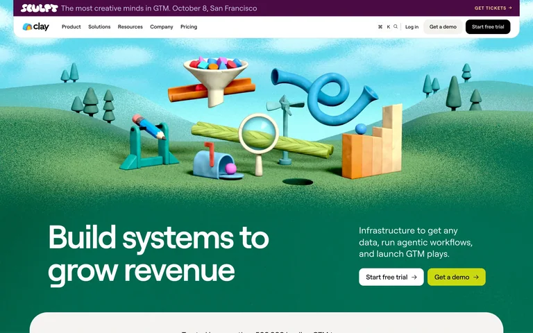
The captured page puts a colorful miniature landscape above a dark green introduction. The scene gives a broad growth-systems message a memorable visual setting, while the text and trial/demo actions explain what to do next.
Adapt it: Use an illustration to explain a relationship in your own product: inputs becoming an output, a workflow becoming simpler, or separate tools becoming connected. Give the headline and action their own readable space.
Watch for: An elaborate illustration can become decoration if it has no connection to the offer. Start with the message; do not invent product capabilities to justify a visual.
2. Airtable: connect the promise to the interface
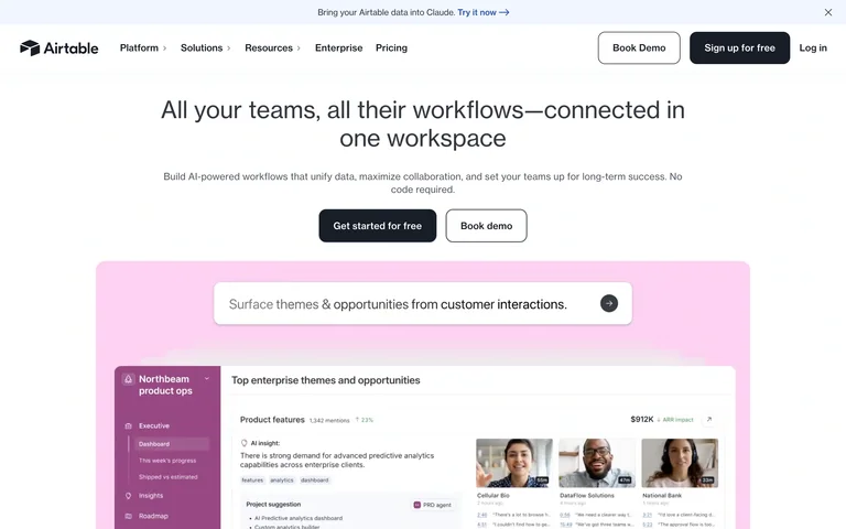
A centered platform message and two distinct actions sit above a wide product-workflow preview. The interface gives the broad claim a concrete object to inspect.
Adapt it: Show a representative workflow immediately after the opening promise. Use the primary action for the most common next step and a secondary action for visitors who need a demonstration.
Watch for: A tiny dashboard image cannot prove every feature. Crop around the task you are explaining and provide a way to inspect the details.
3. AdAnt: let examples carry the introduction
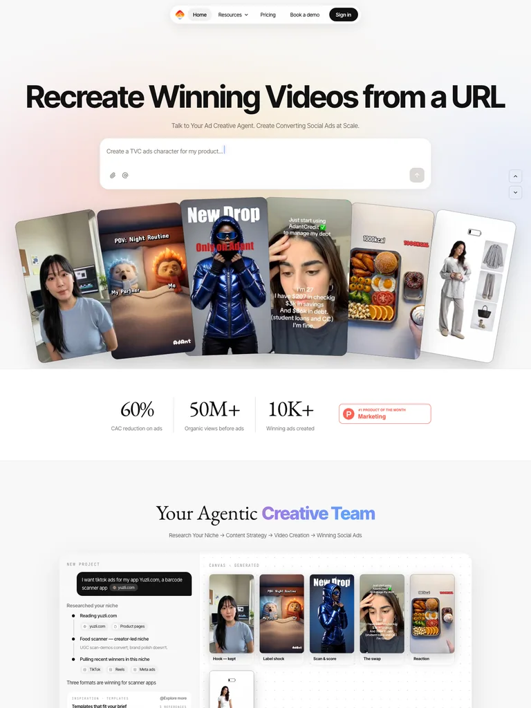
The capture places a broad headline above a prompt area and a fan of portrait video examples. The collection shows the range of output before a reader reaches the deeper explanation.
Adapt it: If your product produces visible work, show a small range of real outputs early. Keep their labels and destinations clear. A modest overlap or tilt can make the collection feel arranged rather than mechanically tiled.
Watch for: Do not add a pretend input field to a product that has no generator. Preserve keyboard access and use a simpler arrangement when overlap would make mobile targets difficult to select.
4. Aardvark: give the product a visual role
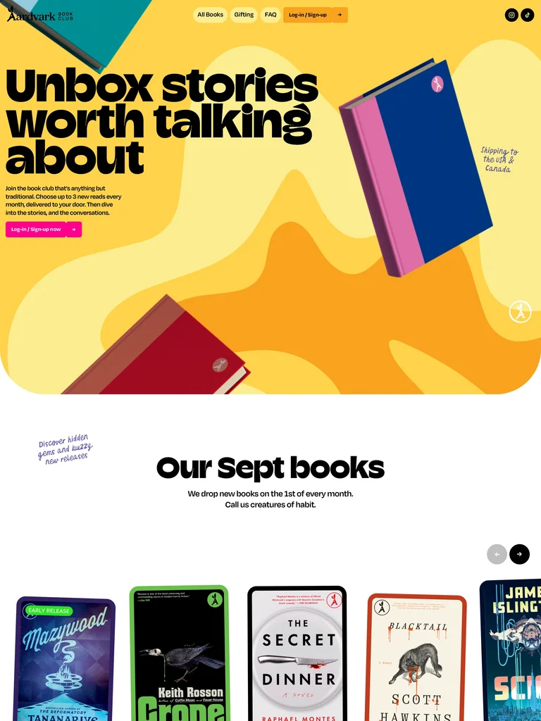
Large black type and vivid book covers make the subscription concrete. A book shelf and illustrated membership steps connect the expressive opening to an understandable process.
Adapt it: Use your actual products as the main imagery. Follow the visual introduction with a short explanation of how someone chooses, receives, or uses what you sell.
Watch for: Bright colors do not replace clear terms. Make the offer, recurring commitments, and next step understandable in ordinary text.
5. Dennis Snellenberg: establish a personal identity
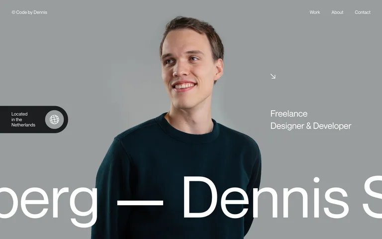
An edge-to-edge portrait and a prominent name make the person central to the opening. Location and specialty information support the identity without giving every detail equal weight.
Adapt it: For a personal site, decide which human detail should lead: your face, your work, or your area of practice. Use the surrounding information to clarify that choice.
Watch for: A screenshot records a visual state. It does not establish how an animation behaves or how a page works with assistive technology. Test your own implementation directly.
How these examples were selected
These are editorial picks from Swipefile’s captured website library. Each demonstrates a different way to introduce an offer. We looked for a readable opening, a clear relationship between imagery and content, and a principle you could describe without naming the brand. The order is not a score. We have not measured these sites’ conversion rates, accessibility, or commercial results.
A useful reference survives a change of color. If the only instruction you can give is “use this orange,” look again. Where is the product? Which sentence earns the largest type? What does the first action promise? Those decisions are more useful than a screenshot treated as wallpaper.
Combine principles without creating a collage
Choose one example for structure and a second for tone. For a small software product, you might borrow Airtable’s relationship between a promise and a product preview, then use the restraint of a personal portfolio to simplify the surrounding copy. Do not combine all five heroes. That creates five competing introductions to one product.
Write down one sentence for each reference: “Use this to guide the size and placement of the product preview.” Add a second sentence explaining what should remain your own: imagery, brand, copy, and interaction details. This makes your intent easier to discuss with a designer or an AI tool.
Turn the reference into a testable brief
Instead of “make it look like Clay,” write:
Lead with an illustration that explains our product’s job. Keep the headline and main action readable without the illustration. Use our own visual assets. Follow with one real product example that supports the opening claim.
Then test the result with your actual content. A hero that only works with a four-word title is not finished if your title is twelve words. A dramatic preview should still make sense when it becomes a single column on a phone. Confirm that every visible action goes somewhere useful.
Your next step
Save the two or three references that solve your specific problem to a board. Use the AI design-brief guide to explain your choices. For longer offers, study the landing-page examples before deciding how much information the page needs.
The Slop Monster loves an unspecified request for “premium.” Give it something more concrete to work with.
Common questions
Should I copy a website reference exactly?
Use the reference to identify layout, hierarchy, and content principles. Create your own copy, branding, imagery, and implementation; a reference is not a license to reuse someone else’s assets.
How many website references should I give an AI tool?
Start with two or three, each with a specific role. Add more only when a missing pattern needs its own example. A small, explained selection is easier to apply than a large unexplained collection.