How to Review an AI-Built Website Against Your Design References
A useful design review compares decisions rather than asking whether the page feels premium. Name what the reference does, identify whether the new design achieves the same purpose, and request the smallest change that resolves the gap. This keeps feedback specific enough to build and verify.
Key takeaways
- Review one design principle at a time rather than matching a screenshot wholesale.
- Use real content and complete interaction states in the comparison.
- Turn each finding into a concrete change with a visible acceptance condition.
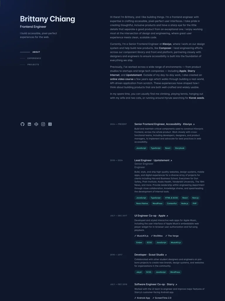
Write down what each reference was meant to contribute
Before reviewing the result, identify the job of each saved reference. One might show how to present a portfolio’s experience, another might demonstrate a product preview, and a third might guide the density of a table. If you cannot name its job, it may not belong in the review set.
For example, the Brittany Chiang capture is useful for the relationship between a stable identity area and detailed professional evidence. That does not mean a new site should inherit its colors, copy, or exact column dimensions. The comparison should focus on the relationship you actually selected.
Compare the reading order before the styling
Look at the page without interacting. What attracts attention first, what explains it, and where does the next action appear? Check whether that order matches the task. A large decorative number or badge can accidentally become more prominent than the thing the user needs to understand.
Describe a hierarchy problem in concrete terms. Instead of “the hero is weak,” say that the image arrives before the product is identified, or that three equally weighted buttons compete for the first action. The builder can act on those observations without guessing what your taste means.
Check whether the evidence survived
A reference may work because it contains strong photography, finished projects, or a recognizable workflow. If the new page replaces that evidence with generic blocks, copying the layout will not produce the same effect.
The Airtable capture connects a broad introduction to a visible interface. When reviewing a page inspired by that principle, ask whether the new product example is equally specific to its own offer. A vague mock dashboard is not a substitute for showing the relevant task.
Review the least flattering content
Use a long heading, a missing image, a new account, and a narrow screen. These cases reveal whether the design depends on an ideal screenshot. A card that works only with a two-word title needs a content rule or a more flexible layout.
For an app surface, inspect more than the populated state. The Tabler task-list reference can guide comparison and grouping, but the implementation must also define empty results, loading, and failed updates. Those are new requirements for your product, not behaviors proved by the capture.
Turn feedback into a bounded revision
A useful request names the current problem, the intended relationship, and what should remain stable. For example: “The project previews are too small to distinguish. Give the gallery more width, reduce the surrounding introduction, and preserve the existing project order and links.”
Add a visible acceptance condition. In that example, the projects should be recognizable at desktop and phone sizes, with titles and destinations still accessible. Avoid bundling an unrelated color change, navigation rewrite, and content rewrite into the same revision unless they genuinely depend on each other.
Verify the changed page rather than the promise
Open the revised route, follow its main action, and inspect the narrow layout. Check that the requested improvement did not remove a useful function or replace accurate copy with invented claims. If the change requires a backend connection, distinguish the rendered interface from the connected behavior.
The mood-board-to-brief guide helps with the earlier specification step. This review happens after something has been built: compare the actual result, record a small number of observable gaps, and make the next revision specific. The Slop Monster has a much harder time hiding behind “make it pop” when the feedback names exactly what needs to change.
References to explore
Common questions
Should an AI-built page look exactly like its reference?
No. Use the reference to evaluate the selected principles, such as hierarchy, evidence, or density. The new page should express its own content, identity, and working requirements.