Empty, Loading, and Error States: Design What Happens Between Screens
An empty screen, a request in progress, and a failed request can all contain very little content, but they mean different things. Good state design tells people which condition they are in and what they can do next. Start with that meaning before choosing an illustration, spinner, or toast.
Key takeaways
- Separate a valid empty result from a request that failed.
- Give each state an explanation and a relevant next action.
- Preserve context and useful input while the interface changes.
Name the state before drawing it
A new account with no projects is different from a filtered list with no matches. A cart with no items is different from a cart that could not be retrieved. Write those conditions separately in the design brief so the implementation does not reuse one cheerful empty message for all of them.
For each state, record its trigger, the information still available, and the next useful action. This small model helps the page remain understandable when the ideal populated screen is unavailable.
Make a genuinely empty state useful
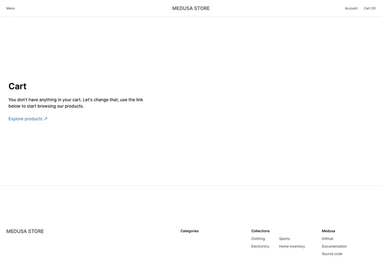
The Medusa empty-cart capture uses a short explanation and a route back to product discovery. It does not need an empty line-item table or an inactive checkout flow. The design gives the absence of items a clear meaning and an appropriate way forward.
For a new project list, the equivalent action might be creating the first project. For a filtered list, it might be removing a refinement. Choose the action according to the cause of the empty state rather than making every empty screen say “Get started.”
Preserve the surrounding task
The Next.js Commerce empty-cart reference shows a drawer over the store, keeping the browsing context visible behind it. The useful principle is reversibility: checking the cart is a side task that should have an understandable way back.
If you use an overlay, define how it closes and where focus returns. Do not let an empty drawer become a dead end. The capture shows the visual arrangement; keyboard and focus behavior must be specified and tested in your own implementation.
Show progress without pretending to know the future
A loading state should communicate that work is ongoing without promising a completion time the system cannot support. Use a progress value only when it reflects meaningful measured progress. Otherwise, a clear pending message may be more honest than an animated percentage.
Keep existing content visible when it remains useful and accurate, and make any stale or refreshing state understandable. Reserve space where practical so that a small status change does not repeatedly move the main controls under the user’s pointer.
Explain failure at the right level
An invalid field needs a correction near that field. A service failure needs a page or component-level explanation. A permission problem needs an account or access explanation. A single generic error message makes these different situations harder to recover from.
Preserve safe entered content when retrying is appropriate. If an action may already have completed, provide a way to check its outcome rather than encouraging repeated submissions. The checkout guide discusses that uncertainty in an order flow.
Make success understandable beyond color
A changed icon or a brief green flash may not explain what succeeded. State the outcome in useful terms, such as which item was saved or whether the next step requires confirmation. Keep important information available long enough to understand.
For updates that appear without moving focus, the W3C status-message guidance explains how relevant status information can be exposed to assistive technology. Choose the appropriate semantics for the actual message; announcing every minor update can create its own noise.
Review the transitions as a small sequence
Walk through initial load, a valid empty state, populated content, an edited filter, a failure, and a successful retry. Use realistic slow responses and long messages. The goal is not to collect six attractive screenshots, but to preserve meaning as the user moves between them.
Pair this with the search and filter guide for result states, or the settings guide for saved changes. An interface feels complete when the routes out of uncertainty are as carefully designed as the populated screen.
References to explore
Common questions
Can the same message cover an empty result and a loading failure?
It should not. An empty result says the request succeeded but found nothing in that scope. A failure says the result is not known. Explain the condition accurately and offer the relevant next step.