SaaS Marketing
CURATED COLLECTION · 18 REFERENCES
Voice, video, coding, meeting notes, creative tools and AI infrastructure, with clear visual notes for each website.
Copy the reference notes below and paste them into Claude, ChatGPT, or your coding assistant. Add what you want to build.
Includes design notes, original sources, and preview links. An assistant that supports browsing can also read the public board link.
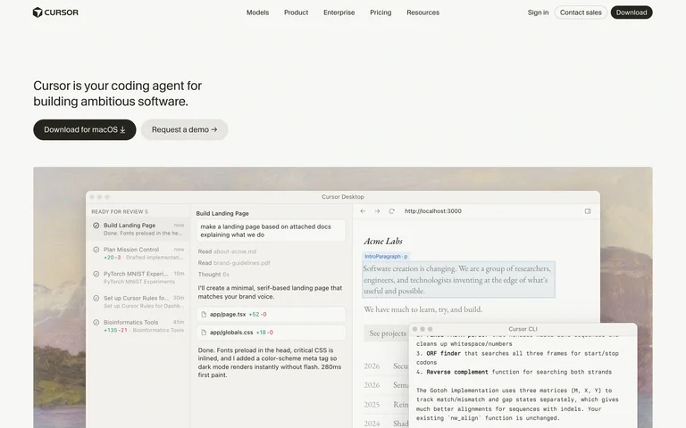
A coding-agent homepage gives a short introduction and download action above a large interface preview.
Useful for: A coding-agent homepage gives a short introduction and download action above a large interface preview.
# Design reference: Cursor
Source: https://cursor.com/
Swipefile reference: https://swipefile.design/ref/ai-cursor/
Captured: 2026-09-05. This is a dated reference, not a claim about the current live product.
Capture scope: one viewport. Do not infer unseen page sections or a complete user flow.

## Objective
Adapt the visual principles below to my project. Use my own content and identity. Do not reproduce logos, proprietary copy, or brand assets.

## Reference notes
- mood: Calm and product-led.
- colors: Warm off-white, near-black type and muted screenshot tones.
- typography: Small sans-serif headline and restrained utility labels.
- layout: Slim top navigation, a compact left-aligned introduction and a wide product screenshot.
- motion: Static capture of one viewport. Visit the source to study motion and interaction.
- texture: A desktop interface floats against a softly textured scene.
- dont: Adapt the structure to your own content and brand; use your own identity, copy and imagery.

Useful for: A coding-agent homepage gives a short introduction and download action above a large interface preview.

## Acceptance criteria
- Existing project conventions, design tokens, working functionality, and unrelated changes are preserved.
- Two or three reference principles clearly support the user's task; conflicts are resolved in favor of usability and the existing product.
- Reusable components and semantic HTML express the interface. Available licensed assets are used; important UI text is never rendered as a bitmap.
- Every visible control has a defined behavior. Loading, empty, error, success, disabled, and long-content states are specified where relevant. Demo data is clearly labeled.
- Navigation and content adapt at 375px, 768px, and 1440px without horizontal page overflow. Keyboard use, visible focus, labeled inputs, at least 44px touch targets, readable contrast, and reduced motion are supported.
- Verification distinguishes rendered behavior from proposals and identifies anything still requiring a backend or external service.

## Quality bar
Clear hierarchy, consistent spacing, restrained surfaces, and purposeful motion. Avoid decorative gradients, excessive cards, placeholder buttons, and invented metrics unless the project calls for them. Do not claim a feature is connected or tested without evidence.
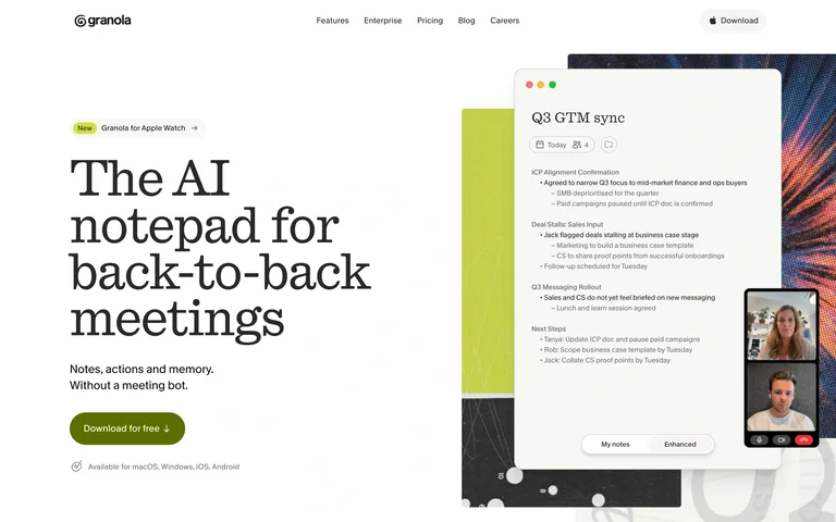
An AI notepad homepage uses editorial typography beside a layered meeting-note preview.
Useful for: An AI notepad homepage uses editorial typography beside a layered meeting-note preview.
# Design reference: Granola
Source: https://www.granola.ai/
Swipefile reference: https://swipefile.design/ref/ai-granola/
Captured: 2026-09-05. This is a dated reference, not a claim about the current live product.
Capture scope: one viewport. Do not infer unseen page sections or a complete user flow.

## Objective
Adapt the visual principles below to my project. Use my own content and identity. Do not reproduce logos, proprietary copy, or brand assets.

## Reference notes
- mood: Human and approachable.
- colors: Warm white, black text and lime-green accents.
- typography: A prominent serif headline contrasts with compact sans-serif navigation.
- layout: A large left-aligned headline and download action balance a tall note window and smaller video-call imagery.
- motion: Static capture of one viewport. Visit the source to study motion and interaction.
- texture: Paper-like note panels sit over a collage of images and colored shapes.
- dont: Adapt the structure to your own content and brand; use your own identity, copy and imagery.

Useful for: An AI notepad homepage uses editorial typography beside a layered meeting-note preview.

## Acceptance criteria
- Existing project conventions, design tokens, working functionality, and unrelated changes are preserved.
- Two or three reference principles clearly support the user's task; conflicts are resolved in favor of usability and the existing product.
- Reusable components and semantic HTML express the interface. Available licensed assets are used; important UI text is never rendered as a bitmap.
- Every visible control has a defined behavior. Loading, empty, error, success, disabled, and long-content states are specified where relevant. Demo data is clearly labeled.
- Navigation and content adapt at 375px, 768px, and 1440px without horizontal page overflow. Keyboard use, visible focus, labeled inputs, at least 44px touch targets, readable contrast, and reduced motion are supported.
- Verification distinguishes rendered behavior from proposals and identifies anything still requiring a backend or external service.

## Quality bar
Clear hierarchy, consistent spacing, restrained surfaces, and purposeful motion. Avoid decorative gradients, excessive cards, placeholder buttons, and invented metrics unless the project calls for them. Do not claim a feature is connected or tested without evidence.
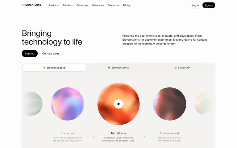
A voice-AI homepage organizes its offerings around an audio demonstration and clear product tabs.
Useful for: A voice-AI homepage organizes its offerings around an audio demonstration and clear product tabs.
# Design reference: ElevenLabs
Source: https://elevenlabs.io/
Swipefile reference: https://swipefile.design/ref/ai-elevenlabs/
Captured: 2026-09-05. This is a dated reference, not a claim about the current live product.
Capture scope: one viewport. Do not infer unseen page sections or a complete user flow.

## Objective
Adapt the visual principles below to my project. Use my own content and identity. Do not reproduce logos, proprietary copy, or brand assets.

## Reference notes
- mood: Precise and inviting.
- colors: White and black with luminous multicolored audio orbs.
- typography: Restrained sans-serif labels keep the demonstration prominent.
- layout: Short headline at the upper left, explanation at the upper right, and a wide demo panel beneath.
- motion: Static capture of one viewport. Visit the source to study motion and interaction.
- texture: Soft, glowing sphere artwork introduces sound visually.
- dont: Adapt the structure to your own content and brand; use your own identity, copy and imagery.

Useful for: A voice-AI homepage organizes its offerings around an audio demonstration and clear product tabs.

## Acceptance criteria
- Existing project conventions, design tokens, working functionality, and unrelated changes are preserved.
- Two or three reference principles clearly support the user's task; conflicts are resolved in favor of usability and the existing product.
- Reusable components and semantic HTML express the interface. Available licensed assets are used; important UI text is never rendered as a bitmap.
- Every visible control has a defined behavior. Loading, empty, error, success, disabled, and long-content states are specified where relevant. Demo data is clearly labeled.
- Navigation and content adapt at 375px, 768px, and 1440px without horizontal page overflow. Keyboard use, visible focus, labeled inputs, at least 44px touch targets, readable contrast, and reduced motion are supported.
- Verification distinguishes rendered behavior from proposals and identifies anything still requiring a backend or external service.

## Quality bar
Clear hierarchy, consistent spacing, restrained surfaces, and purposeful motion. Avoid decorative gradients, excessive cards, placeholder buttons, and invented metrics unless the project calls for them. Do not claim a feature is connected or tested without evidence.
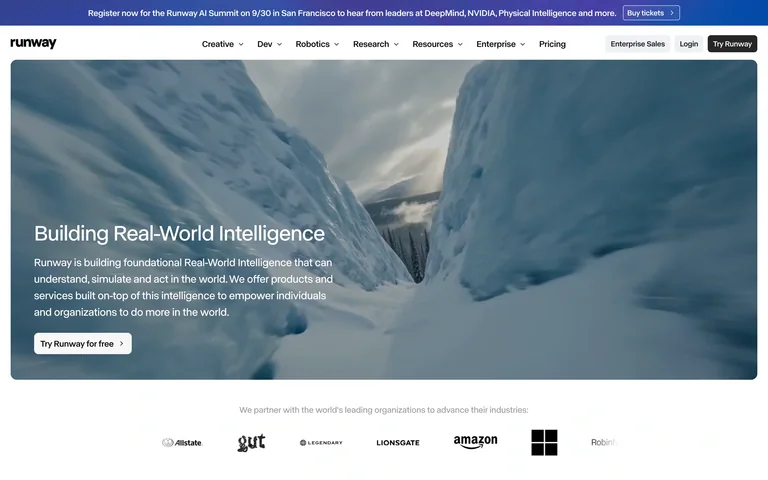
A visual AI company homepage uses a cinematic scene to introduce its platform and research direction.
Useful for: A visual AI company homepage uses a cinematic scene to introduce its platform and research direction.
# Design reference: Runway
Source: https://runway.com/
Swipefile reference: https://swipefile.design/ref/ai-runway/
Captured: 2026-09-05. This is a dated reference, not a claim about the current live product.
Capture scope: one viewport. Do not infer unseen page sections or a complete user flow.

## Objective
Adapt the visual principles below to my project. Use my own content and identity. Do not reproduce logos, proprietary copy, or brand assets.

## Reference notes
- mood: Immersive and ambitious.
- colors: White chrome around cool blue footage with dark text outside the hero.
- typography: Compact sans-serif navigation and readable text over the scene.
- layout: A compact navigation bar frames a broad media hero with bottom-left copy and a trial action.
- motion: Static capture of one viewport. Visit the source to study motion and interaction.
- texture: Full-bleed cinematic landscape footage provides depth.
- dont: Adapt the structure to your own content and brand; use your own identity, copy and imagery.

Useful for: A visual AI company homepage uses a cinematic scene to introduce its platform and research direction.

## Acceptance criteria
- Existing project conventions, design tokens, working functionality, and unrelated changes are preserved.
- Two or three reference principles clearly support the user's task; conflicts are resolved in favor of usability and the existing product.
- Reusable components and semantic HTML express the interface. Available licensed assets are used; important UI text is never rendered as a bitmap.
- Every visible control has a defined behavior. Loading, empty, error, success, disabled, and long-content states are specified where relevant. Demo data is clearly labeled.
- Navigation and content adapt at 375px, 768px, and 1440px without horizontal page overflow. Keyboard use, visible focus, labeled inputs, at least 44px touch targets, readable contrast, and reduced motion are supported.
- Verification distinguishes rendered behavior from proposals and identifies anything still requiring a backend or external service.

## Quality bar
Clear hierarchy, consistent spacing, restrained surfaces, and purposeful motion. Avoid decorative gradients, excessive cards, placeholder buttons, and invented metrics unless the project calls for them. Do not claim a feature is connected or tested without evidence.
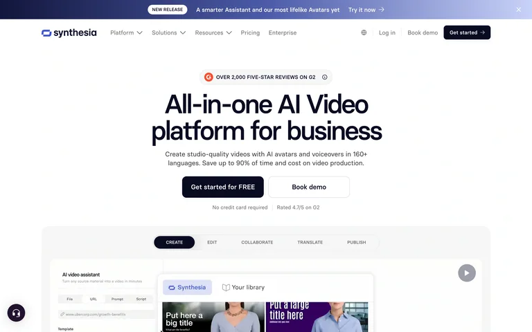
A business video platform pairs a centered value statement with a lower product demonstration.
Useful for: A business video platform pairs a centered value statement with a lower product demonstration.
# Design reference: Synthesia
Source: https://www.synthesia.io/
Swipefile reference: https://swipefile.design/ref/ai-synthesia/
Captured: 2026-09-05. This is a dated reference, not a claim about the current live product.
Capture scope: one viewport. Do not infer unseen page sections or a complete user flow.

## Objective
Adapt the visual principles below to my project. Use my own content and identity. Do not reproduce logos, proprietary copy, or brand assets.

## Reference notes
- mood: Clear and practical.
- colors: White and pale grey with dark navy actions and subtle violet accents.
- typography: Bold sans-serif headline with smaller supporting text.
- layout: Centered headline, supporting sentence and two actions lead into a tabbed editor preview.
- motion: Static capture of one viewport. Visit the source to study motion and interaction.
- texture: Interface panels and video thumbnails supply visual detail.
- dont: Adapt the structure to your own content and brand; use your own identity, copy and imagery.

Useful for: A business video platform pairs a centered value statement with a lower product demonstration.

## Acceptance criteria
- Existing project conventions, design tokens, working functionality, and unrelated changes are preserved.
- Two or three reference principles clearly support the user's task; conflicts are resolved in favor of usability and the existing product.
- Reusable components and semantic HTML express the interface. Available licensed assets are used; important UI text is never rendered as a bitmap.
- Every visible control has a defined behavior. Loading, empty, error, success, disabled, and long-content states are specified where relevant. Demo data is clearly labeled.
- Navigation and content adapt at 375px, 768px, and 1440px without horizontal page overflow. Keyboard use, visible focus, labeled inputs, at least 44px touch targets, readable contrast, and reduced motion are supported.
- Verification distinguishes rendered behavior from proposals and identifies anything still requiring a backend or external service.

## Quality bar
Clear hierarchy, consistent spacing, restrained surfaces, and purposeful motion. Avoid decorative gradients, excessive cards, placeholder buttons, and invented metrics unless the project calls for them. Do not claim a feature is connected or tested without evidence.

An image-model homepage uses a large fashion image as direct proof of its visual capabilities.
Useful for: An image-model homepage uses a large fashion image as direct proof of its visual capabilities.
# Design reference: Recraft
Source: https://www.recraft.ai/
Swipefile reference: https://swipefile.design/ref/ai-recraft/
Captured: 2026-09-05. This is a dated reference, not a claim about the current live product.
Capture scope: one viewport. Do not infer unseen page sections or a complete user flow.

## Objective
Adapt the visual principles below to my project. Use my own content and identity. Do not reproduce logos, proprietary copy, or brand assets.

## Reference notes
- mood: Bold and image-led.
- colors: Black, saturated blue, white and electric lime.
- typography: Large slanted display type contrasts with a condensed secondary line.
- layout: Black navigation and a colored announcement bar frame a nearly full-width image carousel with overlaid copy and actions.
- motion: Static capture of one viewport. Visit the source to study motion and interaction.
- texture: Detailed photographic imagery fills the hero.
- dont: Adapt the structure to your own content and brand; use your own identity, copy and imagery.

Useful for: An image-model homepage uses a large fashion image as direct proof of its visual capabilities.

## Acceptance criteria
- Existing project conventions, design tokens, working functionality, and unrelated changes are preserved.
- Two or three reference principles clearly support the user's task; conflicts are resolved in favor of usability and the existing product.
- Reusable components and semantic HTML express the interface. Available licensed assets are used; important UI text is never rendered as a bitmap.
- Every visible control has a defined behavior. Loading, empty, error, success, disabled, and long-content states are specified where relevant. Demo data is clearly labeled.
- Navigation and content adapt at 375px, 768px, and 1440px without horizontal page overflow. Keyboard use, visible focus, labeled inputs, at least 44px touch targets, readable contrast, and reduced motion are supported.
- Verification distinguishes rendered behavior from proposals and identifies anything still requiring a backend or external service.

## Quality bar
Clear hierarchy, consistent spacing, restrained surfaces, and purposeful motion. Avoid decorative gradients, excessive cards, placeholder buttons, and invented metrics unless the project calls for them. Do not claim a feature is connected or tested without evidence.
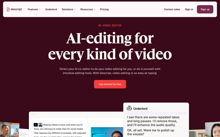
An AI video-editor homepage pairs a large serif headline with layered transcript and editing previews.
Useful for: An AI video-editor homepage pairs a large serif headline with layered transcript and editing previews.
# Design reference: Descript
Source: https://www.descript.com/
Swipefile reference: https://swipefile.design/ref/ai-descript/
Captured: 2026-09-05. This is a dated reference, not a claim about the current live product.
Capture scope: one viewport. Do not infer unseen page sections or a complete user flow.

## Objective
Adapt the visual principles below to my project. Use my own content and identity. Do not reproduce logos, proprietary copy, or brand assets.

## Reference notes
- mood: Warm and expressive.
- colors: Deep burgundy, cream and bright coral.
- typography: A strong serif headline contrasts with compact sans-serif product labels.
- layout: Centered headline and primary action lead into overlapping interface panels at the lower edge.
- motion: Static capture of one viewport. Visit the source to study motion and interaction.
- texture: Transcript cards and video thumbnails make the product concrete.
- dont: Adapt the structure to your own content and brand; use your own identity, copy and imagery.

Useful for: An AI video-editor homepage pairs a large serif headline with layered transcript and editing previews.

## Acceptance criteria
- Existing project conventions, design tokens, working functionality, and unrelated changes are preserved.
- Two or three reference principles clearly support the user's task; conflicts are resolved in favor of usability and the existing product.
- Reusable components and semantic HTML express the interface. Available licensed assets are used; important UI text is never rendered as a bitmap.
- Every visible control has a defined behavior. Loading, empty, error, success, disabled, and long-content states are specified where relevant. Demo data is clearly labeled.
- Navigation and content adapt at 375px, 768px, and 1440px without horizontal page overflow. Keyboard use, visible focus, labeled inputs, at least 44px touch targets, readable contrast, and reduced motion are supported.
- Verification distinguishes rendered behavior from proposals and identifies anything still requiring a backend or external service.

## Quality bar
Clear hierarchy, consistent spacing, restrained surfaces, and purposeful motion. Avoid decorative gradients, excessive cards, placeholder buttons, and invented metrics unless the project calls for them. Do not claim a feature is connected or tested without evidence.
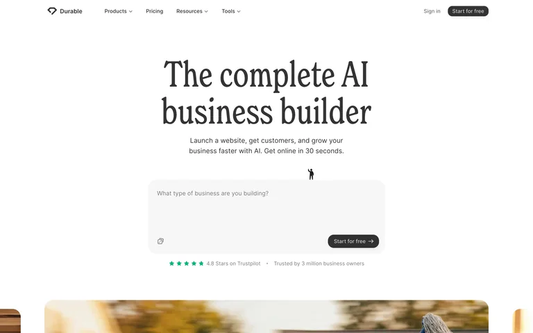
A business-builder homepage places a large prompt field beneath its main positioning statement.
Useful for: A business-builder homepage places a large prompt field beneath its main positioning statement.
# Design reference: Durable
Source: https://durable.com/
Swipefile reference: https://swipefile.design/ref/ai-durable/
Captured: 2026-09-05. This is a dated reference, not a claim about the current live product.
Capture scope: one viewport. Do not infer unseen page sections or a complete user flow.

## Objective
Adapt the visual principles below to my project. Use my own content and identity. Do not reproduce logos, proprietary copy, or brand assets.

## Reference notes
- mood: Simple and approachable.
- colors: White, charcoal and restrained green accents.
- typography: Large serif headline with plain sans-serif form text.
- layout: Centered editorial headline, short description, broad input area and small proof row.
- motion: Static capture of one viewport. Visit the source to study motion and interaction.
- texture: Mostly flat surfaces with a rounded input panel.
- dont: Adapt the structure to your own content and brand; use your own identity, copy and imagery.

Useful for: A business-builder homepage places a large prompt field beneath its main positioning statement.

## Acceptance criteria
- Existing project conventions, design tokens, working functionality, and unrelated changes are preserved.
- Two or three reference principles clearly support the user's task; conflicts are resolved in favor of usability and the existing product.
- Reusable components and semantic HTML express the interface. Available licensed assets are used; important UI text is never rendered as a bitmap.
- Every visible control has a defined behavior. Loading, empty, error, success, disabled, and long-content states are specified where relevant. Demo data is clearly labeled.
- Navigation and content adapt at 375px, 768px, and 1440px without horizontal page overflow. Keyboard use, visible focus, labeled inputs, at least 44px touch targets, readable contrast, and reduced motion are supported.
- Verification distinguishes rendered behavior from proposals and identifies anything still requiring a backend or external service.

## Quality bar
Clear hierarchy, consistent spacing, restrained surfaces, and purposeful motion. Avoid decorative gradients, excessive cards, placeholder buttons, and invented metrics unless the project calls for them. Do not claim a feature is connected or tested without evidence.
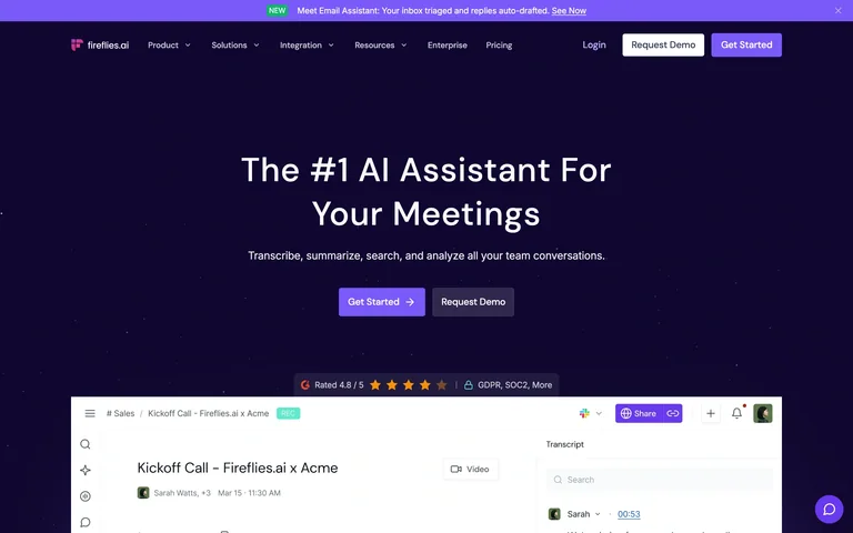
A meeting-assistant homepage uses a concise centered hero above a meeting transcript preview.
Useful for: A meeting-assistant homepage uses a concise centered hero above a meeting transcript preview.
# Design reference: Fireflies
Source: https://fireflies.ai/
Swipefile reference: https://swipefile.design/ref/ai-fireflies/
Captured: 2026-09-05. This is a dated reference, not a claim about the current live product.
Capture scope: one viewport. Do not infer unseen page sections or a complete user flow.

## Objective
Adapt the visual principles below to my project. Use my own content and identity. Do not reproduce logos, proprietary copy, or brand assets.

## Reference notes
- mood: Direct and product-focused.
- colors: Deep violet, white and brighter purple buttons.
- typography: Bold sans-serif headline with small supporting copy.
- layout: Compact navigation, centered statement and actions, then a wide product screenshot.
- motion: Static capture of one viewport. Visit the source to study motion and interaction.
- texture: The transcript interface supplies the main detail.
- dont: Adapt the structure to your own content and brand; use your own identity, copy and imagery.

Useful for: A meeting-assistant homepage uses a concise centered hero above a meeting transcript preview.

## Acceptance criteria
- Existing project conventions, design tokens, working functionality, and unrelated changes are preserved.
- Two or three reference principles clearly support the user's task; conflicts are resolved in favor of usability and the existing product.
- Reusable components and semantic HTML express the interface. Available licensed assets are used; important UI text is never rendered as a bitmap.
- Every visible control has a defined behavior. Loading, empty, error, success, disabled, and long-content states are specified where relevant. Demo data is clearly labeled.
- Navigation and content adapt at 375px, 768px, and 1440px without horizontal page overflow. Keyboard use, visible focus, labeled inputs, at least 44px touch targets, readable contrast, and reduced motion are supported.
- Verification distinguishes rendered behavior from proposals and identifies anything still requiring a backend or external service.

## Quality bar
Clear hierarchy, consistent spacing, restrained surfaces, and purposeful motion. Avoid decorative gradients, excessive cards, placeholder buttons, and invented metrics unless the project calls for them. Do not claim a feature is connected or tested without evidence.
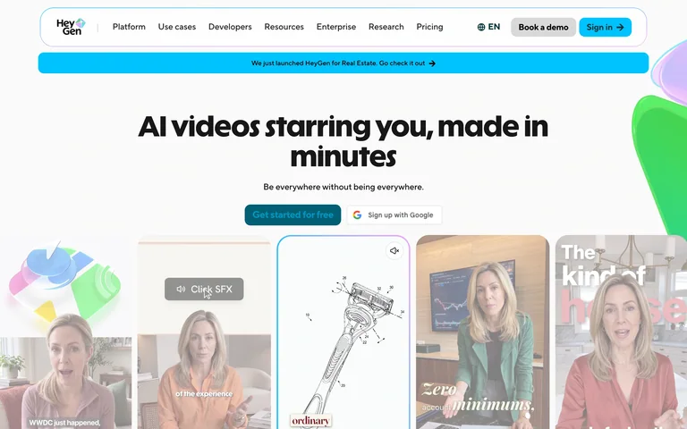
An AI video homepage surrounds a clear value statement with varied creator and avatar previews.
Useful for: An AI video homepage surrounds a clear value statement with varied creator and avatar previews.
# Design reference: HeyGen
Source: https://www.heygen.com/
Swipefile reference: https://swipefile.design/ref/ai-heygen/
Captured: 2026-09-05. This is a dated reference, not a claim about the current live product.
Capture scope: one viewport. Do not infer unseen page sections or a complete user flow.

## Objective
Adapt the visual principles below to my project. Use my own content and identity. Do not reproduce logos, proprietary copy, or brand assets.

## Reference notes
- mood: Friendly and expressive.
- colors: White, cyan and soft multicolored accents.
- typography: Heavy sans-serif headline with compact support text.
- layout: Centered headline and signup actions lead into a row of overlapping video cards.
- motion: Static capture of one viewport. Visit the source to study motion and interaction.
- texture: Portrait videos and translucent decorative forms add variety.
- dont: Adapt the structure to your own content and brand; use your own identity, copy and imagery.

Useful for: An AI video homepage surrounds a clear value statement with varied creator and avatar previews.

## Acceptance criteria
- Existing project conventions, design tokens, working functionality, and unrelated changes are preserved.
- Two or three reference principles clearly support the user's task; conflicts are resolved in favor of usability and the existing product.
- Reusable components and semantic HTML express the interface. Available licensed assets are used; important UI text is never rendered as a bitmap.
- Every visible control has a defined behavior. Loading, empty, error, success, disabled, and long-content states are specified where relevant. Demo data is clearly labeled.
- Navigation and content adapt at 375px, 768px, and 1440px without horizontal page overflow. Keyboard use, visible focus, labeled inputs, at least 44px touch targets, readable contrast, and reduced motion are supported.
- Verification distinguishes rendered behavior from proposals and identifies anything still requiring a backend or external service.

## Quality bar
Clear hierarchy, consistent spacing, restrained surfaces, and purposeful motion. Avoid decorative gradients, excessive cards, placeholder buttons, and invented metrics unless the project calls for them. Do not claim a feature is connected or tested without evidence.
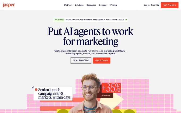
A marketing-agent homepage combines editorial typography with bright campaign artwork.
Useful for: A marketing-agent homepage combines editorial typography with bright campaign artwork.
# Design reference: Jasper
Source: https://www.jasper.ai/
Swipefile reference: https://swipefile.design/ref/ai-jasper/
Captured: 2026-09-05. This is a dated reference, not a claim about the current live product.
Capture scope: one viewport. Do not infer unseen page sections or a complete user flow.

## Objective
Adapt the visual principles below to my project. Use my own content and identity. Do not reproduce logos, proprietary copy, or brand assets.

## Reference notes
- mood: Editorial and energetic.
- colors: Off-white, dark navy, orange-red and pink.
- typography: Large serif headline contrasts with straightforward sans-serif copy.
- layout: Centered headline and paired actions sit above a cropped, colorful visual collage.
- motion: Static capture of one viewport. Visit the source to study motion and interaction.
- texture: Grid patterns, portrait cutouts and campaign annotations.
- dont: Adapt the structure to your own content and brand; use your own identity, copy and imagery.

Useful for: A marketing-agent homepage combines editorial typography with bright campaign artwork.

## Acceptance criteria
- Existing project conventions, design tokens, working functionality, and unrelated changes are preserved.
- Two or three reference principles clearly support the user's task; conflicts are resolved in favor of usability and the existing product.
- Reusable components and semantic HTML express the interface. Available licensed assets are used; important UI text is never rendered as a bitmap.
- Every visible control has a defined behavior. Loading, empty, error, success, disabled, and long-content states are specified where relevant. Demo data is clearly labeled.
- Navigation and content adapt at 375px, 768px, and 1440px without horizontal page overflow. Keyboard use, visible focus, labeled inputs, at least 44px touch targets, readable contrast, and reduced motion are supported.
- Verification distinguishes rendered behavior from proposals and identifies anything still requiring a backend or external service.

## Quality bar
Clear hierarchy, consistent spacing, restrained surfaces, and purposeful motion. Avoid decorative gradients, excessive cards, placeholder buttons, and invented metrics unless the project calls for them. Do not claim a feature is connected or tested without evidence.
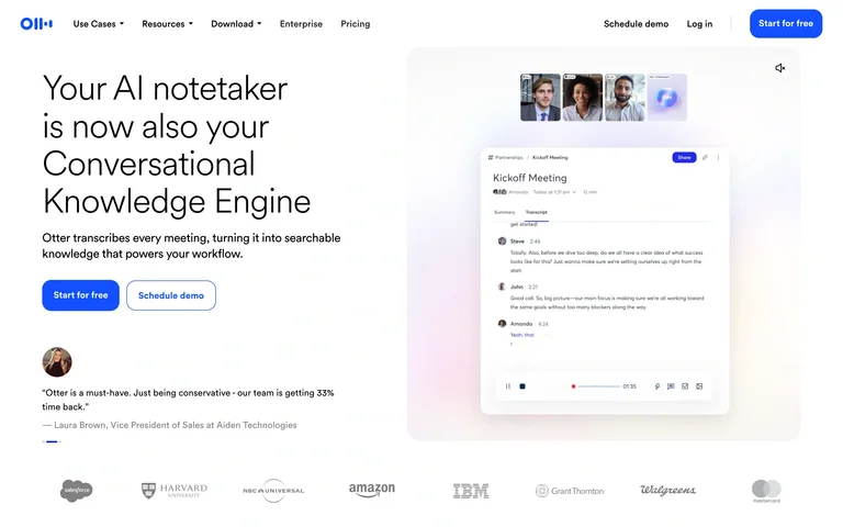
A meeting-knowledge homepage pairs a stacked introduction with a floating conversation-summary panel.
Useful for: A meeting-knowledge homepage pairs a stacked introduction with a floating conversation-summary panel.
# Design reference: Otter
Source: https://otter.ai/
Swipefile reference: https://swipefile.design/ref/ai-otter/
Captured: 2026-09-05. This is a dated reference, not a claim about the current live product.
Capture scope: one viewport. Do not infer unseen page sections or a complete user flow.

## Objective
Adapt the visual principles below to my project. Use my own content and identity. Do not reproduce logos, proprietary copy, or brand assets.

## Reference notes
- mood: Clear and approachable.
- colors: White, bright blue and pale pastel gradients.
- typography: Light sans-serif headline with compact supporting text.
- layout: Left-aligned headline, two actions and a testimonial face a tall product preview; customer logos run below.
- motion: Static capture of one viewport. Visit the source to study motion and interaction.
- texture: Soft gradients create depth behind a white note panel.
- dont: Adapt the structure to your own content and brand; use your own identity, copy and imagery.

Useful for: A meeting-knowledge homepage pairs a stacked introduction with a floating conversation-summary panel.

## Acceptance criteria
- Existing project conventions, design tokens, working functionality, and unrelated changes are preserved.
- Two or three reference principles clearly support the user's task; conflicts are resolved in favor of usability and the existing product.
- Reusable components and semantic HTML express the interface. Available licensed assets are used; important UI text is never rendered as a bitmap.
- Every visible control has a defined behavior. Loading, empty, error, success, disabled, and long-content states are specified where relevant. Demo data is clearly labeled.
- Navigation and content adapt at 375px, 768px, and 1440px without horizontal page overflow. Keyboard use, visible focus, labeled inputs, at least 44px touch targets, readable contrast, and reduced motion are supported.
- Verification distinguishes rendered behavior from proposals and identifies anything still requiring a backend or external service.

## Quality bar
Clear hierarchy, consistent spacing, restrained surfaces, and purposeful motion. Avoid decorative gradients, excessive cards, placeholder buttons, and invented metrics unless the project calls for them. Do not claim a feature is connected or tested without evidence.
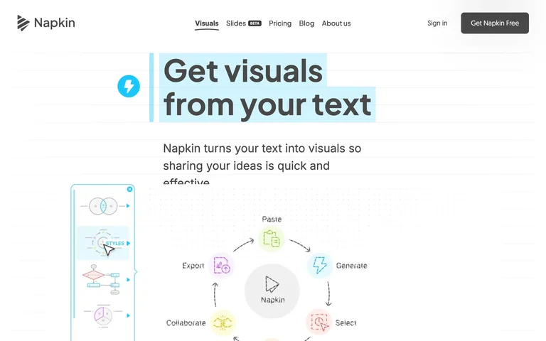
A text-to-visuals homepage combines an editable-text visual treatment with diagram examples.
Useful for: A text-to-visuals homepage combines an editable-text visual treatment with diagram examples.
# Design reference: Napkin AI
Source: https://www.napkin.ai/
Swipefile reference: https://swipefile.design/ref/ai-napkin/
Captured: 2026-09-05. This is a dated reference, not a claim about the current live product.
Capture scope: one viewport. Do not infer unseen page sections or a complete user flow.

## Objective
Adapt the visual principles below to my project. Use my own content and identity. Do not reproduce logos, proprietary copy, or brand assets.

## Reference notes
- mood: Light and practical.
- colors: White, charcoal and cyan selection highlights.
- typography: Bold sans-serif headline with a visible text-selection motif.
- layout: A compact centered headline and introduction sit above diagrams and a narrow sample toolbar.
- motion: Static capture of one viewport. Visit the source to study motion and interaction.
- texture: Hand-drawn-looking diagrams and small colored symbols.
- dont: Adapt the structure to your own content and brand; use your own identity, copy and imagery.

Useful for: A text-to-visuals homepage combines an editable-text visual treatment with diagram examples.

## Acceptance criteria
- Existing project conventions, design tokens, working functionality, and unrelated changes are preserved.
- Two or three reference principles clearly support the user's task; conflicts are resolved in favor of usability and the existing product.
- Reusable components and semantic HTML express the interface. Available licensed assets are used; important UI text is never rendered as a bitmap.
- Every visible control has a defined behavior. Loading, empty, error, success, disabled, and long-content states are specified where relevant. Demo data is clearly labeled.
- Navigation and content adapt at 375px, 768px, and 1440px without horizontal page overflow. Keyboard use, visible focus, labeled inputs, at least 44px touch targets, readable contrast, and reduced motion are supported.
- Verification distinguishes rendered behavior from proposals and identifies anything still requiring a backend or external service.

## Quality bar
Clear hierarchy, consistent spacing, restrained surfaces, and purposeful motion. Avoid decorative gradients, excessive cards, placeholder buttons, and invented metrics unless the project calls for them. Do not claim a feature is connected or tested without evidence.

An enterprise-agent homepage connects a short positioning statement to a human-centered product example.
Useful for: An enterprise-agent homepage connects a short positioning statement to a human-centered product example.
# Design reference: WRITER
Source: https://writer.com/
Swipefile reference: https://swipefile.design/ref/ai-writer/
Captured: 2026-09-05. This is a dated reference, not a claim about the current live product.
Capture scope: one viewport. Do not infer unseen page sections or a complete user flow.

## Objective
Adapt the visual principles below to my project. Use my own content and identity. Do not reproduce logos, proprietary copy, or brand assets.

## Reference notes
- mood: Confident and human.
- colors: White, black and violet accents.
- typography: Bold sans-serif headline with a colored role word.
- layout: Centered headline and email/demo entry sit above a portrait framed by workflow cards.
- motion: Static capture of one viewport. Visit the source to study motion and interaction.
- texture: Portrait imagery and floating interface annotations.
- dont: Adapt the structure to your own content and brand; use your own identity, copy and imagery.

Useful for: An enterprise-agent homepage connects a short positioning statement to a human-centered product example.

## Acceptance criteria
- Existing project conventions, design tokens, working functionality, and unrelated changes are preserved.
- Two or three reference principles clearly support the user's task; conflicts are resolved in favor of usability and the existing product.
- Reusable components and semantic HTML express the interface. Available licensed assets are used; important UI text is never rendered as a bitmap.
- Every visible control has a defined behavior. Loading, empty, error, success, disabled, and long-content states are specified where relevant. Demo data is clearly labeled.
- Navigation and content adapt at 375px, 768px, and 1440px without horizontal page overflow. Keyboard use, visible focus, labeled inputs, at least 44px touch targets, readable contrast, and reduced motion are supported.
- Verification distinguishes rendered behavior from proposals and identifies anything still requiring a backend or external service.

## Quality bar
Clear hierarchy, consistent spacing, restrained surfaces, and purposeful motion. Avoid decorative gradients, excessive cards, placeholder buttons, and invented metrics unless the project calls for them. Do not claim a feature is connected or tested without evidence.

An AI infrastructure homepage uses a luminous cube beneath its developer-focused positioning.
Useful for: An AI infrastructure homepage uses a luminous cube beneath its developer-focused positioning.
# Design reference: Modal
Source: https://modal.com/
Swipefile reference: https://swipefile.design/ref/ai-modal/
Captured: 2026-09-05. This is a dated reference, not a claim about the current live product.
Capture scope: one viewport. Do not infer unseen page sections or a complete user flow.

## Objective
Adapt the visual principles below to my project. Use my own content and identity. Do not reproduce logos, proprietary copy, or brand assets.

## Reference notes
- mood: Technical and futuristic.
- colors: Near-black, bright green and muted grey.
- typography: Large sans-serif headline with compact technical copy.
- layout: Centered headline and two actions sit over a rendered object, followed by partner logos.
- motion: Static capture of one viewport. Visit the source to study motion and interaction.
- texture: Glowing glass-like cube against a dark particle field.
- dont: Adapt the structure to your own content and brand; use your own identity, copy and imagery.

Useful for: An AI infrastructure homepage uses a luminous cube beneath its developer-focused positioning.

## Acceptance criteria
- Existing project conventions, design tokens, working functionality, and unrelated changes are preserved.
- Two or three reference principles clearly support the user's task; conflicts are resolved in favor of usability and the existing product.
- Reusable components and semantic HTML express the interface. Available licensed assets are used; important UI text is never rendered as a bitmap.
- Every visible control has a defined behavior. Loading, empty, error, success, disabled, and long-content states are specified where relevant. Demo data is clearly labeled.
- Navigation and content adapt at 375px, 768px, and 1440px without horizontal page overflow. Keyboard use, visible focus, labeled inputs, at least 44px touch targets, readable contrast, and reduced motion are supported.
- Verification distinguishes rendered behavior from proposals and identifies anything still requiring a backend or external service.

## Quality bar
Clear hierarchy, consistent spacing, restrained surfaces, and purposeful motion. Avoid decorative gradients, excessive cards, placeholder buttons, and invented metrics unless the project calls for them. Do not claim a feature is connected or tested without evidence.
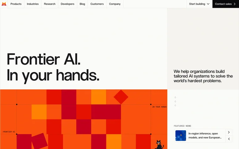
An AI company homepage uses oversized positioning text, compact side copy and a warm pixel grid.
Useful for: An AI company homepage uses oversized positioning text, compact side copy and a warm pixel grid.
# Design reference: Mistral AI
Source: https://mistral.ai/
Swipefile reference: https://swipefile.design/ref/ai-mistral/
Captured: 2026-09-05. This is a dated reference, not a claim about the current live product.
Capture scope: one viewport. Do not infer unseen page sections or a complete user flow.

## Objective
Adapt the visual principles below to my project. Use my own content and identity. Do not reproduce logos, proprietary copy, or brand assets.

## Reference notes
- mood: Direct and distinctive.
- colors: Warm white, black, orange and red.
- typography: Large sans-serif headline paired with small utility labels.
- layout: A broad text area is split between a headline and short supporting column, above a large graphic block.
- motion: Static capture of one viewport. Visit the source to study motion and interaction.
- texture: Flat pixel-like squares provide a distinctive brand pattern.
- dont: Adapt the structure to your own content and brand; use your own identity, copy and imagery.

Useful for: An AI company homepage uses oversized positioning text, compact side copy and a warm pixel grid.

## Acceptance criteria
- Existing project conventions, design tokens, working functionality, and unrelated changes are preserved.
- Two or three reference principles clearly support the user's task; conflicts are resolved in favor of usability and the existing product.
- Reusable components and semantic HTML express the interface. Available licensed assets are used; important UI text is never rendered as a bitmap.
- Every visible control has a defined behavior. Loading, empty, error, success, disabled, and long-content states are specified where relevant. Demo data is clearly labeled.
- Navigation and content adapt at 375px, 768px, and 1440px without horizontal page overflow. Keyboard use, visible focus, labeled inputs, at least 44px touch targets, readable contrast, and reduced motion are supported.
- Verification distinguishes rendered behavior from proposals and identifies anything still requiring a backend or external service.

## Quality bar
Clear hierarchy, consistent spacing, restrained surfaces, and purposeful motion. Avoid decorative gradients, excessive cards, placeholder buttons, and invented metrics unless the project calls for them. Do not claim a feature is connected or tested without evidence.
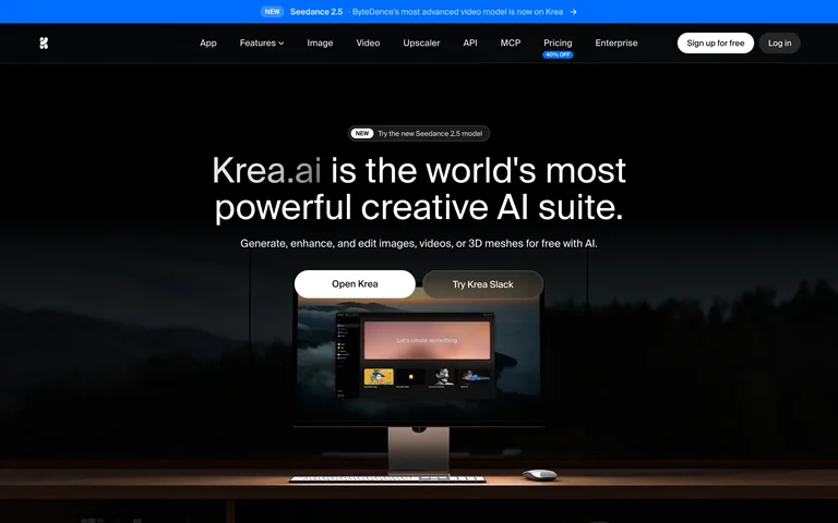
A creative-AI homepage places a concise introduction above a desktop product scene.
Useful for: A creative-AI homepage places a concise introduction above a desktop product scene.
# Design reference: Krea
Source: https://www.krea.ai/
Swipefile reference: https://swipefile.design/ref/ai-krea-home/
Captured: 2026-09-05. This is a dated reference, not a claim about the current live product.
Capture scope: one viewport. Do not infer unseen page sections or a complete user flow.

## Objective
Adapt the visual principles below to my project. Use my own content and identity. Do not reproduce logos, proprietary copy, or brand assets.

## Reference notes
- mood: Immersive and restrained.
- colors: Black, white and cool blue with muted landscape imagery.
- typography: Simple centered sans-serif type.
- layout: Centered headline and two actions sit above a monitor image, with slim navigation and an announcement strip.
- motion: Static capture of one viewport. Visit the source to study motion and interaction.
- texture: A desktop monitor framed by a dark scenic background.
- dont: Adapt the structure to your own content and brand; use your own identity, copy and imagery.

Useful for: A creative-AI homepage places a concise introduction above a desktop product scene.

## Acceptance criteria
- Existing project conventions, design tokens, working functionality, and unrelated changes are preserved.
- Two or three reference principles clearly support the user's task; conflicts are resolved in favor of usability and the existing product.
- Reusable components and semantic HTML express the interface. Available licensed assets are used; important UI text is never rendered as a bitmap.
- Every visible control has a defined behavior. Loading, empty, error, success, disabled, and long-content states are specified where relevant. Demo data is clearly labeled.
- Navigation and content adapt at 375px, 768px, and 1440px without horizontal page overflow. Keyboard use, visible focus, labeled inputs, at least 44px touch targets, readable contrast, and reduced motion are supported.
- Verification distinguishes rendered behavior from proposals and identifies anything still requiring a backend or external service.

## Quality bar
Clear hierarchy, consistent spacing, restrained surfaces, and purposeful motion. Avoid decorative gradients, excessive cards, placeholder buttons, and invented metrics unless the project calls for them. Do not claim a feature is connected or tested without evidence.
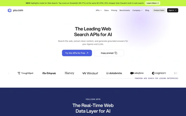
An AI search-API homepage centers its technical positioning above clear developer actions and customer logos.
Useful for: An AI search-API homepage centers its technical positioning above clear developer actions and customer logos.
# Design reference: You.com
Source: https://you.com/
Swipefile reference: https://swipefile.design/ref/ai-you-search/
Captured: 2026-09-05. This is a dated reference, not a claim about the current live product.
Capture scope: one viewport. Do not infer unseen page sections or a complete user flow.

## Objective
Adapt the visual principles below to my project. Use my own content and identity. Do not reproduce logos, proprietary copy, or brand assets.

## Reference notes
- mood: Clear and technical.
- colors: White, charcoal, pale violet and a lime announcement strip.
- typography: Large sans-serif headline and smaller explanatory copy.
- layout: A centered headline, short explanation and paired actions sit above a customer-logo row.
- motion: Static capture of one viewport. Visit the source to study motion and interaction.
- texture: Soft violet glow adds depth to otherwise flat, light surfaces.
- dont: Adapt the structure to your own content and brand; use your own identity, copy and imagery.

Useful for: An AI search-API homepage centers its technical positioning above clear developer actions and customer logos.

## Acceptance criteria
- Existing project conventions, design tokens, working functionality, and unrelated changes are preserved.
- Two or three reference principles clearly support the user's task; conflicts are resolved in favor of usability and the existing product.
- Reusable components and semantic HTML express the interface. Available licensed assets are used; important UI text is never rendered as a bitmap.
- Every visible control has a defined behavior. Loading, empty, error, success, disabled, and long-content states are specified where relevant. Demo data is clearly labeled.
- Navigation and content adapt at 375px, 768px, and 1440px without horizontal page overflow. Keyboard use, visible focus, labeled inputs, at least 44px touch targets, readable contrast, and reduced motion are supported.
- Verification distinguishes rendered behavior from proposals and identifies anything still requiring a backend or external service.

## Quality bar
Clear hierarchy, consistent spacing, restrained surfaces, and purposeful motion. Avoid decorative gradients, excessive cards, placeholder buttons, and invented metrics unless the project calls for them. Do not claim a feature is connected or tested without evidence.
Allow basic usage counts to help us understand what is useful. Your board contents stay out of analytics. Details
Your browser’s privacy preference keeps analytics off.