 hover to scroll
VSL / Webinar Funnel
CURATED COLLECTION · 16 REFERENCES
Long-form enrollment pages for coaching, training, and ongoing memberships.
Copy the reference notes below and paste them into Claude, ChatGPT, or your coding assistant. Add what you want to build.
Includes design notes, original sources, and preview links. An assistant that supports browsing can also read the public board link.
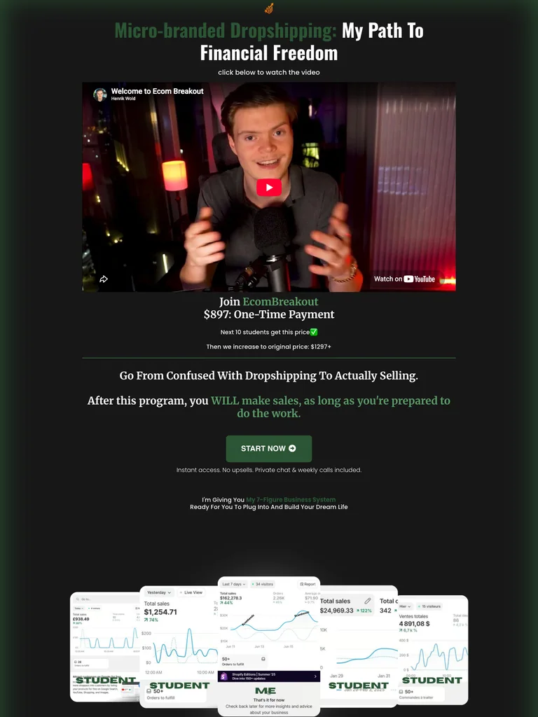
hover to scrollA narrow video sales page with a personal pitch, a simple offer, and a dense student-proof section.
Useful for: Study the public sales page and its section order, offer presentation, and calls to action. This reference captures one page; checkout steps and conversion results are not verified.
# Design reference: Henrik Wold — EcomBreakout
Source: https://breakoutecom.com/start
Swipefile reference: https://swipefile.design/ref/funnel-henrik-wold-ecombreakout/
Captured: 2026-09-07. This is a dated reference, not a claim about the current live product.


## Objective
Adapt the visual principles below to my project. Use my own content and identity. Do not reproduce logos, proprietary copy, or brand assets.

## Reference notes
- mood: Personal and direct
- colors: Near-black canvas, forest-green accents, white copy, and green CTA buttons.
- typography: Bold sans-serif headlines, compact labels, and scannable benefit lists create a clear hierarchy through the long page.
- layout: Personal video → one-time offer → lesson benefits → objection handling → student-message gallery → final start action.
- motion: The capture records a static page state. Preserve readable scrolling and clear action feedback; video playback, counters, and hidden form behavior are not demonstrated.
- texture: Photographic or product imagery, contrasting section backgrounds, grouped benefits, and visual proof panels.
- dont: Use your own offer, brand, and assets. Do not invent testimonials, results, scarcity, guarantees, or pricing.

Useful for: Study the public sales page and its section order, offer presentation, and calls to action. This reference captures one page; checkout steps and conversion results are not verified.

## Acceptance criteria
- Existing project conventions, design tokens, working functionality, and unrelated changes are preserved.
- Two or three reference principles clearly support the user's task; conflicts are resolved in favor of usability and the existing product.
- Reusable components and semantic HTML express the interface. Available licensed assets are used; important UI text is never rendered as a bitmap.
- Every visible control has a defined behavior. Loading, empty, error, success, disabled, and long-content states are specified where relevant. Demo data is clearly labeled.
- Navigation and content adapt at 375px, 768px, and 1440px without horizontal page overflow. Keyboard use, visible focus, labeled inputs, at least 44px touch targets, readable contrast, and reduced motion are supported.
- Verification distinguishes rendered behavior from proposals and identifies anything still requiring a backend or external service.

## Quality bar
Clear hierarchy, consistent spacing, restrained surfaces, and purposeful motion. Avoid decorative gradients, excessive cards, placeholder buttons, and invented metrics unless the project calls for them. Do not claim a feature is connected or tested without evidence.
 hover to scroll
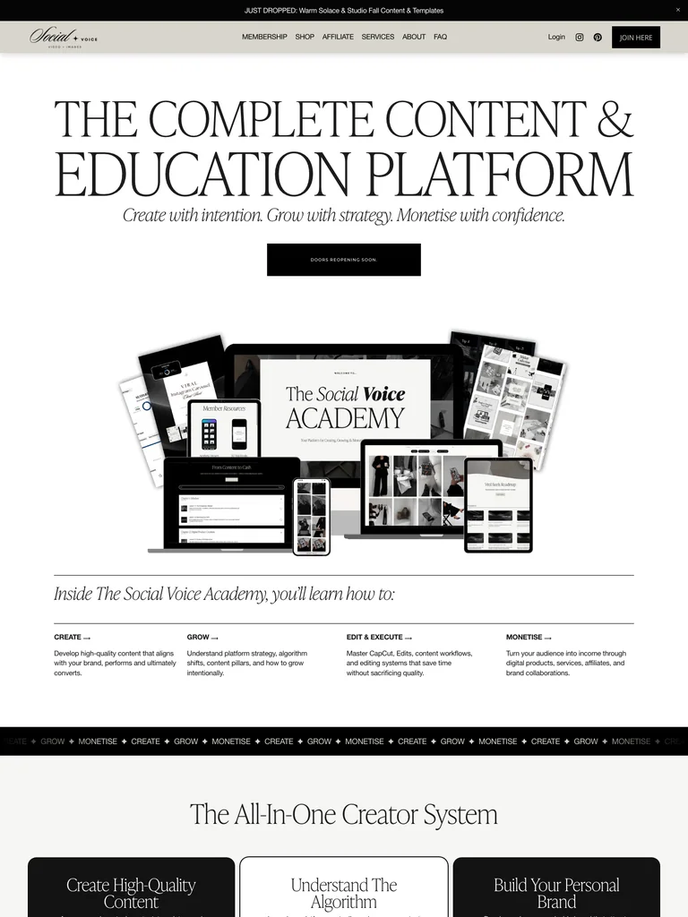
An editorial membership page using course previews, generous spacing, and a long sequence of educational benefits.
Useful for: Study the public sales page and its section order, offer presentation, and calls to action. This reference captures one page; checkout steps and conversion results are not verified.
# Design reference: The Social Voice — Academy
Source: https://thesocialvoiceco.com/academy
Swipefile reference: https://swipefile.design/ref/funnel-caitlin-armstrong-the-social-voice-academy/
Captured: 2026-09-07. This is a dated reference, not a claim about the current live product.


## Objective
Adapt the visual principles below to my project. Use my own content and identity. Do not reproduce logos, proprietary copy, or brand assets.

## Reference notes
- mood: Editorial and restrained
- colors: Ivory, taupe, black, and neutral product imagery.
- typography: Expressive serif display headings mixed with clean supporting text; large typographic shifts separate the offer story from the details.
- layout: Large editorial promise → course-library previews → individual course explanations → membership offer → questions and customer-message proof.
- motion: The capture records a static page state. Preserve readable scrolling and clear action feedback; video playback, counters, and hidden form behavior are not demonstrated.
- texture: Photographic or product imagery, contrasting section backgrounds, grouped benefits, and visual proof panels.
- dont: Use your own offer, brand, and assets. Do not invent testimonials, results, scarcity, guarantees, or pricing.

Useful for: Study the public sales page and its section order, offer presentation, and calls to action. This reference captures one page; checkout steps and conversion results are not verified.

## Acceptance criteria
- Existing project conventions, design tokens, working functionality, and unrelated changes are preserved.
- Two or three reference principles clearly support the user's task; conflicts are resolved in favor of usability and the existing product.
- Reusable components and semantic HTML express the interface. Available licensed assets are used; important UI text is never rendered as a bitmap.
- Every visible control has a defined behavior. Loading, empty, error, success, disabled, and long-content states are specified where relevant. Demo data is clearly labeled.
- Navigation and content adapt at 375px, 768px, and 1440px without horizontal page overflow. Keyboard use, visible focus, labeled inputs, at least 44px touch targets, readable contrast, and reduced motion are supported.
- Verification distinguishes rendered behavior from proposals and identifies anything still requiring a backend or external service.

## Quality bar
Clear hierarchy, consistent spacing, restrained surfaces, and purposeful motion. Avoid decorative gradients, excessive cards, placeholder buttons, and invented metrics unless the project calls for them. Do not claim a feature is connected or tested without evidence.
 hover to scroll
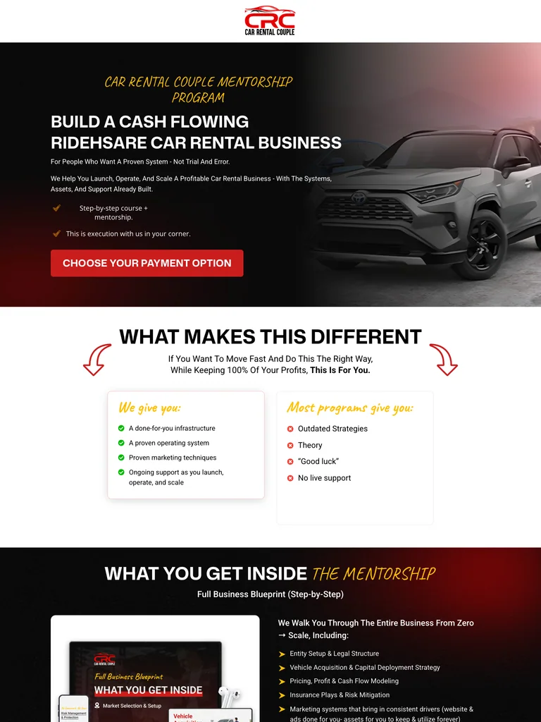
A mentorship sales page that alternates concrete benefits, checklists, and payment-option calls to action.
Useful for: Study the public sales page and its section order, offer presentation, and calls to action. This reference captures one page; checkout steps and conversion results are not verified.
# Design reference: Car Rental Couple — Rideshare Mentorship
Source: https://carrentalcouple.com/mentorship-program
Swipefile reference: https://swipefile.design/ref/funnel-car-rental-couple-rideshare-mentorship-program/
Captured: 2026-09-07. This is a dated reference, not a claim about the current live product.


## Objective
Adapt the visual principles below to my project. Use my own content and identity. Do not reproduce logos, proprietary copy, or brand assets.

## Reference notes
- mood: Practical and emphatic
- colors: Black and white with red purchase buttons and yellow checklist accents.
- typography: Bold sans-serif headlines, compact labels, and scannable benefit lists create a clear hierarchy through the long page.
- layout: Car-led hero and mentorship promise → differentiators → curriculum and services → audience fit → enrollment options → what happens after joining.
- motion: The capture records a static page state. Preserve readable scrolling and clear action feedback; video playback, counters, and hidden form behavior are not demonstrated.
- texture: Photographic or product imagery, contrasting section backgrounds, grouped benefits, and visual proof panels.
- dont: Use your own offer, brand, and assets. Do not invent testimonials, results, scarcity, guarantees, or pricing.

Useful for: Study the public sales page and its section order, offer presentation, and calls to action. This reference captures one page; checkout steps and conversion results are not verified.

## Acceptance criteria
- Existing project conventions, design tokens, working functionality, and unrelated changes are preserved.
- Two or three reference principles clearly support the user's task; conflicts are resolved in favor of usability and the existing product.
- Reusable components and semantic HTML express the interface. Available licensed assets are used; important UI text is never rendered as a bitmap.
- Every visible control has a defined behavior. Loading, empty, error, success, disabled, and long-content states are specified where relevant. Demo data is clearly labeled.
- Navigation and content adapt at 375px, 768px, and 1440px without horizontal page overflow. Keyboard use, visible focus, labeled inputs, at least 44px touch targets, readable contrast, and reduced motion are supported.
- Verification distinguishes rendered behavior from proposals and identifies anything still requiring a backend or external service.

## Quality bar
Clear hierarchy, consistent spacing, restrained surfaces, and purposeful motion. Avoid decorative gradients, excessive cards, placeholder buttons, and invented metrics unless the project calls for them. Do not claim a feature is connected or tested without evidence.
 hover to scroll
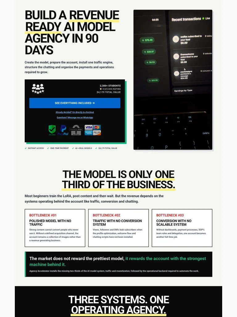
A compact agency-training funnel with an immediate offer, bold headings, and dense dashboard and message screenshots.
Useful for: Study the public sales page and its section order, offer presentation, and calls to action. This reference captures one page; checkout steps and conversion results are not verified.
# Design reference: Bjorn Olsen — Agency Accelerator
Source: https://bjornolsen.com.au/pages/agency-accelerator-trinity
Swipefile reference: https://swipefile.design/ref/funnel-bjorn-olsen-agency-accelerator/
Captured: 2026-09-07. This is a dated reference, not a claim about the current live product.


## Objective
Adapt the visual principles below to my project. Use my own content and identity. Do not reproduce logos, proprietary copy, or brand assets.

## Reference notes
- mood: Bold and compact
- colors: Off-white, black, blue enrollment accents, and selective yellow headline highlights.
- typography: Bold sans-serif headlines, compact labels, and scannable benefit lists create a clear hierarchy through the long page.
- layout: Compressed headline and purchase panel → process explanation → dashboard and message proof → course contents → repeated enrollment offer.
- motion: The capture records a static page state. Preserve readable scrolling and clear action feedback; video playback, counters, and hidden form behavior are not demonstrated.
- texture: Photographic or product imagery, contrasting section backgrounds, grouped benefits, and visual proof panels.
- dont: Use your own offer, brand, and assets. Do not invent testimonials, results, scarcity, guarantees, or pricing.

Useful for: Study the public sales page and its section order, offer presentation, and calls to action. This reference captures one page; checkout steps and conversion results are not verified.

## Acceptance criteria
- Existing project conventions, design tokens, working functionality, and unrelated changes are preserved.
- Two or three reference principles clearly support the user's task; conflicts are resolved in favor of usability and the existing product.
- Reusable components and semantic HTML express the interface. Available licensed assets are used; important UI text is never rendered as a bitmap.
- Every visible control has a defined behavior. Loading, empty, error, success, disabled, and long-content states are specified where relevant. Demo data is clearly labeled.
- Navigation and content adapt at 375px, 768px, and 1440px without horizontal page overflow. Keyboard use, visible focus, labeled inputs, at least 44px touch targets, readable contrast, and reduced motion are supported.
- Verification distinguishes rendered behavior from proposals and identifies anything still requiring a backend or external service.

## Quality bar
Clear hierarchy, consistent spacing, restrained surfaces, and purposeful motion. Avoid decorative gradients, excessive cards, placeholder buttons, and invented metrics unless the project calls for them. Do not claim a feature is connected or tested without evidence.
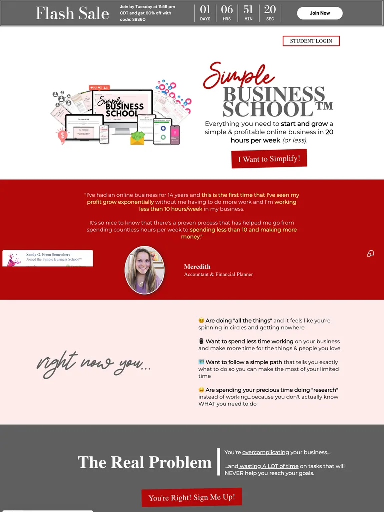 hover to scroll
A membership offer built from product mockups, student stories, audience-fit sections, and a closing FAQ.
Useful for: Study the public sales page and its section order, offer presentation, and calls to action. This reference captures one page; checkout steps and conversion results are not verified.
# Design reference: Steph Blake — Simple Business School
Source: https://scalewithsteph.com/sbs
Swipefile reference: https://swipefile.design/ref/funnel-steph-blake-simple-business-school/
Captured: 2026-09-07. This is a dated reference, not a claim about the current live product.


## Objective
Adapt the visual principles below to my project. Use my own content and identity. Do not reproduce logos, proprietary copy, or brand assets.

## Reference notes
- mood: Warm and persuasive
- colors: White, deep red, pale pink, gray offer bands, and black type.
- typography: Bold sans-serif headlines, compact labels, and scannable benefit lists create a clear hierarchy through the long page.
- layout: Product bundle hero → founder and student stories → audience categories → membership benefits → offer details → FAQ and final join button.
- motion: The capture records a static page state. Preserve readable scrolling and clear action feedback; video playback, counters, and hidden form behavior are not demonstrated.
- texture: Photographic or product imagery, contrasting section backgrounds, grouped benefits, and visual proof panels.
- dont: Use your own offer, brand, and assets. Do not invent testimonials, results, scarcity, guarantees, or pricing.

Useful for: Study the public sales page and its section order, offer presentation, and calls to action. This reference captures one page; checkout steps and conversion results are not verified.

## Acceptance criteria
- Existing project conventions, design tokens, working functionality, and unrelated changes are preserved.
- Two or three reference principles clearly support the user's task; conflicts are resolved in favor of usability and the existing product.
- Reusable components and semantic HTML express the interface. Available licensed assets are used; important UI text is never rendered as a bitmap.
- Every visible control has a defined behavior. Loading, empty, error, success, disabled, and long-content states are specified where relevant. Demo data is clearly labeled.
- Navigation and content adapt at 375px, 768px, and 1440px without horizontal page overflow. Keyboard use, visible focus, labeled inputs, at least 44px touch targets, readable contrast, and reduced motion are supported.
- Verification distinguishes rendered behavior from proposals and identifies anything still requiring a backend or external service.

## Quality bar
Clear hierarchy, consistent spacing, restrained surfaces, and purposeful motion. Avoid decorative gradients, excessive cards, placeholder buttons, and invented metrics unless the project calls for them. Do not claim a feature is connected or tested without evidence.
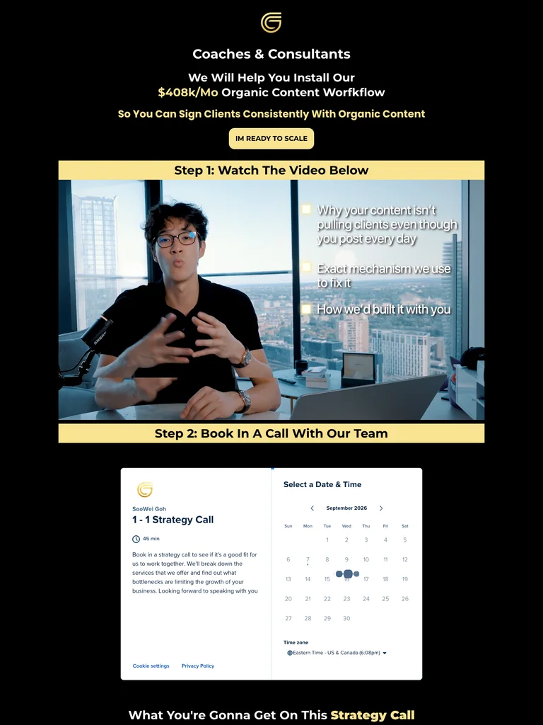 hover to scroll
A video-led consulting funnel with a short opening pitch, a dense proof gallery, and repeated consultation actions.
Useful for: Study the public sales page and its section order, offer presentation, and calls to action. This reference captures one page; checkout steps and conversion results are not verified.
# Design reference: Goh Consulting — Training Funnel
Source: https://gohconsulting.com/training
Swipefile reference: https://swipefile.design/ref/funnel-soowei-goh-consulting-mastery-2-0-all-his-courses/
Captured: 2026-09-07. This is a dated reference, not a claim about the current live product.


## Objective
Adapt the visual principles below to my project. Use my own content and identity. Do not reproduce logos, proprietary copy, or brand assets.

## Reference notes
- mood: Focused and proof-heavy
- colors: Black canvas, warm yellow accents, white text, and gold outlines.
- typography: Bold sans-serif headlines, compact labels, and scannable benefit lists create a clear hierarchy through the long page.
- layout: Audience-specific promise → training video → client-name proof → video case studies → final consultation CTA.
- motion: The capture records a static page state. Preserve readable scrolling and clear action feedback; video playback, counters, and hidden form behavior are not demonstrated.
- texture: Photographic or product imagery, contrasting section backgrounds, grouped benefits, and visual proof panels.
- dont: Use your own offer, brand, and assets. Do not invent testimonials, results, scarcity, guarantees, or pricing.

Useful for: Study the public sales page and its section order, offer presentation, and calls to action. This reference captures one page; checkout steps and conversion results are not verified.

## Acceptance criteria
- Existing project conventions, design tokens, working functionality, and unrelated changes are preserved.
- Two or three reference principles clearly support the user's task; conflicts are resolved in favor of usability and the existing product.
- Reusable components and semantic HTML express the interface. Available licensed assets are used; important UI text is never rendered as a bitmap.
- Every visible control has a defined behavior. Loading, empty, error, success, disabled, and long-content states are specified where relevant. Demo data is clearly labeled.
- Navigation and content adapt at 375px, 768px, and 1440px without horizontal page overflow. Keyboard use, visible focus, labeled inputs, at least 44px touch targets, readable contrast, and reduced motion are supported.
- Verification distinguishes rendered behavior from proposals and identifies anything still requiring a backend or external service.

## Quality bar
Clear hierarchy, consistent spacing, restrained surfaces, and purposeful motion. Avoid decorative gradients, excessive cards, placeholder buttons, and invented metrics unless the project calls for them. Do not claim a feature is connected or tested without evidence.
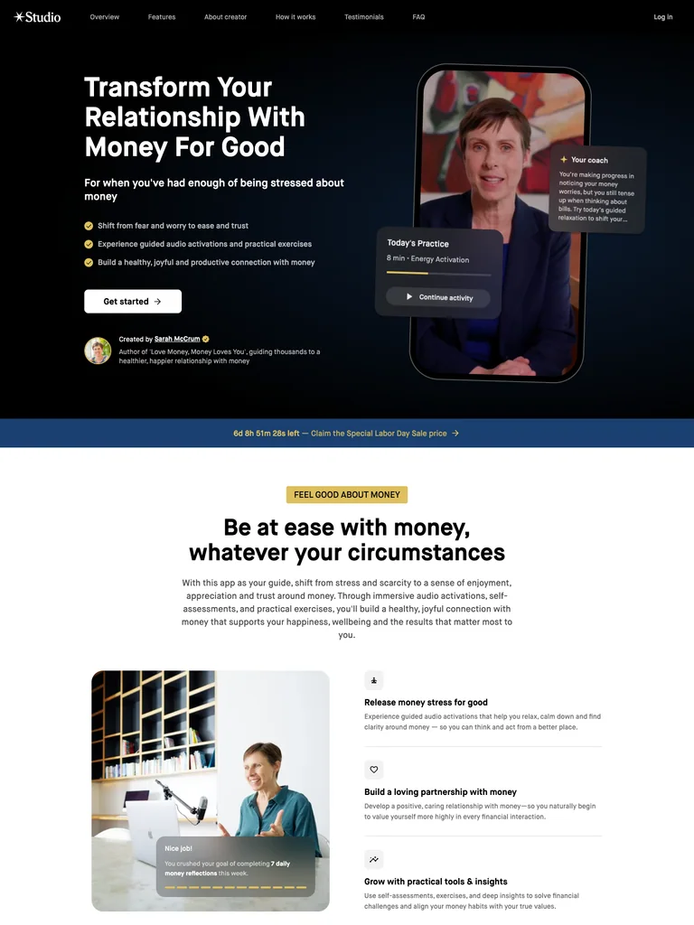 hover to scroll
A membership landing page that uses a mobile product preview and a clear practice-based story to explain the offer.
Useful for: Study the public sales page and its section order, offer presentation, and calls to action. This reference captures one page; checkout steps and conversion results are not verified.
# Design reference: Sarah McCrum — Love Money Studio
Source: https://studio.com/apps/sarah-mccrum/moneylove?code=a&ref=sarah-mccrum
Swipefile reference: https://swipefile.design/ref/funnel-sarah-mccrum-love-money/
Captured: 2026-09-07. This is a dated reference, not a claim about the current live product.


## Objective
Adapt the visual principles below to my project. Use my own content and identity. Do not reproduce logos, proprietary copy, or brand assets.

## Reference notes
- mood: Calm and supportive
- colors: Black, white, medium blue, and small yellow labels.
- typography: Bold sans-serif headlines, compact labels, and scannable benefit lists create a clear hierarchy through the long page.
- layout: Practice-led hero with interface preview → benefits and routine → product features → four-step explanation → membership invitation and final action.
- motion: The capture records a static page state. Preserve readable scrolling and clear action feedback; video playback, counters, and hidden form behavior are not demonstrated.
- texture: Photographic or product imagery, contrasting section backgrounds, grouped benefits, and visual proof panels.
- dont: Use your own offer, brand, and assets. Do not invent testimonials, results, scarcity, guarantees, or pricing.

Useful for: Study the public sales page and its section order, offer presentation, and calls to action. This reference captures one page; checkout steps and conversion results are not verified.

## Acceptance criteria
- Existing project conventions, design tokens, working functionality, and unrelated changes are preserved.
- Two or three reference principles clearly support the user's task; conflicts are resolved in favor of usability and the existing product.
- Reusable components and semantic HTML express the interface. Available licensed assets are used; important UI text is never rendered as a bitmap.
- Every visible control has a defined behavior. Loading, empty, error, success, disabled, and long-content states are specified where relevant. Demo data is clearly labeled.
- Navigation and content adapt at 375px, 768px, and 1440px without horizontal page overflow. Keyboard use, visible focus, labeled inputs, at least 44px touch targets, readable contrast, and reduced motion are supported.
- Verification distinguishes rendered behavior from proposals and identifies anything still requiring a backend or external service.

## Quality bar
Clear hierarchy, consistent spacing, restrained surfaces, and purposeful motion. Avoid decorative gradients, excessive cards, placeholder buttons, and invented metrics unless the project calls for them. Do not claim a feature is connected or tested without evidence.
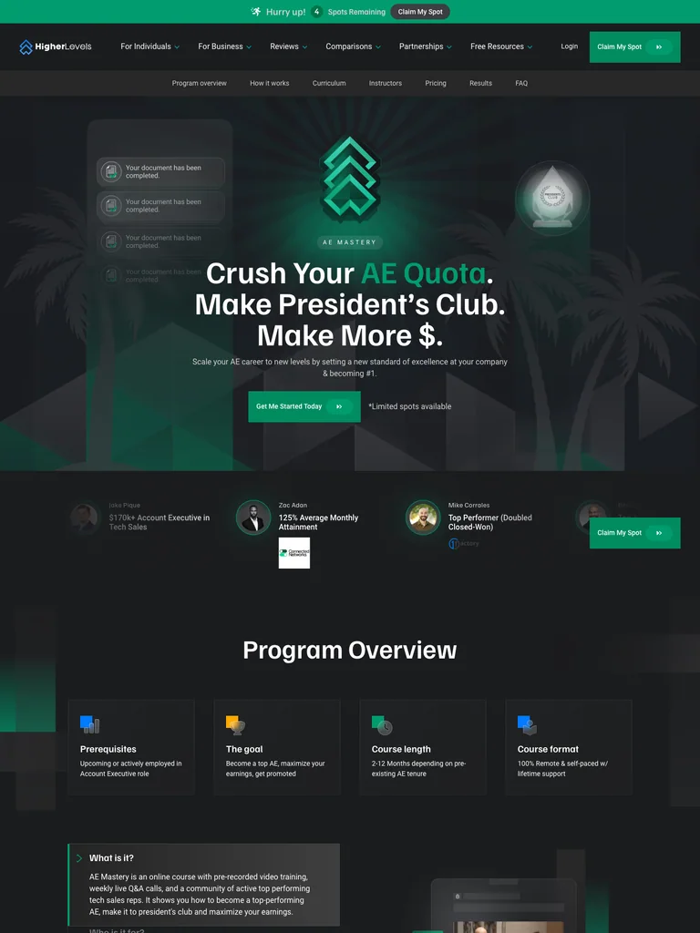 hover to scroll
A sales-training course page with a concise program overview, detailed curriculum, proof, and enrollment actions.
Useful for: Study the public sales page and its section order, offer presentation, and calls to action. This reference captures one page; checkout steps and conversion results are not verified.
# Design reference: Higher Levels — AE Mastery
Source: https://higherlevels.com/ae-mastery
Swipefile reference: https://swipefile.design/ref/funnel-higher-levels-ae-mastery/
Captured: 2026-09-07. This is a dated reference, not a claim about the current live product.


## Objective
Adapt the visual principles below to my project. Use my own content and identity. Do not reproduce logos, proprietary copy, or brand assets.

## Reference notes
- mood: Clear and professional
- colors: Charcoal backgrounds, white headings, and emerald-green accents and instructor frames.
- typography: Bold sans-serif headlines, compact labels, and scannable benefit lists create a clear hierarchy through the long page.
- layout: Career-focused promise → course overview facts → learning format → curriculum → instructor and student proof → enrollment and questions.
- motion: The capture records a static page state. Preserve readable scrolling and clear action feedback; video playback, counters, and hidden form behavior are not demonstrated.
- texture: Photographic or product imagery, contrasting section backgrounds, grouped benefits, and visual proof panels.
- dont: Use your own offer, brand, and assets. Do not invent testimonials, results, scarcity, guarantees, or pricing.

Useful for: Study the public sales page and its section order, offer presentation, and calls to action. This reference captures one page; checkout steps and conversion results are not verified.

## Acceptance criteria
- Existing project conventions, design tokens, working functionality, and unrelated changes are preserved.
- Two or three reference principles clearly support the user's task; conflicts are resolved in favor of usability and the existing product.
- Reusable components and semantic HTML express the interface. Available licensed assets are used; important UI text is never rendered as a bitmap.
- Every visible control has a defined behavior. Loading, empty, error, success, disabled, and long-content states are specified where relevant. Demo data is clearly labeled.
- Navigation and content adapt at 375px, 768px, and 1440px without horizontal page overflow. Keyboard use, visible focus, labeled inputs, at least 44px touch targets, readable contrast, and reduced motion are supported.
- Verification distinguishes rendered behavior from proposals and identifies anything still requiring a backend or external service.

## Quality bar
Clear hierarchy, consistent spacing, restrained surfaces, and purposeful motion. Avoid decorative gradients, excessive cards, placeholder buttons, and invented metrics unless the project calls for them. Do not claim a feature is connected or tested without evidence.
 hover to scroll
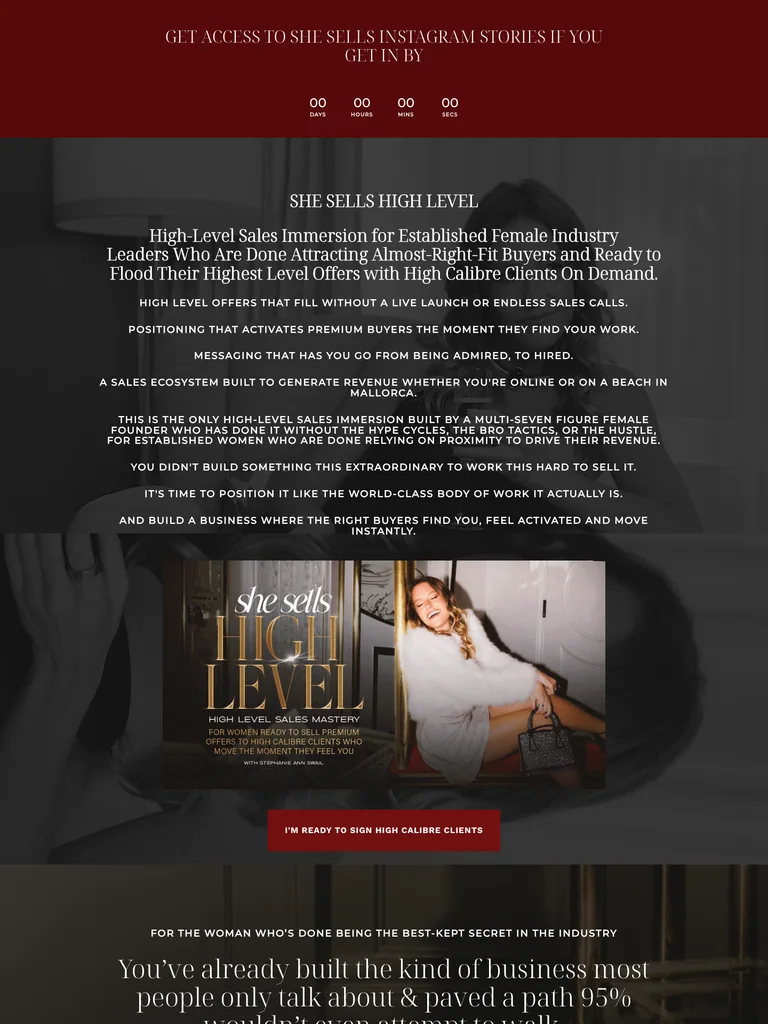
A long coaching-program offer built around audience positioning, a founder story, training details, and repeated enrollment invitations.
Useful for: Study the public sales page and its section order, offer presentation, and calls to action. This reference captures one page; checkout steps and conversion results are not verified.
# Design reference: Stephanie Ann Swail — She Sells High Level
Source: https://stephanieannswail.com/shesellshighlevel
Swipefile reference: https://swipefile.design/ref/funnel-stephanie-ann-swail-she-sells-high-level/
Captured: 2026-09-07. This is a dated reference, not a claim about the current live product.


## Objective
Adapt the visual principles below to my project. Use my own content and identity. Do not reproduce logos, proprietary copy, or brand assets.

## Reference notes
- mood: Personal and editorial
- colors: Deep burgundy, black photographic overlays, white serif headings, and pale FAQ panels.
- typography: Expressive serif display headings mixed with clean supporting text; large typographic shifts separate the offer story from the details.
- layout: Program positioning → reader challenges → audience fit → founder story → training contents and bonuses → enrollment and closing details.
- motion: The capture records a static page state. Preserve readable scrolling and clear action feedback; video playback, counters, and hidden form behavior are not demonstrated.
- texture: Photographic or product imagery, contrasting section backgrounds, grouped benefits, and visual proof panels.
- dont: Use your own offer, brand, and assets. Do not invent testimonials, results, scarcity, guarantees, or pricing.

Useful for: Study the public sales page and its section order, offer presentation, and calls to action. This reference captures one page; checkout steps and conversion results are not verified.

## Acceptance criteria
- Existing project conventions, design tokens, working functionality, and unrelated changes are preserved.
- Two or three reference principles clearly support the user's task; conflicts are resolved in favor of usability and the existing product.
- Reusable components and semantic HTML express the interface. Available licensed assets are used; important UI text is never rendered as a bitmap.
- Every visible control has a defined behavior. Loading, empty, error, success, disabled, and long-content states are specified where relevant. Demo data is clearly labeled.
- Navigation and content adapt at 375px, 768px, and 1440px without horizontal page overflow. Keyboard use, visible focus, labeled inputs, at least 44px touch targets, readable contrast, and reduced motion are supported.
- Verification distinguishes rendered behavior from proposals and identifies anything still requiring a backend or external service.

## Quality bar
Clear hierarchy, consistent spacing, restrained surfaces, and purposeful motion. Avoid decorative gradients, excessive cards, placeholder buttons, and invented metrics unless the project calls for them. Do not claim a feature is connected or tested without evidence.
 hover to scroll
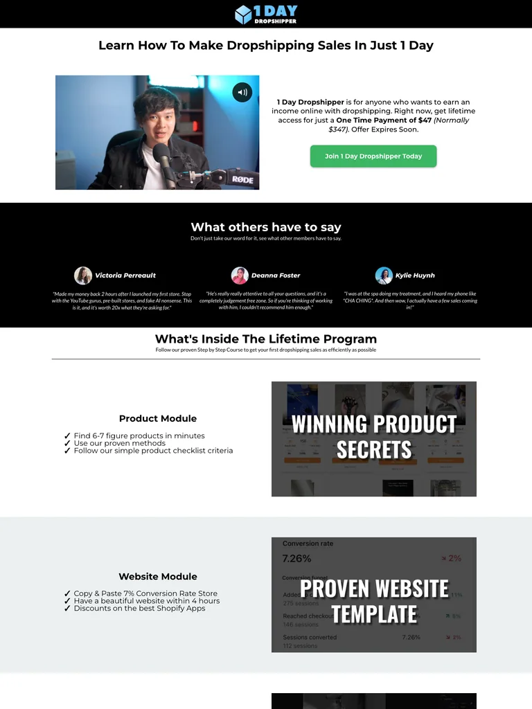
A compact video-led course funnel that alternates black proof sections with a white curriculum and offer explanation.
Useful for: Study the complete public offer page, its section order, and calls to action. Checkout steps, current enrollment availability, and conversion results are not verified.
# Design reference: Kevin Dang — 1 Day Dropshipper
Source: https://smarternomad.com/1daydropshipper
Swipefile reference: https://swipefile.design/ref/funnel-kevin-dang-1-day-dropshipper/
Captured: 2026-09-07. This is a dated reference, not a claim about the current live product.


## Objective
Adapt the visual principles below to my project. Use my own content and identity. Do not reproduce logos, proprietary copy, or brand assets.

## Reference notes
- mood: Simple and practical
- colors: Black and white sections with green enrollment buttons and small gold guarantee details.
- typography: Bold sans-serif headings, compact labels, short benefit lists, and clearly separated curriculum sections make the long offer scannable.
- layout: Video and one-time offer → student proof → curriculum modules → resource previews → member video → mentorship bonus → closing guarantee and CTA.
- motion: The screenshot records a static page state. Preserve readable scrolling and clear action feedback; do not infer video playback, counters, or hidden form behavior.
- texture: Product or instructor imagery, contrasting section backgrounds, grouped curriculum details, and customer-story panels.
- dont: Use your own offer, brand, and assets. Do not invent testimonials, results, scarcity, guarantees, or pricing.

Useful for: Study the complete public offer page, its section order, and calls to action. Checkout steps, current enrollment availability, and conversion results are not verified.

## Acceptance criteria
- Existing project conventions, design tokens, working functionality, and unrelated changes are preserved.
- Two or three reference principles clearly support the user's task; conflicts are resolved in favor of usability and the existing product.
- Reusable components and semantic HTML express the interface. Available licensed assets are used; important UI text is never rendered as a bitmap.
- Every visible control has a defined behavior. Loading, empty, error, success, disabled, and long-content states are specified where relevant. Demo data is clearly labeled.
- Navigation and content adapt at 375px, 768px, and 1440px without horizontal page overflow. Keyboard use, visible focus, labeled inputs, at least 44px touch targets, readable contrast, and reduced motion are supported.
- Verification distinguishes rendered behavior from proposals and identifies anything still requiring a backend or external service.

## Quality bar
Clear hierarchy, consistent spacing, restrained surfaces, and purposeful motion. Avoid decorative gradients, excessive cards, placeholder buttons, and invented metrics unless the project calls for them. Do not claim a feature is connected or tested without evidence.
 hover to scroll
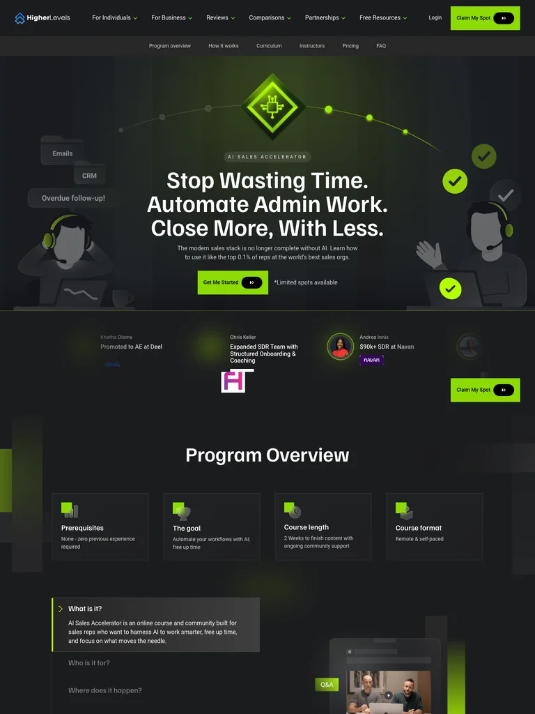
An AI sales-training page with a concise program overview, structured teaching pillars, instructor cards, and bright enrollment accents.
Useful for: Study the complete public offer page, its section order, and calls to action. Checkout steps, current enrollment availability, and conversion results are not verified.
# Design reference: Higher Levels — AI Sales Accelerator
Source: https://higherlevels.com/ai-sales-accelerator
Swipefile reference: https://swipefile.design/ref/funnel-higher-levels-ai-sales-accelerator/
Captured: 2026-09-07. This is a dated reference, not a claim about the current live product.


## Objective
Adapt the visual principles below to my project. Use my own content and identity. Do not reproduce logos, proprietary copy, or brand assets.

## Reference notes
- mood: Technical and purposeful
- colors: Charcoal, white, acid-green accents, and dark illustrated panels.
- typography: Bold sans-serif headings, compact labels, short benefit lists, and clearly separated curriculum sections make the long offer scannable.
- layout: Automation promise → program overview → three teaching pillars → curriculum → instructors → pricing → FAQ and final enrollment panel.
- motion: The screenshot records a static page state. Preserve readable scrolling and clear action feedback; do not infer video playback, counters, or hidden form behavior.
- texture: Product or instructor imagery, contrasting section backgrounds, grouped curriculum details, and customer-story panels.
- dont: Use your own offer, brand, and assets. Do not invent testimonials, results, scarcity, guarantees, or pricing.

Useful for: Study the complete public offer page, its section order, and calls to action. Checkout steps, current enrollment availability, and conversion results are not verified.

## Acceptance criteria
- Existing project conventions, design tokens, working functionality, and unrelated changes are preserved.
- Two or three reference principles clearly support the user's task; conflicts are resolved in favor of usability and the existing product.
- Reusable components and semantic HTML express the interface. Available licensed assets are used; important UI text is never rendered as a bitmap.
- Every visible control has a defined behavior. Loading, empty, error, success, disabled, and long-content states are specified where relevant. Demo data is clearly labeled.
- Navigation and content adapt at 375px, 768px, and 1440px without horizontal page overflow. Keyboard use, visible focus, labeled inputs, at least 44px touch targets, readable contrast, and reduced motion are supported.
- Verification distinguishes rendered behavior from proposals and identifies anything still requiring a backend or external service.

## Quality bar
Clear hierarchy, consistent spacing, restrained surfaces, and purposeful motion. Avoid decorative gradients, excessive cards, placeholder buttons, and invented metrics unless the project calls for them. Do not claim a feature is connected or tested without evidence.
 hover to scroll
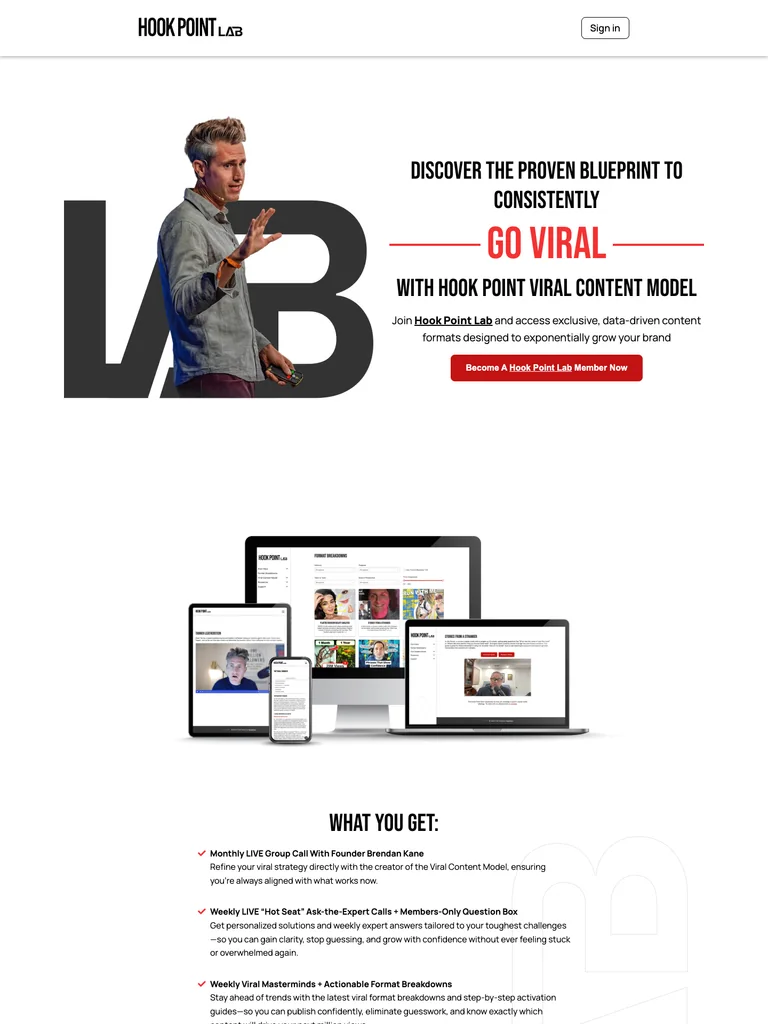
A creator membership page with oversized type, a portrait-led opening, and a strong red closing offer.
Useful for: Study the complete public offer page, its section order, and calls to action. Checkout steps, current enrollment availability, and conversion results are not verified.
# Design reference: Brendan Kane — Hook Point Lab
Source: https://goviral.hookpoint.com/
Swipefile reference: https://swipefile.design/ref/funnel-viral-trends-brendan-kane-1-expert-on-virality-in-the-world/
Captured: 2026-09-07. This is a dated reference, not a claim about the current live product.


## Objective
Adapt the visual principles below to my project. Use my own content and identity. Do not reproduce logos, proprietary copy, or brand assets.

## Reference notes
- mood: Bold, energetic, and community-focused.
- colors: Black and white, vivid red action panels, and restrained gray dividers.
- typography: Bold sans-serif headings, compact labels, short benefit lists, and clearly separated curriculum sections make the long offer scannable.
- layout: Large portrait and membership introduction lead into benefits, live learning opportunities, member examples, supporting proof, and a prominent closing membership panel.
- motion: The screenshot records a static page state. Preserve readable scrolling and clear action feedback; do not infer video playback, counters, or hidden form behavior.
- texture: Product or instructor imagery, contrasting section backgrounds, grouped curriculum details, and customer-story panels.
- dont: Use your own offer, brand, and assets. Do not invent testimonials, results, scarcity, guarantees, or pricing.

Useful for: Study the complete public offer page, its section order, and calls to action. Checkout steps, current enrollment availability, and conversion results are not verified.

## Acceptance criteria
- Existing project conventions, design tokens, working functionality, and unrelated changes are preserved.
- Two or three reference principles clearly support the user's task; conflicts are resolved in favor of usability and the existing product.
- Reusable components and semantic HTML express the interface. Available licensed assets are used; important UI text is never rendered as a bitmap.
- Every visible control has a defined behavior. Loading, empty, error, success, disabled, and long-content states are specified where relevant. Demo data is clearly labeled.
- Navigation and content adapt at 375px, 768px, and 1440px without horizontal page overflow. Keyboard use, visible focus, labeled inputs, at least 44px touch targets, readable contrast, and reduced motion are supported.
- Verification distinguishes rendered behavior from proposals and identifies anything still requiring a backend or external service.

## Quality bar
Clear hierarchy, consistent spacing, restrained surfaces, and purposeful motion. Avoid decorative gradients, excessive cards, placeholder buttons, and invented metrics unless the project calls for them. Do not claim a feature is connected or tested without evidence.
 hover to scroll
A web-design membership funnel organizing courses, community, and coaching around a consistent green action.
Useful for: Study the complete public offer page, its section order, and calls to action. Checkout steps, current enrollment availability, and conversion results are not verified.
# Design reference: Josh Hall — Web Designer Pro
Source: https://webdesignerpro.com/
Swipefile reference: https://swipefile.design/ref/funnel-josh-hall-web-designer-pro-all-access-pass/
Captured: 2026-09-07. This is a dated reference, not a claim about the current live product.


## Objective
Adapt the visual principles below to my project. Use my own content and identity. Do not reproduce logos, proprietary copy, or brand assets.

## Reference notes
- mood: Friendly, clear, and community-led.
- colors: White, charcoal, bright lime green, and soft gray panels.
- typography: Bold sans-serif headings, compact labels, short benefit lists, and clearly separated curriculum sections make the long offer scannable.
- layout: Centered membership introduction and student-video row lead into courses, community, coaching, audience profiles, highlighted member stories, and an instructor-led final invitation.
- motion: The screenshot records a static page state. Preserve readable scrolling and clear action feedback; do not infer video playback, counters, or hidden form behavior.
- texture: Product or instructor imagery, contrasting section backgrounds, grouped curriculum details, and customer-story panels.
- dont: Use your own offer, brand, and assets. Do not invent testimonials, results, scarcity, guarantees, or pricing.

Useful for: Study the complete public offer page, its section order, and calls to action. Checkout steps, current enrollment availability, and conversion results are not verified.

## Acceptance criteria
- Existing project conventions, design tokens, working functionality, and unrelated changes are preserved.
- Two or three reference principles clearly support the user's task; conflicts are resolved in favor of usability and the existing product.
- Reusable components and semantic HTML express the interface. Available licensed assets are used; important UI text is never rendered as a bitmap.
- Every visible control has a defined behavior. Loading, empty, error, success, disabled, and long-content states are specified where relevant. Demo data is clearly labeled.
- Navigation and content adapt at 375px, 768px, and 1440px without horizontal page overflow. Keyboard use, visible focus, labeled inputs, at least 44px touch targets, readable contrast, and reduced motion are supported.
- Verification distinguishes rendered behavior from proposals and identifies anything still requiring a backend or external service.

## Quality bar
Clear hierarchy, consistent spacing, restrained surfaces, and purposeful motion. Avoid decorative gradients, excessive cards, placeholder buttons, and invented metrics unless the project calls for them. Do not claim a feature is connected or tested without evidence.
 hover to scroll
A full coaching-course funnel with wave-shaped sections, extensive program detail, and repeated payment-plan comparisons.
Useful for: Study the complete public offer page, its section order, and calls to action. Checkout steps, current enrollment availability, and conversion results are not verified.
# Design reference: Denise Duffield-Thomas — Money Bootcamp
Source: https://denisedt.com/bootcamp
Swipefile reference: https://swipefile.design/ref/funnel-denise-duffield-thomas-money-bootcamp/
Captured: 2026-09-08. This is a dated reference, not a claim about the current live product.


## Objective
Adapt the visual principles below to my project. Use my own content and identity. Do not reproduce logos, proprietary copy, or brand assets.

## Reference notes
- mood: Supportive, expansive, and coaching-led.
- colors: Sky blue, deep indigo, white, and orange call-to-action buttons.
- typography: Bold sans-serif headings, compact labels, short benefit lists, and clearly separated curriculum sections make the long offer scannable.
- layout: Video-and-copy introduction leads through audience concerns, instructor context, member stories, six training modules, coaching resources, learner-stage panels, bonuses, repeated three-plan pricing, and extensive FAQs.
- motion: The screenshot records a static page state. Preserve readable scrolling and clear action feedback; do not infer video playback, counters, or hidden form behavior.
- texture: Product or instructor imagery, contrasting section backgrounds, grouped curriculum details, and customer-story panels.
- dont: Use your own offer, brand, and assets. Do not invent testimonials, results, scarcity, guarantees, or pricing.

Useful for: Study the complete public offer page, its section order, and calls to action. Checkout steps, current enrollment availability, and conversion results are not verified.

## Acceptance criteria
- Existing project conventions, design tokens, working functionality, and unrelated changes are preserved.
- Two or three reference principles clearly support the user's task; conflicts are resolved in favor of usability and the existing product.
- Reusable components and semantic HTML express the interface. Available licensed assets are used; important UI text is never rendered as a bitmap.
- Every visible control has a defined behavior. Loading, empty, error, success, disabled, and long-content states are specified where relevant. Demo data is clearly labeled.
- Navigation and content adapt at 375px, 768px, and 1440px without horizontal page overflow. Keyboard use, visible focus, labeled inputs, at least 44px touch targets, readable contrast, and reduced motion are supported.
- Verification distinguishes rendered behavior from proposals and identifies anything still requiring a backend or external service.

## Quality bar
Clear hierarchy, consistent spacing, restrained surfaces, and purposeful motion. Avoid decorative gradients, excessive cards, placeholder buttons, and invented metrics unless the project calls for them. Do not claim a feature is connected or tested without evidence.
 hover to scroll
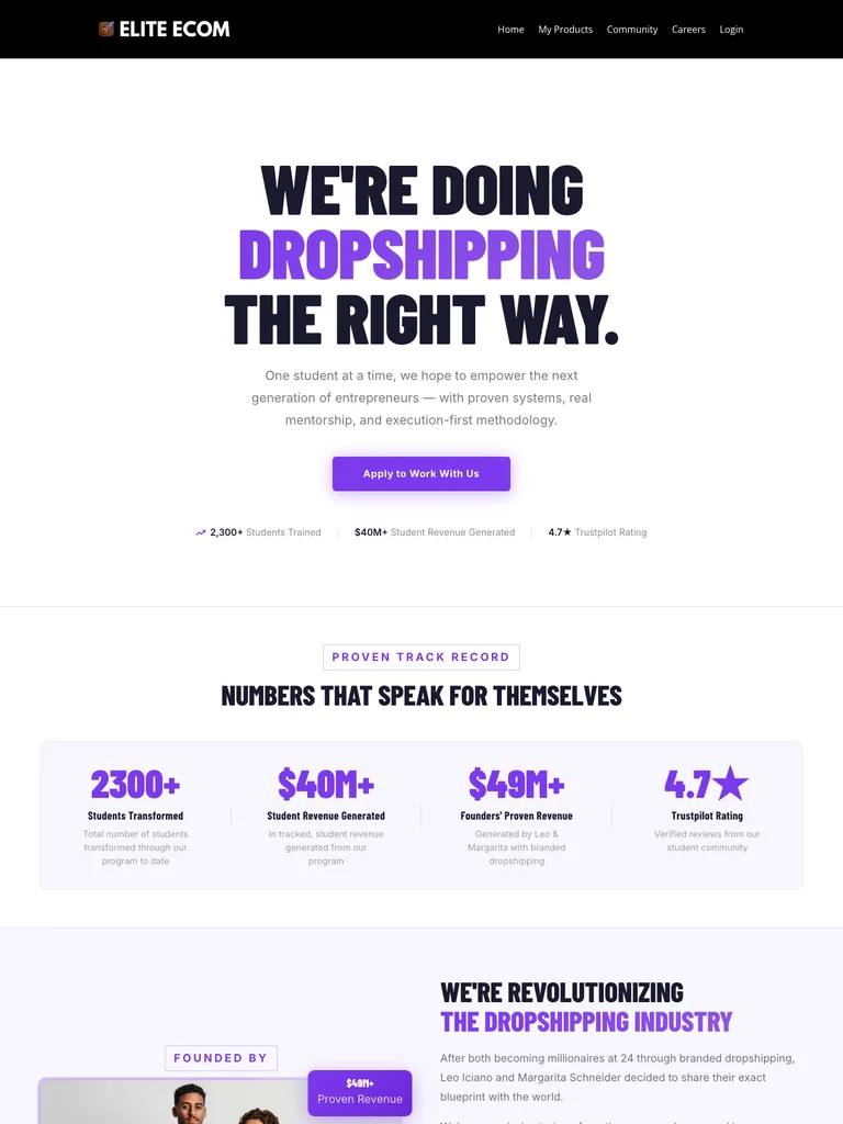
A coaching funnel with condensed display type, violet accents, and repeated application prompts.
Useful for: Study the complete public offer page, its section order, and calls to action. Checkout steps, current enrollment availability, and conversion results are not verified.
# Design reference: Elite Ecom — Coaching Program
Source: https://joineliteecom.com/
Swipefile reference: https://swipefile.design/ref/funnel-elite-ecom-academy-facebook-unlocked-blueprint/
Captured: 2026-09-08. This is a dated reference, not a claim about the current live product.


## Objective
Adapt the visual principles below to my project. Use my own content and identity. Do not reproduce logos, proprietary copy, or brand assets.

## Reference notes
- mood: Bold, focused, and application-led.
- colors: White, near-black navy, vivid violet actions, and pale lavender panels.
- typography: Bold sans-serif headings, compact labels, short benefit lists, and clearly separated curriculum sections make the long offer scannable.
- layout: Oversized condensed headline and application action lead into program context, coaching and community benefits, member reviews, and a final side-by-side program recap and invitation.
- motion: The screenshot records a static page state. Preserve readable scrolling and clear action feedback; do not infer video playback, counters, or hidden form behavior.
- texture: Product or instructor imagery, contrasting section backgrounds, grouped curriculum details, and customer-story panels.
- dont: Use your own offer, brand, and assets. Do not invent testimonials, results, scarcity, guarantees, or pricing.

Useful for: Study the complete public offer page, its section order, and calls to action. Checkout steps, current enrollment availability, and conversion results are not verified.

## Acceptance criteria
- Existing project conventions, design tokens, working functionality, and unrelated changes are preserved.
- Two or three reference principles clearly support the user's task; conflicts are resolved in favor of usability and the existing product.
- Reusable components and semantic HTML express the interface. Available licensed assets are used; important UI text is never rendered as a bitmap.
- Every visible control has a defined behavior. Loading, empty, error, success, disabled, and long-content states are specified where relevant. Demo data is clearly labeled.
- Navigation and content adapt at 375px, 768px, and 1440px without horizontal page overflow. Keyboard use, visible focus, labeled inputs, at least 44px touch targets, readable contrast, and reduced motion are supported.
- Verification distinguishes rendered behavior from proposals and identifies anything still requiring a backend or external service.

## Quality bar
Clear hierarchy, consistent spacing, restrained surfaces, and purposeful motion. Avoid decorative gradients, excessive cards, placeholder buttons, and invented metrics unless the project calls for them. Do not claim a feature is connected or tested without evidence.
 hover to scroll
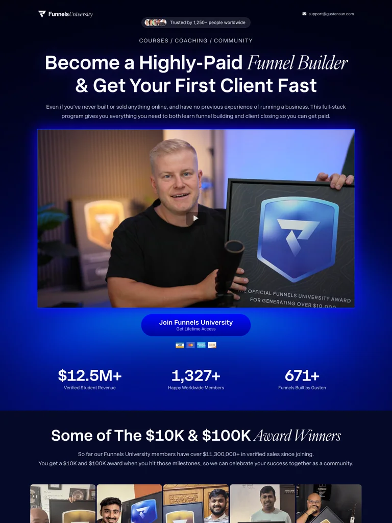
A dark funnel-building program page combining courses, coaching, community, and a long bundle offer.
Useful for: Study the complete public offer page, its section order, and calls to action. Checkout steps, current enrollment availability, and conversion results are not verified.
# Design reference: Gusten Sun — Funnels University
Source: https://funnelsuniversity.com/
Swipefile reference: https://swipefile.design/ref/funnel-gusten-sun-funnel-university/
Captured: 2026-09-08. This is a dated reference, not a claim about the current live product.


## Objective
Adapt the visual principles below to my project. Use my own content and identity. Do not reproduce logos, proprietary copy, or brand assets.

## Reference notes
- mood: High-energy, immersive, and instructor-led.
- colors: Near-black navy, white, electric blue and violet, with bright offer accents.
- typography: Bold sans-serif headings, compact labels, short benefit lists, and clearly separated curriculum sections make the long offer scannable.
- layout: Video-led opening progresses through instructor credentials, member examples, guest experts, courses and community resources, an extended bundle stack, pricing, and repeated enrollment invitations.
- motion: The screenshot records a static page state. Preserve readable scrolling and clear action feedback; do not infer video playback, counters, or hidden form behavior.
- texture: Product or instructor imagery, contrasting section backgrounds, grouped curriculum details, and customer-story panels.
- dont: Use your own offer, brand, and assets. Do not invent testimonials, results, scarcity, guarantees, or pricing.

Useful for: Study the complete public offer page, its section order, and calls to action. Checkout steps, current enrollment availability, and conversion results are not verified.

## Acceptance criteria
- Existing project conventions, design tokens, working functionality, and unrelated changes are preserved.
- Two or three reference principles clearly support the user's task; conflicts are resolved in favor of usability and the existing product.
- Reusable components and semantic HTML express the interface. Available licensed assets are used; important UI text is never rendered as a bitmap.
- Every visible control has a defined behavior. Loading, empty, error, success, disabled, and long-content states are specified where relevant. Demo data is clearly labeled.
- Navigation and content adapt at 375px, 768px, and 1440px without horizontal page overflow. Keyboard use, visible focus, labeled inputs, at least 44px touch targets, readable contrast, and reduced motion are supported.
- Verification distinguishes rendered behavior from proposals and identifies anything still requiring a backend or external service.

## Quality bar
Clear hierarchy, consistent spacing, restrained surfaces, and purposeful motion. Avoid decorative gradients, excessive cards, placeholder buttons, and invented metrics unless the project calls for them. Do not claim a feature is connected or tested without evidence.
Allow basic usage counts to help us understand what is useful. Your board contents stay out of analytics. Details
Your browser’s privacy preference keeps analytics off.